
What is Brand Design? Complete Guide With Step-by-Step Process for 2026
You can spot Coca-Cola from across the street by its curvy bottle shape and red wrapper around it. You recognize an Apple device before the logo even loads. And when you see a certain shade of Tiffany blue on a box, you already know what's inside.
That's the magic of successful branding design.
Brand design or branding design is the strategic process of creating a visual identity that represents a company's personality, values, and positioning. It takes the bigger picture of brand strategy and converts it into tangible visual elements, including logos, typography, color palettes, and imagery, that are used consistently across every digital and physical touchpoint.
Many people mistake branding design for being about aesthetics. But the truth is that it is more than just making things look nice. Branding design is the reason you trust one company over another. Think about how you naturally incline towards purchasing a MacBook instead of a Dell when the latter is obviously easier on your pocket.
Our team spent a week researching all aspects of brand design to give you this comprehensive, single source of truth. In this guide, we have covered:
- What is branding design
- Difference between brand design, branding, and graphic design
- Importance of brand design
- Key elements of branding design
- Brand design principles
- How to do a branding design: from strategy to execution
- Examples of successful brand design
- Common mistakes to avoid
… and a lot more. Whether you're building a brand from scratch or rethinking an existing one, this should give you everything you need to make informed decisions.
What is brand design?
This is the first thing that you should know.
Brand design or branding design is the process of crafting a unified system of visual elements that represent a brand. These elements include the logo, color palette, typography, imagery style, iconography, and the guidelines that govern how everything is used. Together, they form what most people refer to as a "visual identity" or "brand identity."
Paul Rand, the legendary designer behind the IBM, UPS, and ABC logos, explained it well when he said that design is the silent ambassador of your brand. His thoughts on branding design get quoted a lot, and for good reason.
The main objective of brand design is to create a visual system that successfully communicates who you are, what you stand for, and why someone should care, all without requiring the audience to read a single word. It should be able to communicate everything your brand stands for, silently and instantly. Let’s put it this way: if your brand strategy reflects your personality, your brand design is how that personality shows up visually in the world.
Brand design vs. branding: what's the difference?
People use these terms interchangeably all the time, but they're not the same thing. Here’s a comparison table to convey better:
So when someone says "we need to work on our branding," they might mean they need a clearer strategy. They might also mean they need better visual design. And often, they need both. But we should understand that brand design is always grounded in brand strategy. Without a strategy, design is simply ornamental.
Brand design vs. graphic design: how are they different?
This is one of the most common questions that comes up in design communities, and often leads to confusion. The roles do overlap, but the scope is different.
Here’s a simple way to think about it: a brand designer is the architect who draws up the blueprints for the entire building. On the other hand, a graphic designer is the interior decorator who makes specific rooms look great following those blueprints.
In more practical terms, here's how the two roles compare:
All graphic design is different, and the more specialized it is, the better the quality tends to be. Brand design is that specialization. A good brand designer thinks in systems instead of just individual assets.
Both of these roles are complementary. But if you're building or rebuilding a brand from scratch, you need the brand designer first to set the rules. Then the graphic designer can play within them.
Importance of brand design: why it matters
You might be wondering: does all of this really matter that much? Can't I just get a nice logo from a freelancer and call it a day?
Technically, you can. But here's why that's a risky approach.
It shapes how people perceive your business
Harvard professor Gerald Zaltman estimates that 95% of our purchase decision-making takes place in the subconscious mind. That means people are judging your brand before they even realize they're doing it, and visual design is one of the biggest drivers of those snap judgments.
Your brand design is often the very first point of contact someone has with your company. Before they read your copy, check your pricing, or talk to your sales team, they see your visuals e.g. how your website looks as a whole, colors you used, graphic elements or images, etc. And in those first few seconds, they're already forming opinions about whether you're credible, professional, funny, or worth their time.
It builds recognition and loyalty
Recognition comes from consistency, and consistency comes from having a well-designed brand system that looks the same everywhere. Apple is the textbook example here. According to Statista, about 92% of iPhone users stay within the Apple ecosystem. There are many reasons for that, but the brand experience, which is built on exceptionally consistent design, plays a significant role.
And it's not just about tech giants. Research from Forbes shows that consistent branding can increase revenue by up to 23%. That's not a marginal improvement. For a company doing $10M in revenue, that's an extra $2.3M just from being consistent with how the brand shows up visually.
It differentiates you from competitors
In saturated markets, especially in SaaS and tech, a lot of products are pretty similar. The features overlap. The pricing is in the same range. When that happens, brand design becomes one of the fastest and most effective ways to differentiate quality, personality, and professionalism.
This is especially true for startups. Data consistently shows that startups with strong brand strategy grow faster and secure higher valuations. Investors notice design quality because it signals attention to detail, which tends to correlate with attention to product quality, too. This is why, whenever a startup secures an investment, the first thing that they do is a rebranding.
"We've worked with 150+ brands. The ones that grow fastest almost always got their brand design right early."

The key elements of brand design
Now let's get into the specific components that make up a brand's visual identity. There are five core elements that every brand design system should consist of.
Logo and logomark
Your logo is the primary visual symbol of your brand. It's the thing people see most often, and it's usually the first thing that comes to mind when someone thinks of your company.
A strong logo needs to be three things:
- Simple
- Versatile
- Memorable
Simple because complex logos don't scale well and are harder to recall. Versatile because your logo needs to work at every size, from a 16x16px favicon to a billboard. And memorable because the whole point is for people to see it once or twice and remember it.
Let’s look at the HubSpot logo or Dropbox’s half-opened box. Both are made using simple shapes and solid colors, but they're instantly recognizable worldwide. These designs have been kept simple intentionally. But when designing, they were done with much thoughtfulness. Because HubSpot’s integrative functionalities, the logo consists of multiple circles connected to a central one.
When designing a logo system (not just a single logo file), you typically need several variations: a primary logo, a simplified mark for small sizes, a monochrome version for limited color situations, and clear rules about spacing and placement.
Color palette
Color is one of the most emotionally powerful tools in brand design. Different colors trigger different psychological associations, and those associations vary across cultures.
A brand's color palette typically includes a primary color (the dominant one associated with the brand), one or two secondary colors (used for accents and supporting visuals), and a set of neutrals (for backgrounds, text, and utility elements).
The key is choosing colors that align with the emotions and associations you want your audience to feel. Stripe's purple-blue (they call it "blurple") sits between innovation and reliability, which is exactly the balance you want from a payments infrastructure platform. Notion's clean black-and-white palette signals simplicity and focus, reinforcing the idea that their tool brings order to messy workflows. These are deliberate choices rooted in color theory and audience psychology.
One of the most common mistakes in brand design is choosing colors based on the personal preference of the founder or designer rather than what the audience needs to feel. A founder might love dark green, but if the brand is aimed at energetic, young consumers, a muted palette could send the wrong signal entirely.
Typography
Fonts carry personality. A serif font like Times New Roman feels traditional and authoritative. A sans-serif font like Inter or Helvetica feels modern and clean. A display font can feel playful, bold, or artistic depending on the design.
Typography in brand design involves more than just picking a single font. You need to build a font hierarchy: a heading font for titles and large text, a body font for paragraphs and general reading, and sometimes an accent font for special use cases like pull quotes or navigation.
The goal here is to create consistency and readability across every piece of content your brand produces. When the typography is consistent, people subconsciously feel that everything belongs together, even if they can't articulate why.
Good font pairing is a much-coveted skill. The fonts need to complement each other without demanding separate attention, and they need to be legible at every size and on every device.
Imagery style and photography direction
This branding design element often gets ignored, but it's one of the biggest contributors to how a brand "feels" in practice.
Imagery direction covers the rules for photography, illustration, and iconography. These rules define what kind of photos the brand uses (are they warm and human-centric, or cool and product-focused?), what illustration style is appropriate (flat, 3D, hand-drawn?), and how icons should look (line-based, filled, rounded corners or sharp?).
Airbnb is a great example here. Their photography consistently features warm lighting, real people in authentic settings, and a sense of belonging. That visual consistency a well-planned brand design decision that reinforces the company's core message of belonging anywhere.
Without imagery guidelines, you will end up with a brand that looks different every time someone creates a new piece of content. One social post uses stock photos with a cool, blue tone. The next uses bright, saturated illustrations. As a result, your brand will look disjointed, even if the logo and colors are technically correct.
Brand guidelines (the brand book)
The brand guidelines document is where all of these individual design decisions come together into one reference guide. It's sometimes called a brand book, a style guide, or a brand identity manual, but it serves the same purpose: it tells everyone on your team (and any external partners) exactly how to use the brand's visual elements.
A solid brand guidelines document usually covers logo usage rules (minimum sizes, clear space, what not to do), the color palette with exact hex, RGB, and CMYK values, typography specifications, imagery direction, tone of voice guidance, and application examples that show how everything looks in practice across different touchpoints.
This document separates professional brand design from ad-hoc design decisions. Without it, every new hire, every freelancer, and every agency partner will have to go through a guessing game on how to represent your brand. But when with its presence, everyone should stay aligned.
The brand design process: from strategy to execution
Every marketing team have their own process of coming up with a branding design. However, there are some basic phases that all of them need to go through. We researched the process that the teams at companies like HubSpot and Stripe follow, combined them with our own steps at magier and have broken down it into five phases:
Phase 1: Research and discovery
Start with understanding the current state of things. This phase involves a brand audit (what does the current brand look like and how is it perceived?), competitive research (what do other brands in the space look like?), and multiple stakeholder interviews (what do the people inside the company believe the brand should represent?).
We also recommend doing a SWOT analysis at this stage, which looks at the brand's strengths, weaknesses, opportunities, and threats. Your goal should be to identify where the brand currently stands and where there's room for the design to differentiate.
One thing that separates great brand design work from average work is the concept of finding a "cultural tension." This means identifying a gap between what the audience wants and what the market currently offers. The best brand design work positions the brand as the answer to that tension.
Phase 2: Defining the brand strategy
Before anyone opens a design tool, you need a strategy that is finalized and approved. This phase covers the brand's unique value proposition (what makes it different), the target audience definition (who it's for), customer personas (what those people care about), and the brand's mission, values, and positioning statement.
As Arielle Jackson, a Google veteran and startup branding expert, has said, “Your purpose is how you want to change the world for the better. That sense of purpose needs to be defined before a single pixel gets pushed.”
Sometimes, this might feel like it's outside the scope of "design”. But it's not. Brand design decisions that aren't grounded in strategy might look nice but often fail to communicate anything meaningful. The strategy is the foundation that everything else is built on.
Phase 3: Creating the visual identity system
This is where the actual design work happens. Building on the strategy, the brand designer creates the logo system, selects the color palette, defines the typography, establishes the imagery direction, and develops any supporting visual elements like icons, patterns, or illustrations.
The key here is to have a "system." A brand identity isn't a collection of random design decisions, but rather a comprehensive system where every element works together to communicate a consistent message. The colors have to support the mood that the logo sets. The typography should reinforce the personality that the imagery conveys. Everything has to be connected.
This phase usually involves multiple rounds of exploration and refinement. It's completely normal to go through dozens of logo concepts before landing on the right one. The same goes for color palettes and typography pairings. As a brand designer, your objective should be to test different directions and narrow down to the one that best serves the strategy.
Phase 4: Applying design across touchpoints
Once the visual identity system is finalized, it gets applied across all the places the brand shows up. The touchpoints typically include digital environments such as the website, social media profiles, email templates, digital ads, and app interfaces, as well as physical environments such as business cards, packaging, signage, and even office interiors.
This is also the phase where the brand guidelines document is created. The guidelines serve as the rulebook for how the brand design should be applied consistently, no matter who's doing the work.
For most companies, the website is the single most important touchpoint. It's where the brand identity needs to come together in the most comprehensive way. Hence, getting the website right should be your highest-impact application of brand design.
Phase 5: Maintenance and evolution
Branding design is not a one-and-done project. Once the identity is live, it needs ongoing maintenance. This means measuring how well it's performing (through metrics like Net Promoter Score, brand awareness surveys, and customer retention), managing governance across teams to ensure consistency, and planning for when the brand might need a refresh.
There's an important distinction between a brand refresh and a full rebrand. A refresh updates the visual identity to feel more current while keeping the core elements intact. A rebrand is a more fundamental change that may involve a new name, new positioning, and a completely new visual identity. Most brands need a refresh every 5-7 years. Full rebrands are much rarer and should only happen when the business itself has fundamentally changed.
What does a brand designer actually do?
This is a question that comes up constantly in design communities, and it deserves a clear answer.
A brand designer is a specialist who translates a company's strategy, values, and positioning into a cohesive visual identity system that works consistently across every touchpoint. On a day-to-day basis, their work is a combination of strategic thinking and visual execution. They might spend a morning conducting competitive research and an afternoon refining logo concepts. They might also hold a stakeholder workshop in the morning and build out a brand guidelines document in the afternoon.
The core skills a brand designer needs include:
- Strategic thinking (the ability to translate business goals into visual decisions)
- Visual design proficiency (expertise in layout, color, typography, and composition)
- Research skills (knowing how to analyze competitors, audiences, and market trends)
- Communication skills (the ability to present and defend design decisions to stakeholders who may not have a design background)
Within a team, the brand designer bridges the gap between strategy and execution. They work closely with the brand strategist (if there is one) to understand the positioning and then translate that into a visual system that the broader creative team can use.
This role is different from a creative director, who typically oversees the creative output at a higher level and manages teams, and from a brand strategist, who focuses on positioning and messaging without necessarily doing any visual design work. In practice, especially at smaller companies, one person often wears more than one of these hats. But the brand designer's unique contribution is creating the visual rules that everyone else follows.
Brand design examples that get it right
Let's look at a few brands that have done an exceptional job with their brand design, and more importantly, why their approach works.
Example 1: Linear
Linear is a great example of brand design done with intention from day one. Their entire visual identity is layered on precision and restraint: a desaturated blue primary color, clean sans-serif typography, generous spacing, and a dark-mode-first aesthetic that feels native to the developers and product teams who use it. Every touchpoint, from the marketing site to the in-app interface to the brand guidelines page, follows the same visual language. As a result, their product give the vibe of fast, focused, and premium without a single flashy element. They've built a $400M company with a cult following, and their brand design is a big part of why people trust it immediately.

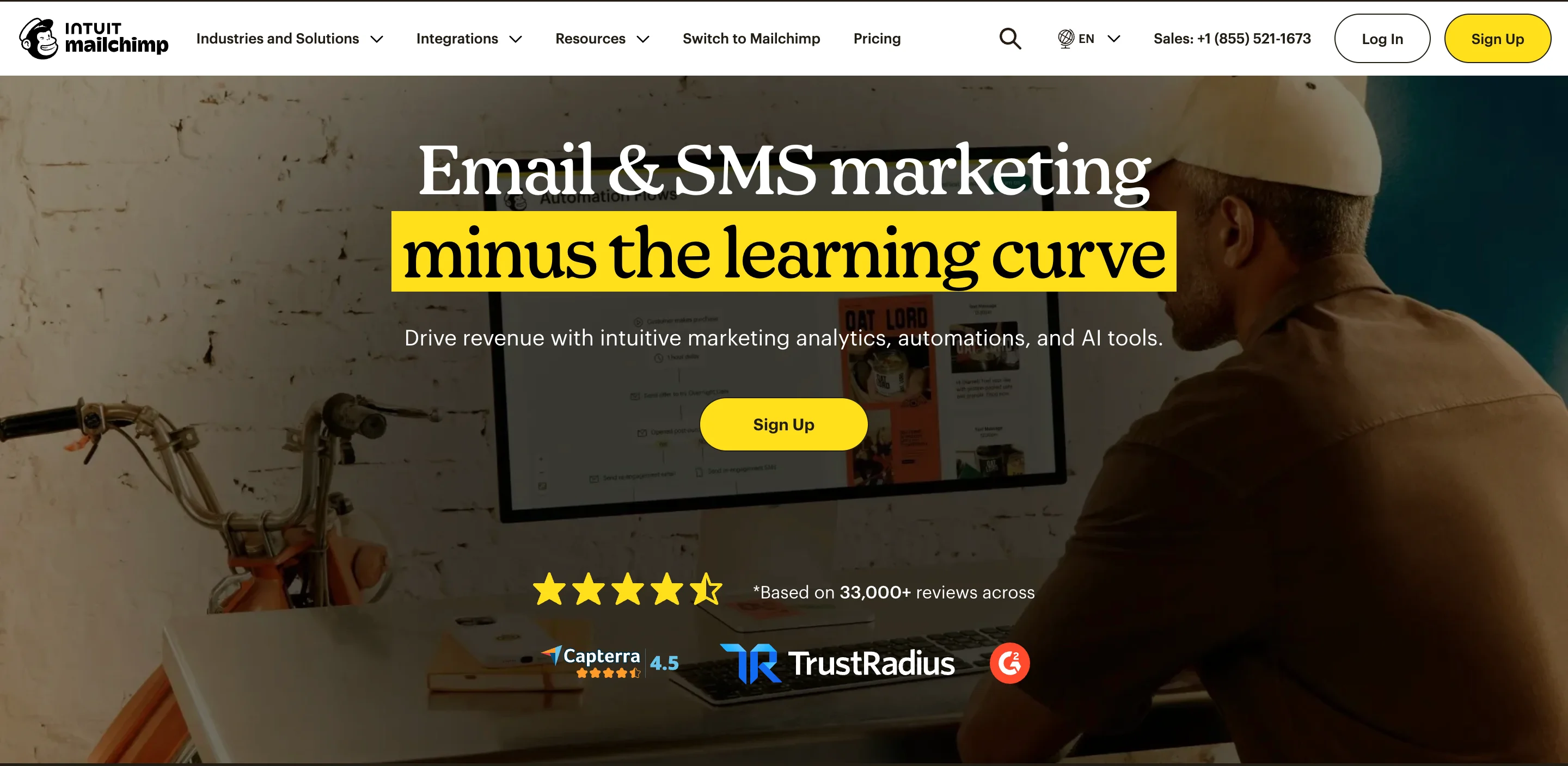
Example 2: Mailchimp
Mailchimp goes in a completely different and succeeds just as well. Their brand design is playful, quirky, and full of personality. They use bold colors, a custom illustration style, and a hand-drawn-feeling typeface that makes a marketing automation tool feel approachable and fun. This is a deliberate strategic choice: in a category full of dry, corporate-feeling tools, Mailchimp's design says "we don't take ourselves too seriously, but we do take your results seriously."
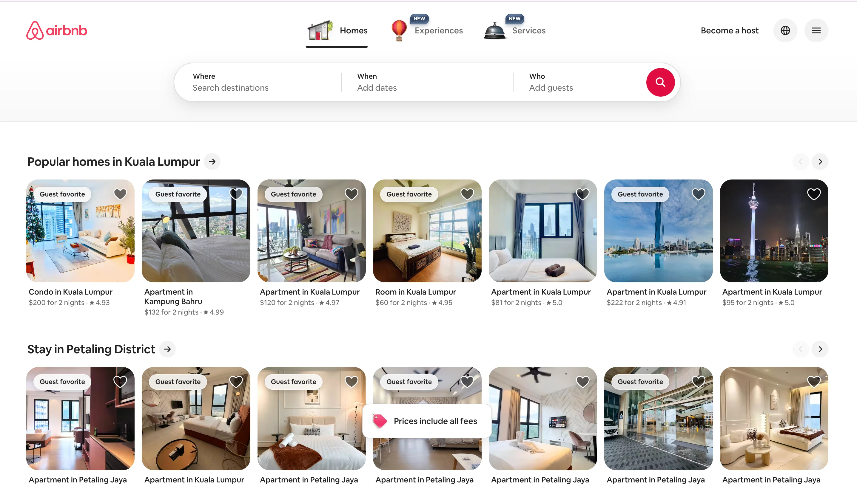
Example 3: Airbnb
Airbnb's brand design revolves around belonging. The Bélo symbol (their logo) was designed to represent people, places, love, and Airbnb itself. Their photography consistently features warm, authentic, and human moments. Their color palette is warm and inviting. Everything in their visual system endorses the idea that Airbnb is all about giving people the best experience while bringing them under a single, homely roof.
Example 4: Slack
Slack is a great example of brand design that communicates collaboration. The bright, multi-color palette, the approachable sans-serif typography, and the clean interface design all work together to make a workplace communication tool feel friendly rather than corporate. The brand design reflects the product experience: organized, colorful, and designed to bring people together.

What all four of these brands have in common is thoughtfulness, consistency, and intentionality. Every visual choice is rooted in the brand strategy. That's what separates good brand design from great brand design.
Common brand design mistakes to avoid
After working with over 150 brands, we've seen some common mistakes come up repeatedly. Here are the ones that you should pay attention to to avoid future redos.
Designing a logo without a strategy behind it
This happens all the time. Someone hires a designer, skips the strategy phase entirely, and ends up with a logo that looks fine but doesn't communicate anything meaningful. Six months later, they're back to square one because the logo doesn't represent who they actually are.
Choosing colors based on personal preference instead of audience psychology
Your favorite color isn't necessarily the right color for your brand. Colors need to align with the emotions and associations your target audience expects and responds to. Personal taste is a starting point, not the final answer.
Ignoring consistency across channels
A brand that looks one way on the website, another way on social media, and yet another way on print materials isn't building recognition. It's building confusion. Consistency is what turns a collection of nice-looking assets into an actual brand.
Skipping the brand guidelines document
Without documentation, every person who touches the brand is making their own interpretation of how it should look. Over time, this drift adds up and the brand loses cohesion. A brand guidelines document is not a luxury. It's a necessity.
Treating brand design as a one-time project instead of an ongoing system
Your brand will evolve as your company grows. If you treat brand design as a box you check once and never revisit, the visual identity will gradually become misaligned with the reality of the business.
Brand design trends for 2026
The field of brand design doesn't stand still, and 2026 is bringing some interesting shifts that are worth paying attention to.
AI-assisted brand design tools are becoming mainstream
Agentic AI is making its way into the design workflow, with tools that can generate logo explorations, suggest color palettes based on audience data, and even create initial brand guidelines drafts. This isn't replacing brand designers (the strategic thinking still requires a human), but it's significantly speeding up the exploration and iteration phases.
The "imperfect by design" aesthetic is gaining ground
After years of hyper-polished, minimalist design dominating, we're seeing a counter-trend: brands intentionally incorporating hand-drawn elements, organic shapes, and deliberate imperfections into their visual identities. The purpose is to feel more human and authentic at a time when AI-generated perfection is becoming ubiquitous.
Sensory branding is expanding beyond visuals
Forward-thinking brands are designing audio logos (think of Netflix's "ta-dum" or Intel's chime), tactile packaging experiences, and even scent-based brand elements. This doesn't replace visual brand design, but it extends the brand identity into new dimensions.
Personal branding is merging with brand design
With the rise of platforms like Substack and the growing influence of creator-led businesses, personal branding now requires the same level of design thinking that was once reserved for companies. Founders and executives are investing in personal brand identities that align with, but are distinct from, their company brands.
Circular and sustainable design principles are influencing visual identity
More brands are incorporating sustainability into their design choices, whether that's through eco-friendly packaging design, minimalist approaches that reduce production waste, or visual identities that actively communicate the brand's commitment to environmental responsibility.
How to get started with brand design for your business
So, how do you actually move forward with brand design? It depends on where you are right now.
If you're a startup building a brand from scratch…
Start with strategy. Define your target audience, your value proposition, and your positioning before you think about logos and colors. A lot of startups rush straight to design because it's the visible part, but the strategic foundation is what makes the design work. Once the strategy is solid, invest in building a proper identity system rather than getting a quick logo and making up the rest as you go.
If you're rebranding an existing business…
Start with an honest audit. Look at what's working and what isn't. Talk to your customers about how they perceive your current brand. Identify whether you need a light refresh (updating the visuals while keeping the core identity intact) or a deeper overhaul (rethinking the positioning and building a new identity from there).
When it comes to getting the design work done, you have several options. You can hire a full-time brand designer (great for ongoing needs, but requires a significant commitment). You can work with a branding agency (high quality, but often expensive and slow). Or you can use a subscription-based design service that gives you access to a team of expert designers on demand, with the flexibility to scale up or down as needed.
The right option depends on your needs, budget, timeline, and the complexity of the project. But always remember that whoever does the work, they should understand the strategic side of brand design, not just the visual execution.
Wrapping up
The best brand design work isn't about creating something that wins design awards (though it often does). It's about creating something that helps real people recognize, remember, and trust your brand across every interaction.
Whether you're building your first brand identity or refreshing one that's been around for years, the principles are the same: start with strategy, invest in a cohesive system, document everything, and commit to consistency over time.
If you're looking for expert design help with your brand identity, our team at magier has worked with over 150 brands on exactly this kind of work. You can also explore our work examples for free inspiration to get started.
FAQ
The 5 C's of branding are a framework that captures the essential principles behind building a strong brand. They are:
Clarity refers to having a clear understanding of what your brand stands for and communicating that without ambiguity. Consistency means showing up the same way across every touchpoint, from your website to your business cards to your social media. Content is about creating valuable material that reinforces your brand's expertise and builds trust with your audience. Connection is the emotional bond you build with your audience through shared values and meaningful interactions. Confidence is the conviction you project in your brand's identity and positioning, which translates into the confidence your audience feels in choosing you.
These five principles apply directly to brand design. The visual identity should make the brand clear, consistent, and confident, while supporting the content and connection strategies.
The 3 7 27 rule is a marketing concept that breaks down how brand recognition and trust are built over time.
The rule says it takes approximately 3 seconds for someone to form a first impression of your brand. That first impression is almost entirely visual, which is exactly why brand design matters so much. Within those 3 seconds, your logo, colors, and overall design quality have already told the viewer something about who you are.
It then takes approximately 7 interactions with your brand for someone to start reliably remembering you. These interactions can happen anywhere: on your website, on social media, through an ad, at a conference. Each time, the brand needs to look and feel consistent to reinforce recognition.
Finally, it takes approximately 27 touchpoints for someone to build enough trust and familiarity to make a purchasing decision. Those 27 touchpoints are the reason brand design consistency isn't optional. If the brand looks different at touchpoint 5 than it did at touchpoint 1, you're essentially resetting the trust-building process.
Paul Rand is widely considered one of the most influential brand designers in history. He's the person behind the logos for IBM, UPS, ABC, NeXT (Steve Jobs' company after leaving Apple the first time), and many others.
His design style was defined by simplicity, wit, and timelessness. He believed that a logo doesn't need to literally describe what a company does. Instead, it should be a simple, memorable mark that becomes associated with the brand over time through consistent use.
His most famous quote is probably the one we mentioned earlier: that design is the silent ambassador of your brand. His work continues to influence how brand designers approach logo design and visual identity today, decades after it was created. The IBM logo he designed in 1972 is still in use over 50 years later. That kind of longevity is the ultimate proof that simple, strategically grounded design endures.
These two terms are closely related and often used interchangeably, but there's a subtle distinction.
Brand identity is the outcome, meaning the complete system of visual elements that represents the brand. This includes the logo, color palette, typography, imagery, and all supporting design elements.
Brand design is the process of creating that identity. It encompasses the research, strategy, creative exploration, and execution required to arrive at the final brand identity system.
Think of it this way: brand design is the verb, and brand identity is the noun. When someone says "we need to update our brand identity," they're talking about the end result. When they say "we need to do brand design work," they're talking about the process that gets them there.
In practice, the two terms overlap enough that using them interchangeably won't cause confusion. But if you're hiring someone for this work, it's worth knowing that the process (brand design) is what you're paying for, and the identity system is what you get delivered.
.png)


.webp)


