Best Law Firm Website Designs to Follow in 2026
A few months ago, we had a law firm customer who wanted a full rebrand of their website. This is how their then website was looking at that time: a stock photo of a courthouse, a dump of text about the firm's "unwavering commitment to justice", and a contact form hidden three clicks deep. Let’s not even talk about the load time.
Needless to say, the best examples of law firm websites are nowhere like that. We reviewed dozens of law firm websites in 2026 and found that the top-performing ones, including firms like Pitta & Baione, Dolman Law Group, YLaw, Stacey-Ann Taylor Law, and Bick Law LLP, consistently get five things right:
- They build trust within three seconds through visible case results, verified reviews, and professional credentials
- They load in under three seconds on mobile, where over 70% of legal website traffic comes from
- They use real photography and bold visual branding instead of generic stock imagery
- They guide every visitor toward a clear next step with persistent CTAs, click-to-call buttons, and short intake forms
- They structure their content with FAQ schema, attorney-attributed expertise, and semantic HTML so that Google AI Overviews, ChatGPT, and Perplexity can cite them directly
Our team spent a significant amount of time researching and reviewing law firm websites to understand what actually works in 2026. Based on our findings, we have created this comprehensive guide for with the best law firm website examples, design principles that they use, trends to follow, mistakes to avoid, and so much more. Whether you're redesigning your firm's website or building one from scratch, this should give you everything you need to make smart decisions.
What makes a great law firm website in 2026?
Before we look at specific examples, it's worth understanding what actually separates a good law firm website from a great one. Because in 2026, looking professional isn't enough. Your site needs to do five things well.
- Build trust naturally: People searching for a lawyer are usually dealing with something stressful. They need to feel, within the first few seconds of landing on your site, that your firm is credible, competent, and worth their time. We looked for trust signals like client reviews, case results, and professional credentials and prioritized the ones that are easily visible to the naked eyes.
- Load fast on mobile: Over 70% of legal website traffic comes from mobile devices. If your site takes more than 3 seconds to load on a phone, you've already lost a significant portion of your visitors before they even see your homepage. We tested each website on mobile before putting them to the list.
- Directs visitors toward next steps with clarity: This is the golden rule of conversion rate optimization. Each page on your site should only have one primary action the visitor can take. We chucked the ones that confused visitors with multiple actions.
- Answer the questions AI systems and search engines are looking for: You need to understand that your target audience no longer uses Google as their only source of information. Especially if they’re in the final stage of their buyer’s journey, they might be heavily relying on LLM-results. That’s why we looked for law firm websites with structured FAQ content, proper schema markup, and attorney-attributed expertise when creating this list.
- Be accessible to everyone: With time, WCAG 2.2 AA compliance has become a design principle which if you ignore, your conversion pipeline will be affected. We took into consideration the sites that work with screen readers, support keyboard navigation, and use adequate color contrast and readable font sizes.
The best law firm website designs to learn from
Let's look at specific law firm websites that are doing an excellent job in 2026, and more importantly, why their approach works.
Example 1: Pitta & Baione LLP

Have you ever landed on a law firm website and immediately felt like you were in good hands? That's exactly what Pitta & Baione pulls off. This New York-based personal injury and estate planning firm opens their homepage with a bold headline and a live settlement ticker on the right showing specific dollar amounts by case type, from $3+ Million for breast cancer to $450,000 for pressure ulcers. The "Request a Consultation" CTA sits right below those numbers, and a persistent live chat widget follows you down the left side of every single page. Further down, you'll find video testimonials, recent legal updates, and a detailed commitment statement that builds trust without overwhelming you.
Design principles they used:
- Settlement results live in the hero section itself, not on a separate page. A visitor sees proof of outcomes before they even scroll. That's a trust signal doing its job right where it matters most.
- The persistent live chat on the left side gives visitors a low-friction way to reach out on every page, without relying on an aggressive popup that interrupts the experience.
- Practice areas are organized with clear icons and short labels (Trusts & Estates, Personal Injury, 9/11 Benefit Claims), so visitors can self-select in seconds instead of reading through paragraphs to figure out if the firm handles their case type.
- Multiple office locations (Manhattan, Washington DC, Albany) are displayed with individual addresses in the footer, which directly supports local SEO and LocalBusiness schema.
Example 2: Dolman Law Group

If you're looking for a personal injury firm that knows how to put its numbers front and center, Dolman Law Group is worth studying. This Florida-based PI and mass tort firm opens with a cinematic hero ("We Fight Your Victory") backed by a dark, high-contrast team photo. But here's the real hook: right below the hero, five key numbers are displayed in a horizontal bar: $67M, $5M, $3.2M, $3.85M, along with 400+ happy clients, $400+ million recovered, 40K cases, and 120+ lawyers. Then a row of media logos (Forbes, Inc., Entrepreneur, People, HuffPost, Metro, Bloomberg) sits immediately beneath all of that. And further down? Specific case results with dollar amounts, plus a personal introduction from Attorney Matt Dolman with a direct scheduling CTA.
Design principles they used:
- The "as featured in" media bar is placed above the fold, right after the hero stats. This builds authority before the visitor reads a single paragraph. Forbes, Inc., HuffPost, Bloomberg. You see those logos and your perception of the firm shifts instantly.
- Individual case results are presented as cards with specific dollar amounts and case types ($5,000,000 motorcycle accident, $2,250,000 wrongful death). Each card works as both social proof and a practice area entry point at the same time.
- Attorney Matt Dolman's personal "Hi, I'm Matthew Dolman" section breaks the corporate tone and creates a direct connection. For a large firm, this kind of personal touch makes a real difference.
- The bold red and dark color palette feels authoritative without defaulting to the typical blue-and-gray that every other law firm seems to use.
Example 3: YLaw

YLaw is a Vancouver-based firm specializing in family, employment, immigration, and estates law, and their website does something most law firm sites don't: it actually has a personality. The hero features a genuine team photo with the word "BE HEARD" in large type over a purple gradient. Below that, the site transitions into a "Know YLaw" section that explains the firm's story, strategy, and what makes them different. Attorney headshots are displayed in a clean grid. And a "Victories" section highlights a combined $9 million+ in settlements from 2016 to 2022, followed by client testimonials with quoted text and full attribution.
Design principles they used:
- The team photo in the hero is a real, well-composed group shot that communicates team strength and professionalism. It immediately differentiates YLaw from firms hiding behind stock courthouse imagery.
- Strategic messaging is woven into the page architecture. Sections are labeled "Our Strategy," "Why We're Doing Something Different," and "The Benefits of Choosing YLaw." These answer visitor questions in the order they'd naturally ask them, which is a smart UX decision.
- Attorney profiles include individual headshots, names, and "Book Your Consultation Now" CTAs attached to each person. Not just a generic firm-level contact form. That makes a real difference in conversion.
- The dedicated "Victories" section includes a specific date range (2016-2022) and a dollar figure. And the testimonials section features full quotes with names, not anonymous blurbs that nobody trusts.
Example 4: Stacey-Ann Taylor Law

Do you want to see what bold personal branding looks like on a law firm website? The Law Office of Stacey-Ann Taylor is an Atlanta-based small business and trademark firm, and her site is one of the most visually distinctive in this entire roundup. The hero says "Trademark Attorney: Protecting Your Business & Brand" over a bright teal and yellow color palette with a photo of the attorney herself. The whole page is built around her personal brand: a "Who Am I?" section tells her story, a "My Business Philosophy" section outlines four core principles, and services are listed clearly under trademark, business formation, and contract creation categories.
Design principles they used:
- The bold color choices (teal, yellow, black) make this site instantly recognizable. In a space where most law firm websites default to navy blue and gray, this visual identity reflects the attorney's personality and the audience she serves: small business owners and entrepreneurs.
- Personal branding is the entire strategy. The "Who Am I?" section reads conversationally and positions the attorney as a fellow business owner who understands her clients' challenges. For her target audience, this approach is way more effective than a formal bio.
- The "Choose the Law Office of Stacey-Ann Taylor If You..." section uses qualifying statements that help the right visitors self-select. "Are Looking for an Expert who Understands Business Trademarks," "Would Benefit From Bold Trademarks." That's smart copywriting doing conversion work.
- The scheduling link is visible in the header on every page, and the "Let's Talk" form at the bottom has only four fields. Short, simple, and easy to complete.
Example 5: Bick Law LLP
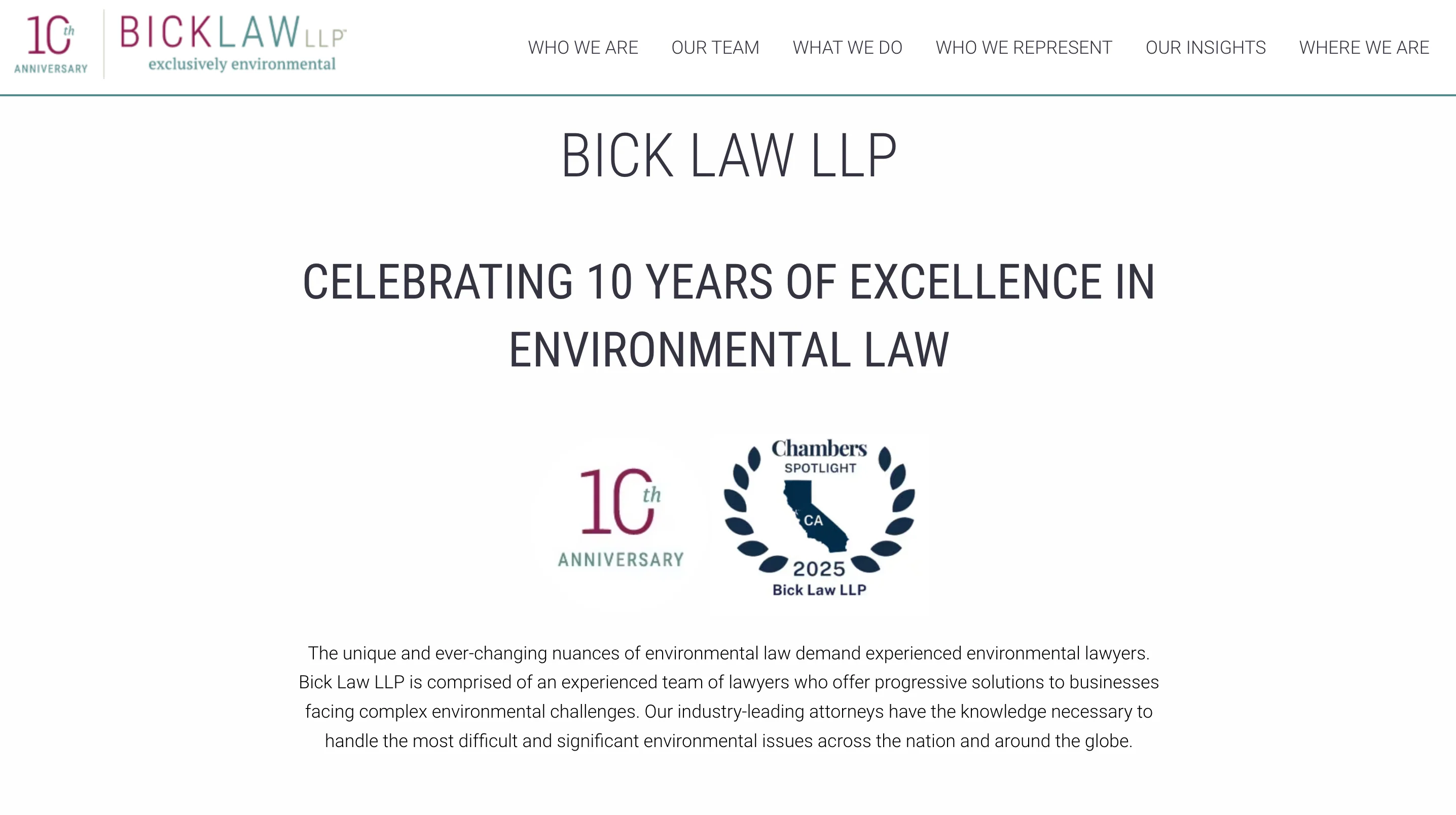
Bick Law LLP is a Newport Beach-based environmental law firm celebrating 10 years of practice. And here's the thing: their design choices are completely unique to their niche. The site opens with a hero slider featuring a nature scene and a "Mastering the Balancing Act" headline. Below that, a "Celebrating 10 Years of Excellence in Environmental Law" section displays a Chambers 2025 badge alongside the firm's description. Partner photos are shown with individual headshots and titles. Practice areas are organized as clean, clickable buttons: Environmental Litigation, Transactions, Compliance Counseling, Sustainability, and Rulemaking. A long-form client testimonial from a former General Counsel at Technicolor Group adds serious authority.
Design principles they used:
- The niche positioning is reinforced visually at every level. Nature imagery, the sustainability practice area, and the "balancing act" metaphor all communicate environmental law specialization without relying on a generic tagline.
- Trust badges (Chambers 2025, Best Lawyers) are highly specific and verifiable. These carry more weight than generic "top lawyer" badges because they come from recognized industry authorities.
- The detailed client testimonial from a named corporate General Counsel reads as a peer endorsement. For the B2B clients Bick Law serves, this carries significantly more weight than consumer-style review stars would.
- Practice areas are presented as clean, equal-weight buttons rather than a long text list. This respects the visitor's time and lets them self-navigate to the relevant area immediately.
Example 6: Latham & Watkins LLP
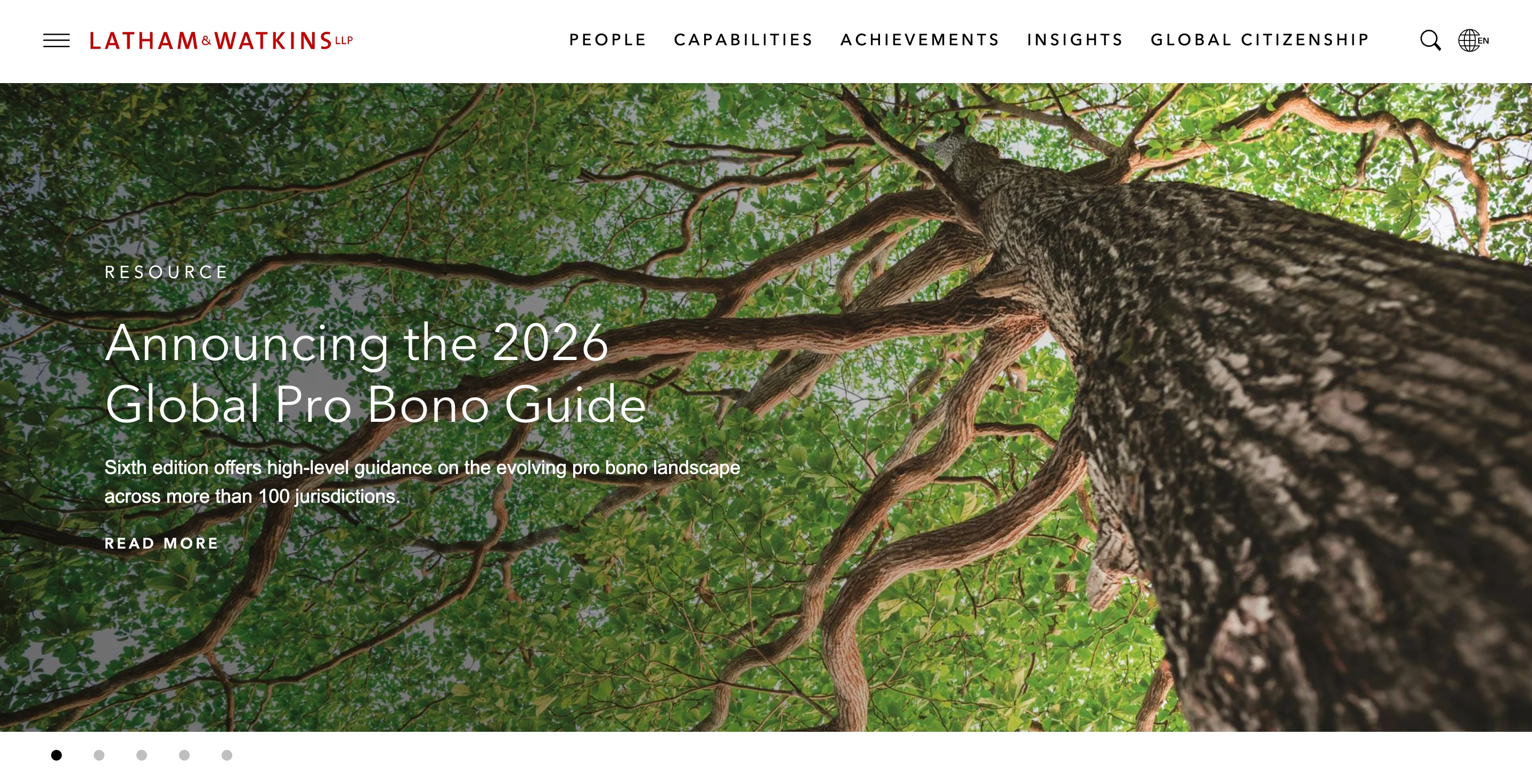
If you want to see how a global BigLaw firm approaches web design, Latham & Watkins is the reference point. Their website takes a completely different approach from the smaller firms on this list, and that's intentional. The hero features a rotating editorial carousel with content like "Announcing the 2026 Global Pro Bono Guide" and a "High-Stakes Jury Trial Victory" highlight. A Financial Times quote ("Most Innovative Law Firm in North America 2025") is displayed prominently mid-page. And the "Our Stories" section links to editorial features including "What Is LathamTech," "AI Academy," and "ATX Open 2026."
Design principles they used:
- This is designed as a content and thought leadership platform, not a lead generation site. For a BigLaw firm, the website's primary purpose is reinforcing authority with corporate clients and in-house counsel, not capturing individual intake forms. That's a fundamentally different design objective.
- The Financial Times quote is positioned as a full-width callout in the center of the page. For a firm of this caliber, third-party editorial validation is the most effective trust signal, and they've given it the visual weight it deserves.
- The "Our Stories" section links to innovation-focused content (LathamTech, AI Academy), which positions the firm as forward-thinking in a traditionally conservative industry. That's a deliberate brand positioning decision, not just a content strategy.
- The footer lists every global office location (Austin to Washington D.C., plus international offices), which supports both authority signals and local SEO for multi-location schema.
Example 7: Rosenblum Law
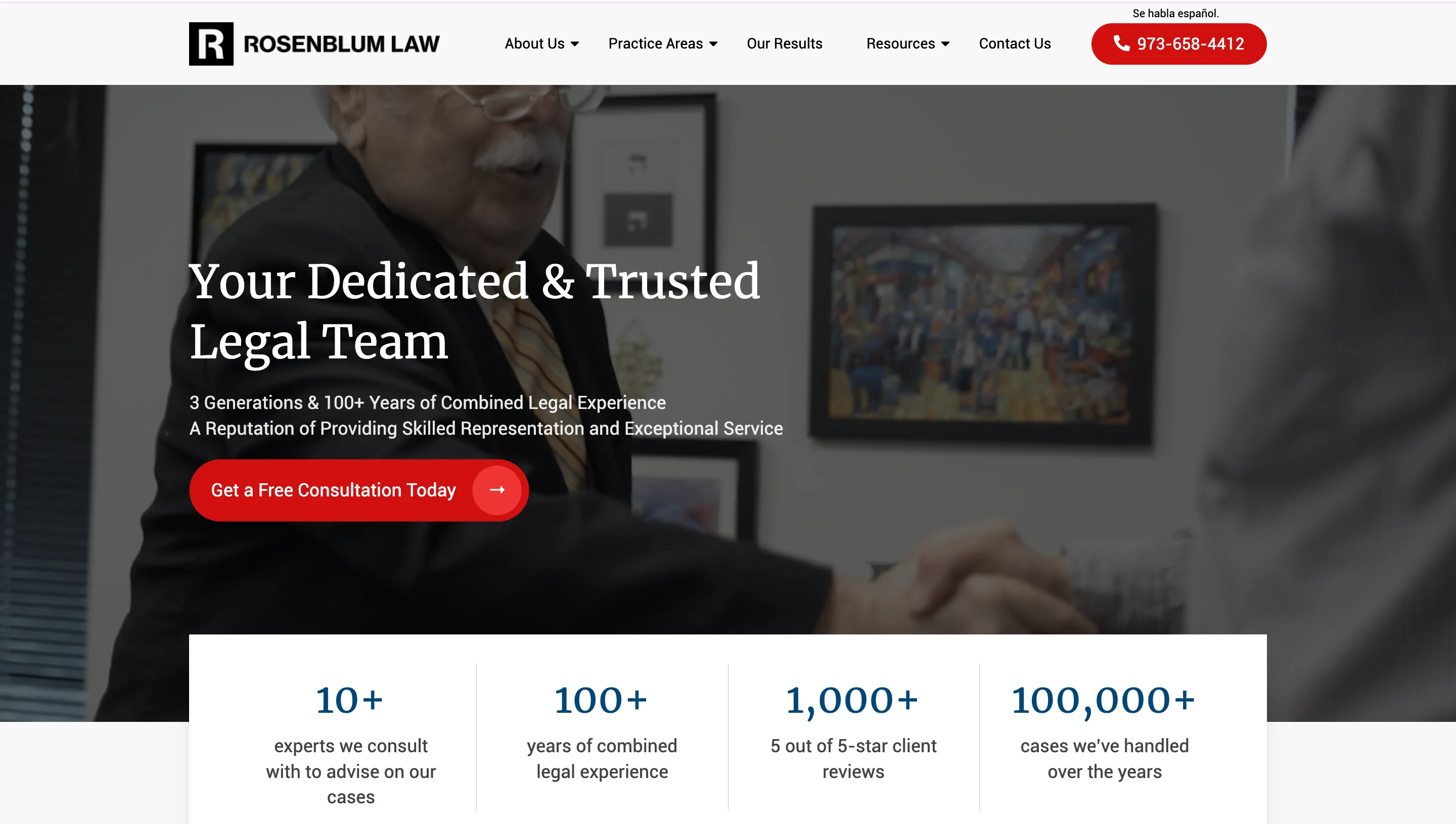
Rosenblum Law is a multi-state firm covering estate planning, personal injury, medical malpractice, and traffic violations. What makes their homepage stand out? It does a lot of things right without doing anything flashy. The hero features a professional team photo with "Your Dedicated & Trusted Legal Team" and a green CTA button ("Get a Free Consultation Today"). Immediately below, four numbers are displayed: 10+ experts, 100+ years of combined experience, 1,000+ five-star reviews, and 100,000+ cases handled. Practice areas are shown as icon-based cards. Attorney bios come with professional headshots. There's even an embedded video section and a "Giving Back to Our Community" section that you rarely see on law firm sites.
Design principles they used:
- The four-number stat bar below the hero (10+, 100+, 1,000+, 100,000+) creates instant credibility through scale. Each number is a different order of magnitude, which reinforces the firm's reach and experience at a glance.
- Video content is embedded directly on the homepage, not hidden on a separate resources page. Attorney-led video builds E-E-A-T and keeps visitors on the page longer, which helps with engagement signals.
- The "Giving Back to Our Community" section is an unusual addition for a law firm homepage, but it serves a clear purpose: it humanizes the firm and adds a trustworthiness signal that goes beyond case results and review counts.
- Multiple office locations (New Jersey, New York, Albany, Buffalo, Philadelphia) are listed in the footer with individual addresses, supporting local SEO and multi-location schema.
The design principles behind the best law firm websites
After reviewing dozens of law firm websites, there are clear principles that the best ones share. These aren't design trends that will fade. They're fundamentals.
Treat the hero section as your opening argument
Think about it: when someone lands on your law firm website, they're making the decision of whether they’ll use your service in about three seconds. Are you credible? Are you relevant to their problem? Can they figure out how to contact you? All these questions can easily be answered by your HERO section.
The best law firm hero sections contain an outcome-focused value proposition, not a mission statement about the firm's 30-year history. They use real photography of the actual team, not stock photos of gavels, handshakes, or empty courtrooms. And, they put an intake form or an attention-grabbing CTA above the fold so nobody has to scroll around looking for how to get in touch.
If a visitor has to scroll down to figure out what your firm does or how to reach you, that's a hero section that needs improvement. And to be honest, most law firm hero sections fall into this category.
Trust signals need to be visible, not buried
People looking for a lawyer are making a high-stakes decision. They need proof that your firm delivers results and that other people trust you. That proof can't be hiding on an "About" page three clicks deep.
The most effective law firm websites display trust signals prominently on the homepage. When applied properly, here’s how this looks like:
- Verdict and settlement highlights, either as a scrolling ticker or a featured results section that visitors see within the first scroll
- Trust badges from organizations like Super Lawyers, Martindale-Hubbell, and state bar associations
- Verified review widgets from Google or Avvo that show real ratings from real clients
- "As featured in" media logos where applicable (Forbes, Bloomberg, local news outlets, etc.)
The key is visibility. If your trust signals are folded within an inner page, they're not doing anything for the visitor who's deciding in those first few seconds whether to stay or leave.
Mobile performance is not optional
This one is simple math. Over 70% of legal website traffic comes from mobile devices. Mobile-friendly websites see 40% higher conversion rates from smartphone users. And Google uses mobile-first indexing, which means your mobile performance directly affects your search rankings.
So if you’re trying to optimize for mobile, here are a few things to ensure about your website’s mobile version:
- Load in under 3 seconds. Anything slower and you're losing potential clients before they even see your homepage.
- Thumb-friendly navigation with adequate tap targets so people aren't accidentally hitting the wrong button.
- Persistent CTAs and click-to-call buttons that stay visible as the visitor scrolls.
- Readable fonts without requiring zooming (minimum 16px for body text).
- Passing Core Web Vitals: Largest Contentful Paint (LCP), Interaction to Next Paint (INP), and Cumulative Layout Shift (CLS).
Attorney bios are great ways to incorporate E-E-A-T
Google's quality raters look for Experience, Expertise, Authoritativeness, and Trustworthiness (E-E-A-T). Attorney bio pages are exactly where these signals are either demonstrated or missed entirely.
Here are a few things that the attorney bios should include for maximum visibility:
- Bar admissions and year of admission
- Law school and degrees
- Practice areas with case-type specificity (not just "litigation," but "complex commercial litigation with 40+ trials completed")
- Professional associations and board certifications
- Notable cases or outcomes (where ethically permissible)
- A professional photograph (not a stock headshot)
- Direct contact information
Generic bios that say "John is a dedicated attorney with years of experience" are invisible to Google's quality raters. You need specifics. "Admitted to the California State Bar in 2009. Complex commercial litigation with 40+ trials completed." That kind of detail is what builds credibility with both humans and algorithms.
But here's the part most firms miss: attorney bios should also include Person schema markup. AI systems like ChatGPT and Perplexity cross-reference firm details against directory sources such as Google Business Profile, Avvo, Martindale, and state bar directories. If your information is inconsistent across these sources, that's a red flag for both search engines and AI systems.
Content architecture should serve both humans and AI
In 2026, your law firm website needs to be readable and useful to two audiences: potential clients and AI systems that might cite your content in their responses.
For humans, this means:
- Practice-area silos with dedicated landing pages (not just a list of services crammed onto a single page)
- A resource hub with blog content that answers the questions your clients actually ask
- FAQ sections on every practice area page
For AI systems, this means:
- FAQPage schema markup on your Q&A content
- Person schema on attorney profiles
- Clear attribution of all content to named attorneys
- Structured, direct answers to questions that prospective clients search for
Here's the catch: a law firm website without proper schema markup, author bios, and FAQ sections is essentially invisible to the AI layer of search. Even if it ranks on page one of traditional Google results, it's missing an entirely new channel of discovery.
Conversion design that respects the visitor's state of mind
This is the riskiest bit when it comes to designing a law firm website. The people visiting your site are often scared, overwhelmed, or dealing with one of the worst moments of their lives. They might have been served divorce papers, been injured in an accident, or just received a criminal charge.
Designing for this emotional state looks very different from designing for someone shopping for software. It means:
- Using calming colors and clear language rather than aggressive "CALL NOW" messaging that adds to the stress
- Building multi-step intake forms that feel like a conversation rather than an interrogation
- Offering multiple contact options (scheduling, live chat, phone, form) so visitors can choose what feels most comfortable for them
- Keeping intake forms short. Ask for name, phone number, email, and a brief description. You can gather full intake details after the consultation is booked, not before.
Every additional field on an intake form reduces completion rates. The goal is to make reaching out feel safe and easy, because for many of these visitors, even picking up the phone feels like a big step.
Law firm website design trends for 2026
AI-ready content and generative engine optimization (GEO)
This is the biggest shift in 2026, and while most brands have been catching up, law firms are still falling behind. You need to understand that your website isn't just competing for clicks on Google anymore. It's competing for citations in AI-generated responses from ChatGPT, Perplexity, and Google's AI Overviews.
The law firm websites that are getting cited are the ones that structure their content with clear Q&A sections, FAQPage schema, and attorney-attributed expertise. In practical terms, that means:
- Every practice area page should have a FAQ section with questions your clients actually ask
- Every answer should be attributed to a named attorney
- The content should be structured clearly enough for AI systems to extract and reference
Firms that invest time and effort in this now will have a significant advantage over the majority of legal websites that are still optimized only for traditional search. And let's face it, that's still most of them.
Moving beyond gavels and scales
The visual identity of law firm websites is finally evolving. After years of the same generic blue-and-gray palette with stock photos of courthouses and handshakes, the best firms in 2026 are making bolder visual choices.
What does that look like? Bold color palettes are emerging: forest greens, terracottas, navy combined with gold accents. Cinematic photography of real people and real offices is replacing stock imagery. And serif paired with sans-serif typography is creating a "modern authority" aesthetic that feels both established and current.
The best law firm websites in 2026 look less like legal templates and more like well-designed SaaS products, while still feeling like a 100-year-old institution you'd trust with your most important legal matter. That's a hard balance to strike, but the firms pulling it off are the ones standing out.
Interactive lead magnets
Static contact forms are being supplemented (and sometimes replaced) by interactive tools. The most effective ones include:
- Case eligibility quizzes that help visitors understand if they have a valid claim
- Settlement estimators that give rough ranges based on case type and circumstances
- Disability benefit calculators for firms in that practice area
These tools serve two purposes at once: they reduce friction for the visitor (a quiz feels less intimidating than a phone call) and they qualify leads before the first conversation happens, saving the firm time on intake. That's a win on both sides.
Client portal transparency
Forward-thinking firms are offering live case status updates through integrated client portals, online payment and financing options, and secure document sharing.
But here's the real question: why should your firm care about this from a design perspective? Because these features don't just improve the client experience. They also reduce the volume of "what's the status of my case?" calls, which frees up your team to focus on billable work. It's a UX decision that directly impacts operational efficiency.
Full WCAG 2.2 AA accessibility
Accessibility is no longer something you tack on after launch. The best law firm websites in 2026 are designed with accessibility from the start.
This means screen reader compatibility, full keyboard navigation, adequate color contrast ratios, readable font sizes (minimum 16px for body text), and meaningful alt text on all images.
Beyond being the right thing to do, WCAG compliance is increasingly a legal requirement. And yes, the irony of a law firm overlooking a legal requirement is not lost on anyone.
Common law firm website mistakes to avoid
After reviewing dozens of sites, we've seen the same mistakes come up over and over. Here are the ones you should pay attention to so you can avoid future redos.
Using template-based providers that own your website and content
This came up repeatedly in discussions on Reddit's r/localseo, and it's a real problem. Certain legal marketing companies build your website on their proprietary platform, which means if you ever want to leave, you lose everything: your site, your content, sometimes even your domain. Always make sure you own your domain, your hosting, and your content. No exceptions.
Stock photography of gavels, handshakes, and empty courtrooms
These images communicate nothing about your specific firm. They say "I'm a law firm" and literally nothing more. Real photography of your team, your office, and your clients (with permission) is always more effective.
Burying contact information with no persistent CTA
If your phone number and scheduling link aren't visible on every page without scrolling, you're making potential clients work too hard to reach you. The best law firm sites have a sticky header with a CTA, a mid-page scheduling form, and a bottom-of-page reinforcement. Three touchpoints, not one.
Overloading the hero section
Your hero section should serve only one purpose: communicate what you do and why someone should trust you. If your hero has a headline, a subheadline, three buttons, a video, an animation, a logo bar, and a chat widget all visible at once, you're asking visitors to process too much. Simplify.
Neglecting mobile performance
A beautifully designed law firm website that takes 4 or more seconds to load on mobile is a website that's actively losing you clients. Run your site through Google's PageSpeed Insights and prioritize the issues it flags. This is one of the fastest fixes you can make.
Generic attorney bios
Bios that say "Jane is a passionate advocate for her clients" with nothing else specific are doing nothing for your E-E-A-T signals. Include bar admissions, specific experience, case outcomes, and professional photos. Specificity is what builds trust.
No FAQ pages or structured Q&A content
Without these, you're invisible to AI Overviews and LLMs. Every practice area page should have an FAQ section that answers real client questions, marked up with FAQPage schema.
Ignoring schema markup entirely
FAQPage schema, Person schema on attorney bios, LocalBusiness schema for your firm: these are basic technical requirements in 2026, not advanced SEO tactics. If your competitors have them and you don't, that's a gap you're losing on every single day.
How much does a law firm website cost?
This is one of the most searched questions in this space, so let's address it directly.
Law firm website costs vary widely depending on the scope, complexity, and who's doing the work. Here's a general breakdown:
The good news is that most well-designed law firm websites achieve positive ROI within 6-12 months. A $10,000 website investment typically pays for itself through just 2-4 new clients, depending on your practice area and average case value. Personal injury firms may recoup their investment from a single case.
The factors that affect cost the most are content volume (how many practice area pages, attorney bios, and blog posts you need), custom features (case assessment tools, client portals, live chat), integrations (Calendly, Clio, CRM systems), and whether the project includes ongoing SEO and content marketing.
The most important thing is to make sure whoever builds your site understands conversion design and legal industry requirements, not just how to make things look nice.
What pages should every law firm website have?
Every law firm website should have these core pages:
Checklist for evaluating your law firm website
Here's a quick checklist you can use to evaluate your current site. If you can check all of these, your website is in strong shape. If not, the ones you're missing are where you should focus your attention.
Trust and first impressions
- Does the hero section communicate a clear value proposition within 3 seconds?
- Are trust signals visible on the homepage without scrolling (reviews, badges, results)?
- Are attorney bios specific, detailed, and accompanied by professional photos?
Performance and mobile
- Does the site load in under 3 seconds on mobile?
- Are Core Web Vitals passing (LCP under 2.5s, INP under 200ms, CLS under 0.1)?
- Is the primary CTA visible without scrolling on mobile?
- Are click-to-call buttons present and working?
Content and AI readiness
- Does every practice area have its own dedicated page?
- Is there a FAQ section with FAQPage schema markup?
- Is all content attributed to a named attorney?
- Are attorney profiles marked up with Person schema?
Conversion
- Is the intake form short (4 fields or fewer)?
- Are there multiple contact options (scheduling, phone, chat, form)?
- Does every page have a clear, visible CTA?
Ownership and control
- Do you own your domain?
- Is your site built on a platform you control (not a proprietary template provider)?
- Can you export your content and move to a different platform if needed?
How magier can help with your law firm website design
If your firm needs a website that's built to convert and not just built to look good, our team at magier can help.
We're a subscription-based design service with a team of expert designers and Webflow developers who have worked with 150+ brands across B2B, SaaS, and professional services. We understand that a law firm website has a very specific set of requirements that are different from those of other businesses. It needs to build trust instantly, load fast on mobile, guide visitors toward an intake action, and be structured for both search engines and AI systems.
We build all of that into our design and development process.
Here's how we work: you get a dedicated design team on a fixed monthly subscription or a one-time project scope with multiple rounds of revisions. There are no per-project quotes and no surprises. Our average turnaround time is under 48 hours per task. Whether you need a full website redesign, landing pages for specific practice areas, or ongoing design support for your marketing team, we can handle it.
Unlike traditional agencies that charge per project and take months to deliver, or template providers that retain ownership of your site, magier gives you high-quality custom design work with the flexibility to scale up or down based on your needs. And you always own everything we create for you.
If that sounds like what your firm needs, you can book a demo to talk with our team, or explore our design services page to see how it works.
Wrapping up
Every law firm website we explored today is structurally different. Yet, they are connected together by a single thread: they were designed with the client's needs in mind.
If you were to rebrand your law firm website with just one principle, this should be it. The firms that treat their website as a pitch rather than just another marketing showpiece are the ones that will turn traffic into clients. And in a market where 75% of consumers judge a company's legitimacy based on its website design alone, that's not something any firm can afford to ignore.
FAQ
The best solo practitioner sites focus on personal branding rather than trying to look like a large firm. Stacey-Ann Taylor Law is one of the strongest examples in our roundup. Her site uses bold colors, a conversational tone, and her own photo as the centerpiece. The key is keeping things lean: a clean homepage, clear practice area pages, a strong bio, a scheduling link visible on every page, and a short contact form. You don't need 20 pages. You need five or six that are done really well.
Five things consistently separate the best from the rest: a fast, mobile-first design that loads in under 3 seconds, trust signals visible above the fold (case results, review ratings, media logos), real photography of the actual team instead of stock images, content structured for AI citation with FAQ schema and attorney-attributed expertise, and a conversion path that respects the visitor's emotional state with calming design and short, easy intake forms.
Use verified reviews from platforms like Google or Avvo wherever possible, since they carry more weight than self-published testimonials. Display a few on the homepage (video testimonials work especially well here), and create a dedicated reviews page for the full collection. Each testimonial should include the client's name (with permission), their case type, and ideally a specific outcome or experience. Anonymous or generic testimonials ("Great lawyer, highly recommend!") don't build nearly as much trust.
The most effective approach is to feature your strongest results prominently on the homepage, either as a scrolling ticker, a stat bar, or featured cards with dollar amounts and case types. Then create a dedicated case results page where visitors can browse the full list. Each result should include the case type, the outcome, and enough context for the visitor to understand the relevance. Make sure to follow your state bar's ethical guidelines on advertising case results, as requirements vary by jurisdiction.
WordPress with a well-coded theme and a plugin like Yoast or RankMath offers the most flexibility and the largest ecosystem of legal-specific themes and integrations. Webflow is a strong option if you want clean code, fast performance, and strong SEO controls without the plugin management overhead. Squarespace works for solo practitioners who need something simple and professional. Avoid platforms that restrict your ability to edit meta tags, heading structure, or URL slugs, and stay away from proprietary platforms where the provider retains ownership of your site.
Usually because they prioritize how the site looks over how it works for the visitor. The most common reasons include burying the CTA so visitors can't figure out how to contact the firm, loading slowly on mobile (where over 70% of legal traffic comes from), using generic stock photography that builds zero trust, writing attorney bios so vague that they add no credibility, and having no FAQ content or schema markup, which makes the site invisible to both AI Overviews and featured snippets.
This came up repeatedly on Reddit's r/localseo, and the answer is clear: be very careful with template providers. Certain legal marketing companies build your site on their proprietary platform, which means if you ever want to leave, you lose your website, your content, and sometimes even your domain. Always make sure you own your domain, your hosting, and your content. Custom builds on platforms like WordPress, Webflow, or Squarespace give you full control and flexibility. They cost more upfront, but they're yours.
.png)