Meta Ads Creative Best Practices for Health and Fitness Brands in 2026
Here's an uncomfortable truth about Meta ads for health and fitness brands in 2026: the more polished and dramatic your creative looks, the more likely it is to underperform, and the more likely it is to get flagged before it ever reaches anyone.
That's not a coincidence. Meta ad creative for health and fitness brands has to do two jobs at once, convert a scrolling stranger into a customer, and stay inside rules that have gotten noticeably stricter. Creative now drives roughly 50% of incremental sales on Meta, more than targeting, reach, and recency combined, which means the actual design and copy inside your ad carries more weight than ever before.
But unfortunately, Meta's algorithm and its policy team are quietly punishing the exact style of ad most fitness and health brands still default to, the glossy, before-and-after, "transformation" style that used to be the entire playbook for this category.
That's exactly the gap this guide fills. We've pulled together the design and copy rules that matter most right now, tested against real case studies and Meta's current policy language, so you can build ads that get approved and actually convert. Here's what this guide covers:
- Meta's health and wellness advertising policy, and what it actually restricts
- Compliant vs non-compliant ad copy
- Hook formulas that convert without causing a policy rejection
- Ideal ad copy structure and character limits
- Creative angles broken down by health and fitness sub-vertical
- Video, static, and carousel design rules by placement
- Real ad creative examples from health and fitness brands
- A complete checklist to run before you launch your next ad
Key takeaways
- Write hooks that name an aspiration the viewer can opt into, never one that assumes something negative about their body or health
- Keep before and after content focused on the lifestyle and emotional shift, not a dramatic body comparison, even when no photo is technically before and after
- Use urgency only when it's real, such as an actual offer deadline, never scarcity that's manufactured
- Lead with the benefit and follow with the feature that delivers it, not the other way around
- Build one dominant visual and one dominant message per ad, not a headline, a testimonial, and a product shot stacked into a single frame
- Treat UGC as a deliberate creative choice with clear audio and strong framing, not just rough production mistaken for authenticity
- Sequence carousel cards like an actual sales conversation, not four unrelated product shots in a row
- Run a second compliance check for regional rules like the TGA or the EU Digital Services Act, since a Meta-compliant ad doesn't automatically clear every market
{{freebie}}
What is Meta's health and wellness advertising policy?
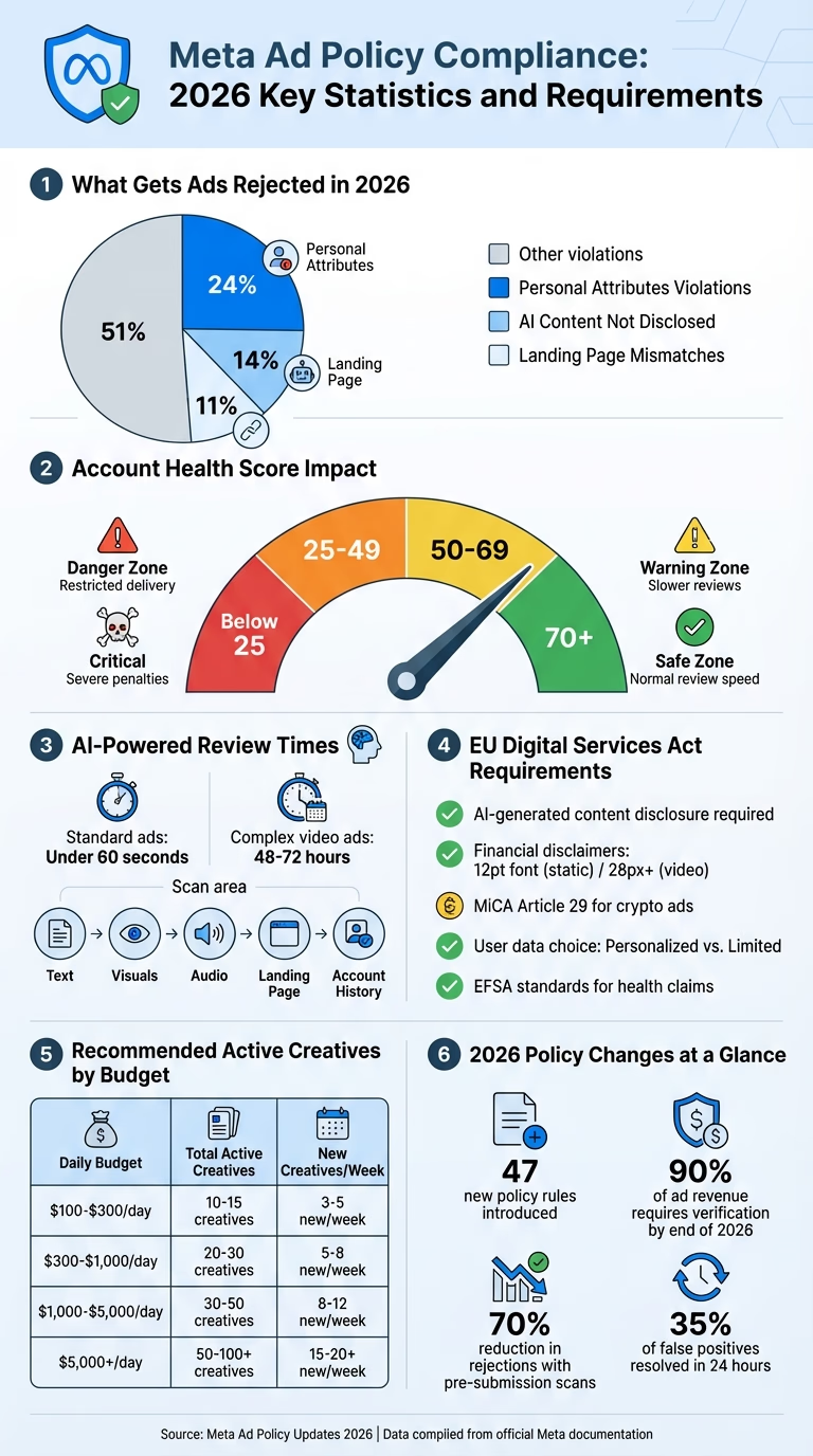
Every rule in this guide traces back to one policy family, so it's worth understanding before anything else. Meta's personal attributes policy prohibits ad creative and copy from implying or asserting knowledge of a person's physical appearance, health status, weight, fitness level, or medical conditions. In practice, this means your ad can't speak as if it already knows something personal about the viewer.
Meta's separate health and wellness policy goes further for this specific vertical, restricting unrealistic body claims, extreme before-and-after imagery, and language that implies guaranteed medical outcomes. Meta has stated these restrictions exist to protect user mental health and prevent misleading medical claims, and enforcement has tightened noticeably as the platform's moderation tools have gotten better at catching violations that used to slip through.
The practical shift for your creative is moving from assumption-based language to aspiration-based language. Instead of naming what's wrong with the viewer, your copy and visuals need to invite them into a positive outcome they can opt into. That single shift is the foundation for almost every rule in the sections below. Here's an infographic we derived from Adamigo which makes it much easier to understand:
{{cta}})
Compliant vs non-compliant ad copy
Non-compliant copy usually fails in one of three ways: it assumes a physical condition, it references a specific diagnosis, or it uses before/after language that implies a dramatic, guaranteed transformation. Here's how that plays out in practice, with a compliant rewrite next to each one.
| Non-compliant example | Compliant rewrite | Why it matters |
|---|---|---|
| "Are you overweight and struggling to lose fat?" | "For people ready to build a stronger, leaner body in 2026." | The rewrite invites rather than assumes, which keeps it inside the personal attributes policy |
| "We know you're frustrated with your slow metabolism." | "Discover the training system that's helping thousands feel their best." | Removes the assumption of a personal, private frustration |
| "If you have diabetes, this supplement is for you." | "Formulated to support healthy blood sugar levels as part of an active lifestyle." | Avoids naming a specific medical condition while still speaking to the same audience |
| "Lose 20kg in 30 days, guaranteed." | "Build habits you can actually stick with." | Removes a guaranteed, specific weight-loss outcome, which Meta treats as a high-risk claim |
| "See her incredible before and after transformation." | "Here's what changed for her after three months of consistent training." | Shifts from a dramatic visual claim to a lifestyle-focused, journey-based framing |
The logic across every compliant rewrite is the same. You're not hiding the benefit, you're just describing it as something the viewer can choose rather than something you already know about their body or their health.
Hook formulas that convert without violating Meta's policies
The hook is whatever a viewer encounters first, the opening one to three seconds of a video, or the first line of copy and the dominant visual on a static ad. It decides whether anyone keeps watching or reading. In 2026, with users scrolling through hundreds of posts per session, a weak hook makes the rest of your creative irrelevant, no matter how good the copy or visuals are further down the ad.
Changing the hook alone can swing performance by 50% to 200%, while changes to the body of the ad rarely move results by more than 20% to 30%. That gap is exactly why the hook formulas below deserve more of your creative time than any other single element in the ad.
Here are five hook formulas that consistently convert for fitness and health brands, and every one of them works precisely because it avoids assuming anything negative about the viewer.
- The bold claim hook: "We helped 1,200 people hit their first pull-up in 30 days." This works because the claim is about the brand's track record, not the viewer's current ability.
- The curiosity gap hook: "Most people train for years and never see results, here's the one thing they're missing." This creates an information gap the viewer wants closed, without naming anything about their own body.
- The social proof hook: "Over 50,000 people have already switched to this training method." Numbers do the persuading here, not assumptions about the viewer.
- The contrast hook: "Old way: 2-hour gym sessions with zero progress. New way: 45 minutes, 3x per week." The contrast is between two methods, not between the viewer and an idealized outcome.
- The direct invitation hook: "If you want to feel stronger, sleep better, and have more energy, keep watching." This names an aspiration and lets the viewer opt in, rather than assuming they currently lack any of those things.
Gym and studio brands tend to see the strongest results from bold claim and social proof hooks. Supplement brands do best with curiosity gap and contrast hooks. Coaching offers convert best with the direct invitation hook, since it builds a qualified lead rather than a broad click.

Ad copy structure that performs for fitness and health offers
Meta's primary text field supports up to 125 characters before truncation, though longer copy can still perform well with an already-engaged audience. Headlines work best at 40 characters or fewer, and descriptions should stay under 30 characters to avoid getting cut off mid-thought.
| Field | Character guidance | Purpose |
|---|---|---|
| Primary text | Up to 125 characters before truncation | Sets up the hook and the core promise |
| Headline | 40 characters or fewer | Reinforces the benefit in a short, punchy line |
| Description | 30 characters or fewer | Adds one more piece of supporting context |
For this vertical, benefit-led copy consistently beats feature-led copy. "Feel stronger in 4 weeks" outperforms "12 resistance training exercises included," because people are buying an outcome, not a list of features. Lead with the transformation the person wants, then support it with the specific feature that delivers it, not the other way around.
Urgency and scarcity language is fine to use as long as it's genuine. "Offer ends Sunday" or "only 20 spots available this month" are both compliant and effective, since they describe a real constraint rather than manufacturing false pressure. Meta's policies and increasingly skeptical audiences both penalize urgency that isn't backed by something real.
Creative angles by health and fitness sub-vertical
Health and fitness isn't one creative category, it's at least six, and each one needs a different core message before you even think about hooks or visuals. Treating a healthtech app and a protein supplement the same way is one of the most common mistakes brands make in this space.
| Sub-vertical | Primary creative job | Strongest angle | Best format |
|---|---|---|---|
| Healthtech / digital health | Build trust | Convenience, clinical credibility | Product demo, expert/founder video |
| Fitness apps | Prove you'll actually stick with it | Personalization, progress | UGC with screen recording |
| Wearables / fitness trackers | Demonstrate what the data shows | "Here's what it actually tracks" | Product demo showing real-world use plus data |
| Nutrition / supplements | Make the product feel desirable and safe | Ingredient transparency, taste | UGC, ingredient close-ups, taste reactions |
| Fitness services / gyms | Sell the experience, not just the workout | Community, coach introduction | Short-form video, facility walkthrough |
| Healthcare / telehealth | Reduce anxiety about the process | Clarity of process, clinician credibility | Process walkthrough, clinician-led video |
The question each sub-vertical needs its creative to answer is different too. A fitness app needs to prove "will I actually use this." A supplement needs to prove "does it work, taste good, and fit my routine." A gym needs to prove "will I enjoy being there." Building your hook and copy around the actual question your specific sub-vertical needs to answer is a bigger lever than any format or platform trick.
{{cta}}
Video creative specs and structure for Reels, Stories, and Feed
Technical specs vary meaningfully by placement, and getting them wrong is one of the fastest ways to waste a good creative concept. Reels favor a 9:16 vertical ratio at 15 to 30 seconds. Feed performs best at a 4:5 ratio and 30 to 60 seconds. Stories should stay 9:16 and under 15 seconds.
| Placement | Aspect ratio | Ideal duration | Notes |
|---|---|---|---|
| Reels | 9:16 | 15 to 30 seconds | Prioritize UGC-style, native-feeling content |
| Feed | 4:5 | 30 to 60 seconds | More room for a structured hook-to-CTA sequence |
| Stories | 9:16 | Under 15 seconds | Keep it fast, direct, and mobile-first |
The first two seconds of any video carry the most weight. Video creative that earns genuine attention in the first three seconds generates roughly 270% more leads than static images, which is exactly why those opening seconds deserve more design attention than the rest of the ad combined. A weak structure spends those seconds on a logo animation or a cinematic establishing shot before getting to the point. A strong structure states the hook immediately, shows the problem in the next couple of seconds, then moves into the product and proof.
Since most video content on Meta gets consumed without sound, on-screen captions aren't optional. Use large, high-contrast text, keep each text frame limited to one idea, and make sure your text appears within the first two seconds so it reinforces the hook rather than trailing behind it.
Static and carousel ad design principles
Static images and carousels remain highly effective for health and fitness brands, particularly for retargeting and product-focused campaigns. The design principle that separates high-performing static ads from the rest is simple: one dominant visual and one dominant message. Ads that try to say five things at once, a headline, a feature list, a testimonial, and a product shot, consistently underperform ads built around a single clear idea.
Social proof is one of the strongest tools available in a static ad. A specific outcome statistic, such as a star rating with a real review count, builds instant credibility in a way a generic claim can't. Before/after imagery still needs to be used carefully here too, since Meta's restrictions on dramatic before/after visuals apply to static ads exactly as much as they apply to video.
Color choices matter more than most brands realize in this category. Blues and greens tend to communicate trust, calm, and health, which works well for wellness and healthtech brands. Oranges and reds create urgency and energy, which suits performance-focused fitness products. Overly clinical white space can feel cold on a social platform, so it's worth using sparingly even for healthtech and supplement brands.
Carousels work best as a sequence rather than a set of unrelated cards. A proven structure for a supplement funnel looks like this:
| Card | Focus | What to include |
|---|---|---|
| Card 1 | Problem or hook | State the core frustration or curiosity gap |
| Card 2 | Ingredient or method | Show what's actually inside the product or how the method works |
| Card 3 | Social proof | A grid of reviews or a specific outcome statistic |
| Card 4 | Offer and CTA | The specific ask, paired with a clear next step |
That sequence mirrors an actual sales conversation, which is why it consistently outperforms four unrelated product shots stitched together.
"Before anything ships, we ask one question: would this still make sense with the logo removed? If the answer is no, it's not ready yet."

UGC production standards for health and fitness Meta ads
The debate between polished production and user-generated content has mostly been settled by the data. UGC-style content consistently outperforms high-production video for fitness brands on Meta, and authentic short-form video achieves roughly 40% higher completion rates than polished brand videos in health verticals specifically. Raw, first-person content simply feels native to the platform in a way a studio commercial doesn't.
That said, UGC doesn't mean low quality. Good UGC still needs clear audio, strong framing, and a compelling hook, the presentation can feel authentic while the underlying creative strategy behind it is still deliberate and tested. Shaky footage and unreadable text will hurt performance regardless of how authentic the content feels.
For transformation content specifically, the safest and most effective approach focuses on the lifestyle and emotional shift rather than a dramatic physical one. Show someone going from feeling tired and unmotivated to energized and confident, rather than leaning on a before/after body shot that risks both a policy rejection and a message that feels exploitative.
Real Meta ad creative examples from health and fitness brands
Feature tables are useful, but seeing real, currently-running ads against the actual rules makes the guidance concrete in a way a hypothetical never can.
Optimum Nutrition's Clear Protein ad is a strong example of staying fully compliant while still hooking attention. The primary text opens with a seasonal, situational contrast, "too hot for milkshakes," tied to a real, relatable moment rather than a claim about the viewer's body or health. The entire pitch stays product-focused, taste, format, and temperature, which sidesteps Meta's personal attributes policy by never touching the viewer's physique at all. The visual backs this up too, one athlete mid-activity, one product callout, one headline, which lines up closely with the "one dominant visual, one dominant message" principle covered earlier in this guide.

Juniper UK's weight loss program ad sits much closer to the line, and that's exactly why it's worth studying. The copy leans on "losing weight" and "losing fat" directly, language Meta's systems scrutinize heavily in this category, though the ad avoids an outright violation by never assuming anything about the viewer's own body. The bigger flag is visual. A body-fat percentage graphic sits directly next to a slim, toned physique, which functions a lot like a before/after image without technically being one, and brushes against the restriction on unrealistic body claims covered in the policy section above. What keeps the ad safer than it first appears is the CTA, "see if you're eligible" frames the offer as a qualification check rather than a guaranteed outcome, which is the aspiration-over-assumption principle from earlier in this guide doing real work.
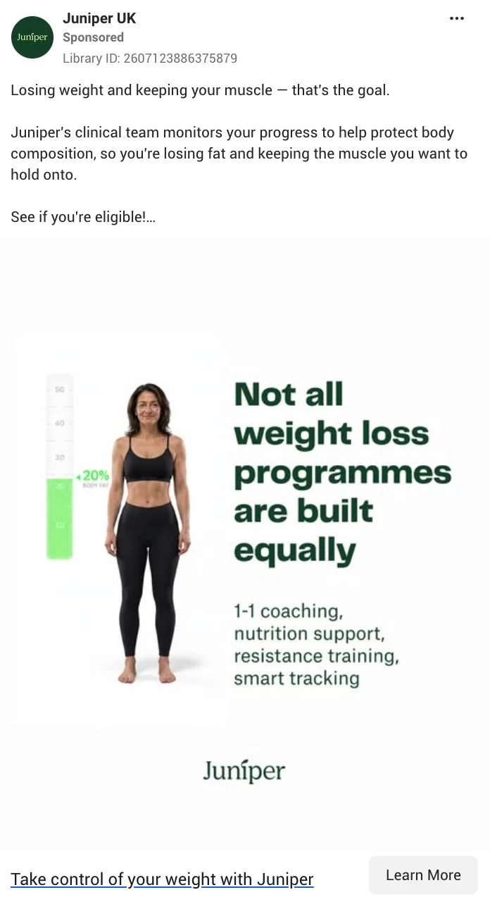
The lesson from these two side by side is that compliance isn't only a copy problem. An ad can pass every personal attributes check in its text and still carry risk through the visual sitting right next to that text.

Choosing your creative approach by product type and funnel stage
Your creative choices should shift depending on both what you're selling and where the viewer is in the funnel. A cold audience seeing a supplement ad for the first time needs a different creative approach than a warm audience who already visited your site.
| Your situation | Lean toward | Why |
|---|---|---|
| Supplement brand, cold audience | Curiosity gap or contrast hook, ingredient-led carousel | Cold viewers need a reason to stop scrolling before they care about proof |
| Supplement brand, warm audience | Testimonial-led static or offer-focused retargeting | Warm viewers already know the brand and need a nudge, not an introduction |
| Fitness app, cold audience | UGC with a bold claim or social proof hook | Builds trust fast with someone who's never heard of the app |
| Fitness app, warm audience | Progress or personalization-focused demo | Reinforces the specific reason they were already considering it |
| Gym or studio, cold audience | Facility tour or coach introduction video | Reduces the anxiety of trying somewhere new |
| Gym or studio, warm audience | Direct offer, such as a trial week or first class free | Removes the last barrier for someone already close to converting |
If you need more inspiration on creative direction, especially with graphic design styles, this guide is for you.
Regional compliance considerations outside the US
Meta's core personal attributes and health and wellness policies apply globally, but individual regions layer additional rules on top. In Australia, supplement and health claims need to align with Therapeutic Goods Administration (TGA) guidelines, which restrict any language implying a product can cure, treat, or prevent disease. In the EU, the Digital Services Act (DSA) adds transparency requirements around how ads are targeted and disclosed, which can affect how you present sponsored content.
If your health or fitness brand advertises outside the US, it's worth checking the specific advertising standards body in each target market before assuming your existing compliant copy translates directly. A claim that clears Meta's global policy can still violate a local regulator's rules.
The complete Meta ad creative checklist for health and fitness brands
Run through this list before launching any new ad creative in this vertical. It pulls together every rule covered above into one place you can use as a final review pass.
Compliance
- Does the copy avoid assuming anything about the viewer's body, health status, or medical condition?
- Does any before/after imagery focus on the journey or lifestyle rather than a dramatic physical change?
- Are all health or supplement claims free of disease cure, treatment, or prevention language?
- Is any urgency or scarcity language genuine rather than manufactured?
- Have you checked regional rules (TGA, DSA, or others) if the ad runs outside the US?
Hook
- Does the hook land in the first one to three seconds without assuming anything negative about the viewer?
- Is the hook type matched to the offer (bold claim or social proof for gyms, curiosity gap or contrast for supplements, direct invitation for coaching)?
- Would the hook still make sense if you removed all context around it?
Copy
- Is the primary text under 125 characters, or intentionally longer for an already-engaged audience?
- Is the headline 40 characters or fewer and benefit-led rather than feature-led?
- Does the copy lead with the outcome the viewer wants before mentioning the feature that delivers it?
Visual
- Does the ad have one dominant visual and one dominant message, rather than competing elements?
- Does the color choice match the intended emotional tone (trust and calm vs energy and urgency)?
- If it's a carousel, does the sequence build like a conversation rather than four unrelated cards?
Format
- Is the aspect ratio correct for the placement (9:16 for Reels and Stories, 4:5 for Feed)?
- Does the video hit the ideal duration for its placement rather than running long out of habit?
- Are captions and on-screen text present, legible, and timed to appear within the first two seconds?
Final thoughts
Strong Meta ad creative for health and fitness brands has to do two things at the same time, convert a scrolling stranger and stay inside rules that have gotten meaningfully stricter. Getting both right consistently takes real iteration, not a one-time setup, since what counts as compliant and what actually converts both keep shifting as Meta's policies and its algorithm evolve.
Before you launch your next ad, run it through the checklist above section by section. It's built to catch the most common, costly mistakes before they turn into a disapproval notice or a wasted production budget. If you need ad design that's compliant from the start, whether that's static, video, or carousel, you can trust magier's team to get it right. Take a look at our work examples to see it in practice.
{{cta}}
FAQ
Meta continues to restrict before/after imagery that implies dramatic, unrealistic, or medical-level results, and enforcement has gotten stricter as Meta's moderation tools have improved. The safer approach in 2026 is framing transformation content around the lifestyle and emotional journey rather than a side-by-side body comparison.
Avoid any language that implies you know the viewer's personal health condition or physical appearance, and use outcome-focused, aspirational phrasing instead. "For people who want to feel stronger and more energized" stays compliant, while "if you're tired of being out of shape" does not, since the second version assumes something about the viewer's current state.
UGC-style video with a strong hook in the first three seconds consistently outperforms polished production for fitness brands on Meta. Genuine social proof, outcome-focused messaging, and a direct, matched CTA tend to maximize performance across both cold and warm audiences.
Meta's personal attributes policy prohibits ads from implying knowledge of a viewer's body, health status, weight, or personal struggles, while the health and wellness policy specifically restricts unrealistic body claims and extreme before/after imagery. Aspirational, inclusive messaging that invites the viewer into an outcome stays compliant, while assumption-based language that names something about their current body or health does not.
Yes, as long as the urgency is genuine, such as a real offer deadline or an actual limited number of spots. Manufactured urgency that isn't backed by something real risks both a policy penalty and a loss of trust with increasingly skeptical audiences.
UGC-style content consistently outperforms polished production for fitness and health brands on Meta, with authentic short-form video achieving roughly 40% higher completion rates in health verticals specifically. Polished production still has a place, but it shouldn't be the default choice for this category.
Reels and Stories perform best at a 9:16 vertical ratio, while Feed placements perform best at a 4:5 ratio. Matching the ratio to the placement rather than reusing one master creative everywhere is one of the simplest ways to improve performance.
Primary text performs best under 125 characters before truncation, though longer copy can still work for an already-engaged audience. Headlines should stay at 40 characters or fewer, and descriptions should stay under 30 characters to avoid getting cut off.
.avif)