Graphic Design Styles: The Ultimate Guide for 2026
Particularly, the last 5 years have shown the impact that graphic design has had on brand recognition. The benefits of great design aren’t limited to your branding, but span across various applications, like advertising, blogs, websites, and social media content.
To tap into this potential, I'll share with you current graphic design styles and how to apply them to your branding and designs. Remember that the overall goal of any design is to communicate your message effectively and engage your audience through dedicated visuals.

{{freebie}}
1. New Maximalism
New Maximalism challenges the minimalist design ethos by introducing its polar opposite: an abundance of colors, shapes, and patterns. Maximalism in graphic and web design is becoming more and more popular.
This bold style requires courage, and designers are embracing it wholeheartedly. In fact, they're using New Maximalism as a refreshing escape from the sometimes monotonous minimal designs that have dominated recent years.
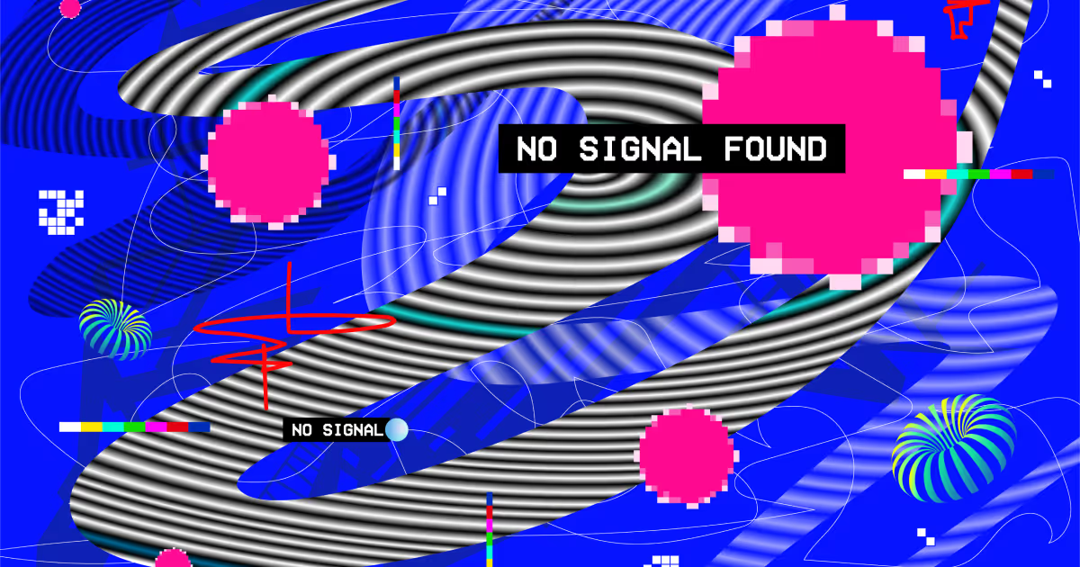
It's a bold and eye-catching graphic design style that's definitely not for the faint of heart. It's rebellious, pushing boundaries and breaking rules.
This style thrives on complexity and visual abundance. The opposite of minimalism's "less is more" approach. Instead, New Maximalism screams "more is more!" It aims to create a sense of energy, excitement, and even a bit of controlled chaos.
Vibrant color combination, patterns, and dynamic compositions. The goal is to create an emotional response. After all, in a world where we're constantly bombarded with information, sometimes you need to go big to stand out!
A 2020 study surveying 4,598 people from 30 countries revealed common emotional associations with colors. For instance, 68% associated red with love, 52% linked yellow with joy, and 51% connected black with sadness. It’s very interesting to see how brands apply this ‘rule’ to their graphic design styles.
Those who adopt New Maximalism are willing to take risks and push creative boundaries. This results in designs that are both colorful and unconventional.
According to Adobe's 2025 Creative Trends report, maximalist design approaches saw a 34% increase in usage across digital campaigns compared to the previous year, as brands sought to stand out in increasingly crowded digital feeds.
{{cta}}
2. Art Deco
Art Deco originated in the 1920s and is known for its geometric shapes, bold patterns, and refined aesthetic. It is influenced by the technology and social progress of its time. Art Deco also incorporates zigzags, chevrons, sunburst motifs, and sleek, streamlined forms.
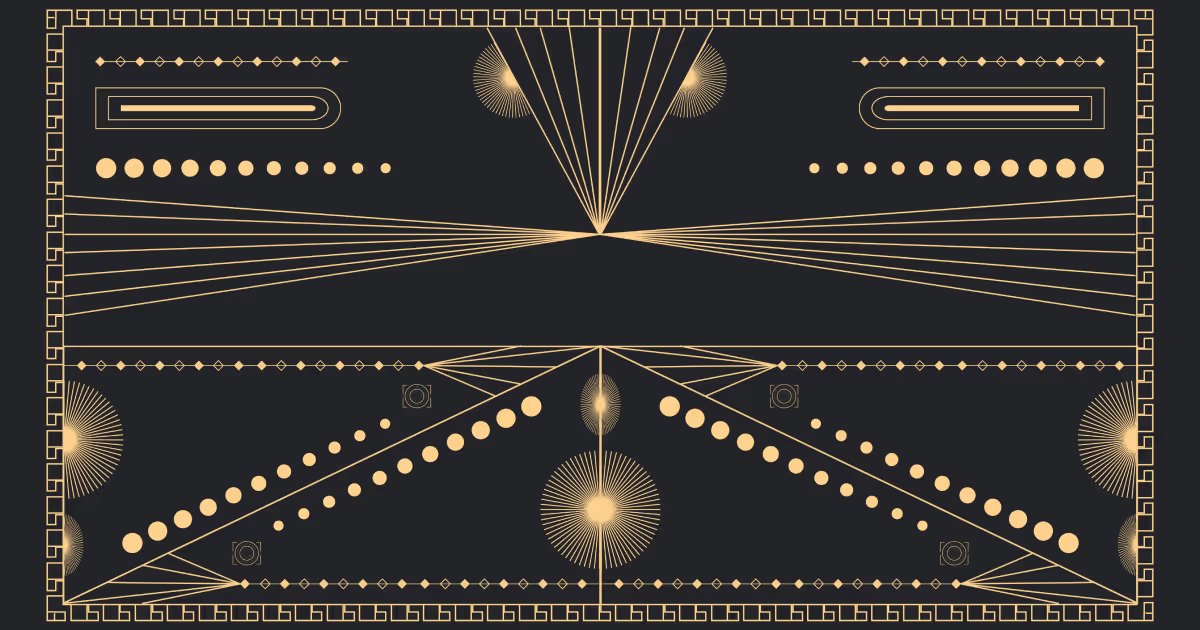
The movement's aesthetic can be seen in various forms of design. For example, graphic arts, typography, architecture and furniture. In architecture and interior design, Art Deco is defined by luxurious materials like chrome, glass, and marble.
In graphic design, this style is all about combining retro elements with contemporary design practices. The modern take on Art Deco is found in minimalistic and geometric interpretations of the classic style.
Brands use the Art Deco aesthetic to present a sense of glamour and sophistication. Textured illustrations and playful typographic elements complement the overall design.
Iconic posters by artists like Cassandre and architectural marvels (like the Chrysler Building in New York) are great real-life examples of Art Deco.

3. Art Nouveau
Art Nouveau flourished between 1890 and 1910. This graphic design style focuses on organic, flowing lines and curves. The curves are known as "whiplash" lines. Other common elements found in Art Nouveau include stylized flowers, plants, and feminine figures.
Artists and designers create a retro feel using natural motifs and refined illustrations. Through Art Nouveau, they also express a connection to nature, incorporating decorative and ornamental details.
Contemporary applications of Art Nouveau are often seen in branding and packaging designs. Espresso Republic is a brand that exemplifies how Art Nouveau aesthetics can be adapted to create refined designs.
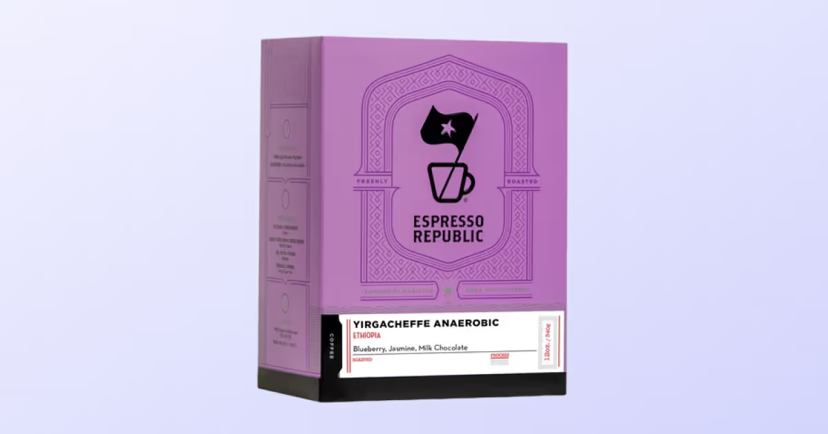
Among the artists who have used this style in posters and illustrations are Alphonse Mucha, Eugène Grasset and Théophile-Alexandre Steinlen.
4. Neo-Brutalism
Unique, unorthodox and unapologetic. This is how we would describe neo-brutalism in three words.
Neo-brutalism is a contemporary evolution of mid-20th-century brutalist architecture. Brutalism architecture was known for its raw, unrefined aesthetics and use of stark, concrete materials. Meanwhile, "Neo" stands for "new" or "revived."
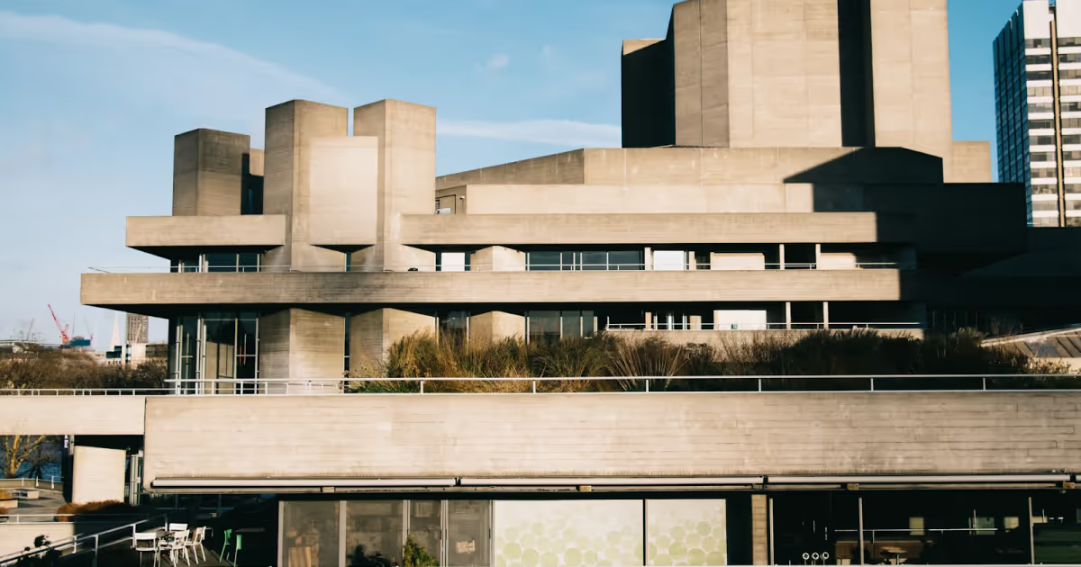
In graphic design, neo-brutalism translates this into bold, high-contrast visuals, minimalistic layouts, and a raw, utilitarian feel. Think of it as a modern or updated version of the original brutalist style. It incorporates design elements while maintaining the core principles of raw and unrefined aesthetics.
How does this apply to graphic design?
This style disregards the more common and regular graphic design, including conventional layout principles. Instead, neo-brutalism opts for bold, high-contrast color schemes and large blocks of text.
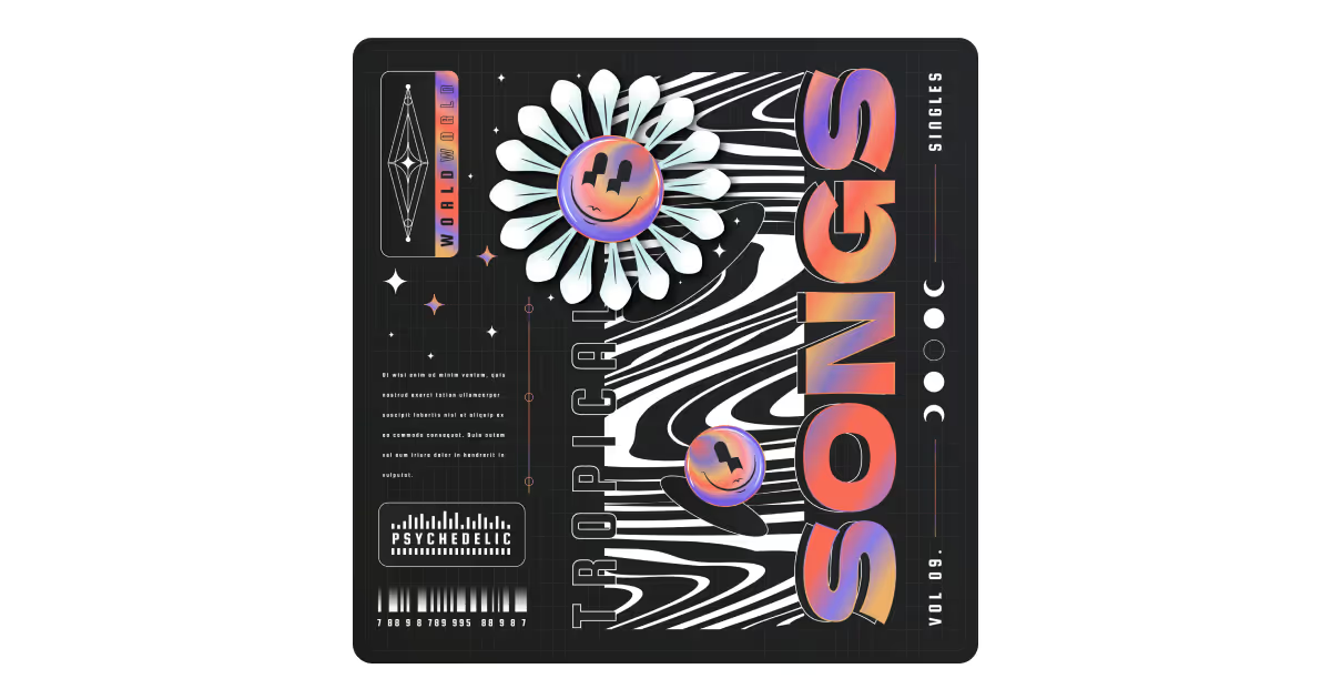
Neo-brutalism combines traditional layout concepts with solid colors and simple yet distinctive typography. It's characterized by the use of pure black alongside other hues.
This style has evolved from its poster and print origins to influence web design, branding, and packaging.
Today, Neo-brutalism embraces a kind of organized chaos that is both eye-catching and memorable. This inspires designers to push the boundaries of what we can consider visually acceptable.
5. Y2K Evolution
The Y2K (Year 2K) evolution is a nostalgic design trend inspired by the late 1990s and early 2000s. This era marked the beginning of the Internet and new media. You can see those influences all over this style.
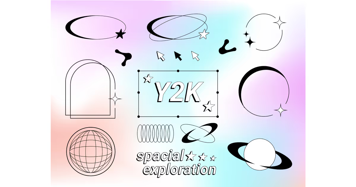
Bold color combinations, pixelated imagery, and cybernetic themes are some of the components that characterize Y2K.
Y2K design also features holograms and a general sense of futurism. It playfully uses technology-inspired elements, such as distorted typography, holographic effects, and pixel art.
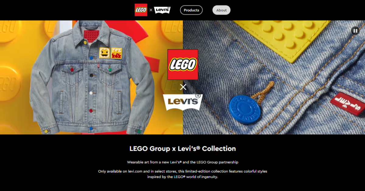
We witnessed the perfect example of Y2K design in modern branding in 2020, when Lego and Levi’s collaborated to create a nostalgic, striking campaign. This collab embraced the Y2K style with pixelated graphics, bright, bold colors, and playful use of early internet and technology-inspired elements.
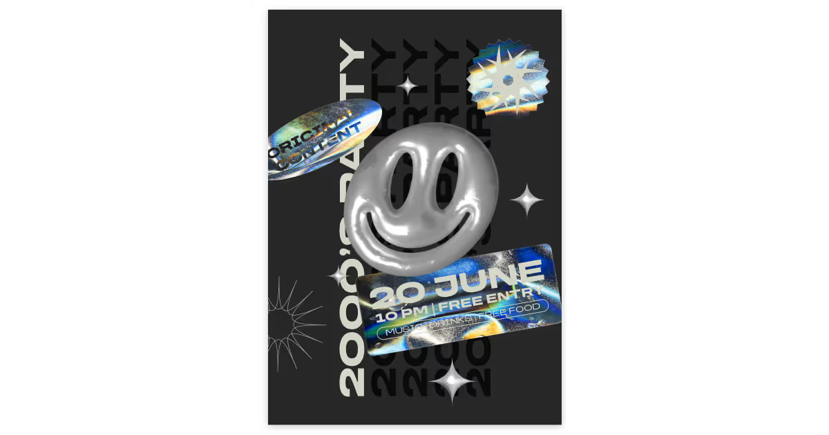
The Y2K aesthetic is also defined by the sub-trend of liquid metals. Chrome-like graphics and liquifying tools are used in branded imagery and promotional materials.
6. Retro Vintage
Retro vintage design draws inspiration from the aesthetics of the early 1980s and extends into the 1990s. In this style, we see a lot of grainy textures and geometric shapes. We notice the use of bold typography, minimalistic layouts, and a refined color palette.
The influences of retro vintage are visible in various branding materials and advertisements.
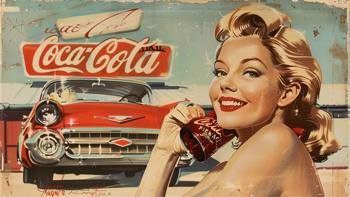
Modern designers are taking a fresh look at retro vintage design techniques. They're adding their own spin with things like bold product photography and textured finishes. This mix gives off that cool, nostalgic vibe we notice in certain brands.
Line art and sticker designs are also popular. They give a playful nod to 1970s American graphic design.
7. Minimalism
Minimalism in graphic design is a style characterized by its simplicity, clean lines, and uncluttered composition. It emphasizes the essence of the message, stripping away extraneous elements to focus on the core idea. This approach has gained significant popularity in recent years due to its effectiveness in conveying information clearly and aesthetically.
Key characteristics of minimalist design include:
- Simplicity: The use of minimal elements and a restrained color palette.
- Cleanliness: A clean, uncluttered layout with ample white space.
- Typography: The use of simple, legible fonts that complement the overall design.
- Functionality: A focus on practicality and usability.
- Repetition: The repetition of basic elements to create a sense of harmony and balance.
The appeal of minimalism lies in its ability to:
- Improve readability: By reducing visual clutter, minimalist designs make it easier for viewers to focus on the essential information.
- Enhance clarity: The simplicity of minimalist designs helps to avoid confusion and ensures that the message is delivered clearly.
- Create a sense of elegance: The clean lines and uncluttered composition of minimalist designs can create a sophisticated and timeless aesthetic.
- Save time and resources: The streamlined nature of minimalist design can reduce production costs and time.
Many iconic brands, such as those of Apple, Nike, and FedEx, are great examples of minimalist design.

8. Geominimalism
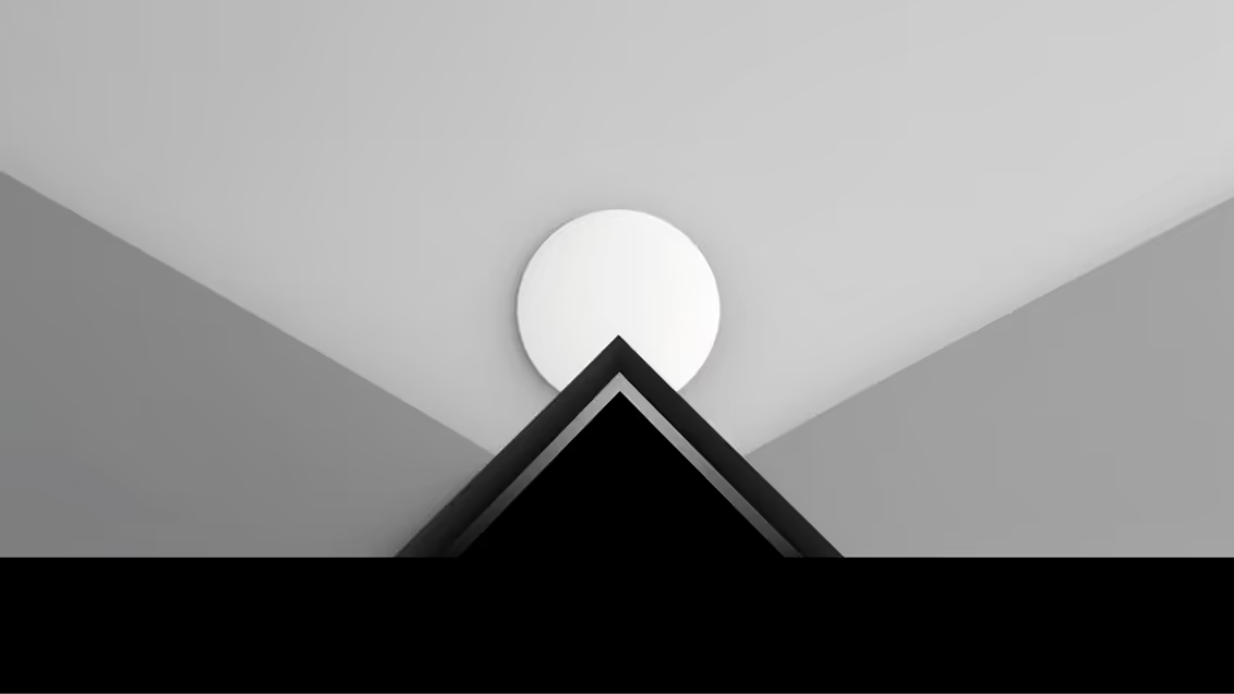
Geominimalism is a contemporary graphic design aesthetic that draws inspiration from the minimalist movement and the natural world. This style is characterized by its clean lines, simple forms, and subtle color palettes, often incorporating elements of geology, topography, and celestial bodies.
The term "geominimalism" is a combination of "geo" (meaning Earth or land) and "minimalism." This fusion reflects the style's emphasis on reducing visual clutter while simultaneously celebrating the beauty and complexity of the natural world.
Key characteristics of geominimalism include:
- Simple forms: Geominimalist designs often feature basic shapes like circles, squares, and triangles, which can be used to represent geological formations, celestial bodies, or abstract landscapes.
- Neutral color palettes: The color schemes used in geominimalist design are typically muted and earthy, drawing inspiration from natural materials like stone, sand, and clay.
- Clean lines: Geominimalist designs emphasize clean lines and sharp edges, creating a sense of order and precision.
- Natural textures: While the overall aesthetic is minimalist, geominimalist designs may incorporate subtle textures or patterns that evoke the natural world, such as the grain of wood or the ripples of water.
Geominimalism has gained popularity in recent years due to its ability to create visually appealing and calming designs that resonate with people's desire for connection to nature.
With climate change and other environmental topics getting the attention they deserve, it makes sense that geominimalism has been brought to the forefront, too.
This style is often used in branding, packaging, and website design, as well as in various forms of art and illustration.
9. Pop Futurism
Remember the nostalgic look of '80s music albums?
This is what pop futurism revolves around.
Pop Futurism is a graphic design style that blends elements of pop art and futurism. It emerged in the mid-20th century, drawing inspiration from the optimism and technological advancements of the era. This style is characterized by bold colors, geometric shapes, and a focus on consumer culture.
The style was heavily influenced by the work of artists like Andy Warhol and Roy Lichtenstein, who popularized the use of mass-produced imagery and comic book aesthetics.
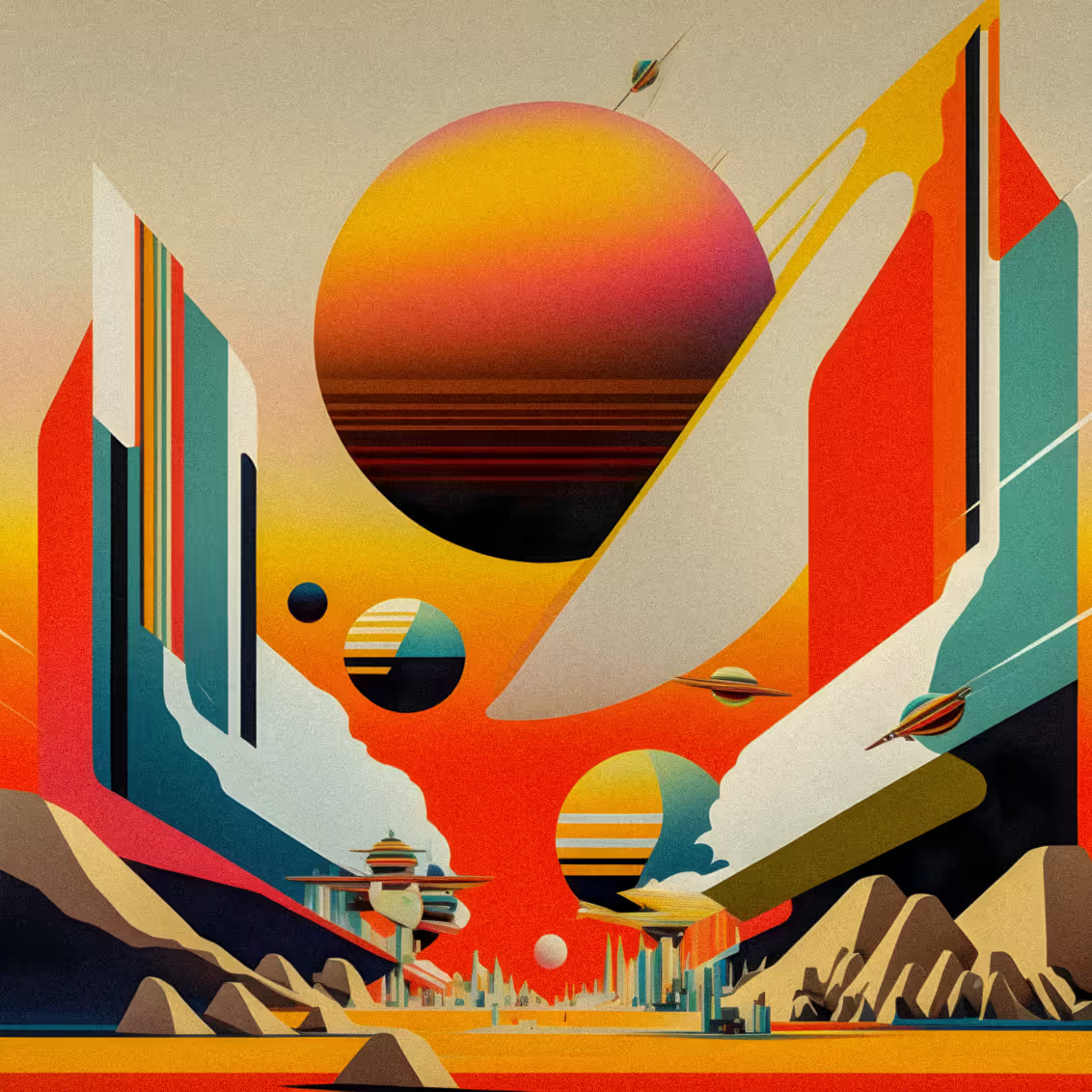
Pop futurism brings a playful, almost impulsive feel to the design. It reminds of old-school game consoles, neon lights, and early digital art. This trend takes inspiration from the best and adds the right dose of modern twist. This is why we often see designs made out of retro elements with maximalist compositions that form digital-arty compositions.
The fusion of retro elements with contemporary techniques results in a unique aesthetic that feels futuristic. Some brands love to imitate this style to create memorable visuals and leave a lasting impression.
10. Modern Surrealism
Surrealism, a movement rooted in the Dadaist art movement, emerged in the early 20th century, primarily in Europe. It sought to tap into the unconscious mind through automatic writing, dream analysis, and other techniques. The surrealists aimed to challenge traditional notions of reality and explore the irrational, the dreamlike, and the subconscious. 3D surrealism in graphic design 2024 has become a huge trend too.
Modern surrealism has evolved into a distinctive style that blends elements of realism and fantasy, often creating visually striking and thought-provoking compositions. Surrealist graphic design draws inspiration from the original movement's principles, but it also incorporates contemporary aesthetics and techniques.
Modern Surrealism in graphic design explores the intersection between the physical and digital realms. It creates a sense of dreamlike vagueness. Abstract illustration and simplified symbolism are also part of this style.
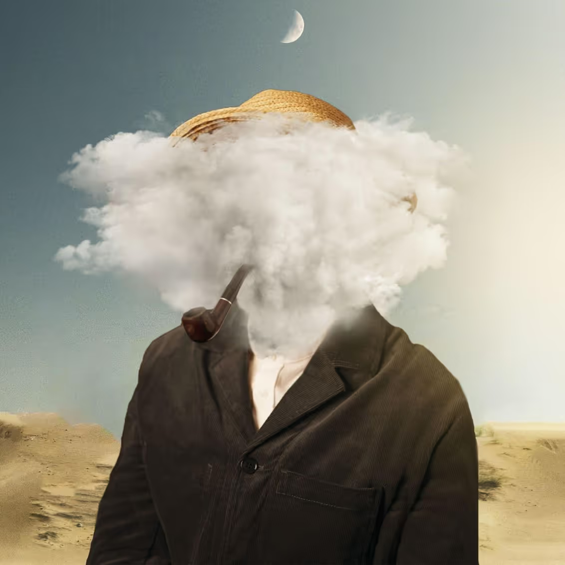
As digital technology continues to evolve, so does the surrealism’s influence. Brands use textured, painterly effects in packaging and digital presence. Designers use airbrushing, abstract shapes, and textured elements. This creates compositions that challenge conventional perceptions.
Modern Surrealism welcomes the bizarre and the imaginative. It evokes a sense of mystery and wonder. It allows viewers to “get lost” between virtual and real experiences.
The secret ingredient to doing so is pushing the boundaries of visual representation.
Brands do that to engage audiences through unique and memorable aesthetic experiences.
This trend manifests in various design assets, including event illustrations, logos, and branding. For example, packaging designs for matcha and coffee brands frequently use this aesthetic to create something extraordinary, a design that makes a difference.
11. Psychedelic
The trippy psychedelic trend is an extension of modern surrealism. It's dreamy, abstract, and a bit mystifying. It’s called psychedelic because it explores and presents distorted visuals.
This style is characterized by acid-inspired color palettes, warped imagery, and abstract patterns. Designers use it to reflect consciousness and escapism.

The return of this aesthetic in 2024 may be linked to the growing interest in psychedelic experiences and their influence on creative expression. Brands adopt these surreal visuals to differentiate themselves. Also, to captivate audiences with bold, unconventional designs.
For example, companies like Sonos have incorporated psychedelic elements into their product photography. Energy drinks and beer brands use trippy illustrations to stand out on shelves. This trend is also seen in retro designs when designers use the 60s hippie nostalgia and contemporary graphic practices.
12. Glassmorphism
Just when we thought we’d seen it all comes glassmorphism.
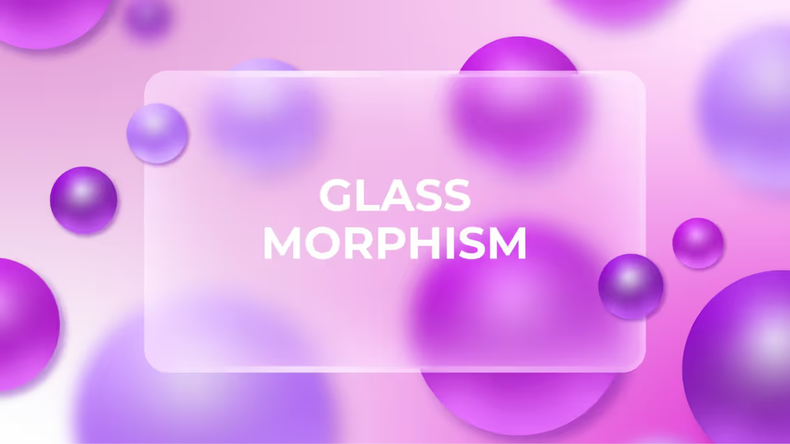
Glassmorphism is a modern graphic design style that has gained significant popularity in recent years. Inspired by the translucent quality of glass, this style incorporates elements of transparency, blurring, and layering to create visually appealing and interactive interfaces.
Key characteristics of glassmorphism include:
- Transparency: The use of semi-transparent overlays or backgrounds to reveal underlying content or imagery.
- Blurring: The application of a subtle blur effect to create depth and a sense of distance between elements.
- Layering: The stacking of multiple elements with varying levels of transparency to create a sense of dimension and depth.
- Minimalism: A focus on simplicity and clean lines to enhance the overall aesthetic.
Glassmorphism has become particularly popular in web design, app development, and user interface (UI) design.
13. Grunge
Grunge, a style that originated in the late 1980s and early 1990s, primarily within the Seattle music scene, has made a significant impact on various creative fields, including graphic design. This aesthetic, characterized by its raw, unpolished, and often rebellious nature, has become synonymous with authenticity and a rejection of mainstream commercialism.
Grunge graphic design typically incorporates elements such as:
- Rough textures: These can include distressed paper, grainy photographs, and weathered surfaces.
- Muted color palettes: Often dominated by earthy tones, blacks, and grays.
- Handwritten typography: Unconventional and often messy fonts that convey a sense of spontaneity.
- Distorted imagery: Images that are intentionally distorted, blurred, or obscured.
- Symbolism and iconography: The use of symbols and imagery that often challenge societal norms or express personal narratives.
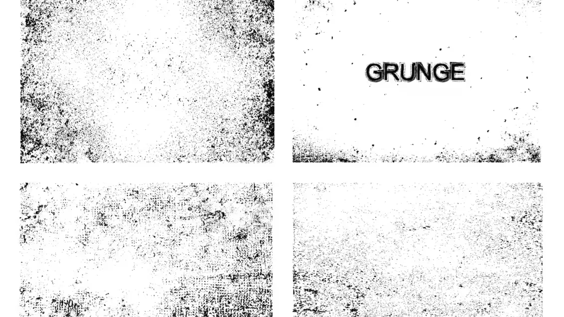
The comeback of the New Grunge is closely linked to the current cultural climate. This involves the influence of activism and the gritty realities faced by Gen Z. The aesthetic features distressed textures, splatters, and scraps. It creates a sense of rebelliousness and authenticity.
We particularly see this trend in the sports sector, where it adds a raw, dynamic edge to team identities. Major sports clubs use this grunge-inspired look to infuse their branding with a bit of an edge.
14. Bento Box
Think of bento boxes—those adorable, compartmentalized meals from Japan. Now, imagine applying that same attention to detail, balance, and visual appeal to your design projects. That's the essence of bento box design.

Key features of bento box design:
- Grid-based layouts: Think of it like a bento box's compartments. It keeps everything organized and visually pleasing.
- Minimalist aesthetics: Simple, clean lines and uncluttered designs create a sense of elegance.
- Vibrant colors: Bold colors add a pop of energy.
- Patterned backgrounds: Subtly textured backgrounds can make your design more interesting.
- Japanese-inspired elements: Cherry blossoms, koi fish, or Mount Fuji can add a touch of Japanese flair.
Elements are grouped into small sections, creating a clean and easy-to-navigate layout. It’s like giving each piece of content its own little space. Each space of the box contains certain information that doesn’t feel cluttered.
Perfect for brands that want to share detailed or multi-faceted information in a visually appealing and contained way.
You can usually find Bento Box's graphic design style on websites, apps, and even print designs.
15. American Kitsch
American Kitch is a graphic design aesthetic that draws inspiration from the kitschy, often campy, and nostalgic elements of American culture. It's characterized by bold colors, playful typography, and a sense of humor that often leans towards the ironic or exaggerated.
The term "kitsch" itself refers to art or objects that are considered to be bad taste but are often appreciated ironically or for their nostalgic value. American Kitch, in particular, often references pop culture icons, vintage advertising, and Americana motifs.
This design style emerged in the mid-20th century, coinciding with the rise of consumerism and mass media. As American culture became increasingly homogenized, designers began to experiment with playful and accessible aesthetics that would resonate with a wide audience.
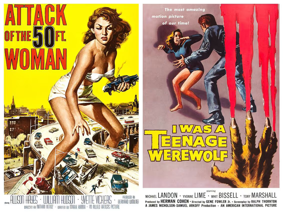
Key elements of American Kitsch often include:
- Bold Colors: Vibrant and often contrasting colors are a hallmark of this style.
- Playful Typography: Quirky fonts, such as comic sans or handwritten scripts, are commonly used.
- Nostalgia: References to vintage aesthetics, such as retro patterns and 50s-era design, are frequent.
- Humor: A sense of irony or exaggeration often underlies American Kitch designs.
- Pop Culture References: Icons from movies, television, and music are often incorporated into designs.
In graphic design, American Kitsch can be used to evoke a sense of fun & to engage the viewer. Designers achieve this by using bold typography and vivid graphics that embrace the idea of mid-century design.
The most distinct use of this style can be seen in movie posters and album covers.
16. Punk
Punk rock, a musical genre born in the 1970s, has had a huge impact on popular culture. Its raw energy, DIY attitude, and anti-establishment vibe have influenced everything from fashion to art. One area where punk has made a big mark is graphic design. Punk design, characterized by its bold typography, stark imagery, and unconventional layouts, is a visual expression of the punk spirit.
Punk design emerged alongside the punk rock movement. It was a way for bands, fanzines, and record labels to communicate their message and reach their audience in a direct and unfiltered manner. Punk designers often used simple, inexpensive materials and techniques, such as photocopiers and stenciling, to create their work. This DIY approach reflected the punk ethos of self-sufficiency and rejection of mainstream culture.
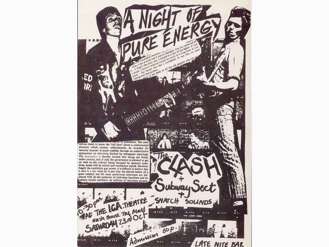
Key characteristics of punk design include:
- Bold typography: Punk designers often use large, sans-serif fonts that are easy to read and visually striking. These fonts can be combined with hand-lettering or graffiti-style typography to create a raw and rebellious look.
- Stark imagery: Punk design often features simple, black-and-white imagery that is often shocking or provocative. This imagery can be used to convey a message or to challenge societal norms.
- Unconventional layouts: Punk designers often experiment with unconventional layouts that break the rules of traditional graphic design. This can include asymmetrical layouts, collage techniques, and the use of negative space.
- DIY aesthetic: Punk design is often characterized by a DIY aesthetic that reflects the punk movement's emphasis on self-sufficiency and rejection of mainstream culture. This can be seen in the use of simple materials, handmade elements, and a rough-and-ready appearance.
Punk graphics use bold, unconventional typography and contrasts. This conveys a sense of urgency and defiance. Designers create edgy, provocative visuals that challenge mainstream norms and celebrate individualism.
17. 3D Design
The history of 3D graphics can be traced back to the early days of computer-generated imagery (CGI). As technology advanced, so too did the capabilities of 3D software, enabling designers to create increasingly complex and realistic visuals. Today, 3D design has become an integral part of the creative process, with tools like Blender, Maya, and Cinema 4D widely used by professionals.
3D graphic design style focuses on shading, perspective, and texture to give graphics a sense of volume and dimensionality.
Applications of 3D Graphic Design:
- Advertising: 3D visuals can create eye-catching and memorable advertisements.
- Gaming: 3D graphics are essential for creating immersive and realistic gaming experiences.
- Product Design: 3D modeling can help designers visualize and prototype products before they are manufactured.
- Architecture: 3D visualizations can be used to present architectural designs to clients and stakeholders.
- Film and Animation: 3D graphics are widely used in the film and animation industry to create special effects and realistic characters.
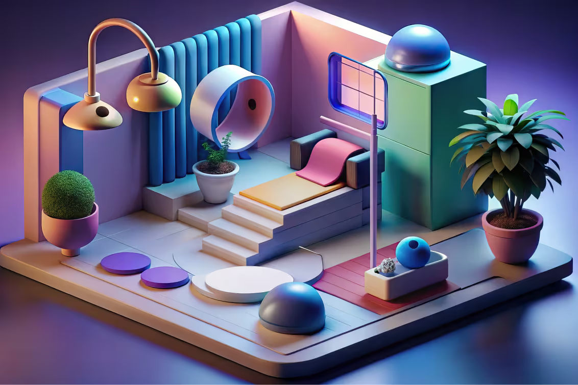
Photorealistic 3D graphics aim to create lifelike images. They are often used in advertising to showcase products in a highly detailed way. 3D typography adds depth to text elements, making them stand out, as seen in Karl Phatt's "Scripts with Depth" project.
18. Flat design
Flat design strips away three-dimensional effects like shadows, gradients, and textures in favor of simple, two-dimensional elements. It became the dominant digital design language after Microsoft's Metro UI in 2012 and Apple's iOS 7 redesign in 2013.
The core idea is functional clarity. Every element on the screen serves a purpose, and nothing is decorative for its own sake. Bold colors, clean typography, and sharp edges define the look.
Flat design works especially well for mobile interfaces, app icons, and digital products where fast load times and cross-device consistency matter. Brands like Google, Spotify, and Airbnb have all embraced flat design principles in their interfaces.
That said, pure flat design has faced criticism for sacrificing usability. When everything looks equally flat, users struggle to identify clickable elements. This is why many designers now use "flat 2.0" or semi-flat design, which adds subtle shadows and depth cues while keeping the overall simplicity intact.
As John Kim, Director of Design at Big Human, puts it: "Flat design isn't outdated. It's incomplete."

19. Swiss/International style
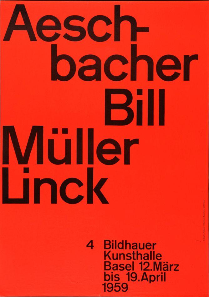
The Swiss style, also known as the International Typographic Style, emerged in Switzerland during the 1950s. It's built on mathematical grids, objective photography, and sans-serif typefaces like Helvetica and Univers.
Josef Müller-Brockmann, one of the movement's pioneers, believed design should communicate information as clearly and objectively as possible. His poster work for the Zurich Tonhalle concert series remains a masterclass in grid-based composition.
The Swiss style gave us the grid system that virtually every modern website and publication layout still uses today. If you've ever aligned content to a 12-column grid in Figma or CSS, you're working with Swiss design principles.
Key characteristics include asymmetric layouts, generous white space, left-aligned ragged-right text, and a strict typographic hierarchy. Photography replaces illustration, and decoration is intentionally eliminated.
Modern brands like Apple, Google, and the New York Times owe much of their visual clarity to Swiss design thinking. It's arguably the most influential graphic design movement of the 20th century.
20. Bauhaus
The Bauhaus school, founded by Walter Gropius in Weimar, Germany in 1919, is one of the most important design movements in history. Its core philosophy was simple: form follows function. Art and craft should merge, and design should be accessible to everyone.
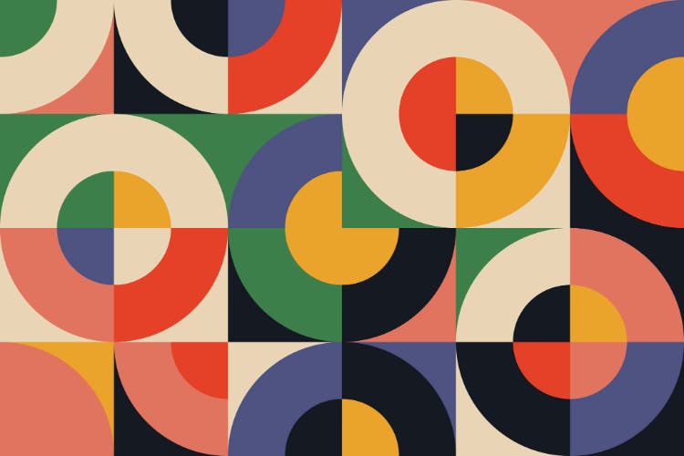
Bauhaus designers like László Moholy-Nagy, Herbert Bayer, and Wassily Kandinsky emphasized geometric shapes, primary colors, and asymmetric composition. The movement's influence stretches from architecture and furniture to typography and graphic design.
In graphic design, the Bauhaus legacy shows up in the use of geometric sans-serif typefaces, grid-based layouts, and the idea that visual hierarchy should be created through size, weight, and spatial relationships rather than decoration.
The school only operated for 14 years before the Nazis shut it down in 1933, but its principles shaped nearly every design discipline that followed. Modern brand identities from IKEA to the London Underground owe a debt to Bauhaus thinking.
Today, Bauhaus-inspired design is seeing a resurgence in digital interfaces, especially in dashboard and data visualization design where clarity and function take priority over ornament.
How to Choose the Right Graphic Design Style for Your Brand
Knowing about design styles is one thing. Picking the right one for your brand is another. Here's a practical framework to narrow it down.
Start with your brand values, not your preferences
If your brand is built on trust and reliability (think: financial services, healthcare), styles like Swiss design, minimalism, or flat design will reinforce that message. If your brand is about energy and creativity (think: gaming, fashion, entertainment), maximalism, psychedelic, or pop futurism will feel more aligned.
Consider your audience
A B2B SaaS company targeting CTOs has a different visual expectation than a streetwear brand targeting Gen Z. Research from Big Human found that startups using strategic design refreshes saw a 20% increase in conversion rates, so the style you choose has real business impact.
Think about the medium
Some styles translate better across specific formats. Bento box layouts work beautifully on websites and apps but can feel rigid in print. Grunge and psychedelic styles make striking posters and packaging but can hurt readability on mobile screens.
Test with real content
Before committing to a full rebrand, apply your chosen style to 2 or 3 real assets: a social media post, a landing page section, and a presentation slide. If it works across all three, you're on the right track.
As one design research team concluded: "A great designer is a good researcher. Understanding where visual language comes from makes it easier to use it intentionally."
The Role of AI in Graphic Design Styles (2026 Update)
AI tools like Adobe Firefly, Canva's Magic Studio, and Kittl AI have changed how designers explore and apply graphic design styles. What used to take hours of manual experimentation now takes minutes.
But the shift in 2026 isn't about AI replacing designers. It's about AI becoming a collaborative tool that accelerates the creative process. Designers use AI to generate mood boards, test color palettes across different styles, and rapidly prototype visual concepts before committing to a direction.
The more interesting trend is the backlash. As AI-generated visuals have become more common, there's a growing demand for designs that feel unmistakably human. Hand-drawn illustrations, imperfect textures, and organic typography are gaining traction specifically because they signal that a real person made something intentional.
As the research points out: "Design work can't be separated from the hands that make it."
This tension between AI efficiency and human authenticity is defining the 2026 design landscape. The most effective approach combines both: use AI to explore quickly, then refine with human judgment and craft.
Find Your Graphic Design Partner to Explore New Styles
Keeping up with graphic design styles is a challenge if your brand doesn't have in-house experts. Magier makes it easy for you. This subscription-based service connects you with skilled graphic designers and Webflow developers.
Here’s how:
You get professional help whenever you need it. There’s no need to hire full-time staff or a traditional agency. With Magier, you can enjoy expert knowledge, flexible plans, and quick 48-hour turnaround times. This way, you keep your brand's design fresh and up-to-date.
Conclusion
I hope you found this detailed guide on graphic design styles inspiring and helpful. Try adding some of them to your own projects and playing around. Remember, there are no right or wrong way when it comes to choosing a style. It's all subjective. Of course, always follow your brand guidelines, but don't be afraid to explore and experiment with colors, typography, images to find your way.
If you wanna try something new and are looking for graphic design support, simply reach out to our team of senior designers at Magier.
Frequently Asked Questions
What are the different graphic design styles?
The major graphic design styles include minimalism, maximalism, flat design, Swiss/International style, Bauhaus, Art Deco, Art Nouveau, neo-brutalism, retro vintage, Y2K, glassmorphism, grunge, psychedelic, pop futurism, bento box, punk, 3D design, geominimalism, American kitsch, and modern surrealism. Each style has distinct characteristics in terms of color palette, typography, shapes, and emotional impact, and they're used across branding, web design, packaging, and advertising.
What are the 7 types of graphic design?
The seven types of graphic design are visual identity design, marketing and advertising design, user interface (UI) design, publication design, packaging design, motion graphics design, and environmental design. These represent the professional disciplines within graphic design, while terms like "minimalism" or "Art Deco" refer to visual styles applied within those disciplines.
What are the 9 types of graphic design?
Expanded lists typically add illustration design and typographic design to the core seven. Some classifications also include web design and social media design as separate types. The exact count varies by source because different organizations (like AIGA) categorize the field differently.
What are the 10 types of graphic design?
A 10-type classification often includes visual identity, marketing/advertising, UI, publication, packaging, motion graphics, environmental, illustration, typographic, and infographic design. The number of "types" depends on how broadly or narrowly you define each category.
How to find your graphic design style?
Start by studying the major design movements and identifying which ones resonate with you visually. Create a mood board collecting work you admire, then look for recurring elements: are you drawn to clean grids or chaotic compositions? Bold colors or muted palettes? Geometric shapes or organic forms? Your natural preferences will point toward a style family. From there, practice by recreating work in that style, then gradually add your own variations.
What is a style guide in graphic design?
A style guide (also called a brand guide) is a document that defines the visual rules for a brand's design. It typically includes the logo and its usage rules, color palette with hex codes, typography hierarchy, spacing and layout guidelines, photography and illustration direction, and tone of voice. Style guides ensure consistency across every touchpoint, from websites to business cards.


.avif)