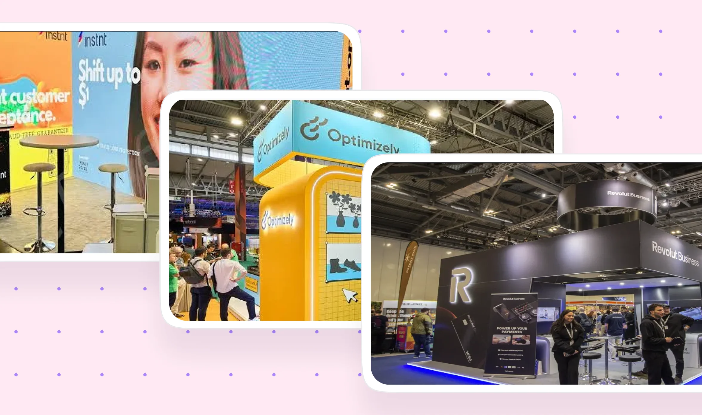
How to Make Your Trade Show Booth Stand Out: Design Practices & Examples
Deny it if you like, but the majority of us spend a fortune to attend trade shows. But what happens when you don't see the expected engagement and leads from it? Most of the time, a badly designed trade show booth is responsible for it.
If you are wondering how to make your trade show booth stand out, the answer starts with trade show booth design that works from the aisle. A trade show booth that stands out gets noticed from the aisle, explains your offer quickly, and invites people to step inside. Attendees compare many booths before they choose where to stop, and research from the Center for Exhibition Industry Research (CEIR), summarized by SCIP, found that 97% come with shopping-related goals while only 36% plan to buy at the show. Your booth has to grab attention before it can grab a buyer.
If you think a small booth cannot compete with a large one, you’re awfully wrong. We have written this blog for in-house designers and marketers to show them exactly how to design a jaw-dropping trade show booth regardless of the size and how to turn the visitors into buyers through intentional design. Here’s what you’ll learn:
- Design practices derived from the best in the industry
- Step-by-step workflow for designing a successful trade show booth
- Real life examples and lessons to derive from them
- Trade show booth design trends to consider
- What booths cost and where to spend or save.
and so much more.
{{freebie}}
The importance of having a well-designed trade show booth
Attendees pass booth after booth, and they decide in a few seconds whether yours deserves a stop. That quick judgment happens before anyone reads a brochure or talks to your team, so trade show booth design works as your first sales conversation. A well-designed booth earns the stop, and a poorly designed one loses it.
What a well-designed booth does for your business
A strong exhibit booth design helps you in six ways, and each one has a clear reason behind it.
- It attracts the right visitors: Clear branding, lighting, and headlines signal who the booth is for, so people who fit your audience stop and others keep walking. That saves your team from long conversations with people who will never buy.
- It explains your offer quickly: A clear headline lets visitors qualify themselves from the aisle, so the people who step in already understand what you sell.
- It builds recognition: Consistent colors, messaging, and materials make your brand easy to recall during the show and when your follow-up email arrives afterward.
- It improves conversations: A comfortable layout with clear zones keeps visitors longer, and longer visits give your team room to ask questions and qualify leads.
- It gets more from your budget: Show fees are fixed once you book the space, so design is one of the few areas where you can raise results without raising the price of exhibiting.
- It supports your staff: A demo area, a seating zone, and a lead capture point give your team clear places to work, so they spend less time improvising.
What a poorly designed booth costs you
Every visitor who walks past without stopping is a missed lead, and every confused visitor who cannot tell what you do is a wasted impression. Cluttered graphics, a blocked entrance, and weak lighting also make a company look less credible. That hurts conversations even when someone does step in.
You pay for the space, the shipping, and the staff either way. And let's face it, fixing a design problem on show day costs far more than fixing it during the design stage. Reprinting graphics or changing a layout at the venue means rush fees, lost hours, and a booth that may still not be ready when the doors open.
Booth size does not decide results
Does a bigger booth guarantee better results? No, because exhibit companies such as GES and Metro Exhibits both point out that smaller booths can pull in more visitors than large ones. Attention comes from clear messaging, good lighting, and an inviting layout, and a large booth with a cluttered back wall gives visitors nothing to remember. A well-planned 10x10 can outperform a poorly planned 20x20.
The three layers of a booth that stands out
A booth that stands out works on three layers, and each one depends on the one before it. People have to notice you first, then understand you, and only then will they act. We use these three layers to organize the ten design practices later in this guide.
A well-designed booth also answers five questions almost immediately.
- Who are you?
- What do you offer?
- Why should visitors care?
- What can they experience at your booth?
- What should they do next?
Start with your goal, audience, and one creative concept
Good trade show design gets easier once you know what the booth must achieve. Without a goal, you end up adding features because they look good, and the booth becomes scattered.
Match your design to your goal
Booth design for a trade show works best when you pick one primary goal before you open a design tool. The table below shows what to prioritize for each goal and the reason behind it.
Pick the top one or two rows for your show. If you try to serve all eight goals, the booth tries to say everything and ends up saying nothing.
Research the show before you design
Your booth sits inside a venue with its own rules, so read the exhibitor kit before you finalize anything. It lists height limits, lighting rules, power options, and where you can hang signs, and ignoring it can force a redesign late in the process.
Next, study who attends and where your booth sits on the floor plan. A spot near an entrance gets steady foot traffic, while a corner spot may need a bolder design to pull people in. Photo galleries from past editions show what competitors built and which ideas you can improve.
Finally, collect your ideas in a mood board with colors, materials, furniture, lighting, and branding elements. It keeps your team and any exhibit house you hire aligned, and it helps you compare quotes when you send a request for information, quote, or proposal (RFI, RFQ, or RFP) to vendors.
Pick one creative concept
A concept is the idea that ties your graphics, layout, and materials together, and it should come from your brand positioning instead of from decoration. Start by asking what visitors should feel when they approach and what one thing they should remember. Choose one concept and commit to it, because mixing three directions makes a booth look unplanned and leaves visitors unsure what your brand stands for.
Pick the right booth type and size
Whether you call them trade show booths or trade show exhibits, the space you book decides how many sides visitors can approach from, how tall you can build, and how much you will pay. Exhibition booth design starts with that space, so choose the type before you choose colors or furniture.
Booth types compared
Sizes vary slightly from show to show, so check the exhibitor kit for exact numbers. The table below summarizes the inline, corner, peninsula, split island, island, and double-deck types.
A double-deck booth counts as a structure at many venues, so expect extra engineering and several rounds of approval. Larger booths also raise the cost of shipping, staffing, and drayage, which is the fee for moving booth materials from the loading dock to your space.
How to make a 10x10 booth stand out
A 10x10 booth is small, so every element has to work harder. Put your headline on the back wall above eye level, keep the graphics simple, and add one small interactive element such as a tablet demo.
Light colors, minimal graphics, and vertical pieces like a retractable banner stand or a tower make a small space feel larger. Keep the front completely open so visitors can step in without squeezing past furniture.
For a 10x10 trade show booth design, a fabric back wall, a branded table cover, and one strong light source usually give you the most impact for the least money.
What changes at 20x20 and above
For a 20x20 trade show booth design, plan zones before you pick furniture. You can create a welcome area, a product area, a demo area, and a meeting space instead of one open room.
Overhead signage becomes important at this size because visitors need to find you from across the hall. Your layout also needs clear paths so crowds do not bunch up at one counter.
Hardware and materials
Your hardware sets what is possible for graphics, lighting, and reuse, so choose it based on how often you exhibit and how often your message changes. A strong trade show backdrop is usually the largest visual element in the booth, and it is the first piece to plan when you design a trade show display.
Most fabric graphics are printed with dye-sublimation, a process where ink bonds with the fabric instead of sitting on top of it. The result is a sharp image that resists wrinkles and travels well. Some printers also offer direct-to-fabric printing, which applies ink straight onto the fabric, and GES describes it as a process that reduces water use and material waste compared with older textile printing.
{{cta}}
10 ways to make your trade show booth stand out
These trade show booth design tips follow the three layers from earlier, starting with how your booth looks from the aisle and ending with how your team closes the conversation. You do not need all ten at once, but each one fixes a specific problem we see at many booths.
Layer 1, attraction: get noticed from the aisle
1. Design for three viewing distances
People see your booth from three distances, and each distance needs a different message. From far away they only read your name or slogan, from mid-range they look for what you offer, and up close they want proof and details. SpeedPro calls these long-range, mid-range, and short-range graphics.
Exhibit vendors such as All Flags and Displays suggest your company name should be readable from 30 feet or more, your tagline from about 15 feet, and supporting details from about 5 feet. Treat those numbers as a starting rule of thumb, and test them in the actual hall.
Which should you show at long range, a slogan or a logo? A slogan usually works better for an unknown brand because it explains why people should visit, while a well-known brand can rely on its logo because people already recognize it. Check the culture of the show first, since a very tall graphic can feel aggressive at some venues.
2. Use vertical space and protect your sightlines
Your sightlines are the lines of sight from the aisle to your booth. Tall elements like overhead signs, back walls, and towers decide how far away people can find you, and they save floor space, which helps small booths most.
Protect those sightlines when you plan furniture. Exhibitors often design a bold back wall and then block half of it with a couch or display case. At the Burns McDonnell exhibit described by GES, the seating and coffee table sit below the height of the back wall text, so nothing covers the message.
Check the exhibitor kit for height limits, because inline booths often have an 8-foot limit while island booths usually have none.
3. Use color with intention
Color helps people recognize your booth from far away, so use your brand colors consistently and add contrast where your message needs attention. CR&A Custom describes a simple guide called the 60-30-10 rule, where 60% of the space is your main color, 30% is a second color, and 10% is an accent. Pair that ratio with a palette of no more than three colors. Too many colors overwhelm the eye, and too few make the booth look dull.
Color psychology, the study of how colors influence feelings, gives you a simple way to choose accent colors based on the feeling you want visitors to have.
Cool tones build trust but attract less attention than warm tones, while warm tones grab the eye but can become overwhelming quickly. Motor City Pizza Co. balances this by using warm reds and oranges for its food imagery and cooler blues to signal trust, according to GES.
4. Layer your lighting
Convention hall lighting is rarely flattering, so extra light helps your graphics and products look sharper. Several layers of light also guide the eye to your most important message first.
Accent lighting makes graphics look sharper and colors look richer. The MC-Bauchemie exhibit described by GES aims directional spotlights at the headline and logo on each back wall panel.
Before you finalize the layout, check for shadows, because overhead signs or shelves can block light and leave key graphics dim. This problem is common because it often goes unnoticed until show day. Also pick a color temperature that fits your brand, since warm light feels cozy and cool light feels energizing.
5. Keep the front open and leave negative space
Negative space is the empty area around your graphics and furniture, and it helps your headline and logo stand out because the eye has fewer things to compete with. GES suggests aiming for about 40% empty space as a starting guideline, so treat that as a target to test and not as a strict rule.
Apply the same idea to the floor. A table across the front of your booth is like a shop that puts a counter in the doorway and then wonders why nobody comes in. Angle tables along the sides instead, and keep the entrance clear so visitors can step in without hesitation.
An open layout also supports accessibility, which means every visitor can reach and use your booth. These four habits make the biggest difference.
- Clear entrances: Keep every entry point free of obstacles so wheelchairs and strollers can enter.
- Wide paths: Leave enough room inside for people to move without squeezing past furniture.
- Readable signs: Place signs at heights that work for people who are standing or seated.
- Seating options: Offer chairs or benches with armrests for visitors who need a rest.
Exhibitor guides also mention compliance with the Americans with Disabilities Act (ADA), so ask your show organizer which accessibility rules apply to your space. Venue rules can differ, so confirm the details before you finalize the layout.
Layer 2, communication: help people understand you
6. Write one clear headline and set a hierarchy
Visitors scan your booth instead of reading it, so your headline has to explain the benefit in a few words. Exhibit vendors suggest keeping main messages between six and ten words and printing them at least three to four feet high, so people can read them from the aisle.
Write the headline around what the customer gets, not around who you are. The table below shows the same message before and after, using an invented company.
The after version is short, names a benefit, and can be read from across the aisle. The before version describes the company, which visitors can learn later from your team.
But a headline alone does not guide the eye, and that's where a messaging hierarchy comes in. A messaging hierarchy ranks your content so visitors see the most important message first and the details last.
Use product visuals that show your actual offer. For a software company, a screenshot or a live demo is usually more persuasive than a generic stock photo, because visitors can see what they would be buying.
7. Test your design from the aisle and check your print files
A design that looks perfect on your laptop can look very different on a 10-foot banner. Sending a low-resolution file to a large printer is like blowing up a passport photo for a billboard. It will print, and everyone will see exactly what went wrong.
Before you approve production, view the design from 20 to 50 feet away, from the aisle angle, and from inside the booth. Designers often check only the inside view, but attendees first see your booth from a distance and at an angle. Then run through these five checks, several of which Vistaprint's booth guide also recommends.
- CMYK versus RGB: Screens use RGB, while printers use CMYK, so convert your brand colors and share the CMYK values with your printer to avoid surprises.
- Print proof: Request a print proof or physical swatch, because colors can shift under convention lighting and warm tones may turn yellow.
- Resolution: Use high-resolution images so graphics stay sharp at large sizes.
- Bleed and safe zones: Extend backgrounds into the bleed area and keep key text inside the safe zone, so edges are not trimmed away.
- Contrast at a distance: Use strong contrast between text and background, because small or low-contrast text can disappear on a backlit banner.
Production files also need a venue check. Fire-retardant material rules, electrical load, and installation requirements can change what you are allowed to build, so ask your exhibit house or fabricator to review structural details before production.
"Your eyes lie to you on a laptop screen, so print one panel at full size before you order the rest. It costs a little now and saves you a very awkward moment on show day."

Layer 3, conversion: turn interest into conversations
8. Add one interactive element tied to your product
Interactive elements give people a reason to stop, stay, and remember you, and they work best when they connect to what you sell. Product demos, touchscreen configurators, quizzes, and photo moments all fit this idea.
Be careful with games that have no link to your product. Giving away a prize for spinning a wheel that has nothing to do with your offer is like hosting a cooking class to sell insurance, because you will get a crowd but not the one you wanted.
An unexpected element can work too, but only if you can explain why it belongs. At the Kolor Plusz exhibit described by GES, staff in life-size mascot costumes stand near a plush product display, so the surprise points straight back to the product.
Start small if your budget is limited. A tablet demo, a short product quiz, or a branded photo spot costs far less than a VR setup, and it still gives visitors something to do.

9. Give visitors a reason to stay
The longer visitors stay, the more time your team has to ask questions and build trust. Comfortable seating, charging stations, and refreshments give people a reason to pause, especially after hours of walking on hard floors. Metro Exhibits describes this as making your booth an oasis on a busy floor.
Flooring helps too, because padded flooring or carpet makes your booth feel like a place to rest. It also marks your territory, which is useful for open-sided booths, and it can tie into your brand colors.
Plan your zones around the visitor journey, which moves from attraction to interest, engagement, conversion, and follow-up. Each zone supports one step, so a visitor who notices your headline can move to a demo and then to a conversation without hitting a barrier. For larger booths, split the space into zones with clear purposes.
- Welcome zone: A place for greetings and first conversations, positioned so it never blocks the entrance.
- Brand zone: The main identity and storytelling area, usually the back wall.
- Product zone: Displays and demos where visitors see what you offer.
- Engagement zone: Interactive activities that draw people in.
- Meeting zone: Seating and tables for longer sales conversations.
- Storage zone: Hidden storage for bags, samples, and extra materials, because clutter makes a booth look unprofessional.
Meeting spaces come in three types. Open spaces suit casual networking, semi-private spaces allow relaxed talks with fewer distractions, and private rooms suit formal or sensitive discussions, though they usually fit only in larger island booths.
10. Prepare your team, apparel, and swag
Your design earns the stop, and your team earns the conversation, so staff behavior deserves the same planning as graphics. Staff should stand at the edges of the booth, angled toward the aisle, and make eye contact instead of sitting behind a table. That keeps the entrance open, and it shows passersby that someone is ready to talk.
Plan the opening of every conversation, because a friendly, informed person is what turns a browser into a lead. Give each team member one opening question that fits your goal, such as "What are you hoping to find at this show?", and one clear next step to offer, such as a demo or a meeting. If a visitor wants a longer talk, move to the meeting area so the aisle never gets blocked.
Branded apparel helps visitors identify who to talk to and keeps your look consistent, and matching shirts also advertise your company wherever your team walks in the venue. Swag works the same way, so choose fewer, more useful items such as a quality tote bag or notebook, because people keep and use them while cheap giveaways usually end up in the trash.
Train your team before the show with a short briefing on your headline, your goal, and the first question to ask, so conversations stay consistent.
Trade show booth examples that work, and why
The next three booths use light, height, and bold signage to be found across a large hall.
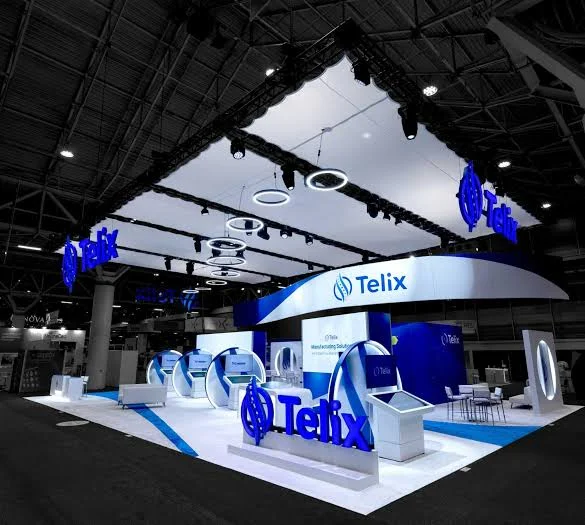
Telix
Telix's island booth is almost entirely white and blue, with large three-dimensional logo letters at the corners and a stretched white ceiling hung with glowing rings. Touchscreen stations and high tables sit on a white floor with one blue stripe.
Design lessons to derive from:
- Put dimensional logos at the corners of an island, because visitors approach from every direction and glowing letters announce the brand from each one (practices 1 and 2).
- Build a ceiling that defines your space, because the white canopy and ring lights separate the booth from a dark hall and make it the brightest thing in view (practice 4).
- Place interactive screens at the edges and keep the center open, because the kiosks leave room for conversation in the middle of the floor (practices 5 and 8).
Revolut Business
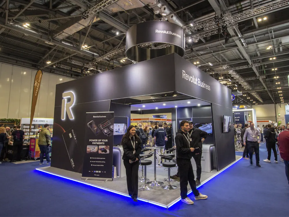
Revolut Business uses matte black walls, a large illuminated R, a round overhead sign, and a blue LED strip along the base of the platform. Two team members in dark clothing stand at the front edge, facing the aisle.
Design lessons to derive from:
- Limit the palette to one dark base and one accent light, because the blue edge lighting against black walls makes the booth easy to find among busy neighbors (practices 3 and 4).
- Use a lit logo and an overhead ring for the long-range read, because both can be seen from across the hall while the roll-up banner carries a shorter message, "Power up your payments," for people who come closer (practice 1).
- Station your team at the front edge, because standing there, facing the aisle, invites people in without a table in the way (practice 10).
Google Pixel for Business
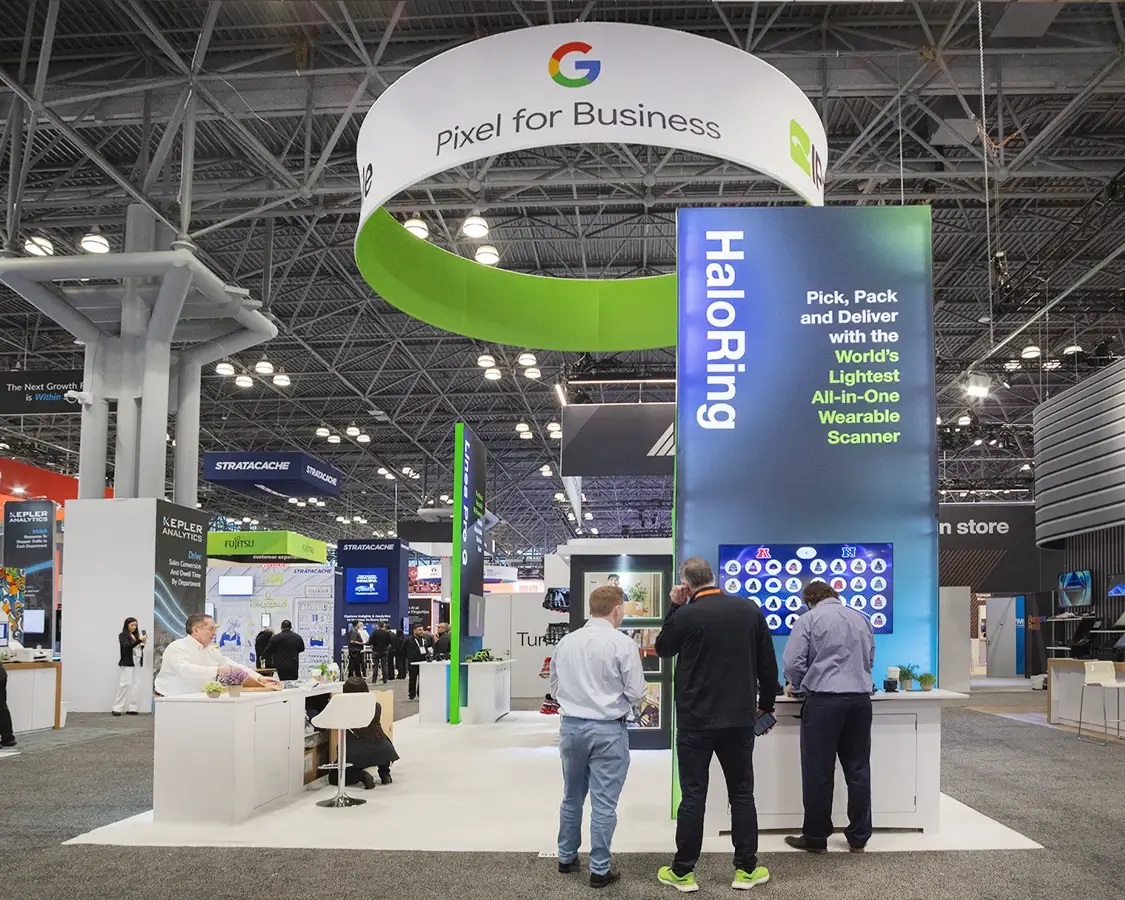
Google's booth hangs a large ring sign with the Pixel for Business name and the Google G above a tall blue-and-green tower. The tower names the HaloRing product and gives one line about a lightweight wearable scanner for picking, packing, and delivering.
Design lessons to derive from:
- Hang a large ring sign so people can find you above the booths around you, because the white ring rises over the neighbors in a crowded hall (practices 1 and 2).
- Give a single product its own tall tower with a name and one benefit, because large white type on a dark gradient reads quickly and sets a clear hierarchy (practice 6).
- Put demos at standing height, because the counters with screens let visitors lean in and try the product while the white floor keeps attention on the display (practice 8).
Optimizely
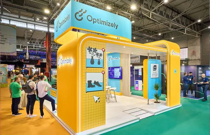
Optimizely's booth uses a rounded yellow arch with glowing edge lighting under a large cyan header sign. Grid-patterned panels carry simple illustrations, such as plants and boots with location pins and a cursor icon, that look like parts of a web interface.
Design lessons to derive from:
- Pick two bold, high-contrast colors and repeat them everywhere, because the yellow arch against the cyan header reads clearly from across the hall (practice 3).
- Turn your product's world into the artwork, because the cursor and pin icons hint at what the company does without a paragraph of text (practice 6).
- Frame the entrance with architecture, because the open arch and glowing edge draw the eye inward and keep the front clear (practices 4 and 5).
Instnt
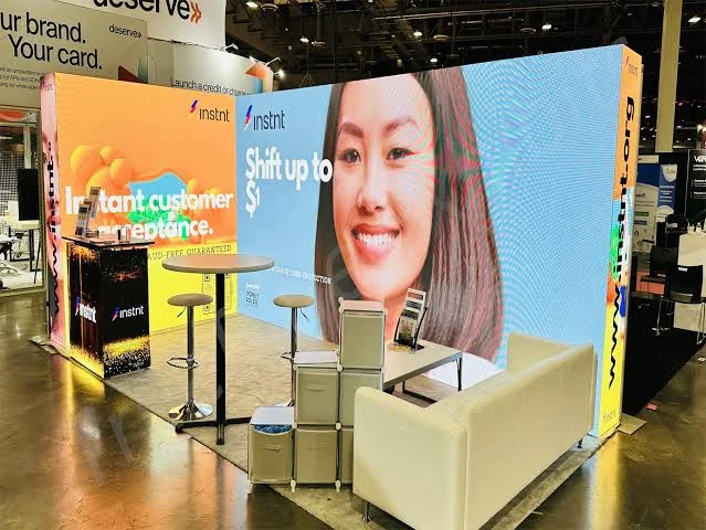
Instnt's booth is dominated by a large LED wall showing a smiling woman beside a bold headline, with an orange panel that reads "Instant customer acceptance." A high table, a counter, and a white sofa fill the floor in front.
Design lessons to derive from:
- Use a human face on a large screen, because a big face catches the eye from down the aisle and gives the headline a human anchor (practice 6).
- Keep the value proposition to a few words, because "Instant customer acceptance" can be read in a glance (practice 6).
- Hide your storage, because the stacked cubes beside the sofa sit in plain view and pull attention away from the screen (practice 9).
The next two examples are 3D renders, not photographs of a show floor, so treat them as design ideas and not as proof of results.
Shopify (3D render)
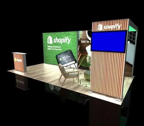
This Shopify concept shows a wood-floored booth with a green brick-textured back wall, a wood-slat tower topped by a large screen, and one lounge chair. A wood-slat counter at the left repeats the logo.
Design lessons to derive from:
- Choose materials that fit your brand, because the green wall, wood slats, and warm floor give an approachable feel that matches the tagline on the wall (practice 3).
- Add height with a tower, because the slatted tower carries a screen and the logo above eye level (practice 2).
- Make the main message larger than the render shows, because the small line under the logo would be hard to read from the aisle (practice 1).
Casper (3D render)
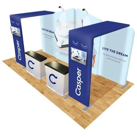
This Casper concept shows a fabric booth with two blue arches, a light-blue back wall that reads "Live the dream," and two white counters with the round C logo. Small monitors are built into the arches.
Design lessons to derive from:
- Use fabric arches to frame the entrance, because they add height and brand color, and the vertical logo along each leg can be read from the side of the aisle (practices 1 and 2).
- Pair a short, emotional headline with one product image, because "Live the dream" and a bed photo say what the brand sells without a paragraph (practice 6).
- Keep the front open, because the two counters sit close to the entrance in this layout and could block the way in, so move them to the sides (practice 5).
Which practices each booth shows
Notice that most of these booths rely on one clear decision, such as a lit ring sign, a bold color pair, or a short headline. You can copy those decisions at almost any booth size.
Trade show booth design trends for 2026
Trends show where exhibitors are putting their attention in 2026, but most available sources are exhibit companies, so treat them as directions to consider and not as proven results. Here are six that appear across several sources, along with what you can do about each.
Modular and reconfigurable booths
Adam Expo Stand, an exhibit builder, reports double-digit growth in collapsible booth systems that set up in under four hours and adapt to different floor plans. AlphaGraphics adds that modular setups let you keep the core brand look while swapping panels, headers, and graphics for each audience. To use this, design every panel on a shared grid so new additions look planned.
Intentional visitor paths
Strategic Factory describes booth layouts moving away from open floor space toward planned routes that take visitors from curiosity to engagement to conversation, and The Tradeshow Network says behavioral psychology is shaping how exhibit layouts are planned. To use this, decide where visitors should walk first, second, and third, then place your headline, demo, and meeting area along that route.
Sustainable materials people ask about
AlphaGraphics notes that buyers and partners now ask how booth materials are made and what happens to them once the show ends. To use this, choose reusable fabric graphics and LED lighting, and prepare a one-sentence answer for your team.
AI and live data
The Trade Group's 2026 whitepaper points to branded games, dynamic LED walls, AI in the design process, and live surveys, and The Tradeshow Network adds AI that personalizes booth conversations. To use this, start with one low-cost option, such as a short on-screen survey, and use the answers in your follow-up.
Micro-experience zones and photo moments
Adam Expo Stand describes small pods where one visitor spends 60 to 90 seconds with a product simulation or personalized content. Strategic Factory claims that planned photo moments extend a booth's reach after the event, but it shares no data, so treat that as an idea worth testing. To use this, add a branded photo spot with your hashtag and a clear sign.
Follow-up built into the booth
Strategic Factory also lists post-show nurturing as something to plan inside the booth experience itself. To use this, plan your QR code, landing page, and first follow-up message before the booth is built, as the digital layer section explains.
Some older habits are fading as these trends grow. Cluttered back walls, paper sign-up forms, and piles of printed brochures lose out to cleaner graphics, tablet sign-ups, and QR codes, because digital capture is cheaper and easier to act on after the show.
How much does a trade show booth cost, and where should you spend?
Cost is the top question for most exhibitors, but quotes vary widely because every booth differs in size, materials, and complexity. Treat every figure below as a vendor estimate, and ask for a written quote before you plan around it.
Booth cost ranges
For custom builds, Triumfo, an exhibit builder, puts the cost at about $150 to $250 per square foot for booths of 20x20 and larger, including design, build, and display services. Expo Stand Service quotes a wider range of $100 to $300 per square foot. At those rates, a 400-square-foot 20x20 booth lands between $40,000 and $120,000, depending on materials, lighting, and technology.
Smaller setups cost less in total. All Flags and Displays estimates the following ranges for design, fabrication, and graphics only.
The booth is only part of your total spend. You also pay for show space, shipping, drayage, show services such as electricity and internet, installation and dismantle labor (I&D), travel, and marketing materials. I&D labor can add up quickly at venues that require union crews.
Sources disagree on the exact split. All Flags and Displays says the booth itself is roughly one-third of your total trade show investment. The Tradeshow Network estimates that exhibit space is only about 30% of total show costs, with design, shipping, drayage, installation, and staffing making up the other 70%.
Another post from the same company cites EXHIBITOR Magazine data that puts booths and graphics at about 18% of the budget and show services at 12%. Use these splits as rough guides and build your own budget line by line.
Where to splurge and where to save
So where should your money go first? Let's face it: most first-time exhibitors cannot afford to spend on everything, so put your money where visitors might look the most.
Should you buy or rent?
Buying usually pays off once you exhibit often. Pulse RevOps places the break-even point at about three to four shows a year, after which owning is typically cheaper per show, and The Tradeshow Network says rental exhibits cost about 35% of the hardware purchase price. Many exhibitors choose a hybrid, owning a core structure and renting furniture or extra space for each event.
Common booth design mistakes and how to fix them
Most booth problems are easy to fix during the design stage and expensive to fix at the venue. The table below lists common mistakes, what each one costs you, and the fix.
If you can only fix three, we would start with the headline, the entrance, and the lighting. Those three affect every visitor who sees your booth, so they give you the biggest return for the least effort.
How to stand out by business type
The best booth for a software company looks different from the best booth for a food brand, because each one sells in a different way. The table below shows what to lead with, what to avoid, and what to put behind your QR code for three common business types.
Pick the row closest to your business and test your headline against it. If your headline could fit any company in your industry, it needs more specifics.
The digital layer: what happens after the scan
Most booth guides mention QR codes in a line or two, but the code is only the start. What visitors see after scanning decides whether you collect a lead or lose one, so this part of the design deserves as much care as your back wall. The blend of a physical booth and digital follow-up is often called phygital, and it is one of the easiest upgrades to make.
Design the QR code placement
Place a large, high-contrast QR code at eye level on your back wall or counter, not in the corner of a flyer. Give it a specific reason to scan, such as getting a free guide or a discount, because a clear benefit earns more scans than a generic prompt.
Leave a white border, called the quiet zone, around the code so phones can read it. Test it with several phones before the show, since crowding the code with other graphics is a common reason scans fail.
Build the page behind the code
So what should happen after someone scans? Visitors scan with one hand, usually while standing in a crowded aisle, so the page has to load fast and work well on a phone. It should offer one clear action that matches your booth headline, such as booking a demo, downloading a guide, or entering a contest.
That's where a dedicated landing page comes in. A designer plans the message and layout, and a developer builds a fast, mobile-friendly page in Webflow that you can update between shows. If you want help with that build, check how magier takes care of Webflow development.
We have seen how much a clear page can change results. Jupus booked 40+ demo calls in the first two days after magier relaunched its landing page. For plancraft, combined design and Webflow work from magier led to a 20% conversion increase. While these were campaign pages, not booth projects, the same principle applies to any page a QR code opens.
Plan your post-show follow-up
Tag every lead in your CRM with the show name so you can track revenue from that event over time. Use lead retrieval tools or tablet sign-ups to capture contacts without paper forms, which also lets your team follow up within days while the conversation is still fresh.
Venue Wi-Fi is notoriously unreliable, so bring a mobile hotspot for demos and sign-ups and keep key files saved offline. If your audience is tech-savvy, an AR trigger, which is a printed marker that opens a 3D view when scanned, can show a product that is too large to bring to the show.
How to measure your booth's results
How do you know whether your booth worked? Measurement starts before the show, because you need a primary goal to measure against. Choose one main metric, such as leads, sales, partnerships, or brand impressions, and track the others as supporting data.
The Tradeshow Network frames ROI as revenue from leads divided by total show cost. Revenue is not profit, so many teams also compare the result against their gross margin.
Here is an illustrative example with made-up numbers, not a benchmark. Say your total show cost is $20,000 and you collect 200 leads, which gives you a cost per lead of $100. If 10 of those leads become customers worth $4,000 each, your revenue from the show is $40,000. Dividing $40,000 by $20,000 gives a result of 2, which means each dollar spent returned two dollars in revenue.
Within a week of the show, hold a short debrief with your team. Ask what worked, what did not, what visitors responded to, and what you would change about the design, because this feedback often shows more than the numbers do.
Your booth design timeline and planning tools
A simple booth design timeline
Starting early gives you more design options and avoids rush fees. For a custom booth, start at least 12 to 16 weeks before the show, and for a portable display with custom graphics, 6 to 8 weeks usually works.
Promote your booth before the show with social posts, email, and your event hashtag, because visitors who already know your booth number are more likely to come looking for it.
Tools for planning your booth layout
You can plan a layout with the same tools designers use, and several of them offer free or trial versions, so check current terms before you commit.
For inspiration, browse booth projects on Behance and Pinterest, and watch how exhibitors explain their layouts on YouTube. Exhibitors also share tips in communities such as Reddit's r/smallbusiness, so reading a few threads before you design can surface ideas you will not find in guides. Have a qualified fabricator review structural and venue details before production, because venue rules take priority over the creative concept.
Before you go
A trade show booth stands out when it attracts attention, explains your offer clearly, and gives visitors an easy way to take the next step. The design choices in this guide, from viewing distances to QR landing pages, all serve those three layers.
We know that putting this into practice takes work, especially when your team is already stretched and the show date keeps getting closer. That's where magier comes in. Our subscription covers design and Webflow development under one fixed monthly fee, with unlimited revisions and a 48-hour turnaround per task, so you can get your graphics and landing pages ready without managing several vendors. Design starts from €2,750 per month and Webflow from €890 per month, and you can pause or cancel anytime. Check out magier's combined design and Webflow subscription to see how it works.
Pick the section closest to your situation and start there. If your show is close, begin with the headline and the QR landing page, because they are the fastest changes with the biggest effect.
{{cta}}
FAQ
Set a goal, research the show, choose a booth type, design for three viewing distances, test the design from the aisle, and plan your QR code and follow-up. Following these steps in order keeps the design tied to what the booth needs to achieve.
Common mistakes include too much text, a blocked entrance, weak lighting, low-resolution print, and no plan for follow-up. Each one is cheaper to fix during design than at the venue.
At builder rates of $100 to $300 per square foot, a custom 20x20 booth costs roughly $40,000 to $120,000. Rentals cost less, because rental exhibits run about 35% of the hardware purchase price.
The main directions are modular booths, intentional visitor paths, sustainable materials, AI and live data, small experience zones, and follow-up built into the booth. Each one is covered above with a practical step you can take.
A 10x10 portable setup can start around $1,500, while custom builds are often quoted at $100 to $300 per square foot. Show space, shipping, drayage, and labor come on top of the booth itself, so ask vendors for a full written quote.
Start with your goal, your booth size, and how often you exhibit, then compare options such as tension fabric, modular systems, and fully custom builds. Ask vendors about print quality, setup time, shipping weight, and the cost of updating graphics, because those details decide what you pay over several shows. Request a print proof and a pre-show preview before you approve production.
Saltwell pairs one bold headline with open space, and Kolor Plusz uses mascot costumes that connect to its plush products. Each one succeeds because it makes one clear design decision and links it to the brand. The examples section above explains nine booths and the practice each one shows.
Many brands build a modular base and swap graphics, headlines, and panels for each audience. This keeps costs down and keeps the core look consistent.
Choose one primary goal, then track cost per lead and how many leads convert within 90 days. Tag every lead in your CRM with the show name so you can follow revenue over time.
Start at least 12 to 16 weeks ahead for a custom booth and 6 to 8 weeks for a portable display with custom graphics. Starting early gives you more design options and lowers rush fees.
Buying usually makes sense when you exhibit three or four times a year or more, because rental fees start to approach ownership costs. If you exhibit less often or need different sizes, renting is more flexible, and many companies mix both.
Use light colors, minimal graphics, and vertical elements such as banner stands or towers. Keep the front open and avoid clutter, because every physical barrier makes a small space feel smaller.
An effective booth gets noticed from the aisle, explains your offer in a few seconds, and gives visitors an easy next step. It also fits your goal and your audience.
.avif)

.webp)