How to Design a Landing Page: Step-by-Step Guide, Best Practices & Examples (2026)
It's almost midnight. Peter is refreshing his ad dashboard for the third time this hour. The clicks keep coming in, but the conversions stay flat.
The biggest possible reason behind Peter’s debacle: unoptimized landing page design.
A landing page has one purpose: get a visitor to take one specific action, like signing up, buying, or booking a demo. Getting your landing page design right is very important, because visitors decide within seconds whether to stay or leave. Here’s what happened to DHL: after redesigning a landing page with a more noticeable sign-up form and a real photo of a courier instead of a stock image, the page converted at more than 98 percent, according to case study data compiled by Growbo.
A landing page that doesn’t use good website design principles does the opposite. It confuses visitors, hides the action you want them to take, and wastes the ad spend or traffic that brought people there in the first place.
The internet has no shortage of landing page advice, but most consists of generic tips only. Few guides cover how design should change by page intent, like a pricing page versus a contact page, or by business model, like SaaS versus ecommerce. We wrote this guide to cover both, so you can design a landing page that fits your specific project instead of following one-size-fits-all advice.
Here's what you'll find below:
- Difference between landing page and website
- The core website design principles to use
- A step-by-step process to design a landing page
- Landing page design best practices for 2026
- Landing page examples from Linear, PostHog, and Stripe
- Best practices for different business model
- Best practices for different kind of landing pages
- Common mistakes to avoid
… and so much more. Happy designing!
{{freebie}}
What is a landing page, and how is it different from a website?
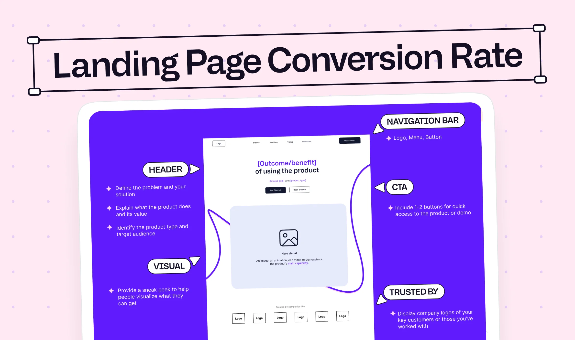
A landing page is a web page built to fulfil one specific goal, like getting a signup, a demo booking, or a purchase. Unlike a full website, it can skip (if needed) navigation menus and links to other pages, because every extra path is a chance for a visitor to leave before taking that one action.
A website, on the other hand, has to serve many different visitors with many different needs at once. Someone might be comparing pricing, someone else might be reading a case study, and someone else is just trying to find your contact information. A website's job is to support all of those journeys at the same time, not just one.
| Attribute | Landing page | Website |
|---|---|---|
| Primary goal | One specific action (signup, purchase, demo) | Multiple goals across different visitor types |
| Navigation | Minimal or none | Full menu, footer links, search |
| Number of CTAs | One, repeated down the page | Several, based on page and visitor journey |
| Typical use case | Ad campaigns, product launches, lead generation | Ongoing brand presence, multi-page journeys |
| Example | A PPC page for "Webflow development for SaaS" | A full company site with home, pricing, and blog pages |
4 website design principles every landing page should follow
Before you open a design tool, it helps to know that a landing page design is not a separate discipline from website design. It uses the same foundational principles, just with fewer places to hide a weak decision.
Visual hierarchy and directing the eye
People scan a page before they read it, so your layout needs to guide their eyes to the right place first. A strong hierarchy usually moves from headline, to supporting copy, to the call to action, to a supporting visual. When every element competes for attention at once, visitors don't know where to look. Confused visitors almost never convert.
Contrast and focal points
Contrast is what makes your call to action impossible to miss. A button with strong contrast against its background pulls the eye immediately, a pattern researchers call the Von Restorff effect, since distinctive items get noticed and remembered more than ones that blend in. Use contrast deliberately, and save it for the one action you actually want a visitor to take.
Alignment and proximity
Alignment keeps a page feeling organized, so avoid mixing left, center, and right alignment within the same section. Proximity works alongside it. Related elements, like an icon and its description, should sit close together, while unrelated elements need enough space between them to read as separate ideas.
Consistency across every section
Repetition, in a design sense, means your fonts, colors, and button styles look the same from the top of the page to the bottom. This is what makes a page feel like one coherent experience rather than several unrelated sections stitched together. It's also one of the first things a visitor notices, even if they couldn't tell you exactly why a page feels trustworthy.
These are website design fundamentals in the truest sense. A landing page is simply where you apply them with the fewest distractions in the way.
How to design a landing page: an 8-step workflow
Once you know the fundamentals, the actual process of designing a landing page follows a predictable order. Skipping steps is usually where the mistakes come from, so here's the sequence we walk clients through.
- Define one conversion goal: Before anything else, decide what single action you want a visitor to take, whether that's booking a demo, starting a trial, or making a purchase. Every later decision on the page should support this one goal, so if a section doesn't serve it, cut it.
- Know your audience before you open a design tool: Understand what your visitor already believes, what they're worried about, and what would convince them to act. Skipping this step is why so many landing pages read like a company talking about itself instead of speaking to the visitor's actual problem.
- Wireframe the structure before adding visuals: Sketch out the order of your sections in grayscale first: hero, problem, solution, proof, and call to action. If the wireframe makes sense without any color or imagery, the layout is doing its job, and you can move on to visual design with confidence.
- Write the hero first: Your hero section needs a headline that states the outcome you offer, a subheadline that clarifies who it's for, one clear call to action, and a supporting visual. Most visitors decide whether to keep reading within seconds of arriving here, so this section carries more weight than any other on the page.
- Build supporting sections in order: After the hero, walk the visitor through the problem you solve, how you solve it, and proof that it works, in that order. Each section should answer exactly one question, like "can I trust this company" or "has this worked for someone like me," before moving to the next.
- Apply your website design system for consistency: Use the same typography scale, color palette, and spacing rules across every section of the page. This keeps the page feeling like one connected experience instead of a set of mismatched blocks.
- Optimize for mobile: Design vertically rather than shrinking a desktop layout, since roughly 57 percent of internet traffic now comes from mobile devices. Buttons need enough space to tap comfortably, and text should stay readable without visitors needing to zoom in.
- Hand off to development and test: Once the design is ready, get it built accurately, then run it through real testing, whether that's an A/B test or simply watching a few people use it. A landing page is rarely finished after the first version goes live, and treating it as ongoing work is what actually improves conversions over time.
Landing page best practices for 2026
Once the process is in place, these are the practices that separate a page that looks fine from one that actually converts.
Lead with benefits, not features
A feature describes what your product has, while a benefit describes what that feature actually does for the person using it. Saying your software includes automated reporting is a feature. Saying it saves your team six hours a week is a benefit, and benefits are what actually persuade someone to act.
Use social proof visitors actually trust
Testimonials, case studies, and client logos all work because of the same psychological effect: people trust the choices other people have already made. Testimonials with real names and photos feel more credible than a generic quote. Client logos borrow authority from companies your visitors already recognize. Case studies with real numbers work best of all, since a specific result is harder to dismiss than a vague compliment.
Keep the page to one goal and one CTA
Repeat your call to action at a few points down the page rather than adding a second, competing one. A page offering "book a demo," "start a trial," and "contact us" at the same time usually converts worse than a page asking for one thing clearly.
Write for a 7th-grade reading level
Simple, specific language almost always outperforms vague, impressive-sounding copy.
| Weak copy | Stronger copy |
|---|---|
| Innovative platform | Automate customer onboarding |
| Best solution | Reduce reporting time by 80 percent |
| Great experience | Ship a page in days, not weeks |
| Learn more | See the redesign |
Design for accessibility from the start
About one in four adults in the US lives with some form of disability, according to CDC data, so accessible design is not a niche concern. A few practical steps cover most of the basics:
- Keep text and background colors at a contrast ratio of at least 4.5 to 1, per W3C's WCAG 2.2 guidelines, so text stays readable for people with low vision or color blindness.
- Make touch targets at least 24 by 24 pixels, so buttons and links are easy to tap accurately on a phone.
- Use plain, direct language, since it helps every visitor, not just someone using a screen reader or unfamiliar with your industry's terms.
- Add visible focus outlines so visitors moving through the page by keyboard can always see where they are.

Examples of well-designed landing pages
Seeing these principles applied helps more than reading about them in the abstract.
Linear
Linear's landing page uses a short headline, one product visual, and a single call to action, with almost no competing color or copy. The minimalism is deliberate. Removing distraction lets the product itself do most of the persuading.
.webp)
PostHog
PostHog leans into a bold, personality-driven value proposition and developer-focused copy, including a mascot that shows up throughout the page. Speaking directly in the tone its technical audience already uses builds trust faster than generic corporate language ever could.
.webp)
Stripe
Stripe takes a complex product and simplifies it through layout and illustration rather than long blocks of text. Breaking a technical offering into small, visual sections makes it approachable without dumbing down what the product actually does.
.webp)
Designing landing pages by business model
The principles covered so far apply everywhere, but who you're selling to changes which ones deserve the most attention. A B2B buyer and a B2C shopper are evaluating very different things before they act, so the design has to reflect that.
B2B SaaS
- Use real product screenshots, not abstract stock photos, since buyers want to see what they're actually signing up for before they book a demo.
- Show integrations with tools they already use, like Slack, HubSpot, or Salesforce, since compatibility often decides whether a tool gets shortlisted at all.
- Lead with outcomes, not features. B2B buyers are evaluating risk as much as value, and a clear result is easier to justify internally than a feature list.
- Include a case study with real metrics. A named client with a specific result builds more trust than a generic testimonial.
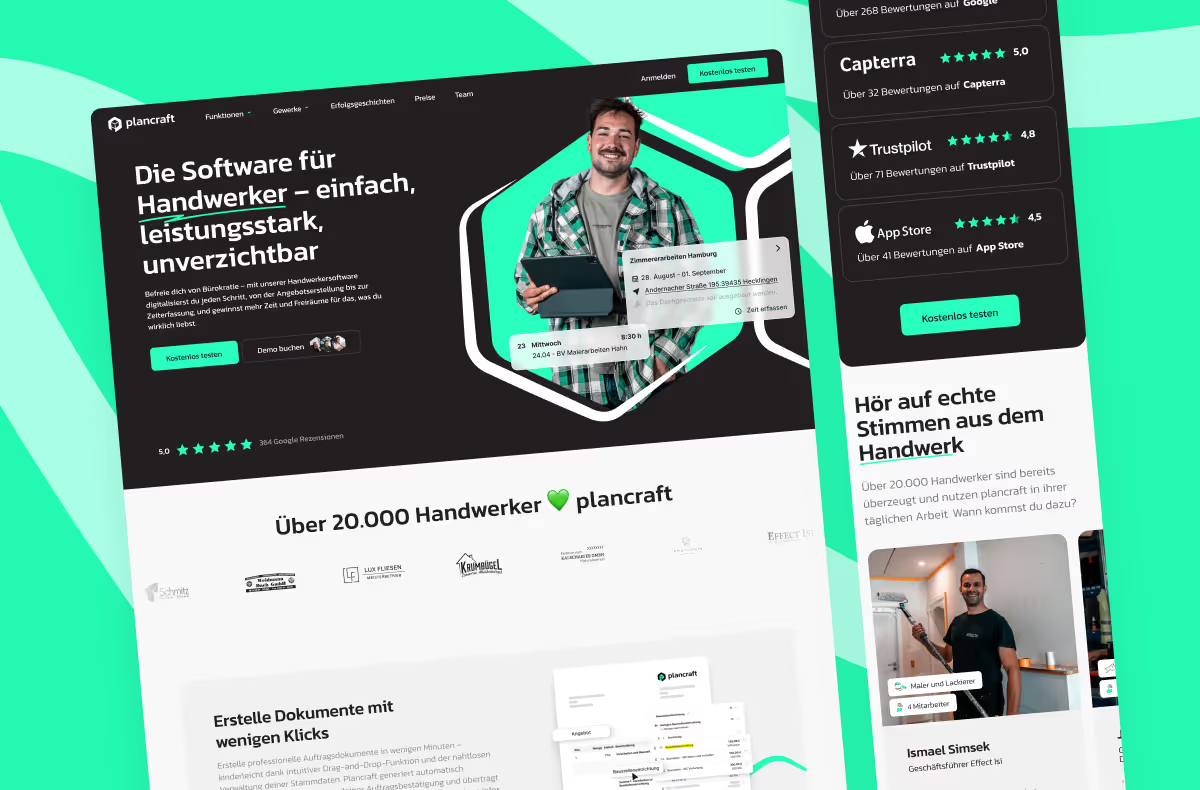
Plancraft is the perfect example of all these golden rules.
B2C ecommerce
- Let large, high-quality product photography carry the page, since ecommerce visitors decide with their eyes first.
- Keep copy short and benefit-driven. Emotional language about the outcome usually outperforms detailed specifications for most consumer purchases.
- Feature reviews prominently, ideally with star ratings and real photos, since social proof drives ecommerce conversions more than almost anything else.
- Highlight the offer clearly, whether that's a discount, free shipping, or a limited-time bundle, since urgency and value both matter here.
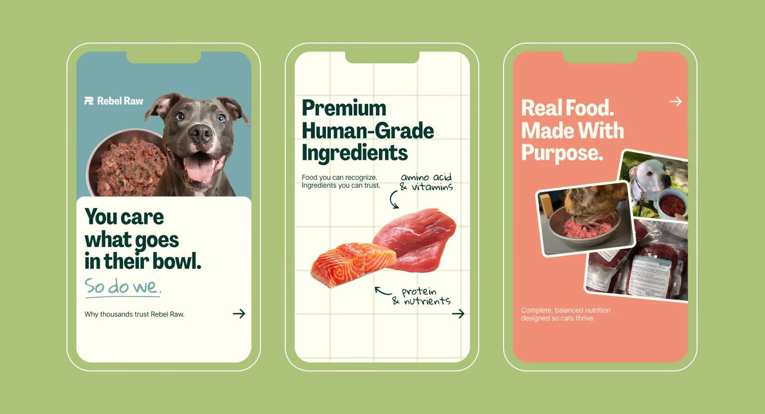
magier designed the website and web app of Rebel Raw, a dogfood brand using all these rules.
Service and agency businesses
- Lead with a case study or a specific result, since visitors are buying expertise, not a product they can preview directly.
- State the outcome in your headline, not the capability. "Websites that generate qualified pipeline" persuades more than "we build websites."
- Show real client logos and testimonials to establish credibility before a visitor ever speaks with your team.
- Keep the page focused on one next step, like booking a call, rather than offering several different ways to get in touch.
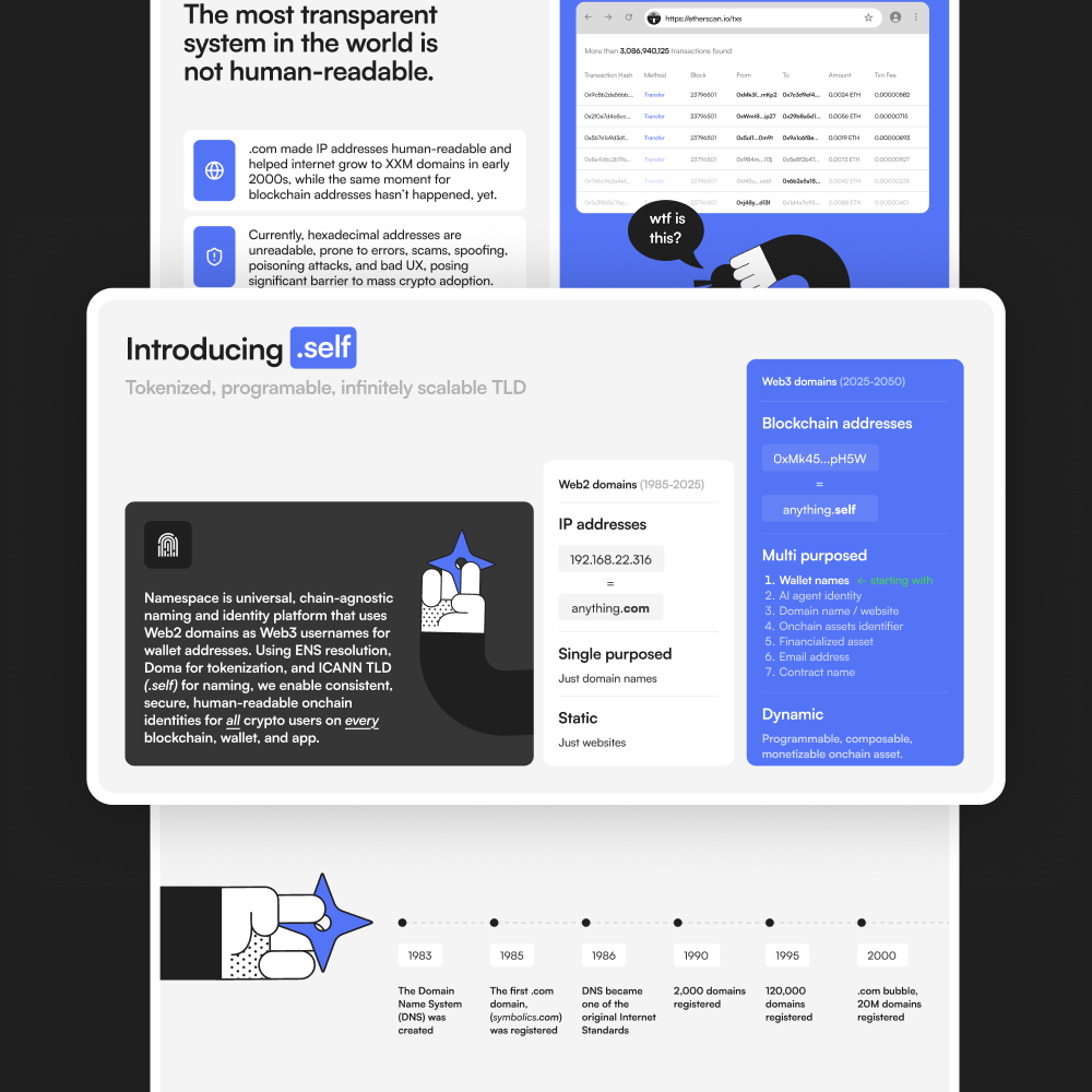
Namespace is a good application of all these principles.
Healthcare
- Prioritize clarity over creativity. Visitors are often anxious, so plain, direct language builds more trust than clever copy.
- Show real providers, including credentials and specialties, rather than generic stock photography.
- Make booking visible throughout the page, since removing friction from scheduling is often the single biggest lever here.
- Lead with patient reviews and outcomes to reassure a visitor who may be nervous about the decision ahead of them.
Fintech
- Lead with security signals, like compliance badges or encryption standards, since trust is the primary barrier to conversion.
- Show the product early, ideally a real dashboard view, so visitors can picture themselves using it.
- Keep the page simple and uncluttered. Complexity reads as risk in a category where visitors are already cautious about handing over financial information.
- Use enterprise trust signals, like customer logos or usage numbers, to reassure visitors evaluating a new financial tool.
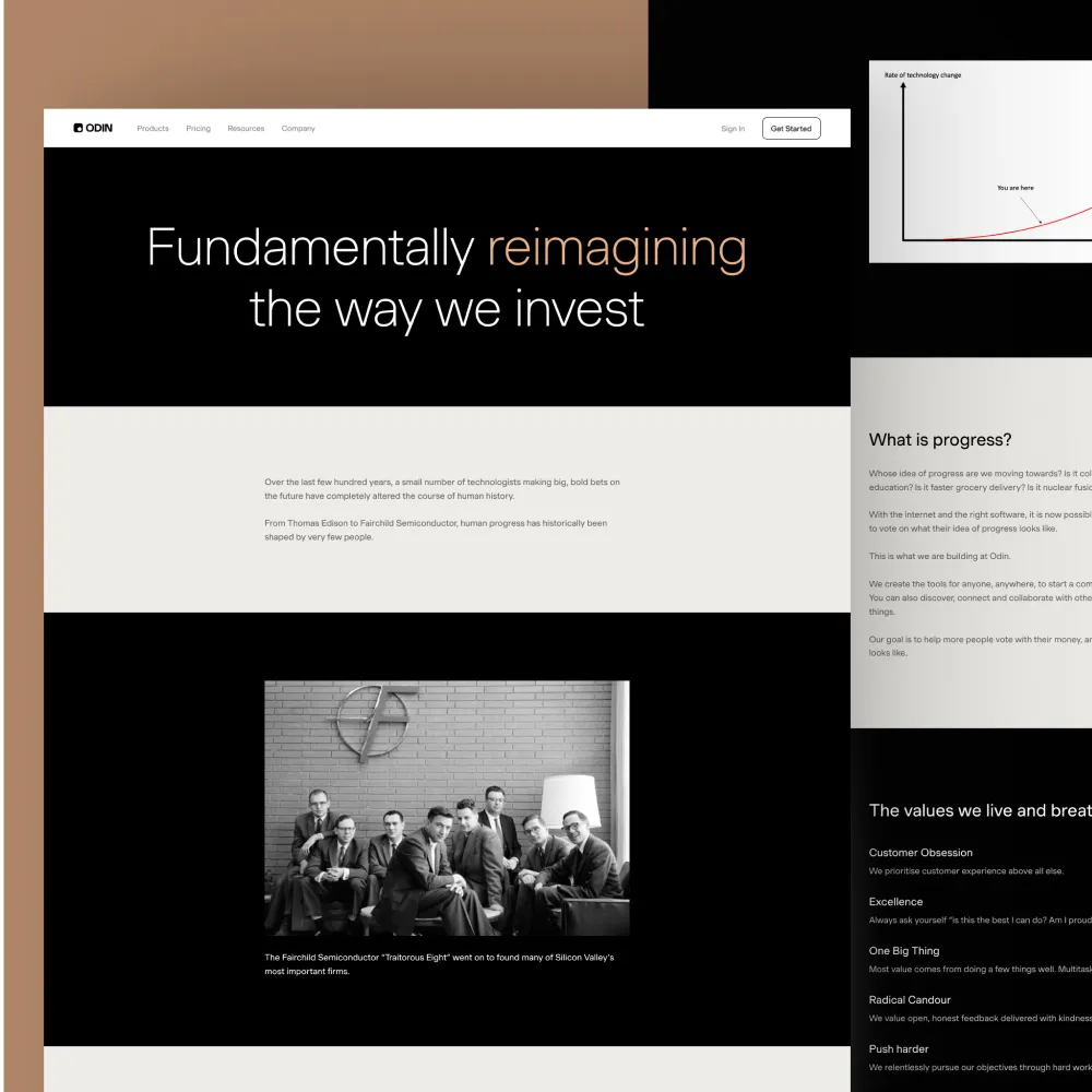
Here's another perfect example of fintech website design. This is our client, Odin.
Designing landing pages by use case and page intent
The principles above stay the same no matter what kind of page you're designing. What changes is which principle you lean on hardest, depending on the page's purpose.
| Page type | Primary purpose | What to prioritize |
|---|---|---|
| Home page | Orient any visitor, whoever they are | Clear value proposition above the fold, paths to every key page |
| Pricing page | Remove the final hesitation before a decision | Clear plan comparison, FAQ, visible guarantees |
| About us page | Build trust with an already-interested visitor | Team credibility, honest story, social proof |
| Contact page | Make it effortless to reach you | Minimal form fields, multiple contact options |
| Blog or resource page | Earn trust over time, not immediate conversion | Scannability, clear headings, a soft CTA |
| Product or campaign landing page | Convert a visitor who arrived with one intent | Single CTA, benefit-led copy, minimal navigation |
Home page
A home page has to work for a visitor who could be anyone, so it carries a different job than a landing page built for one campaign.
- Answer what you do, who it's for, and why you're different, all within the first screen, since a home page visitor hasn't arrived with the same single intent a landing page visitor has.
- Link to every key page, like pricing, product, and case studies, within the first screen or two of scrolling.
- Keep navigation to 5 to 7 items, so visitors aren't choosing between more options than they can reasonably compare.
Pricing page
By the time someone reaches your pricing page, they're close to deciding, so the job here is removing the last bit of hesitation.
- Use a comparison table so visitors can scan plans at a glance instead of reading through paragraphs of description.
- Add an FAQ addressing common objections, like cancellation policy, contract length, or what happens after a trial ends.
- Show a guarantee or trial option to lower the perceived risk of committing.
About us page
A visitor reading your about us page is already interested and wants to know who's actually behind the product.
- Tell an honest story rather than a promotional one, since this page is where trust either solidifies or falls apart.
- Feature real team members and credentials instead of a generic mission statement.
- Include social proof, like press mentions or client logos, to reinforce credibility already built elsewhere on the site.
Contact page
A contact page serves one purpose: making it effortless for a ready visitor to reach you.
- Keep the form to only the fields you truly need, since every extra field is a reason to abandon it.
- Offer more than one way to get in touch, like email, phone, or live chat.
- Set expectations for how quickly you'll respond, so visitors aren't left guessing.
Blog or resource page
Unlike a landing page, a blog or resource page isn't chasing an immediate conversion. It's building trust and search visibility over time.
- Use short paragraphs and clear headings so visitors can scan rather than read start to finish.
- Include a soft call to action rather than a hard sell, since pushing too early undermines the trust this page is meant to build.
- Link to related resources or services naturally within the content, rather than interrupting the reading experience.
Product or campaign landing page
This is the page type most people mean when they say "landing page," and everything covered earlier in this guide applies most directly here.
- Keep the page to a single call to action, repeated at a few key points as the visitor scrolls.
- Match the headline to the ad or campaign that brought the visitor here, so the message feels continuous.
- Remove navigation and links that don't support the one goal, since every extra path is a chance to lose the visitor before they convert.
From design file to live page: handing off to development
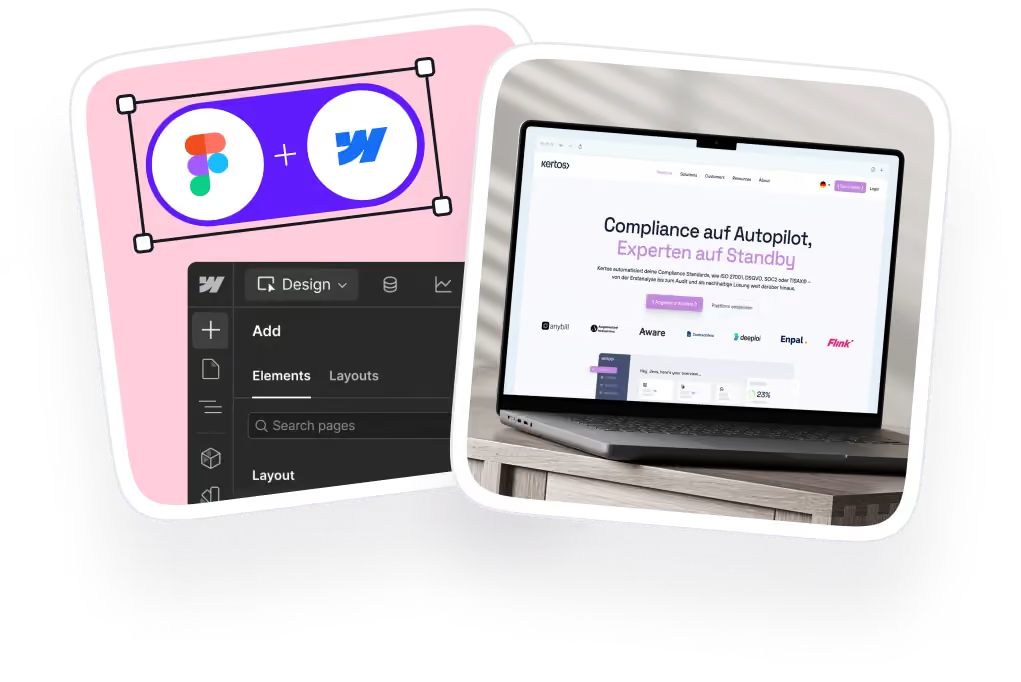
A polished Figma file and a working, live page are not the same thing. Design tools don't always translate cleanly into production code, and teams without a developer on hand often end up stuck between a finished design and a page that never actually ships.
Handing a beautifully designed file to someone who's never built a production page before is a bit like handing an architectural blueprint to someone who's never poured concrete. The vision doesn't always survive the translation.
Webflow has become a popular answer to this problem, since its visual building blocks let non-developers assemble and edit sections without needing an engineer for every small change. Let's be honest, that flexibility is exactly why so many teams choose it over a fully custom build.
"A Webflow build should let a marketer fix a typo without opening a support ticket. If your team still needs a developer for that, the handoff wasn't actually finished."

That's exactly what magier's Webflow development service exists to fix. Our developers, all Webflow Premium Partner certified, handle the handoff from Figma to a live, editable Webflow build, so your design doesn't lose fidelity and your team can still make small edits later without waiting on a developer for every request. When we relaunched a landing page for Jupus, it booked more than 40 demo calls in the first two days. For plancraft, we developed more than 30 individual pages and migrated over 200 URLs without disrupting their existing SEO, work that also drove a 20 percent increase in conversions.
If your team is already comfortable in Figma and Webflow, building the page yourselves is a reasonable option. If you're stretched thin, or the handoff keeps stalling before anything ships, that's usually a sign it's worth bringing in dedicated help rather than losing more time to trial and error. See how magier handles Webflow development.
{{cta}}
Common landing page design mistakes to avoid
Even with a solid process, a few recurring mistakes quietly hurt conversions more than anything else on this list.
- Leading with features instead of outcomes: Listing every feature your product has is a bit like a job candidate reading their entire resume out loud instead of just answering the question they were asked. Visitors buy results, not a list of specifications.
- Using generic stock imagery: A real product screenshot or an honest photo builds more trust than a stock photo of people smiling at a laptop, since visitors can tell the difference even if they can't say how.
- Adding too many competing calls to action: A page with three competing calls to action is a lot like a waiter reciting five specials before you've even opened the menu. You end up remembering none of them.
- Hiding pricing or proof: If you're asking someone to book a demo or start a trial, showing enough evidence upfront to justify that ask matters more than making them dig for it.
- Writing walls of text: Short paragraphs with one idea each are easier to scan, and scanning is how most visitors actually read a landing page.

Getting there
Designing a landing page well comes down to applying solid website design principles to one specific goal, then following through on every section with the reasoning behind it, not just the look of it.
None of this happens automatically. Getting from a wireframe to a tested, converting page takes real design and development time, especially without a dedicated team already in place. That's exactly what magier's combined design and Webflow subscription is built for: one subscription, a full team of designers and developers, unlimited revisions, and a 48-hour turnaround per task. See how magier covers both design and Webflow, or book a free demo if you'd rather talk it through first.
If you're still deciding whether you need a landing page or a full website, start with the comparison table near the top of this guide. If you already know what you're building, go straight to the step-by-step process and start there.
{{cta}}
FAQ
Define your goal, understand your audience, wireframe the structure, then design the hero section before building out supporting sections. Apply a consistent design system throughout, optimize for mobile, and test the page once it's live.
Start by defining one specific goal for the page, then build your hero section around a clear headline, one call to action, and a supporting visual. From there, add proof and benefits in a logical order, keeping every element focused on that single goal.
AI tools can generate a starting layout, draft copy, and even build a basic page from a text prompt. The result usually still needs human judgment to fix generic copy, adjust hierarchy, and match your actual brand and audience.
No, a homepage is part of a larger website and has to serve many types of visitors and goals, while a landing page is a standalone page built around one specific action.
A good landing page has one clear goal, a strong hero section, benefit-led copy, real social proof, and a single call to action repeated at the right points. It also loads quickly and works just as well on mobile as it does on desktop.
A simple landing page can take anywhere from a few days to two weeks, depending on how much research, copywriting, and testing goes into it. More complex pages with custom illustration or animation typically take longer.
The 7 C's are commonly listed as Content, Customization, Community, Communication, Connection, Commerce, and Context. In the context of SEO, the most relevant are Content (quality and structure), Context (search intent alignment), and Connection (internal linking and external linking).
Most landing page builders let you swap fonts, colors, images, and layout blocks without touching code. Focus your customization on matching your brand and reinforcing your one conversion goal, rather than adding extra sections just because you can.
.avif)