How to Design a Landing Page Using Claude Design: A Step-by-Step Guide
A few weeks ago, we got on a discovery call with a prospect who needed a landing page redesign. He casually mentioned that he had spent almost an entire week trying to do it himself using Claude Design. He went in thinking AI-powered design would be straightforward, and came out humbled by how much he did not know.
The truth is that Claude Design's default output scores between 38 and 45 on a 100-point quality rubric that practitioners use to evaluate landing page effectiveness. A properly executed workflow raises that to 68 or 78. That gap is the reason some Claude Design outputs get published and some get quietly scrapped. And almost nobody is writing about how to bridge it.
Claude Design is Anthropic's visual creation workspace, separate from Claude Code and from the main chat interface. It launched in April 2026 and has already reached 222,000 monthly global searches, which tells you that adoption is outpacing useful instruction by a significant margin. Most people who open it for the first time generate something that looks passable, assume they are done, and wonder later why the page is not performing as expected.
We wrote this guide to cover everything founders, marketers, and product managers need to know about designing a landing page with Claude Design, whether you are building a quick mockup or a fully polished page ready to ship. No design experience, no coding knowledge required.
Here is what this guide covers:
- What Claude Design is, and how it differs from Claude Code and Figma
- How it compares to other AI design tools like v0, Framer AI, and Lovable
- What to prepare before you open Claude Design for the first time
- How to set up a design system so your output does not look generic
- How to write a first prompt that actually produces something useful
- How to refine output using the Tweaks panel and on-canvas tools
- The human quality pass that most people skip, and why skipping it is costly
- How to get from prototype to a live page using three different deployment routes
- The most common mistakes and how to avoid them
{{freebie}}

What is Claude Design?
Claude Design is Anthropic's dedicated visual creation workspace, separate from the main Claude chat interface. It gives you a canvas where you can describe what you want to build, feed in brand assets, and have Claude generate a designed, coded page you can iterate on and eventually deploy.
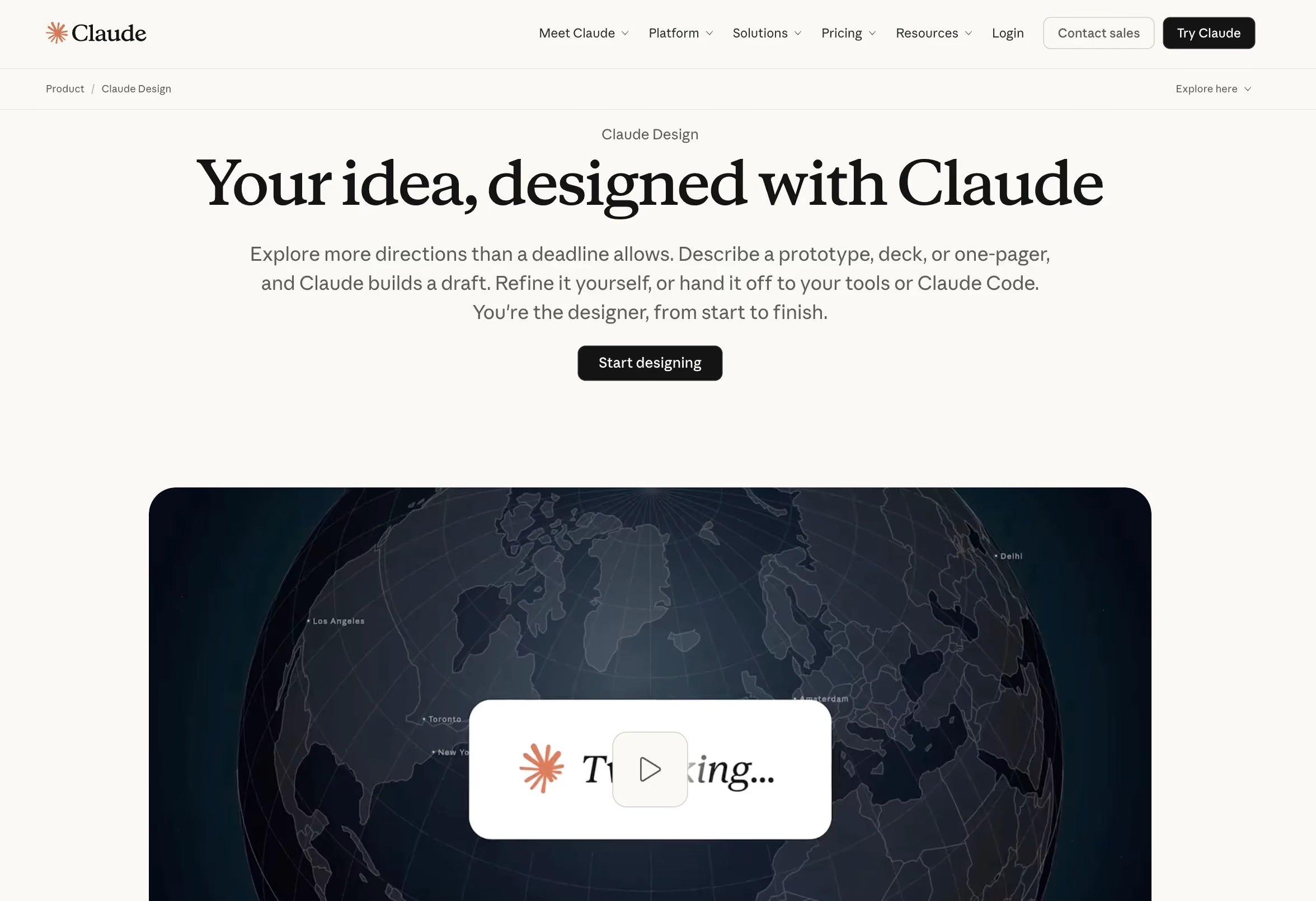
It is worth being clear about what Claude Design is not, because there is real confusion about this in the market. It is not a replacement for Figma. It is not the same as Claude Code, which is Anthropic's command-line tool for writing and deploying code. And it is not the same as Claude Artifacts, which generates inline interactive content inside a chat window. Claude Design sits in its own lane: it is the bridge between "I have an idea" and "I have a working prototype I can show someone."
The clearest way to understand where Claude Design is powerful and where it is limited is to compare it directly against what a traditional design tool does:
Think of Claude Design as a UX strategist, copywriter, and front-end developer working from your brief. It is not a graphic designer producing bespoke visual assets.
One more piece of context worth knowing: when Mike Krieger, the co-founder of Instagram who later joined Figma's board, left Figma to join Anthropic as Chief Product Officer, it was not a coincidence. Claude Design's April 2026 launch wiped 7% off Figma's stock value in a single day. The competitive stakes here are real, and they explain why Claude Design has been built to do as much of the design workflow as possible without requiring a professional designer.

Claude Design vs. other AI design tools
Claude Design is not the only AI tool making this claim. Here is how it compares to the main alternatives across five dimensions that actually matter:
Claude Design's main advantage over v0 and Lovable is that it combines UX strategy, copy, and code generation in one workflow, rather than starting from a design prompt and generating code only. Its main limitation compared to Framer AI is that Framer's output is already optimized for a specific publishing platform, so the path to live is more direct for non-technical users. We will cover deployment options in detail in Step 4.
{{cta}}
What you need before you start using Claude Design
Before walking through the steps, it is worth being honest about the plan you need and who this workflow is actually designed for.
On plan access: Claude Design is available on the free tier, but with meaningful limitations on how many projects you can run and how much iteration you can do per session. The full workflow described in this guide, including the design system setup, prompt refinement, and export, works best on the Pro plan (approximately $20 per month). If you are on the free tier, you may hit session limits mid-workflow, which is frustrating when you are in the middle of a refinement pass. Two intensive design sessions can consume up to 58% of a weekly Pro plan limit, so it is worth knowing that going in.
On who this is for: This guide is written for founders, marketers, and product managers who need a working landing page and do not have a professional designer available right now. You do not need to know how to code. You do not need design experience. What you do need is a clear understanding of your product, your audience, and what you want visitors to do when they land on the page.
Before you open Claude Design, have the following ready:
- Your product name and a one-paragraph plain-language description of what it does
- Your target audience (be specific: "B2B SaaS founders at companies with 10 to 50 employees" is more useful than "businesses")
- Your primary conversion goal (book a demo, start a free trial, download a guide)
- Your main competitors (three to five names)
- Your key differentiator (what you do that they do not, in one sentence)
- Your logo file and brand guide PDF, if you have them
- Your current website URL, if one exists
- Three to five URLs of landing pages you admire, from any company
The last two items on that list matter more than most people expect. We will explain why in the next section.
Step 1: Set up your design system
If there is one Claude design skill worth developing before anything else, it is this one. For teams who have specifically searched for the Claude frontend design skill, this is exactly where that skill is applied. It is the context layer that determines whether Claude's frontend code output matches your brand or defaults to a generic template. Skipping the design system setup is the single most common reason output looks generic.
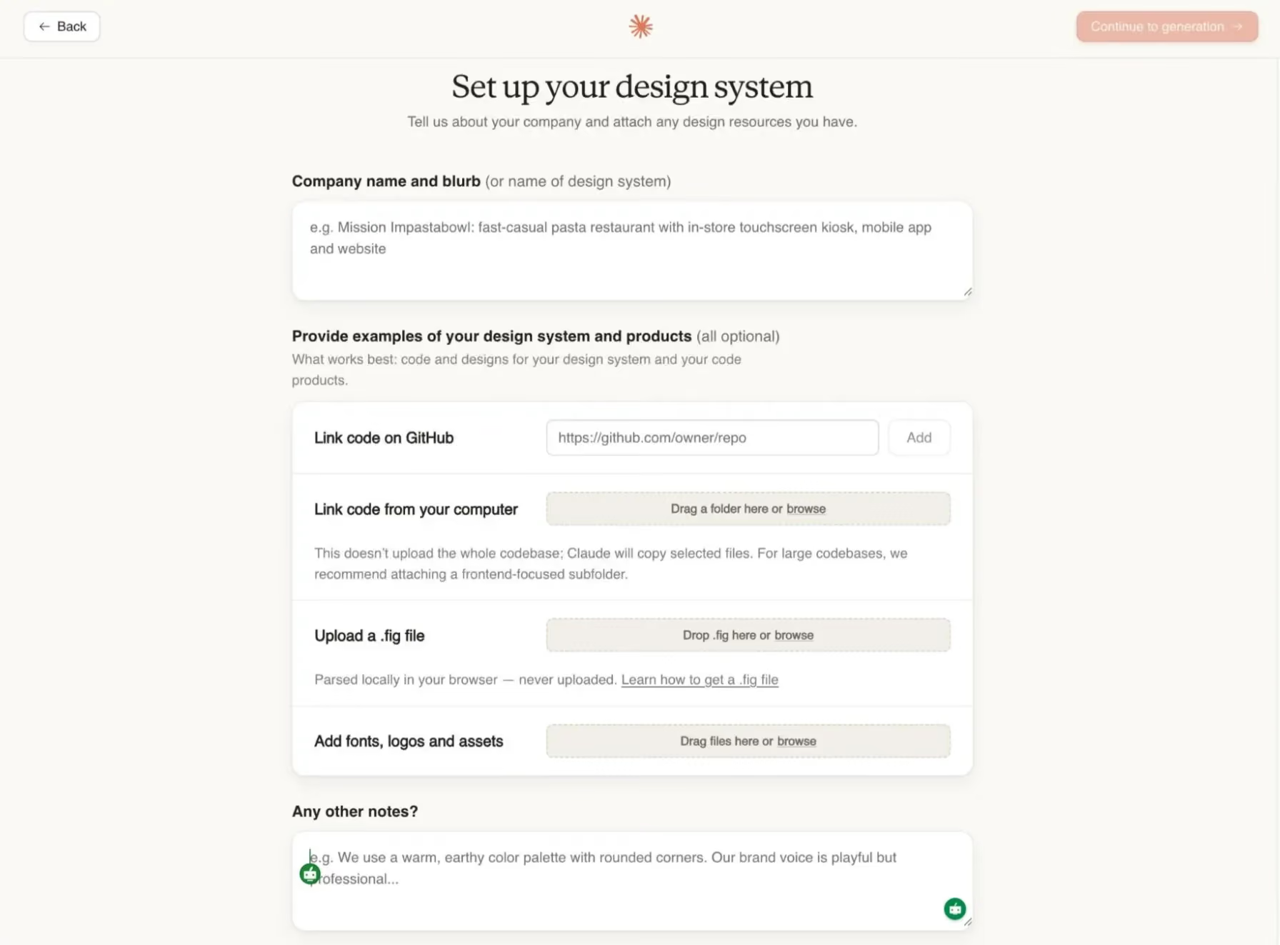
If you open Claude Design, type a brief description of your product, and hit generate without setting up a design system first, you will get something that looks like every other AI-generated landing page: clean, competent, and completely interchangeable with your competitors. The design system is how you give Claude persistent visual context. Without it, Claude is making visual decisions based on nothing. With it, Claude is making decisions based on your brand.
Here is how to set it up:
- Navigate to claude.ai/design and sign in with your Anthropic account.
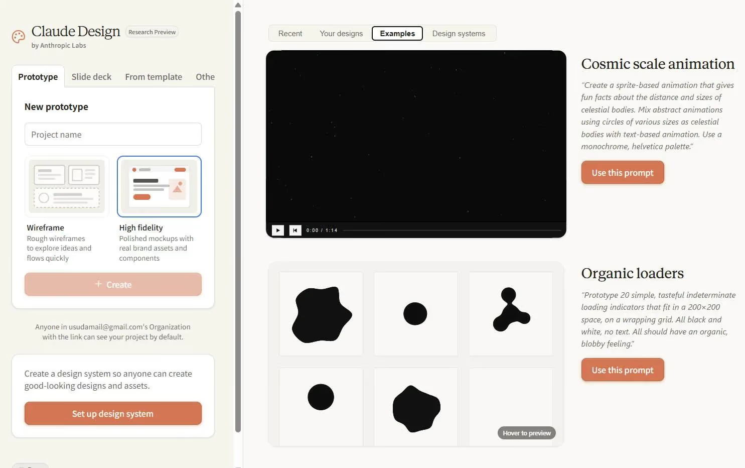
- Select the Design Systems tab from the left navigation panel.
- Click Create design system and enter your company name and a short product description (two to three sentences is enough).
- Upload your brand assets. This includes your logo file, your brand guide PDF if you have one, and any custom font files. If you do not have a brand guide, upload three to five screenshots of your current website or marketing materials so Claude has visual reference points.
- If you have a live website, paste the URL into the brand extraction field. Claude will automatically pull your existing color palette and typography from the site, which saves significant setup time.
- Add a brand voice note. This is a short text block (three to five sentences) describing the tone you want the page to use. Something like: "Direct and confident, without being aggressive. Speaks to senior operators who are skeptical of hype. Uses plain language and avoids jargon. Acknowledges that the problem is hard before offering the solution."
One additional step separates professional workflows from beginner ones: create a CLAUDE.md file or a saved brand brief note that you can paste into new sessions. Professional practitioners use design guideline documents that run to 300 lines or more, covering typography scale, spacing rules, color usage, component behavior, and copy tone. You do not need to start at 300 lines. Even a one-page brand brief that you paste at the start of each new session will dramatically reduce the quality degradation that happens when Claude starts a new project without context from your previous sessions.
Step 2: Write a prompt that actually works
The most common question people have after they figure out how to use Claude Design is why their output looks generic when someone else's looks publish-ready and unique. The answer is almost always the prompt. Most guides say "write a detailed prompt" and then show you an example of a vague prompt that produces mediocre output. The quality gap between a one-line prompt and a structured prompt is not small. Research from practitioners who have benchmarked Claude Design output systematically shows that default AI output scores between 38 and 45 on a 100-point quality rubric. A proper workflow raises that to between 68 and 78. Almost all of that gap lives in the prompt.
The reason the gap is so large is that Headline, Subheadline, and CTA copy together carry approximately 55% of a landing page's conversion weight. When you write a weak prompt, Claude generates generic copy for all three. When you write a structured prompt, Claude has enough context to make specific, differentiated choices.
Use this multi-slot prompt structure. Fill in every slot before you submit:
The Claude Design landing page prompt template
WHO: [Describe your target audience in one sentence. Include company size, role, and the specific situation they are in when they find your page.]
PROBLEM: [Describe the specific pain they are experiencing right now. What have they already tried? Why has it not worked?]
PRODUCT: [Name your product and describe in two sentences what it does and how it works.]
DIFFERENTIATOR: [What do you do that your main competitors do not? Be specific. Avoid generic claims like "easier" or "faster" unless you can quantify them.]
SECTIONS: [List the sections you want on the page in order. Example: Hero, Problem, How it works, Features, Social proof, Pricing, FAQ, CTA]
ACTION: [What is the single primary action you want visitors to take? One action only.]
CONSTRAINT: [Describe the visual style and tone. Example: "Clean and modern, lots of whitespace, professional but not corporate, no stock photography, direct and confident copy."]
Here is what a filled-in version looks like for a B2B SaaS design subscription:
WHO: Founders and heads of marketing at B2B SaaS companies with 10 to 100 employees who need consistent, high-quality design output but cannot justify the cost of a full-time senior designer.
PROBLEM: They are either waiting weeks for agency work, paying for inconsistent freelancers, or asking a developer to handle design tasks that are outside their skill set. They have tried design marketplaces and been burned by slow turnaround and poor quality control.
PRODUCT: magier is a design subscription for B2B SaaS companies. For a fixed monthly fee, clients get unlimited design requests, 48-hour turnaround, and access to a team of pre-qualified senior designers.
DIFFERENTIATOR: Unlike design marketplaces, every designer on magier has been vetted through a 50-point quality assessment. Unlike agencies, there are no project quotes, no scope negotiations, and no surprise invoices.
SECTIONS: Hero, Problem, How it works, Who it is for, Proof (logos + testimonials), Pricing, FAQ, CTA
ACTION: Book a free strategy call
CONSTRAINT: Clean, modern SaaS aesthetic. High contrast. Lots of whitespace. Direct, confident copy that does not use buzzwords. No stock photography. The tone should feel like a senior operator talking to another senior operator.
When you submit this prompt, Claude has enough context to make specific choices on every element of the page. When you submit "design a landing page for my design subscription service," Claude makes generic choices, because it has no other option.
How to provide visual inspiration
One of the most underused Claude Design prompting techniques is pairing your text brief with visual reference screenshots. Before or alongside your structured prompt, upload screenshots of landing pages whose layout and visual style you want Claude to reference. These do not need to be competitors. They can be any pages you admire visually. The goal is to give Claude a visual target, because text descriptions of visual style are inherently ambiguous.
Practitioners who consistently produce strong output from Claude Design collect 50 or more inspiration sections before starting a project. Tools like FigJam and Miro work well for organizing these. You do not need to go to that extreme for a single landing page, but uploading three to five strong reference screenshots alongside your prompt will meaningfully reduce the chance of generic output.
A short note alongside each screenshot goes a long way. Something like "I like how this hero uses negative space" or "I want my pricing section to feel this clean" gives Claude some context to work with.
Step 3: Review and refine the output
Once Claude generates your initial design, your first instinct will probably be to either accept it as it is or regenerate the entire page. Both are the wrong move. If you want to see Claude Design examples to benchmark your output against before you start refining, the Examples tab inside the main interface maintains a gallery of completed designs you can use as a calibration reference.
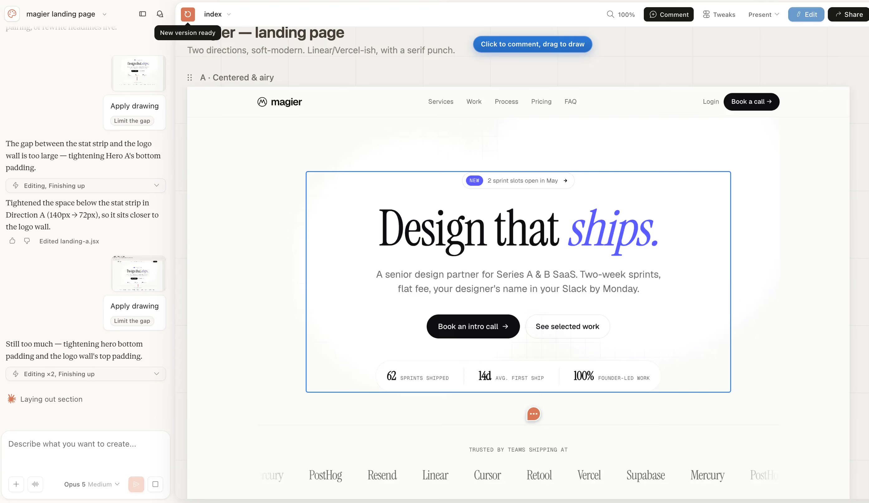
Accepting it wholesale means you are publishing AI-generated copy and placeholder social proof, which will hurt your conversion rate and affect your brand. Regenerating the whole page is also wasteful because it consumes a large portion of your session limit for changes that could have been made with a targeted edit. This is important to consider because, on the Pro plan, two intensive design sessions can consume nearly 60% of your weekly token allocation.
Claude Design gives you four specific tools for refinement. Use them in this order:
- Direct text editing on canvas: Click any text element on the canvas and edit it directly. Use this for small copy fixes, headline rewrites, and label changes. This is zero token cost.
- The Draw tool: Use this to circle or highlight elements on the canvas that need adjustment. After marking something, describe in the chat what you want changed about it. This is more precise than describing changes in text alone, because Claude can see exactly what you are pointing to.
- Inline comments: Leave comments on specific blocks by right-clicking and selecting the comment option. This works well when you want to flag something for a later pass rather than addressing it immediately.
- The Tweaks panel: This is the most underused tool in Claude Design. The Tweaks panel gives you sliders for spacing, font sizes, and other visual parameters. Adjusting these does not trigger a full page regeneration, which means you can make visual refinements without consuming session tokens. If your page feels too cramped or too sparse, use the Tweaks panel before you write a chat prompt asking Claude to fix it.
For chat-based iteration, use the "one question at a time" method. Instead of sending Claude a list of five things to fix, send one specific request and review the output before sending the next. This produces more predictable results and makes it easier to identify when something has gone wrong.
What to look for in a first pass:
- Does the hero headline make a specific claim, or does it sound like it could apply to any company in your industry?
- Does the page have a clear visual hierarchy, or does everything feel like equal weight?
- Are the section transitions logical, or does the page jump from topic to topic without flow?
- Does the copy use your actual differentiators, or has Claude defaulted to generic benefit statements?
If the output looks generic, the fix is almost always to go back to your prompt and add more specific information, not to regenerate with the same inputs.
The human quality check that shouldn’t be skipped
Let's be honest: Claude Design will get you to a well-structured, visually coherent landing page faster than any previous tool. But "well-structured and visually coherent" is not the same as "ready to publish." There is a pass you need to do by hand before this page goes live, and most people skip it because the output looks polished enough.
The reason this pass is not optional comes back to that 55% conversion weight figure. The three elements that carry more than half of your page's conversion performance are the Headline, the Subheadline, and the CTA. Claude Design will generate all three. They will be grammatically correct, logically structured, and completely forgettable. Rewriting them in your own voice, with your own specific claims, is the single highest-leverage action you can take after generation.
Here is the full human quality pass checklist:
- Rewrite every headline and subheadline: Not edit. Rewrite. The AI version gives you a structure to push against. Your version should make a specific, verifiable claim that a competitor could not honestly make.
- Rewrite every CTA: "Get started" and "Book a demo" are not CTAs. They are placeholders. Your CTA should name what the visitor is about to receive: "Book your free 30-minute strategy call" or "Start your first design request today."
- Replace every placeholder testimonial with a real one: If Claude has generated example social proof, delete it and replace it with quotes from actual customers, with their real names and company names.
- Remove or replace any logo bar that uses placeholder brand names: If you do not have enough real client logos for a logo bar, either remove the section or use a different social proof format.
- Add any micro-interactions or animations manually: Claude Design generates static pages. Any scroll-triggered reveals, hover states, or animated elements need to be added in post-production via Claude Code or directly in your deployment platform.
If you are spending 80% of your time on the initial build and 5% on the quality pass, you are allocating your effort backwards.
"If you are still treating Claude Design as a tool that replaces designers, you are going to be disappointed. If you treat it as a tool that removes the barrier between an idea and a prototype, it is genuinely one of the best things we have seen in years."

Step 4: Export and go live
This is the step that turns a Claude Design website concept into something real. Getting from a prototype to a live page is not one action, it is three different routes depending on your technical level and how permanent you need the result to be.
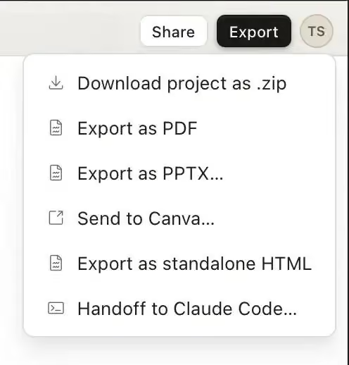
Here is how the three options compare:
OneClickLive
This is the fastest path. It deploys your Claude Design output as a live page on a temporary URL with no setup required. It works well for sharing a prototype with stakeholders or getting early feedback from users, but it is not a permanent production hosting solution. Use it when speed matters more than permanence.
GitHub Pages
This gives you a permanent page that you can connect to a custom domain. The process involves exporting your Claude Design output as standalone HTML, creating a GitHub repository, uploading the files, and enabling GitHub Pages in the repository settings. Each of these steps is well-documented and does not require you to write any code, but it does require you to be comfortable following technical instructions without hand-holding. If you only need to share the raw HTML with a developer rather than host it yourself, GitHub Gist is a faster option. It lets you paste the exported HTML into a public or private snippet that anyone with the link can access, without setting up a repository. This is the right route for most founders and marketers who want a permanent page without paying for a hosting platform.
Claude Code handoff
This is the production route. You export your Claude Design output as a structured implementation bundle and hand it off to Claude Code, which then builds the page as a full React or Next.js application with Tailwind CSS component styling. This is how design teams at companies using Webflow, Framer, or custom development stacks integrate Claude Design into a professional workflow. It requires either a developer or a technical founder comfortable working in a code environment, but it produces the cleanest, most maintainable output of the three routes.
If you are not sure which route to choose, use this simple test: if you need the page live today for testing purposes, use OneClickLive. If you need it live permanently and you are comfortable with basic GitHub operations, use GitHub Pages. If the page is going into a production product or needs to match a broader design system, use the Claude Code handoff.
Common mistakes to avoid with Claude Design
These are the five mistakes that show up most consistently in community discussions and practitioner post-mortems. Each one is fixable, but only if you know what to look for.
Skipping the design system setup
This is the most costly mistake because its effects are invisible until you compare the output to what a properly briefed session produces. When you skip the design system, Claude makes visual decisions based on nothing. The output will be clean and generic. The fix is not to iterate harder on a bad foundation. The fix is to go back and build the design system before you generate anything.
Writing a one-line prompt
"Design a landing page for my SaaS product" is not a prompt. It is a request for Claude to make every important decision on your behalf, with no information to guide those decisions. The multi-slot prompt template in Step 2 exists to prevent this. If your prompt is shorter than 150 words, it is probably missing information that Claude needs.
Publishing AI-generated copy without rewriting it
Claude Design's copy is structurally sound and completely generic. Headlines like "The smarter way to manage your workflow" and CTAs like "Get started for free" will not convert your specific audience. The human quality pass in Step 3 is not optional. It is where your conversion rate is won or lost.
Regenerating the whole page instead of using targeted tools
When something looks wrong, the instinct is to start over. On the Pro plan, full regenerations are expensive in terms of token consumption. Before you regenerate, ask whether the issue can be fixed with a direct canvas edit, a Draw tool annotation, or a Tweaks panel adjustment. Nine times out of ten, it can.
Not knowing when to move from Claude Design to Claude Code
Claude Design is a prototyping tool. It is not a production development environment. When your page needs complex animations, dynamic content, API integrations, or a component system that needs to be maintained over time, that is the point to move to Claude Code or to a professional development workflow. Trying to get Claude Design to do production-grade work leads to increasingly convoluted iteration cycles that waste session limits without producing better results.
When to use Claude Design vs. Claude Code vs. Figma
These three tools are often discussed as if they compete with each other. In practice, professional teams use all three in sequence. The question is not which one is better. The question is which one is right for the stage you are at.
The typical professional workflow looks like this: use Claude Design to build and validate the concept, use Figma for any collaborative review and component documentation that needs to happen with a larger team, and use Claude Code for production implementation. Claude Design eliminates the prototyping phase that previously required a professional designer. It does not replace what Figma and Claude Code do in the stages that come after.
v0 by Vercel, Framer AI, and Lovable each occupy adjacent spaces. v0 is strong for developer teams that want React component code fast. Framer AI is strong for teams already on the Framer platform who want to stay in one tool from design to publish. Lovable is strong for non-technical founders who want to go from idea to full application without touching code. Claude Design sits closest to Lovable in terms of accessibility, but with significantly stronger UX strategy and copy capabilities built into the workflow.
Final thoughts
Claude Design is the fastest path from a product idea to a working, designed landing page that exists right now. It removes the prototyping barrier that has historically required either a professional designer or weeks of Figma work. For founders, marketers, and operators who need to test ideas quickly, that matters a lot.
But the workflow in this guide is not a shortcut. The design system setup, the structured prompt, the human quality pass, and the deployment decision all require real effort and real decisions. Claude Design does not remove the thinking. It removes the technical execution barrier that previously stood between the thinking and the result.
If you want to use Claude Design for your next landing page, the best place to start is with the prompt template in Step 2. Fill in every slot before you open the tool. That single action will produce better output than anything else you do in the first session.
If your team needs landing pages built to a professional standard without managing the AI workflow yourselves, take a look at how magier works. We handle the design, the iteration, and the quality pass, with 48-hour turnaround, multiple revisions, and a fixed monthly fee. You can see our work here.
{{cta}}
FAQ
Claude Design is Anthropic's visual creation workspace, separate from the main Claude chat interface. It lets you describe a page you want to build, upload brand assets, and have Claude generate a designed, coded landing page you can iterate on and deploy.
Claude Design has a free tier, but it comes with session and project limits that make the full workflow described in this guide difficult to complete without hitting constraints. The Pro plan (approximately $20 per month) is the recommended starting point for anyone who wants to use Claude Design seriously for landing page work.
You can access Claude Design at claude.ai/design. You will need an Anthropic account. The Design tab is available on all plan tiers, though features and session limits vary by plan.
Yes. Claude Design generates HTML, CSS, and JavaScript automatically. You do not need to write or edit any code to produce a working prototype. Deployment via OneClickLive requires no technical knowledge at all. Deployment via GitHub Pages requires following step-by-step instructions but no original coding.
Claude Design is a visual creation tool focused on producing designed pages through a canvas-based interface. Claude Code is a command-line development tool for writing, editing, and deploying code in a technical environment. Claude Design is better for prototyping and page design. Claude Code is better for production implementation and ongoing development.
You can export your Claude Design output as standalone HTML for deployment on any hosting platform, as a PDF for presentation purposes, or as a structured implementation bundle for handoff to Claude Code.
Claude Design generates HTML and CSS output. This output can be imported into Webflow using Webflow's HTML import feature, though some manual adjustment is typically required. WordPress integration requires developer involvement to place the generated HTML into a theme or page builder. Claude Design is not a native plugin for either platform.
The single most effective action is building a thorough design system before generating anything, including uploading brand assets and writing a detailed brand voice note. The second most effective action is using the multi-slot prompt structure in Step 2 of this guide rather than a brief description. Generic output is almost always the result of insufficient input, not a limitation of the tool itself.
Claude Design does not carry context from one session to another automatically. This means that if you start a new project without providing brand context, Claude will make visual decisions without reference to your previous sessions. Creating a saved design system and a reusable brand brief note (or CLAUDE.md file) is the solution to this problem.
They serve different purposes. Claude Design is faster for getting to a working prototype from scratch and requires no design skills. Figma is better for collaborative design workflows, component libraries, and design handoff to development teams. Most professional teams use both: Claude Design for initial prototyping and concept validation, Figma for team collaboration and component documentation.
.avif)