Corporate Website Design: 10 Examples and Best Practices (2026)
It is surprising how easily corporate website design turns into a debate about colors and fonts. Most of the times, clients send a bunch of random websites that they like to the designers simply based on aesthetics. As a result, the homepage ends up looking trendy and nice, but does little for the buyer’s journey. Visitors cannot tell what the company does or what to do next. So they leave, and the site brings in no leads.
On the other hand, designing from scratch is equally hard, which is why learning from the best sites helps. In this guide, we list 10 of the best corporate websites in the industry and draw design lessons from each one, so you can apply them directly to your own site.
Here is what you will learn in this guide.
- What a good corporate website does
- Methodology we used to shortlist the websites
- 10 examples and what to copy from each
- Best practices for designing corporate websites
- A checklist to audit your site
- What to consider when you build in Webflow
{{freebie}}
How we chose these 10 websites
We built this list around one question. Which software companies have a homepage that works for a business that has already grown? A site that serves a large, expanding company has to explain a lot without confusing anyone, and that is the problem a growing SaaS team will face next.
So we picked companies that meet these criteria.
- SaaS or software platforms: Each company sells software to businesses, so the lessons carry over to a SaaS homepage.
- Strong revenue: Each has grown into an established business with significant revenue, which means its website has supported real sales over time.
- Sustained growth: Each has kept adding customers over several years and not for one season.
- Expansion: Each has added products, audiences, or markets, so its homepage has to explain more without losing the visitor.
- Strong inbound demand: Each attracts visitors and leads on its own through search, content, and word of mouth, so the site has to convert people who arrive without a sales call.
- Proof on the page: Each homepage shows named customers, numbers, or recognition, so we can point to evidence and not only design choices.
- Lessons that transfer: Each site gives at least two ideas that a smaller team can copy without a large budget.
This is an editorial list and not a ranking, and we reviewed each homepage on November 5, 2026. magier is a Webflow Premium Partner, and we included Webflow because it meets the same criteria.
{{cta}}
10 corporate website examples to learn from
The ten sites below sell B2B software or platforms, so their lessons map directly onto a SaaS homepage. We reviewed each homepage on November 5, 2026. Sites change often, so open each one live before you copy anything.
Workday
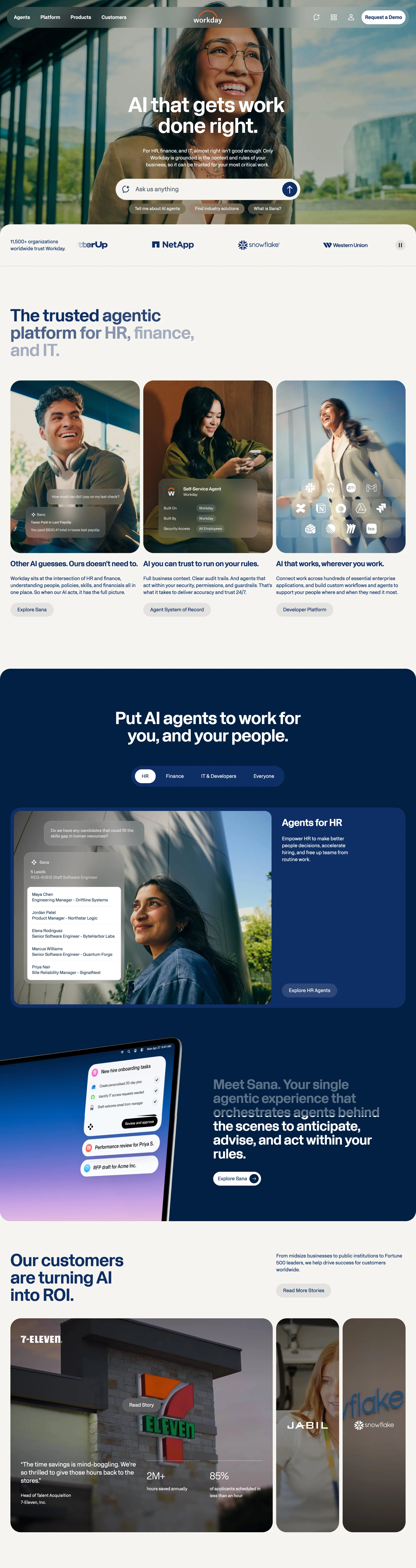
Workday sells HR, finance, and IT software to large organizations. Its homepage opens with a prompt box where visitors can ask a question or pick a suggested topic. Lower down, tabs split the pitch by team.
Category: Enterprise HR, finance, and IT software
Design lessons to derive:
- Name the buyer’s risk in the hero. The subheading says “almost right isn’t good enough” for HR, finance, and IT, which speaks to a buyer who cannot afford mistakes.
- Add a prompt box with suggested questions. Visitors can jump straight to what they want to know without reading the whole page.
- Use tabs by team. HR, Finance, IT and Developers, and Everyone each get their own use case.
- Give customer results their own section. The 7-Eleven story shows hours saved with a named brand.
Best for: Enterprise software sold to several departments.
Vercel
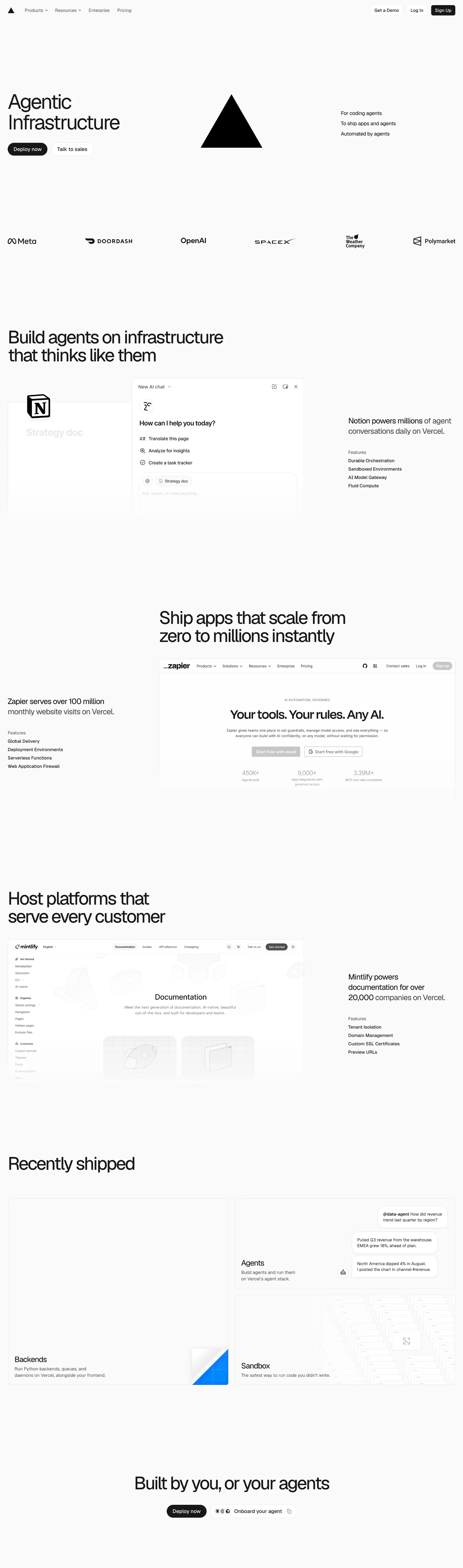
Vercel is a cloud platform for building and hosting web apps and AI agents. The page is black and white, with one large headline per section and one named customer under each. Each section ends with a short list of the features behind the claim.
Category: Developer cloud and infrastructure
Design lessons to derive:
- Pair each claim with a named customer and one usage fact. Notion, Zapier, and Mintlify each appear next to the claim they prove.
- Keep feature lists to four items. Technical readers can scan them in seconds.
- Give self-serve and sales separate buttons. “Deploy now” and “Talk to sales” let each buyer pick a path.
- Show a status line in the footer. “All systems normal” signals reliability without a single sentence of copy.
Best for: Developer tools and infrastructure companies.
Stripe
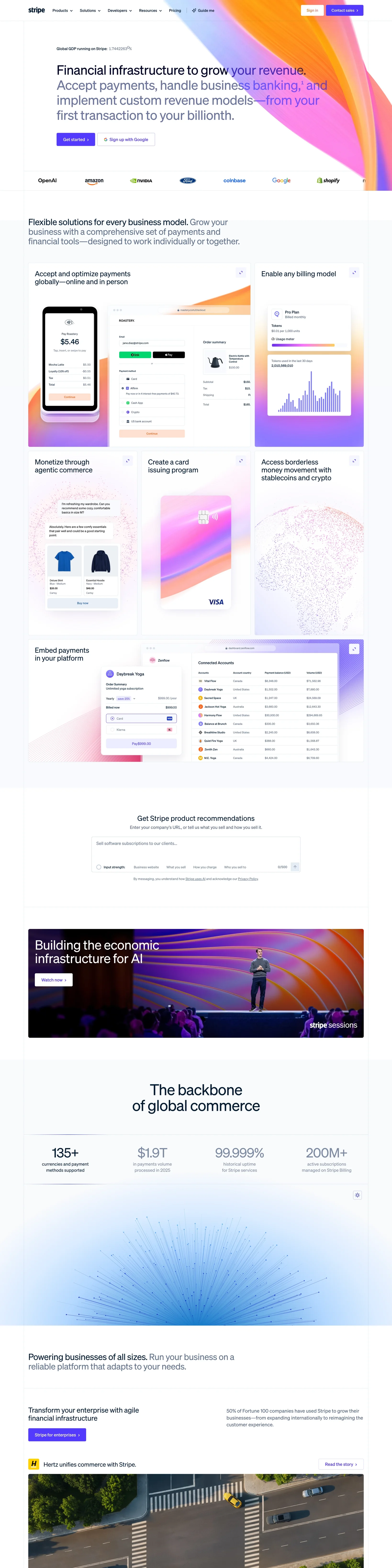
Stripe sells payments and financial tools to businesses of every size. Its homepage promises help from the first transaction to the billionth, then sorts visitors by need and by company type. The footer works as a map of products, industries, and developer resources.
Category: Payments and financial infrastructure
Design lessons to derive:
- Write one promise that covers small and large buyers. “From your first transaction to your billionth” makes a startup and an enterprise both feel included.
- Offer a product recommendation prompt. Visitors describe their business and get a suggestion, so they don’t have to read every product page.
- Sort visitors by company type. Enterprise, startup, and SaaS platform each get their own story and button.
- Use the footer as a map. Products, industries, developers, and support each have a column, which serves visitors who skip the homepage.
Best for: B2B companies with many products and audiences.
Datadog
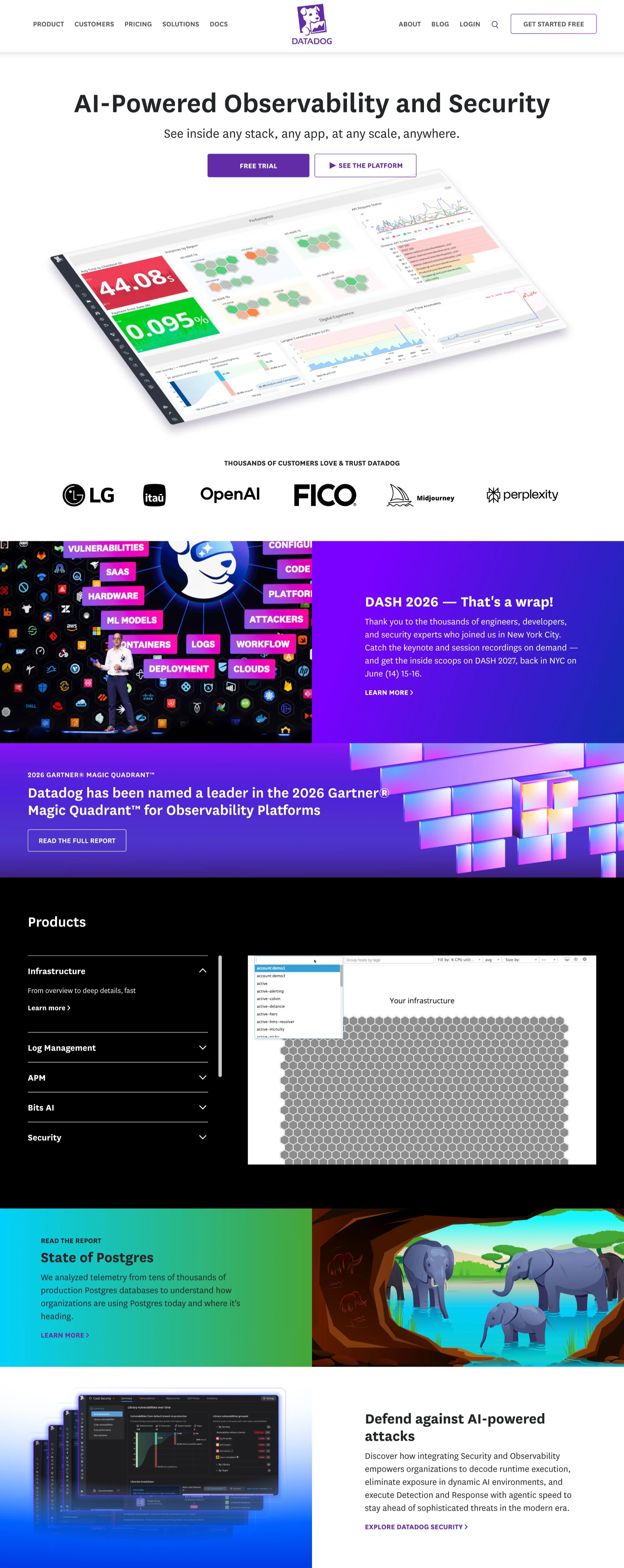
Datadog sells monitoring and security tools to engineering teams. A banner at the top announces its Gartner Magic Quadrant recognition, and the hero offers a free trial and a platform tour. Below that, an accordion lets visitors open each product and see a preview.
Category: Observability and security software
Design lessons to derive:
- Put third-party recognition at the very top. The Gartner banner builds trust before the headline is read.
- Offer two paths in the hero. “Free trial” suits hands-on buyers, and “See the platform” suits those who want a tour first.
- Let visitors explore products on the same page. The accordion shows a preview for each product, so nobody has to leave the homepage to understand it.
- Include content for other audiences. A research report, an event recap, and a careers section sit lower on the page.
Best for: Technical products with a long list of features.
Snowflake
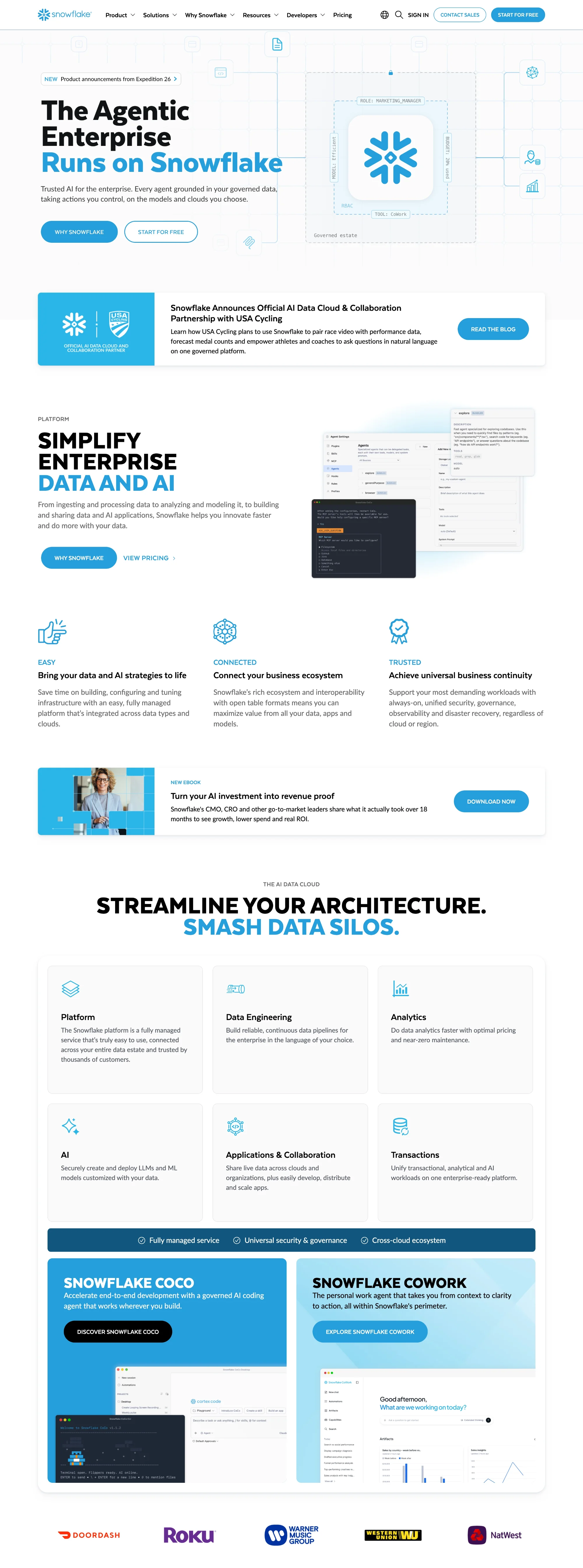
Snowflake is a data cloud platform. Its homepage opens with a one-line promise about enterprise AI running on governed data. It then explains the platform in three ideas and six product areas, followed by a customer story with numbers.
Category: Data cloud and AI platform
Design lessons to derive:
- Reduce a big platform to three words. “Easy,” “Connected,” and “Trusted” give visitors something to remember.
- Name the pain in a section heading. “Smash data silos” tells buyers what problem the platform solves.
- Show the product areas as cards. Six cards (Platform, Data Engineering, Analytics, AI, Applications, Transactions) show the full scope at a glance.
- Tell one customer story with numbers. Under Armour’s result of 30x more visibility into product margins gives the claims proof.
Best for: Platforms with a broad product suite.
Zendesk
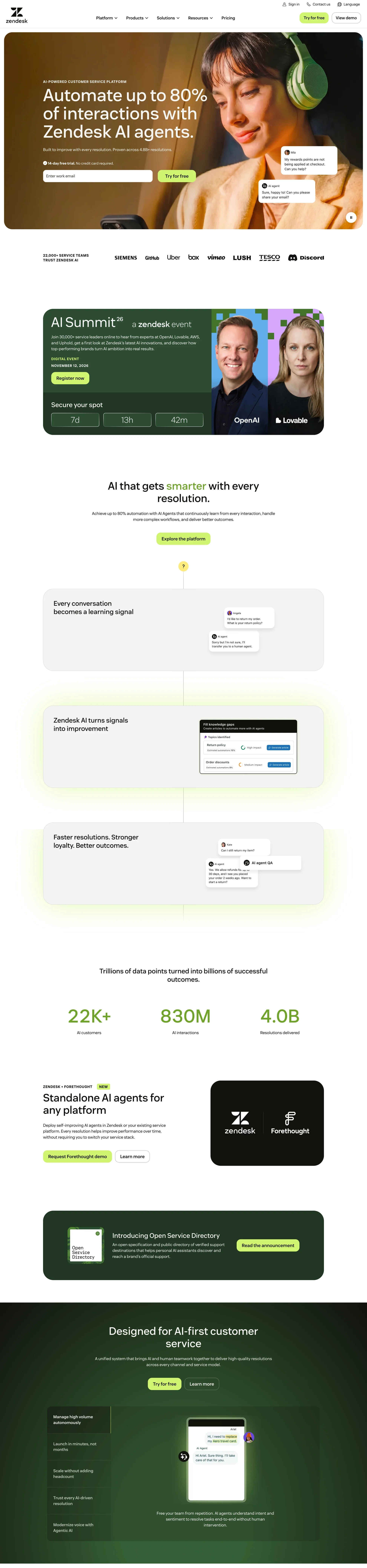
Zendesk sells customer service software. The hero puts a number in the headline and an email field with a free-trial promise right under it. Further down, stats, customer stories, pricing, and an ROI calculator are all linked from the homepage.
Category: Customer service software
Design lessons to derive:
- Put the outcome in the headline. “Automate up to 80% of interactions” tells buyers what they get before they read anything else.
- Make the first step small. An email field and a “no credit card required” line sit in the hero.
- Show scale in a stats band. Customers, interactions, and resolutions each get one number.
- Link pricing and an ROI calculator. Buyers can check the cost early, which removes a common reason to leave.
Best for: SaaS with a free trial and sales-led plans.
Intercom
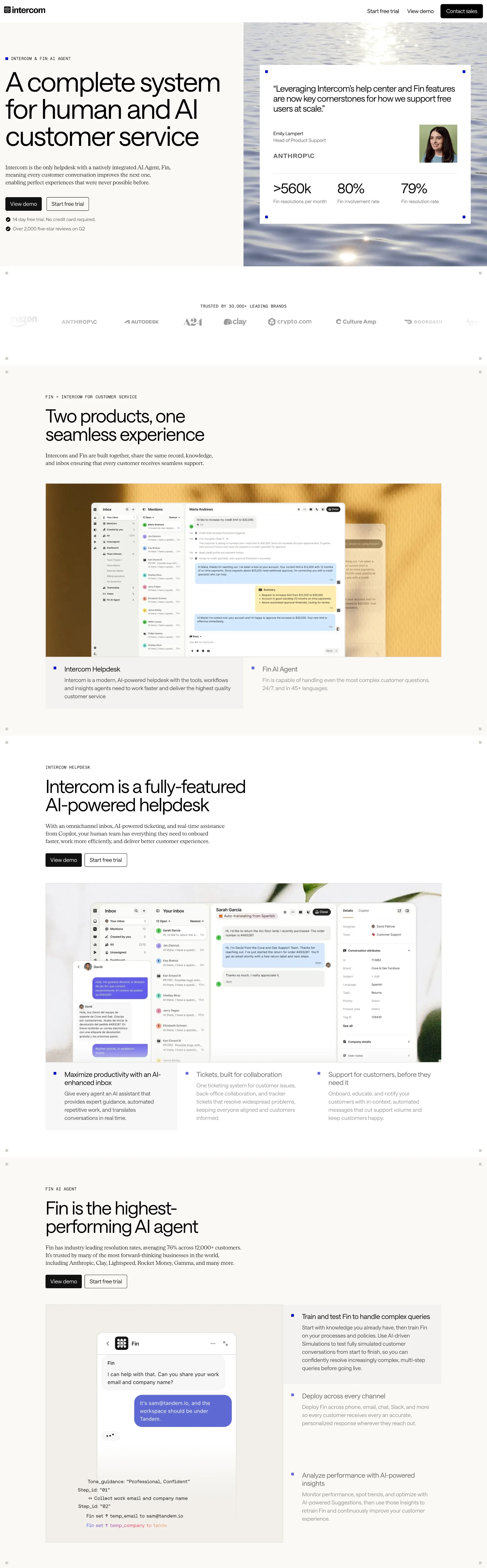
Intercom sells a helpdesk with a built-in AI agent called Fin. Its hero holds the headline, two buttons, a named customer quote, and three numbers in one view. A price also appears on the homepage.
Category: Customer service platform
Design lessons to derive:
- Place a named quote and key numbers next to the main button. Proof sits at the moment a visitor decides.
- Reduce doubt under the buttons. “14 day free trial, no credit card required” and a review count answer the first questions a buyer has.
- Use testimonial tabs. Visitors pick a company close to theirs, such as Anthropic, Clay, or MoneySupermarket.
- Publish pricing on the homepage. Showing the price removes a common objection before a sales call.
Best for: SaaS with a free trial and a published price.
Asana
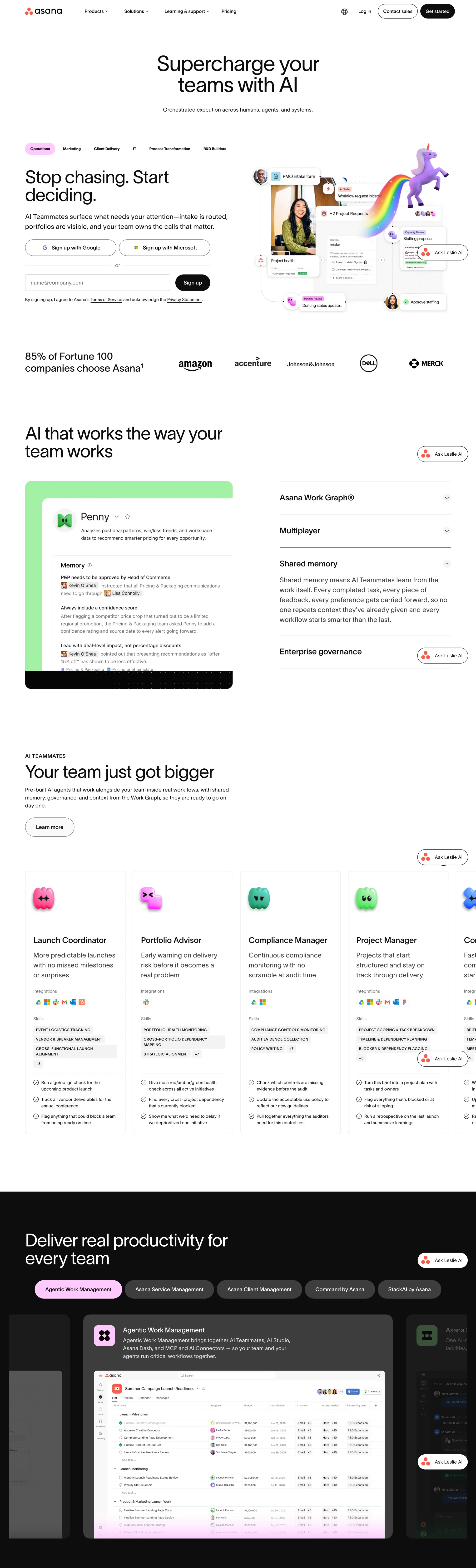
Asana sells work management software for teams. Its hero pairs two short commands, “Stop chasing. Start deciding.”, with a sign-up box and tabs by team. A later section lists three problems in plain words before it introduces any feature.
Category: Work management software
Design lessons to derive:
- Write the headline as a pair of short commands. The first names the pain, and the second names the outcome.
- Add a proof stat with a footnote. “85% of Fortune 100 companies choose Asana” carries a source line, which makes it easier to trust.
- Describe the problems first. “Projects are spread across tools and inboxes” and “Status updates eat the week” show the visitor you understand their day.
- Offer three ways to start. A demo, resources, and a template suit buyers at different stages.
Best for: Software used by many teams across a company.
Atlassian
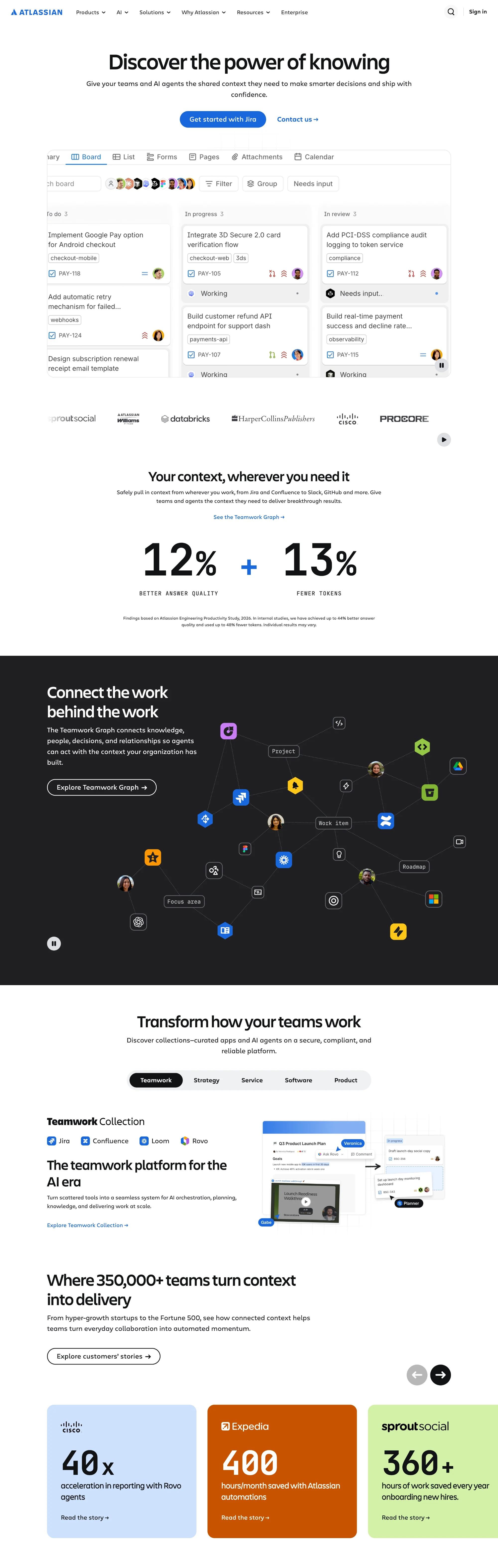
Atlassian sells team collaboration and software development tools. The hero shows a real Jira board, and a color-coded set of cards later gives one big number for each customer. The page ends with a two-line call to action that repeats the hero’s promise.
Category: Team collaboration and software development
Design lessons to derive:
- Show the product in the hero. A live board tells visitors what the tool does without a paragraph of copy.
- Give each customer proof its own card. Cisco’s 40x faster reporting, Expedia’s 400 hours saved each month, and Sprout Social’s 360+ hours saved each year each get one large number.
- Footnote statistics with their source. The “12% better answer quality” claim cites the Atlassian Engineering Productivity Study, 2026.
- End by repeating the promise. “Stop searching. Start shipping.” closes the page with one button.
Best for: Companies with several products and one platform story.
Webflow
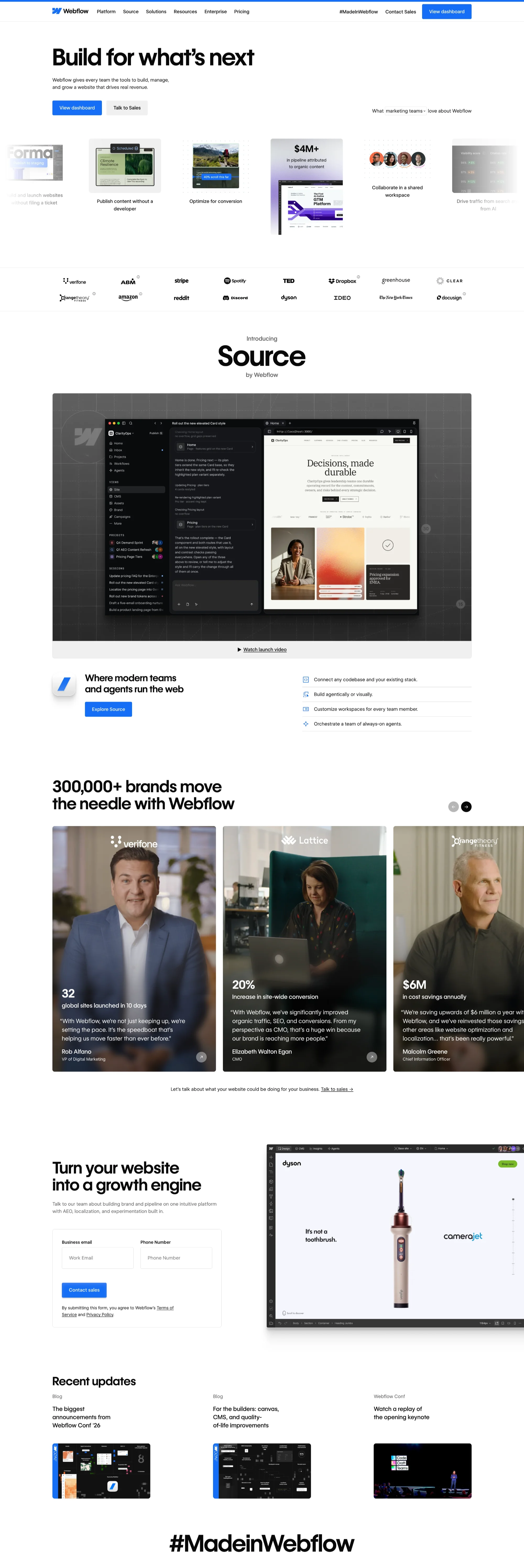
Webflow is a platform for building, managing, and growing websites visually. Its homepage opens with a short headline, “Build for what’s next,” and two buttons. Below that, a row of small cards shows what the platform does for marketing teams, followed by a product launch video and customer stories. magier is a Webflow Premium Partner, which is why we include it here.
Category: Website platform
Design lessons to derive:
- Give each customer story one big number. Verifone launched 32 global sites in 10 days, Lattice saw a 20% increase in site-wide conversion, and Orangetheory Fitness reports $6M in annual cost savings. Each card carries a named person and title.
- Offer two buttons in the hero. “View dashboard” suits existing users, and “Talk to Sales” suits new buyers.
- Keep the sales form short. The “Turn your website into a growth engine” section asks for a business email and a phone number only.
- Show what customers have built. A “#MadeinWebflow” gallery of real sites proves the platform’s range better than a feature list.
Best for: Companies that sell a visual product and can show customer work.
Which example should you study first?
Every site on this list teaches something, yet the closest match to your company teaches the most. Start with the row that fits you.
What is a corporate website?
A corporate website is the official online home of a company. It explains who the company is, what it offers, who it serves, and why it can be trusted.
It usually includes the brand story, product or service pages, case studies, careers, investor information, press, and support. Buyers, job seekers, investors, and journalists all use the same site, and each of them wants something different. That is what makes corporate website design harder than designing a single page.
The table shows how a corporate website differs from a landing page and a campaign site.
What makes a corporate website good?
The bitter truth is that many visitors decide within moments whether to stay, and the first screen is often all they see before they choose. A good corporate site makes those moments count, and it does three jobs well.
- It explains who you are fast: A visitor should know what you do and who you serve in the first screen.
- It earns trust: Named customers, specific numbers, and work samples show visitors that your claims are true.
- It shows the next step: Each page points to one clear action, so nobody has to guess what to do.
Great corporate website design does all three, and each of the 10 examples above does them in a different way. Pay attention to how each one does it, because the how is what you can copy.
How to study an example the smart way
Here is the answer to the choice from the start of this guide. All 10 examples control the order of the page, which means they decide what a visitor sees first, second, and third, and they end with one clear next step. Their colors and fonts count for far less than that order.
Most of us collect screenshots instead. Your folder named “inspo” has 200 screenshots and no notes, and a designer cannot do much with that. That’s where a written method comes in, because it turns admiration into something your team can use.
Follow these five steps for each example you like.
- Read the homepage first: Write down what the first screen says, what proof follows, and what the main button asks for.
- Open one service or product page: Check how it explains the offer and what the next step is.
- Open one case study: See how the company shows results and who it names.
- Read the About page: Notice how it builds trust with people and facts.
- Scroll to the footer: Check what the site considers important enough to repeat.
Also note what is missing. The best sites leave out extra menu items, extra messages, and stock photos, and what they skip tells you as much as what they include.
7 best practices you can copy
These seven practices come from the sites above and from what changes when a design goes live in Webflow. Each one says what to do, where you can see it, and how to build it.
Write the first screen in four parts
A strong first screen answers four questions in order: who it is for, what you do, what they get, and why they should believe you. Zendesk puts the outcome in the headline (“Automate up to 80% of interactions”). Intercom places a named customer quote and three numbers beside the buttons.
Write all four in one pass before you design anything, and cut any sentence that could appear on a competitor’s site. Use a real heading for the main promise, so search tools and AI tools can quote it correctly.
Give each intent its own button
Visitors arrive in different states of readiness, so one button cannot serve all of them. Datadog offers “Free trial” for hands-on buyers and “See the platform” for people who want a tour first. Vercel and Webflow pair a self-serve action with “Talk to sales.”
Label each button with the action and not the product name. Then track clicks on each one separately, because the split tells you how ready your visitors are.
Build the menu from real questions
Start with the 10 questions buyers ask on sales calls and in support chats, and write the menu in their words. A menu built from your org chart shows your teams, and a menu built from questions shows visitors where to go. Keep the top level to about five to seven items, and move everything else into groups.
Stripe’s footer shows the second half of this. It lists products, industries, developers, and support in separate columns, which helps visitors who skip the homepage and head straight to the footer. In Webflow, build the menu and footer once as symbols or components, so one edit updates every page.
"Write the menu labels in the words a customer would say out loud, because a clever label costs you a click and a plain one earns it."

Put sourced proof beside each claim
A claim without proof reads as marketing, and proof without a source reads as decoration. Asana footnotes its “85% of Fortune 100 companies” statistic, and Atlassian cites the study behind its “12% better answer quality” figure. For every number on your site, record who said it, when, and where the visitor can check it.
Match proof to the promise next to it. A speed claim needs a speed result, and a security claim needs a certification. In Webflow, store testimonials, customer logos, and result numbers in CMS collections, so marketing can reuse them in the hero, on product pages, and in case studies without asking a developer.
Build the design system as variables and components
A design system is a set of rules for colors, fonts, spacing, buttons, and layouts that you define once and reuse. In Webflow, set colors, type sizes, and spacing as variables, and build buttons, cards, and page sections as components. Then add one hidden style guide page that shows every element in use.
Agree on a class naming convention before the first page is built, such as Client-First, so any developer can read the project six months later. Without these steps, a corporate site slowly turns into 40 slightly different buttons, and every redesign costs more than the last.
Fix the three usual speed problems
Corporate homepages are slow for the same three reasons, and each one has a direct fix. Google’s Core Web Vitals measure all three.
Google checks whether at least 75% of real page visits meet each target, so test on field data in PageSpeed Insights and not only on your office connection. Fix the worst score first. Check the current numbers on Google’s Web Vitals page.
Build accessibility and motion into the components
Fixing accessibility page by page is slow and often skipped. Build it into the components instead, so every new page inherits it. Set text and background colors as pairs that meet WCAG 2.2 AA contrast, which means at least 4.5 to 1 for normal text and 3 to 1 for large text. Give every button and link a visible focus state, use real headings in order, and label every form field.
Treat motion the same way. Animate transform and opacity, because those two properties are the cheapest for a browser to draw, which keeps scroll animation smooth in GSAP. Switch animation off when a visitor has “reduce motion” turned on in their device settings. Give any autoplaying background video a pause control. Read the full rules in the W3C WCAG 2.2 standard.
Give each page one next step
Every important page should point to one action, such as booking a demo, reading a case study, or contacting the team. Five equal buttons are like a restaurant menu with 80 dishes, and the guest leaves hungry. Different pages can use different actions, but each page should lead with one. Visitors who know what to do next are more likely to do it.
How to serve buyers, job seekers, investors, and press
How do you serve four visitors with one homepage? You give each of them an obvious way in and keep the rest out of their way. The table shows where to send each audience.
Large banks show how this works. Shadow Digital’s 2026 review describes UBS organizing its menu by audience, such as individuals and institutional clients, and not by product. Each group gets its own entry point without a separate website.
Common corporate design mistakes to avoid
These corporate website design mistakes are common habits, and most come from a rushed launch and not from poor judgment. You might think fixing them takes too long, yet most need one small change to start. Fix the first screen before anything else.

What changes when you build it in Webflow
Why does a good design still turn into a slow or messy build? Usually because nobody settled a few decisions before the build began. The build is where a design system either becomes real or falls apart. That is why corporate website design and development should be planned together.
Webflow lets a team build a corporate site visually, reuse components, and manage content in a CMS. That’s where the build stage helps or hurts, because every unplanned page, one-off style, or heavy animation adds work later. Settle these five things before development starts.
- Page templates: Decide which page types you need, such as service, case study, and blog, so each is built once.
- Reusable components: List the buttons, cards, and sections that appear on many pages.
- CMS structure: Decide which content will grow, such as case studies and team members, and define its fields.
- Animation: Choose where motion helps a visitor understand something, and skip the rest.
- Handoff: Organize the Figma file so a developer can find every style and page without guessing.
magier works with expert Webflow developers and GSAP animation specialists, and it also offers Figma-to-Webflow conversion and technical SEO. You can see how magier handles Webflow development, including a staging and push-to-live workflow.
Are design awards worth chasing?
Awards can help you spot strong craft, and they are worth a look. Awards for corporate website design, such as Awwwards and the CSS Design Awards, reward creativity, usability, and technical quality, which are the same qualities behind a good site. A winning site can teach you a lot about detail and motion.
Treat an award as one signal and not a promise. Winners change each year, and a trophy does not prove that a site converts for a business like yours. Before you cite a specific award, check the award body’s own website for the current list.
A simple checklist to audit your site
This takes about 30 minutes. Open your homepage on a laptop and a phone, and check each row against what a stranger would see. Does your site pass the first row?
How to redesign your corporate website in 5 steps
Fix the front door before you repaint the house. Most teams get better results by improving the highest-impact pages first than by rebuilding everything at once. Here is a simple path.
- Audit what you have: Run the checklist above, and look at which pages get the most visits and which ones lose visitors.
- Plan the pages: Decide which audiences you serve, which pages they need, and how the menu groups them.
- Design the system and the key pages: Define colors, fonts, and components first, then design the homepage and two or three core pages.
- Build and test: Build in your chosen platform, then test speed, accessibility, and phone layouts before launch.
- Launch and improve: Watch real visitor behavior, fix the weakest page first, and repeat.
A good partner can speed up steps three and four. The next section explains what to look for, so you can judge a team before you commit.
How to choose a partner to build it
How do you know whether a design team can do this for a corporate site? Ask questions that reveal how they actually work. Here are six to start with.
- Can I see relevant work? Look for sites with a similar audience and a similar number of pages.
- Who will do the work? Find out whether the people in the pitch are the people who build.
- How do revisions work? Ask what is included and what costs extra.
- How will we handle the handoff? A clear process from design to build prevents surprises.
- How is pricing set? Look for a fixed, published price and not a surprise bill.
- What happens if it is not working? Check the contract terms and how you can pause or leave.
magier offers pre-qualified designers and developers, a 48-hour turnaround per task, unlimited revisions, and a fixed monthly fee with no long-term contracts. That’s where a clear process helps you most, and you can see how magier works before you decide.
Where to find more examples
Galleries are the fastest way to find corporate website design ideas and to see modern corporate website design in action. Use them to study why a page works and not only how it looks.
- Awwwards: A showcase of top sites judged by design professionals, good for bold ideas.
- CSS Design Awards: Another awards site, useful for craft and technical quality.
- Landbook: A curated gallery of landing pages, easy to browse by style.
- Behance: A platform where designers share full projects, including site case studies.
- Dribbble: A large collection of design shots, good for details and components.
- Mobbin: A library of real screens, helpful for studying how products and pages are structured.
- Made in Webflow: A showcase of published Webflow sites with layouts you can learn from.
Start with one change
Good corporate website design comes down to three jobs, which are to explain who you are, earn trust, and show the next step. Every example in this guide does them in the same order, and that order is the choice that closes the loop from the start. Copy the order of the page, and you can leave the budget behind.
A redesign takes work, and it can feel like a lot when your team is already stretched. You might worry that it costs too much, takes too long, or means handing your brand to someone else. Starting with the first screen keeps all three risks small, because you test one page, compare it with your own checklist, and keep the final decision.
If you want a partner for the design and the build, see how magier approaches Webflow design. Design starts from €2,750 per month and Webflow service from €890 per month, with no long-term contracts and the option to cancel or pause anytime. Run the checklist on your homepage this week, and fix the first screen first.
{{cta}}
FAQ
A corporate website is the official online home of a company. It shows who the company is, what it offers, and why it can be trusted. It serves many audiences at once, such as buyers, job seekers, investors, and press.
A good corporate website design explains what the company does in the first screen, earns trust with real proof, and shows one clear next step. It also loads fast, works on phones, and is easy for everyone to use. Clarity beats flashy effects.
Start by deciding who visits and what each audience needs. Then plan the pages and menu, design a simple system of colors, fonts, and components, and build and test for speed and accessibility. Launch, watch how visitors behave, and improve the weakest page first.
Most start with a homepage, an About page, service or product pages, case studies, and a contact page. Add careers, investor, or press pages when you serve those audiences. More pages are not better, because clarity is better.
A corporate website represents the whole company and serves many audiences. A landing page is built around one action for one campaign or audience. A corporate site is long term, while a landing page is usually tied to a campaign.
Sites from well-known companies are often praised in the design community and by awards bodies such as Awwwards and the CSS Design Awards. Winners change every year, so check the award body's own site for the current list before citing one.
Ask to see relevant work, find out who will do the work, and learn how revisions, handoff, and pricing work. A fixed, published price and clear terms for pausing or leaving are good signs. Start with the questions in the partner section above.
Write clear headings, answer the main question early on each page, and use plain language. Keep the site fast and well structured, and show real proof. These are the same habits that help human visitors.