.avif)
Best B2B Infographic Examples and How to Design Your Own (2026)
A few years ago, HubSpot published a State of Marketing infographic that got shared more than the 30-page report it was based on. The report covered extensive data and analysis. But the infographic had one thing the report didn't: it communicated the key findings in under 10 seconds. That's the job of a B2B infographic, and most companies are getting it wrong.
A B2B infographic is a visual content asset that uses data visualization, icons, charts, and structured layouts to turn complex business information into something a buyer can absorb and share in seconds. In a category where decision-makers are buried in whitepapers and slide decks, infographics make the difference by getting the key insight immediately visible rather than hiding on page 12 of a PDF.
According to research cited by Forbes, 91% of consumers prefer visual content over traditional text-based formats. And it's not just a consumer preference. Venngage found that 72% of B2B buyers prefer infographics at the start of their buying journey, which makes them one of the highest-performing content formats for awareness and lead generation.
The best-performing infographics are created as modular assets that get repurposed across LinkedIn, sales enablement decks, email campaigns, website pages, and even AI search summaries. If you're still designing infographics as one-off vertical images for a single blog post, you're leaving most of their value on the table. That is why we came up with this blog to share how to design the most effective B2B infographics along with examples.
{{freebie}}
Here's what we cover:
- Why infographics work for B2B
- 12 infographic types mapped to specific B2B use cases
- 8 real B2B infographic examples with design breakdowns
- The anatomy of a high-performing B2B infographic
- A step-by-step design workflow from concept to final output
- Design specifications for typography, color, icons, and spacing
- The best tools for B2B infographic design in 2026
- How to design for multi-channel repurposing
- Common mistakes and how to avoid them
What is a B2B infographic?
A B2B infographic is a visual content asset designed specifically for business-to-business audiences. It uses data visualization, icons, charts, and structured layouts to communicate complex information (research findings, processes, frameworks, product comparisons) in a format that's faster to absorb and easier to share than written content.
The "B2B" distinction should be considered because B2B infographics serve a different audience and a different purpose than consumer-facing ones. A B2C infographic might explain how to brew the perfect cup of coffee. A B2B infographic explains how a SaaS platform reduces sales cycles by 30%, or maps the five stages of enterprise procurement, or visualizes the ROI of a marketing automation investment. The audience is busier, more skeptical, and evaluating your content as a signal of your expertise.
In practice, B2B infographics show up across the entire marketing and sales funnel. At the top of the funnel, they drive awareness through shareable industry statistics and trend summaries. In the middle, they support evaluation through product comparisons, process explanations, and framework visualizations. At the bottom, they help close deals through case study summaries and ROI visualizations that buying committees can circulate internally. And in 2026, the best B2B infographics are designed as modular assets that work across all of these stages and channels rather than being created for a single blog post.
Why infographics still work for B2B
The data case for B2B infographics is strong. More than 90% of B2B buyers start their purchasing cycle online, and 74% of business buyers conduct more than half of their research digitally before making a decision. These buyers are evaluating multiple vendors simultaneously, scanning content quickly, and looking for information they can absorb and share with their buying committee. Infographics serve that need better than almost any other content format.
But most B2B infographics don't deliver on that potential. The typical B2B infographic is a long vertical image with too much text, tiny fonts, inconsistent icons, and a visual hierarchy so flat that nothing catches the reader's eye. It's essentially a Word document with a colored background and some clip art. Designing an infographic like a document with decorations added on top is like putting a racing stripe on a minivan. It looks like you tried, but it doesn't change the performance.
The infographics that actually perform in B2B share a few common traits. They have:
- One clear takeaway
- A strong visual hierarchy that guides the eye
- Data visualizations that prove the point
- Consistent design systems
- Enough whitespace to let the content breathe.
The examples in this guide demonstrate all of these traits, and the design sections that follow show you how to build them yourself.
"We've seen B2B infographics drive more LinkedIn engagement than video content that cost ten times as much to produce. The secret isn't production value. It's having one clear insight that your audience wants to share with their network."

The 12 types of B2B infographics (and when to use each one)
Before you start designing, it helps to know which type of infographic fits your goal. Not every B2B infographic is a vertical blog image with statistics. There are at least 12 distinct formats, each suited to a different business purpose and audience.
The most common mistake is defaulting to a statistics infographic for every use case. If your goal is to explain a process, a process infographic will perform better than a statistics one, because the format matches the content. Pick the type that fits your message before you start designing.
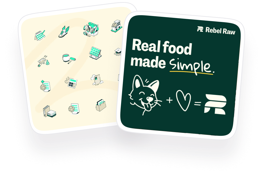
10 best B2B infographic examples with lessons
These ten companies represent different approaches to B2B infographic design, from data-heavy marketing reports to executive-grade minimalism to technical architecture diagrams. For each one, we explain the specific design decisions that make it effective and pull out three lessons you can apply to your own work.
McKinsey & Company
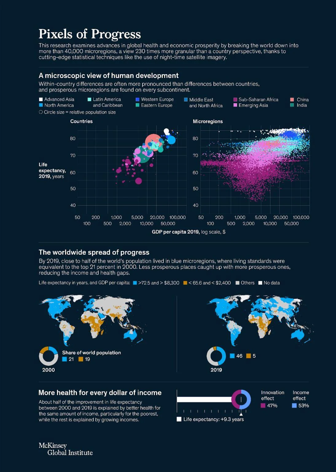
McKinsey designs infographics for executive audiences. The color palette is minimal (often just two or three colors), the typography is sophisticated, and charts dominate the visual space. There's almost no decorative illustration, because McKinsey's audience doesn't need visuals to be entertained. They need them to be precise.
This simplicity is what makes McKinsey infographics effective in enterprise contexts. A C-suite executive evaluating a strategic framework wants to see the data clearly, understand the structure immediately, and trust the source. Decorative elements would undermine that trust by making the content feel less rigorous.
McKinsey's chart design is also worth studying. Their charts use clean gridlines, clear labels, and consistent scales that make the data self-explanatory. The reader never has to guess what a chart means, because the design removes ambiguity.
Design lessons from McKinsey:
- Design for your audience's expectations, because executive audiences trust minimalist data visualization more than illustrated infographics.
- Let charts do the talking without decorative accompaniment, because data density signals rigor to analytical audiences.
- Use a restrained color palette (2-3 colors maximum) for enterprise content, because visual restraint communicates sophistication and credibility.
HubSpot
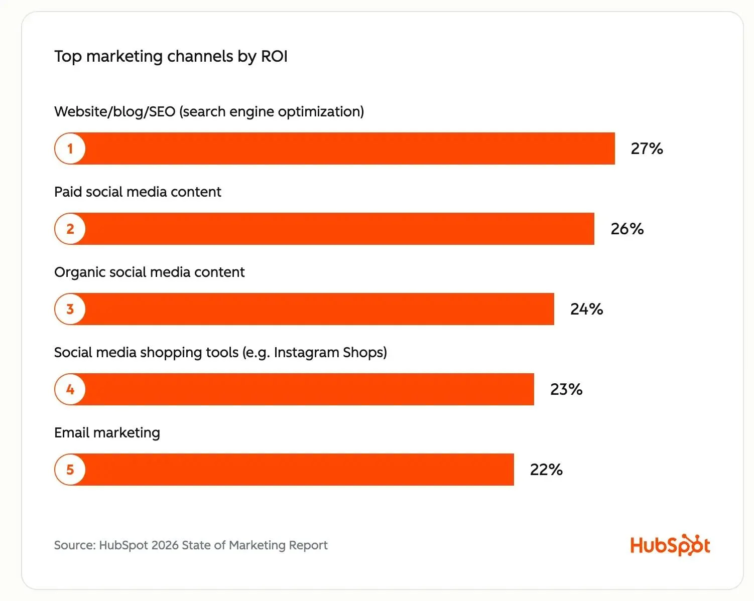
HubSpot sets the standard for data-driven B2B infographics, particularly through their annual State of Marketing and State of AI reports. The design approach is built on clean hierarchy, with each section covering exactly one idea supported by one or two data points. Icons carry much of the visual weight, which means the infographic communicates even when the reader is scanning rather than reading.
The brand colors are present throughout but never overwhelming. HubSpot uses its signature orange as an accent against neutral backgrounds, which gives the infographic brand identity without making it feel like a product advertisement. The generous whitespace between sections is what really makes these infographics scannable, because each data point has room to breathe.
What makes HubSpot's approach particularly effective for B2B is that the infographics are designed to be quoted and shared. Each statistic is presented as a self-contained visual unit, which means a marketing manager can screenshot one section and drop it into a presentation or LinkedIn post without losing context.
Design lessons from HubSpot:
- Design each section as a self-contained visual unit, because B2B audiences will screenshot and reshare individual data points more often than they'll share the full infographic.
- Use icons as the primary visual language instead of illustrations or stock photography, because icons communicate faster and scale better across formats.
- Give every data point enough whitespace to stand on its own, because crowded statistics compete with each other instead of reinforcing the story.
Salesforce
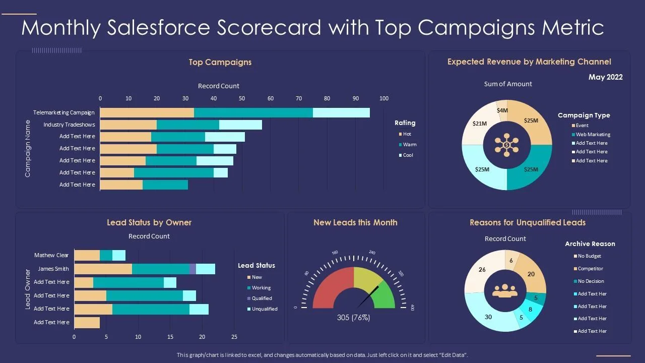
Salesforce takes a different route by using custom illustrations as the visual foundation rather than charts and icons. Their infographics often feature large typography paired with illustrated characters and scenes that make enterprise software concepts feel approachable and human.
The data visualization in Salesforce infographics is intentionally simple. Instead of complex multi-axis charts, they use basic bar charts, donut charts, and simple comparisons that any audience can understand in seconds. This simplicity is a deliberate choice, because Salesforce's infographics target a broad business audience rather than a data-literate analyst audience.
The reading flow is also worth studying. Salesforce designs their infographics with a clear top-to-bottom narrative that guides the reader through a story rather than presenting data points in isolation. Each section builds on the previous one, which keeps the reader engaged longer.
Design lessons from Salesforce:
- Use custom illustration to humanize complex B2B concepts, because abstract enterprise ideas become relatable when they're visualized through characters and scenarios.
- Keep data visualization simple when your audience is broad, because a chart that requires explanation defeats the purpose of an infographic.
- Design a narrative flow rather than a collection of isolated data points, because storytelling keeps readers engaged while random statistics get abandoned halfway through.
Microsoft
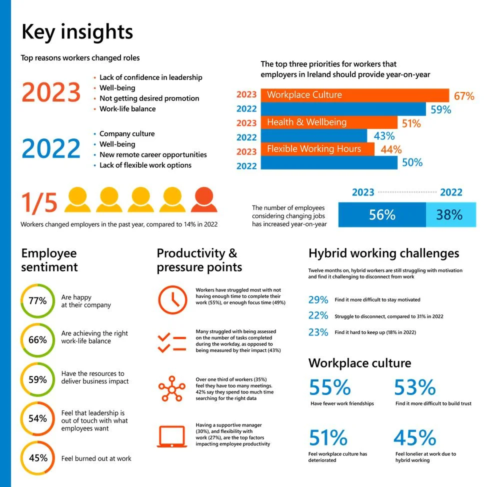
Microsoft produces some of the most polished B2B infographics through their Work Trend Index reports and AI adoption studies. The design approach blends strong illustration with statistical storytelling, creating infographics that feel like premium editorial content rather than corporate marketing.
What makes Microsoft's infographics effective is how they balance data with visual narrative. The Future of Work reports use illustrations of people and workplaces alongside hard data, which grounds abstract workforce trends in relatable human experiences. This combination works because the audience (HR leaders, executives, IT decision-makers) needs both the emotional context and the data proof to act on the findings.
The production quality is consistently high across dozens of annual publications, which signals a design system that's built for scale. Microsoft's infographic templates allow different teams to produce on-brand visual content without starting from scratch each time.
Design lessons from Microsoft:
- Blend illustration with statistics to ground abstract trends in human experience, because data about "the future of work" becomes more persuasive when readers can see themselves in it.
- Build a scalable infographic design system rather than designing each one from scratch, because consistency across many publications builds brand recognition and reduces production time.
- Use editorial-quality production values for research reports, because the perceived quality of the design affects the perceived credibility of the data.
Deloitte
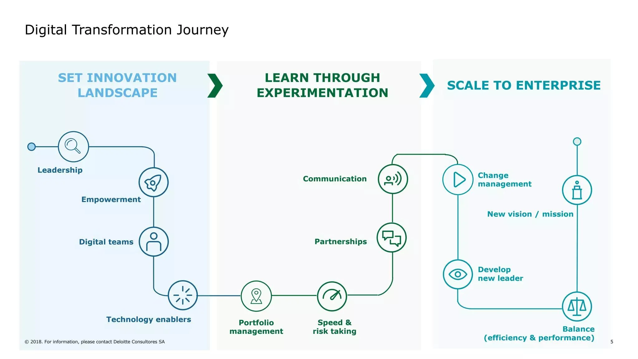
Deloitte excels at a specific infographic category that most B2B companies struggle with: process diagrams, transformation roadmaps, and technology landscape visualizations. These are the infographics that make complex consulting frameworks scannable for stakeholders who need to understand a strategy without reading a 50-page report.
The strength of Deloitte's approach is structural clarity. Their roadmap infographics use clear phase markers, directional arrows, and consistent color coding that make it obvious how one stage connects to the next. Their technology landscape diagrams organize dozens of tools and platforms into logical groupings that would take pages to explain in text.
Design lessons from Deloitte:
- Use process and roadmap infographics to make consulting frameworks actionable, because stakeholders who can see the full journey are more likely to commit to the first step.
- Apply consistent color coding across phases or categories, because color is the fastest way to communicate grouping and sequence in a complex diagram.
- Design landscape diagrams with clear grouping logic, because organizing complexity is more valuable than simplifying it away.
IBM
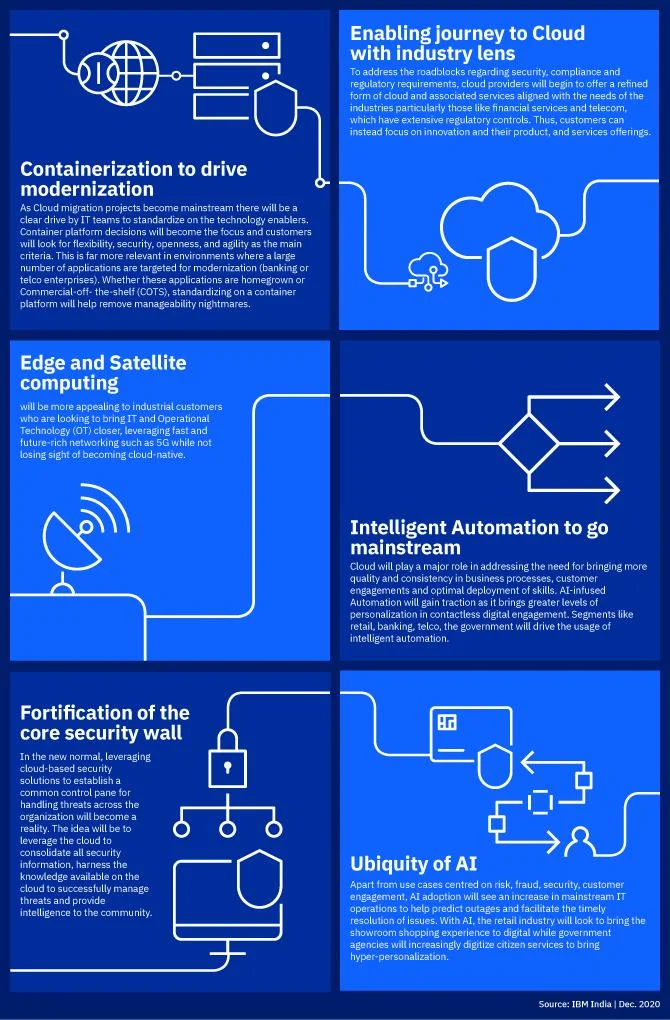
IBM demonstrates how to visualize abstract technology concepts like AI, cloud computing, and enterprise architecture. These are notoriously difficult subjects to make visual, because there's nothing physical to photograph or illustrate. IBM solves this by using flat illustrations, geometric abstractions, and layered diagrams that give form to formless concepts.
Their enterprise architecture infographics are particularly strong. They organize complex multi-layer technology stacks into clean visual hierarchies that help technical and business audiences understand how components relate to each other. This bridge between technical complexity and visual clarity is IBM's core infographic strength.
Design lessons from IBM:
- Use geometric abstraction and layered diagrams to visualize concepts that have no physical form, because abstract ideas need visual structure to become understandable.
- Design technology architecture infographics as layered systems rather than flat lists, because layers communicate relationships that lists cannot.
- Maintain a consistent illustration style across all infographic content, because visual consistency across dozens of publications signals enterprise-grade professionalism.
Cisco

Cisco produces strong infographics in the cybersecurity and network architecture space. Their annual security reports and IT trend publications use clean enterprise diagrams, statistical storytelling, and threat visualization formats that make complex security data accessible to both technical and non-technical audiences.
What makes Cisco's approach worth studying is how they handle technical density. A network architecture diagram or threat landscape could easily become overwhelming, but Cisco uses consistent visual hierarchies, restrained color palettes, and clear labeling to keep even the most complex diagrams readable. The infographics are designed to be referenced in meetings and presentations, which means they need to communicate their point when projected on a screen, not just when viewed on a laptop.
Design lessons from Cisco:
- Design technical diagrams for presentation contexts (not just blog reading), because B2B infographics often end up projected in meetings where readability at a distance matters.
- Use consistent visual conventions across security and architecture diagrams, because your audience builds literacy in your visual language over time and inconsistency resets that learning.
- Simplify threat and risk data into clear hierarchies rather than showing every data point, because decision-makers need to understand the priority, not the exhaustive detail.
Semrush
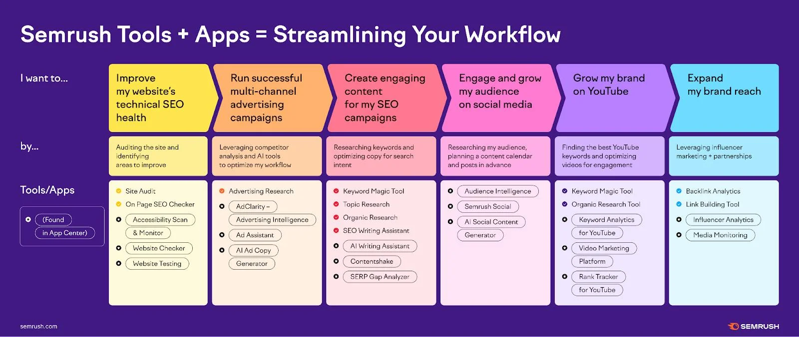
Semrush produces some of the most effective infographics in the digital marketing space. Their content team creates process workflows, benchmark comparisons, and SEO checklists that serve as practical reference tools rather than one-time reads. This utility focus is what makes them highly shareable in marketing communities.
The design approach is clean and functional. Semrush infographics use consistent color coding, clear step numbering, and enough visual variety to keep the reader moving through long-form content. The comparison graphics are particularly well executed, with side-by-side layouts that make it easy to evaluate differences at a glance.
Design lessons from Semrush:
- Design infographics as practical reference tools rather than one-time content pieces, because utility drives bookmarks, shares, and return visits.
- Use clear step numbering and directional cues in process infographics, because the reader should never have to guess what comes next.
- Make comparison layouts side-by-side rather than stacked, because horizontal comparison is faster to process than vertical scrolling between options.
Gartner

Gartner has created some of the most recognized infographic formats in all of B2B. The Magic Quadrant is arguably the most influential infographic template in enterprise technology, and their Hype Cycle is a close second. These formats work because they provide standardized frameworks that entire industries use as shared reference points.
Beyond the famous quadrants, Gartner designs strong decision tree and maturity model infographics. These formats are particularly effective for B2B because they help buyers self-assess and categorize themselves, which is a powerful engagement mechanism. A buyer who places their organization on a maturity scale has already started the evaluation process that leads to a purchase.
Design lessons from Gartner:
- Create standardized visual frameworks that your audience can use as shared reference points, because repeatable formats build brand recognition and industry authority.
- Design self-assessment infographics (maturity models, decision trees) that invite the reader to engage actively, because participatory content drives deeper engagement than passive reading.
- Prioritize structural innovation over visual decoration, because a new way of organizing information is more valuable than a new way of decorating it.
Boston Consulting Group
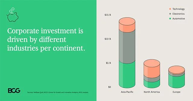
Boston Consulting Group infographic showing corporate investment trends by continent, with stacked bar charts comparing Technology, Electronics, and Automotive spending across Asia-Pacific, North America, and Europe
Boston Consulting Group (BCG) produces executive-ready visual content that rivals McKinsey in sophistication but with a slightly more accessible design approach. Their strategy frameworks, maturity models, and market analysis infographics are frequently cited in boardrooms and investor presentations, which means the design needs to hold up in high-stakes professional contexts.
BCG's infographics are worth studying for their balance between analytical depth and visual clarity. Where McKinsey leans toward pure data minimalism, BCG adds just enough visual structure (colored section headers, subtle background shading, well-placed callout boxes) to guide the reader through complex strategic arguments without requiring them to decode the layout.
Design lessons from Boston Consulting Group:
- Add subtle structural guides (section shading, callout boxes, divider lines) to help readers follow complex strategic arguments, because even executive audiences benefit from visual wayfinding in dense content.
- Design infographics that hold up when printed, projected, and viewed on mobile, because executive content gets consumed in all three contexts.
- Use your infographic formats as intellectual property that builds brand recognition, because BCG's growth-share matrix and similar frameworks are as much brand assets as they are analytical tools.
All 10 examples at a glance
For additional inspiration beyond these eight, Column Five maintains a gallery of 50+ B2B infographic examples organized by design type. It's one of the best free resources for browsing B2B infographic styles and formats. Other B2B companies producing strong infographic content include Microsoft, Cisco, PwC, and AWS, each applying the aforementioned principles to their own industry contexts.

The anatomy of a high-performing B2B infographic
The best B2B infographics follow a consistent structural formula. This isn't a rigid template, but it's a reliable blueprint that works across most B2B use cases. If you're designing your first infographic or briefing a designer, this structure gives you a starting point that's proven to perform.
- Strong headline: This is the single key takeaway of the entire infographic. It should communicate the core message even if the reader doesn't scroll past it. Think of it as the subject line of the visual.
- 1-2 sentence introduction: Brief context that tells the reader what the infographic covers and why it matters. Keep this to two sentences maximum, because anything longer belongs in the blog post, not the infographic.
- Hero statistic: The one number that earns attention and justifies reading further. This should be the most surprising, compelling, or relevant data point in your research.
- 3-6 supporting sections: Each section covers one idea with one supporting data point or visualization. The key rule is one idea per section, because mixing ideas within sections destroys scannability.
- One chart or data visualization: This is the proof. A well-designed chart communicates credibility and depth in a way that text and icons alone cannot.
- One comparison or contrast: Before/after, old way/new way, or product A vs. product B. Comparisons create context that helps the reader understand the significance of your data.
- Summary: Restate the core takeaway in one sentence. This gives readers who scrolled to the bottom the key message even if they skipped sections.
- CTA: The next step you want the reader to take. Download a resource, visit a page, book a call, or share the infographic.
How to design a B2B infographic (step-by-step)
Here's the practical workflow for creating a B2B infographic from concept to final output.
Step 1: Define the audience
An infographic for executives needs a different design approach than one for practitioners. Executives want data density and minimal decoration. Marketers want shareable visuals with clear takeaways. Technical buyers want architecture diagrams and process flows. Know who you're designing for before you choose a style.
Step 2: Gather and verify data from credible sources
Bad data in a beautiful infographic is still bad data, and B2B audiences will check your sources. Use first-party research, industry reports, or recognized third-party data. Always include source attribution in the infographic itself.
Step 3: Identify the single key takeaway
Every effective infographic has one core message. If you can't summarize the point in one sentence, the infographic is trying to do too much. Narrow your focus before you start designing.
Step 4: Sketch the information hierarchy before opening your design tool
Map out which information comes first, which supports the main point, and which is secondary. A rough sketch on paper or a whiteboard prevents the common mistake of letting the design tool dictate the structure.
Step 5: Choose the infographic type
Use the 12-type table from earlier in this guide. Match the format to your content. A process story needs a process infographic, not a statistics layout.
Step 6: Build a consistent design system
Define your colors (1 primary + 1 accent + neutrals), typography scale, icon style, and spacing rules before you start placing content. Consistency is what makes a B2B infographic look professional rather than improvised.
Step 7: Design the desktop version first, then create responsive and social variants
Start with the full-size version, then adapt it into LinkedIn carousel slides, email-friendly sections, and presentation-ready components. Designing for modularity from the start is faster than retrofitting later.
Step 8: Test readability
Show the infographic to someone unfamiliar with the topic and ask them to tell you the main message within 10 seconds. If they can't, the hierarchy needs work.
Step 9: Export multiple formats
PNG for blog embedding, PDF for downloads and email, SVG for web and scalable display, and segmented image files for social media posts. Each channel has different format requirements.
Step 10: Measure performance and refine
Track engagement (views, shares, time on page), lead generation (downloads, form fills), and repurposing performance (LinkedIn engagement, email click rates). Use what you learn to improve the next infographic.
B2B infographic design specifications (the reference guide)
These specifications are what professional designers use when creating B2B infographics. Bookmark this section if you're designing in-house or use it to brief a designer.
Typography scale
Recommended typefaces for B2B: Inter, IBM Plex Sans, Manrope, Geist, Source Sans, Public Sans. Limit yourself to one or two typefaces per infographic.
Color strategy
The strongest B2B infographics use a restrained palette. One primary brand color, one accent color for highlights and CTAs, neutral gray for supporting elements, black for text, and white for backgrounds. Five colors total. Avoid rainbow palettes, because they make enterprise content look less credible and harder to scan.
Icon style
Choose one icon style and stick to it throughout the entire infographic. Your options are outlined, filled, duotone, or line icons. Mixing multiple icon libraries or styles (say, outlined navigation icons with filled data icons) creates visual inconsistency that undermines trust. If you're building infographics regularly, establish an icon library as part of your design system.
Chart selection guide
Avoid pie charts with many slices (they become unreadable after 4-5 segments) and unnecessary 3D effects (they distort data perception without adding clarity).
White space targets
Generous spacing improves both readability and perceived quality. If your infographic feels crowded, the fix is almost always removing content rather than shrinking the spacing.
Best tools for B2B infographic design in 2026
The right tool depends on who's doing the designing and what level of customization you need.
Figma deserves special mention because it's increasingly the tool of choice for B2B design teams that create infographics alongside website components, social assets, and marketing materials. Designing everything in one tool keeps the design system consistent and makes repurposing faster.
The AI tools are the biggest shift in 2026. Napkin AI turns text into diagrams automatically, which is useful for rapid concept exploration. Gamma creates report-style layouts from text input. Neither replaces a skilled designer for final output, but both accelerate the ideation phase significantly.
Designing infographics for multiple channels (the 2026 approach)
The most important shift in B2B infographic design for 2026 is that the best infographics are no longer designed for one destination. They're designed as modular systems that get adapted across channels.
Here's how to think about format by channel.
The practical way to design for all of these is to start with the full-length blog version, then extract modular sections that work independently. If each section of your infographic is designed as a self-contained unit (one idea, one data point, one visual), you can pull any section into a LinkedIn carousel slide, an email header, or a sales deck without redesigning it.
2026 B2B infographic design trends
Here are the trends shaping how the best B2B companies approach infographic design right now.
1. Modular, repurposable sections
The create-once-use-everywhere approach is becoming standard. Infographic sections are designed as independent components that work in blog posts, LinkedIn carousels, email campaigns, and presentations simultaneously. This isn't just efficient. It's how you maximize the ROI of every infographic you produce.
2. Interactive web infographics
Static images are being supplemented (not replaced) by interactive web versions with scroll-based storytelling, hover effects, and clickable data points. These work especially well for research reports and annual benchmarks where the audience wants to explore the data at their own pace.
3. Animated SVGs and subtle motion
Short animated infographic sections are becoming popular for LinkedIn and social distribution. Animated charts that build sequentially, text that appears on scroll, and subtle motion effects increase engagement without requiring video production budgets.
4. Dark mode variants
As more professionals use dark mode across their devices and platforms, B2B design teams are producing dark mode versions of their infographics as standard deliverables rather than afterthoughts.
5. AI-assisted chart generation
Tools like Napkin AI and Gamma are enabling marketers to generate first-draft visualizations from raw data and text. The outputs still need designer refinement for brand consistency and polish, but the ideation and first-draft phases are significantly faster.
6. Accessibility-first design
High-contrast palettes, readable font sizes, color-safe combinations, and descriptive alt text are moving from nice-to-have to standard practice. This matters for B2B because corporate audiences increasingly access content through accessibility-compliant systems and screen readers.
Common B2B infographic design mistakes and how to avoid them
Here are the most common mistakes we see in B2B infographics, along with the fix for each one.
1. Too much text
If your infographic has paragraphs of body text, it's not an infographic. It's a document with a colored background. The fix is to ruthlessly edit down to essential data points, short labels, and concise headlines. Every word that doesn't directly support the visual story should be cut.
2. Tiny fonts
Infographics that look fine on a designer's monitor become unreadable when shared on LinkedIn mobile, projected in a presentation, or viewed on a laptop. The fix is to set your minimum body text at 16px and test readability on a phone screen before publishing.
3. Excessive colors
Rainbow palettes make B2B content look less credible, because visual restraint signals professionalism. The fix is to limit your palette to five colors maximum (1 primary, 1 accent, gray, black, white) and let whitespace do the work that extra colors are trying to do.
4. Inconsistent icon styles
Mixing outlined icons with filled icons with illustrated icons makes the infographic feel like it was assembled from random parts rather than designed with intention. The fix is to choose one icon style, source all icons from the same library, and audit for consistency before publishing.
5. Overly complex charts
A chart with 12 data series, three axes, and a legend that requires five minutes to decode isn't helping anyone. The fix is to simplify every chart until the key insight is obvious within seconds. If the chart needs extensive explanation, the chart is too complex.
6. No clear visual flow
If the reader's eye bounces around the infographic without knowing where to go next, the hierarchy has failed. The fix is to use size, contrast, spacing, and directional cues (arrows, numbering, visual weight) to create a clear top-to-bottom reading path.
7. Weak hierarchy
When everything in the infographic looks equally important (same font size, same color, same visual weight), nothing catches the reader's attention and they don't know what matters. The fix is to create clear size and contrast differences between headline, section headers, data points, and supporting text.
8. Generic stock photos
Infographics that use stock photos of people in suits pointing at screens don't build credibility. They signal that the content wasn't worth investing in original visuals. The fix is to use custom illustrations, data visualizations, icons, or branded graphics instead.
How to get B2B infographics made: DIY vs. hiring
Whether you're searching for a B2B infographic design template to customize yourself or looking to hire infographic designers who specialize in B2B visual content, the right approach depends on your volume and quality requirements. Here are the three most common paths.
The right choice depends on your volume and quality requirements. If you produce infographics monthly and need them to match your brand system, a design subscription gives you the most consistent output without the overhead of hiring a full-time designer. If you need one infographic for a single campaign, a freelancer is the more practical choice.
Final thoughts
The best B2B infographics aren't the ones with the most elaborate illustrations or the most data points. They're the ones that communicate one clear message through strong hierarchy, consistent design, and enough whitespace to let the content breathe. Every example in this guide, from HubSpot's data reports to McKinsey's executive charts to IBM's technology diagrams, follows that same principle.
The biggest opportunity in 2026 is designing infographics as modular systems rather than one-off blog images. When every section of your infographic works independently across LinkedIn, email, sales decks, and your website, you multiply the value of every design you produce.
If your team needs help creating B2B infographics that actually perform, magier's design team can help. We handle infographic design, data visualization, and visual content as part of our ongoing design subscription. You can learn more on our design services page.
FAQ
An effective B2B infographic has one clear key takeaway, a strong visual hierarchy that guides the reader's eye, credible data with source attribution, a consistent design system (typography, color, icons), and enough whitespace to let the content breathe. In 2026, the most effective infographics are also designed as modular systems that can be repurposed across LinkedIn, email, sales decks, and blog posts.
Costs range from free (using template tools like Canva) to $500-$2,000+ for a custom freelance-designed infographic. Design subscriptions like magier offer ongoing infographic design at a fixed monthly fee with unlimited revisions. The right investment depends on your volume, quality requirements, and whether you need infographics as a one-time asset or an ongoing content channel.
For professional custom infographics, Figma, Adobe Illustrator, and Adobe InDesign are the industry standards. For AI-assisted rapid design, Napkin AI, Gamma, and Beautiful.ai can generate first-draft visualizations from text and data. For template-based infographics that non-designers can create, Canva, Visme, and Piktochart are the most popular options.
Start by defining your audience and identifying the single key takeaway. Gather credible data, sketch the information hierarchy before opening your design tool, choose the right infographic type for your content, build a consistent design system (colors, typography, icons), design the full version first and then create channel-specific variants, and test readability before publishing. The step-by-step section in this guide covers the full 10-step workflow.
Some of the strongest B2B infographic examples come from HubSpot (data-driven marketing reports), Salesforce (illustration-led enterprise storytelling), McKinsey (executive-grade minimalism), Deloitte (process and platform diagrams), Gartner (decision frameworks), Semrush (marketing workflows), Ahrefs (minimalist educational infographics), and IBM (technology concept visualization). See the examples section above for detailed design breakdowns of each.
.avif)