Best B2B Website Design Examples to Inspire Your Website (2026)
You've probably searched "best B2B websites" before and landed on a list of 20 screenshots with captions like "clean design" and "great use of whitespace." That's not very helpful when you're trying to figure out what your own site should look like or planning for a conversion lift. If that sounds familiar, you're not alone.
Here's why it's worth getting this right. According to research from Forrester, 94% of first-impression assessments of a website are design-driven. And with 93% of B2B buyers starting their search on a search engine, your website is often the first and most important sales conversation your company has.
The best B2B websites share a few things in common. They lead with a clear value proposition, guide visitors toward one primary action, use real product visuals instead of stock imagery, and place trust signals where buyers actually look for them. Understanding these patterns is what separates a site that looks good from one that actually converts.
This guide is built slightly differently than most "best of" lists. Instead of just showing you pretty B2B websites, we break down the specific design decisions that make each one work, from layout logic to conversion mechanics to trust-building. We also cover common mistakes, 2026 trends, and a practical framework for applying these lessons to your own site.
Here's what we cover:
- 10 design lessons from the best B2B websites in the world
- 20+ real examples across SaaS, ecommerce, enterprise, services, and manufacturing
- What each site does well and why it works
- 3 specific design takeaways from every example
- A master comparison table organized by industry
- B2B website design trends shaping 2026
- Common B2B website design mistakes and how to fix them
- A step-by-step framework for applying these lessons to your site
10 B2B website design lessons from the best in the business
If you want the highlights before the full breakdown, here are the most important design principles we found across every site in this guide:
- Lead with one clear value proposition above the fold.
- Use one primary CTA per page.
- Show your product in action instead of using stock photography.
- Place social proof within the first scroll.
- Design separate journeys for different buyer personas.
- Keep your navigation simple even if your product is complex.
- Invest in page speed and Core Web Vitals.
- Make your pricing or path to pricing easy to find.
- Build a content hub that answers your buyers' questions.
- Use motion and interaction to explain, not to decorate.
- Display certifications and trust signals above the fold for manufacturing and enterprise buyers.
- Design for mobile research even if your buyers convert on desktop.
What makes a B2B website look good and convert better
Before we get into specific examples, it helps to understand the design patterns that show up in almost every high-performing B2B website. The following design or conversion principles are patterns backed by data and repeated across the top-converting sites in every B2B vertical.
Think of the list as your evaluation lens. As you look at the examples in this guide, you'll notice that the best sites share most or all of these characteristics.
A clear value proposition above the fold
The best B2B sites communicate what they do and who they serve in the first headline. Visitors should never have to scroll to understand the core offering, because the homepage is the most expensive piece of real estate you have.
One primary call to action with a secondary option
Top-performing sites guide visitors toward one main action (like "Book a Demo" or "Start Free Trial") and offer a lower-commitment alternative (like "Watch a Video" or "See Pricing") for buyers who aren't ready to convert yet. This structure respects the buyer's stage in the decision process.
Social proof placed strategically
Customer logos, testimonials, case studies, and review badges all reduce perceived risk. The best B2B websites place them early in the page and repeat them near conversion points, because trust needs reinforcement at every decision moment.
Product-focused visuals instead of stock imagery
Sites that show the actual product, dashboard, or service in context outperform sites that rely on generic business stock photos. B2B buyers want to see what they're buying, and real product visuals build credibility.
Scannable sections with concise copy and strong typography
B2B decision-makers are busy. The sites that convert best use clear headings, short paragraphs, and visual hierarchy to make it easy to find specific information without reading every word.
Performance-optimized pages with responsive layouts
Page speed is both a ranking factor and a trust signal. Research shows that a well-designed user experience can increase conversion rates by up to 400%, and slow-loading pages actively drive buyers away.
SEO-friendly content hubs
The strongest B2B websites don't just have a homepage and a pricing page. They build resource centers, blogs, and educational content that address buyer questions at every stage of the funnel, which drives organic traffic and supports the sales process.
Consistent design systems with reusable components
The best B2B sites feel cohesive across every page because they use consistent colors, typography, spacing, and component patterns. Consistency signals professionalism and makes the site easier to maintain and scale.
So how do the best B2B companies put these patterns into practice? Let's look at real examples across five industries, starting with SaaS.
Best B2B SaaS website design examples
SaaS websites have some of the highest design standards in B2B, because the product itself is digital and the website is often the primary sales channel. The median SaaS landing page converts at 3.8%, but top performers hit double digits. The difference almost always comes down to design decisions.
Here are six SaaS websites that set the standard.
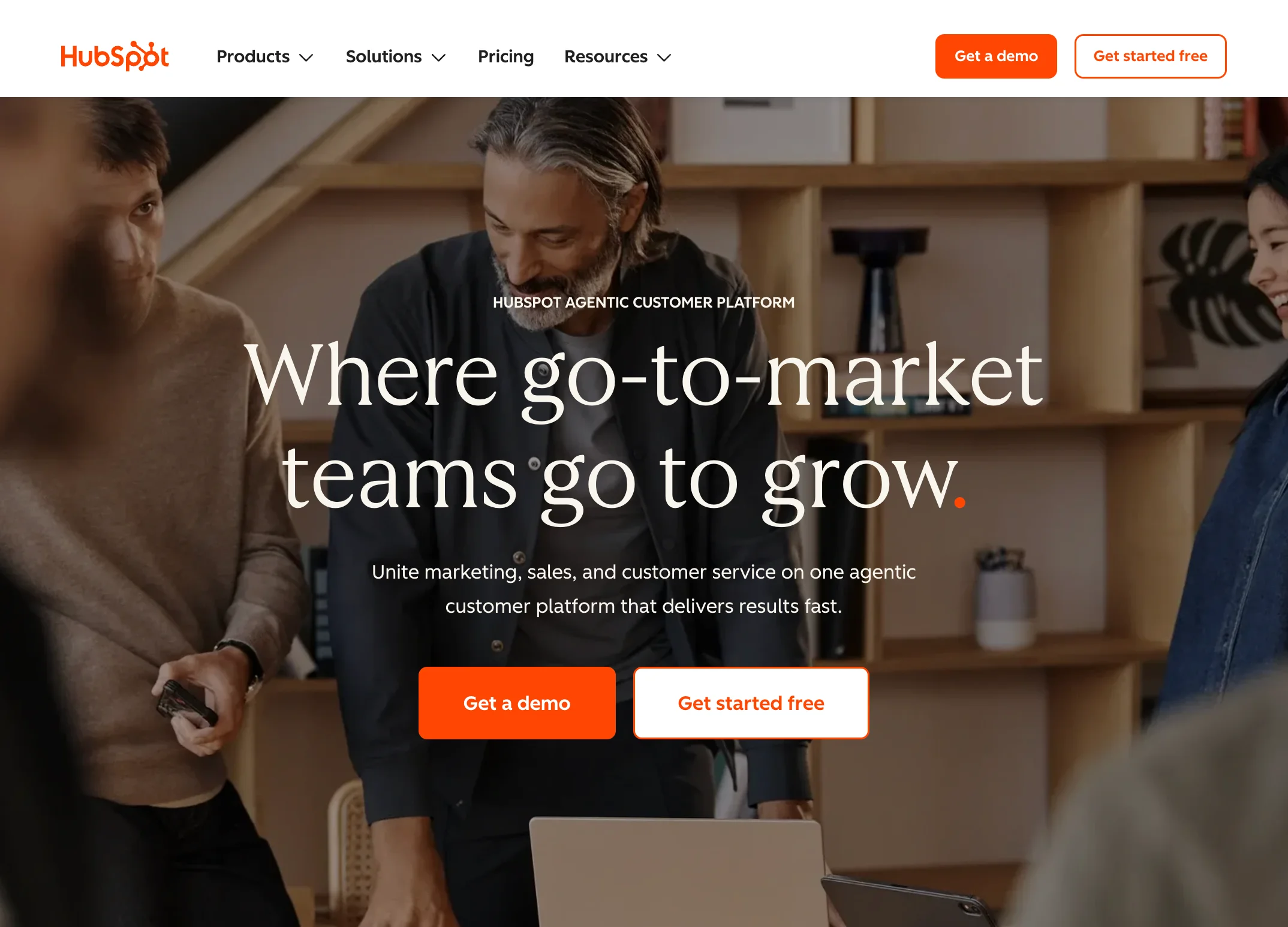
Stripe
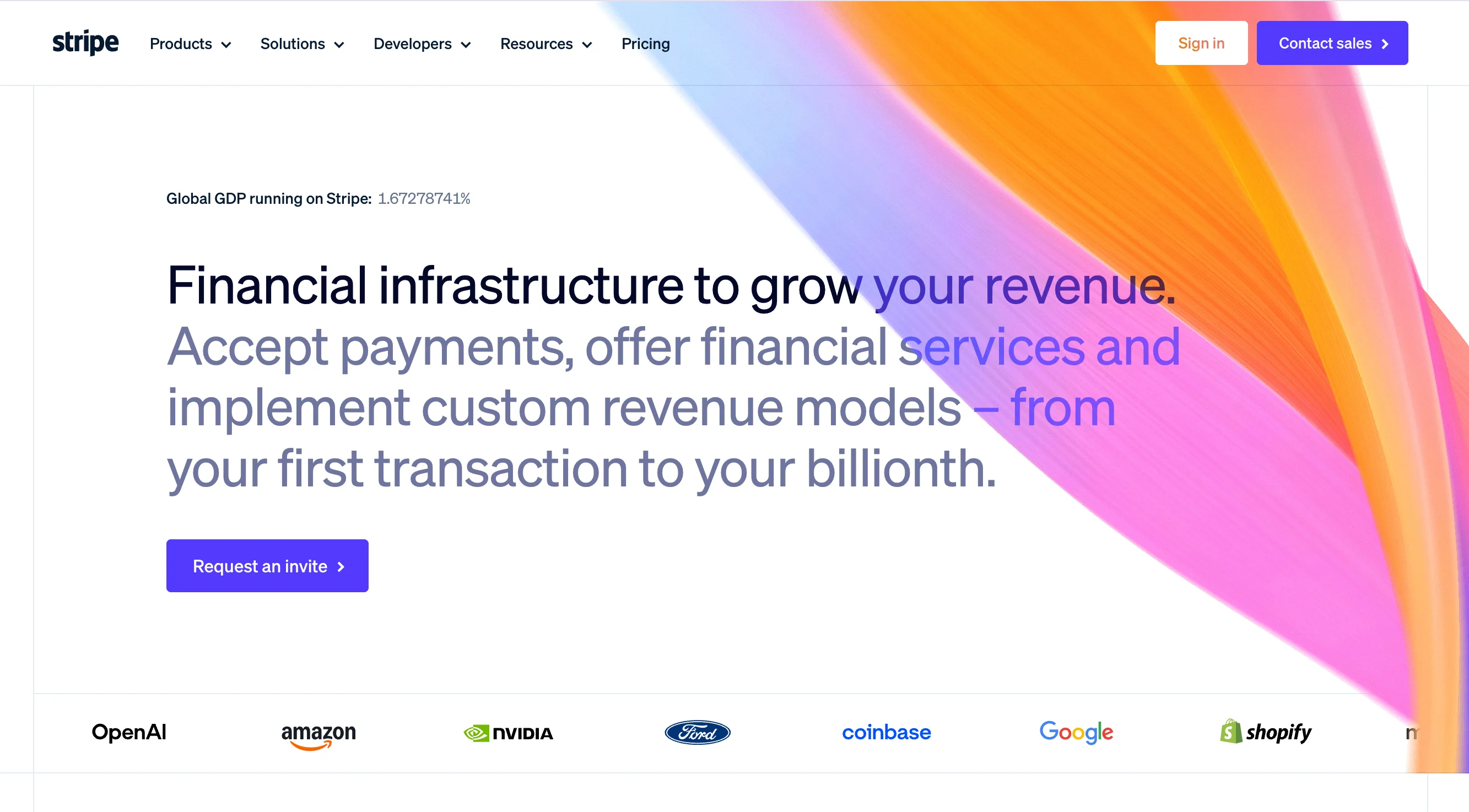
Stripe has been the gold standard in B2B website design for years, and it continues to earn that reputation. The site's power comes from restraint. Stripe uses exceptional typography and generous whitespace to create a visual hierarchy that feels premium without being cluttered.
What really makes Stripe's site effective is its interactive product storytelling. Rather than describing what the API does in paragraphs of text, Stripe shows it through live code examples, animated workflows, and product demonstrations that respond to the user's scroll. This approach works because it lets technical buyers evaluate the product and non-technical stakeholders understand the value at the same time.
Stripe also builds separate content journeys for developers and enterprise buyers. The developer docs have their own design language, while the enterprise pages focus on scale, security, and support. This segmentation matters because these two audiences evaluate Stripe on completely different criteria.
Design lessons from Stripe:
- Use typography and whitespace as your primary design tools, because they create hierarchy without visual clutter.
- Build separate content paths for technical and non-technical audiences, because each group evaluates your product differently.
- Use subtle motion to demonstrate product functionality, because showing how something works beats describing it.
Webflow
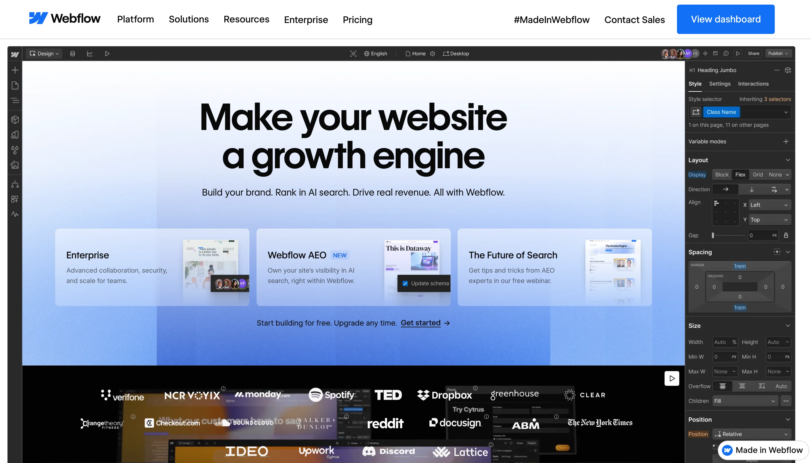
Webflow has a unique advantage in B2B web design. Because it's a website builder, its own site is essentially a proof of concept. And it delivers. The site features a clean visual hierarchy, outstanding CMS-powered feature pages, and excellent use of customer proof throughout.
The documentation and educational content on Webflow's site deserve special attention. Webflow University, the template marketplace, and the community showcase all function as conversion tools that also provide genuine value. This works because buyers who learn through Webflow's content naturally consider Webflow as the solution.
Webflow also demonstrates strong SEO execution through its content structure. Every feature page, use case page, and educational resource is optimized for search, which means the site captures buyers at multiple stages of the research process.
Design lessons from Webflow:
- Let your website be the proof of your product's quality, because B2B buyers trust what they can see and experience over what they're told.
- Turn educational content into a conversion path, because helping buyers learn builds trust and keeps them on your site longer.
- Design feature pages as standalone landing pages, because each one can capture organic traffic for different search queries.
HubSpot
HubSpot runs one of the best educational content libraries in B2B. The website is designed around lead generation, and every element supports that goal, from the blog and resource center to the free tools and certification programs.
HubSpot's design stands out for how it manages complexity. HubSpot offers dozens of products across marketing, sales, service, and CMS. Instead of overwhelming visitors with everything at once, the site uses clear navigation categories, product comparison pages, and use-case-based entry points that guide buyers to the right product for their needs.
The conversion paths on HubSpot's site are worth studying closely. Almost every piece of content connects to a relevant next step, whether that's a free tool, a gated resource, or a product demo. This works because it gives visitors multiple ways to engage based on their readiness to buy.
Design lessons from HubSpot:
- Organize a complex product suite by use case rather than by product name, because buyers think in terms of problems, not product SKUs.
- Connect every piece of content to a logical next step, because dead-end pages waste the traffic you've already earned.
- Offer free tools as a conversion mechanism, because giving value upfront builds the trust that paid products require.
Asana
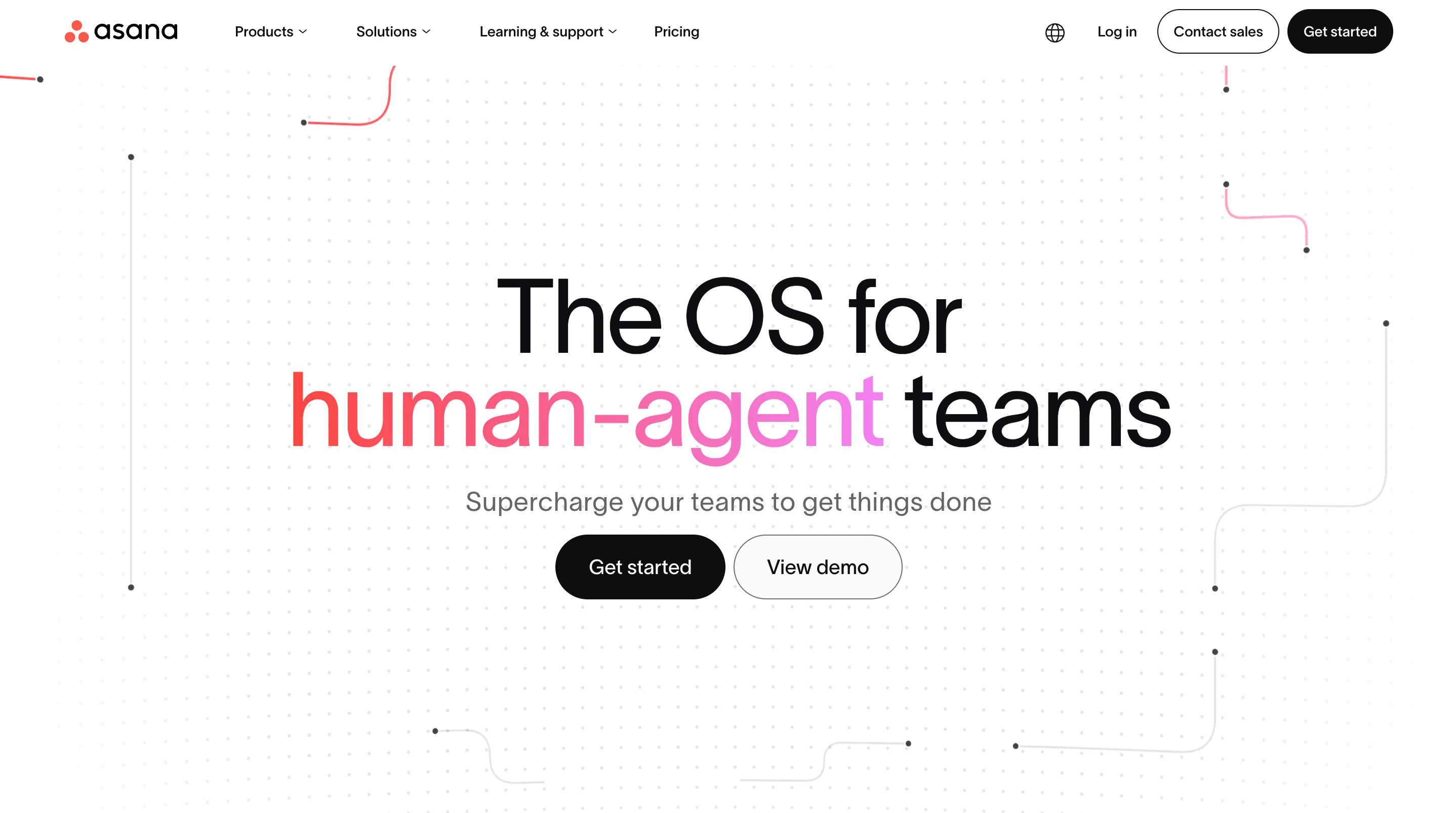
Asana takes a product-first approach to storytelling. The website puts the product interface front and center, using real screenshots and interactive previews to show how Asana works in practice. This is effective because project management is a crowded category, and showing the actual experience helps Asana stand out from competitors who rely on abstract messaging.
The navigation is surprisingly simple for a product with as many features as Asana offers. Rather than listing every feature in the header, Asana groups content by audience (teams, enterprises, individuals) and by use case (project management, workflow automation, goal tracking). This simplicity signals confidence in the product.
Asana's enterprise messaging is also well executed. The enterprise pages focus on security, admin controls, and scale without losing the friendly, approachable tone that defines the brand. That balance is hard to achieve, and most B2B companies default to either too corporate or too casual.
Design lessons from Asana:
- Put your product UI at the center of your homepage, because real product visuals beat abstract illustrations every time.
- Group navigation by audience and use case, because this structure matches how buyers actually think about their needs.
- Maintain a consistent brand tone across all buyer segments, because tone shifts between pages make your site feel disjointed.
Notion
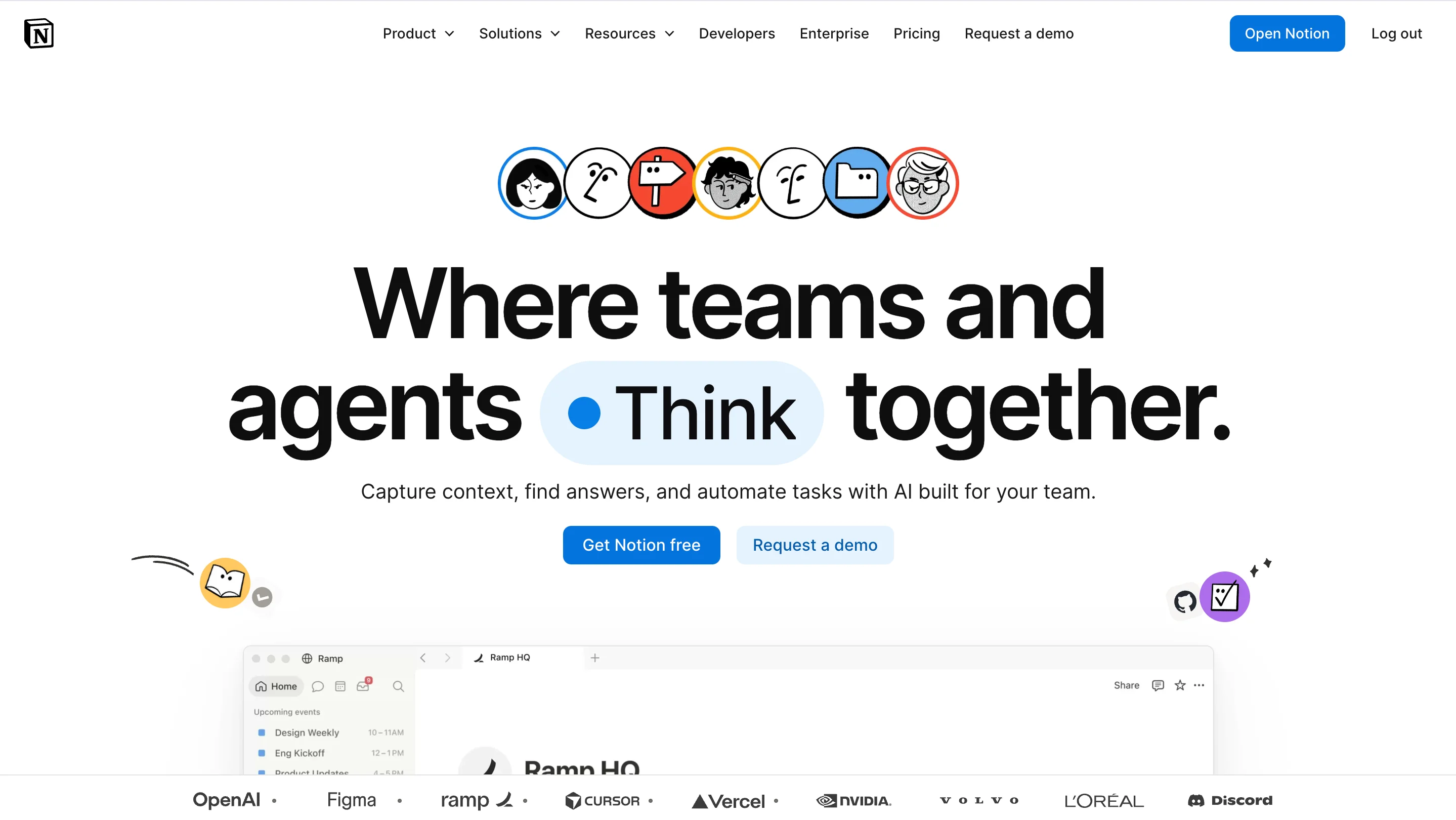
When it comes to content presentation, Notion is the best. The site's design is clean and spacious, with a layout that feels more like a well-designed publication than a software marketing page. This works because Notion's product is all about organizing information beautifully, and the website demonstrates that capability before the visitor even signs up.
The template gallery is one of Notion's strongest conversion tools. By offering hundreds of free templates, Notion gives visitors a reason to create an account and start using the product immediately. This is a smart design decision because it turns the website into an onboarding tool rather than just a marketing page.
Notion's onboarding flow is also worth noting. The transition from marketing site to product experience is smooth and intentional, with minimal friction between "I'm interested" and "I'm using it." That seamlessness matters because every unnecessary step in the signup process costs you a percentage of potential users.
Design lessons from Notion:
- Design your website to feel like a preview of the product experience, because consistency between the marketing site and the actual product builds trust.
- Use a free resource gallery (templates, tools, examples) as both a conversion mechanism and an SEO asset, because it attracts organic traffic and encourages signups simultaneously.
- Minimize friction between "interested" and "signed up," because every extra click or form field reduces conversions.
Linear
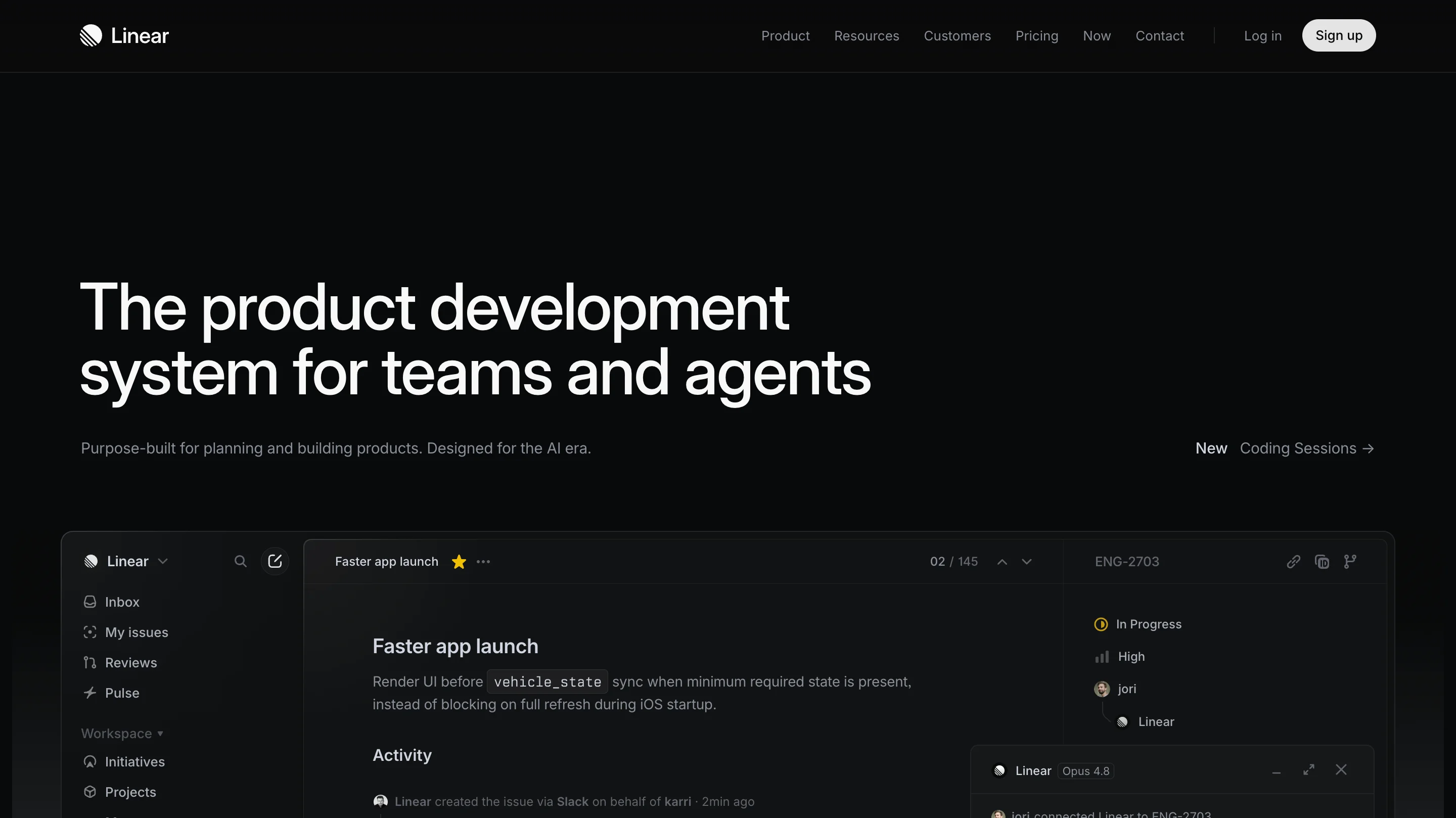
Linear proves that B2B doesn't have to look boring. The site uses a minimalistic design with bold typography, dark backgrounds, and outstanding animations that make a project management tool feel like a premium product. Hiring a motion designer to add flashy effects to a mediocre site wouldn't achieve this result. Linear's animations work because they serve a purpose, such as illustrating speed, precision, and the quality of the product experience.
The white spaces in Linear's design are what make it powerful. There isn't much copy on the page, and there don't need to be. The product visuals, the animations, and the typography communicate the brand's core message (speed and precision) without paragraphs of explanation.
Linear's approach only works because it's backed by a strong product. But the lesson still applies: when your design language matches your product's core value, the website becomes an extension of the brand rather than just a marketing wrapper around it.
Design lessons from Linear:
- Match your design language to your product's core value, because a tool built for speed should feel fast on its marketing site too.
- Use restraint as a design strategy, because saying less with more confidence signals quality.
- Invest in purposeful animation, because motion that demonstrates product attributes is far more effective than decorative effects.
B2B SaaS website examples at a glance

Best B2B ecommerce website design examples
B2B ecommerce design has different requirements than SaaS. The buyers are often procurement professionals managing large orders, custom pricing, and approval workflows. About 73% of B2B buyers prefer to shop online, and the global B2B ecommerce market is projected to surpass $32 trillion by 2026. Some projections put that number at $62.2 trillion by 2030, which signals that the shift to online B2B purchasing is accelerating, not slowing down. That scale means the stakes for getting ecommerce UX right are enormous.
So what does good B2B ecommerce design look like? Here are three sites that get it right.
Amazon Business
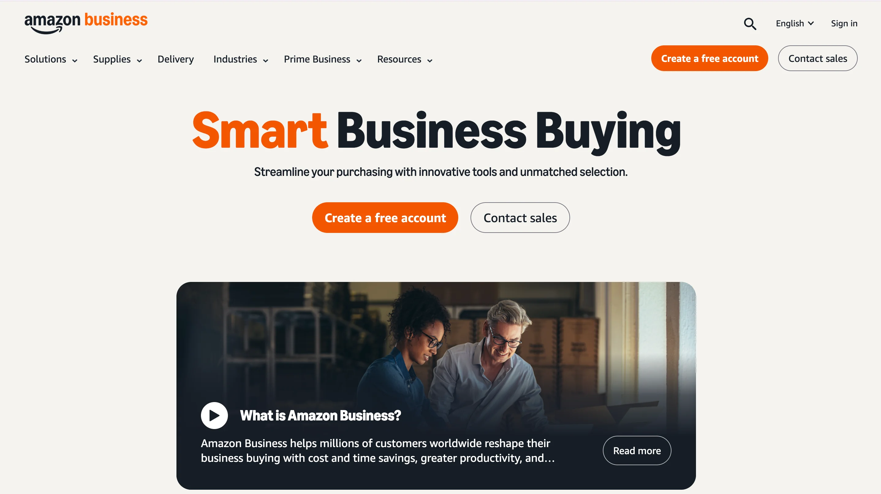
Amazon Business is the enterprise arm of Amazon, and it demonstrates how a consumer-grade shopping experience can be adapted for B2B procurement. The site handles enormous product catalogs through advanced filtering, customized business pricing, and integrated approval workflows that let purchasing teams manage orders within their existing processes.
What makes Amazon Business effective is that it removes friction at every step. Bulk ordering, multi-user accounts, purchase order support, and tax-exempt purchasing are all built into the core UX rather than bolted on as afterthoughts. This matters because B2B buyers have more complex requirements than consumers, and forcing them through a consumer checkout process creates frustration.
The site also segments the experience by business size and industry, which means a small business owner and an enterprise procurement manager see different content and tools. That segmentation keeps the experience relevant for both audiences without overwhelming either one.
Design lessons from Amazon Business:
- Prioritize search and filtering over browsing for large catalogs, because B2B buyers usually know what they need and want to find it quickly.
- Build approval workflows into the purchasing UX, because B2B purchases involve multiple decision-makers and your checkout process needs to reflect that.
- Surface pricing tiers and bulk discounts early, because procurement teams compare vendors on total cost and hidden pricing loses deals.
Grainger
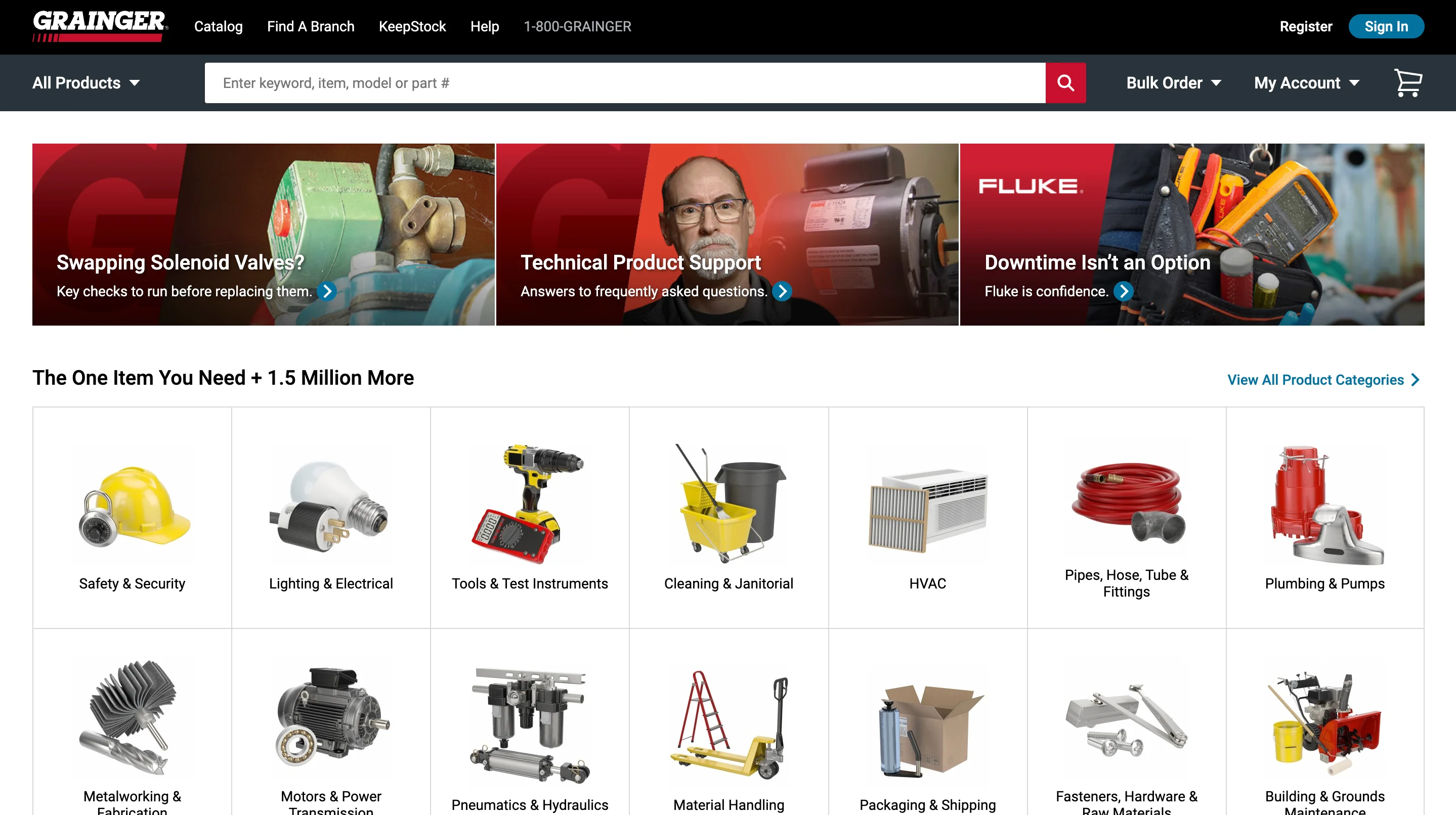
Grainger is one of the best examples of B2B industrial supply design. With millions of products in its catalog, the site focuses on rapid re-ordering, clear SKU visibility, and multi-location inventory tracking. The design prioritizes functionality over aesthetics, which is the right call for its audience of MRO (maintenance, repair, and operations) buyers.
The site's search experience is particularly well designed. Grainger's search handles technical product names, part numbers, and industry-specific terminology effectively, which matters because industrial buyers search differently than consumers. They often know the exact specification they need, and the site needs to understand that language.
Grainger’s account-level personalization is also pretty good. Repeat buyers see their order history, frequently purchased items, and customized pricing based on their account terms. This reduces time-to-purchase for returning customers, which is critical for a business where customers reorder the same supplies regularly.
Design lessons from Grainger:
- Design your search to understand industry-specific terminology, because B2B buyers use technical language that generic search engines often miss.
- Make reordering faster than ordering, because returning customers are your highest-value segment and their time is your competitive advantage.
- Prioritize function over aesthetics when your audience values efficiency, because MRO buyers don't need a beautiful homepage as much as they need a fast path to the right product.
Alibaba
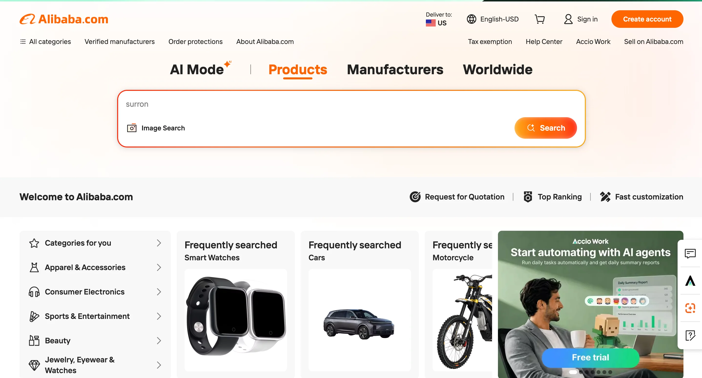
Alibaba is the global standard for B2B marketplace design. The site handles trust and verification at a scale that most B2B platforms never encounter, connecting millions of buyers with suppliers across different countries, languages, and regulatory environments.
Alibaba's design is notable for its trust infrastructure. Supplier profiles include verification badges, trade assurance programs, inspection reports, and buyer reviews. These trust signals are essential because B2B buyers on Alibaba are often sending significant payments to suppliers they've never met in person, and the platform's design needs to bridge that trust gap.
The product listing design also deserves attention. Each listing includes minimum order quantities, shipping estimates, customization options, and direct messaging with the supplier. This density of information works because Alibaba's buyers are evaluating suppliers, not just products, and they need all of this data to make a decision.
Design lessons from Alibaba:
- Build trust verification into the core UX when buyers and sellers don't have existing relationships, because marketplace transactions depend on platform-level credibility.
- Include all evaluation criteria (pricing, minimums, shipping, customization) on the product listing itself, because B2B buyers compare multiple suppliers simultaneously and shouldn't have to click into each one separately.
- Design for cross-border commerce by supporting multiple languages, currencies, and regulatory contexts, because your buyers' needs change based on where they're located.
B2B ecommerce website examples at a glance
Best enterprise and technology website design examples
Enterprise and technology companies face a specific design challenge. Their products are often complex, technical, and multi-layered, but the website still needs to be accessible to both technical evaluators and business decision-makers. The best enterprise sites solve this by creating clear information architecture and using design to make technical concepts approachable.
Vercel
Vercel is one of the best examples of developer-focused design in B2B. The site manages to feel premium and polished while still speaking directly to a technical audience. The product demos, code examples, and performance benchmarks are all front and center, because Vercel's buyers want to see proof of capability, not marketing promises.
The balance between developer credibility and business decision-maker messaging is well handled. Technical visitors can explore documentation, deployment guides, and framework comparisons, while the enterprise pages focus on scale, security, and team collaboration. This dual-track approach works because enterprise deals require buy-in from both engineers and executives.
Design lessons from Vercel:
- Lead with technical proof (benchmarks, code examples, demos) when your audience is developers, because this audience trusts evidence over marketing copy.
- Create separate but connected paths for technical and business audiences, because the person evaluating your product is often not the person approving the purchase.
- Use your site's own performance as a proof point, because a fast, well-built website signals that your hosting or deployment product actually delivers on its promises.
Cloudflare
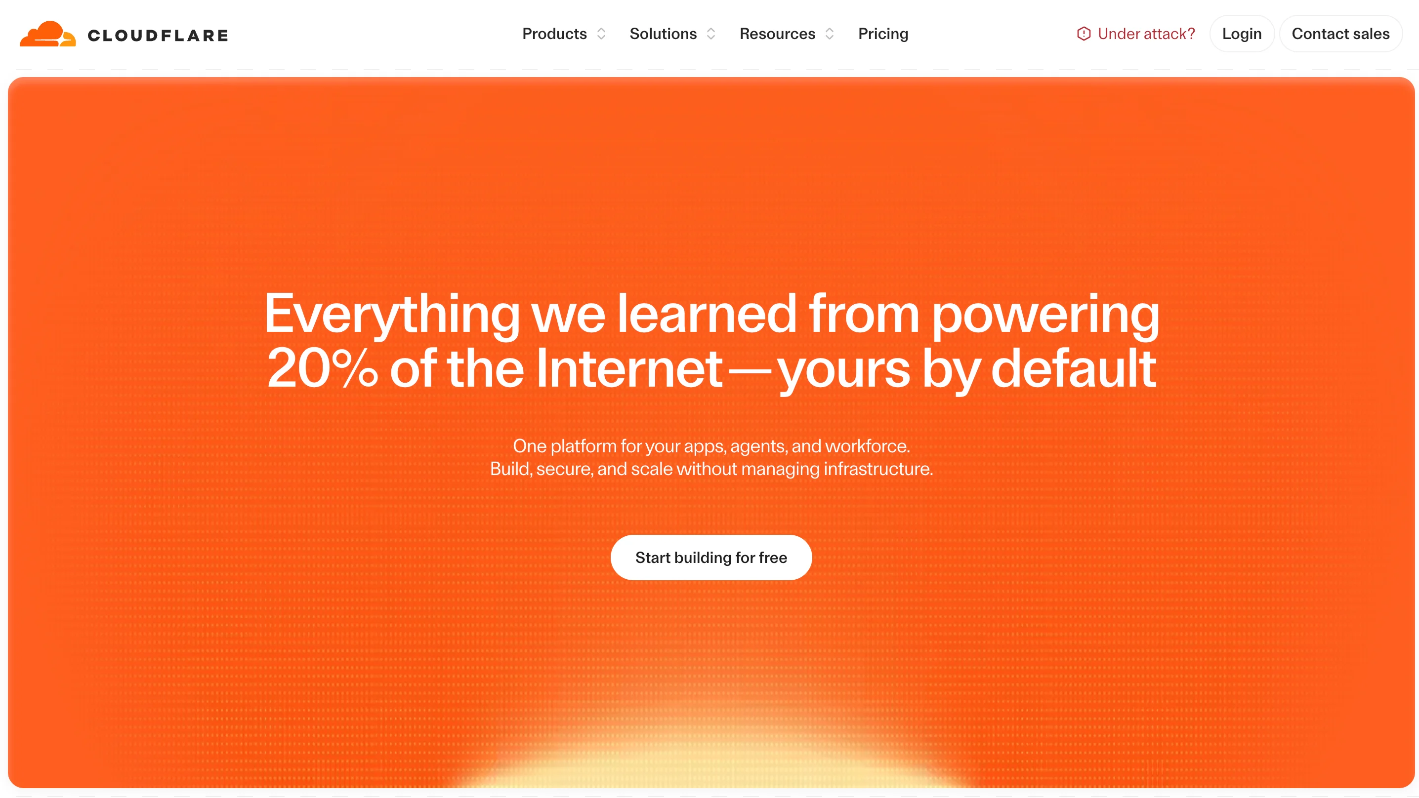
Cloudflare has a challenging information architecture problem. The company offers security, performance, networking, and developer platform products, each with multiple tiers and use cases. The website handles this by organizing content around use cases and solutions rather than product names.
This approach works because buyers usually start with a problem ("I need to protect my site from DDoS attacks" or "I need to speed up my global content delivery") rather than a product name. By mapping navigation to problems, Cloudflare meets buyers where they are instead of forcing them to learn the product taxonomy first.
Design lessons from Cloudflare:
- Organize a complex product suite by the problems it solves, because buyers search for solutions and not product names.
- Use clear visual segmentation between product lines, because visitors should be able to tell at a glance which part of the site they're in.
- Make technical documentation a first-class citizen in your navigation, because B2B tech buyers often evaluate products through docs before they talk to sales.
Snowflake

Snowflake demonstrates how enterprise storytelling can work at scale. The site communicates the value of a data platform to both technical data engineers and C-suite executives, using different content types and design approaches for each audience.
The use of customer stories and case studies is especially well executed. Rather than generic "customer X increased revenue by Y%" blurbs, Snowflake's case studies are detailed, industry-specific, and focused on the technical architecture decisions that led to results. This depth matters because enterprise buyers are comparing platforms, and surface-level testimonials don't help them evaluate the technical fit.
Design lessons from Snowflake:
- Tell detailed customer stories that include technical decision-making, because enterprise buyers evaluate your product's fit through the experience of companies similar to theirs.
- Segment content by industry vertical, because a healthcare data platform buyer and a financial services buyer have very different compliance and performance requirements.
- Use data visualizations and architecture diagrams to communicate value, because abstract platform benefits become concrete when you show the architecture.
Datadog
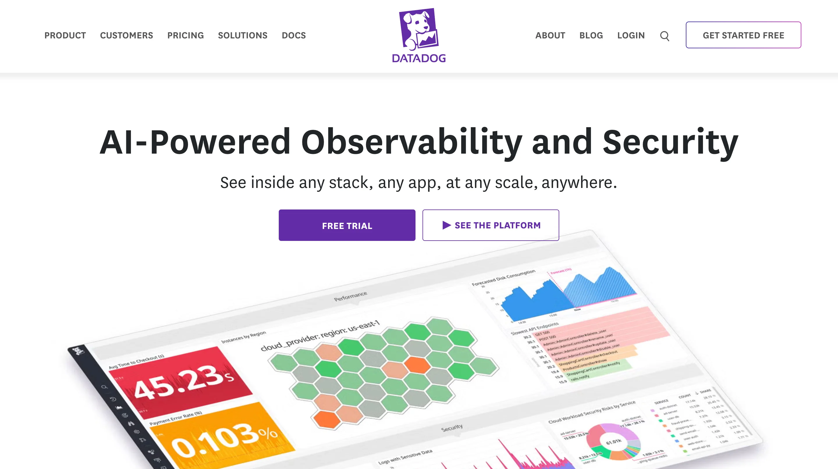
Datadog has one of the best information architectures in enterprise B2B. The company offers monitoring, security, and analytics products that could easily overwhelm a visitor. But the site uses clear product category pages, comparison tools, and integration directories to help buyers find exactly what they need.
The integration directory is a standout feature. By listing 750+ integrations with detailed documentation for each, Datadog reduces a major buyer objection ("will it work with our stack?") before the visitor ever talks to sales. This is effective because enterprise tech buyers evaluate compatibility as a primary purchasing criterion.
Design lessons from Datadog:
- Build an integration directory if your product connects to other tools, because enterprise buyers need to verify compatibility before they invest in evaluation.
- Use product comparison pages to help buyers self-select the right tier, because reducing confusion at the evaluation stage shortens the sales cycle.
- Design for depth rather than breadth on technical pages, because surface-level feature lists don't help buyers who are doing serious evaluation.
Figma
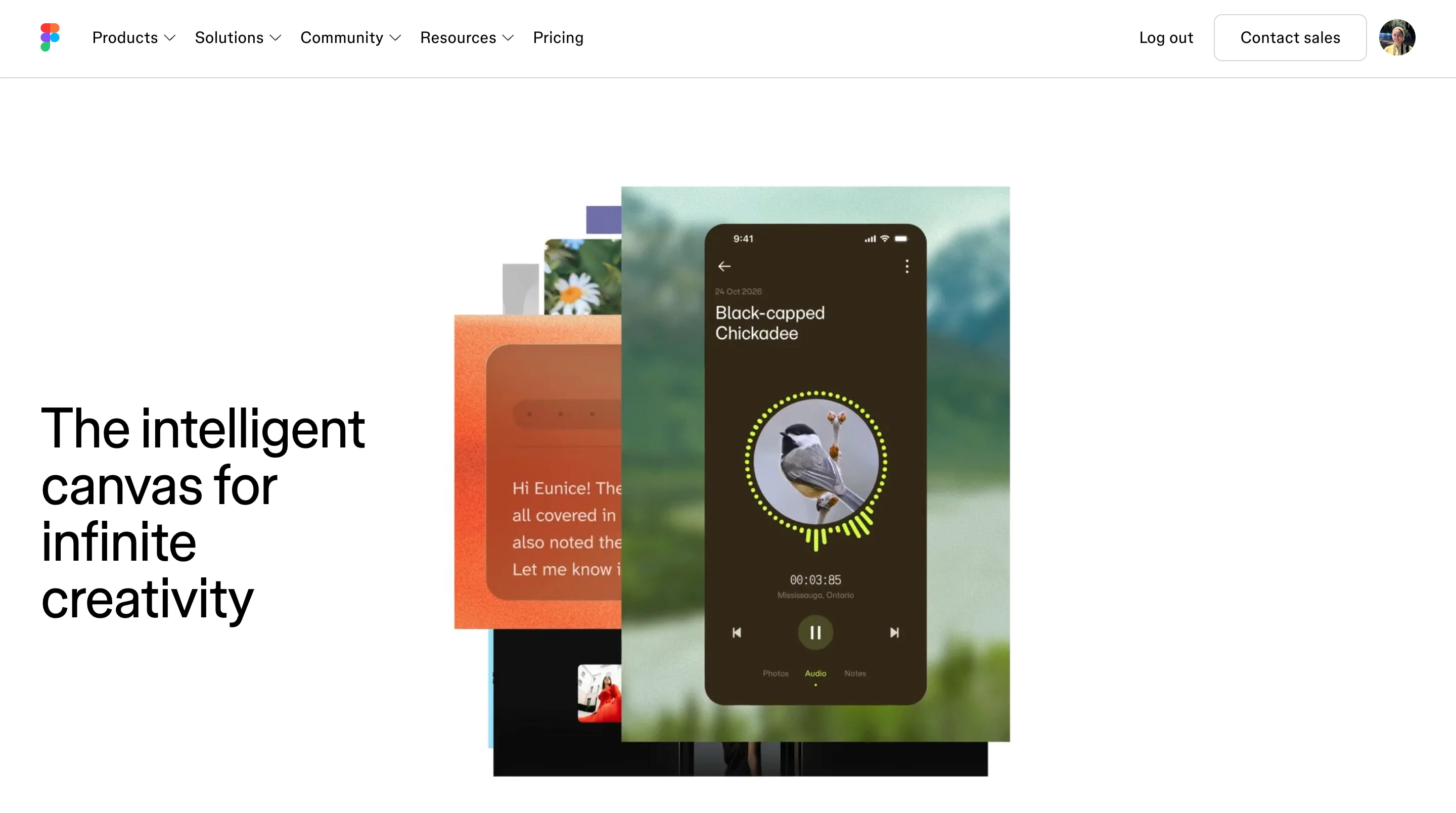
Figma uses its website as a product marketing showcase. The site demonstrates what Figma can do by incorporating the product into the marketing experience itself. Interactive design examples, collaborative features, and real-time previews all appear throughout the site, and they serve as proof points.
The collaboration angle in Figma's marketing is especially effective. Every page reinforces the message that Figma is built for teams, and the design itself feels collaborative and open. This matters because Figma competes against tools that are also powerful but positioned more as individual productivity software.
Design lessons from Figma:
- Use your website to demonstrate your product's value, not just describe it, because interactive proof is more persuasive than feature descriptions.
- Reinforce your core differentiator on every page, because repetition through varied contexts builds a stronger brand position than saying it once on the homepage.
- Design community and sharing features into the marketing site, because user-generated content (templates, plugins, examples) becomes a powerful organic growth channel.
B2B enterprise website examples at a glance
Best B2B services and agency website design examples
Service and agency websites face a different design challenge than product companies. When you're selling expertise rather than software, your website itself becomes the primary portfolio piece. Visitors judge the quality of your work by the quality of your site, which means the design standards are uniquely high.
Clay
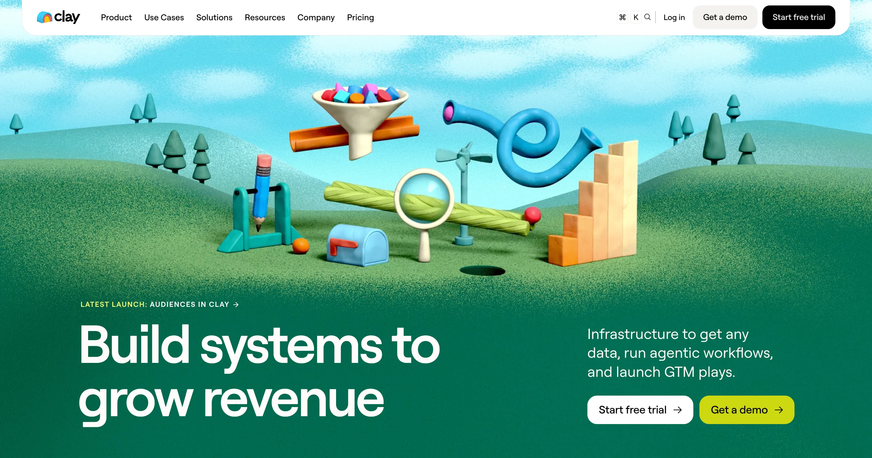
Clay (the design agency, not the data tool) is widely regarded as one of the best-designed agency websites in the world. The site is a masterclass in using visual design as the primary communication tool. Minimal copy, maximum visual impact, and a portfolio that speaks for itself.
Clay's approach works because of its confidence. The site doesn't over-explain what the agency does or cram the homepage with case study summaries. Instead, it lets the work do the talking, which signals to potential clients that Clay is selective and in demand. This positioning works because premium agencies attract premium clients by demonstrating quality, not by listing services.
Design lessons from Clay:
- Let your portfolio be your primary sales tool, because service buyers trust what they can see over what they're told.
- Use visual confidence (minimal copy, strong imagery, bold layout) to signal premium positioning, because how your site looks is the first proof of the quality you deliver.
- Be selective about what you show, because a curated portfolio of 10 strong projects is more persuasive than a gallery of 50 mediocre ones.
Instrument
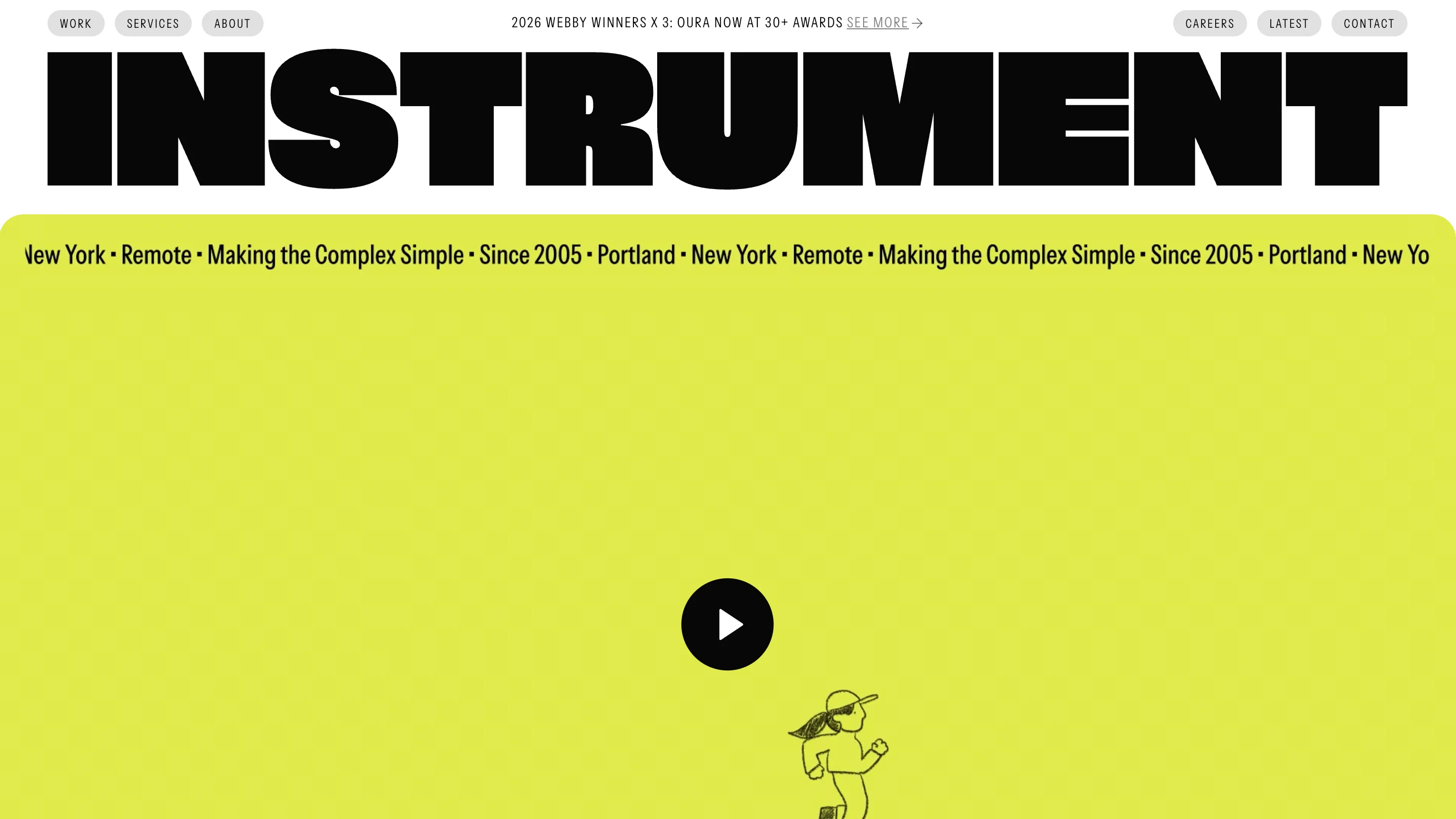
Instrument demonstrates how service companies can tell their story through project narratives rather than feature lists. Each case study on the site reads like a design story, with context, challenge, process, and result. This editorial approach to case studies works because it helps potential clients imagine what it would be like to work with Instrument, not just what the output would look like.
The site's overall design is clean and editorial, with strong photography and thoughtful typography. The navigation is simple, which keeps the focus on the work rather than the agency's organizational structure.
Design lessons from Instrument:
- Present case studies as narratives with context, challenge, and result, because storytelling is more persuasive than before-and-after screenshots.
- Keep your agency site focused on the work, because potential clients are evaluating your taste and judgment through every design decision you make.
- Use editorial design principles (strong photography, considered typography, generous white space) to signal quality, because these details communicate care and attention.
Ramotion
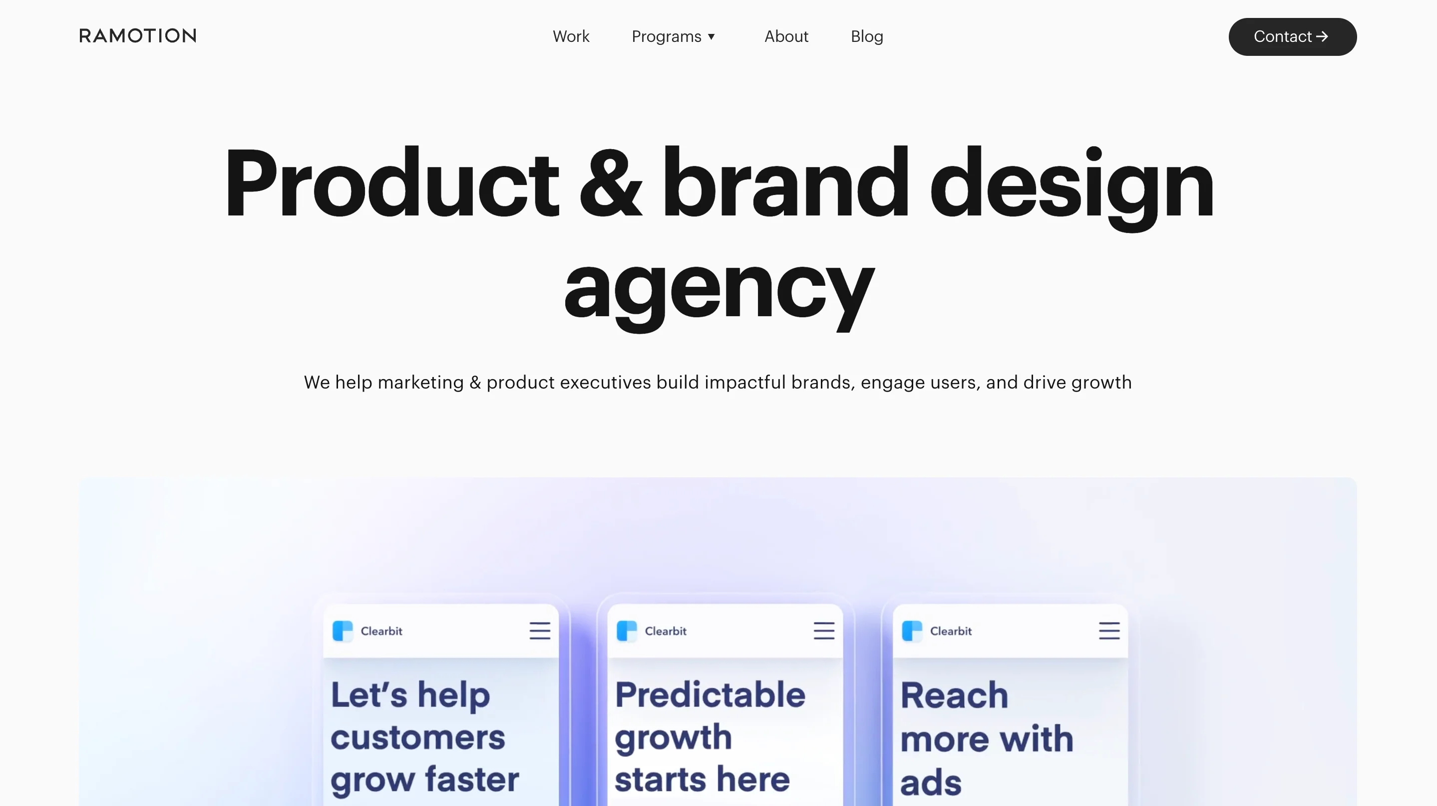
Ramotion does a great job of balancing brand identity with portfolio showcase. The site communicates clear service positioning (brand identity, UI/UX design, web development) while letting the portfolio demonstrate the range and quality of the work. This balance matters because agencies that lead with services often feel generic, while agencies that lead with portfolio alone can feel unfocused.
The service pages are well structured, with enough detail to help buyers understand what they'd be getting without overwhelming them. Each service page connects to relevant case studies, which creates a natural browsing path for visitors who want to evaluate the agency's expertise in a specific area.
Design lessons from Ramotion:
- Balance service descriptions with relevant portfolio examples on the same page, because buyers want to see proof alongside the promise.
- Create clear service categories even if your work spans multiple disciplines, because buyers who can't figure out what you do won't reach out.
- Link every service page to relevant case studies, because this creates a natural evaluation path for potential clients.
B2B services examples at a glance
Best manufacturing and industrial website design examples
Manufacturing websites have a reputation for being outdated and difficult to use. But the reality is that manufacturing buyers are just as digitally savvy as SaaS buyers. They expect modern UX, clear product information, and intuitive navigation. The challenge is that manufacturing sites need to communicate a different kind of trust.
Let's be honest, a SaaS buyer worries about whether the product integrates with their stack. A manufacturing buyer worries about whether your facility can produce 50,000 parts to aerospace specifications on time. That's a fundamentally different trust equation, and the design needs to reflect it.
According to NSF research, 72% of consumers are more likely to purchase products that display certification marks, because those marks signal that a product has been independently tested and meets established standards. Yet most manufacturing websites bury their certifications, compliance badges, and facility information multiple clicks away from the homepage. That's a significant problem, because procurement teams evaluate credibility before they evaluate product specifications.
Siemens
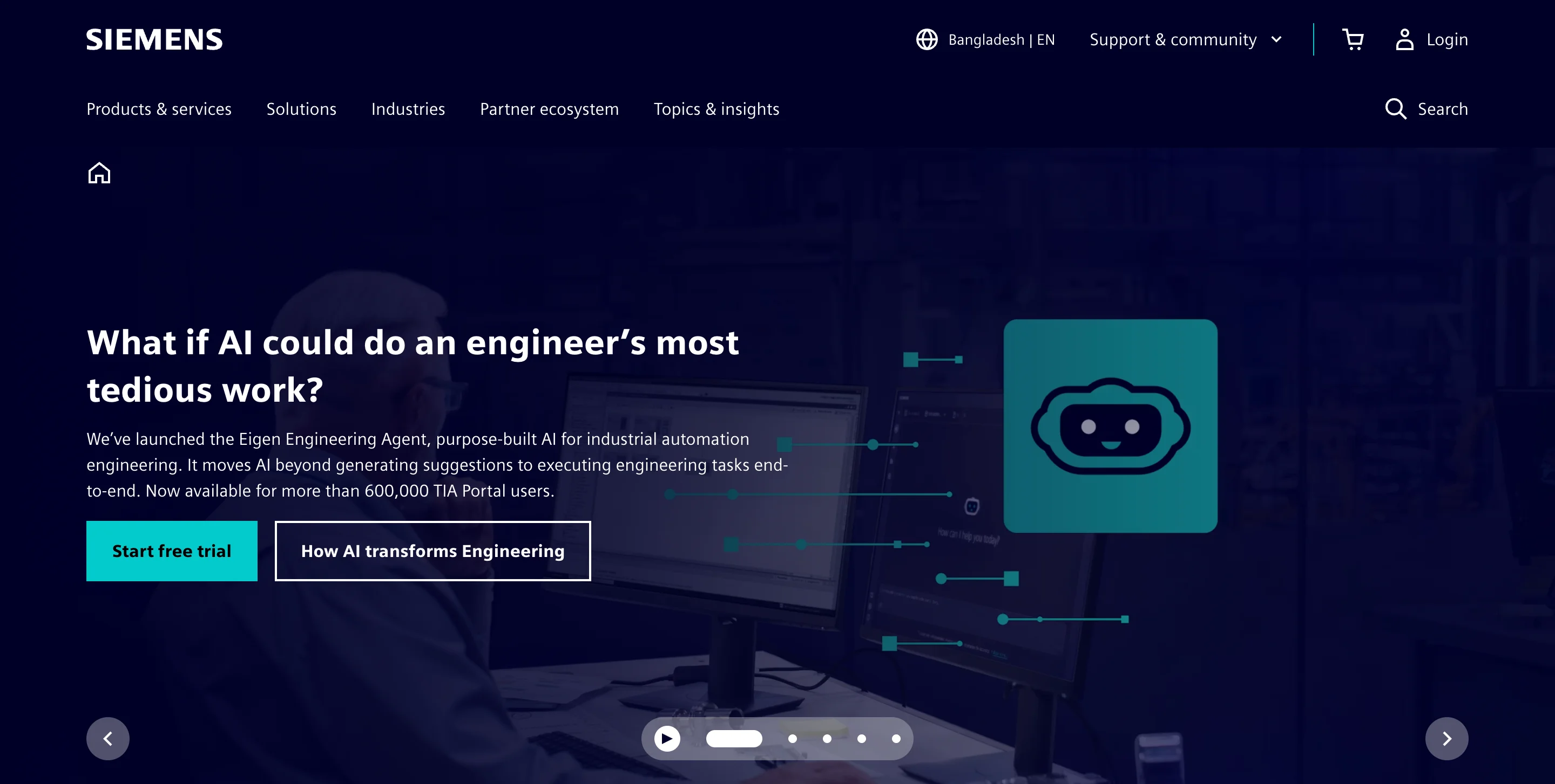
Siemens manages one of the most complex product portfolios in industrial B2B, spanning automation, energy, healthcare, and infrastructure. The website handles this complexity through industry-specific landing pages, clear product categorization, and technical documentation that's accessible without being oversimplified.
The navigation structure deserves special attention. Siemens uses industry verticals as the primary navigation path, which means a buyer in automotive manufacturing and a buyer in building automation see different content from their first click. This works because industrial buyers identify strongly with their industry, and content that speaks to their specific use case is far more persuasive than generic product pages.
Design lessons from Siemens:
- Use industry verticals as your primary navigation when your product serves multiple sectors, because industrial buyers evaluate your relevance through the lens of their specific industry.
- Make technical documentation accessible and well-organized, because manufacturing buyers often need specifications, CAD files, and datasheets before they contact sales.
- Build dedicated landing pages for each industry you serve, because a single general homepage can't communicate deep expertise across multiple verticals.
Schneider Electric
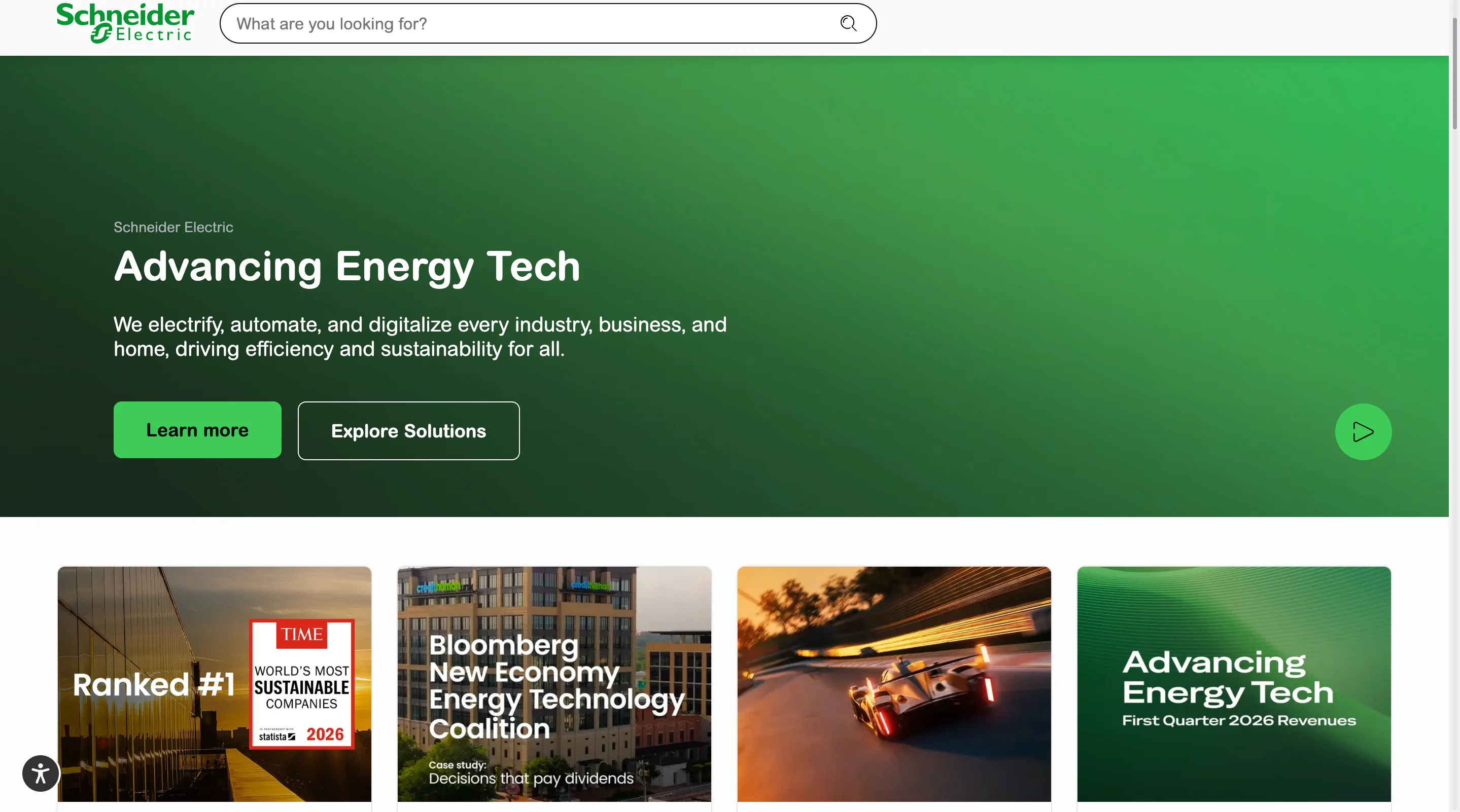
Schneider Electric demonstrates strong global presence design. The site includes language switchers, regional content variations, and local contact pathways that make it easy for buyers anywhere in the world to find relevant information. This matters because manufacturing is a global business, and a buyer in Germany has different regulatory requirements and distributor networks than a buyer in Brazil.
The balance of product information with sustainability messaging is also noteworthy. The site integrates environmental data, energy efficiency metrics, and corporate responsibility content without overwhelming the product pages. This balance is increasingly important because ESG criteria are becoming a factor in industrial procurement decisions.
Design lessons from Schneider Electric:
- Design for global audiences with regional content, language support, and local contact pathways, because manufacturing buyers need to reach the right regional team quickly.
- Integrate sustainability messaging into product pages rather than isolating it in a separate section, because ESG criteria are becoming a purchasing factor and buyers want to see environmental data alongside technical specs.
- Make distributor and partner information easy to find, because manufacturing sales often flow through channel partners and your website needs to support that process.
Rockwell Automation
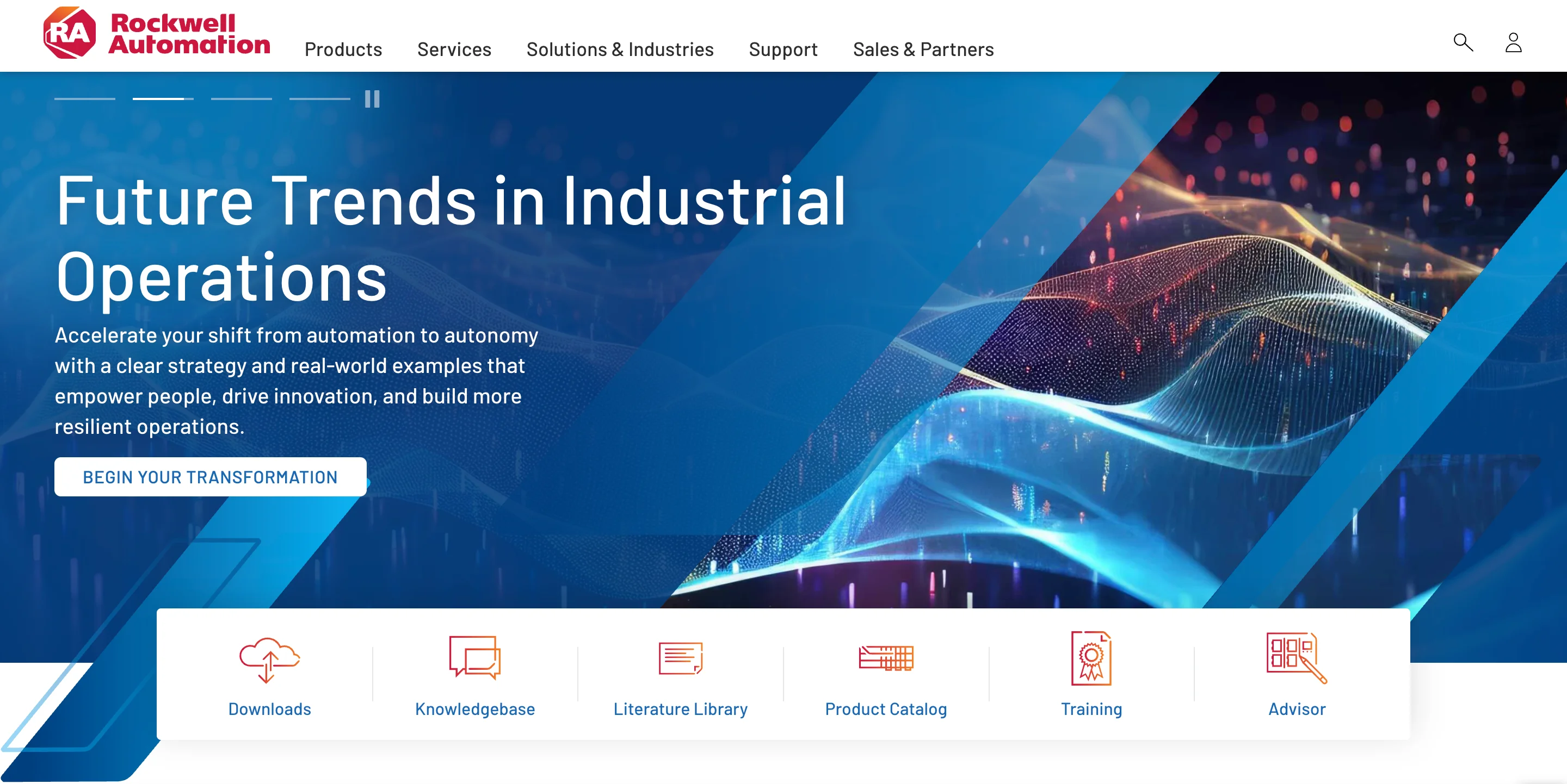
Rockwell Automation excels at making RFQ (request for quote) processes accessible through its website design. The path from product discovery to quote request is clear and frictionless, which is critical because the RFQ is the primary conversion event for most manufacturing websites.
The site also stands out in terms of displaying certifications and compliance information prominently. ISO standards, safety certifications, and industry-specific compliance badges are visible on product pages rather than buried in a footer or "about us" section. This placement matters because procurement teams use these signals to filter vendors before they even evaluate technical specifications.
Design lessons from Rockwell Automation:
- Design your RFQ pathway as carefully as a SaaS company designs its signup flow, because the quote request is your primary conversion event and friction in that process costs you leads.
- Display certifications and compliance badges on product pages, not just in your footer, because procurement teams use these signals as qualifying criteria early in their evaluation.
- Build product configuration tools into the website when possible, because allowing buyers to specify requirements before requesting a quote improves lead quality and saves time for both parties.
B2B manufacturing website examples at a glance
All B2B website examples at a glance
Here's a master comparison of every website featured in this guide. Use this table to find the examples most relevant to your industry and goals.
B2B website design trends to watch in 2026
The examples above reflect where B2B design is right now. But the field is moving quickly, and a few trends are already reshaping how the best companies approach their websites.
1. AI-first positioning
More B2B companies are integrating AI directly into their product and marketing experience rather than treating it as a feature bullet point. This shows up in chatbots that actually help (not just popup-and-annoy), AI-powered product recommendations, and dynamic content that adjusts based on the visitor's behavior. The sites that do this well use AI to reduce friction rather than add complexity.
Tools like Drift and Intercom have made AI-powered chat a standard feature on B2B websites, and the companies seeing the best results are the ones that train their bots on real buyer questions rather than generic scripts.
2. Motion and microinteractions with purpose
Linear and Stripe proved that animation can be a competitive advantage in B2B. In 2026, more B2B sites are adopting motion design, but the ones that work are the ones where every animation has a role. Scroll-triggered product demos, hover states that reveal additional information, and transitions that guide the eye toward the CTA are all examples of motion that serves conversion rather than decoration.
3. Answer engine optimization (AEO)
With AI Overviews appearing in Google search results for B2B queries, website design now affects how and whether your content appears in AI-generated answers. Sites that structure their content with clear headings, concise definitions, and FAQ schema are more likely to be cited in AI overviews. This isn't separate from SEO. It's the next layer of it.
4. Dark mode and high-contrast design
Developer-focused B2B companies have used dark themes for years, but the trend is spreading to broader B2B audiences. Dark backgrounds with high-contrast typography create a premium, modern feel that works particularly well for technology products. The key is ensuring accessibility and readability aren't sacrificed for aesthetics.
5. Personalized buyer journeys
The best B2B sites in 2026 are moving beyond simple "enterprise vs. SMB" segmentation. They're using industry, role, and behavioral signals to serve different content to different visitors. Snowflake's industry-specific landing pages and Amazon Business's buyer-type segmentation are early examples of this trend.
6. Mobile-first design for B2B research
The old assumption that B2B buyers only use desktop is outdated. Research increasingly happens on mobile, especially during commutes, conferences, and quick comparisons between meetings. Google data shows that a 1-to-10 second increase in mobile page load time increases bounce probability by 123%, which means B2B sites that aren't optimized for mobile are losing buyers during the research phase.
Common B2B website design mistakes (and how to avoid them)
Knowing what good looks like is only half the picture. Here are the most common mistakes we see on B2B websites, along with the fix for each one.
1. Overloading the hero section
Many B2B sites try to say everything above the fold. The hero ends up with a headline, a subheadline, two buttons, a product mockup, animated stats, and a logo bar, all competing for attention simultaneously. The fix is to give your hero section one job. Lead with a single, clear value proposition and one primary CTA. Everything else can live further down the page.
2. Hiding pricing or burying it behind "contact us"
B2B buyers increasingly expect pricing transparency. Hiding your pricing forces qualified buyers into a sales call they don't want, and it signals that you're either expensive or unsure about your value. The fix is to show pricing tiers, starting-at prices, or at minimum a clear path to a personalized quote with specific criteria listed.
3. Using stock photography instead of product visuals
Generic stock photos of people shaking hands in conference rooms don't build trust or communicate value. They signal that you didn't invest in your own marketing. The fix is to show your actual product, your team, your facility, or your work. Real visuals create real trust.
4. Neglecting mobile experience
If your B2B website looks broken or slow on a phone, you're losing potential buyers during their initial research. Research shows that a well-designed UX can increase conversion rates by up to 400%, and mobile responsiveness is a core part of that equation. The fix is to design mobile-first and test on real devices, not just responsive breakpoints in a browser.
5. No clear conversion path
Some B2B sites have great content but no obvious next step for the visitor. Every page should guide the visitor toward one primary action, whether that's booking a demo, requesting a quote, downloading a resource, or signing up for a free trial. The fix is to audit every page on your site and ask "what should a visitor do next?" If the answer isn't obvious, add a clear CTA.
6. Treating the website as a brochure
A B2B website that lists features and services without addressing buyer questions, objections, or the evaluation process is functioning as a digital brochure. And let's face it, nobody reads brochures. The fix is to design your website as a self-service sales tool that guides buyers through the evaluation process with relevant content at every stage.
7. Inconsistent design across pages
When your homepage looks polished but your product pages look like they were built three years ago, it creates a trust gap. Research shows that consistent branding can increase revenue by nearly 33%. The fix is to invest in a design system with reusable components, consistent typography, and standardized spacing, so that every page feels like it belongs to the same company.
8. Ignoring how design affects search performance
Your website's design choices directly affect whether search engines can crawl, index, and rank your content. Heavy JavaScript rendering, slow-loading images, poor mobile layouts, and missing heading structures all reduce your visibility in both traditional search results and AI-generated overviews. The fix is to treat Core Web Vitals (LCP, CLS, and INP) as design requirements, not as afterthoughts. Build your pages with clean semantic HTML, optimized images, and responsive layouts from the start, because Google measures these metrics and uses them as ranking signals.
Accessibility standards like WCAG also matter for both compliance and UX, and privacy compliance signals like GDPR badges can serve as additional trust indicators for European buyers.
How to apply these design lessons to your own B2B website
Looking at great examples is inspiring, but it doesn't help unless you have a plan for applying what you've learned. Here's a practical framework for turning inspiration into action.
Audit your current site against B2B best practices
Go back to the design patterns section at the top of this guide and score your site against each one. Do you have a clear value proposition above the fold? Is there one primary CTA? Is social proof visible early? Is your site fast on mobile? Be honest about where you stand, because the audit is only useful if it reflects reality.
You don't need a complex scoring system for this. A simple "yes / partially / no" for each pattern will give you a clear picture of where your biggest opportunities are.
Prioritize changes by business impact
Not everything needs to change at once, and trying to redesign everything simultaneously usually results in a project that stalls. Start with the changes that have the highest potential impact on conversion. For most B2B sites, that means improving your hero section, clarifying your CTAs, and adding social proof above the fold. These three changes tend to produce the most significant results because they affect every single visitor.
After the high-impact changes, move to the structural improvements like navigation, page speed, and mobile responsiveness. These take more effort but compound over time.
Choose the right path for your team
Once you know what needs to change, you need to decide how to get it done. There are three common paths, and each has tradeoffs.
You can learn more about the last option here.
The right choice depends on your budget, timeline, and how much design work your company needs beyond just the website. If you're rebuilding from scratch and have the budget, an agency project makes sense. If you need ongoing design support across your website, marketing materials, and product, a subscription model gives you more flexibility.
Final thoughts
The best B2B websites aren't the ones with the flashiest animations or the most expensive redesigns. They're the ones that communicate value clearly, build trust quickly, and make it easy for buyers to take the next step. Every example in this guide, from Stripe to Siemens, follows that same core logic.
That said, knowing what good looks like and actually building it are two different things. Redesigning a B2B website takes time, design expertise, and a clear understanding of what your buyers need at each stage of their decision. If your team is stretched thin or you're not sure where to start, that's where a dedicated design partner can help. You can see how magier works on our website design services page.
If you want a practical starting point, pick the industry section closest to yours, study the 3 design lessons from each example, and audit your own site against the patterns in the first section of this guide. Start with the highest-impact changes (hero section, CTA clarity, social proof placement) and build from there.
FAQ
B2B website design is the process of creating a website specifically for a company that sells products or services to other businesses. It differs from B2C design because the buying process involves longer sales cycles, multiple decision-makers, and a greater emphasis on trust, credibility, and detailed product information rather than impulse purchases.
B2B website design is the process of creating a website specifically for a company that sells products or services to other businesses. It differs from B2C design because the buying process involves longer sales cycles, multiple decision-makers, and a greater emphasis on trust, credibility, and detailed product information rather than impulse purchases.
Finding the right B2B website design company depends on your industry, budget, and goals. There are many talented B2B website designers and B2B website design agencies that specialize in different verticals. Some well-known options include Clay, Instrument, and Ramotion for premium custom work. If you're looking for an alternative to the traditional agency model, magier offers B2B website design services through a design subscription that provides dedicated design support with a 48-hour turnaround and unlimited revisions.
Website design has a significant impact on conversion. Research shows that a well-designed user experience can increase conversion rates by up to 400%, and 94% of first-impression assessments are design-driven. Specific design elements that affect conversion include CTA clarity, page speed, social proof placement, and how well the site addresses buyer questions and objections.
Popular B2B website templates are available on Webflow, HubSpot's template marketplace, and ThemeForest. Templates work well for companies in the early stages that need a functional site quickly, but custom design is usually the better choice for companies that want to differentiate their brand and optimize for conversion. The tradeoff is time and cost versus uniqueness and performance.
Start by understanding your buyer personas and their decision-making process. Then build the site around a clear value proposition, simple navigation, strong social proof, and a conversion-focused layout. The "How to apply these examples" section in this guide provides a step-by-step framework for auditing your current site and prioritizing improvements.
B2B websites need to account for longer sales cycles, multiple stakeholders (a typical B2B purchase involves 4 to 6 decision-makers), and buyers who are evaluating on criteria like integration, compliance, ROI, and vendor reliability. B2C websites optimize for individual impulse or consideration purchases. This means B2B sites generally need more detailed content, stronger trust signals, and clearer paths to speaking with a sales team.
.png)
.webp)