Best Dental Website Designs to Turn Visitors Into Patients (2026)
About 78% of patients search online before they ever book a dental appointment, and over 70% of those searches happen on mobile. That means your website is the first impression most prospective patients will ever have of your practice, and they're forming that impression on a phone screen while sitting in traffic or scrolling between meetings.
Dental website design comes with challenges that most web designers don't think about. You're designing for people who are often anxious about visiting the dentist, comparing costs across multiple practices, and looking for visual proof that you can deliver the results you promise. A site that looks polished but doesn't address those specific concerns won't convert visitors into booked appointments.
At magier, we've designed digital assets for 150+ brands, including healthcare and dental projects. We know what performs in this space because we've tested it. That experience led us to creating this guide.
In this article, we have covered 12 dental websites across six practice categories, and we break down the specific design decisions that make each one effective. We also cover the "digital anesthetic" design approach (using design to calm anxious patients), dental-specific conversion tactics, the ROI math of a website redesign, and common mistakes that cost dental practices patients every day.
Here's what we cover:
- 10 design lessons from the best dental websites in the world
- 12 real examples across premium, cosmetic, family, pediatric, multi-location, and DTC categories
- What each site does well and why it converts dental patients
- 3 specific design takeaways from every example
- A master comparison table organized by practice type
- Dental website design trends shaping 2026
- The ROI math that makes dental web design a smart investment
- Common dental website design mistakes and how to fix them
- A step-by-step framework for improving your own practice site
10 dental website design lessons from the best practices online
If you want the highlights before the full breakdown, here are the most important design principles we found across every site in this guide.
- Make "book an appointment" visible on every page and reachable in under two taps on mobile.
- Use real photos of your team, office, and patients instead of stock imagery.
- Design your site as a "digital anesthetic" with calming colors, soft tones, and generous whitespace.
- Display Google reviews and patient testimonials directly on service pages.
- Build dedicated landing pages for each treatment you offer.
- Make insurance and financing information easy to find.
- Include before-and-after galleries with real patient results.
- Display your dentist credentials, certifications, and ADA membership prominently.
- Optimize for mobile-first, because that's where your patients are.
- Invest in page speed.
What makes a dental website convert visitors into patients
Before we look at specific examples, let's establish the design patterns that show up in virtually every high-converting dental website. These aren't generic best practices. They're shaped by the specific psychology of dental patients and the way people search for and choose a dentist.
The "digital anesthetic" approach
This is the most important concept in dental web design, and most competitors miss it entirely. Dental anxiety affects a significant portion of the adult population, and your website is the first opportunity to either increase or reduce that anxiety. The best dental websites use calming color palettes (soft blues, greens, warm neutrals), rounded corners, generous whitespace, and approachable photography to create a visual experience that feels welcoming rather than clinical. Think of it this way: if your waiting room is designed to put patients at ease, your website should do the same.
Booking that works in under two taps
The primary conversion event on a dental website is booking an appointment. The best sites integrate booking directly with their practice management software (Dentrix, Jane, or RevenueWell) so patients can see real-time availability and schedule without calling. This is effective especially because research shows that 38% of new patient calls go unanswered during business hours, which means every unanswered call is a patient your competitor gets instead.
Trust signals calibrated for dental
Dental trust signals are specific: Google Reviews embedded on service pages (not just a link to your Google profile), before-and-after galleries with real patient results, dentist bios with credentials and ADA membership, and team photos that show the actual humans patients will meet. The research is clear on this: 88% of consumers trust online reviews as much as personal recommendations.
One treatment, one page
Every treatment your practice offers should have its own landing page. A patient searching for "dental implants near me" needs to land on a page specifically about implants, with relevant before-and-after photos, pricing guidance, FAQs, and a booking CTA. A generic services page that lists 15 procedures in bullet points can't compete.
Insurance and financing transparency
One of the most underrated conversion factors in dental design is making insurance and financing information visible and easy to find. Patients comparing dental practices often eliminate options based on insurance acceptance before they even look at the design or reviews. The best dental sites list accepted plans clearly and explain financing options (CareCredit, in-house payment plans) on both the homepage and individual treatment pages.
Mobile-first for urgent searches
Dental searches are often urgent. A broken tooth, sudden pain, or a recommendation from a friend all lead to phone-based searches where the patient wants to find, evaluate, and book within minutes. Research shows that 98% of consumers used the internet to find a local business in 2025, and dental practices are one of the most commonly searched local service categories. Sites optimized for mobile with tappable phone numbers, simplified navigation, and fast load times capture these patients.
Performance that passes the speed test
Core Web Vitals is really important for dental sites. The benchmarks are LCP under 2.5 seconds, INP under 200 milliseconds, and CLS under 0.1. Sites that hit these targets rank better in local search and keep impatient patients from bouncing.
Accessibility is also crucial for dental sites. Following WCAG guidelines for contrast, font sizes, and keyboard navigation ensures that elderly patients, patients with disabilities, and anyone using assistive technology can use your site without barriers.
Now let's look at how the best dental practices put these patterns into practice.
Best premium and modern dental website designs
These three practices have elevated dental branding beyond the typical clinical look. Their sites feel more like premium lifestyle brands than dentist offices, and that positioning helps them attract patients who value experience as much as expertise.
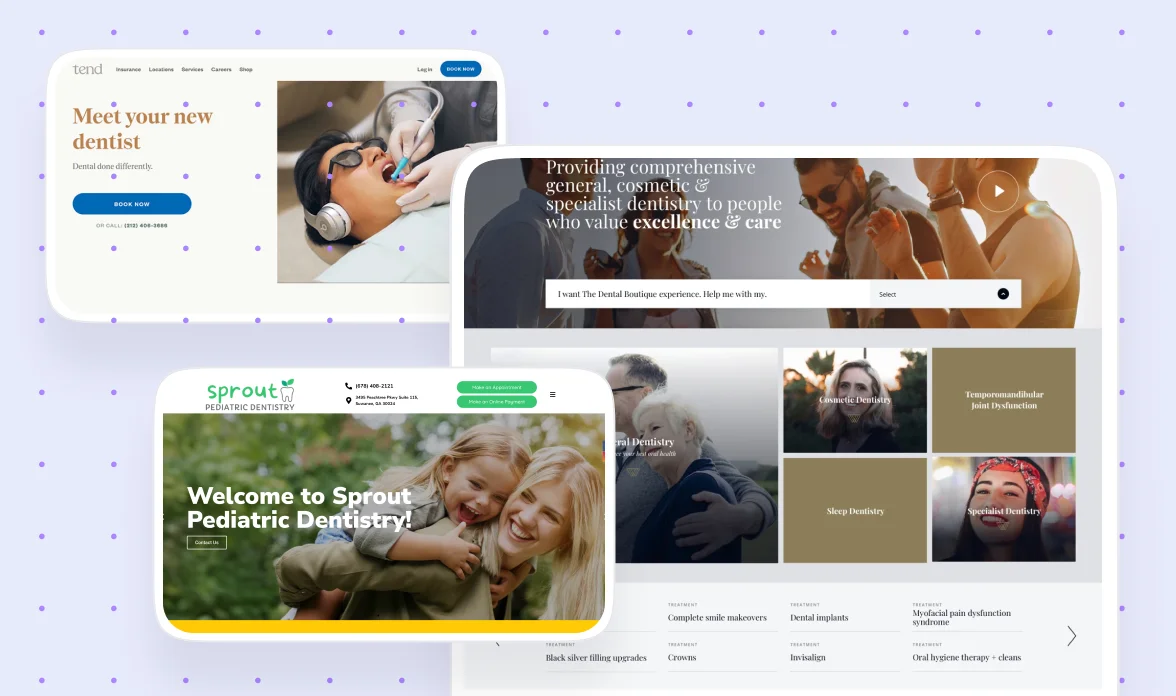
Tend
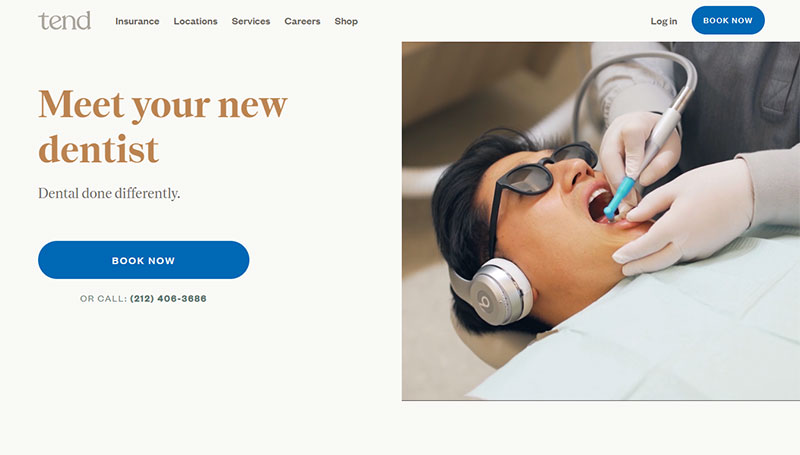
Tend is widely regarded as one of the strongest examples of modern dental website design, and it earns that reputation through every design decision on the site. The brand identity feels more like a boutique hotel than a dental practice, with exceptional typography, generous whitespace, and photography that shows real patients in real spaces rather than stock models.
The CTAs are impossible to miss without being aggressive. "Book an Appointment" appears in the header, the hero section, and throughout the page in a way that feels like an invitation rather than a sales push. This balance is hard to achieve and worth studying, because dental patients respond better to warmth than urgency.
The mobile experience is particularly strong. Tend clearly designed mobile-first, with tappable elements, fast load times, and a booking flow that works smoothly on a phone screen. Given that most dental patients are searching on mobile, this isn't a nice-to-have. It's the primary experience.
Design lessons from Tend:
- Invest in brand photography that shows your real spaces and people, because authenticity builds the trust that stock photography erodes.
- Design CTAs that feel invitational rather than urgent, because dental patients respond better to warmth than pressure.
- Treat the mobile experience as the primary design, not a responsive afterthought, because that's where most of your patients are.
Smile Design Dentistry
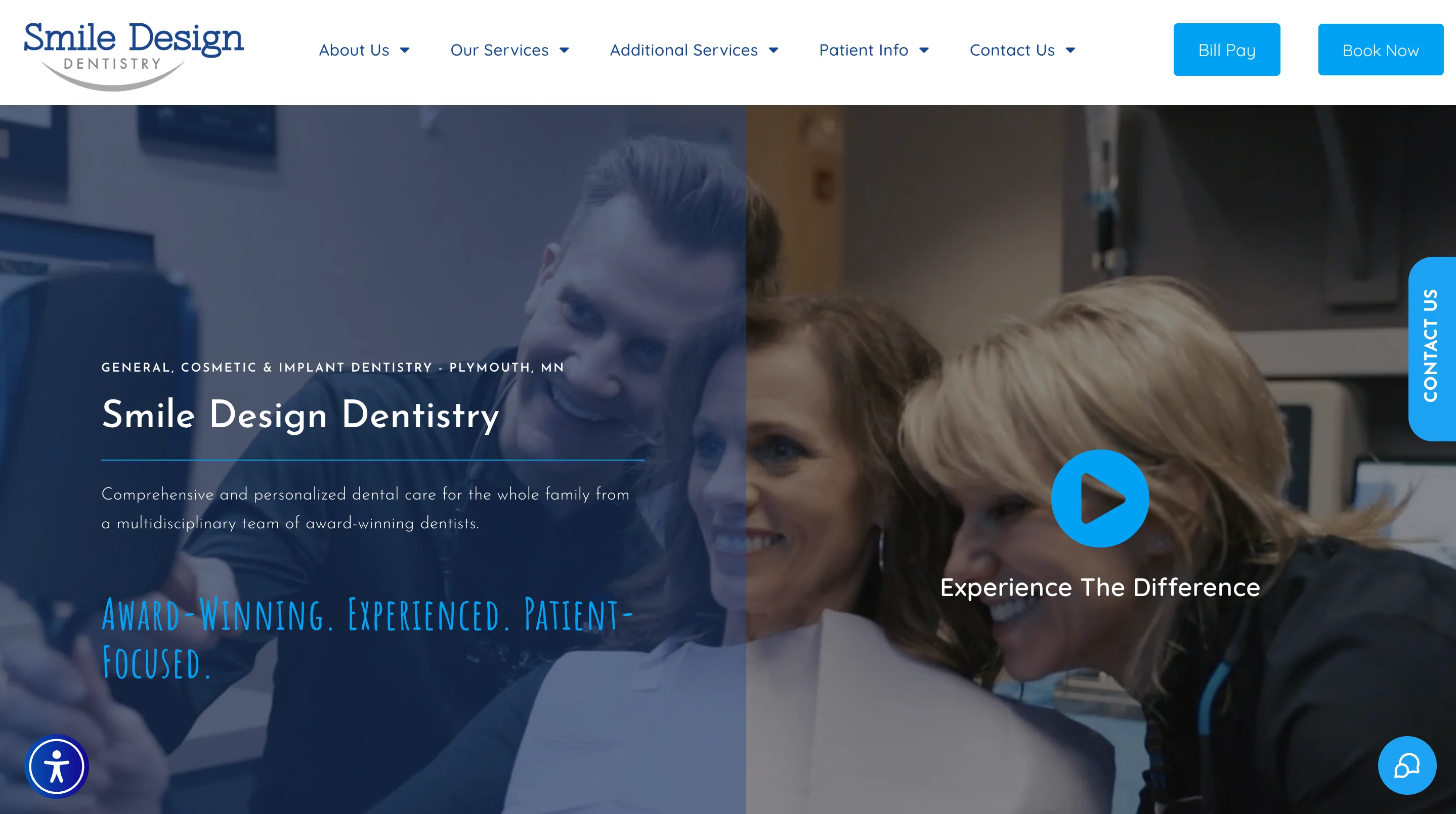
Smile Design Dentistry excels at visual storytelling for cosmetic dentistry. The site features strong before-and-after imagery that demonstrates treatment outcomes in a way that's both compelling and tasteful. These galleries serve as the most powerful trust signal on the site, because patients considering cosmetic work need to see results before they'll commit.
The treatment pages are conversion-focused. Each procedure has its own dedicated page with relevant imagery, patient testimonials specific to that treatment, FAQs, and a clear booking CTA. This structure is effective for both SEO (each page targets a specific treatment keyword) and conversion (patients find exactly the information they need without digging).
The doctor profiles are also well executed. They include credentials, personal details, and professional photography that humanizes the practice and gives patients a sense of who they'll be trusting with their smile.
Design lessons from Smile Design Dentistry:
- Use before-and-after galleries as your primary conversion tool for cosmetic treatments, because visual proof of results is more persuasive than any amount of copy.
- Build treatment-specific landing pages with testimonials, FAQs, and CTAs relevant to that specific procedure, because generic service pages convert poorly.
- Invest in professional doctor profile photography and copy, because patients choose the person as much as the practice.
Premium examples at a glance
Best cosmetic and luxury dental website designs
Cosmetic dental practices compete for high-ticket elective procedures where patients are comparing options carefully. The design needs to communicate luxury, expertise, and results simultaneously. Before-and-after galleries do more selling than any headline in this category.
Apa Aesthetic
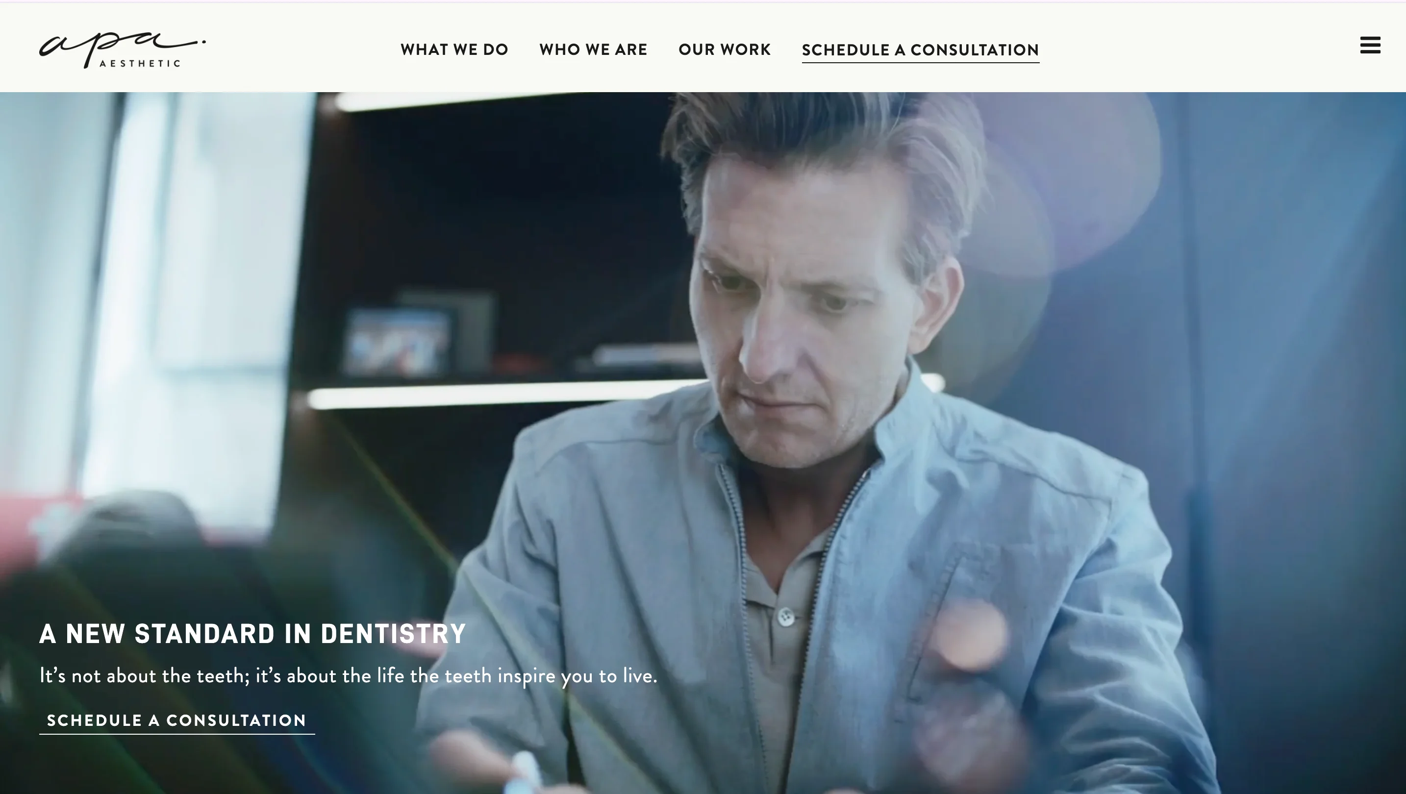
Apa Aesthetic takes luxury dental branding to the level of a fashion magazine. The site uses editorial photography, sophisticated typography, and a muted color palette that signals exclusivity. This design approach is effective because patients considering $20,000+ cosmetic procedures expect a brand experience that matches the investment.
The treatment pages are rich with visual content and patient stories that contextualize the results. Rather than just showing teeth, Apa shows the full transformation, including how the patient's confidence changed. This emotional storytelling converts better than clinical before-and-after photos alone.
Design lessons from Apa Aesthetic:
- Match your design's luxury level to your pricing tier, because patients paying premium prices expect a premium brand experience at every touchpoint.
- Use editorial photography and layout to tell transformation stories, because emotional narratives convert better than clinical documentation for elective procedures.
- Keep the color palette restrained and sophisticated, because luxury branding operates through restraint rather than visual noise.
The Dental Boutique
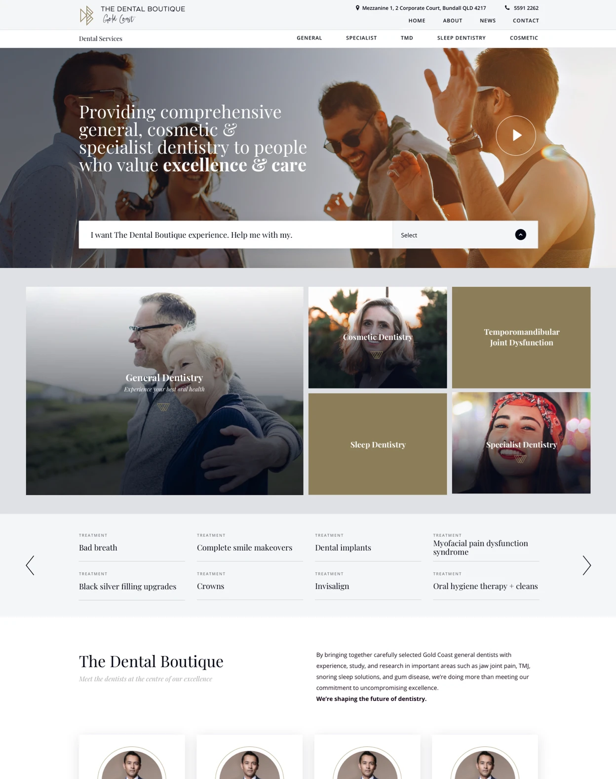
The Dental Boutique (Australia) demonstrates excellent use of lifestyle photography in dental design. The images don't just show teeth. They show confident people living full lives after treatment. This approach is helpful because it connects the clinical outcome (better teeth) to the emotional outcome (better life) that patients actually care about.
The overall design feels premium without being intimidating, which is a balance that many cosmetic dental sites struggle to achieve. The warm tones and welcoming layout reduce the anxiety that often accompanies high-consideration dental decisions.
Design lessons from The Dental Boutique:
- Use lifestyle photography that connects clinical results to emotional outcomes, because patients are buying confidence and quality of life, not just dental work.
- Balance premium positioning with warmth, because cosmetic dental patients need to feel both impressed and welcomed.
- Let your photography do the selling, because in cosmetic dentistry, visual quality communicates service quality.
Beverly Hills Dental Arts
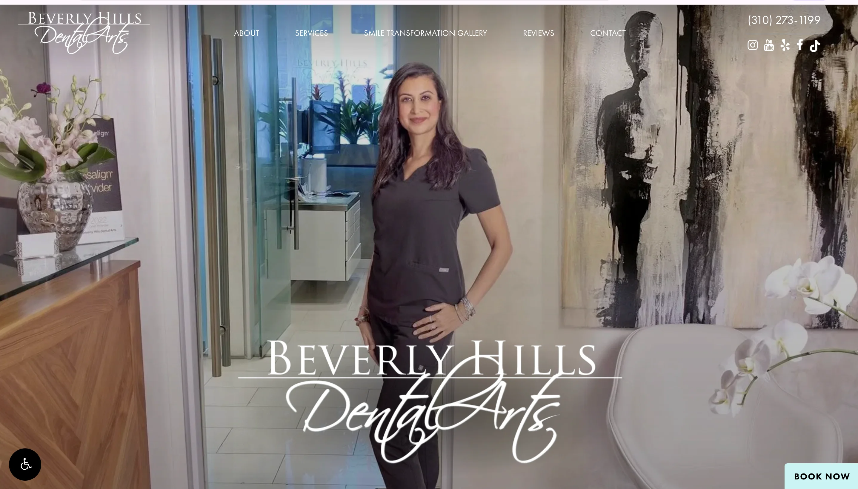
Beverly Hills Dental Arts demonstrates how location-based positioning can work through design. The site uses its Beverly Hills address as a credibility signal, pairing it with sophisticated visuals and detailed treatment information that reinforces the premium positioning.
The balance between luxury aesthetics and clinical credibility is well handled. The site doesn't sacrifice substance for style. Treatment pages include detailed procedure information, recovery timelines, and cost guidance alongside the premium photography.
Design lessons from Beverly Hills Dental Arts:
- Use your location as a design asset when it reinforces your positioning, because geographic prestige translates to perceived expertise for cosmetic practices.
- Balance aesthetic luxury with clinical substance on treatment pages, because high-ticket patients need both emotional appeal and detailed information to make a decision.
- Include cost guidance and recovery timelines on cosmetic treatment pages, because transparency reduces anxiety for patients considering elective procedures.
Cosmetic examples at a glance
Best family and general dental website designs
Family and general practices need to serve the broadest audience: adults, seniors, parents booking for children, and first-time patients who may be nervous. The design needs to be welcoming, easy to navigate, and organized enough to handle dozens of services without feeling overwhelming.
Green Door Dental
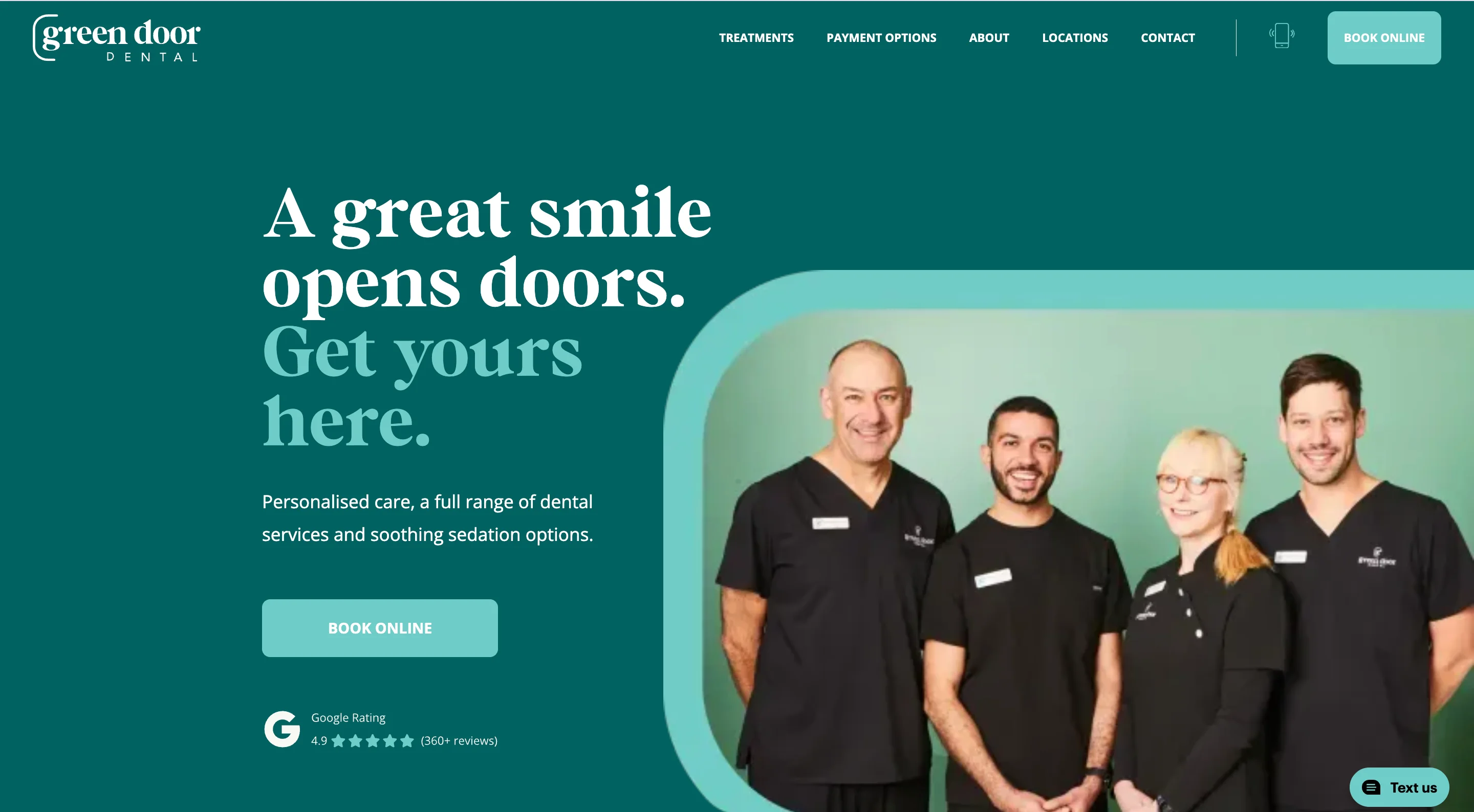
Green Door Dental does an excellent job of creating a friendly, approachable brand that reduces dental anxiety from the first interaction. The color palette, messaging tone, and photography all communicate warmth and patience, which is exactly what nervous patients need to see before they'll consider booking.
The site structure is clean and intuitive. Services are organized logically, and the booking path is short and clear. The homepage doesn't try to communicate everything at once, which keeps the experience focused and calming.
Design lessons from Green Door Dental:
- Build your brand around approachability rather than clinical authority, because family practice patients prioritize comfort and trust over technical credentials.
- Use a calming color palette and friendly photography, because these visual choices reduce the anxiety that prevents many adults from booking dental care.
- Keep the homepage focused on one primary action (booking), because simplicity converts better than comprehensiveness for general practice sites.
East River Dental
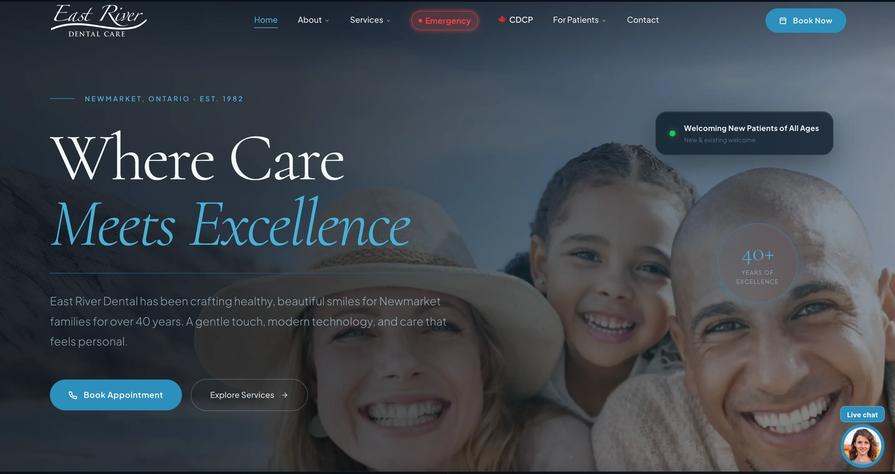
East River Dental uses minimalist design to communicate professionalism. The clean layout, clear typography, and well-organized information hierarchy create a site that feels modern and competent without being intimidating. This restraint is effective because it signals confidence in the quality of care without needing to over-explain.
The information architecture handles a broad range of services well. Rather than listing everything on one page, East River Dental creates logical groupings that help patients find what they need in two clicks or fewer.
Design lessons from East River Dental:
- Use minimalist design as a trust signal, because visual restraint in dental web design communicates competence and confidence.
- Organize services into logical groupings rather than one long list, because patients scan and leave if they can't find their specific need quickly.
- Keep typography clean and hierarchy strong, because readability is a form of respect for your patient's time and attention.
Dental House
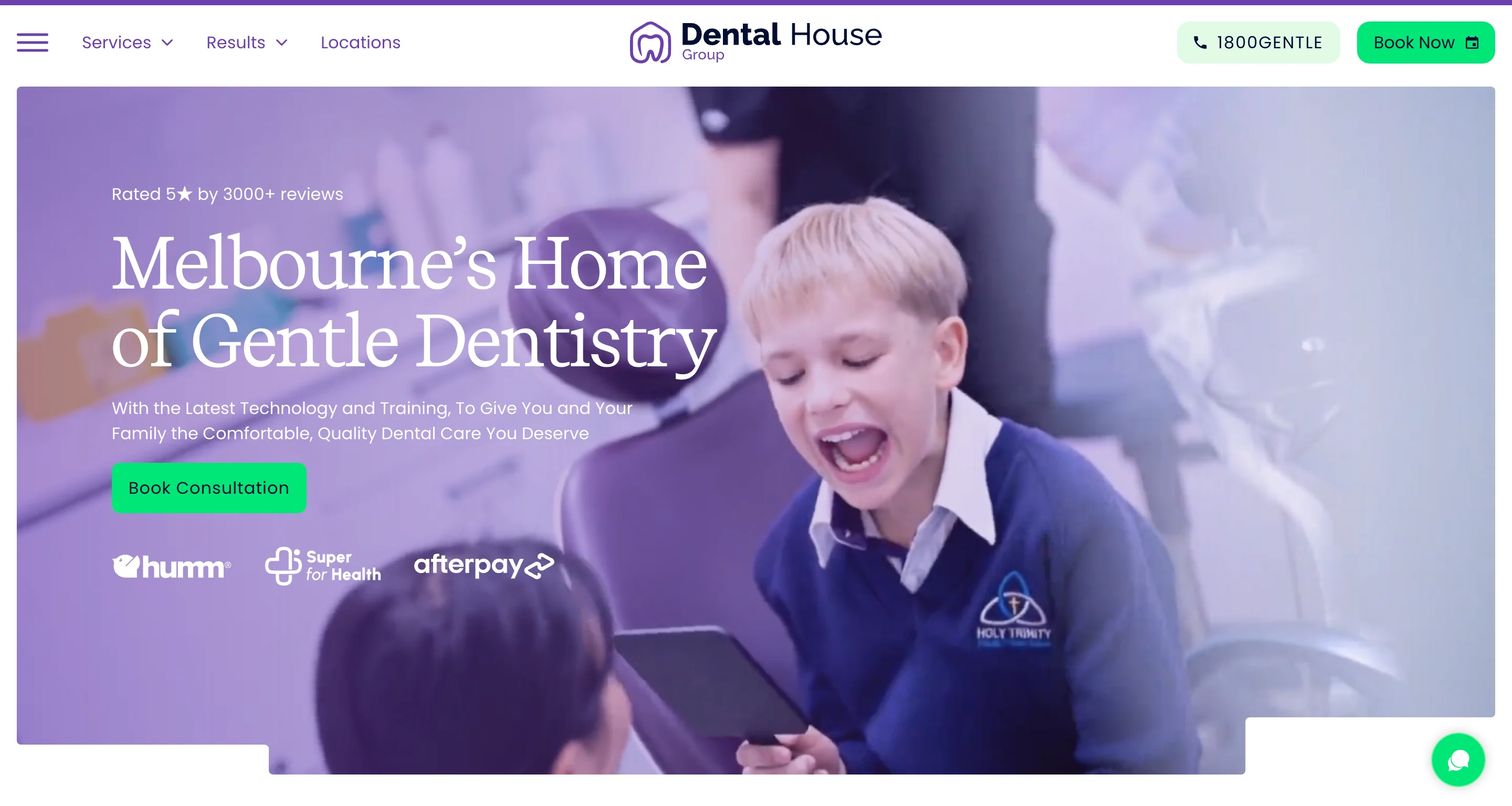
Dental House (Australia) demonstrates how to build effective treatment pages for a general practice that offers dozens of services. Each treatment page provides enough information to be useful without overwhelming the patient, and each includes relevant CTAs and trust signals.
The patient-focused UX is also worth noting. The site is organized around what patients need (treatments, booking, location, emergency info) rather than around the practice's internal structure. This patient-first navigation makes the experience feel intuitive even for first-time visitors.
Design lessons from Dental House:
- Build treatment pages that inform without overwhelming, because patients researching dental procedures need clarity and not an information dump.
- Organize navigation around patient needs rather than your practice structure, because first-time visitors don't know your departments and shouldn't need to.
- Include CTAs on every treatment page, because a patient who finishes reading about a procedure is at peak motivation to book.
Family examples at a glance
Best multi-location and enterprise dental website designs
Multi-location dental organizations face a unique design challenge: maintaining consistent branding across dozens or hundreds of offices while making it easy for patients to find their nearest location and book locally.
Bupa Dental Care
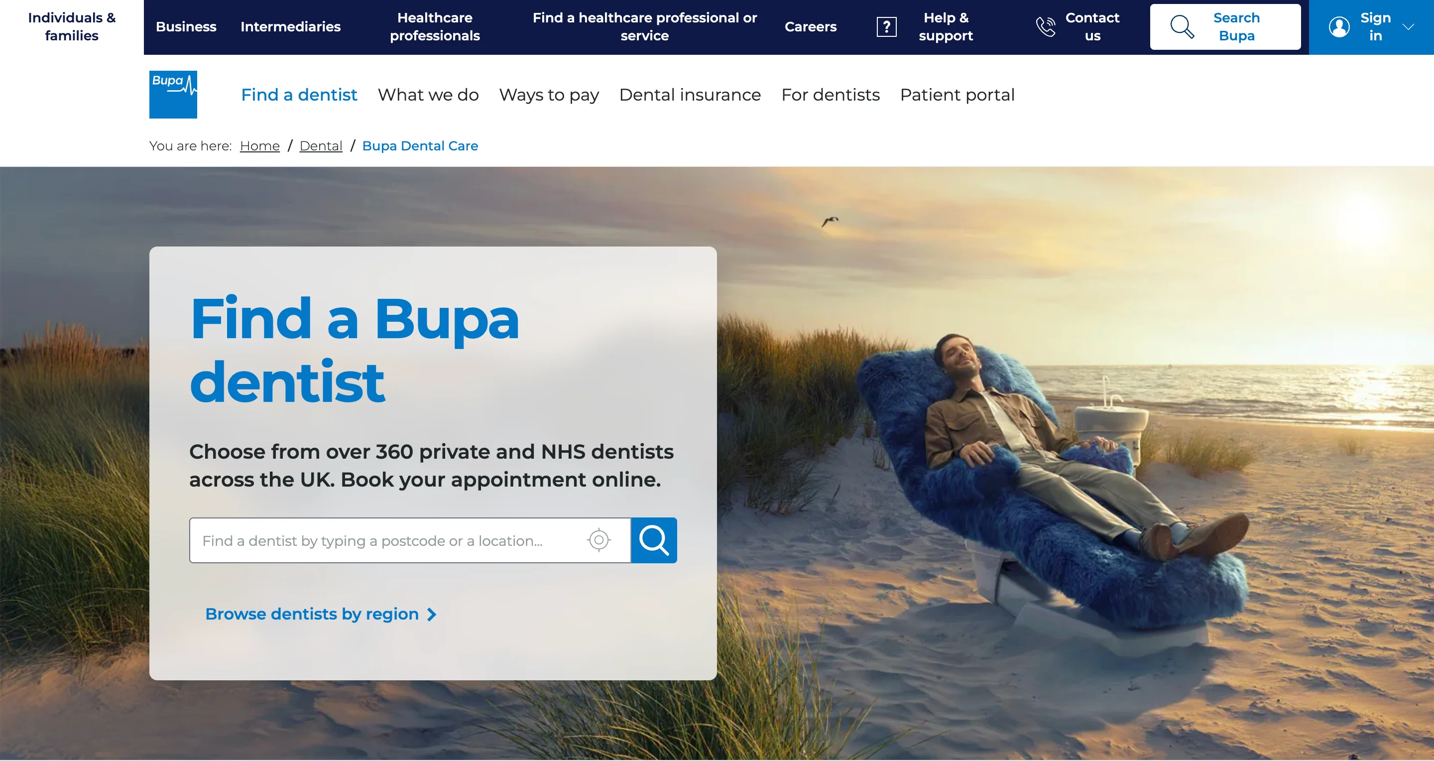
Bupa Dental Care is one of the strongest examples of enterprise dental UX. The site manages hundreds of UK locations through a location finder that lets patients search by postcode, browse nearby offices, and book at their preferred location. This functionality helps because multi-location dental organizations that don't make location discovery easy lose patients to single-location competitors who are easier to find and book.
The information architecture handles scale well. Despite the breadth of services and locations, the navigation stays clean and the booking path remains short. Accessibility is also strong, with clear contrast, readable fonts, and logical heading structures.
Design lessons from Bupa Dental Care:
- Build a location finder as the primary navigation tool for multi-location practices, because patients need to find their nearest office before they'll engage with anything else on your site.
- Maintain consistent branding and UX across all locations, because inconsistency between location pages signals disorganization.
- Prioritize accessibility at the enterprise level, because a large dental organization serves the most diverse patient population.
Multi-location examples at a glance
Best pediatric dental website designs
Pediatric dental websites design for two audiences simultaneously: parents (who make the decisions and handle the booking) and children (who experience the visit). The best sites build trust with parents while creating a sense of fun and safety that children respond to.
Little Smiles Pediatric Dentistry
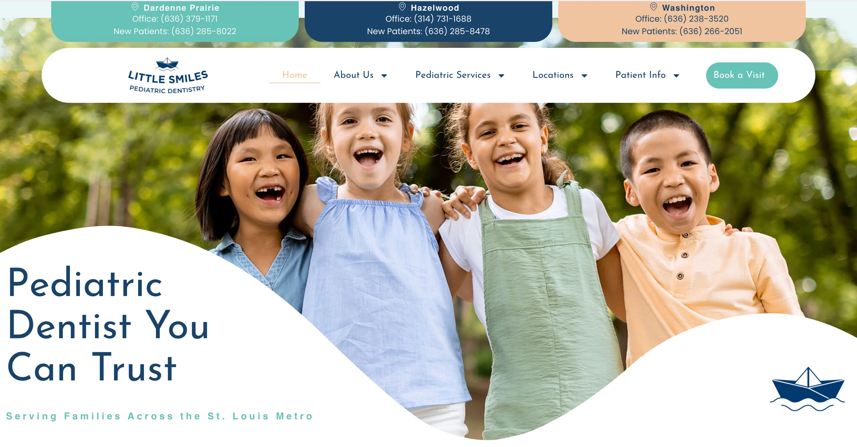
Little Smiles uses bright, engaging visuals that appeal to children without overwhelming parents. The color palette is warm and energetic, the photography shows real kids having positive experiences, and the overall tone communicates that this is a place where children feel safe.
The design balances child-friendly elements with the practical information parents need. Service descriptions, insurance details, and booking CTAs are all easy to find, while the visual design reassures parents that the practice understands kids.
Design lessons from Little Smiles:
- Design for two audiences simultaneously by making visuals appeal to children and content serve parents, because both need to feel comfortable for a booking to happen.
- Use warm, energetic colors and real photography of children, because these create a sense of safety that generic dental imagery can't achieve.
- Keep the practical information (services, insurance, booking) easy to find despite the playful design, because parents are making a healthcare decision and need clear information.
Sprout Pediatric Dentistry
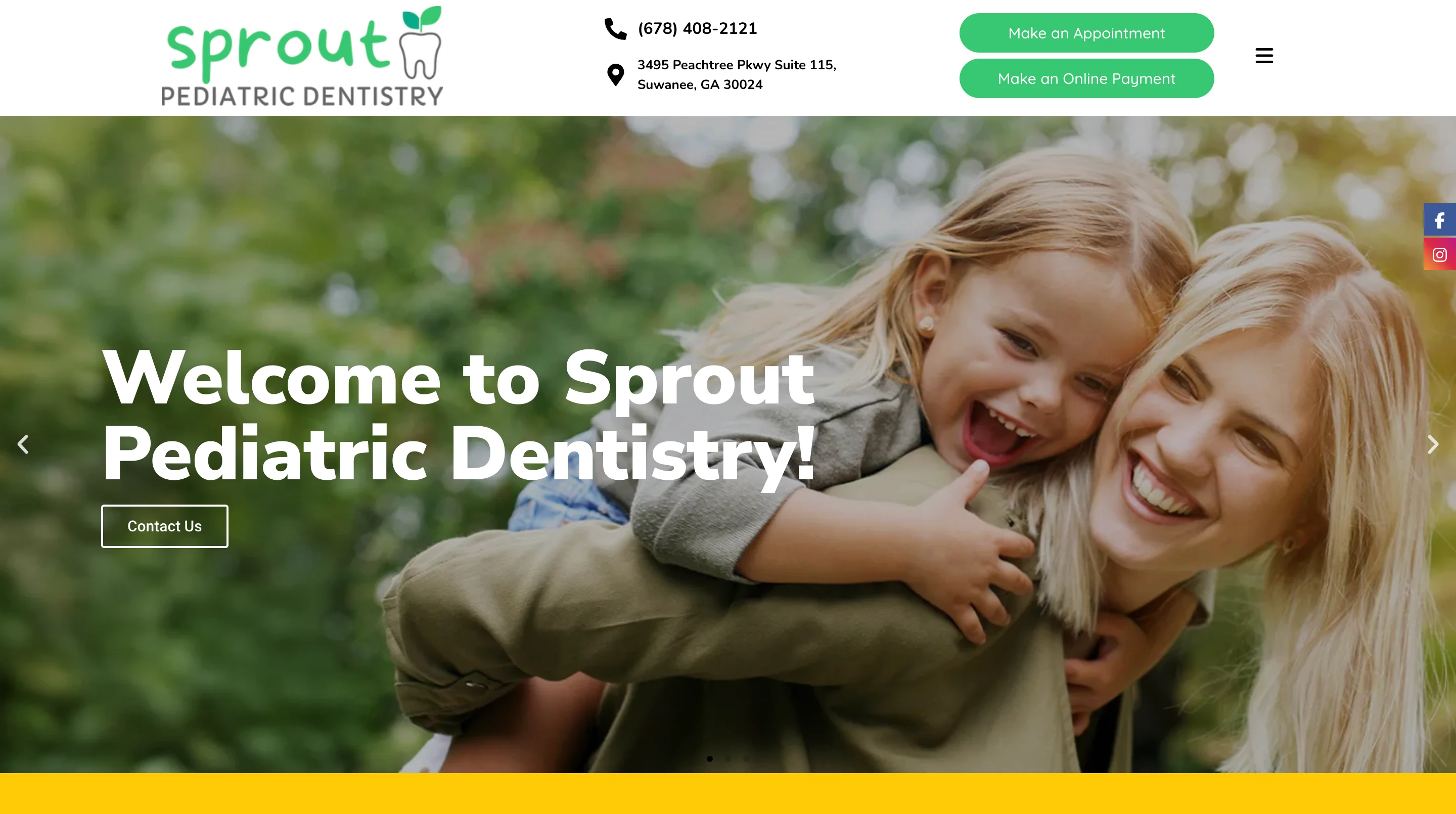
Sprout takes a slightly different approach with excellent custom illustrations and a child-friendly brand that feels polished and professional rather than cartoonish. The illustration style communicates fun and safety while maintaining the credibility that parents need from a healthcare provider.
The site does a good job of explaining pediatric dental procedures in language that reduces parental anxiety. Instead of clinical descriptions, the content focuses on what parents can expect, how to prepare their child, and what the experience will feel like.
Design lessons from Sprout Pediatric Dentistry:
- Use custom illustrations to build a child-friendly brand that still feels professional, because parents trust practices that take both fun and quality seriously.
- Write content that addresses parental anxiety directly, because the parent's emotional state determines whether they book or keep searching.
- Explain what to expect during procedures rather than how they work clinically, because parents care about their child's experience more than technical details.
Pediatric examples at a glance
All dental website design examples at a glance

What is dental website design?
Dental website design is the process of creating a website specifically for dental practices, clinics, and dental brands. It differs from general web design because it requires attention to dental patient psychology (anxiety reduction, trust-building), HIPAA-compliant forms, practice management software integration for online booking, and treatment-specific content that drives both SEO and patient education.
Dental website design trends to watch in 2026
The examples above reflect what's working right now. But dental web design is evolving, and a few trends are reshaping how the best practices approach their websites.
1. AI-powered chat assistants for scheduling and FAQs
With 38% of new patient calls going unanswered during business hours, AI chatbots that can handle appointment scheduling, answer common questions, and route urgent cases are becoming standard on top dental sites. The practices getting this right are training their bots on real patient questions rather than generic scripts.
2. Interactive smile assessments and consultation forms
Quiz-based tools that help patients evaluate their needs before calling the office are replacing traditional contact forms. These tools qualify leads (patients who complete a detailed assessment are more likely to book) while giving the practice information that makes the first consultation more productive.
3. Video introductions from dentists
Practices are adding short video introductions from their dentists to homepages and doctor profile pages. These work because they let patients see and hear the person who will be treating them, which reduces anxiety and builds a personal connection before the first visit.
4. Transparent pricing and financing information
The shift from "call for pricing" to upfront cost visibility is accelerating. Practices that display starting-at prices, financing options, and insurance acceptance prominently are winning patients from competitors who still hide this information. Patients don't want to make a phone call just to find out what a cleaning costs.
5. Scroll-triggered animations that explain procedures
Motion design that shows how implants, veneers, or aligner treatments work is becoming more common on treatment pages. These animations educate patients about what to expect and make complex procedures feel less intimidating, which supports conversion.
6. AEO optimization for dental content
With AI search engines now answering dental queries directly, the structure of your content matters as much as the content itself. Research shows that content with clear answer blocks gets cited by AI engines at 2.7x the rate of traditional content. Practices that structure their service pages and FAQs with clear headings, concise definitions, and schema markup are more likely to appear in AI-generated answers.
How much does dental website design cost?
Costs range from $500 to $25,000+ depending on the approach. A template-based site on Webflow or WordPress can cost $500 to $5,000. A custom dental website from a specialized agency typically runs $3,000 to $25,000 or more. Design subscriptions like magier offer ongoing design support at a fixed monthly fee. The right investment depends on your practice's size, goals, and how much you need beyond just the website.
The ROI of dental website design
If you're a practice owner evaluating whether to invest in a website redesign, the math is straightforward. The average dental landing page converts at roughly 10%. If your current site converts at 5%, doubling that to 10% means twice as many booked appointments from the same traffic.
Here's where the numbers get compelling. Research shows that 5 extra patients per month from a better-converting website can return $60,000 to $75,000 in annual lifetime value. A dental website redesign typically costs between $3,000 and $25,000 depending on scope. That means the investment can pay for itself within the first few months if the new site converts even marginally better.
This isn't just about aesthetics. It's about whether your website is an asset that generates patients or a liability that sends them to a competitor with a faster, cleaner, more trustworthy site. Every element covered in this guide (booking visibility, mobile optimization, trust signals, treatment pages) directly affects whether a visitor becomes a patient or bounces.
Common dental website design mistakes and how to avoid them
Knowing what good looks like is only half the picture. Here are the most common mistakes we see on dental websites, along with the fix for each one.
1. Stock photos of impossibly white teeth and generic messaging
If your homepage features the same stock photo of a model with blindingly white teeth that appears on 500 other dental websites, you're not building trust. You're blending in. The fix is to invest in original photography of your actual team, office, and patients (with proper consent), because authenticity is the strongest visual trust signal in dental design.
2. Burying the booking CTA below the fold
Many dental sites put the booking button in the navigation menu and nowhere else. The booking CTA should be visible in the hero section, repeated throughout the page, and persistent on mobile. Every scroll that doesn't include a booking option is a missed conversion opportunity.
3. One generic "services" page for everything
A single page that lists cleanings, implants, veneers, Invisalign, and root canals in bullet points can't rank for any of those terms and can't address the specific concerns a patient has about each procedure. The fix is to build dedicated landing pages for every treatment you offer.
4. Missing or hard-to-find insurance and financing information
If a patient has to call your office to find out whether you accept their insurance, many of them simply won't call. They'll go to the competitor who lists accepted plans on their website. The fix is to create a dedicated insurance page and mention accepted plans on treatment pages.
5. No before-and-after gallery
For any practice offering cosmetic treatments, the absence of a before-and-after gallery is a significant missed opportunity. Patients considering elective procedures need visual proof of outcomes, and a well-designed gallery is the most persuasive element on a cosmetic dental site.
"A dental website without before-and-after photos is like a restaurant without a menu. You're asking people to commit without showing them what they'll get."

6. Slow-loading hero images and videos
Large, unoptimized images and autoplay videos tank page speed, and slow dental sites lose patients to faster competitors. The fix is to compress images (WebP format), lazy-load below-the-fold content, and avoid autoplay video with sound.
7. Ignoring mobile experience
Over 70% of dental searches happen on phones, and many of those searches are urgent (broken tooth, sudden pain, recommendation from a friend). If your site is hard to use on mobile, you're losing the majority of your prospective patients. The fix is to design mobile-first and test the complete patient journey on real phones.
How to apply these examples to your own dental practice website
Looking at great examples is inspiring, but it's only valuable if you have a plan for applying what you've learned.
Audit your current site against dental best practices
Go back to the design patterns section earlier in this guide and score your site against each one. Is booking visible on every page? Do you have dedicated treatment pages? Are your Google reviews displayed on service pages? Does the site load in under 3 seconds on mobile? Be honest about where you stand, because the audit is only useful if it reflects reality.
Prioritize changes by patient impact
Start with the changes that affect the most patients. For most dental sites, that means improving booking CTA visibility, adding or improving treatment-specific pages, and fixing mobile responsiveness. These three changes tend to produce the most significant results because they affect every visitor.
Choose the right path for your practice
Whether you're looking for custom dental website design, evaluating a dental office website design overhaul, or exploring dental website design and marketing packages, the right approach depends on your practice's size and budget.
The right choice depends on your budget, timeline, and how much design work you need beyond your website. If you also need social media graphics, ad creative, patient brochures, and signage, a subscription model gives you more flexibility than a one-time agency project.
Final thoughts
Your dental website is your first patient interaction. It determines whether a prospective patient trusts you enough to book or clicks back to search results and visits a competitor instead. Every example in this guide, from Tend to Sprout Pediatric Dentistry, succeeds because it answers the same question a patient is asking: "Can I trust this practice with my smile?"
Building a dental site that answers that question well takes investment in design, content, and UX. If your team is stretched thin or you're not sure where to start, a dedicated design partner can help. You can see how magier works on our webdesign services page.
If you want a practical starting point, pick the practice category closest to yours, study the 3 design lessons from each example, and audit your own site against the patterns in the framework section. Start with booking visibility, treatment pages, and mobile experience, and build from there.
FAQ
Start with the three highest-impact changes: make your booking CTA visible on every page, build dedicated landing pages for your highest-value treatments, and embed Google reviews on your service pages rather than linking to an external review site. These three changes tend to produce the most significant results because they affect trust, SEO, and conversion simultaneously.
Dental website templates are available on Webflow, WordPress, Squarespace, and Canva. Framer also offers modern dental templates. Templates work well for solo practices that need a functional site quickly. For practices that need PMS integration, HIPAA-compliant forms, or custom branding, working with a designer or agency is usually the better path.
HIPAA applies to any dental website that collects protected health information through patient intake forms, appointment request forms, or patient portal access. In practice, this means encrypted form submission, secure data storage, minimum necessary data collection, and clear privacy notices. Basic contact forms that only collect name and phone number typically don't trigger HIPAA requirements, but any form that asks about medical history or insurance does.
A good dental website makes it easy for patients to find information, build trust in the practice, and book an appointment. The key elements include visible booking CTAs on every page, dedicated treatment landing pages, real photography (not stock), embedded Google reviews, dentist credential displays, insurance and financing information, mobile-first responsive design, and fast page load times.
The best dental website design company for your practice depends on your budget and goals. Specialized dental agencies like PBHS, ProSites, and TNT Dental focus exclusively on dental. For practices that want ongoing design support across their website, marketing materials, and brand assets, magier offers dental website design services through a subscription with dedicated dental website designers, a 48-hour turnaround, and unlimited revisions.
WordPress is the most popular choice for dental sites because of its plugin ecosystem (including HIPAA-compliant form plugins and Dentrix integrations). Webflow offers stronger design flexibility and is excellent for practices that want a modern, custom look. Squarespace works for simple practice sites where design templates are sufficient. Specialized dental platforms (ProSites, PBHS) offer all-in-one solutions with built-in dental features but less design flexibility. Figma is useful for prototyping dental website designs before development.
.png)
.webp)


