15 Best Medical Website Designs to Take Inspiration From (2026)
Your medical website is probably the first interaction most people will ever have with your brand.
Google processes over one billion health-related searches every day, and nearly 80% of internet users have looked up medical information online. That's a lot of first impressions happening on screens.
The best medical website designs in 2026 treat that first impression seriously. They build trust fast, simplify complex information, and make the path to action (whether that's booking an appointment or exploring a drug pipeline) feel effortless.
We've designed a good number of medical and health-tech websites ourselves at magier, so we know what performs well in this space. But for this post, we also went deep on research, reviewing over 50 medical websites across hospitals, health-tech platforms, biotech and pharmaceutical companies, medical device manufacturers, dental practices, and telemedicine startups. The goal was to identify success patterns, CRO takeaways, and the best inspiration for any health-tech or medical brand that is building or redesigning their site.
In this blog, you'll find 15 medical websites that don't just look good visually but are also built with proper conversion principles at their core, organized by category so you can skip ahead to the examples most relevant to your industry.
We’ve also covered:
- Methodology we used to choose the medical website design inspirations
- Basic design elements every medical website should have
- Medical website design trends in 2026
- Common design mistakes to avoid
- Tools and resources for design
- Conversion Rate Optimization practices
- How to choose the right design approach for your medical website
Let's get into it.
{{freebie}}
Key takeaways
- Build your navigation around how patients search, because that rarely matches how your organization is structured.
- Remove every element that doesn't support your primary action. Restraint converts better than complexity.
- Your color palette and photography should reinforce your brand positioning rather than follow medical website conventions by reflex.
- If your site serves multiple audiences, give each group a clearly defined entry point.
- Educational pages deserve the same design attention as your homepage.
- Reveal information gradually, especially for high-consideration medical decisions where patients need time to process.
- Animation works well for explaining complex medical products, as long as every motion serves a clear communication goal.
- Modular, self-contained content blocks work exceptionally well for biotech and pharma sites where users scan rather than read sequentially.
- If your brand voice is warm, your visual design needs to match. A mismatch confuses users at an instinctive level.
- For medical services that compete on convenience, the design itself needs to feel convenient. Fewer elements, shorter copy, faster paths.
How we chose these websites
Most "best medical website" lists pick sites that are simply good-looking. But that's just one factor to consider. A homepage can be beautifully designed and perfectly color-coordinated, but if it can't address your concerns clearly and quickly, you're going to leave and find one that does.
We evaluated each site across seven dimensions, and a website had to score at least 8/10 on most of them to make this list.
- Visual design and brand identity: We looked at color systems, typography choices, photography direction, and overall visual consistency. In healthcare, color isn't just about aesthetics. Soft blues, teals, and greens signal calm and trust, while warm neutrals create approachability. We paid attention to whether the color palette was intentional and consistent or whether it felt like someone picked a template and left the defaults.
- Information hierarchy and clarity: A medical website has to communicate a lot of information to a lot of different people. We evaluated how well each site organizes that information, specifically whether the most important content (what we do, how to book, where to find us) is immediately accessible without scrolling or clicking through multiple tabs.
- Conversion architecture: We looked at CTA placement, appointment booking integration, form design, and the overall path a visitor takes from landing on the site to completing a meaningful action. A medical website can look good and still convert poorly if the CTAs are buried, the booking process has too many steps, or the primary action isn't clear above the fold.
- Page load speed and technical performance: We ran each site through Google PageSpeed Insights and checked Core Web Vitals scores. If a medical website takes five seconds to load, most people aren't going to wait around to find out if the care is any better than the site.
- Mobile experience: Most healthcare searches happen on phones. We tested every site on mobile devices and evaluated whether the experience felt intentionally designed for smaller screens or simply squeezed down from a desktop layout.
- Accessibility: We checked for basic accessibility standards including color contrast ratios, heading structure, alt text on images, and keyboard navigability. Medical websites serve users who may have visual, motor, or cognitive impairments, and the best ones treat accessibility as a design decision, not an afterthought.
- Content quality and tone: Medical websites walk a fine line between clinical accuracy and patient-friendly language. We evaluated whether each site communicates clearly without drowning visitors in jargon, and whether the copy feels like it was written for the audience or for the organization itself.
No single site on this list is perfect across all seven. But every site here does at least five of these things well, and each one offers a specific lesson worth learning from.
{{cta}}
Best hospital and clinic website designs
1. Mayo Clinic
.avif)
Mayo Clinic's website has been one of the most referenced medical websites in the industry, and the 2026 version is just as strong.
Most hospital websites have the tendency to put too much information on the homepage. They cram in every department, every service line, every announcement. Mayo Clinic does the opposite. The homepage is built around a single, dominant search bar because the team clearly understands that the vast majority of visitors arrive with a specific question or condition in mind.
But the real strength of the site is the information architecture sitting underneath that search bar. Mayo Clinic organizes its entire content library around conditions and procedures, not internal departments. That means a patient searching for "knee replacement" lands on a comprehensive resource page, not a confusing organizational chart.
Their typography is also clean and highly readable. The color system is restrained (mostly whites, grays, and a muted blue). And the educational content is written at a reading level that respects patients without dumbing things down.
Takeaway for designers: If your medical website's primary audience is patients, build your navigation around what they're searching for, not how your organization is structured internally.
2. Cleveland Clinic
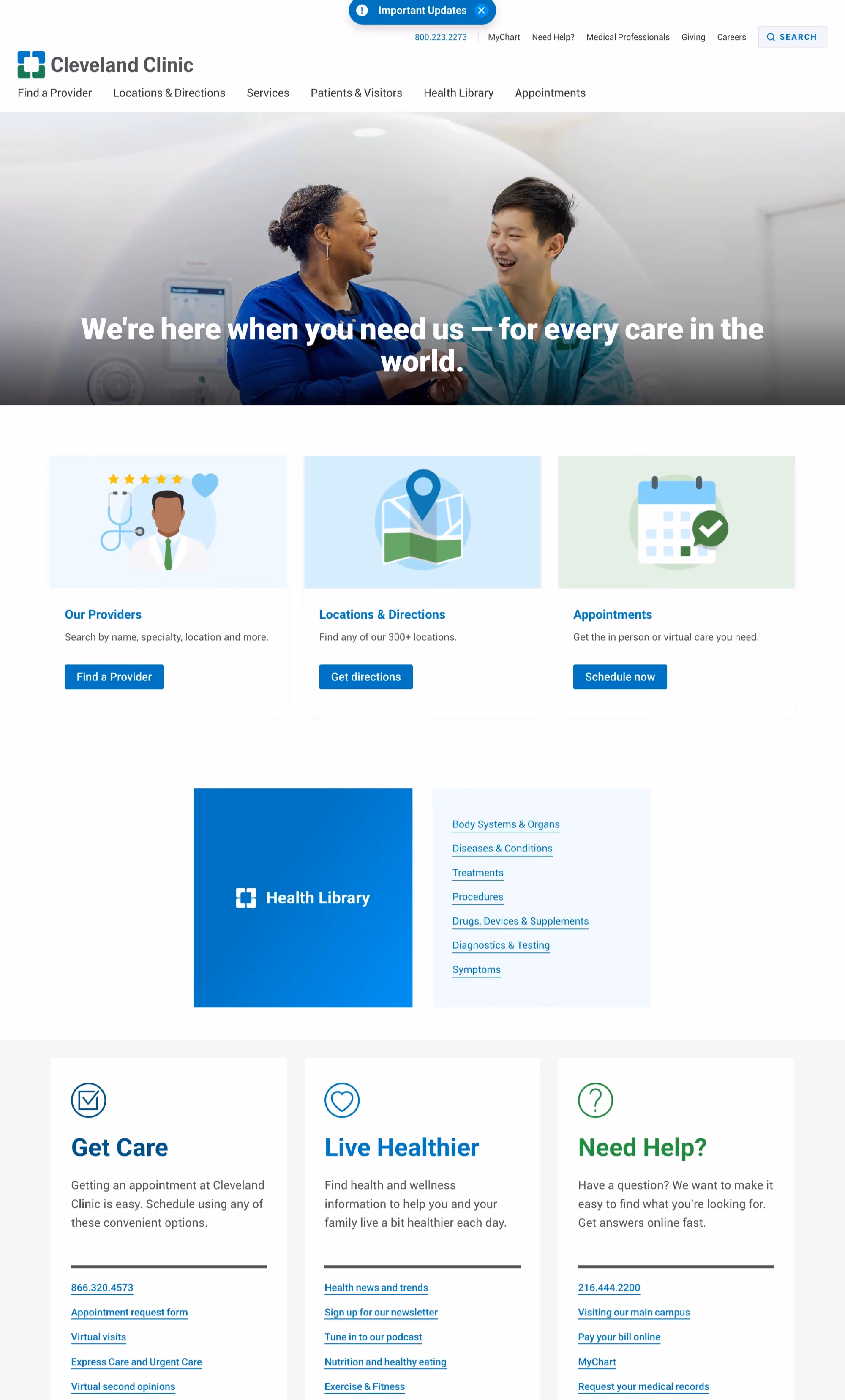
Cleveland Clinic's website is a great example when it comes to mega menu design. If you're designing navigation for a large hospital system with hundreds of service lines, go study this site.
The mega menu is organized into clear categories (patients & visitors, health library, departments, locations), and each category opens into a well-structured panel that doesn't overwhelm. That sounds simple, but getting mega menus right in healthcare is one of the hardest UX problems there is. Cleveland Clinic has clearly invested heavily in it.
One more thing worth noting here is the health library. It's one of the most comprehensive medical education resources on the internet, and the design treats it with the seriousness it deserves. Clean layouts, strong typographic hierarchy, easy-to-scan sections, and relevant internal linking throughout.
The appointment booking experience is also notable. It's accessible from virtually every page, the CTAs are consistently placed, and the booking steps are straightforward. No unnecessary form fields, no confusing multi-step process.
Takeaway for designers: Invest disproportionately in your navigation system. For large medical organizations, the menu structure is often the single most important design decision you'll make.
3. One Medical

One Medical is the perfect amalgam of premium consumer brand sensibility and healthcare. The design feels more like a wellness lifestyle brand than a doctor's office, and that's entirely intentional.
The homepage uses high-quality, warm photography of real patients and providers. Not sterile clinical imagery. Not stock photos. Real people in real settings. This immediately changes the emotional tone of the entire experience.
The color palette is soft and warm (muted greens, off-whites, gentle earth tones), which is a deliberate departure from the typical blue-and-white medical website. And it works because One Medical's brand positioning is about making healthcare feel human and approachable.
What makes this site particularly compelling for designers is the restraint. Every page has generous white space. Copy is short and benefit-focused. There's no visual clutter. The team clearly made hard decisions about what to leave out, and that discipline shows.
Takeaway for designers: If your medical brand's positioning is around warmth, approachability, or a premium patient experience, lean into photography and color choices that reinforce that. You don't have to default to blue.
Best health-tech and SaaS platform website designs
4. Doctolib
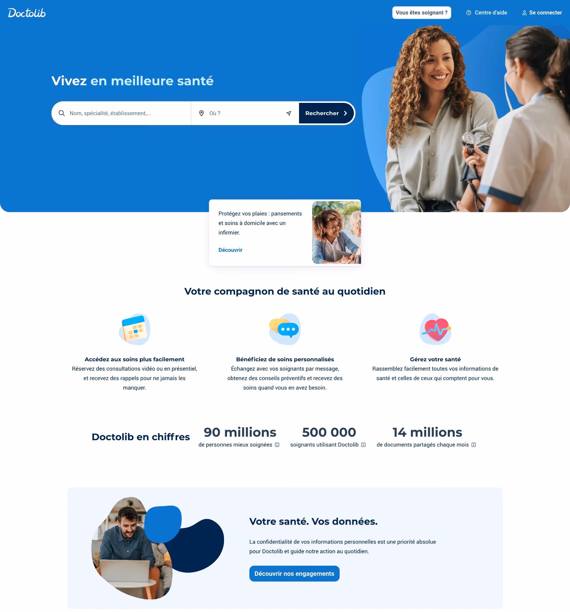
Doctolib is Europe's largest medical appointment booking platform, used by over 80 million patients across Germany, France, and Italy. The homepage is built entirely around one action: finding a doctor and booking an appointment. A prominent search bar sits at the top, the layout is minimal, and the entire experience is designed to get you from "I need a doctor" to "appointment confirmed" in as few steps as possible.
The doctor profile pages are where the site really performs well. Each profile shows verified patient reviews, available time slots, accepted insurance, spoken languages, and credentials, all on a single page without tabs or hidden sections. The mobile experience is just as fast and frictionless as desktop, which matters because a large portion of bookings happen on phones, often in urgent moments.
The visual design is intentionally understated. A simple blue-and-white palette, clean typography, and generous spacing keep the focus entirely on the task at hand. Doctolib isn't trying to impress you with animations or bold visuals. It's trying to get you to a doctor. And the design serves that goal precisely.
Takeaway for designers: If your medical website's primary function is booking, remove everything that doesn't directly support that action. Doctolib proves that restraint and clarity convert better than visual complexity.
5. Maven Clinic

Maven Clinic is a virtual healthcare platform focused on women's and family health, and its website is one of the cleanest medical website designs we've come across.
Their brand identity is strong and consistent. A distinct color system (deep purple and warm accents), custom illustrations, and thoughtful typography give Maven a recognizable visual language that feels professional without being cold.
The homepage hierarchy is also precise. A clear headline and value proposition sit at the top, followed by audience segmentation (for individuals vs. for employers), then social proof, then a deeper dive into services. Every section serves one particular purpose without conflict.
Like One Medical, Mavel also does a great job when it comes to the right use of white space. The generous spacing between sections gives the content room to breathe and makes the experience feel calm, which is exactly the right emotional register for a healthcare platform.
Takeaway for designers: Strong brand identity is not just for consumer apps. In health-tech, a distinctive visual language helps you stand out from the sea of generic blue-and-white medical websites.
6. Hims & Hers

Hims & Hers is probably the most polarizing medical website on this list, and that's precisely why it's here.
The design goes against almost every convention in medical website design. Bold colors. Playful typography. Lifestyle photography that looks more like a fashion brand than a telehealth company. The homepage scrolls through product categories with the confidence of a DTC e-commerce brand, not a healthcare provider.
And it converts quite well.
The lesson here is that the design conventions in medical websites exist for a reason, but they're not rules. If your target audience is younger, digitally native, and comfortable with telehealth, you can afford to push the visual boundaries much further than a traditional hospital system can.

What Hims & Hers gets right beyond the aesthetics is the simplicity of the user journey. You land on the site, select a category, answer a few quick health questions, and you're connected with a provider. The design supports that speed by removing every possible obstacle.
Takeaway for designers: Know your audience. If you're designing for a younger, consumer-facing health brand, you have more creative freedom than you think. Just make sure the experience stays simple underneath the visual boldness.
Best biotech and pharmaceutical website designs
7. Pfizer

Pfizer's website is interesting because it serves an incredibly diverse audience. Patients, healthcare providers, investors, researchers, media, and job seekers all land on the same domain. Each target group has a different use case and the design has to work for all of them.
The homepage handles this with a rotating hero section that highlights different priorities (recent breakthroughs, corporate news, patient resources), paired with a navigation system that clearly segments by audience type. The "For patients" and "For professionals" pathways are distinct and well-organized.
If there's one page to study on this site, it's the drug pipeline. For biotech and pharma companies, the drug pipeline is one of the most important pages on the entire website, especially for investor and researcher audiences. Pfizer presents it as an interactive, filterable table that lets users sort by therapeutic area and development phase. It's functional, scannable, and doesn't require you to download a PDF to understand it.
The overall visual design is corporate but modern. Blue tones (expected for pharma), clean grid layouts, and strong typographic hierarchy throughout. Nothing flashy, but everything is precisely where you'd expect it to be.
Takeaway for designers: If your medical website serves multiple distinct audiences, invest in clear audience segmentation, both in navigation and in content structure. One homepage can serve many audiences if the pathways are well-defined.
8. Zephyr AI
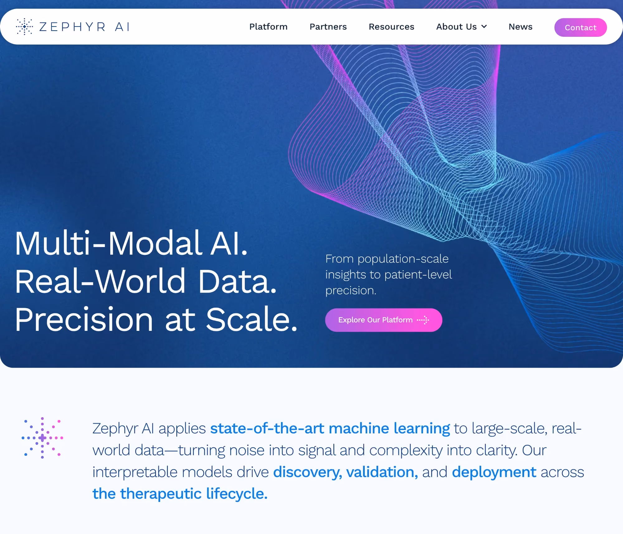
Zephyr AI is an AI precision medicine company, and its website explains complex science in a way that feels accessible without dumbing it down — something most medical websites struggle with.
The homepage opens with a strong positioning statement and immediately follows it with a visual explanation of the platform. Not a wall of text. Not a dense scientific abstract. A clean, designed visual that communicates the concept quickly.
What makes Zephyr's design effective is how it avoids the common biotech trap of trying to impress scientists and investors simultaneously with the same content. The homepage establishes credibility for both audiences through clear messaging and strong visual hierarchy, then channels them toward deeper content through well-placed CTAs.
The color palette is modern (deep navy with accent colors), and the typography is confident. The overall feel is "technology company that happens to work in medicine," which positions the brand effectively for both talent acquisition and partnership conversations.
Takeaway for designers: For biotech and AI-medicine companies, prioritize clear visual storytelling over dense scientific copy on the homepage. You can go deep on the science in dedicated sections. The homepage needs to hook first.
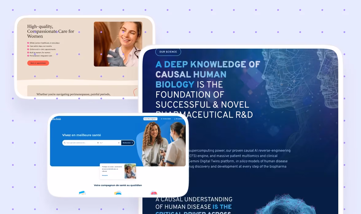
9. Aitia

Aitia is a biotech company that uses causal AI to understand biological systems. Their website is a case study in modular UX design done right.
The page structure is built around discrete, self-contained content blocks that each explain one aspect of the company's work. This modular approach means each section can stand on its own, which is important because biotech audiences often scan rather than read sequentially.
The visual design uses scientific data visualizations and abstract graphics that feel appropriate for the subject matter without becoming confusing. It's a fine line, and Aitia walks it well.
The site's strongest quality is clarity of message. In an industry where most websites drown you in jargon and acronyms, Aitia leads with plain-language explanations and follows with the technical depth. That structure respects both the expert and the non-expert visitor.
Takeaway for designers: Modular content design works exceptionally well for biotech websites. Build each section to be self-contained and scannable, so users can absorb the key message without reading the entire page.
Best medical device and life science website designs
10. Medtronic

Medtronic is one of the largest medical device companies in the world, and its website reflects that scale without becoming unwieldy.
The homepage is organized around therapeutic areas (cardiac, neurological, diabetes, surgical, etc.), giving healthcare professionals a fast path to the devices and resources relevant to their specialty. The navigation is deep but well-structured, with clear visual cues that prevent users from getting lost.
Medtronic's product pages are great examples of medical design. Each device gets a dedicated page with clinical evidence, technical specifications, ordering information, and educational videos, all organized in a tabbed interface that keeps the page manageable despite the volume of content.
Photography throughout the site also feels credible. You see surgeons using devices in real operating room settings, not staged studio shots. This builds credibility with the healthcare professional audience in a way that polished stock imagery simply can't.
Takeaway for designers: For medical device websites, organize content around therapeutic areas or clinical applications, not product SKUs. Healthcare professionals think in terms of patient conditions, not product catalogs.
11. CMR Surgical
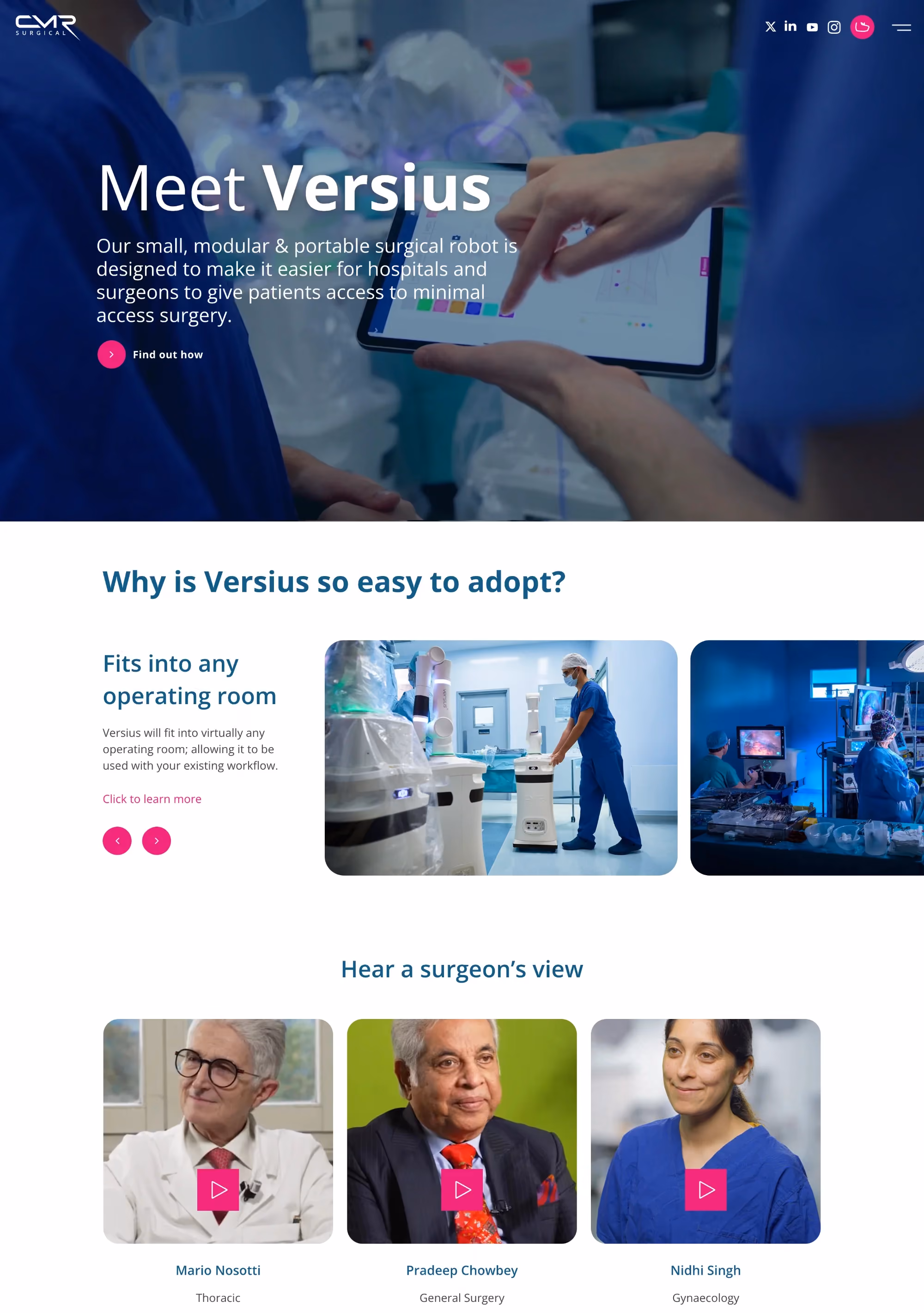
CMR Surgical makes robotic surgical systems, and its website uses motion design and animation to communicate the sophistication of its technology in a way that static images can't.
The homepage features subtle, well-executed animations that show the Versius robotic system in action. These aren't gratuitous motion graphics. They serve a genuine communication function by helping visitors understand how the technology works in a surgical environment.
The visual design is minimal yet confident. Dark backgrounds, crisp product photography, and carefully controlled typography create a premium feel that's appropriate for a high-value medical device brand. Every visual element serves the goal of communicating precision and technical excellence.
The site also does a good job of serving its dual audience: surgeons who want to understand the clinical capabilities, and hospital administrators who need to evaluate the business case. Separate content pathways address each group without creating a confusing experience.
Takeaway for designers: Animation and motion design can be powerful tools for medical device websites, especially when you need to explain how a complex product works. Just make sure every animation serves a clear communication goal.
Best dental and specialty practice website designs
12. CariFree

CariFree is a science-based oral health company, and its website is a strong example of how to position a dental brand as an authority without resorting to the typical dental website clichés (you know the ones: stock photos of impossibly white teeth, generic "we care about your smile" copy).
The design uses a complementary grey-and-white palette that builds trust while remaining easy on the eyes. What's notable is how the site handles content-heavy pages. CariFree has a lot of educational content about dental science, and the design makes that content scannable and approachable through strong typographic hierarchy, clear section breaks, and strategic use of imagery.
The CTAs are well-integrated into the educational content, which means users are guided toward products and professional consultations at natural decision points, not through aggressive pop-ups or banner ads.
Takeaway for designers: If your medical or dental brand has a strong educational content strategy, design the content experience as carefully as you design the homepage. Educational pages that look like an afterthought undermine the authority you're trying to build.
13. Spring Fertility

Spring Fertility's website is a great example of how to handle an emotionally sensitive medical specialty (fertility) with design that feels warm and supportive without being patronizing.
They used a color palette that is soft and calming. Blush pinks, warm neutrals, and gentle greens create an environment that acknowledges the emotional weight of fertility treatment without being clinical or sterile. The photography features real patients and providers in candid moments, not posed stock imagery.
What Spring Fertility does exceptionally well is information hierarchy. The site progressively discloses information, leading with high-level reassurance and gradually offering more detailed clinical information as the user scrolls deeper. That progression mirrors the actual patient journey, where you start with broad questions and gradually move toward specific treatment details.
The appointment booking CTA is present but never aggressive. It feels like an invitation, not a sales pitch. For a medical specialty where patients often take weeks or months to make a decision, that restraint is the right design choice.
Takeaway for designers: Match your information disclosure strategy to the emotional journey of your patient. For high-consideration medical specialties, progressive disclosure works better than front-loading everything.
Best telemedicine and digital health website designs
14. Tia
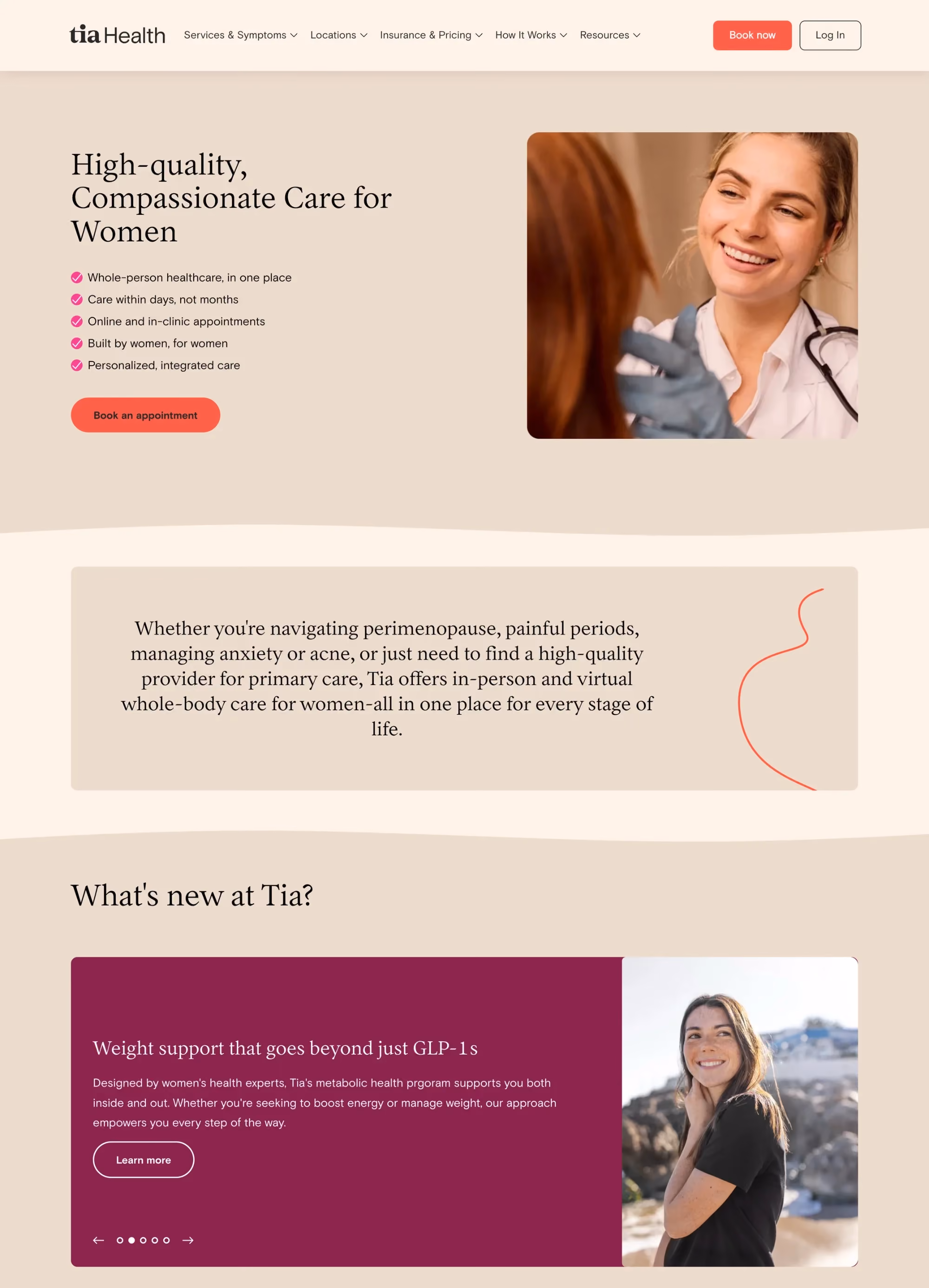
Tia is a modern women's healthcare platform, and its website is one of the best examples of human-centered medical website design in 2026.
The visual identity is warm and distinctive. Rich, earthy tones replace the typical clinical blue palette. Custom illustrations add personality without undermining credibility. And the photography feels personal and real, like you're looking at actual Tia patients and providers rather than a casting agency's portfolio.
Tia's brand voice is woven directly into the design. The copy on the site is conversational, empathetic, and clear. And the design supports that voice with typography choices and spacing that make the text feel inviting rather than clinical. This is a site where the copy and design team were clearly working together, not in separate silos.
The service descriptions are specific and patient-focused. Instead of listing medical jargon, Tia describes its services in terms of what the patient experiences and what outcomes they can expect. That patient-first framing is reflected in every design decision.
Takeaway for designers: If your brand voice is warm and human, your typography, color palette, and photography need to reinforce that. A mismatch between voice and visual design confuses users at an instinctive level.
15. Alto Pharmacy

Alto Pharmacy reimagines the pharmacy experience, and its website reflects that ambition. The design is clean, modern, and stripped of almost every visual convention you'd associate with traditional pharmacy websites.
The homepage leads with a clear value proposition and a simple "get started" CTA. The visual design uses a restrained color palette (white, soft blue, gentle accent colors) and generous spacing to create an experience that feels calm and trustworthy.
From studying their website, it seemed that Alto's design principle is simplicity. The site doesn't try to explain every feature of the service on the homepage. Instead, it focuses on the one thing that matters most to potential users: getting your medication delivered is easy and reliable. Everything else (insurance handling, provider coordination, medication management) is introduced gradually as the user explores deeper.
The mobile experience is outstanding. Given that most pharmacy interactions happen on a phone, Alto is clearly designed for mobile first and then expanded to desktop.
Takeaway for designers: When you're designing for a medical service that competes on convenience, make the design itself feel convenient. Fewer elements, shorter copy, faster paths to the primary action.

What actually makes a medical website design work in 2026?
Before we look at individual sites, it's worth establishing what "good" looks like. Because in healthcare, a beautiful website that confuses patients or hides critical information is worse than an ugly one that gets out of the way.
After reviewing dozens of medical websites, the best ones all share a few things in common.
Trust has to be immediate
Patients visiting a hospital website are often anxious. Investors landing on a biotech site need to see credibility within seconds. The best medical websites build trust through visible doctor credentials, certifications, patient reviews, and clean visual hierarchy. Not through stock photos of smiling people in lab coats.
Navigation needs to be dead simple
Medical sites serve multiple audiences (patients, doctors, researchers, investors, insurance partners), and the best ones don't try to show everything on the homepage. They give each audience a clear entry point.
CTAs need to be obvious and specific
"Book an appointment" beats "Learn more" every time. The highest-converting medical websites put their primary action above the fold and repeat it at natural decision points throughout the page.
Accessibility is not optional
With WCAG 2.2 now the baseline and WCAG 3.0 on the horizon, medical websites that ignore accessibility are not just excluding users. They're exposing themselves to legal risk. The best medical website designs bake accessibility into every decision, from color contrast to screen reader compatibility to simplified language.
And finally, speed matters more than you think
A study by Google found that 53% of mobile visitors leave a page that takes longer than three seconds to load. In healthcare, where the user might be searching for urgent care information on their phone, that number is probably even higher.
With that framework in mind, let's look at the sites that nail it.
Key medical website design trends shaping 2026
After analyzing these 15 sites (and the 35+ others we reviewed but didn't include), a few clear trends came through.
Calming color palettes are replacing "hospital blue"
The best medical websites in 2026 are using soft teals, warm greens, blush tones, and earthy neutrals. Blue is still common, but the most interesting sites are finding ways to differentiate through color. The ones that feel fresh are the ones that moved away from the classic clinical blue-and-white combination entirely.
Minimalism is winning, but only when it's purposeful
The top-performing sites aren't minimal because it looks good. They're minimal because someone made hard decisions about what to show and what to remove. Every element that remains has a clear job. White space is generous because it reduces cognitive load for users who are often stressed or anxious, and the best sites treat that breathing room as a functional choice.
AI-powered features are showing up, but the good ones are thoughtful
Symptom checkers, personalized content recommendations, and intelligent chatbots are appearing on more medical websites. The implementations worth studying are the ones that genuinely help users find information faster. Adding a chatbot icon to the bottom corner without real utility behind it doesn't count.
Telemedicine is very much expected now
Two years ago, telehealth integration felt like a differentiator. In 2026, patients expect it. The best medical websites integrate virtual visit booking alongside in-person scheduling and make the experience feel like one unified process rather than two separate systems stitched together.
Accessibility is finally getting the attention it deserves
The Colorado Health Foundation scored 95 out of 100 on Lighthouse accessibility after their redesign. That's the benchmark. More medical websites are investing in WCAG 2.2 compliance, screen reader testing, and cognitive accessibility. The ones doing it well are treating it as a design priority from the very beginning of the project.
Mobile-first is the standard now
Given that 62% of companies report increased conversions from responsive design, and most healthcare searches now happen on phones, the best medical sites are clearly designed for mobile-first. The desktop experience expands on what was already built for smaller screens, and it shows.
Design elements every medical website needs in 2026
This depends on what type of medical organization you are. Here's a practical reference.
For hospitals and clinics:
- Online appointment booking above the fold
- Doctor profiles with credentials, photos, and patient reviews
- A patient portal with secure login
- A health library or educational content hub
- HIPAA-compliant contact forms
- Insurance verification or accepted-plans information
- Location pages with maps and directions
- Telemedicine/virtual visit integration
For biotech and pharmaceutical companies:
- An interactive drug pipeline page (filterable by phase and therapeutic area)
- Investor relations section with financial reports and SEC filings
- Scientific publications and research highlights
- Leadership team bios with credentials
- Career pages optimized for scientific talent
- Press and media resources
For medical device companies:
- Product pages organized by therapeutic area or clinical application
- Clinical evidence and case study sections
- Technical specifications and ordering information
- Educational video libraries
- Healthcare professional registration or gated content areas
For dental and specialty practices:
- Before-and-after galleries (where appropriate and ethical)
- Service descriptions in patient-friendly language
- Transparent pricing information
- Provider bios with personality, not just credentials
- Google Maps integration for location visibility
For telemedicine platforms:
- Frictionless onboarding and account creation
- Provider search and filtering by specialty
- Integrated video visit technology
- Prescription management and pharmacy integration
- Secure messaging between patients and providers
Common medical website design mistakes to avoid
We saw these over and over again while reviewing 50+ medical sites. They're the most common problems, and they're all fixable.
Mistake #1: Building the site around the org chart
When a hospital organizes its website by department instead of by patient need, users get lost immediately. Patients don't think in departments. They think in symptoms, conditions, and questions. Your site architecture should reflect how people actually search for information, and that almost never matches how your organization is structured internally.
Mistake #2: Stuffing the hero section
A headline, a subheadline, two buttons, a product mockup, animated stats, and a logo bar. All of these visible before you even scroll. We saw this on more sites than we'd like to admit. The hero section should do one thing well. One clear message. One clear action. That's it.
Mistake #3: Using generic stock photography
Patients can tell the difference between a real doctor in a real clinic and a model in a studio. Every single time. If your budget allows for custom photography, do it. If it doesn't, at least choose stock images that feel candid and natural rather than staged and overly polished.
Mistake #4: Ignoring mobile performance
If your medical website takes more than three seconds to load on a mobile device, you're losing over half your visitors before they even see your content. Test your site on real devices, and don't rely solely on desktop browser emulators to tell you how it feels.
Mistake #5: Leaving accessibility to the end of the project
Bolting WCAG compliance onto a finished design is expensive and usually results in a worse experience. Accessibility needs to be part of the process from day one. That means choosing accessible color contrast ratios early, building semantic HTML throughout, and testing with screen readers during development rather than scrambling to fix things after launch.
"Accessibility in healthcare shouldn't be a phase two item. If your website isn't accessible, you're telling a portion of your patients they don't matter enough."

Mistake #6: Writing like a textbook
Medical jargon alienates patients. Most healthcare content should be written at or below an eighth-grade reading level. That doesn't mean dumbing it down. It means being clear. The best medical copywriters manage to be both accurate and easy to understand at the same time.
Tools and resources for medical website design
If you're starting a medical website design project, these resources will save you time.
For design inspiration:
- Awwwards for award-winning healthcare sites
- magier’s work gallery
- Dribbble for medical UI concepts and component ideas
- SiteInspire for curated examples across industries
- Lapa Ninja for landing page inspiration
For accessibility testing:
- Lighthouse (built into Chrome DevTools)
- axe DevTools browser extension
- WAVE Web Accessibility Evaluation Tool
- NVDA or VoiceOver for screen reader testing
For CMS platforms commonly used in medical website design:
- Webflow for marketing-focused medical sites where the design team needs direct control
- WordPress for content-heavy sites with large health libraries (with proper security hardening)
- Drupal for enterprise hospital systems that need robust content management
- HubSpot Content Hub for medtech startups that want CMS and marketing tools in one platform
For performance optimization:
- Google PageSpeed Insights
- GTmetrix
- WebPageTest
How to choose the right design approach for your medical website
By now you've seen 15 very different examples of medical website design. The right approach for your project depends on a few factors.
Start with your primary audience
If patients are your main users, invest heavily in search functionality, appointment booking, and educational content. If investors are your primary audience (common for biotech and pharma), prioritize your pipeline page, leadership section, and investor relations. If healthcare professionals are your target, build around clinical evidence and product specifications.
Then consider your brand positioning
A premium concierge healthcare brand like One Medical can afford a warm, lifestyle-forward design. A major hospital system like Cleveland Clinic needs to prioritize information density and navigation clarity. A biotech startup needs to communicate credibility and scientific rigor. Your design should reinforce your positioning at every level, from color palette to content structure.
And be honest about your resources
A 50-page hospital website with custom photography, interactive pipeline tools, and WCAG 3.0 compliance requires a serious investment. Professional medical website redesigns in the biotech space alone range from $25,000 to $150,000+. Know your budget, your timeline, and your maintenance capacity before you start designing.
The good news is that the principles behind great medical website design are consistent across every category. Build trust immediately. Make navigation simple. Put the user's needs ahead of your organization's preferences. Design for mobile first. And take accessibility seriously from day one.
The specific trends and tools will keep evolving, but those fundamentals will stay the same. Get them right, and you'll have a medical website that works well regardless of what changes next.
Final thoughts
We started this post with a simple question: what does a great medical website actually look like in 2026? After reviewing 50+ sites and breaking down the 15 best ones, the answer is surprisingly consistent.
The best medical websites earn your trust quickly, help you find what you need without friction, and make the next step obvious. Whether that next step is booking an appointment, reading about a clinical trial, or contacting a sales team, the design serves that goal and gets out of the way.
If you're planning a medical website project this year, take one thing from each example on this list. Study Mayo Clinic's content architecture. Look at how Doctolib reduces the path to booking. Pay attention to how Tia's brand voice and visual design work together. You don't need to copy any of them. But understanding why they work will make your own design decisions sharper.
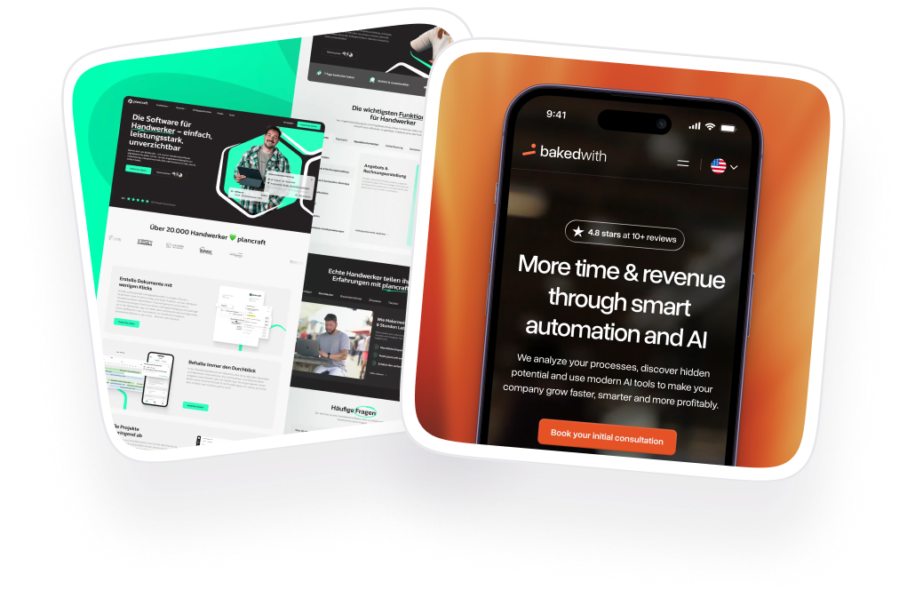
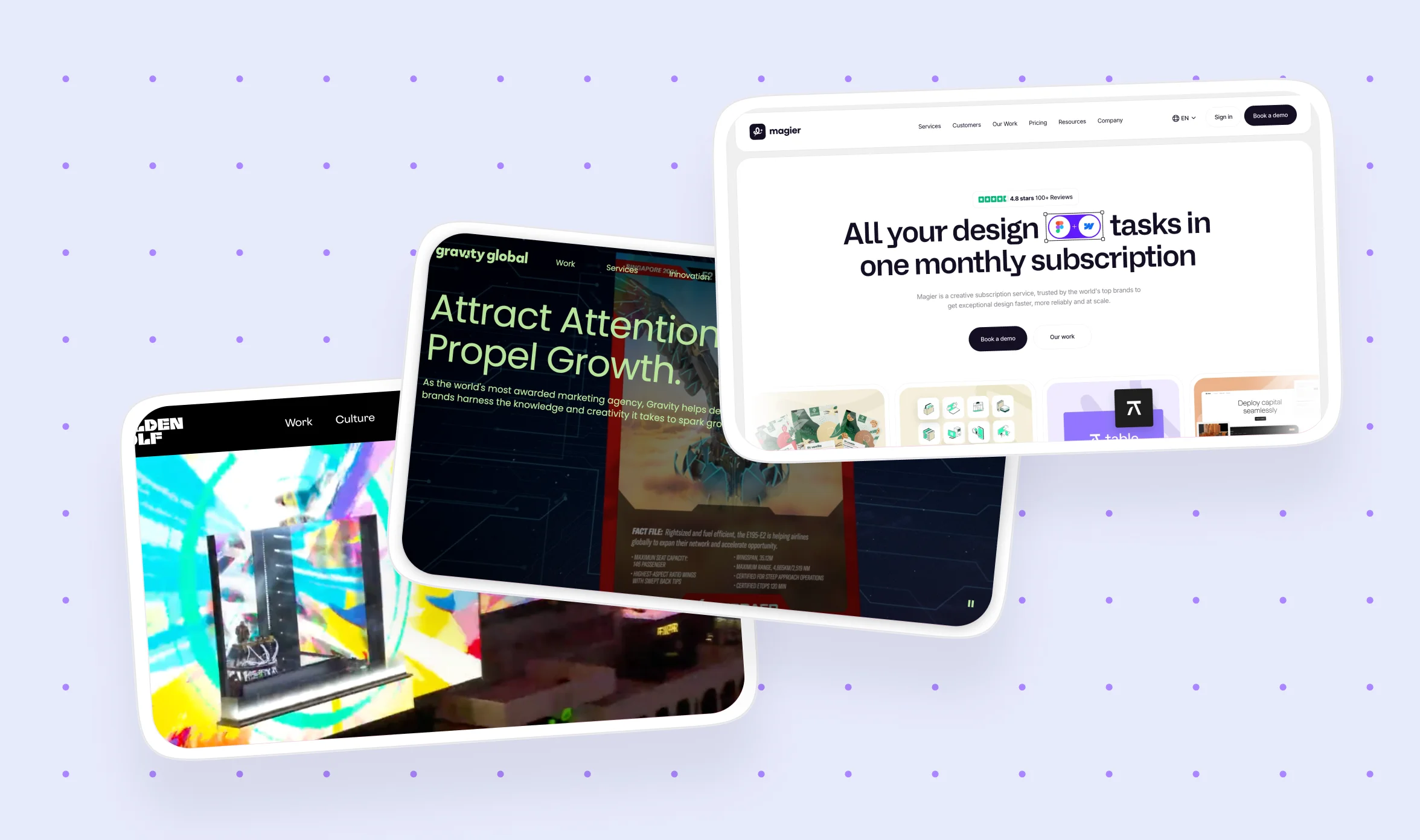
And if you need a team to help you get there, that's what we do at magier. We've designed medical and health-tech websites for companies across the industry, and we work as either a one-time project partner or an ongoing design and development subscription. Book a demo and let's talk about your project.
FAQ
Most medical websites benefit from a full redesign every three to four years to keep up with evolving design standards, accessibility requirements, and user expectations. Between redesigns, ongoing updates to content, performance optimization, and incremental UX improvements are just as important as the initial build.
Yes. Beyond being the right thing to do, accessibility is increasingly a legal requirement. WCAG 2.2 is the current standard, and WCAG 3.0 is on the horizon. In the US, the ADA applies to healthcare websites. In Germany, the BFSG accessibility law went into effect in 2025. The best medical websites build accessibility into the design from day one through proper color contrast, semantic HTML, keyboard navigation, and screen reader compatibility.
Medical website design typically refers to sites for hospitals, clinics, dental practices, and individual providers where the primary users are patients. Health-tech website design covers SaaS platforms, telemedicine apps, digital health tools, and biotech companies where the audience may include patients, investors, healthcare professionals, or enterprise buyers. The design priorities differ significantly depending on who the primary user is and what action they need to take.
Start with your primary CTA. Make sure it's visible above the fold and repeated at natural decision points throughout the page. Simplify your booking or contact process to as few steps as possible. Use specific CTAs like "Book an appointment" rather than vague ones like "Learn more." Test your site on mobile devices since most healthcare searches happen on phones. And make sure your page load time is under three seconds.
Soft blues, teals, and greens are the most common because they signal calm and trustworthiness. However, the best medical websites in 2026 are moving beyond the standard "hospital blue" and using warm neutrals, blush tones, and earthy palettes to differentiate. The right choice depends on your brand positioning. A fertility clinic will benefit from warmer tones, while a medical device company may lean toward darker, more technical palettes.
HIPAA compliance for medical websites involves using encrypted contact forms, securing patient data with SSL certificates, ensuring any third-party tools (analytics, chat, scheduling) have signed Business Associate Agreements (BAAs), and storing patient information on HIPAA-compliant servers. Work with a development team that understands these requirements from the start rather than trying to retrofit compliance after launch.
The most critical pages are the doctor/provider directory, appointment booking, location pages, the health library or conditions and procedures section, the patient portal login, and insurance or billing information. Most patients arrive with a specific question or need, so these pages should be reachable within one or two clicks from the homepage.
Webflow works well for marketing-focused medical sites where the design team needs direct control over the layout. WordPress is a strong option for content-heavy sites with large health libraries, as long as security is properly managed. Drupal suits enterprise hospital systems that need robust content management. HubSpot Content Hub is a good fit for medtech startups that want their CMS and marketing tools in one platform.
It depends on the scope. A smaller clinic or dental practice website can range from $5,000 to $15,000. Mid-sized health-tech or pharmaceutical websites typically fall between $25,000 and $75,000. Enterprise hospital systems and large biotech sites with interactive pipeline pages, patient portals, and WCAG 3.0 compliance can run from $75,000 to $150,000 or more.
A good medical website design builds trust quickly, makes navigation simple for multiple audience types, loads fast on mobile, follows accessibility standards (WCAG 2.2 at minimum), and has a clear conversion path whether that's appointment booking, contact forms, or investor-facing CTAs. Visual design matters, but it needs to serve the user experience rather than compete with it.
.png)

.webp)