.avif)
Ebook Cover Design: Examples and a Step-by-Step Guide
You have about two seconds.
That's roughly how long a prospect spends looking at your ebook cover before deciding whether to click or scroll past. If it doesn't communicate the right brand, the right tone, and the right level of quality in that window, no amount of great writing or strong reviews will save you.
The bitter truth is that the reader judges the content inside by the cover outside.
That's the problem good ebook cover design exists to solve. It's not about making something beautiful for its own sake. It's about making something that earns the click, because without the click, nothing else matters.
According to a survey cited by design platform Wixel, 79% of readers make a split-second decision about a book based solely on its cover. And with 85% of book sales now originating in online marketplaces, the thumbnail is the first and often only chance your cover gets to do its job.
At magier, we design covers, lead magnets, and marketing collateral for 150+ brands across SaaS, B2B, and consumer publishing, so we've seen firsthand what separates covers that convert from covers that don’t get approval from clients, nor their customers.
Here's what this guide covers:
- What makes ebook covers different from print covers
- Examples across fiction, non-fiction, and SaaS/B2B categories
- Genre-specific visual conventions and color psychology data
- A step-by-step design workflow from research to final export
- Platform specifications for every major retailer in a single comparison table
- A tools comparison (free and paid) to help you choose what to design with
- A full cost breakdown by tier, from DIY to design subscription
- Print book cover essentials (bleed, spine, CMYK, and trim sizes)
- How to test your cover before you publish
What makes ebook cover design different from print
When a reader picks up a physical book, they hold it, turn it over, read the back cover, and feel the texture of the spine. The entire object is the experience. Ebook covers don't get any of that. They get a rectangle, roughly 100 to 250 pixels tall, displayed on a screen alongside dozens of competitors, and that's it.
This should change almost every design decision of yours. On a physical shelf, you can use fine detail, intricate illustration, and subtle texture because the reader is standing close enough to appreciate it. On a digital storefront, those same details become visual noise that makes a cover harder to read and easier to ignore. What works in a bookshop window fails completely as a mobile thumbnail.
The platforms where most ebooks are discovered, including Amazon Kindle, Apple Books, Kobo, Google Play Books, Goodreads, and StoryGraph, all display covers at sizes where only the boldest, clearest visual information survives. Your cover needs to pass what designers call the shrink test. Reduce it to 150 pixels wide and ask whether you can still read the title, identify the genre, and feel something. If the answer to any of those is no, the cover needs to be simpler.
There's also a second screen to consider. Social media ads, email newsletters, and author websites all display covers at varying sizes in unpredictable contexts. A cover designed with clarity and contrast as its foundation will hold up in all of those environments without needing a separate version.
Ebook cover design examples by genre
The fastest way to understand what a great ebook cover looks like is to study the best ones in your category. Each genre has its own visual language, and readers have trained themselves to recognize it quickly. Here's a breakdown of what works across the major categories, with commentary on why.
Business and self-help
Business and self-help covers have one primary job, which is to signal credibility. The reader is considering spending money on your expertise, and the cover needs to communicate that the content inside is worth their time. That's why these covers consistently prioritize the title above everything else.
The title in a business ebook cover typically occupies 40 to 60% of the visible surface. Graphics are kept simple, often limited to a single icon, abstract shape, or minimal illustration. Color palettes lean toward bold primary colors, clean whites, or confident dark backgrounds. The typography is almost always a strong sans-serif that reads clearly at thumbnail size.
What you'll notice across the best examples in this category:
- Very large, dominant titles that are readable at thumbnail size
- Simple or abstract graphics that support the title rather than compete with it
- High contrast between title text and background
- Minimal decorative elements that could reduce clarity at small sizes
- A clear benefit statement in the subtitle, telling the reader exactly what they'll gain
Business covers that try to include too much, such as author photos, endorsement quotes, award badges, and secondary graphics, tend to lose the visual clarity that makes them click-worthy in a crowded storefront.
A few covers that demonstrate these principles clearly:

| Cover | Author | Why it works |
|---|---|---|
| Atomic Habits | James Clear | Single pill icon on a white background. Title is the dominant element. Won the Penguin Cover Design Award 2024 for adult non-fiction. The restraint is the point. |
| Deep Work | Cal Newport | Dark background, large white title, minimal illustration. Instantly legible at thumbnail size, which is why it continues to sell years after publication. |
| The Psychology of Money | Morgan Housel | Simple coin graphic, clean typographic hierarchy, muted palette. Looks like something a senior executive would leave on their desk deliberately, which is the intended signal for its audience. |
| $100M Offers | Alex Hormozi | Bold yellow background, large typography, direct-response aesthetic. Breaks the muted palette convention of the category intentionally, and works because of it at the price-point and audience it targets. |
Romance
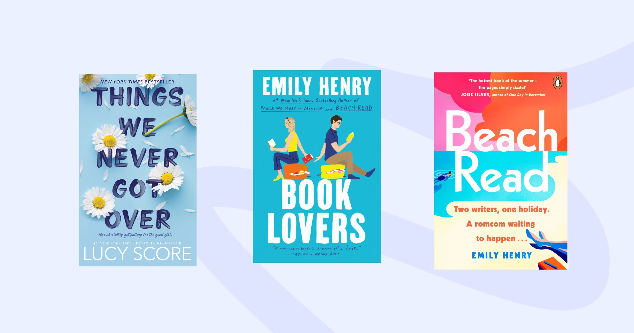
Romance is one of the most visually consistent genres in publishing, and that consistency is intentional. Readers of romance have strong expectations, and a cover that doesn't meet them signals the book might not deliver the genre experience they're looking for.
Modern romance ebook covers lean toward bright, recognizable color palettes, expressive characters shown through illustration or stylized photography, and clean typography that's warm rather than cold. The shift over the past few years has been toward illustrated characters and away from photographic covers, particularly in contemporary romance and romantasy.
What distinguishes strong romance covers:
- Warm or vibrant color palettes that signal emotional intensity
- Expressive character depictions that give the reader someone to root for immediately
- Clean, readable typography in fonts with personality but not complexity
- Strong emotional cues in the imagery, whether longing, tension, joy, or intimacy
- Clear genre signaling that tells a romance reader this book is for them within a single glance
A few covers that show how this plays out in practice:
| Cover | Author | Why it works |
|---|---|---|
| Fourth Wing | Rebecca Yarros | Black background, gold celestial motifs, no human figure on the front. Sold 12 million copies across the series within two years and set the visual template for the entire romantasy wave that followed. |
| A Court of Thorns and Roses | Sarah J. Maas | Single floral motif, dark atmospheric palette, large title typography. Communicates serious fantasy with a romantic core without showing characters, letting readers project onto the story. |
| Funny Story | Emily Henry | Warm, bright palette with an illustrated scene. Instantly recognizable as contemporary romance within a single glance, a strong example of consistent genre signaling across a series. |
Thriller and mystery
Thriller and mystery covers work through contrast and tension. The visual approach communicates that something is wrong, something is hidden, or something is about to happen. That sense of unease is what draws the right reader in.
These covers typically use dark palettes with a single accent color, bold sans-serif typography, and simple imagery that creates mood without explaining the plot. Negative space is used generously, which helps the cover breathe and keeps the focus on the one or two elements that carry the tension.
Common elements across effective thriller and mystery covers:
- Dark palettes with one strong accent color (red, white, or a cold blue)
- Bold, large typography that doesn't soften or decorate
- Simple, unsettling imagery that raises a question rather than answering one
- Generous negative space that creates a sense of isolation or dread
- High contrast between all elements so nothing gets lost at small sizes
Here are some examples and what we can learn from them:

| Cover | Author | Why it works |
|---|---|---|
| Gone Girl | Gillian Flynn | Woman's blurred, partially obscured face on a dark background. Unsettling without being explicit. Cold, clinical typography communicates psychological unease before the reader knows the plot. |
| The Silent Patient | Alex Michaelides | Bold red background, woman's face partially covered. One strong accent color, one focal image, no visual noise. Follows the genre formula so precisely it now feels archetypal. |
| The Girl on the Train | Paula Hawkins | Blurred train window perspective. The visual metaphor matches the unreliable narrator premise of the book without requiring any copy to explain it. |
Fantasy and sci-fi
Fantasy covers are the most visually ambitious in publishing. Readers of the genre expect richness, detail, and world-building, even from a single image. The challenge is delivering that richness in a format that also survives the thumbnail test.
The strongest fantasy covers use dramatic illustrations, atmospheric lighting, and large decorative titles that feel like they belong to the world inside the book. Sci-fi leans in a different direction, favoring futuristic lighting, geometric forms, and cool color palettes that signal technology, space, or a future that doesn't feel warm.
What works in fantasy and sci-fi:
- Dramatic, high-quality illustrations that reward closer inspection
- Rich atmospheric lighting that creates depth and mood
- Large, decorative title typography that matches the world's aesthetic
- Strong visual symbolism (a weapon, a world, a creature, a symbol)
- Sufficient simplicity so the cover still reads as a clear image at 150 pixels wide
The romantasy subgenre has added its own aesthetic to the mix, bringing embossed-style florals, ornate typography, and covers that feel almost tactile. If you're designing in this space, studying the current bestseller list is essential before opening a design tool.
Here are some examples and what we can learn from them:

| Cover | Author | Why it works |
|---|---|---|
| The Name of the Wind | Patrick Rothfuss | Swirling atmospheric artwork in dark jewel tones with a large decorative title. Rich at full size, clear at thumbnail. One of the most referenced covers in fantasy design discussions for exactly this balance. |
| The Way of Kings | Brandon Sanderson (art by Michael Whelan) | Architectural symbolism at massive scale: towers, sky, silhouetted figure. Whelan's Stormlight Archive covers became the visual benchmark for high-quality epic fantasy illustration in the modern market. |
| The Priory of the Orange Tree | Samantha Shannon | Bold dragon illustration with intricate typography. The dragon rewards close inspection but still reads as a clear, powerful image at thumbnail size. |
| Fourth Wing | Rebecca Yarros | Black-and-gold celestial grammar with no human figure. Crossed over from romance onto fantasy shelves because the cover communicates both. Its visual language now defines an entire subgenre. |
Memoir and literary fiction
Memoir and literary fiction covers signal sophistication through restraint. These are covers that trust the reader to fill in the emotional meaning from a single strong image or a carefully chosen typographic treatment. They deliberately avoid over-explaining.
Publishers like Fitzcarraldo Editions and NYRB Classics have built entire brand identities around this principle. One color, strong typography, and nothing unnecessary. The covers communicate "this is a serious book for a thoughtful reader" without saying a word.
What distinguishes strong memoir and literary fiction covers:
- Minimal composition built around one strong visual element
- Generous white or negative space that feels confident rather than empty
- Refined typography that often does more work than any image
- Subtle color palettes that signal emotion rather than genre
- Restraint as a deliberate choice, not an absence of ideas
Children's books
Children's book covers function differently from every other category because they're selling to two audiences simultaneously. The child responds to the visual appeal, and the adult makes the purchase decision.
Strong children's book covers use warmth, expressive characters, and bright colors that invite rather than challenge. The typography tends to be rounded, friendly, and large enough to be read by a child who might not yet be a strong reader. For series, consistency across covers builds recognition for both audiences.
What works in children's book cover design:
- Expressive, warmly illustrated characters that children want to spend time with
- Bright, inviting color palettes that feel joyful rather than alarming
- Friendly, rounded typography that's easy to read and unthreatening
- A clear visual focus on a character or object that tells a story immediately
- Series consistency so returning readers recognize the brand at a glance
SaaS and B2B ebooks
This is where ebook cover design diverges most sharply from trade publishing, and it's where most B2B companies get it wrong. A SaaS ebook is not a novel. It's not even really a book by trade publishing standards. It's a lead generation asset, a gated piece of content designed to capture an email address or demonstrate expertise to a potential customer.
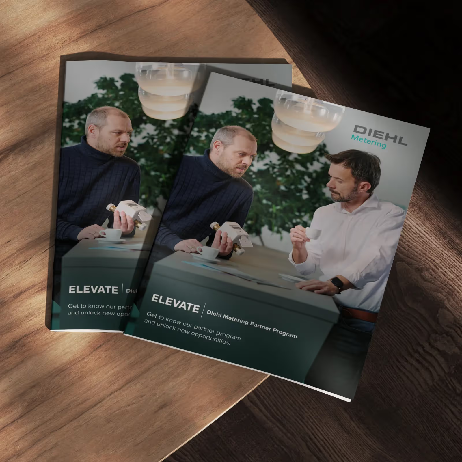
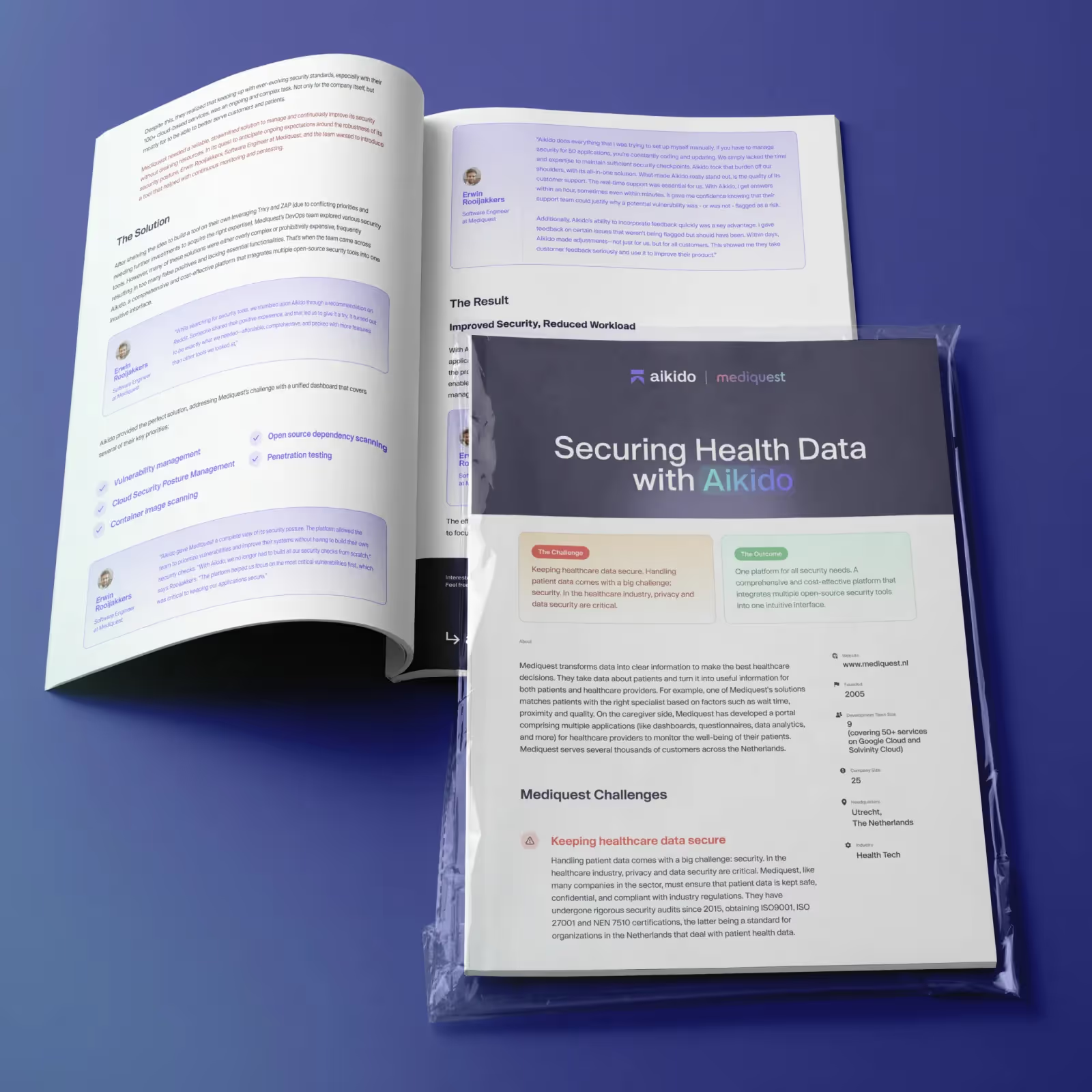
The best SaaS ebook covers don't look like books at all. They look like premium reports, industry benchmarks, or editorial design pieces. Companies like HubSpot, Salesforce, Ahrefs, Semrush, Notion, Linear, Stripe, and Zapier consistently produce covers that feel closer to a well-designed annual report than a Kindle bestseller. That's not an accident. Their audience isn't browsing a digital bookstore looking for something to read on a flight. Their audience is a B2B buyer evaluating whether this content is worth their time and their data.
What that means in practice is that the title becomes the hero in a different way. Instead of "Marketing Guide," the best SaaS covers say something like "The 2026 B2B Demand Generation Benchmark Report" or "How 500 SaaS Teams Are Using AI in Their Marketing Stack." The benefit statement is the hook, not the visual.
There are four cover layouts that work consistently in SaaS and B2B:
| Layout type | Structure | Best for |
|---|---|---|
| Editorial | Logo, title, subtitle, abstract illustration, author | Reports, whitepapers, industry research |
| Product-first | Logo, title, product screenshot, CTA | Product guides, tutorials, customer education |
| Bold typography | Large title, simple icon, subtitle, brand | Thought leadership, frameworks, guides |
| Data report | Year or stat, topic title, minimal graphic, brand | Annual reports, surveys, benchmark studies |
For color, the trend in SaaS cover design has moved away from heavy gradients and complex effects toward white backgrounds, soft grays, one or two accent colors, and generous whitespace. This creates a modern, trustworthy aesthetic that performs better with enterprise buyers than the more decorative approaches that dominated a few years ago.
For illustration style, the most effective SaaS covers use abstract shapes, 3D objects, geometric patterns, minimal isometric graphics, or product UI elements. The covers that underperform tend to rely on generic stock photography, such as handshakes, people pointing at laptops, or overused AI robot imagery.
Before you publish your next SaaS ebook, run it through this checklist:
- Does the title clearly state what the content is about and why it's valuable?
- Is the title large enough to be read at thumbnail size?
- Does the cover match your brand identity (colors, typography, illustration style)?
- Have you used one clear focal point rather than competing elements?
- Does the contrast between text and background hold up on a white screen?
- Does the cover feel premium and trustworthy rather than decorative?
- Have you avoided generic stock imagery?
- Have you tested it at thumbnail size (roughly 180 pixels wide)?
If someone removes your logo, the design should still feel unmistakably like your brand. That's the standard to aim for.
"SaaS companies spend serious money on landing pages and almost nothing on their ebook covers. Both are conversion assets. Both need the same level of design thinking."


Need an ebook cover designed? magier can help.
If you are producing ebooks, lead magnets, whitepapers, or gated content on an ongoing basis, magier's design subscription is built for exactly that kind of work. You get a dedicated team of pre-qualified designers, a 48-hour turnaround on requests, unlimited revisions, and a fixed monthly fee you can cancel anytime.
Most teams come to magier because they need more than a one-off cover. They need the cover, the interior layout, the social assets to promote it, the landing page to gate it, and the email banner to announce it. All of that sits within a single subscription, which means one brief, one team, and no separate suppliers to coordinate.
magier has designed over 1,000 SaaS and B2B marketing assets for 150+ brands, with a 4.9/5 average rating on Trustpilot. If you want to see what that looks like in practice, take a look at magier.com/design-services.


{{cta}}
What makes a good ebook cover: the anatomy of a high-converting cover
A high-converting ebook cover answers three questions almost instantly. What is this about? Who is it for? And why should I download or buy it? If a reader can't answer all three within a few seconds of seeing your cover, the design is working against you.
The visual hierarchy of a strong ebook cover follows a consistent structure, regardless of genre:
- Title (the largest element, always)
- Main image or illustration (supporting the title, not competing with it)
- Author name (smaller than the title, but legible)
- Subtitle or series name (if it adds meaningful context)
- Publisher mark (optional, and only if it adds credibility)
The title is always the largest element because it's the one thing that must be readable at every size the cover will appear. If readers can't read the title in a thumbnail, many will never get close enough to see anything else on the cover.
Everything else in the hierarchy serves one function. It supports the title and reinforces the emotional promise of the book. When elements start competing with the title for visual dominance, the cover loses clarity, and clarity is what converts.
Ebook cover design best practices
These are the principles that separate covers that convert from covers that get scrolled past. They apply across genres and formats, though the specific execution varies by category.
1. Design for the thumbnail first
The most common cover design mistake is building a beautiful full-size image and then discovering it falls apart at thumbnail size. By then, you've already invested hours in a direction that may not work.
A better approach is what designers call dual-scale design. Build your cover at full size (1,600 x 2,560 px for most platforms), but test it at 150 pixels wide after every major design decision. If the title isn't readable, if the focal point isn't clear, or if the genre isn't obvious at that size, simplify before moving forward.
The thumbnail test takes about 30 seconds and saves you from the most expensive mistake in cover design, which is finishing a cover that looks great on your monitor but disappears on a phone screen.
2. Match your genre's visual language
Genre visual conventions aren't arbitrary. They exist because readers have trained themselves to recognize them quickly, and covers that violate them signal to readers that the book might not deliver the experience they're expecting. You can be distinctive within genre conventions, but ignoring them entirely is usually a risk that costs more than it gains.
Use this table as a starting reference when you're building your genre brief:
| Genre | Color palette | Typography style | Imagery type | Mood |
|---|---|---|---|---|
| Business / self-help | Bold primaries, clean white, confident darks | Strong sans-serif, large, minimal decoration | Abstract shapes, simple icons, minimal illustration | Authoritative, clear, confident |
| Romance | Warm tones, vibrant pinks and purples, rich golds | Elegant serif or script, warm and expressive | Illustrated or stylized characters, florals, soft light | Emotional, intimate, inviting |
| Thriller / mystery | Dark backgrounds, single accent (red, white, cold blue) | Bold sans-serif, stark, no softening | Minimal unsettling imagery, silhouettes, shadows | Tense, ominous, curious |
| Fantasy | Rich jewel tones, deep blues and greens, atmospheric | Decorative, large, world-appropriate | Dramatic illustration, characters, symbolic objects | Epic, immersive, magical |
| Sci-fi | Cool blues, blacks, metallics, neon accents | Geometric, futuristic, clean | Futuristic environments, technology, space | Intellectual, vast, curious |
| Memoir / literary fiction | Soft or muted tones, single color emphasis, white | Refined serif or clean sans, typographic focus | Abstract, symbolic, one strong visual element | Reflective, serious, emotional |
| Children's | Bright, warm, high-contrast | Rounded, friendly, large and readable | Expressive illustrated characters, warmth | Joyful, inviting, safe |
| SaaS / B2B | White, soft grays, 1–2 brand accent colors | Large sans-serif, benefit-driven, clean | Abstract shapes, geometric, product UI, 3D objects | Trustworthy, authoritative, modern |
Treat this table as a starting point rather than a rigid set of rules. Study the current bestseller list in your specific genre before you start designing, because trends shift and the table above reflects current patterns, not permanent truths.
3. Prioritize typography over illustration
For ebook covers specifically, typography does more work than illustration. An image that's too complex collapses into noise at thumbnail size. A well-set title that's bold, high-contrast, and the right size holds up at every scale.
The rules for cover typography are simpler than they might seem:
- Use one display font for the title
- Use one supporting font for the author name and subtitle
- Maximize contrast between your title text and the background
- Avoid text effects like glows, bevels, and heavy drop shadows that muddy the text at small sizes
If you're designing for a modern SaaS or non-fiction cover and need a starting point for typefaces, these are worth exploring. Inter, Geist, Manrope, IBM Plex Sans, Söhne, and Neue Haas Grotesk are all clean, highly legible at small sizes, and carry a contemporary professional feel without being cold.
4. Use high contrast and keep details simple
Strong contrast is what makes a cover readable when it's the size of a thumbnail on a bright mobile screen or embedded in an email. White titles on dark backgrounds, dark titles on light backgrounds, and clear separation between text and imagery are the baseline. Placing title text over busy backgrounds without an overlay or gradient underneath is one of the most reliable ways to make a cover look amateurish.
Fine textures, intricate patterns, and small decorative elements tend to disappear or become visual noise at small sizes. If a design element isn't doing meaningful work at 150 pixels wide, it probably shouldn't be on the cover at all.
5. Limit your focal points
A cover with one strong focal point is almost always more effective than a cover with three or four competing elements. That focal point can be a character, an object, a symbol, or a compelling scene, but there should be one clear answer to the question "what is this cover about visually?"
Trying to show every plot element or every feature of your SaaS product on the cover is a common mistake. Readers don't need the full story from the cover. They need enough to feel curious and confident that this book is for them.
6. Use color with intention
Color isn't just aesthetic on an ebook cover. It's one of the fastest-acting genre signals a reader processes, often before they've consciously registered the title. Research from CoverRater found that specific blue-orange contrast combinations increase click-through rates for science fiction covers by up to 37%, and that magenta-teal combinations boost romance conversion by 28%. Those aren't small margins.
Beyond genre signaling, color also communicates quality. Covers with muddy, low-contrast, or clashing color combinations signal "this was made quickly without expertise." Clean, intentional color palettes, even simple ones, signal that someone made considered choices, and that perception transfers to the reader's judgment of the content inside.
{{freebie}}
Common ebook cover design mistakes
These are the mistakes that most reliably cost authors and marketers clicks, downloads, and sales. Some are technical. Most are conceptual.
- Tiny, illegible title text: If the title can't be read at thumbnail size, the cover has failed its primary job. The title should be the largest element on the cover by a significant margin.
- Too many fonts: More than two typefaces on a single cover almost always creates visual chaos. Pick one display font for the title and one supporting font for everything else, and stick to them.
- Low-contrast text and backgrounds: Placing your title over a busy image without a contrast overlay, or choosing a text color that's too similar to the background, makes your cover nearly invisible at small sizes.
- Overly detailed artwork: Fine illustration and complex imagery can look stunning at full size. At 150 pixels wide, they turn into an unreadable blurry texture that signals nothing to the reader.
- Generic stock imagery without customization: A stock photo used as-is tells the reader that you chose the first result from a search rather than thinking about what would work specifically for your book. A study of 200 covers by HMD Publishing found that covers using identical visual templates averaged 23% lower sales than those with unique approaches.
- Excessive design effects: Heavy glows, bevel effects, complex drop shadows, and layered filters tend to look dated and add visual noise without adding meaning. Modern cover design is moving in the opposite direction.
- Ignoring genre conventions: A thriller that looks like a romance, or a business ebook that looks like a fantasy novel, will confuse the reader and lose the click. Genre signaling is a feature, not a constraint.
- Skipping the thumbnail test: According to research, 52% of readers will skip a book they might have otherwise been interested in simply because they dislike the cover. Testing at thumbnail size costs you 30 seconds and can save your cover from this outcome.
- Over-relying on templates: Canva and similar tools are useful starting points, but leaning too heavily on unmodified templates produces covers that look like they came from the same source as hundreds of other books, because they did.
Ebook cover dimensions and specs for every platform
This is the reference table you need before exporting your cover file. Platform requirements vary, and uploading the wrong dimensions can result in rejection, distortion, or a cover that looks blurry in thumbnail rendering.
| Platform | Recommended dimensions (px) | Aspect ratio | File format | Max file size | Color mode |
|---|---|---|---|---|---|
| Amazon KDP (ebook) | 1,600 x 2,560 | 1:1.6 | JPEG or TIFF | 50 MB | RGB |
| Apple Books | 1,600 x 2,400 | 1:1.5 | JPEG | — | RGB |
| Kobo | 1,600 x 2,560 | 1:1.6 | JPEG | — | RGB |
| Barnes & Noble Press | 1,600 x 2,560 | 1:1.6 | JPEG | — | RGB |
| Google Play Books | 1,600 x 2,560 | 1:1.6 | JPEG | — | RGB |
| IngramSpark (ebook) | 1,600 x 2,560 | 1:1.6 | JPEG | — | RGB |
| Smashwords / Draft2Digital | 1,600 x 2,560 minimum | 1:1.6 | JPEG | — | RGB |
| ACX (audiobook) | 2,400 x 2,400 (square) | 1:1 | JPG, PNG, or TIF | 8 MB | RGB |
A few practical notes on using this table:
A single 1,600 x 2,560 px JPEG works for most platforms
If you're publishing primarily through Amazon KDP, that single master file will be accepted by Kobo, Barnes & Noble, Google Play Books, IngramSpark, and most aggregators without modification.
Apple Books uses a slightly different ratio
Apple's preferred dimensions are 1,600 x 2,400 px, which is a 1.5:1 ratio rather than the 1.6:1 that KDP prefers. The difference is small, roughly 160 pixels of height, and most retailers accept minor ratio variations without rejection. If you're publishing primarily through Apple, adjust your canvas height accordingly.
DPI matters for print, not for ebooks
On screen, what counts is the total pixel count, not the DPI value. A 1,600 x 2,560 cover tagged at 72 DPI looks identical to one tagged at 300 DPI on a digital device. KDP recommends 300 DPI as a best practice, but it checks your pixel dimensions, not the DPI setting in your file.
JPEG is the universal standard for ebook covers
PNG is accepted on some platforms and preserves quality well, but it creates larger files with no visible benefit on screen. Avoid BMP and GIF entirely.
Amazon will reject covers under 1,000 pixels on the shortest side
Uploading at minimum resolution rather than the recommended 1,600 x 2,560 is a common mistake that results in covers that look soft and pixelated in Amazon's search carousels.
Print book cover design: what changes when you go physical
Designing for print is a fundamentally different process from designing an ebook cover. An ebook cover is a single front-facing image. A print cover is a three-panel wraparound that includes the front cover, the spine, and the back cover, all designed as a single continuous file that gets wrapped around a physical book.
That structural difference creates a set of technical requirements that don't exist in digital publishing.
Bleed, trim, and safe area
When a book is printed and cut, the cutting machine isn't perfectly precise. Bleed is the extra artwork you extend beyond the final trim edge, typically 0.125 inches (3mm) on all sides, so that if the cut runs slightly wide, there's no white gap at the edge of the cover. The trim is the final intended size of the book. The safe area is an inset margin inside the trim, at least 0.25 inches from each edge, where you keep all critical text and logos so they don't get clipped.
Spine width
The spine is the strip of the cover that faces outward on a shelf. Its width is determined by your page count and paper stock, not by your design choices. For standard 60 lb uncoated text stock, the spine width is approximately 0.002252 inches per page, so a 250-page book has a spine of roughly 0.56 inches. Both Amazon KDP and IngramSpark have spine width calculators on their websites. Always use the printer's calculator to confirm this number before designing.
CMYK vs. RGB
Digital covers are designed in RGB because screens display in RGB. Print covers must be delivered in CMYK because printers use cyan, magenta, yellow, and black inks. Colors that look vibrant in RGB, particularly bright neon greens, electric blues, and deep saturated reds, can shift noticeably when converted to CMYK. Always convert your print files to CMYK and proof them before submitting.
300 DPI is non-negotiable for print
Unlike ebooks, where pixel count matters and DPI is largely irrelevant, print files must be designed and exported at 300 DPI minimum. Designing at 72 DPI and trying to upscale to 300 DPI for print doesn't work. The artwork degrades visibly.
Here are the most common print book trim sizes and their use cases:
| Trim size | Dimensions (inches) | Common use case |
|---|---|---|
| 5" x 8" | 5 x 8 | Compact fiction, novellas |
| 5.5" x 8.5" | 5.5 x 8.5 | Memoir, literary fiction, shorter non-fiction |
| 6" x 9" | 6 x 9 | Trade paperback (most popular across all genres) |
| 8.5" x 11" | 8.5 x 11 | Workbooks, textbooks, illustrated guides |
The 6 x 9 inch trade paperback is by far the most popular trim size on Amazon KDP. If you're not sure which size to use, start there.
Working from a template
Both Amazon KDP and IngramSpark provide cover template generators on their websites that calculate exact dimensions, spine width, and bleed requirements based on your trim size, page count, and paper stock. Always start from the printer's template rather than building from scratch. The template gives you bleed guides and safe zone markers built in, which removes the most common source of print cover errors.
Designing ebook and print covers together
Even though they require different files, your ebook and print covers should feel like they came from the same place. Use the same typography, color palette, and core visual elements across both. Readers who discover your ebook and then buy the print version should recognize the cover immediately.
How to design an ebook cover (step-by-step workflow)
Here's the process that takes you from a blank canvas to a cover that's ready to publish. These steps apply whether you're designing it yourself or briefing a designer.
Step 1: Research your genre's top covers
Before you open any design software, spend time on the Amazon bestseller list in your genre. Screenshot 50 to 100 covers that catch your eye. Look for the recurring patterns across those covers. Note what colors appear repeatedly, what typography styles dominate, what types of imagery are used, and which covers stand out from the rest. This research is what prevents you from designing in a vacuum and ending up with a cover that signals the wrong genre.
Step 2: Define your cover's core message
Answer three questions in writing before you start designing. What is this about? Who is it for? Why should someone click? The answers become your design brief. If you can't answer these clearly, your cover won't be able to either.
Step 3: Build a mood board
Collect color palettes, typography references, and imagery examples that match the direction you want to take. Pinterest, Milanote, or a simple folder of screenshots all work. The mood board keeps you from getting distracted by tempting but wrong directions once you start designing.
Step 4: Choose your approach
Decide whether you're designing it yourself, using a premade cover, hiring a freelancer, or working with an agency or design subscription service. This decision depends on your budget, timeline, and the level of customization you need. The tools section and cost section below give you the information you need to make that call.
Step 5: Sketch three to five concepts
Even rough sketches help you evaluate directions before committing to detailed design work. Try one typographic approach, one image-led approach, and one with a strong graphic element. Comparing directions at this stage costs you a few minutes and saves you hours of rework.
Step 6: Design at full size, test at thumbnail size
Build your cover at 1,600 x 2,560 px minimum. After each major design decision, resize a copy to 150 pixels wide and check three things. Can you read the title? Is the genre obvious? Does one focal point stand out? If any of those answers is no, simplify before continuing.
Step 7: Get feedback from your target audience
Share your cover with people who read in your genre, not just friends and family. Author communities on Reddit and Facebook, beta reader groups, and split-testing tools like PickFu give you responses from readers who have actual opinions about what they'd click on. Friends and family tend to say they like it even when they wouldn't click on it.
Step 8: Export according to your platform's specifications
Use the specs table in the previous section to confirm the right dimensions, file format, and color mode for each platform you're publishing on. Export separate files for ebook and print if you're publishing in both formats. Label your files clearly with the platform and version so you know exactly what's been exported and for where.
How to test your ebook cover before publishing
Designing a cover you believe in is not the same as knowing it will work. The covers that convert are the ones that have been tested against real reader responses, not just approved by the author and their team.
Here are the most effective testing methods, roughly in order of cost and effort:
The thumbnail grid test (free, 10 minutes)
Create a grid that shows your cover alongside 20 bestselling covers in your genre at the same thumbnail size. Look at it critically: does your cover hold its own in that company? Does it signal the right genre? Does it stand out without feeling out of place? This test is blunt and fast, and it catches more problems than any amount of solo reviewing.
Informal audience polls (free, 1 to 2 days)
Share two or three cover options in an author community, a genre-specific reader group, or with beta readers. Ask which they'd click on first, and why. The "why" answers are often more useful than the votes.
PickFu split tests ($50 to $150, 24 hours)
PickFu lets you test two cover designs against each other with a panel of readers you can filter by genre preferences. You get quantitative results (which cover won) and qualitative comments (why). For a book you're investing significant money or time into, this is worth the cost.
Facebook or social media A/B tests ($50 to $100, 3 to 7 days)
Run the same ad copy with two different cover images to a small targeted audience. Measure which generates more clicks. This is the closest thing to a real-world test because it measures actual click behavior, not stated preferences. Reedsy's research on this approach found an average 35% increase in marketability for books with professionally designed covers, and 99Designs found click-through rate improvements ranging from 6% to 122% across four cover redesigns.
Any one of these methods is better than no testing. The thumbnail grid test costs nothing and takes ten minutes. If you do nothing else to validate your cover before publishing, do that.
Best tools for ebook cover design
The right tool depends on your skill level, your budget, and what you need the cover to do. Here's a breakdown of the main options.
| Tool | Skill level | Price | Best for | Limitations |
|---|---|---|---|---|
| Canva | Beginner | Free / Pro (~$15/mo) | Quick designs, templates, marketing graphics | Templates are widely used; covers can look generic without heavy customization |
| Adobe Photoshop | Advanced | ~$22/mo (subscription) | Complex image manipulation, photo-based covers | Steep learning curve; not ideal for layout-heavy print covers |
| Adobe InDesign | Advanced | ~$22/mo (subscription) | Print layouts, precision typography, full wraparound covers | Overkill for ebook-only work; significant learning investment |
| Affinity Publisher | Intermediate | Free (as of 2026) | Full creative control, print and ebook layouts, no subscription | Fewer templates; smaller community for troubleshooting |
| BookBrush | Beginner | From ~$8/mo | 3D mockups, box sets, social media ads for authors | Less design flexibility than general design tools |
| Placeit | Beginner | From ~$9/mo | Realistic mockups (book on Kindle, tabletop, etc.) | Primarily a mockup tool, not a full design environment |
| Book Bolt | Beginner | From ~$9/mo | KDP-specific sizing, spine calculators, print templates | Limited design features beyond templates |
| Figma | Intermediate | Free / Pro (~$15/mo) | Collaborative design, digital covers, fast iteration | Not purpose-built for print; no built-in spine calculators |
| Procreate | Intermediate | ~$13 (one-time) | Custom hand-drawn illustration on iPad | No print layout tools; requires separate software for text layout |
| GIMP | Intermediate | Free | Photoshop alternative for image manipulation | Dated interface; less intuitive than paid alternatives |
| KDP Cover Creator | Beginner | Free | Auto-calculates spine and barcode for KDP print | Designs look clearly self-published; very limited creative control |
A few notes on how to use this table:
Canva is the most accessible starting point, but it comes with a real risk. Canva's book cover templates are used by thousands of authors. Without significant customization, your cover will look like it came from the same source as a hundred other books. Research suggests covers built from unmodified templates average 23% lower sales than unique designs. Use Canva, but treat the templates as a starting structure, not a finished product.
Affinity Publisher is now free and worth serious consideration. As of 2026, Affinity's entire suite (Publisher, Designer, and Photo) is free. It covers roughly 90% of what Adobe InDesign and Photoshop do, handles both digital and print covers, and is a legitimate professional option without a subscription cost.
Adobe InDesign is the industry standard for print. If you're designing a full wraparound print cover with spine text, bleed guides, and back cover copy, InDesign gives you the most precise control. For ebook-only work, it's more than you need.
AI-generated ebook covers: when they work and when they don't
AI image generation tools, including Midjourney, DALL-E, Canva AI, and purpose-built tools like Inkfluence AI, have become a genuine option for generating cover imagery. Understanding where they add value and where they fall short is important before you commit time or money to this approach.
Where AI-generated imagery works reasonably well:
- Concept exploration: Generating several rough visual directions quickly is something AI does efficiently. If you're deciding between a typographic approach and an illustrated approach, AI can show you what the illustrated version might look like before you invest in a designer.
- Abstract or geometric imagery: AI produces clean abstract shapes, textures, and geometric forms with reasonable consistency. For SaaS and non-fiction covers where the visual is secondary to the title, AI-generated backgrounds and abstract elements can work.
- Budget-constrained situations: If your budget is truly $0 and you need something more distinctive than a Canva template, an AI-generated image with carefully applied typography can be a functional solution.
Where AI-generated imagery consistently falls short:
- Typography: AI tools cannot reliably place readable text on an image. Any AI-generated cover still needs a human designer to handle the title, author name, and subtitle. The image and the text are two separate problems.
- Genre-specific nuance: Romance readers, fantasy readers, and thriller readers have highly trained eyes for what belongs in their genre. AI imagery often produces results that are visually interesting but genre-ambiguous, which undermines the cover's primary job.
- Licensing and legal clarity: The legal status of AI-generated images used in commercial publishing is still being defined in multiple jurisdictions. If you're publishing commercially, verify the licensing terms of the specific tool you're using before submitting.
- The uncanny look: AI-generated human figures and faces still carry a recognizable quality that many readers associate with low-effort or low-quality production. For romance, memoir, and any genre where human figures are central to the cover, this is a meaningful risk.
The most practical current approach is a hybrid. Use AI to generate background imagery, abstract elements, or initial concepts, then work with a human designer to handle typography, layout, and genre refinement. This gives you the speed and cost advantages of AI while maintaining the professional quality that converts.
How much does ebook cover design cost
The honest answer is that ebook cover design costs anywhere from nothing to several thousand dollars, and the relationship between price and quality is real but not linear. A $600 cover from a genre-specialist freelancer will almost always outperform a $2,000 cover from a general design studio with no publishing experience.
Here's a breakdown of the main tiers:
| Tier | Price range | What you get | Best for | Risk level |
|---|---|---|---|---|
| DIY (free tools) | $0 | Template-based, self-designed in Canva or similar | Hobby authors, extremely tight budgets | High (generic look, likely to underperform) |
| Premade covers | $50–$350 | Pre-designed with your title and author name applied | Budget-conscious indie authors | Medium (limited uniqueness, retired after purchase on some platforms) |
| Freelance designer | $300–$1,200 | Custom design with genre expertise, multiple revisions | Serious self-published authors and small publishers | Low (if you vet genre experience properly) |
| Design agency | $1,000–$2,000+ | Full service with art direction, illustration, multiple formats | Professional publishers, major launches | Low |
| Design subscription | Fixed monthly fee | Unlimited covers and revisions, fast turnaround, pre-qualified designers | SaaS companies, publishers with ongoing content needs | Low |
The average cost of a professional custom book cover in 2026 is around $920 (SpineMagazine.co), with the sweet spot for most self-published authors sitting between $400 and $1,200. Below $200 for a claimed custom cover is high risk. At that price point, you're almost certainly getting a heavily modified template rather than original work.
If you're a SaaS company or a brand producing multiple ebooks, lead magnets, and marketing assets on an ongoing basis, a design subscription model tends to be more cost-effective than briefing individual freelancers for each project. magier works with 150+ brands on exactly this kind of ongoing marketing design, with a fixed monthly fee, 48-hour turnaround, and unlimited revisions. If that's relevant to your situation, you can see how it works at magier.com/design-services.
Where to hire an ebook cover designer
If you've decided to hire, here's where to look and what to evaluate before you commit.
| Service | Price range | Model | Key feature |
|---|---|---|---|
| Reedsy | ~$880 avg | Marketplace (vetted) | Filter by genre and service type; consistent quality due to vetting |
| 99Designs | $279–$999 | Contest + direct hire | See multiple design directions before committing |
| Fiverr | $20–$500 | Marketplace (open) | Widest range; vet portfolios in your genre before booking |
| Upwork | Varies | Marketplace (general) | Work history and success ratings; best with a clear brief |
| Damonza | From $395 | Premium service | Unlimited revisions; 100% money-back guarantee |
| Ebook Launch | $497–$595 | Fixed-price service | Family-run; structured process with consistent quality |
| MiblArt | $200–$700 | Full-service | Bundled formatting, logo, and marketing materials |
| INeedABookCover | Varies | Curated directory | 3+ years experience and 20-cover portfolio required |
When evaluating any designer, look for three things. First, a portfolio in your specific genre, not just general graphic design. Second, evidence that they understand thumbnail optimization and not just full-size presentation. Third, clear communication about what's included in the price, particularly how many revision rounds you get.
Final thoughts
Your ebook cover is the single most viewed asset in your publishing or content marketing workflow. It appears in search results, retailer carousels, email campaigns, social media posts, and reading app libraries, all at different sizes and in different contexts. Getting it right is worth the investment in time, thought, or money that it takes.
That said, getting it right isn't easy, and pretending it is won't help you. A cover that converts requires genre knowledge, design skill, thumbnail testing, and sometimes multiple rounds of revision before it lands. Whether you design it yourself or hire someone, the work involved is real.
If you're a brand or team producing ebooks and marketing content on an ongoing basis and you want a design partner who understands how covers and marketing assets work together, take a look at how magier works.
For everyone else, pick the section of this guide most relevant to your situation, whether that's the genre examples, the platform specs table, the tools comparison, or the step-by-step workflow, and start there.
FAQ
JPEG is the universal standard for ebook covers across all major platforms. Use maximum quality JPEG and let the platform's servers handle compression. PNG is accepted on some platforms but creates larger files without visible quality benefits on screen. Avoid BMP and GIF entirely.
The fastest test is the thumbnail grid. Put your cover at thumbnail size next to 20 bestselling covers in your genre and ask whether it holds its own. For a more rigorous test, use PickFu to split-test two designs with real readers in your genre, or run a small Facebook ad test comparing two cover versions. Reedsy's research found that professionally designed covers average a 35% increase in marketability in this kind of test.
Yes, they require separate files with different specifications. That said, they should be designed together for visual consistency. Use the same typography, color palette, and core visual elements so readers who encounter both formats recognize the book immediately.
An ebook cover is a single front-facing image displayed digitally. A print cover is a three-panel wraparound that includes the front cover, spine, and back cover, all designed as one continuous file. Print covers also require CMYK color mode, 300 DPI resolution, bleed allowance (0.125 inches on all sides), and a spine width that depends on your page count and paper stock.
Amazon KDP recommends 1,600 x 2,560 pixels at a 1.6:1 aspect ratio. This single dimension works for most major platforms including Kobo, Barnes & Noble, Google Play Books, and IngramSpark. Apple Books prefers 1,600 x 2,400 px (1.5:1). Export as a JPEG in RGB color mode for all digital platforms.
Ebook cover design ranges from $0 for DIY tools through $50 to $350 for premade covers, $300 to $1,200 for a custom freelance designer, and $1,000 to $2,000 or more for a full-service agency. The average cost of a professional custom cover in 2026 is around $920 (SpineMagazine.co). The sweet spot for most self-published authors is $400 to $1,200 for a custom cover that includes both ebook and print-ready files.
AI tools can generate imagery for use in cover design, but they cannot reliably handle typography, which is one of the most important elements of any cover. The most practical approach is using AI-generated imagery as a starting point or background element, combined with human-designed typography and layout. Always verify the licensing terms of any AI image tool before using its output in commercial publishing.
A good book cover design answers three questions instantly. What is this about, who is it for, and why should I click or buy it. It does this with a large, readable title, genre-appropriate imagery and color, a single dominant focal point, and strong contrast that holds up at thumbnail size.
The most common mistakes are title text that's too small to read at thumbnail size, using more than two fonts, low contrast between text and background, overly detailed artwork that collapses at small sizes, and choosing cover imagery that signals the wrong genre. Skipping the thumbnail test and over-relying on unmodified templates are also among the most frequent errors.
For beginners, Canva is the most accessible starting point because of its templates and drag-and-drop interface. For intermediate designers who want full creative control without a subscription, Affinity Publisher is now free and handles both digital and print covers professionally. For advanced designers working on print covers with complex layouts, Adobe InDesign is the industry standard.
.avif)