The Best Restaurant Website Designs: 9 Best Examples + Design Lessons (2026)
It's 7:15 p.m., someone is walking to dinner, and they search for your restaurant on their phone. They tap your site, wait for a large hero image, and find a menu that opens as a PDF they have to pinch and zoom.
If that sounds familiar, you're not alone. Because most restaurant sites are built to look good in a demo and not to answer a hungry visitor's first questions.
Good restaurant website design answers five questions fast: what you serve, what it costs, whether you're open, where you are, and how to book. Diners check before they go; a TouchBistro survey of 521 US diners found that 59% look at the online menu and 51% look at the restaurant's website before choosing a new restaurant. We recently checked nine well-known restaurant sites, and even the best ones break at least one basic rule, which the audit tables below show.
Here is what you will find in this guide.
- Methodology we used to choose the best restaurant website designs
- Individual profile on each website and design lessons to derive from them
- Purpose of a restaurant website
- Best practices for designing a restaurant website
- HTML menus vs PDF menus and how to structure one on Webflow
- Design direction to follow
... and so much more.
This guide takes about 20 minutes to read, and you can test your own site against the first section tonight.
{{freebie}}
Quick-compare table: the best restaurant website designs in 2026
How we chose and checked these sites
We chose the nine sites using four criteria:
- A clear job done well: each site does one thing clearly, such as showing the menu, driving bookings, or telling a brand story.
- A different approach: the sites solve the problem in different ways, so you can compare fine dining, restaurant groups, casual spots, bakeries, and bars.
- Live and reachable: every site was online and readable on the check date.
- Details we could verify: we only included sites where we could confirm what we describe from the page itself.
What we recorded on each site:
- The platform, from the page code
- The menu format
- The booking route
- Whether prices appear on the homepage
- Where the hours and address sit
We did not measure page speed, check structured data, or judge mobile layouts, because we could not do that reliably from the page content alone. magier did not build any of these sites, and sites change, so look at the live page before you copy anything.
{{cta}}
9 best restaurant website design examples in 2026
Most lists of restaurant sites praise a design without checking what it does. This one checks what each site does on the page, and it shows where even the best examples fall short. If you are looking for restaurant website inspiration, this list of the best restaurant websites shows what each site does on the page, and where even the best ones fall short.
Fine dining and destination restaurants
These two sites show two different ways to keep a high-end site calm. One leads with a story, and the other leads with restraint.
Noma
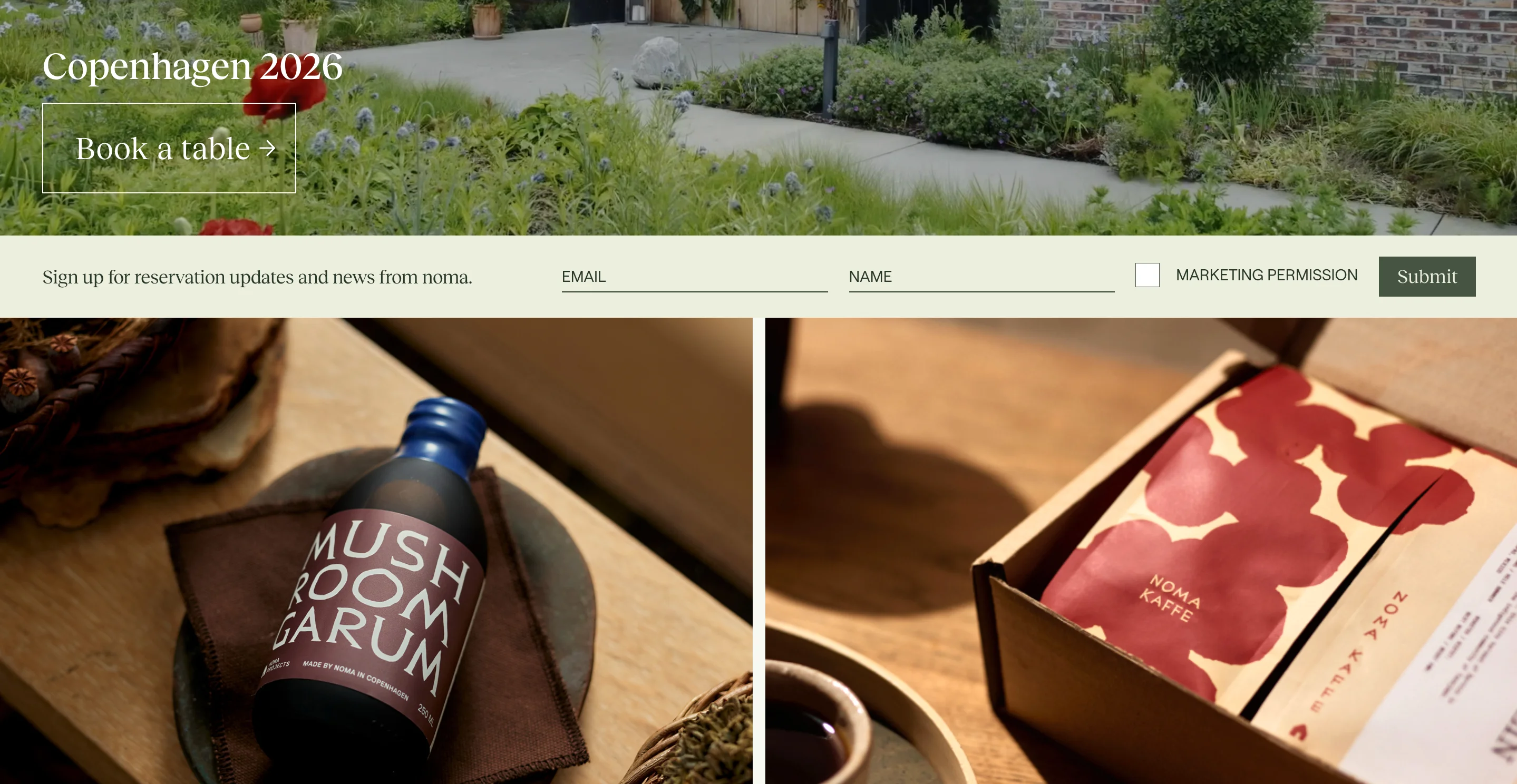
Noma's homepage leads with a single story, the restaurant's return to Copenhagen in 2026, and one booking action. It also sells pantry products, coffee, and a book without turning the page into a store.
Website: noma.dk
Design lessons to derive from:
- Keep one primary booking action in the header and the first screen, because "Reservations" in the navigation and "Book a table" in the hero both lead to the same Tock page, so visitors never hunt for it.
- Let a story carry the page only if guests already know you, because the homepage has no menu or prices and the hours sit in the footer.
- Place shop and newsletter paths below the story, so they support the brand without competing with booking.
Eleven Madison Park
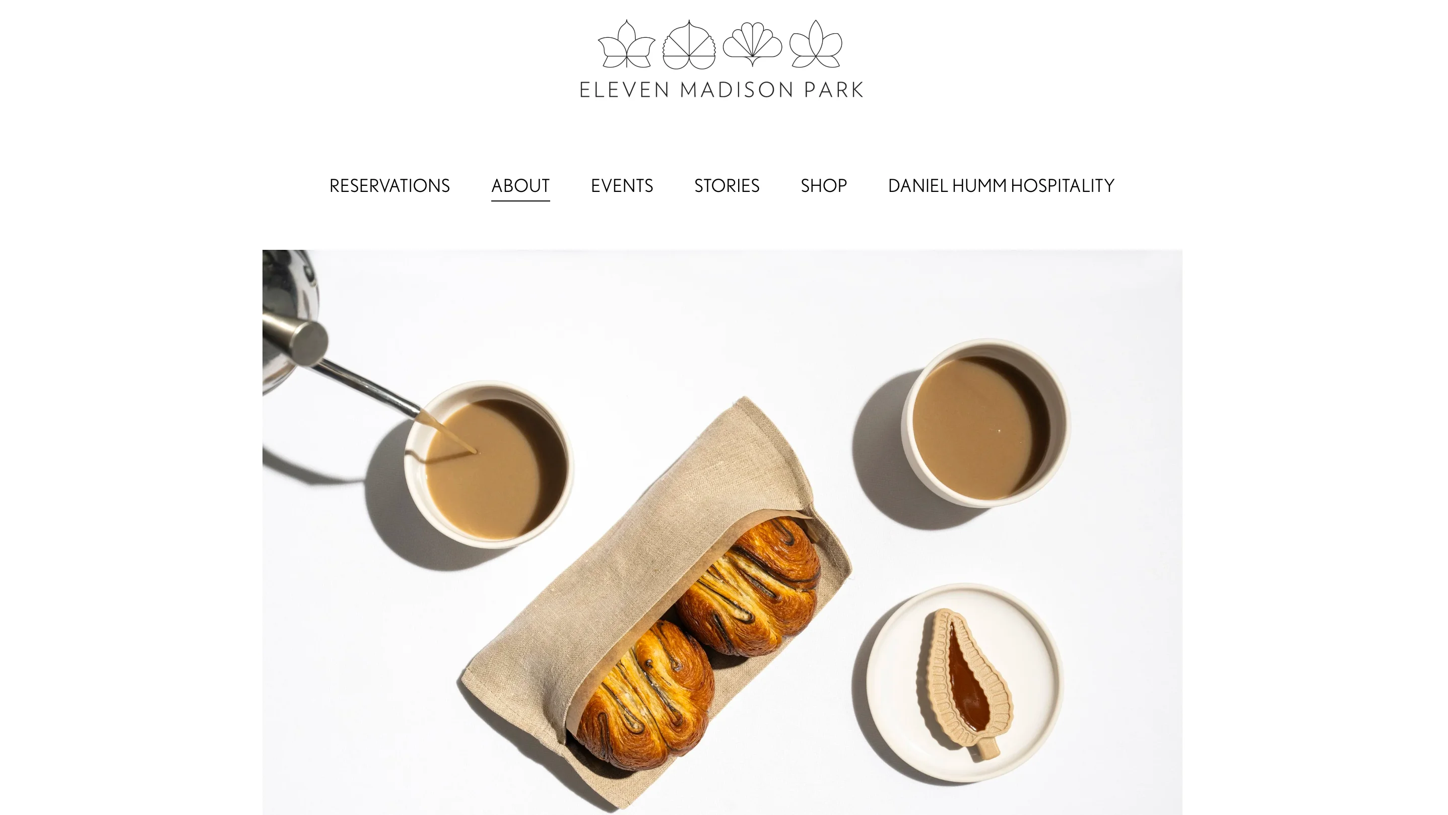
Eleven Madison Park runs on Squarespace and keeps its navigation minimal, with Reservations in the header and Resy as the booking route. It explains on the page that the food menu changes with the seasons, so it does not publish it online.
Website: elevenmadisonpark.com
Design lessons to derive from:
- If you cannot publish a menu, say why and tell guests what to expect, because an unexplained gap looks like missing information.
- Put dining room and bar hours on the page, since fine dining guests still need to plan their visit.
- Offer drinks lists as text and not as PDFs, because the cocktail and wine lists open as PDFs, which are harder to read on a phone.
Restaurant groups and hospitality brands
Groups have a different problem, because visitors first have to choose a place. These sites handle that choice in two different ways.
Dishoom
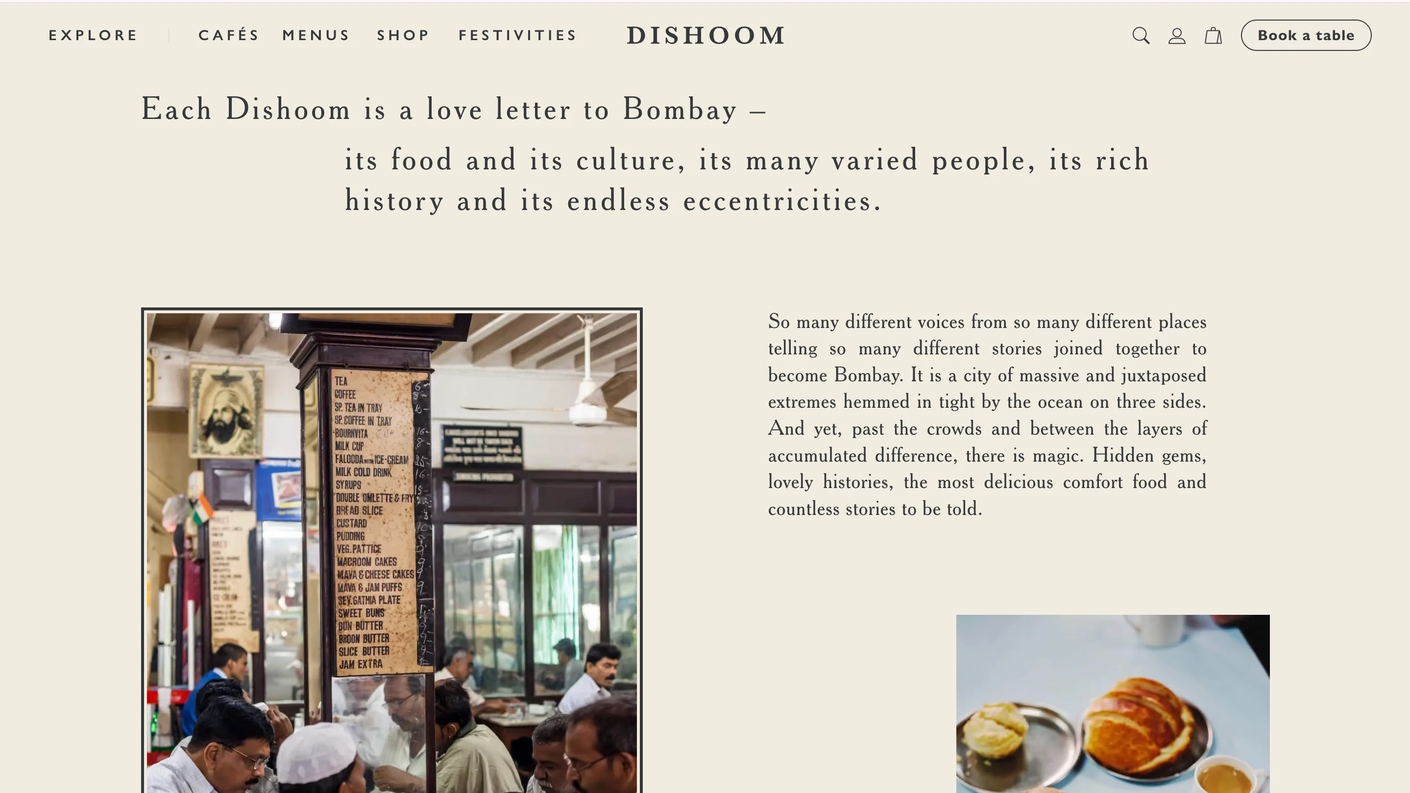
Dishoom's site handles 13 cafés and five Permit Rooms inside one structure. The page code shows a custom build with Next.js and Sanity as the content system.
Website: dishoom.com
Design lessons to derive from:
- Split menus by how guests eat (all day, breakfast, drinks, puddings, vegan, and kids), because people reach their menu in one tap.
- Keep "Book a table" visible in the header on every screen and repeat it in the hero, so the booking action never scrolls away.
- Keep dietary information on your own pages when you can, because allergens open in an outside app and that adds a step for guests who need it most.
Nobu
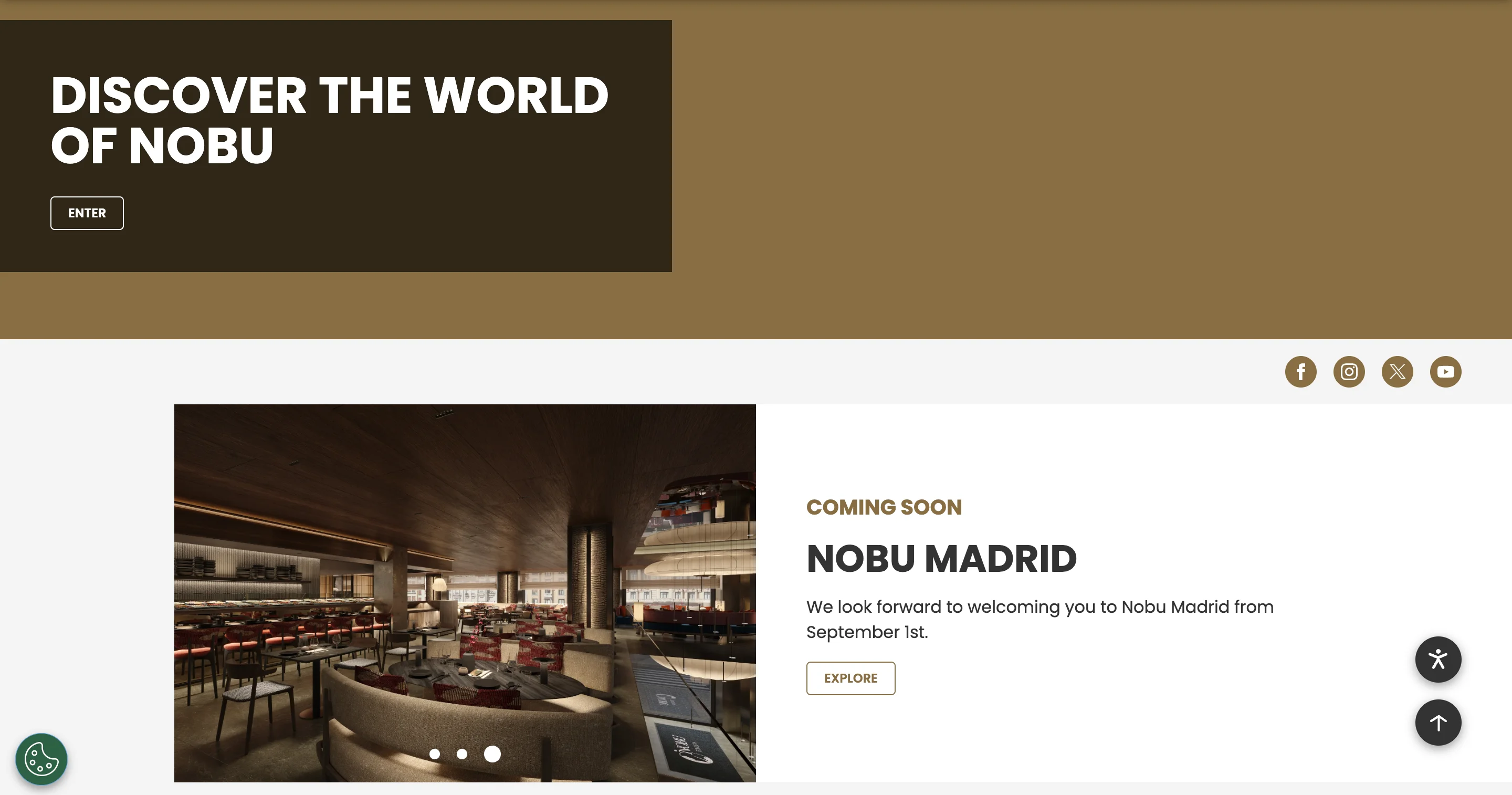
Nobu's global site groups its locations by region and marks restaurants inside Nobu Hotels with an H. It runs on Silverstripe CMS and gives each location its own page, plus a separate takeout list for US locations.
Website: noburestaurants.com
Design lessons to derive from:
- Use a region-grouped location picker with clear markers, because visitors to a group site start by choosing a place.
- Give each location its own page, booking route, and takeout option, so local details never get mixed.
- Keep banners current, because as of our check date the homepage still announced Nobu Madrid as "coming soon" with a September 1 opening date.
Menu-first and casual
Casual restaurants win by showing the product quickly. These two sites do it with a daily menu and with a clear set of routes.
Padella
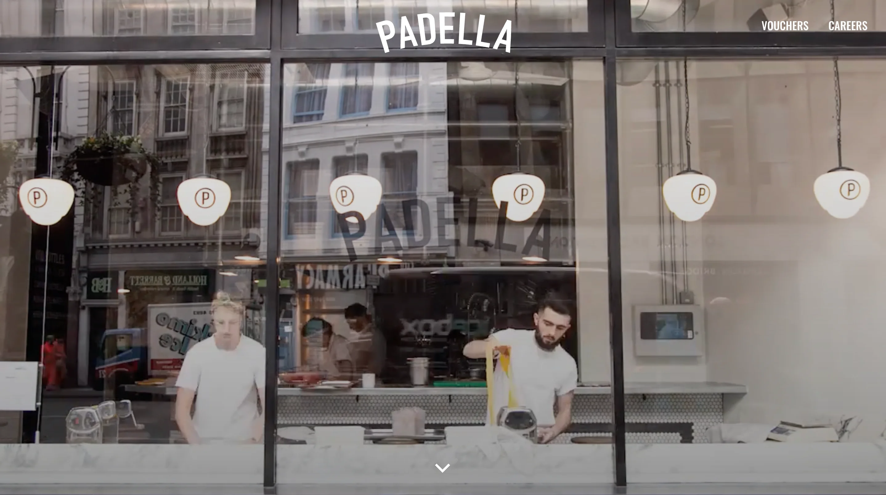
Padella's homepage is the day's menu, set as text with prices and a date, above links to its three locations. It also offers separate routes for small bookings and for groups of seven or more.
Website: padella.co
Design lessons to derive from:
- Show the real product first, because a dated menu with prices tells visitors what you serve and what it costs in one scroll.
- Date the menu so visitors know it is current, which builds trust.
- Separate small and large bookings, because groups need a set menu and a person to contact while smaller parties only need a button.
Pizzeria Beddia
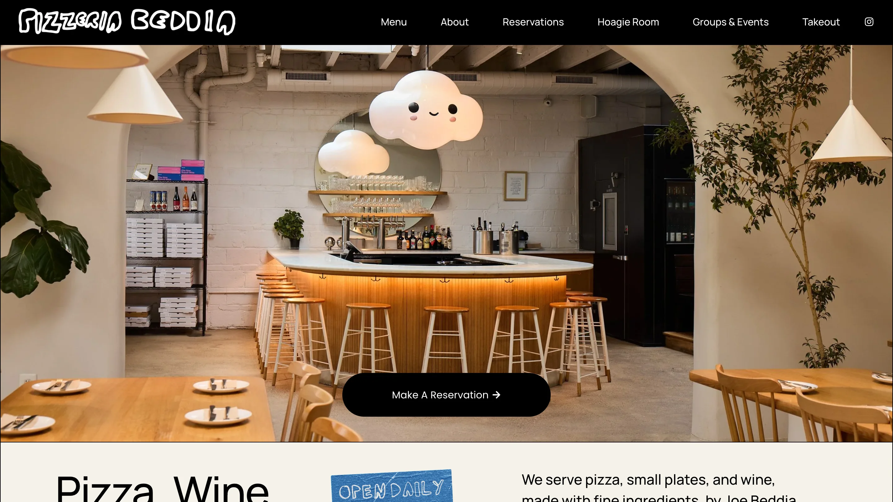
Pizzeria Beddia runs on Squarespace, greets visitors with "Pizza, Wine, and Everything Fine" and a Make A Reservation button, and then states that walk-ins are welcome. It is a useful entry if you are collecting modern pizza restaurant website design examples, because it keeps the page short and separates reservations, takeout, and groups.
Website: pizzeriabeddia.com
Design lessons to derive from:
- Say whether walk-ins are welcome, because it removes a barrier for people who do not plan ahead.
- Package special experiences with clear terms, such as the Hoagie Room (two hours for six people, with reservations opening 30 days ahead) and a Pizza Party for groups of 7 to 24.
- Separate routes by need in the navigation (Reservations, Takeout, and Groups & Events), so each visitor finds their path at once.
Bakeries and food brands
Some restaurants are really product brands. This example shows what that looks like and where it can go wrong. If you are collecting food website examples beyond restaurants, a bakery that sells one product shows how a brand can lead with the product itself.
Lune
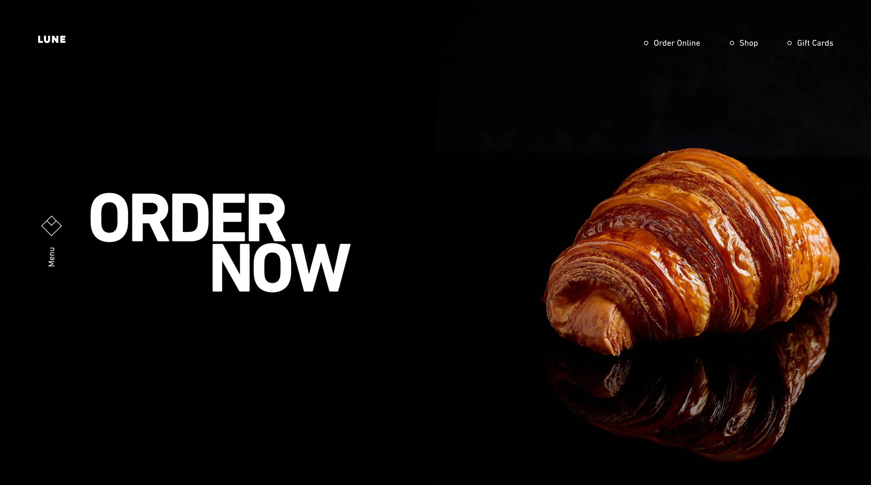
Lune presents a croissant bakery as a product brand, with a full-screen video, a short manifesto, and an Order Now button above a list of locations across Australia. The page runs on WordPress and the order button appears in both the header and the hero.
Website: lunecroissanterie.com
Design lessons to derive from:
- Treat the product as the hero and keep ordering visible in the header and the first screen, because visitors who want a croissant should never search for the button.
- Keep intro video short and skippable, because an intro video is like a doorman who makes you watch a short film before you can come in, and Lune at least adds a skip control.
- Do not block pinch zoom, because the page's viewport tag sets a maximum scale and turns off user scaling, which stops people with low vision from enlarging text.
Bars and nightlife
Bars sell atmosphere and events, so their sites need more than a menu and a booking button.
Death & Co
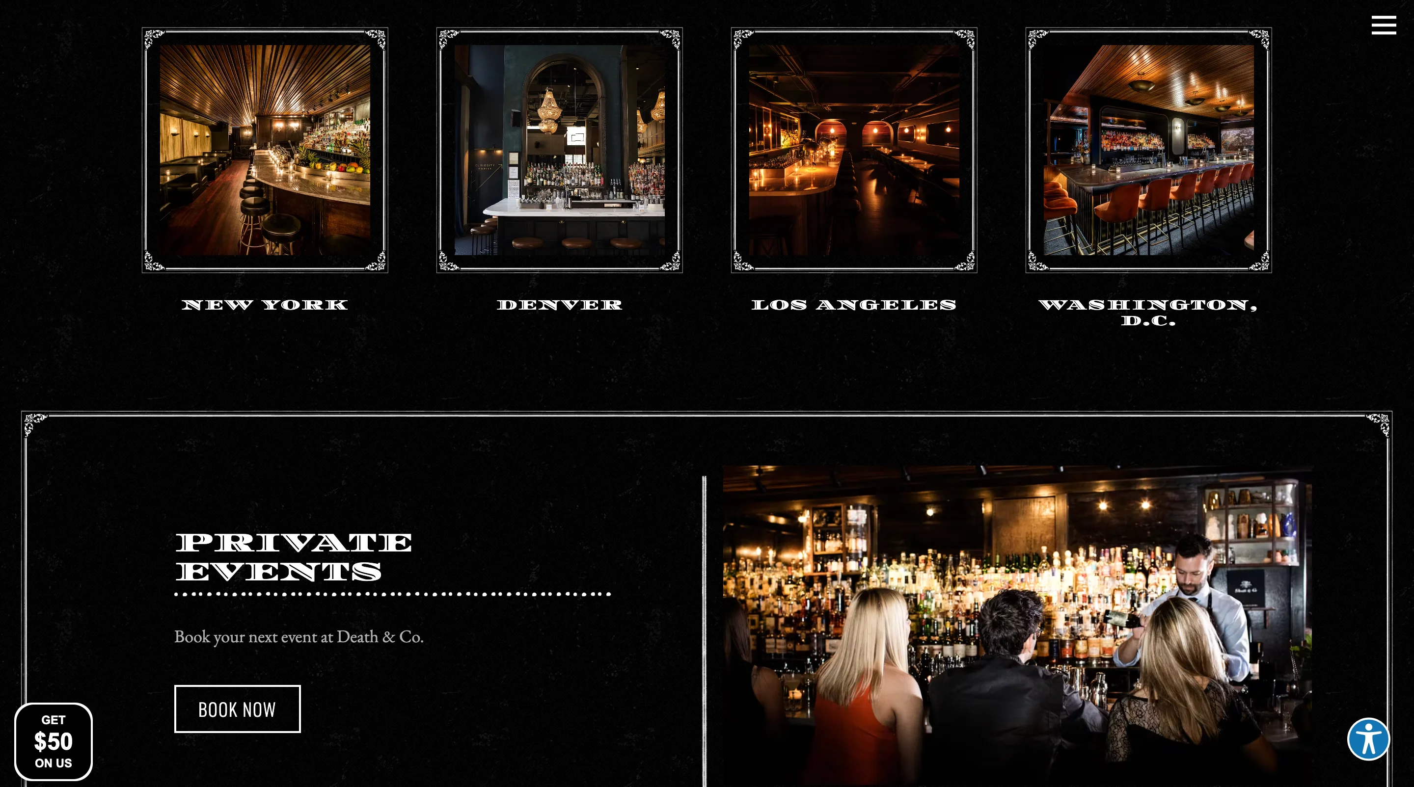
Death & Co's site runs on BentoBox and lists five locations, a private events page, a consulting page, and a shop. Reservations for every venue go through SevenRooms, and the homepage includes a booking form with location, party size, date, and time.
Website: deathandcompany.com
Design lessons to derive from:
- Put a multi-location booking form on the homepage, so visitors pick a place, party size, and date in one step.
- Treat private events as a conversion path with their own navigation item and a promo block, since events can bring in more revenue than one table.
- Add accessibility controls and keep metadata in sync, because the hero gallery has pause and play controls and a skip link, while the meta description lists four locations and the navigation lists five.
Culture and personality
The last example shows how voice and a clear structure can work together.
Girl & the Goat
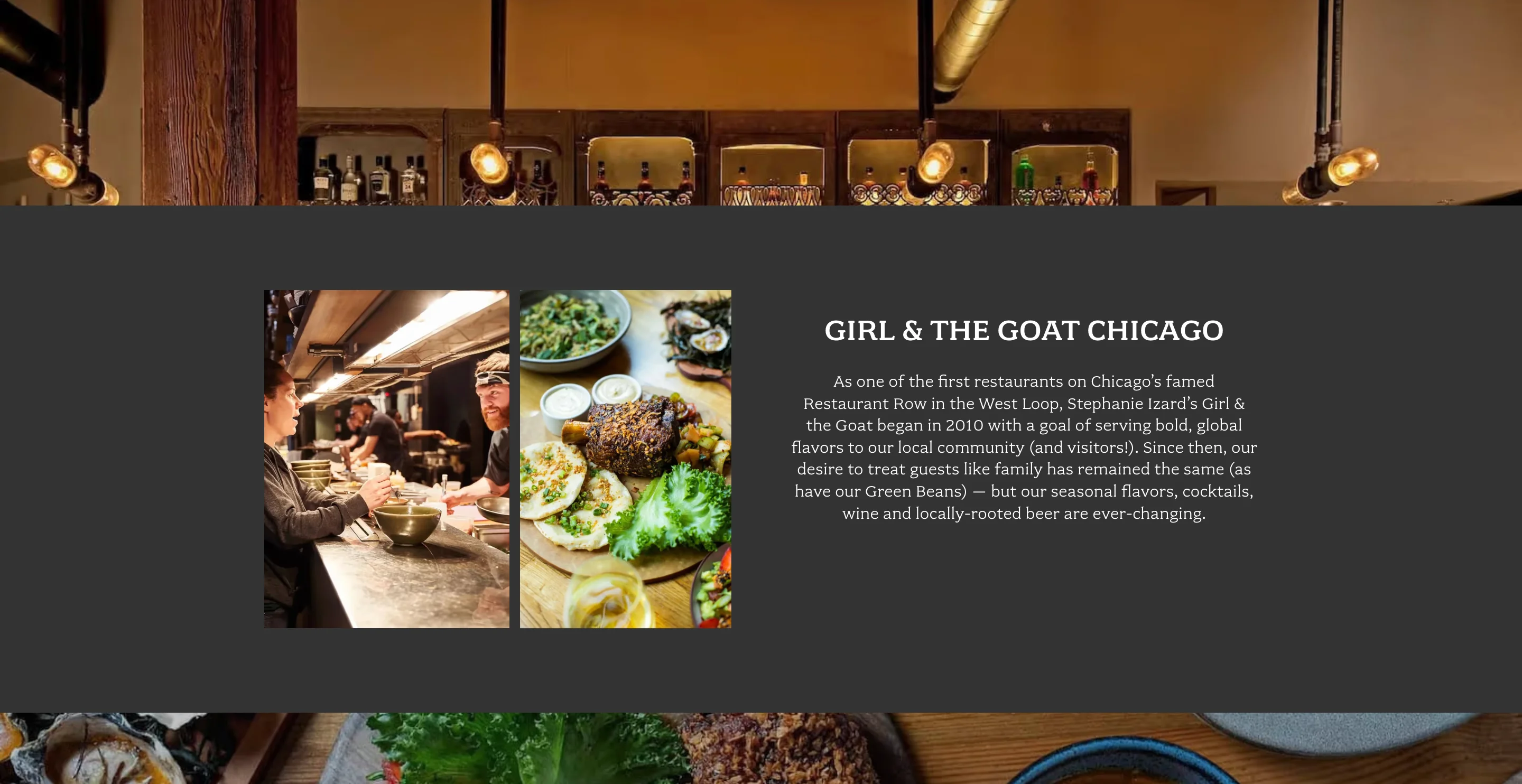
Girl & the Goat's Chicago site is built in Webflow and puts the address, hours, phone number, and directions on the homepage. A Reserve button follows each section, including the chef's counter experience, a featured dish, and Sunday brunch.
Website: girlandthegoat.com
Design lessons to derive from:
- Repeat the booking action after each feature, so interest turns into action at the moment it peaks.
- Split menus into dinner, Sunday brunch, and drinks pages, so guests reach the right menu quickly. We could not confirm whether the menu items are text or images from the page content, so check that on the live site.
- Write in the restaurant's own voice, as with "join the herd" and "gather your G.O.A.T crew," and link accessibility and site map pages in the footer.
Purpose of a restaurant website
A restaurant website has a short job, and it has to do it on a phone while someone is deciding where to eat. Every visitor arrives with the same five questions, so the page should answer them in this order.
Try the 10-second test on your own site. Open it on your phone, start a timer, and see whether you can find the menu, the price level, today's hours, directions, and the booking button before it runs out. If you can't, fixing that should come before any design trend.
10 restaurant website design practices
These practices show up across the nine sites, and several of them show up as mistakes on the same sites. Use them as a checklist for your own restaurant web design.
1. Make booking impossible to miss
Put the booking button in the header, the first screen, after the menu, and at the bottom of the page. Noma, Dishoom, and Pizzeria Beddia all keep the action visible so visitors never scroll to find it. If guests have to hunt for the button, some of them will book somewhere else.
2. Put the menu on the page
An on-page menu loads faster on a phone, is easier to update, and can be shared as a link. Reading a PDF menu on a phone is like reading a phone book through a keyhole. Padella shows how far you can take this, because the homepage is the menu.
3. Design for the 10-second visit
Think of a hungry visitor on a phone. They want to know whether you are open, what you serve, what it costs, where you are, and how to book, in about that many seconds. Test your site against that path before you touch colors or fonts.
4. Show the price level early
If you serve a tasting menu, say so and show the price, because hiding it can create the wrong expectations. If you are a casual restaurant, prices help visitors decide quickly. Padella lists every price on the homepage, while most fine dining sites in our set show none.
5. Mix food, space, people, and process in your photos
A page of dish photos tells visitors little about the experience. Add the room, the team, and the kitchen, so guests can picture themselves there. Girl & the Goat mixes a chef at the counter, shareable dishes, and brunch pours.
6. Say who you are in the first screen
Name the restaurant, the cuisine, the place, and one distinctive line, then add a booking button. Let's face it, nobody searching at 7:15 p.m. wants a culinary journey, they want a table. Pizzeria Beddia does this in one line and one button, and that's where a clear hero earns its space.
7. Make the location actionable
Show the address as a tap-for-directions link and the phone number as a tap-to-call link. For groups, add a location picker, as Dishoom and Nobu do. Girl & the Goat puts address, hours, phone, and directions in one block on the homepage.
8. Use motion and video with restraint
A short, skippable video can set a mood, but a long intro delays the information visitors came for. Lune includes a skip control, and Death & Co lets visitors pause its hero gallery. If a visitor has to wait for the site to finish performing, you have made them watch the show before they can order dinner.
9. Keep text legible and let people zoom
Use readable type sizes, strong contrast, and text-based menus. Never block pinch zoom, which Lune's viewport tag does, because people with low vision rely on it. Link an accessibility statement, as Eleven Madison Park, Girl & the Goat, and Nobu do.
10. Keep pages fast
Large hero images and videos are the most common reason restaurant pages feel slow. Compress images, set their dimensions, and test on a real phone. The speed section below gives Google's thresholds.
Which sites adopt which practice
The table below shows which of the nine sites do each practice, based on page content on October 5, 2026.

Do you need a one-page restaurant website?
A one pager restaurant site can work when you have one venue, one menu, and one booking route, because every answer fits on a single scroll. It stops working when you add several locations, separate brunch and dinner menus, or events, because visitors then need clear pages to land on. Padella's homepage shows a middle path, with the menu on one page and links to each location.
Show proof without clutter
Awards, press, and reviews help new visitors trust you, but they should sit below the booking action. Dishoom groups its awards in one section lower on the homepage, and Nobu does the same with an "In the media" block of press features. Keep this section short, because a long wall of logos pushes the menu and the booking button down the page.

Capture guests you have already won
Six of the nine sites include an email signup, and every one places it below the main content so it never competes with booking. If you add one, ask for as little as you need, and tell guests what they will receive.
HTML menus vs PDF menus
If you are planning a restaurant menu design website, start by deciding how guests will read the menu on a phone, because many of them will. The menu is the most visited page on most restaurant sites, so how you build it affects everything else. An on-page menu usually wins, with a few narrow exceptions.
In an older SinglePlatform survey reported by Fast Casual, 62% of consumers said they were less likely to choose a restaurant if they couldn't read its menu on a mobile device. Eleven Madison Park shows one fair exception, because a menu that changes with the seasons may not belong online. In that case, explain why, as the restaurant does, and keep the drinks lists as readable text.
How to structure a restaurant menu in Webflow
If you build in Webflow, treat the menu as content, not as a design. Create collections so staff can change a dish once and see it update wherever it appears, and magier's Webflow development service builds this kind of structure, including a staging step before changes go live. Check the exact field types against Webflow's documentation before you build, since features change.
"Webflow works well for restaurants because the people running the service can edit the content while the design stays locked. The site looks the same in month twelve as it did at launch."

How to structure a multi-location site
Give each location its own page, and keep the shared elements in one place, so changes happen once. A Locations collection can hold each address, hours, phone number, map link, and booking link, and each location page can show only its own menu. This is the structure Nobu and Dishoom use at a much larger scale, with a region-grouped picker and one page per venue.
Keep guests on your site when booking and ordering
Booking is where most restaurant sites lose visitors. The route you choose decides how many steps a guest takes before a table is theirs.
Place the booking action in four spots, the header, the first screen, after the menu, and at the bottom of the page. On a phone, keep it visible while the visitor scrolls. If you offer online ordering as well, give it its own button so guests do not have to choose between two actions inside one.
Which design direction to follow by restaurant type
Do not copy another restaurant's look. Instead, pick the direction that matches your type, and copy the structure that fits it.
Speed, accessibility, and local SEO basics
Design wins visitors only if the page loads and works. These three basics take little time to check, and most restaurant sites fail at least one.
Speed
Google's Core Web Vitals give you clear targets. A good score means Largest Contentful Paint of 2.5 seconds or less, Interaction to Next Paint of 200 milliseconds or less, and Cumulative Layout Shift of 0.1 or less, measured for real visitors. We did not measure the sites above, so test your own with Google's Web Vitals guidance and PageSpeed Insights.
Large hero images and background videos usually cause slow loading. Chat widgets, analytics tags, and social embeds also often hurt Core Web Vitals. Set width and height on images so the layout does not jump while they load.
Accessibility
The Web Content Accessibility Guidelines (WCAG) ask for a contrast ratio of at least 4.5:1 between text and its background, or 3:1 for large text. They also ask that text can be resized up to 200 percent without losing content or function. Text over a hero photograph is a common place for contrast to fail, and a viewport tag that blocks pinch zoom, as Lune's does, can conflict with the resizing rule. List allergen information on your own pages when you can, so guests who need it do not leave your site to find it.
Local SEO and structured data
Structured data helps Google read your hours, cuisine, and menu link. Google's documentation shows the Restaurant type with fields for cuisine and a menu URL, plus ways to mark up business hours. The same documentation notes that the Restaurant carousel is limited to a small set of providers, so markup helps accuracy and does not guarantee a special result. Check your markup with Google's structured data guide and its testing tools, and keep the hours and address on your site the same as on your Google Business Profile, so visitors never see two different answers.
How to build a restaurant website: builder, template, or custom
You have three routes, and the right one depends on who edits the site and how much design control you need. The nine sites we checked use a mix of platforms, so no single choice is standard.
Platform options
These strengths and trade-offs reflect our view, and platform features change, so check current details before you choose. Wix and Framer also offer restaurant templates, and both rank for this topic with their own examples.
Should you use a restaurant website template?
You might be thinking a template is enough, and for a single restaurant with one menu it often is. A good restaurant website template gives you a text menu, a booking link, and a mobile layout, so test those three things on the template's demo before you buy. Avoid any restaurant website design template that shows the menu as an image or a PDF, because it repeats the problems described above. Whichever restaurant website builder you choose, check how easily your staff can edit the menu, since a site nobody updates falls out of date quickly.
What it costs
Prices vary a lot, and every figure below is a vendor estimate. One estimator puts a menu-and-contact site at $1,500 to $4,000, a site with reservations at $4,000 to $8,000, and one with online ordering or several locations at $8,000 to $25,000 or more. Another guide says template-based sites run $1,500 to $5,000 and fully custom builds $12,000 to $25,000. Costs depend more on integrations than on visual design, so ask any designer which booking and ordering tools your quote includes.
Building the menu in Webflow
The CMS structure above is what lets staff change a dish once and see it update everywhere. That's where Webflow's CMS comes in, and we have seen how well a clear structure works on content-heavy sites. For plancraft, magier developed 30+ individual pages and migrated 200+ URLs, and the combined design and Webflow work led to a 20% conversion increase. That was not a restaurant project, but the principle carries over, because a clear structure makes a large site easier to update and easier to trust. See how magier approaches Webflow and web design if you want help with the design and the build together.
Measure whether your restaurant website works
Traffic alone does not tell you whether the site is working. Track the actions that lead to a table.
Review these numbers monthly. A rise in menu views with flat booking clicks usually means the booking button is hard to find.
Restaurant website design trends for 2026
A trend only helps if it fits your restaurant. These four show up in the sites we checked.
- The menu as the homepage: Padella shows that putting the dated menu and prices on the first screen answers the visitor's biggest questions at once.
- Restaurants as brands with shops: Dishoom, Noma, and Death & Co all extend the brand into stores for products, gifts, or bar tools. Keep ordering and booking ahead of the shop in the hierarchy.
- Content hubs: Dishoom runs a journal with recipes and events, and Noma publishes a long letter on its homepage. Use content only if you have someone to keep it fresh.
- Restraint with video and motion: Google's AI Overview for this topic lists interactive menus and playful micro-animations as trends, but Lune's intro video and Death & Co's pause controls show that control is as important as effect.
Restaurant website pre-launch checklist
Run this list before launch and again every quarter. It covers the checks that most often go wrong, and each row has a pass condition you can test in a minute.
Final thoughts
A restaurant website works when it answers five questions quickly, puts booking within reach, and keeps the menu readable on a phone. The nine examples above show that you can do that in very different styles, from Noma's restraint to Girl & the Goat's voice.
We know a good site takes work to build and to keep current, especially when your team is busy running a restaurant. You might be thinking a full rebuild is out of reach, but the three fixes below are small edits you can make on almost any platform. A well-built site makes the updates easier, because staff change a dish once and it updates everywhere, and magier's website design service can help with the design and the build. Pick the three fixes that would help your site the most, such as the booking button, the menu format, and pinch zoom, and make them this week.
{{cta}}
FAQ
A small site can work with a home page, menu, about, and contact page. A group needs a page per location, and some restaurants succeed with a single page.
It answers what you serve, what it costs, when you are open, where you are, and how to book within a few seconds. It also looks and sounds like the restaurant feels.
Mobile use, a text menu, booking friction, and accessibility have the biggest effect on whether visitors book. Test those four before anything else.
Google's good thresholds are Largest Contentful Paint of 2.5 seconds or less, Interaction to Next Paint of 200 milliseconds or less, and Cumulative Layout Shift of 0.1 or less. Measure them on real visits.
It helps Google read your hours, menu link, and cuisine, but it does not guarantee a rich result. Check your markup with Google's testing tools.
Vendor estimates run from about $1,500 for a menu-and-contact site to $8,000 or more with ordering or several locations. Costs depend on integrations as much as on design.
Put it on the page. HTML menus work better on phones and are easier to update, and a PDF should be a secondary option for print.
It depends on who edits the site and how much design control you need. Compare editing, booking tools, speed, and cost in the platform table above.
Link to or embed a booking system such as Resy, OpenTable, Tock, or SevenRooms, and place the button in the header and after the menu. Test it on a phone.
Give each action its own clear button and keep both in the header. Label them by task, such as Reserve and Order online, so guests do not have to guess.
A menu, prices, hours, an address with directions, a booking or ordering action, and photos that show food, space, and people. Add a location picker if you run several venues.
Start with the five visitor questions, put booking in the header, build the menu as page content, and design for phones first. Then test the 10-second path on a real phone.
.avif)

.webp)
%20(1).avif)