What Is Corporate Identity Design? The Complete Guide With Examples
You have probably scrolled through your own company's channels and noticed the logo looks slightly different on your website than it does on your LinkedIn company page. Or, your pitch deck uses one font and your emails use another. On top of that, your team can never agree on which blue is the actual brand blue.
If you could relate to at least one of the situations stated above, you are not alone.
That difference between how your company should look and sound, and how it actually appears across every channel, is exactly what corporate identity design exists to bridge. Corporate identity design is the process of defining and applying a consistent visual and verbal system across your website, product, marketing, and every other place your company shows up.
Research from Sprout Social found that 76% of consumers say they would buy from a brand they feel connected to over a competitor, and Marq's State of Brand Consistency report found that companies presenting their brand consistently see revenue growth of 10 to 20%. Done well, corporate identity design helps you achieve these numbers while making your brand instantly recognizable and trustworthy.
But how would you know how to do it well? That’s what pushed us to write this step-by-step guide on corporate identity design with examples.
Here is what this blog covers:
- What is corporate identity design, and how it differs from corporate design and branding
- Four pillars for a complete corporate identity
- Core visual elements for corporate identity design
- Real examples from both classic brands and modern software companies
- A step-by-step process for building a corporate identity design system
- What corporate identity design costs
- Common mistakes that dilute a brand's consistency
- The tools to help with building the system
{{freebie}}
What is corporate identity design?
Corporate identity design is the practice of defining how your company presents itself, both visually and verbally, and then applying that system consistently everywhere your business shows up. It goes beyond a logo and entails aspects like color palette, typography, imagery, tone of voice, and the behavior your team shows toward customers and each other.
Think of it as the difference between a company that looks assembled overnight and one that feels like a single, deliberate entity. When every interaction: your website, your emails, your sales deck, reflects the same values and the same visual system, customers pick up on that consistency even if they never consciously notice it. That perception of stability and intention is a large part of why corporate identity design has become a standard practice for growing companies, not just large enterprises.
Corporate identity vs corporate design vs branding: what is the difference
These three terms get used interchangeably online, and that mix-up is exactly why "corporate identity and corporate design" shows up as one of the most common related searches on this topic. Once you separate what each term actually covers, choosing what to prioritize gets a lot easier.
In practice, corporate design sits inside corporate identity, and corporate identity sits inside your broader branding effort. You cannot build a strong corporate design without first answering the corporate identity questions, since design without a clear identity behind it tends to look nice without saying anything specific about who you actually are.
Importance of corporate identity design
A consistent corporate identity does more than look tidy. It changes how quickly a prospect trusts you, how short your sales cycle actually is, and how much mental effort a buyer has to spend piecing together who you are before they say yes.
It builds trust faster
Every touchpoint your company has, your website, your product, your sales emails, your social presence, quietly shapes what a prospect thinks about working with you. A consistent identity makes each of those touchpoints reinforce the same impression instead of contradicting it, so trust builds faster than it would if every channel looked and sounded like a different company.
It shortens the sales cycle
This effect shows up most clearly in B2B, where a prospect typically experiences a long string of touchpoints before they ever sign a contract. When every one of those touchpoints already agrees with the last, a buyer has less to verify and less to second-guess, which tends to shorten the time between a first conversation and a signed deal.
It removes friction for the buyer
A pitch deck that looks nothing like the website, or a proposal that uses a different tone than the sales emails that led up to it, forces a prospect to do the mental work of piecing together who you actually are. A consistent identity removes that friction, and it lets your product and your team do the convincing, instead of leaving inconsistent design to work against you.

{{cta}}
What are the four pillars of corporate identity design?
A strong corporate identity rests on four pillars, and design is only one of them.
- Corporate culture: the values, beliefs, and internal norms that shape how your team makes decisions and treats each other. This is the foundation every other pillar builds on, since a mismatch between your stated values and your actual internal culture is usually the first thing that makes an identity feel hollow.
- Corporate behavior: how your company acts, both internally and externally. This includes how your team talks to customers, how you handle complaints, and even something as small as whether employees use a formal or informal tone with each other.
- Corporate communication: the tone, language, and storytelling your company uses across every channel, from your website copy to your support emails. Consistent communication keeps your message from fragmenting as more people on your team start writing on the company's behalf.
- Corporate design: the visual system that expresses everything above, including your logo, colors, typography, and imagery. This is the pillar most people mean when they say "corporate identity," but it only works when the other three pillars are actually true to how the company operates.
What are the core elements of corporate identity design?
With your four pillars defined, you can move on to corporate design, which is where the visual system actually gets built. These are the individual elements a designer works through, and skipping any one of them tends to leave rooms that require filling out later
- Logo: the single visual mark people associate with your company first. It should work at any size, from a favicon to a trade show banner, and it should still make sense in black and white before you ever add color. Mastercard tested this idea directly in 2019, when it removed its name from its logo entirely and kept only the red and yellow interlocking circles, after research from Pentagram found that more than 80% of people already recognized the symbol without the word "Mastercard" next to it.
- Typography: the fonts you use across headlines, body text, and your logo itself. A typeface can become a brand asset on its own. Helvetica, designed in 1957 by Max Miedinger and Edouard Hoffman, became a visual shorthand for reliability simply through decades of consistent use by companies like Jeep and Panasonic, and IBM later built its own custom typeface, IBM Plex, to feel professional while staying approachable.
- Color palette: a main brand color plus two or three supporting colors, each documented with its exact codes so every designer and tool on your team uses the same shade every time.
- Visual language and imagery: the mood, lighting, and style of every photo or illustration you use, since imagery communicates emotion faster than text does.
- Iconography: a consistent icon style derived from your broader design system, so icons feel like they belong to your brand instead of looking like they were pulled from a generic icon pack.
- Design grid: the underlying layout structure that keeps spacing, alignment, and hierarchy consistent across every page and document.
- Style guide: the document that records every rule above, so anyone on your team or any outside partner can apply your identity correctly without guessing.
Real corporate identity examples
Reading about pillars and elements only goes so far. Seeing how real companies apply them side by side makes the whole system click.
Patagonia: values that live outside the style guide
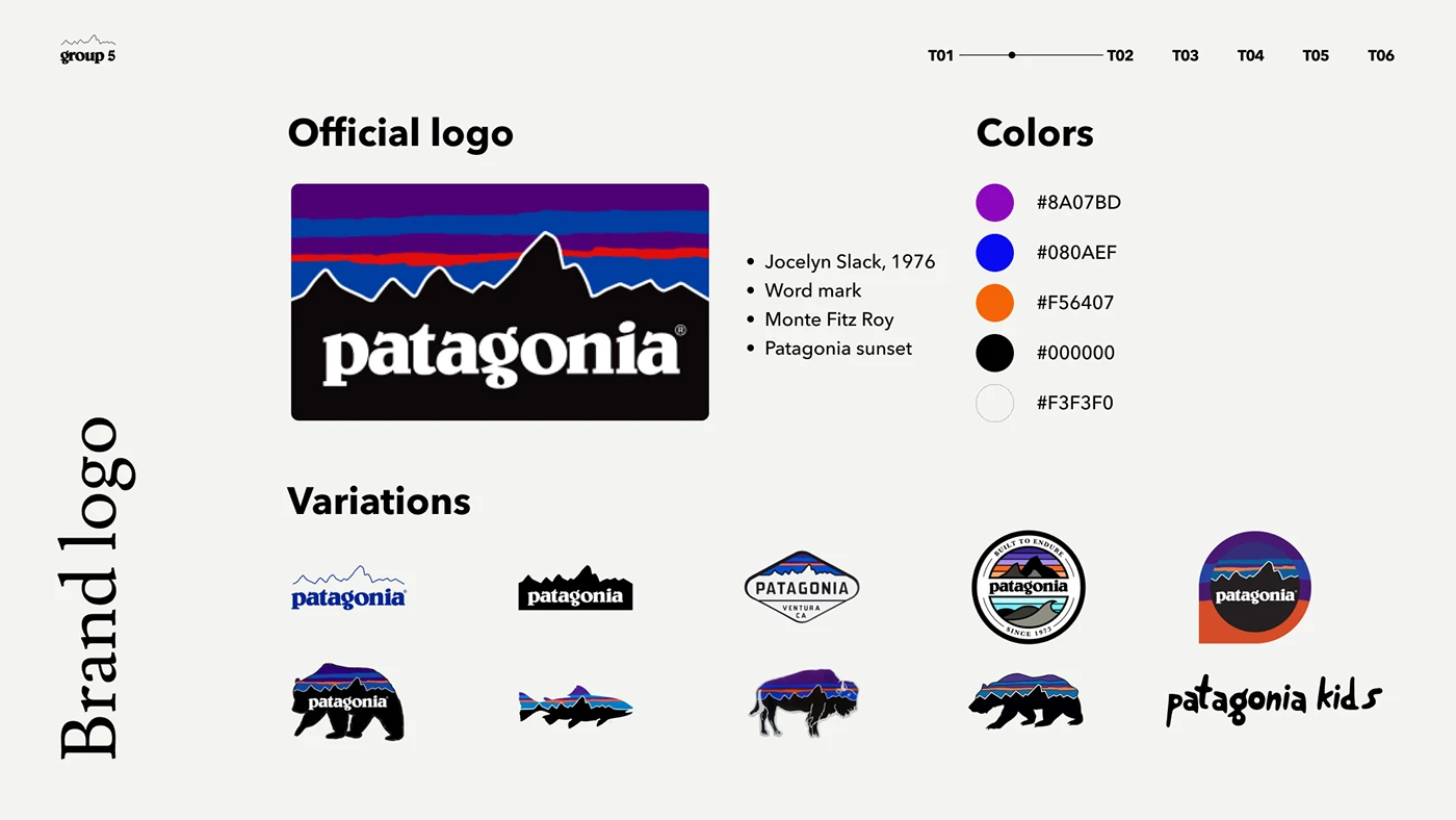
Patagonia's environmental values shape more than its visuals, showing up directly in business decisions, campaigns, and policies rather than staying confined to a style guide somewhere. That consistency between what the company says and what it actually does is what makes the identity feel earned rather than decorative. Customers who care about sustainability trust the brand precisely because the values show up in places a logo alone never could.
Stripe: restraint as the whole message
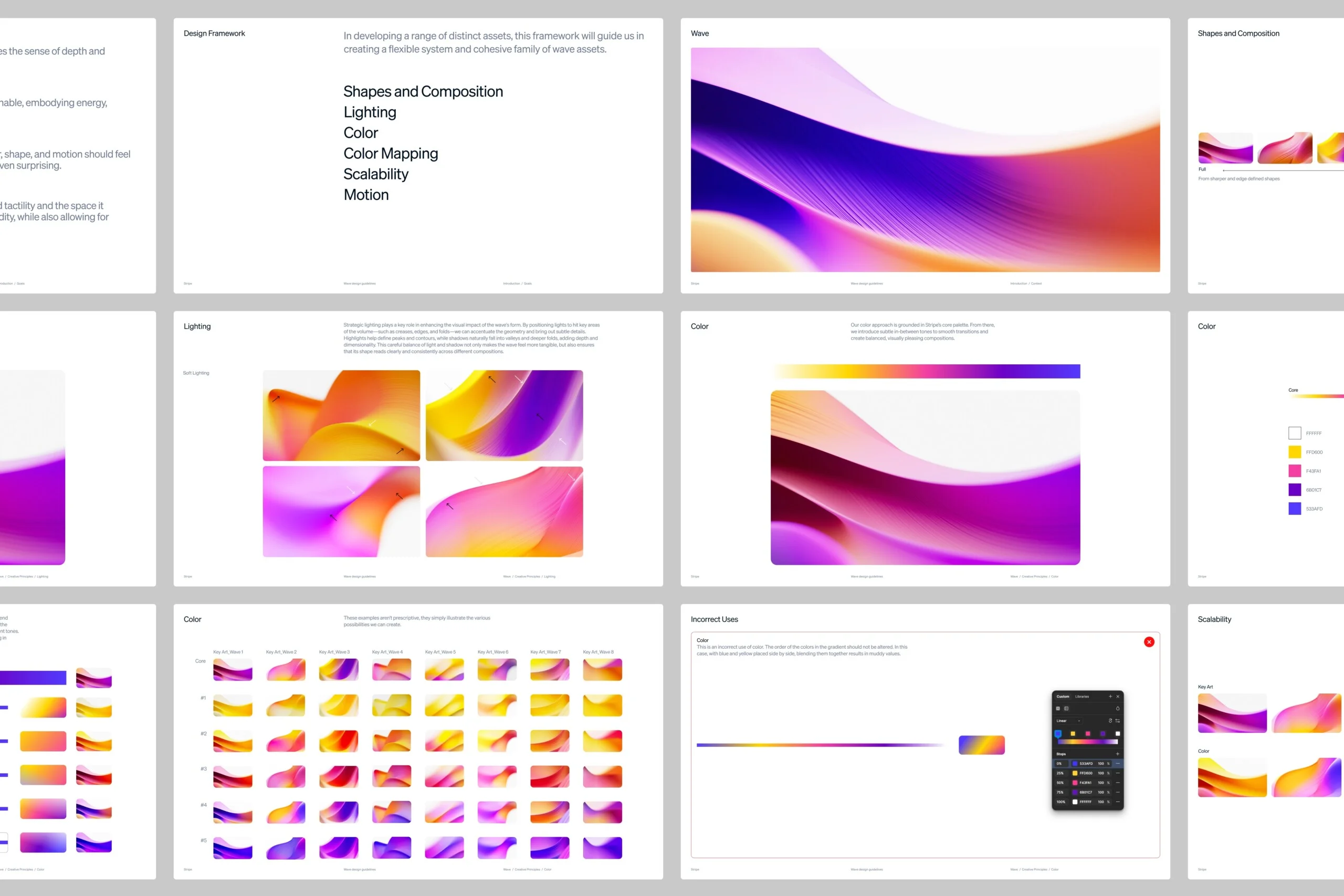
Editorial typography, generous white space, and a calm, technical writing style make Stripe feel trustworthy to the developers and finance teams it actually serves. Nothing about the identity oversells or adds unnecessary flourish, which matches the audience's own expectations of a company handling their payment infrastructure. The restraint itself becomes part of the message, signaling competence rather than needing to state it outright.
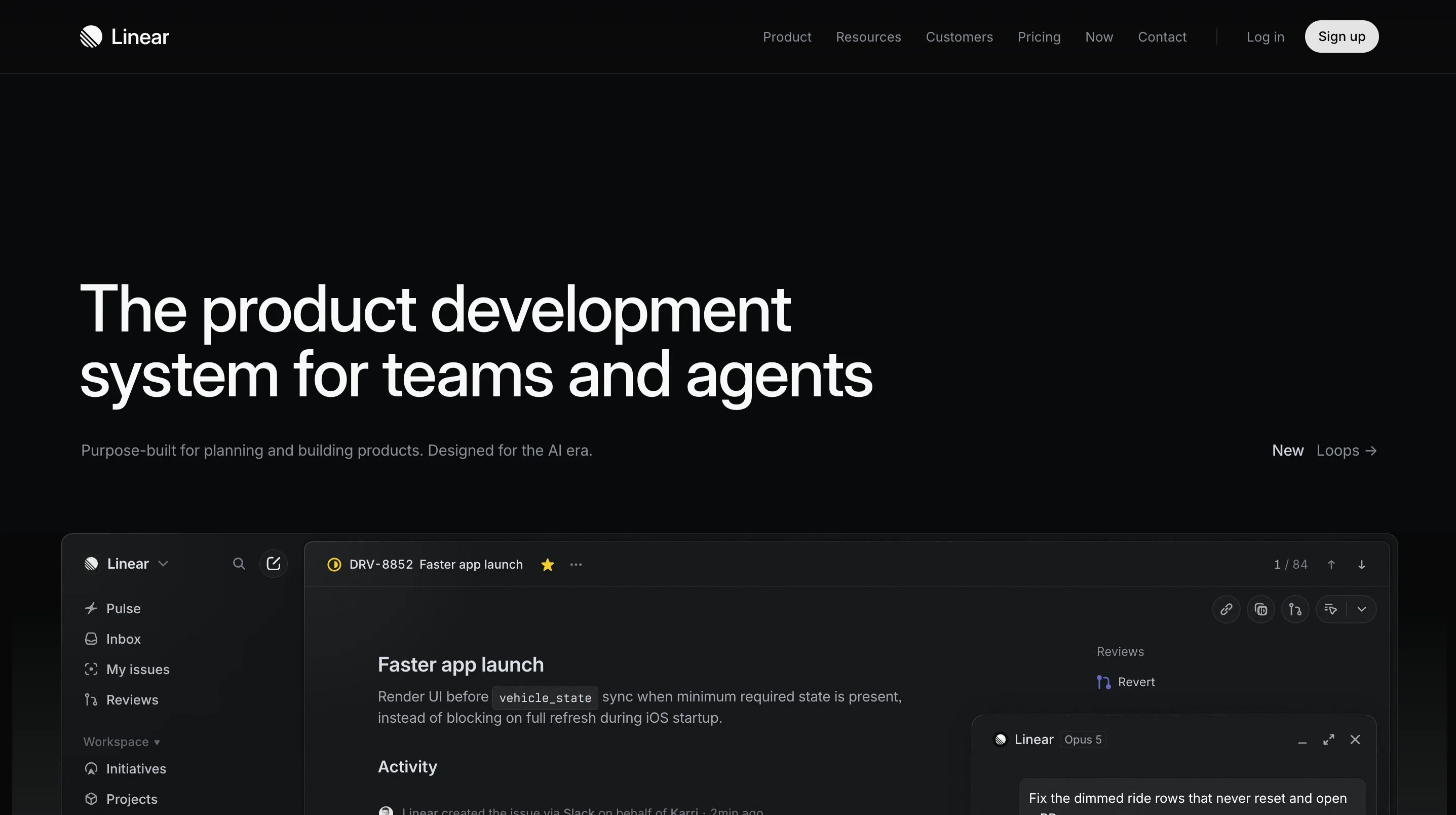
Linear: an identity built for one specific audience
A dark, product-first visual language paired with precise, minimal copy speaks directly to Linear's audience of software teams. The identity avoids soft, approachable cues entirely, choosing sharpness and speed instead, which mirrors how the product itself is built and marketed. For a tool aimed at engineers who value efficiency, that alignment between how the brand looks and what it actually offers counts for more than broad appeal ever could.
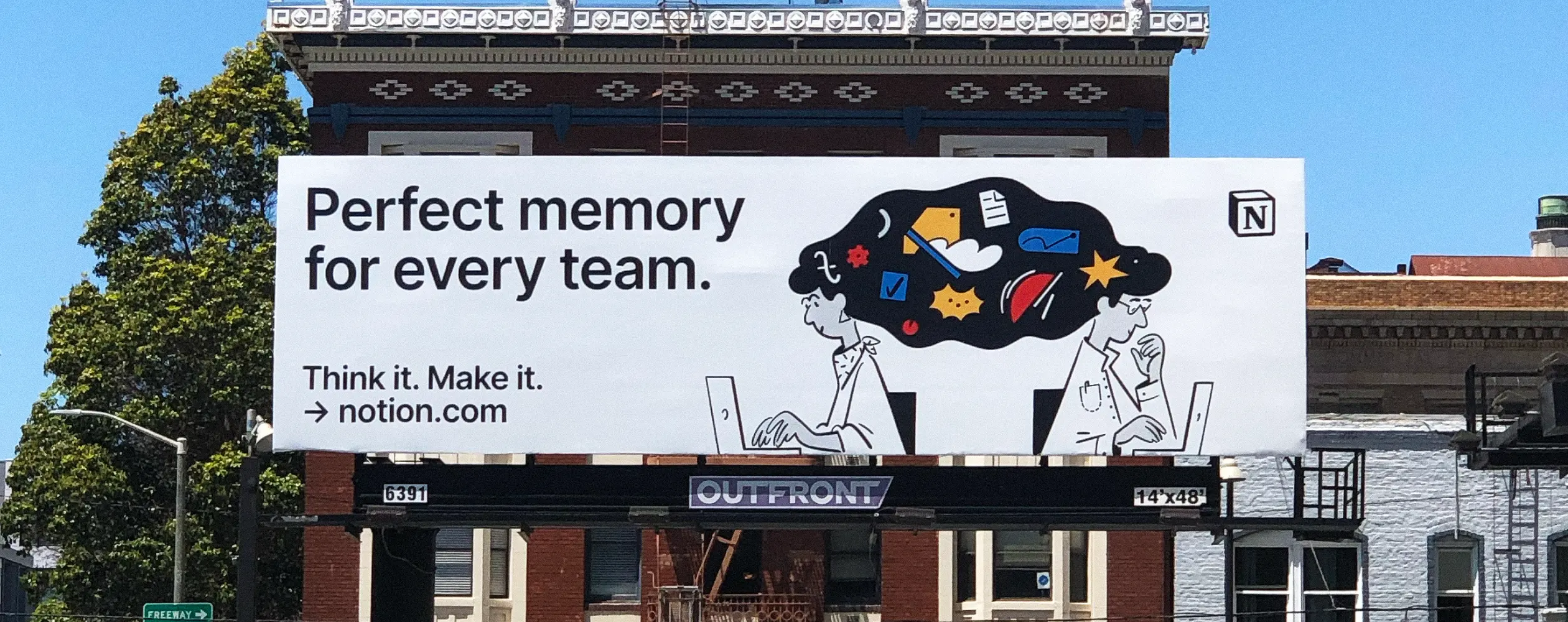
Notion: standing apart from corporate blue by choice
A monochrome palette paired with soft illustrations gives Notion a flexible, user-first feel that reads differently from the sea of corporate blue many B2B tools default to. The illustration style does a lot of the work here, making a fairly abstract productivity tool feel approachable rather than intimidating to a new user. Choosing to look nothing like typical enterprise software is itself a form of positioning, without a single word of copy involved.

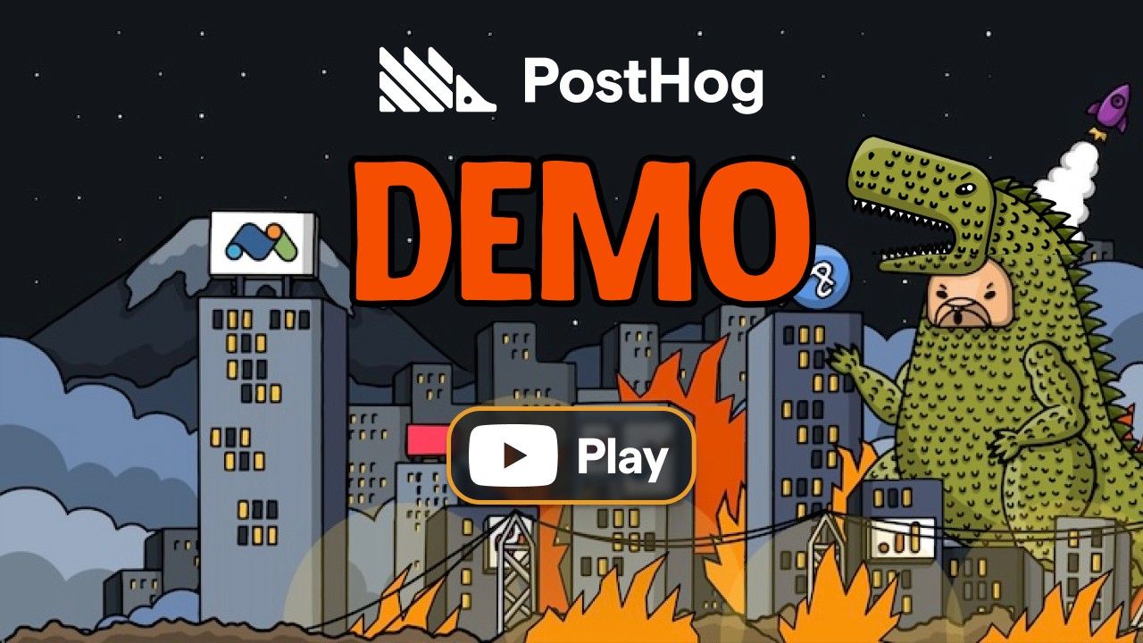
PostHog: openness as a design choice
PostHog, a product analytics platform built for engineers, uses a hand-drawn hedgehog mascot and openly informal writing across its product, documentation, and marketing site. The company publishes its entire roadmap, internal handbook, and even salary structure in public, and the identity reflects that same directness rather than hiding behind polished corporate language. For a category full of dashboards that all look and sound alike, PostHog's willingness to look unfinished and sound like an actual person talking is exactly what makes it memorable.
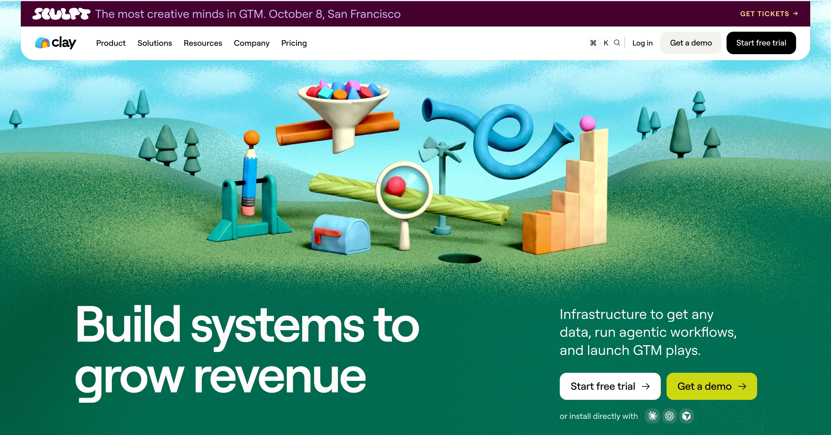
Clay: taking its own name literally
Clay, a go-to-market and data enrichment platform, builds its identity around its own name, using a warm, claymation-inspired illustration style instead of the flat, blue-toned interfaces most B2B software defaults to. The visual language carries consistently across the product, the website, and its social presence, so the brand feels handcrafted rather than templated. It's a clean example of a company taking its own name literally and turning that into a real visual system, rather than treating naming and design as two separate decisions.
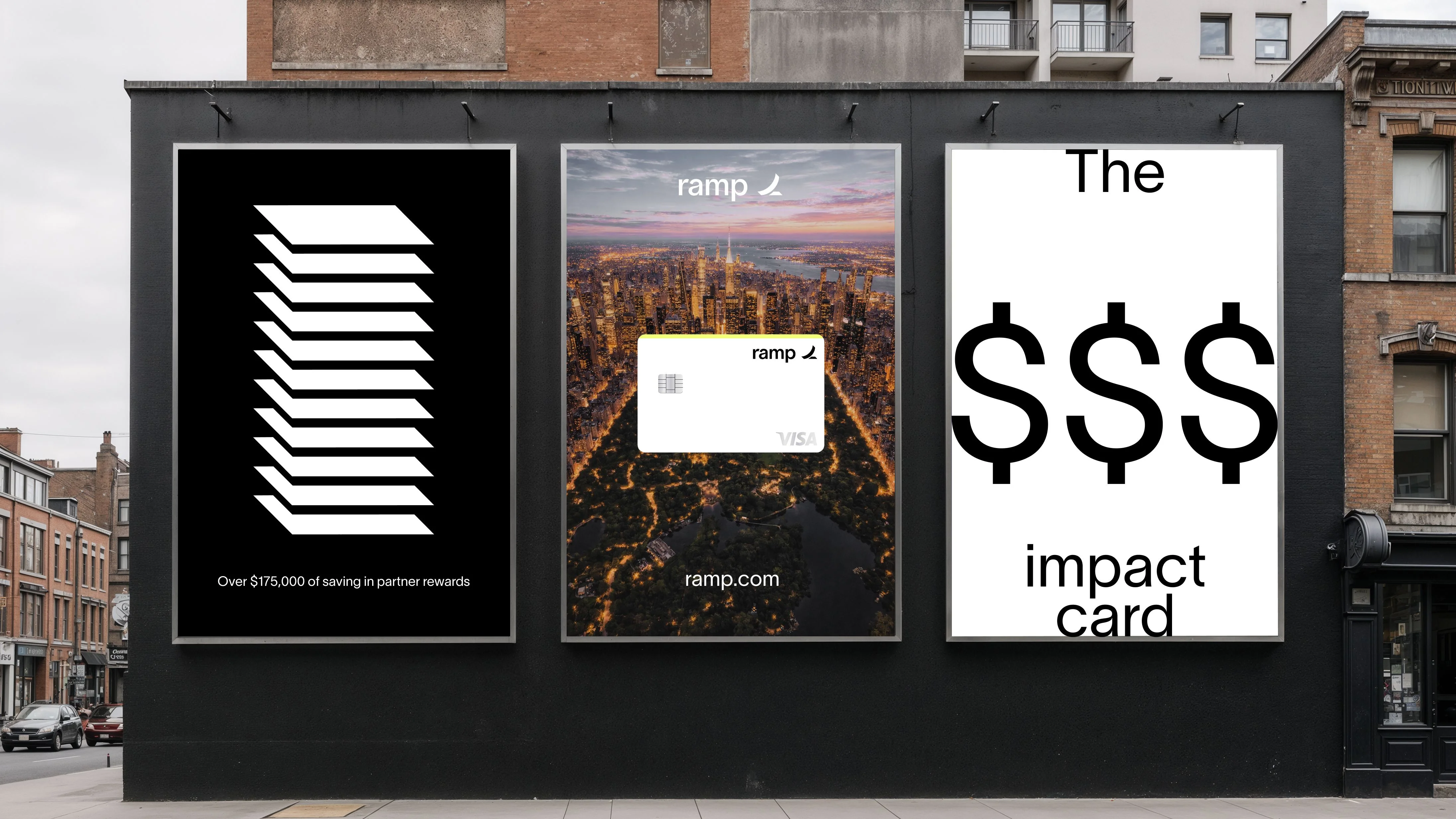
Ramp: confidence through restraint
Ramp, a corporate card and spend management platform, uses stark black-and-white typography and plain, almost blunt copy in a category where most competitors lean on trust badges and soft blues to seem credible. The identity reads as confident rather than cautious, which is a deliberate contrast to how finance-adjacent products usually try to reassure a buyer. That confidence carries through to the product itself, where the same directness shows up in the actual interface language.
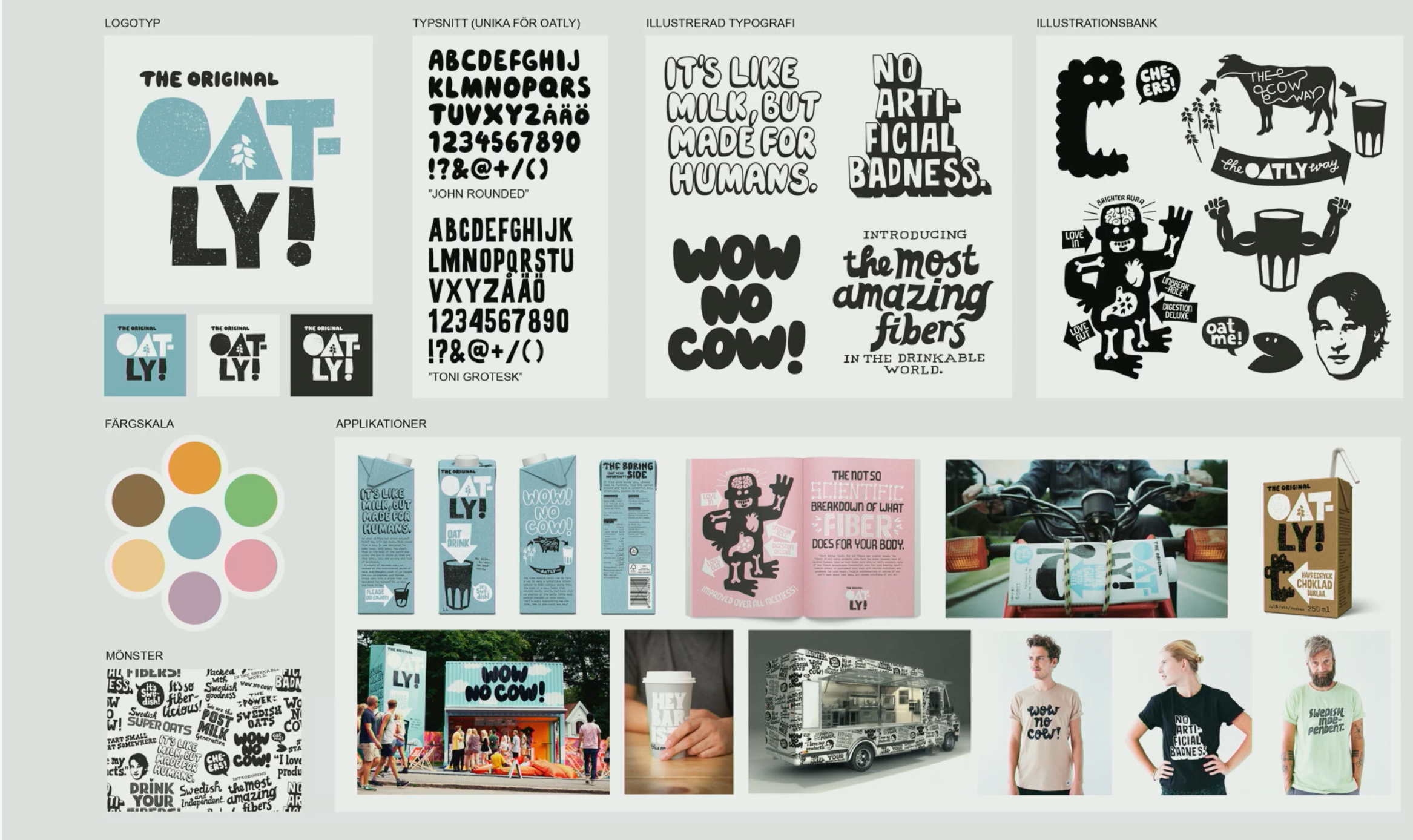
Oatly: an identity willing to pick a fight
Oatly prints its own opinions directly on its packaging, including admissions about its manufacturing footprint and jabs at the dairy industry, in a hand-lettered style that looks more like a zine than a grocery product. The identity takes a real position instead of staying neutral, which is a risk most food brands avoid entirely. That willingness to say something specific, even something some customers disagree with, is exactly what makes the brand memorable in a category full of interchangeable packaging.
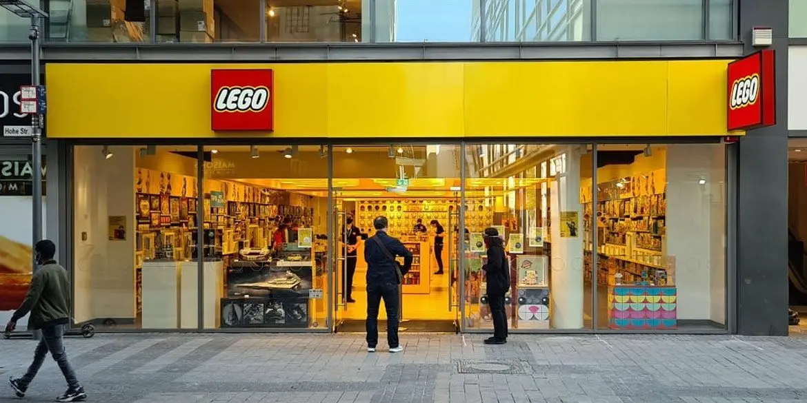
Lego: colors borrowed straight from the product
The yellow lettering, black outline, and red background echo the shape of the building blocks the company is named for, so the logo reads as an extension of the product rather than a decoration sitting on top of it. The bold primary colors carry over from the toy line's original palette, which means the branding and the product have shared a visual language since the beginning instead of growing apart over time. Even without a single brick in view, the logo alone is enough to bring the whole play experience to mind.
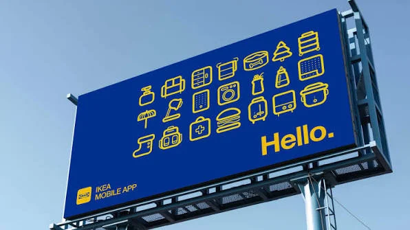
IKEA: a palette that shows up before you reach a product
The blue and yellow palette shows up on everything from staff uniforms to store layouts, which keeps the brand instantly placeable the moment you walk into any location worldwide. That consistency pairs with warm, everyday photography showing real homes and real use, rather than staged, aspirational interiors. The combination makes IKEA feel approachable and practical rather than corporate, which lines up with the actual product it sells.
How to design a corporate identity, step by step
With the building blocks defined, here is a practical process you can follow, whether you are working with an agency or handling this internally before you bring in outside help.
Step 1: Define your values and positioning
Before you touch a single color or font, get clear on why your company exists, who you serve, and what makes your approach different from the alternatives your customers already know about. Skipping this step is why so many corporate identities end up looking polished but saying nothing specific about the company behind them.
A few well-known frameworks can help with this step. Simon Sinek's concept of the Golden Circle, from his book Start With Why, argues that the clearest brands lead with why they exist before they explain what they do or how they do it. Marty Neumeier's book The Brand Gap makes a similar point from the opposite direction, showing how a blank space tends to open up between a company's business strategy and its design when the two are developed separately instead of together.
Neither framework replaces the work of defining your own values, but both are useful starting points if you are not sure where to begin.
Step 2: Research your audience and competitors
Look at how the companies you compete with present themselves, and identify the visual and verbal codes that are already common in your industry. This tells you where you can differentiate and where straying too far would just confuse your audience about what category you are even in.
Step 3: Build your verbal identity
Decide how your company sounds before you decide how it looks, since your tone of voice should guide your visual choices, not the other way around. The next section walks through exactly how to do this.
Step 4: Design your visual system
Work through the core elements from earlier in this guide, logo, typography, color, imagery, and icons, testing each choice against the values and positioning you defined in step one.
Step 5: Turn it into a digital design system
A static style guide is not enough anymore, since most of your customer touchpoints live on your website and product. The section below covers exactly what this looks like in practice.
Step 6: Document everything in a style guide
Record every rule, from logo spacing to color codes to writing guidelines, in one place that any designer, developer, or new hire can reference without having to ask you directly. Some companies call this same document a corporate design manual or a corporate identity manual, but the function is identical either way.
Step 7: Roll out and govern it
Launching the new identity is the easy part. Keeping every new asset, page, and email consistent with it six months later is where most companies actually struggle, which the section further down covers in more detail.
How to build your tone of voice (verbal identity)
Your tone of voice is how your company sounds across every piece of writing, from your website headlines to your support replies. It should reflect your actual personality, whether that is formal and precise or casual and direct, and it should stay recognizable no matter who on your team is doing the writing that day.
Mailchimp uses a conversational, often witty tone that shows up in its product messages and even its error screens, which works because it is written into the brand's actual guidelines rather than left to whoever happens to be writing that day. Deloitte, on the other hand, uses a more formal and precise tone built to signal expertise to corporate clients. Neither tone is better than the other. The right choice depends entirely on your own audience and positioning.
How to turn your corporate design identity into a digital design system
Most corporate identity guides stop at the style guide, but for any company with a website, and that is nearly every company today, the identity actually needs to live as a working system of components rather than a static document of colors and fonts.
A website built page by page, with no shared component system behind it, tends to end up looking like it was assembled by five different designers who never spoke to each other, mostly because in a lot of cases, it was.
A digital design system takes the same rules from your style guide, such as buttons, cards, navigation, forms, and hero sections, and turns them into reusable components inside a tool like Figma or Webflow. Every new page then gets built from the same pieces instead of being designed from scratch, which keeps your site consistent as it grows and makes updates far faster to roll out, since a change to one component updates every page that uses it.
This is not just a theoretical benefit. When magier rebuilt plancraft's design and Webflow presence together, the combined work led to a 20% increase in conversion, alongside 30 or more individual pages developed and over 200 URLs migrated onto the new system. A relaunch built the same way for Jupus resulted in more than 40 demo calls booked within the first two days after going live.
This is exactly the kind of work a combined design and Webflow team specializes in, since building the components and building the site they live on are really the same project. See how magier covers both design and Webflow, from the initial visual system through to a fully built, component-based website.
How to keep your identity consistent after launch
Launching a new corporate identity is the visible, exciting part. Keeping it consistent afterward is the part almost nobody plans for, and it shows in the numbers. The same Marq research found that although 95% of companies have brand guidelines in place, only 1 in 4 actually enforce them.
That gap usually shows up in small ways at first: a sales rep builds a deck with an old logo file; a new hire picks a font that is close enough but not quite right; a marketing intern uses the wrong shade of blue in a social post. None of these mistakes are dramatic on their own, but they add up quickly, and within a year a consistent identity can look like it was never defined in the first place.
This is exactly why so many companies eventually move away from one-off projects and toward an ongoing setup where design and development support is available every month rather than during a single launch window. New pages, new campaigns, and new hires all need something updated eventually, and having someone on call for that keeps the drift from creeping back in.
How much does corporate identity design cost
Cost is the question most corporate identity guides skip entirely, and it is one of the most searched questions on this exact topic. The real answer depends heavily on scope, but concrete numbers make that range far more useful than a vague answer.
In Germany, the Allianz Deutscher Designer sets a benchmark hourly rate of €105 for professional designers, and full project pricing from agencies like Helder ranges from around €2,000 for a brand audit alone up to €18,500 or more for a complete brand design project. Those numbers give you a sense of what a fully custom, one-off agency engagement tends to cost.
Asking a single freelance logo designer to build your entire corporate identity, from visual system through digital rollout, is a bit like asking a barista to also run your company's finance department. They might pull it off, but you are stretching someone far outside what they were actually trained to do, and the differences usually appear later in places like your website or your sales materials.
For a growing company, a subscription model solves a specific problem that one-off pricing does not. Your identity needs are never actually finished, so paying for ongoing access to a design and development team, rather than a single fixed-scope project, tends to match how the work actually happens over time. See how magier's process works if you want a closer look at how a monthly subscription actually runs day to day.
"A logo file and a live, working website are two completely different disciplines. Asking one person to do both well is usually how a company ends up rebuilding its site twice."

Common mistakes to avoid when building a corporate identity
A handful of mistakes come up again and again, and most of them are avoidable once you know to look for them.
- Starting with the logo instead of the strategy: Sketching logo concepts before you have defined your values and positioning tends to produce something that looks nice but does not actually say anything specific about your company.
- Choosing colors on instinct alone: A color palette should account for accessibility, industry context, and differentiation from your closest competitors, not just what looks good on a mood board.
- Treating one typeface as a complete system: A single font with no defined hierarchy, spacing, or usage rules leaves every designer guessing, which shows up as inconsistency within months.
- Redesigning the logo every time someone gets restless: Some founders redesign their logo every time a co-founder gets restless on a slow Sunday afternoon, which is a fast way to spend real money arriving back at a shade of blue the company already had two years earlier.
- Skipping the digital design system: Building individual pages instead of reusable components might feel faster at first, but it usually costs more time later, once every page needs the same fix applied one by one.
Tools that make corporate identity design easier today
The tools available for this work have changed a lot even in the last couple of years, and using them well can shorten a process that used to take months.
- Figma: the standard tool for building and sharing design systems, letting an entire team work from the same components in real time.
- Adobe Firefly and Midjourney: useful for generating early mood boards and visual direction before a designer commits to a final concept.
- ChatGPT: a fast way to draft early tone of voice options or test how a piece of copy sounds in a formal versus casual register before a copywriter adjusts the wording further.
- Webflow: the platform that turns a design system into an actual, componentized website, so your visual identity and your live site stay in sync as you grow.
magier for corporate identity design: a couple of examples
We've seen this play out with our own clients, not just in theory.
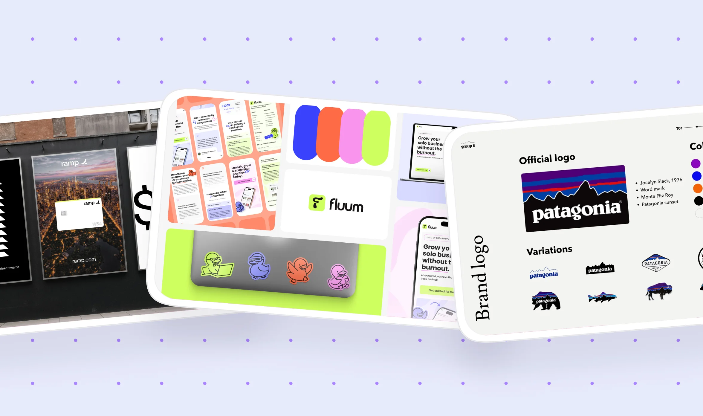
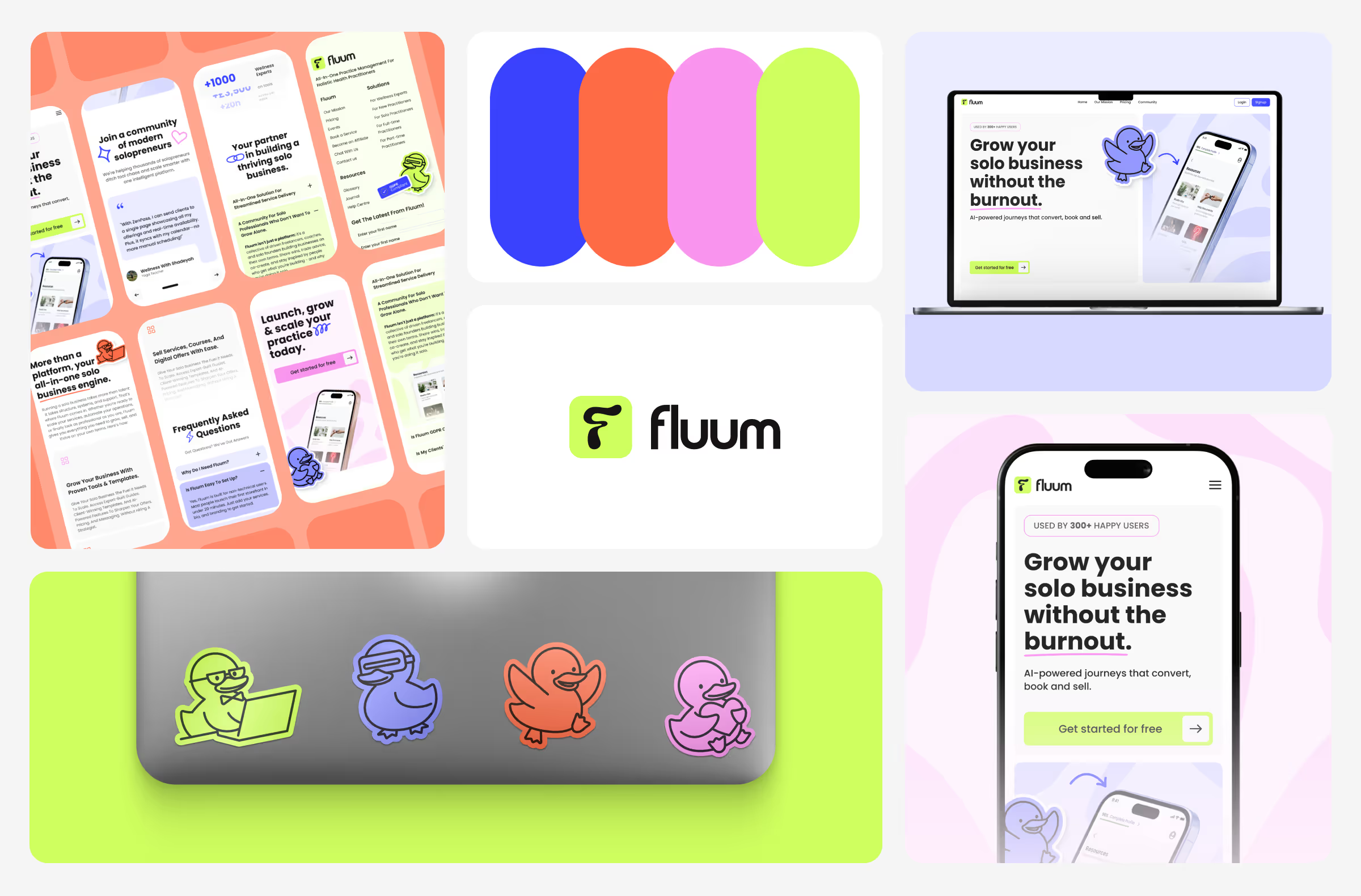
Fluum, an all-in-one platform for freelancers, needed a full rebrand and a working website live within 30 days, with no in-house design team and one person running all of marketing. Once it shipped, the new site saw a 40% increase in engagement and a 35% increase in signups.
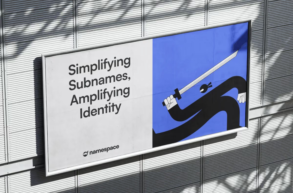
Namespace, a Web3 naming service, needed a complete identity built from scratch, from a mascot to a full product design system, and ended up paying around 45% less than the freelance quotes they'd been getting elsewhere in the crypto space. Neither result came from the logo alone. It came from every piece of the identity staying consistent once it was actually built.
Bringing it all together
A strong corporate identity does more than make your company look put together. It develops credibility and trust that shortens sales cycles, and it gives your team a shared system to work from instead of reinventing decisions.
None of this happens at once, and building a complete identity, from values through a working digital design system, takes time, effort, and coordination of the entire team. Most companies find the visual pieces match faster than the routine of keeping everything consistent once the initial launch excitement wears off.
If you would rather have a dedicated team handle the design and the Webflow build together, book a free demo with magier and we can walk through what that would look like for your company specifically.
If you are handling this yourself for now, start with the section on defining your values and positioning, since every other decision in this guide builds on that foundation. Come back to the cost breakdown and the digital design system section once you are ready to scope out what help you might need.
{{cta}}
FAQ
A strong corporate identity gives digital designers a clear system of components, colors, and typography to build from, rather than making decisions page by page. This is exactly why digital design systems, like the ones built in Figma and Webflow, have become such a central part of corporate identity work today.
In graphic design specifically, corporate identity refers to the visual assets a designer creates and documents, such as the logo, typography, and color system. It is the design discipline's contribution to the larger corporate identity, which also includes behavior and communication outside of design's scope.
Start by defining your values and positioning, then research your audience and competitors before building your tone of voice and visual system. Document everything in a style guide, turn it into a digital design system for your website, and put a governance process in place so it stays consistent after launch.
Corporate design is the visual system, including your logo, colors, and fonts. Corporate identity is the larger whole that corporate design sits inside, covering your company's culture, behavior, and communication as well as its visuals.
A corporate design typically includes a logo, a color palette, typography, imagery and visual language, iconography, a layout grid, and a style guide that documents the rules for all of it. Some companies also include audio elements, like a jingle or sound logo, though this is far less common outside of broadcast-heavy industries.
.avif)

.avif)