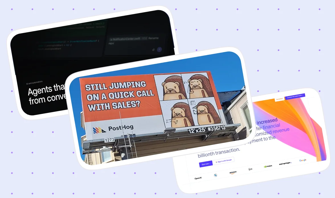
Banner Design Best Practices for B2B Brands (With Real Examples)
Good banner design and a clear B2B offer go together like espresso and a Monday morning stand-up: skip one and the whole thing falls apart before 10am.
It doesn’t matter whether that banner is being used on a homepage, a LinkedIn feed, or a conference backdrop. Most teams are correct with the espresso part on one placement and still wonder why the other four are not pulling their weight.
That is what we’ve seen when teams try to design banners by themselves. And to help them, we have created this guide. This blog covers banner design for B2B brands specifically, meaning any visual asset built to communicate one business message quickly. That can be a website hero, a LinkedIn post, an email header, or a conference backdrop.
We design and build banners, heroes, and full websites for B2B SaaS clients every week. When writing this guide, we used that knowledge and experience to make it the single source of banner design best practices for you.
Here's what we cover:
- What is a B2B banner design
- Importance of having a well-designed banner
- Which tools B2B teams actually use, and where each one fits
- The framework and best practices that apply across every banner
- The technical constraints (dimensions, file size, safe margins)
- How banner design changes across placements
- General best practices, common mistakes, and when it makes sense to bring in expert help
- How to build a banner system that scales instead of redesigning from scratch every time
- Real banner examples
{{freebie}}
What is B2B banner design
A banner, in the B2B context, is any visual asset designed to communicate one business value in a short window of attention, whether that window is 3 seconds on a website or a passing glance on a LinkedIn feed. It covers website heroes, social ads, email headers, webinar graphics, and conference booth backdrops, all treated as one design discipline rather than five unrelated tasks.
The biggest difference between B2B and B2C banner design is what the viewer is actually doing when they see it. A consumer scrolling past an impulse-purchase ad responds to excitement and novelty, while a B2B buyer is evaluating trust, expertise, and outcomes before they will even consider clicking through. That means clarity beats cleverness almost every time, and a banner that tries to be clever at the expense of being clear usually loses the reader before the message lands.
As Peep Laja, founder of the conversion optimization firm CXL, puts it, "clarity trumps persuasion any day," a line that shows up constantly in CRO circles for exactly this reason.
{{cta}}
Why it is important to have a well-designed banner
There are very few design decisions as measurable as a banner. Unlike a rebrand or a new illustration style, a banner's success shows up directly in a number: clicks, form submissions, trial signups, or booked demos. That measurability is what makes banner design worth taking seriously, since a small change in hierarchy or wording can be tested and proven, not just debated in a review meeting.
Three real redesigns make this even more convincing. ArchiveSocial increased clicks on its homepage banner form field by 101.68% after making the primary action more visually dominant and moving it higher above the fold. Hubstaff redesigned its homepage hero, increased hero form submissions by 34%, and saw that translate into a 49% lift in visitor-to-trial conversion overall. Groove rebuilt its landing page hero around a clearer value proposition and supporting credibility cues, lifting conversion from 2.3% to 4.3%, with later refinements pushing it closer to 4.7%.
These three cases show a pattern that you should remember: every improvement came from clarity and hierarchy, not from more decoration. That is the standard we will keep returning to when judging whether a design choice earns its place on a banner.
Platforms and tools for banner design
Tool choice for B2B banners is a fairly settled question compared to some design decisions, so this section stays short, and it applies whether you are searching for banner design online or asking what is the best program to design a banner outright.
Figma is the standard for most B2B teams, since it handles responsive variants, shared components, and collaborative review better than anything else on this list. Adobe Illustrator is worth reaching for when a banner needs vector-heavy artwork or large-format output, such as a conference backdrop. AI-assisted tools have earned a real place in the workflow too, with Relume AI useful for quick hero layout starting points, ChatGPT for drafting and shaping messaging, and Galileo AI for early UI concepts, though none of them replace the layout judgment a human still needs to apply. A small set of mockup resources rounds out a professional setup, since tools like LS Graphics, Angle, and Mockuuups Studio turn a flat banner design into a realistic device or environment preview in a few clicks, which helps a client or stakeholder picture the banner in context before it goes live.
For most B2B SaaS teams and agencies, Figma alone covers the vast majority of banner work, with the AI tools layered in as accelerants rather than replacements.
Best practices across different platforms and tools
Before opening any design tool, a B2B banner needs four questions answered. This is the framework that should shape every banner this guide covers, and it maps directly to why the case studies above worked.
Once those four elements are set, the headline is the single highest-impact decision on the banner. A weak headline names a topic, while a strong one states the outcome.
The advertising pioneer David Ogilvy made the same point decades before banners existed as a format, noting that on average, "five times as many people read the headline as read the body copy," which means a weak headline wastes most of the attention a banner will ever get, no matter how strong the rest of the design is.
The rest of the visual system should support that headline rather than compete with it. Keep the palette to one accent color against a neutral background, since B2B buyers respond to restraint more than variety, and reserve that accent color specifically for the CTA and other places you want the eye to land. A rough split of 55% text to 45% visual space tends to hold up well across most placements, though the exact ratio should flex depending on how much the product visual itself needs to carry the message.
A repeatable workflow keeps this from becoming a fresh debate every time a banner needs building.
- Write the messaging first, meaning the headline, supporting copy, and CTA, before opening Figma at all.
- Build the layout on a 12-column grid, so every future banner shares the same underlying structure.
- Allocate roughly the 55/45 text-to-visual split described above.
- Place trust logos or proof points before adding any decorative elements.
- Zoom out to 25% and check whether the headline is still immediately clear at that size.
- Create the responsive variants (desktop, tablet, mobile, and a LinkedIn square) from the same file, rather than starting each one from scratch.
Technical constraints and specs to consider when designing a banner
Unlike most of the judgment calls in this guide, the details below have objectively right and wrong answers. A banner that looks perfect in the design file can still fail once it is exported, cropped, or viewed on a different screen, so these banner size measurements and constraints exist to prevent that gap between the file and the real world.
Two habits protect a banner across all of these formats. First, design in three zones, a core zone that must always show, a support zone that is nice to show, and a decorative zone that can be safely cropped, so a banner survives being trimmed for a different placement. Second, build every banner mobile-first, since more than half of B2B website traffic now arrives on mobile, and a banner that only works at desktop width is failing the majority of its actual audience.
Use cases: banner design by placement
A website hero, a LinkedIn ad, an email banner, a conference booth, and a webinar graphic are five different design problems, not one banner resized five different ways. Each one has its own viewing distance, attention span, and technical ceiling, so treating them identically is one of the fastest ways to end up with a banner that works nowhere well.
Website hero
This is the highest-priority placement, since its job is to explain the company in about 5 seconds to a visitor who has never heard of it before. A strong structure includes a headline, a supporting subheadline, a primary CTA, a secondary CTA for visitors who are not ready to commit, a product visual, and a row of customer logos for immediate trust.

LinkedIn ads and organic banners
LinkedIn rewards restraint. A headline of 6 to 12 words, large typography, one visual, one CTA, and a brand color accent tend to outperform anything busier. Avoid putting paragraphs of text inside the image itself, since LinkedIn's own algorithm and the viewer's patience both punish that.
Email banners
Keep the height between 180 and 250 px, and keep the text live in HTML rather than embedded inside the image file. This matters for accessibility, since screen readers cannot parse text embedded in an image, and it also protects against email clients that block images by default.
Conference booth banners
People view these from 3 to 5 meters away, so a huge headline, a QR code, minimal copy, and bold contrast are non-negotiable. A simple test works well here. If someone cannot read it in 3 seconds from across the aisle, it is too busy for the format.
Webinar and event banners
These need a speaker, a topic, a date, a registration CTA, and the brand, in that rough order of visual priority. Hierarchy matters more than illustration for this placement, since attendees are scanning for logistics, not admiring artwork.
Best practices across these use cases
Despite their differences, all five placements share the same underlying content order, moving from headline, to supporting copy, to CTA, to proof or logos, to supporting visual. The table below shows how word count and priority element shift by placement while that order stays constant.
The test that ties this whole section together is simple. A viewer should understand the banner's point even if they ignore everything below the headline, and if that is not true, the hierarchy needs work before the visual polish does.
General best practices for every banner
A handful of rules apply no matter which placement you are designing for.
Design for scanning, not reading
People view banners in an F-pattern or Z-pattern, not top to bottom like a paragraph, so short phrases and a clear visual path matter more than complete sentences. Usability author Steve Krug summed this up plainly in Don't Make Me Think, "we don't read pages, we scan them," and a banner has even less time to earn attention than a full page does.
Use proof before decoration
A statistic, a client logo, or a short testimonial builds more trust than another illustration, since B2B buyers respond to evidence more than to visual flourish. This is the same mechanism psychologist Robert Cialdini described in Influence, where he explains that people treat a behavior as more correct the more they see other people performing it, which is exactly what a row of recognizable client logos signals to a skeptical buyer.
Respect whitespace
A rough rule of 64 to 120 px for outer margins, with smaller gaps of 16 to 32 px between the headline, body copy, and CTA, keeps a banner from feeling like it is shouting. Designer Dieter Rams put the underlying principle simply, "good design is as little design as possible," and a banner with room to breathe almost always reads faster than one crammed edge to edge.
Design mobile-first
Build the smallest version of the banner first, then scale up, rather than designing for desktop and hoping the mobile crop survives.
Run the QA stress tests before publishing
Three quick checks catch most banner failures before they go live: shrink the banner down and see if the message still reads in two seconds, crop the edges to see if the core message survives, and export at the platform's typical compression to check the text stays crisp. Skipping this step is a bit like shipping a product without testing it on a single real device, it looks fine in the controlled environment and then falls apart the moment a real user touches it.
Common mistakes in B2B banner design
A handful of mistakes account for most of the underperforming banners we see.
The stock photography mistake deserves a specific callout, since it shows up constantly. Smiling people gathered around a laptop in a bright office rarely communicates expertise to a B2B buyer, and it is a bit like hanging a stock photo of a chef in your restaurant's window instead of a picture of the actual food, it tells the viewer nothing about what they are actually going to get.
"Half the 'redesigns' we get asked to fix aren't actually broken, they're just trying to say five things at once. The fix is almost always subtraction, not addition."

When to bring in expert help
A quick internal LinkedIn post or a webinar graphic for a small internal audience is perfectly fine to build yourself in Canva, and there is no reason to overthink something low-stakes. But a homepage hero, a client-facing proposal deck banner, or a conference booth backdrop carries real brand risk if the hierarchy or messaging is off, since these are often a buyer's first impression of the company.
Getting the one-sentence job of a banner right while also running a company or a marketing team is difficult to do consistently on your own. That difficulty is exactly why a second, experienced set of eyes tends to catch the cluttered hero or the buried CTA that is easy to miss when you have been staring at your own homepage for months. This is the gap magier's design team exists to close, stepping in specifically for the banners where the brand risk is highest, so the founder or marketer who spotted the problem does not also have to be the one who fixes it alone.
Building a banner system that scales with you
One good banner rarely stays a one-off. As soon as a campaign launches, a homepage updates, or a new offer needs a banner, teams either rebuild from scratch every time or scramble to resize an existing file under deadline pressure. Building a system instead of a single asset solves this before it becomes a recurring problem.
A working system has four parts:
1. A master Figma file with the hierarchy and CTA rules already locked in, so nobody has to make those decisions fresh each time.
2. A small variant set built alongside the primary version, typically a tighter crop for constrained placements and a text-light version for busy environments, generated from the same master rather than designed separately.
3. A clear naming and versioning convention, such as campaign plus placement plus date, so nobody accidentally ships an outdated offer.
4. And a direct handoff between the design file and the live page it ends up on, so a banner update does not mean re-briefing a separate development team every time.
That last part is where magier's approach differs from a typical design-only shop. Because magier runs on one subscription covering both design and Webflow development, the same team that designs the banner can also push it live on the actual site, which closes the gap between a polished Figma file and a banner that is actually working on your homepage. See how magier covers both design and Webflow if you want that handoff solved for good, or book a free demo with magier to talk through your specific banner and website needs.
If you want to see how these same principles apply to paid advertising creative specifically, our guide on ad design best practices covers Meta, TikTok, and Google Display in more depth, since that is a related but distinct discipline from the owned-channel banners this guide focuses on.
Real B2B banner examples worth studying
Principles only carry a reader so far. Studying real B2B banner designs shows what restraint and hierarchy look like once a team has actually shipped them, and it tends to spark better banner design ideas than staring at a blank Figma file ever will.
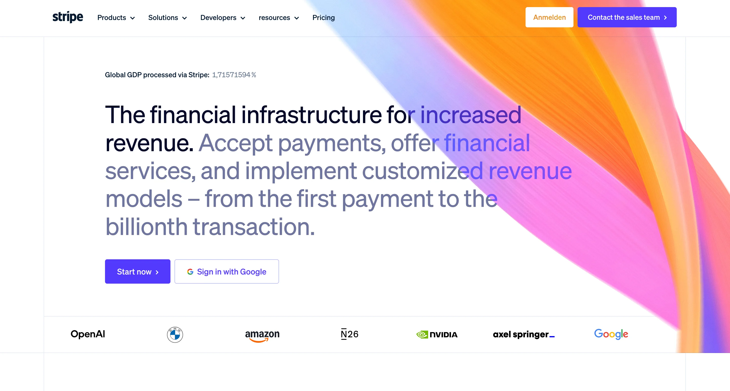
Stripe leans on editorial typography and generous whitespace, with real product screenshots doing the work instead of illustrations. The consideration here mirrors exactly what made Groove's redesign succeed, a clearer value proposition with fewer competing elements.
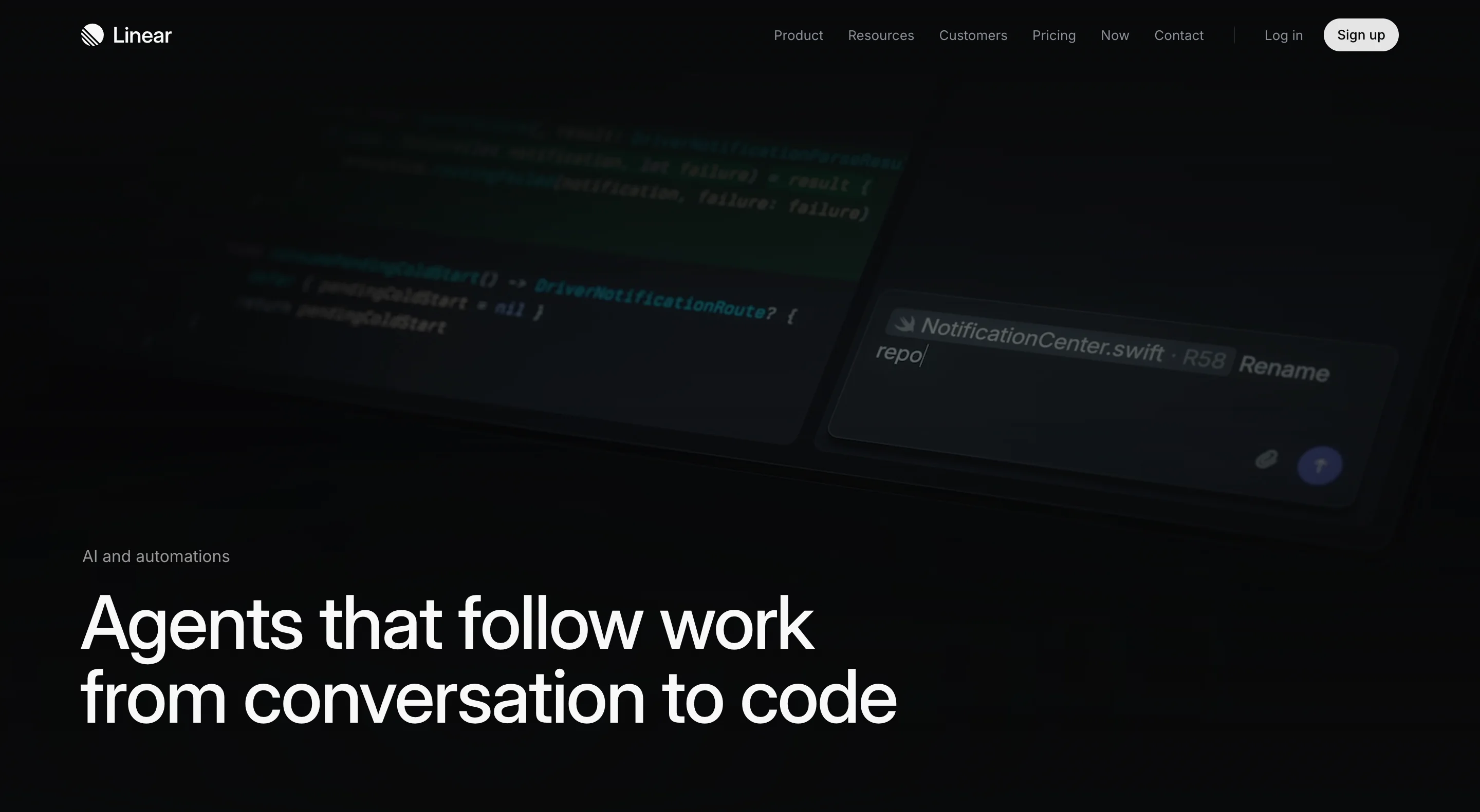
Linear builds minimal, product-first heroes where the interface itself becomes the hero rather than sitting beside supporting copy. There is very little explanatory text, which only works because the product visual is doing so much of the communicating on its own.
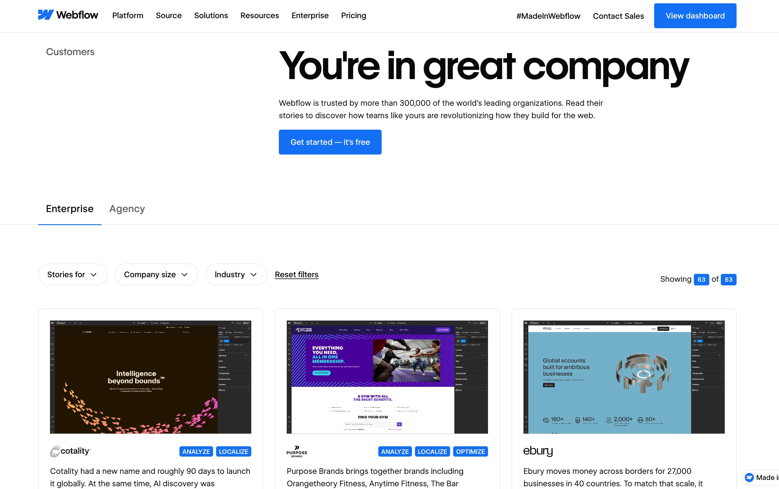
Webflow combines enterprise-grade messaging with visible customer proof, a direct application of the proof-before-decoration rule covered earlier in this guide.
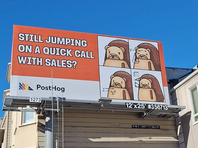
PostHog takes the opposite visual approach with mascot-driven, personality-forward campaign banners, and still keeps its message clear, showing that personality and clarity are not actually in tension when the hierarchy underneath is solid.
For further reading, Adobe's own banner design guide covers the QA workflow in more depth, and UX Collective's piece on persuasive banners is worth a read for a more critical, user-experience-first perspective on the same topic.
Final thoughts
Good banner design comes down to the same handful of decisions repeated across every placement: one audience, one value proposition, one proof point, and one action, all built on a hierarchy that survives cropping, compression, and a five-second glance. None of that is complicated when in theory; the hard part is applying it consistently once a headline needs writing, a deadline is close, and five different opinions are in the room.
But that is normal, and it is exactly why a system beats a one-off every time. Build the framework once, lock the hierarchy, and the next banner takes a fraction of the effort the first one did.
If you want that system built for you instead of built alone, see how magier covers both design and Webflow or book a free demo with magier to talk through your specific banners.
For now, pick the placement that is causing you the most trouble right now, website hero, LinkedIn, email, booth, or webinar, and start there rather than trying to fix everything at once.
{{cta}}
.avif)

.webp)