Hero Section Design for SaaS Websites: How To, Best Practices, and Examples
We once asked our design team which part of a page they spend the most hours on and prioritize the most. The answer was hero section design.
A hero section is the first screen of your page, made of a headline, a supporting line, a call to action, and a visual. It tells a visitor what you offer and what to do next, which is why it decides whether they keep scrolling. Nielsen Norman Group’s 2018 eye-tracking study found that users spent about 57% of their page-viewing time above the fold, which is where a hero sits.
When we asked the same team what is their secret to designing an effective hero section, they told us to study those of pages that are known for converting well. We took that advice to heart and went through hero sections from well-known SaaS companies, one part at a time. This guide is what we learned.
It is written specifically for SaaS marketing leads and founders who want their use their first screen to hook visitors and turn them into customers. Here is what you can expect in the next 20 minutes:
- What is a hero section in a landing page
- Differences in hero section design of a normal company vs a SaaS
- Anatomy of a SaaS hero section design
- How to design one
- Hero designs by SaaS type and style
- Annotated SaaS hero section design examples
- Common mistakes, and when to skip a hero
- How to build and test your hero in Webflow
Happy reading!
{{freebie}}
What is a hero section in website design?
In web design, the hero section of a website is the first block a visitor sees on a page. It consists of a headline, a short supporting line, a call to action (CTA), and a visual. People also search for it as a website hero, and DACH-speaking markets often call it the Hero Bereich.
The name fits the role the section plays, because it takes the lead on the page the way a hero leads a story. Every section below it supports the promise the hero makes. Its visual is often called the hero image (Hero Bild in German), and the best ones show the product itself instead of a stock photo of colleagues high-fiving a laptop.
The terms around it get mixed up often, so this table separates them.
SaaS hero section design gets five seconds to make its case
You never get a second first impression, and in SaaS the first one has about five seconds. Visitors often compare several tools in open tabs, so they judge each page quickly and close the one that makes them think the hardest. That makes website hero section design one of the highest-stakes parts of a SaaS site.
A study of 28 SaaS websites shows how often the first screen misses.
- 60.7% had a hero title people understood within five seconds.
- 32.1% needed extra explanation.
- 7.1% could not be understood from the title alone.
Each unclear title gives visitors a reason to leave, and every visitor who leaves counts toward your bounce rate (Absprungrate in German). The clarity problem exists even though 82.14% of those same sites had a clear CTA, so a visible button does not rescue a confusing message. The fix usually isn't visual, and the how-to section shows why.
Hero section design best practices for SaaS, element by element
Which parts of a hero do the real work, and what rule should each one follow? The best hero section design for SaaS comes down to a few rules, and each one below comes with its reason. These hero section design best practices (or Gestaltungstipps für die Hero Section, as German searchers say) are grouped by element. This table gives the short version before we go through each part.
Headline and subheadline
What should a SaaS headline actually say? It should name the outcome the visitor gets, because people judge a page by what it does for them and not by what category it belongs to. A useful check is the four-question test, which asks who the product is for, what problem it solves, how it solves it, and what result the visitor gets.
Competitors disagree on length, with advice ranging from under 8 words to 5 to 7 words. A range of about 5 to 10 words works well because shorter headlines force specificity, while going shorter than that can strip out the context a new visitor needs. As an illustration, "Next-generation analytics for modern teams" describes a category, while "Connect campaign spend to qualified pipeline in one dashboard" describes a job.
The subheadline adds one detail the headline could not fit, such as who the product is for or how it works. Keep it to one or two sentences, because a longer block pushes the CTA down the screen. On desktop, Spell UI suggests headlines of roughly 48 to 72 px and subheadlines of 18 to 22 px, which keeps a clear gap between the two levels.
Call-to-action
How many buttons does a hero need? One primary action covers most cases, and the data agrees, since it found an average of 1.4 CTAs per SaaS hero. A secondary button earns its place only when it serves a different intent, such as "See how it works" for the visitor who is not ready to sign up.
Two equal buttons force the visitor to make a decision, and visitors who are asked to decide often leave instead. Make the primary button larger and higher in contrast, and keep the secondary one visually quieter. Use a verb that tells people what happens next, and add a short reassurance line nearby, such as "No credit card required," when it is true.
Your sales model should set the wording, so use this table as a starting point and not as a rule.
The destination has to match the promise as well, because a "Start free" button that opens a sales form breaks trust in the first click. A visitor who expects a free account and finds a demo request may feel misled, so keep the label and the destination in agreement.
Product visual and hero image (Hero Bild)
The research also found that 75% of the SaaS sites it studied use a featured image in the hero, so the visual is the norm and the real question is what it shows. For SaaS it should show the product, because people trust what they can see. Among the sites with a featured image, 57.1% showed the product UI, 33.3% used illustrations, and only 9.5% used real people.
Picture a screenshot shrunk so far that the dashboard numbers look like gray lines. The visitor cannot tell what the product does, so the visual proves nothing. Crop to the one detail that proves your headline, and use video only when motion explains something a still image cannot, such as a workflow that unfolds over several steps.
Other hero image types exist, including customer images, founder photos, and abstract images with no direct link to the product. Customer and founder images suit services and small brands, and abstract images work only when the headline can stand alone. For a SaaS product, a website hero image that shows a cropped screenshot with realistic data is the safest default, and it should still make sense at mobile size.
Two optional extras show up often. A carousel rotates several hero slides in the same space, and a pre or post-hero utility strip is a small line of text and icons, such as the tools your product works with, placed just above or below the hero. Each adds one more thing for visitors to process, so add them only after the core hero passes the five-second test.
Social proof and navigation
Where should trust signals go? Place them close to the claim they support, because proof loses force when it sits three scrolls away from the promise. A study by Tenet found that only 46.43% of SaaS heroes include any social proof, with an average of 1.54 elements per hero. One or two relevant signals, such as customer logos your buyers recognize, work better than a wall of unfamiliar brands.
The header competes with your hero, so keep it simple. The SaaS sites in Tenet's study averaged about five menu items, and a clean menu helps visitors stay focused on the headline and the button. Tenet also found an average of 2.2 CTAs in the header, so the menu is another place where actions compete, and one primary header CTA that matches the hero keeps the path clear.
Visual hierarchy and whitespace
Does the visitor know where to look first? Size, color, and contrast set the reading order, so the headline should be the largest element, the CTA the highest-contrast one, and everything else quieter. Whitespace groups related elements and gives each one room, which lowers the effort of reading.
Here is a simple test from Exportarts. Remove one element at a time, and if the message and the orientation barely change, that element probably does not belong.
Motion, performance, and accessibility
Can a hero move and still load fast? Yes, as long as the hero animation has a purpose, such as a short text entrance or a product preview that shows the tool in action. A headline that takes three seconds to finish animating tests a visitor's patience, so keep entrances brief. Small animated details, such as a hover state on the CTA, are called microinteractions, and they work best when they confirm an action instead of decorating the page.
Speed deserves the same care. Your hero is often the largest element on the screen, so it often sets your Largest Contentful Paint (LCP), and Google's web.dev guidance treats 2.5 seconds or less as a good score. Compress images, use video sparingly, and lazy-load media below the fold, but never the hero itself, because delaying it delays the first impression.
Accessibility completes the picture.
- Text contrast: Normal text should meet a 4.5:1 ratio under WCAG guidance, and small text over gradients or images needs the closest check.
- Reduced motion: Respect the "prefers-reduced-motion" setting so that visitors who are sensitive to movement see a calmer version.
- Keyboard access: Make sure the CTA can be reached and activated without a mouse.
{{cta}}
Hero section design for SaaS vs other websites
Can you design a SaaS hero the way you would design one for a store or a portfolio? The four parts are the same, a headline, a supporting line, a call to action, and a visual, but the job each one does changes. A store hero can lean on a product the visitor understands at a glance, while a SaaS hero has to explain software that nobody can pick up or try on. This table shows where the two diverge.
The visual has to show the product at work
Software has no shape to photograph, so a stock image of a smiling team says little about what you sell. A cropped view of the real interface usually works better.
The call to action asks for more commitment
A SaaS hero usually asks for a trial or a demo, which costs the visitor time and often contact details. Our research suggests one primary button works best, so if you offer both a trial and a demo, make one clearly stronger.
Proof carries more weight
A visitor cannot test software before clicking, so trust has to come from customer logos or usage numbers. It was found that only 46.43% of the SaaS sites it reviewed had social proof in the hero, averaging 1.54 elements, which suggests one or two well-chosen proof points near the headline are enough.
What stays the same
The fundamentals do not change, which means a clear headline, one main action, a supporting visual, and a layout that works on a phone. That’s where the five-step process in the next section helps, because it starts from your audience and your message and not from a layout.
How to design a SaaS hero section, step by step
Here is the step most teams do last, and it belongs first: writing the message before choosing a layout. A layout built around a weak message cannot be saved by good typography, while a clear message survives an average layout. That is why the five steps below start with words and end with the build.
Step 1: Define the audience and intent
Visitors arrive at different stages, and intent can be grouped into four types:
- Informational
- Educational
- Commercial
- Transactional.
Someone searching "what is data management" needs an educational page, while someone searching "best data management solution" may be ready for a "Get started" button. A hero that pushes a trial on the first visitor often triggers the back button.
Step 2: Write the message before the layout
Answer six questions in a sentence or two each, covering the persona, the alternative they use today, their problem, your capability, the features behind it, and the benefit. Your answers add up to your value proposition, which is the reason a visitor should choose your product over the tool they use today.
Orbix Studio describes two copywriting formulas that turn it into a headline and subheadline pair. PAS (Problem, Agitate, Solution) names the problem, shows what ignoring it costs, and then presents your product as the fix. BAB (Before, After, Bridge) describes the current state, then the better state, and positions your product as the bridge between them, which suits subheadlines because they have room for only one sentence of contrast. Then draft three to five headline directions from this table, where the examples are illustrations and not live copy.

Step 3: Choose the proof and the visual
Decide what makes your promise believable before you draw anything. That might be a product screenshot, a short demo, a customer logo strip, or a quantified result with context. A visual chosen after the message can prove the headline, while a visual chosen first tends to compete with it.
Step 4: Pick a layout
Most SaaS heroes fall into one of the five layouts below, and none of them is guaranteed to convert better than the others.
For a conventional B2B SaaS site, the split and centered layouts are the usual starting points because they balance the message with product proof.
Step 5: Design desktop and mobile together, then build it
Design both sizes in the same session, because a hero that looks sharp at 1440 px can fall apart at 375 px. Build the layout in a tool your team can edit, usually Figma first and then Webflow, so that later headline tests do not need a developer. That's where a design and Webflow subscription helps, because the same team that designs the hero can build and adjust it without a handoff gap.

Hero section design examples for SaaS, and what to borrow from each
These nine hero sections show one clear idea you can adapt for your own product. The “what to avoid” lines are our judgment from the screenshots and not test results (except for Fluum, plancraft, and bakedwith, for they are our own clients and we have seen them perform), and live pages change often, so open each site to see its current version.
Navia
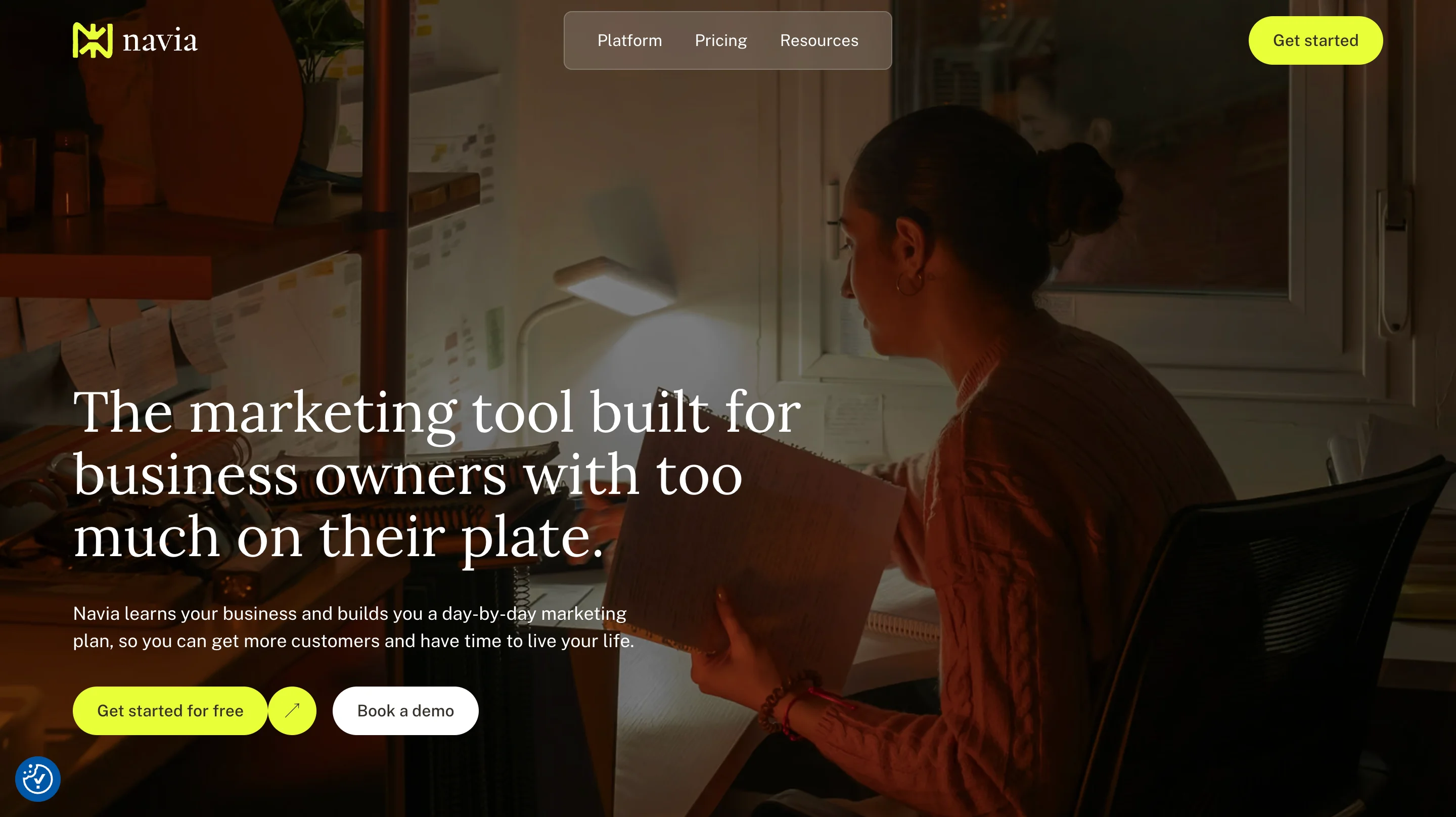
Hero type: Full-bleed lifestyle photo hero
What to copy:
- A headline that names the exact audience and problem, “business owners with too much on their plate”
- A subline that states the outcome plainly, a day-by-day marketing plan and more time to live your life
- A strong primary button for the free option, with “Book a demo” as a quieter second choice
What to avoid: relying on a dark lifestyle photo with no product in view, because the visitor cannot tell what the tool looks like.
Wispr Flow
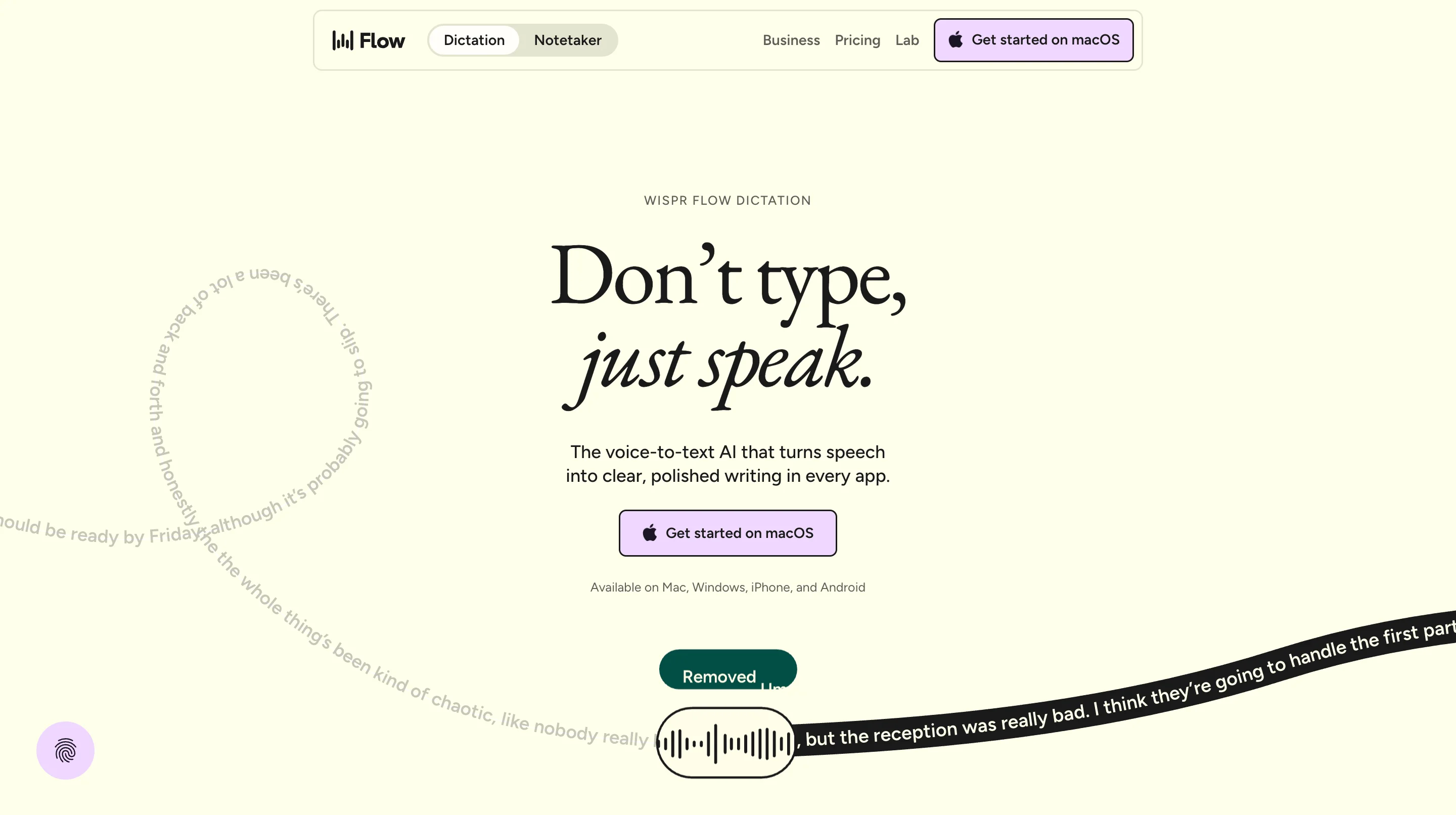
Hero type: Centered text hero with an animated speech visual
What to copy:
- A short two-part headline that states the benefit, “Don’t type, just speak”
- A subline that defines the category in one line, a voice-to-text AI that turns speech into polished writing
- One button, with the supported platforms listed directly beneath it
What to avoid: pairing a macOS-specific button with a multi-platform line, which can leave visitors on other devices unsure what the button does.
Capsule
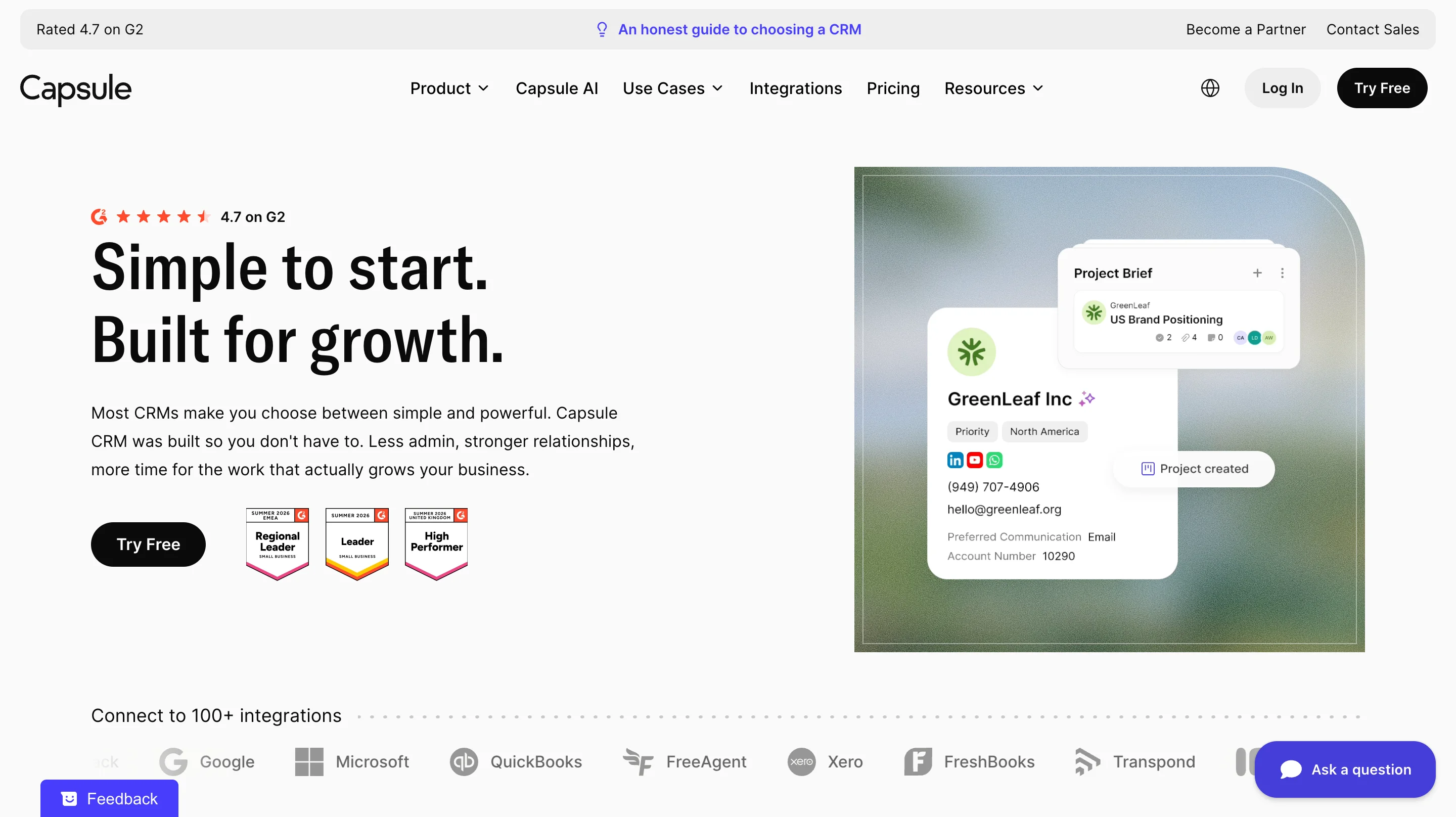
Hero type: Split hero with a product UI card and proof badges
What to copy:
- A G2 rating placed directly above the headline, so proof is the first thing read
- A product card beside the text that shows a real contact record and project, so the visitor sees the software
- An integrations strip below the fold line that answers “will it work with my tools?”
What to avoid: stacking a rating, three review badges, an announcement bar, a chat button, and a feedback tab around one primary button.
plancraft
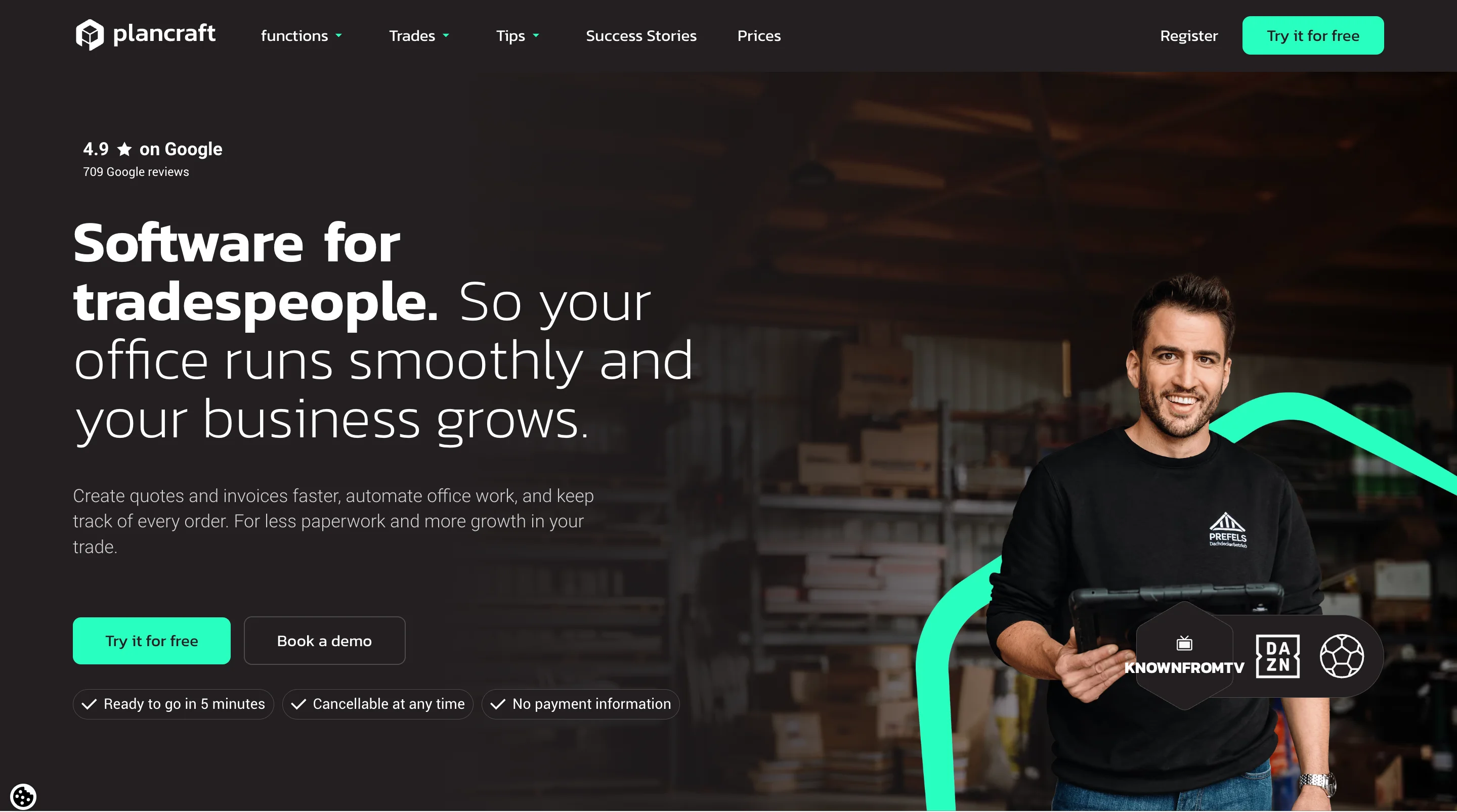
Hero type: Photo hero with a portrait of a tradesperson holding a tablet
What to copy:
- A headline that names the audience, “Software for tradespeople”
- Reassurance chips under the buttons, “Ready to go in 5 minutes,” “Cancellable at any time,” and “No payment information”
- Proof in two forms, a 4.9 Google rating from 709 reviews and a strip of TV logos
What to avoid: light, thin grey body text over a busy photo, which can be hard to read on a phone.
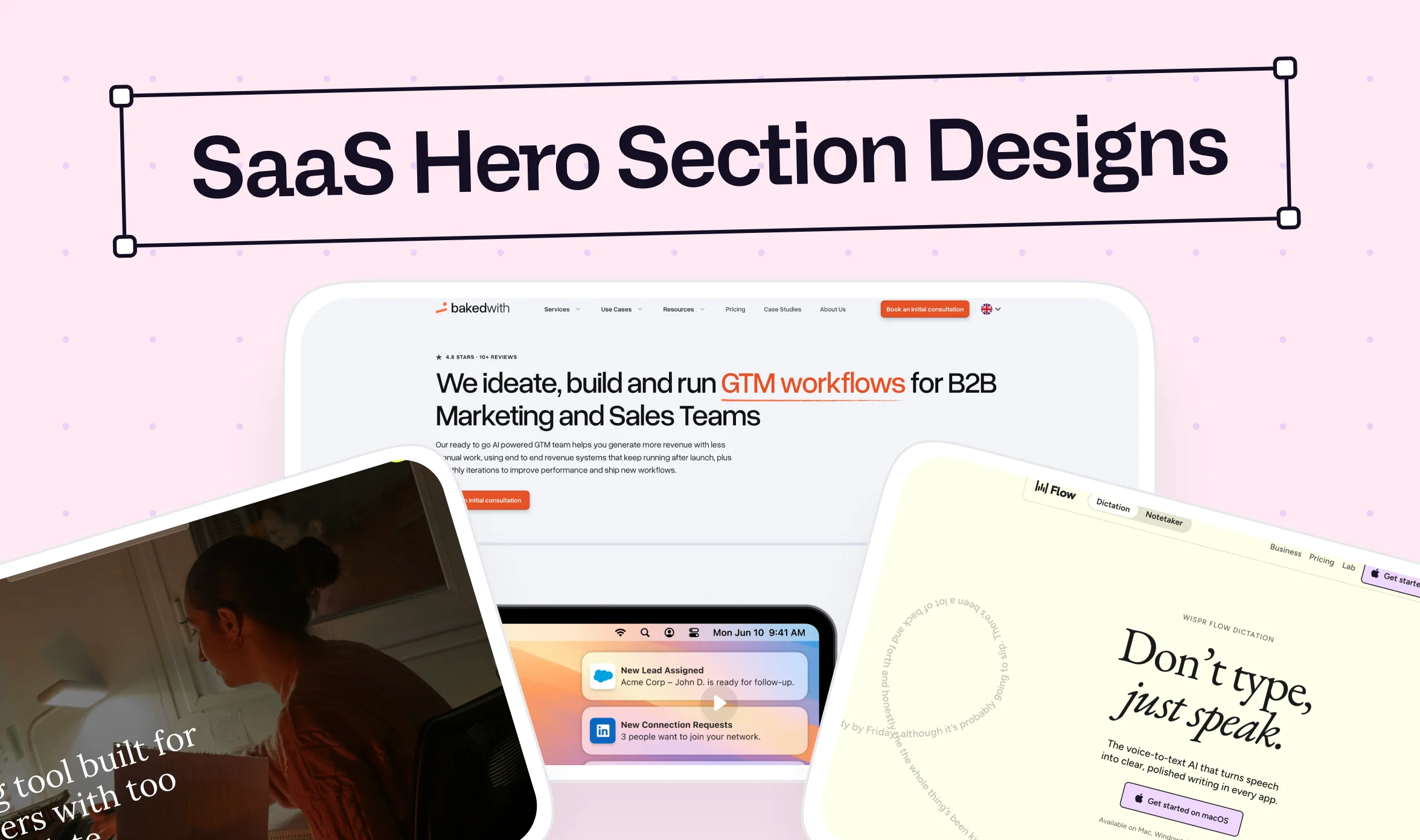
bakedwith
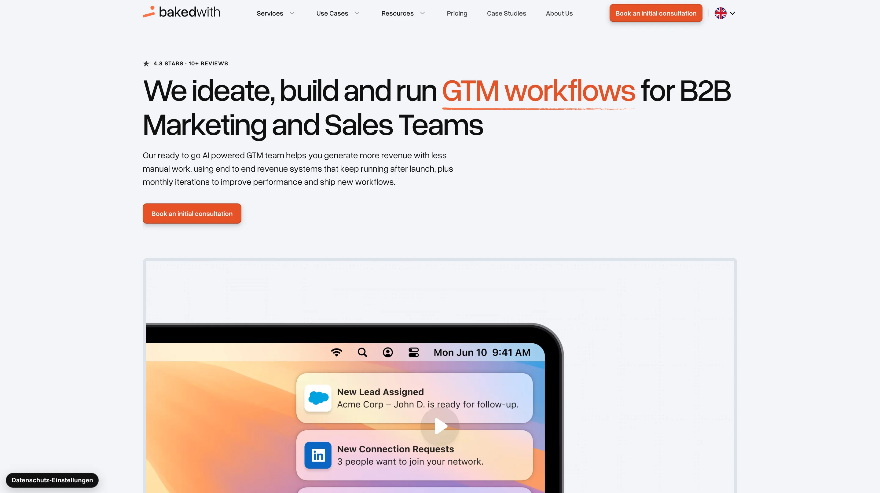
Hero type: Left-aligned text hero with a demo video
What to copy:
- A headline that says what they do and for whom, with the key phrase “GTM workflows” highlighted
- One button, “Book an initial consultation,” repeated in the header and the hero
- A video mockup with notifications from Salesforce and LinkedIn, which makes an abstract service concrete
What to avoid: a 38-word subline in one block, which asks the visitor to read more than a hero needs.
Fluum
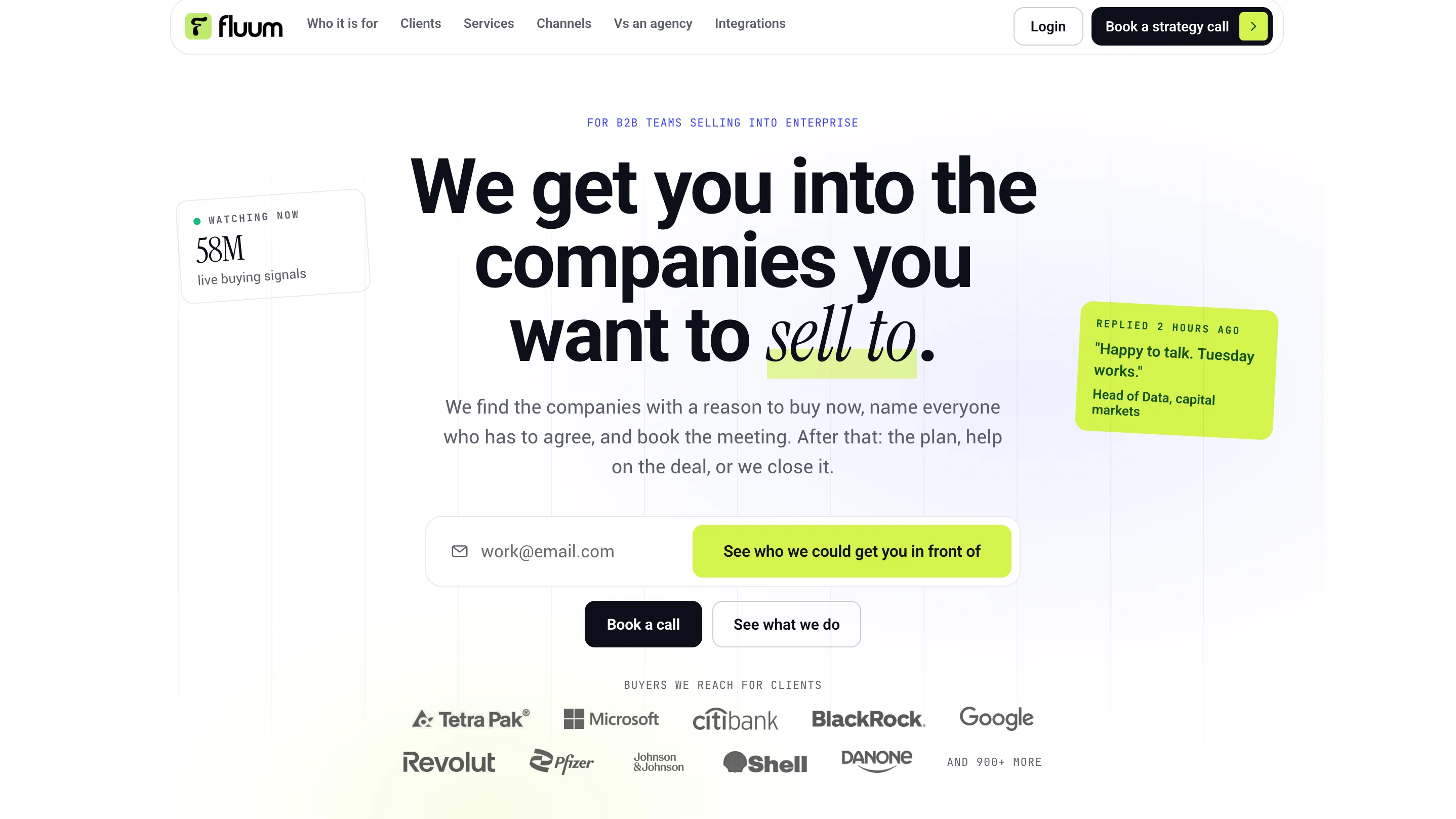
Hero type: Centered text hero with an email capture
What to copy:
- An audience line above the headline, “For B2B teams selling into enterprise”
- A subline that walks through the offer in order, find the companies, name the decision makers, and book the meeting
- A logo strip of the buyers it reaches for clients, placed right under the actions
What to avoid: offering four paths at once, an email field, “Book a call,” “See what we do,” and a header “Book a strategy call.”
time.fyi
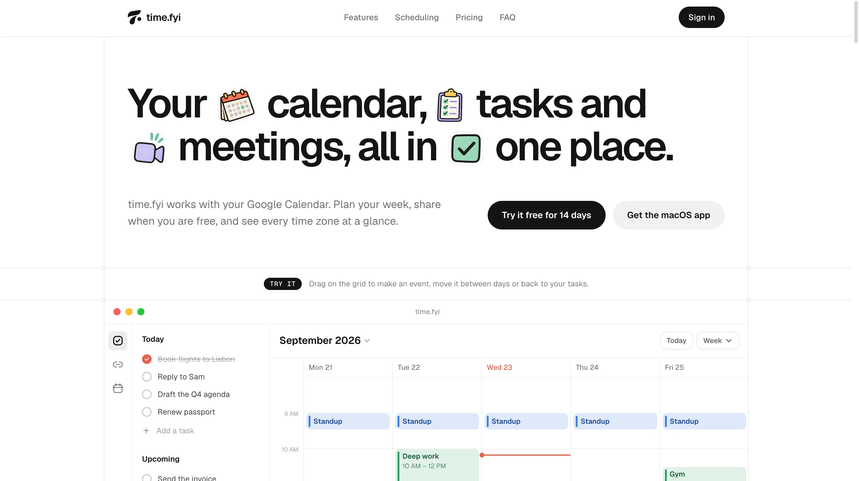
Hero type: Text hero with an interactive product demo
What to copy:
- A headline that lists the product’s three parts, calendar, tasks, and meetings, with small icons that make it easy to scan
- A subline that names the tool it works with, Google Calendar
- A live demo below the buttons with a “Try it” prompt, so the visitor uses the product before signing up
What to avoid: placing icons inside the headline text, which can break the line awkwardly on a narrow phone screen.
Weave
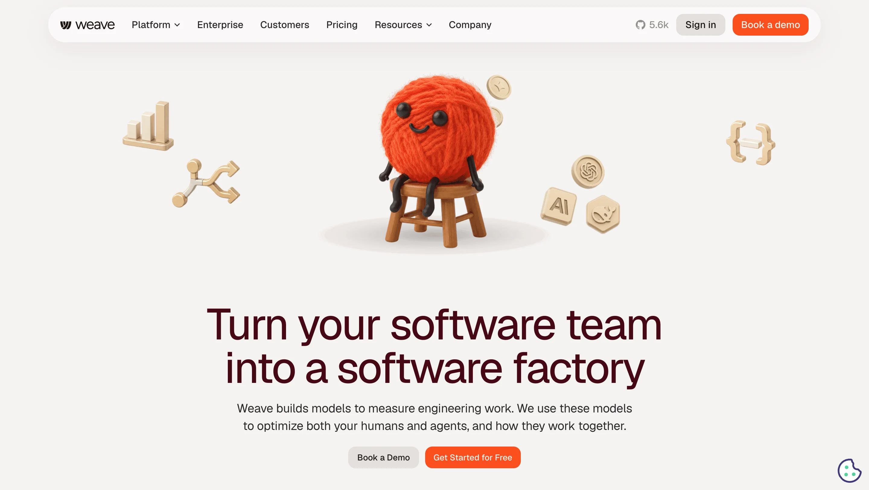
Hero type: Centered hero with a 3D mascot illustration
What to copy:
- A bold one-line promise, “Turn your software team into a software factory”
- A two-sentence subline that explains the mechanism, models that measure engineering work and then optimize humans and agents
- Two buttons with clear priority, the free option in the stronger color and the demo in grey
What to avoid: showing only a mascot illustration, so the visitor has to scroll to see what the software does.
pen.dev
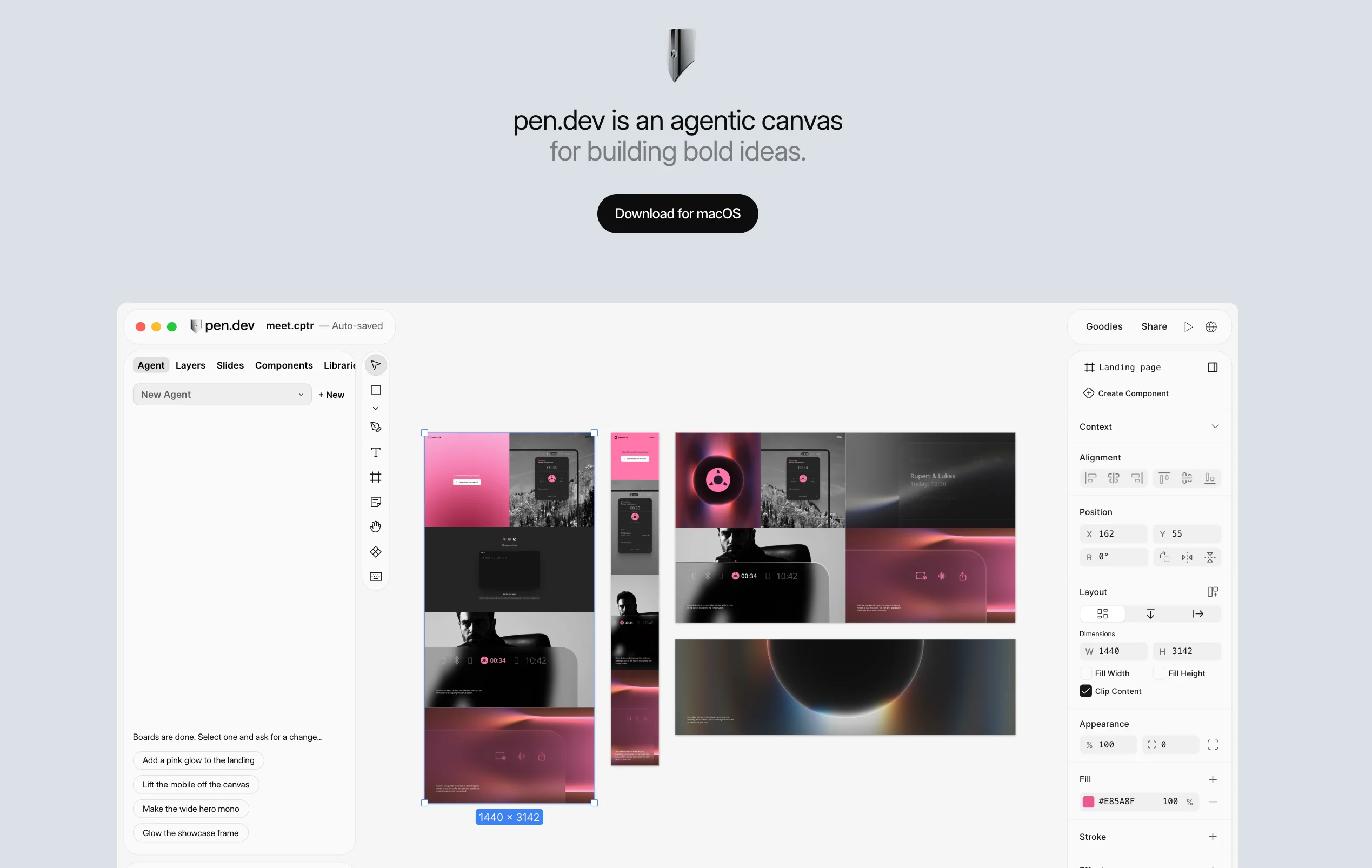
Hero type: Minimal hero with a full product screenshot
What to copy:
- One button, “Download for macOS,” with no navigation bar competing with it
- A large product screenshot with the agent panel and prompt suggestions visible, so the visitor sees how it works
- A one-line statement that names the category, an “agentic canvas”
What to avoid: leading with the brand name and an unfamiliar category term, which leaves out who the product is for and works better for a known brand than a new one.
These nine examples are just a starting point, and your own market will have strong ones. These sources let you keep studying, and they work best when you note the same four things you saw above: the headline, the visual, the button, and the proof. A gallery shows how a page looks, while your own analytics show how your visitors behave, so use both together.
Here are some free galleries you can browse:
- Land-book (land-book.com): a free gallery of landing pages across industries, including SaaS, useful for comparing visual directions.
- Lapa Ninja (lapa.ninja): a free landing page gallery with categories and thousands of designs.
- SaaSFrame (saasframe.io): a SaaS-focused library of marketing pages and hero sections, where the largest archive needs a paid plan.
- Saaspo: a gallery dedicated to SaaS websites, organized by industry and section.
- Landingfolio (landingfolio.com): section-level inspiration, so you can look at hero sections on their own.
- One Page Love (onepagelove.com): an archive of single-page sites and landing pages going back to 2008.
- Godly (godly.website): a gallery that leans toward animation and interaction, helpful if you are weighing a motion-heavy hero.
Hero section design by SaaS type and style
Should a developer tool and an HR platform use the same hero? Usually not, because different buyers need different proof. This table gives a starting direction for each type, and it is a starting point and not a strict template.
A developer tool can still use a light, editorial layout, and an analytics product can still use a workflow-led hero if that explains the value better. Treat each row as a starting direction, and test it against how your own buyers decide.
Other site types
The same guidance applies beyond SaaS with a few adjustments. A minimalist hero section design works when the value proposition is easy to grasp, because the copy carries more weight when there is less around it. An ecommerce hero section design usually leads with a real product image, since shoppers want to see what they are buying. A portfolio hero section design often shows the person or the work, which puts a face to the name, and a grid hero section design shows several items at once, which suits visitors who choose between categories.
Recommended hero section size and mobile design
What is the recommended size for a hero section design? No single pixel size fits every screen, because above the fold changes with device, screen size, and browser chrome. A better approach is to size the hero to the viewport, and Orbix Studio suggests that it fill about 60 to 100% of the desktop viewport and 50 to 70% on mobile.
Hero section size on desktop
Design around three text levels, which are the headline, the subheadline, and the CTA label. Use the type ranges from earlier as a starting scale, then check that the CTA and the first line of the visual are both visible at common laptop heights. I could not find a verified standard for hero pixel dimensions, so treat any fixed number you see elsewhere as a rule of thumb that needs testing on your own audience.
Hero section mobile design
Imagine a headline that wraps to three lines on a phone and pushes the CTA below the visible screen. At that point the button might as well not exist. Hero section mobile design means choosing what the phone shows first and in what order, not shrinking the desktop layout.
Test at narrow widths, at larger text settings, and at the breakpoints where your layout changes, because visitors use many screens. Webflow lets you preview each breakpoint, so check the CTA position at every one.
Common hero section design mistakes, and the fix for each
The most common mistake happens before anyone opens a design tool, and it is starting with the visual and writing the message afterward. That order lets the layout decide how much room the headline gets, instead of the message deciding what the layout should support.
And let's be honest, most teams start with the visual because a layout is easier to react to than an empty headline field. That habit makes sense, even though it costs you scrolls. The table below covers that mistake and nine others, each with its fix.
A stock photo of hands typing on a laptop tells visitors only that your company owns a laptop. You might also be thinking you can add animation to rescue a weak hero. Animation draws the eye, but it cannot fix an unclear message, and it can slow the page, so settle the headline, proof, and CTA first.
"Most hero sections we’re asked to fix were not ruined by a bad designer. They were ruined by six stakeholders who each added one more thing."

When you shouldn't use a hero section
Does every page need one? No, and knowing when to skip it protects the visitor's time. LogRocket's guidance points to four cases where a marketing-style hero gets in the way.
- Browse-first products: Ecommerce, news, and forums work better when browsing is the first action, so a hero adds a step.
- Dashboards with several key actions: A hero with its own CTA can bias attention away from other widgets.
- Simple task tools: An image converter or chatbot should let people start the task immediately, since a hero delays it.
- Returning users: Frequent visitors want the product, not an introduction they have already seen.
Building your SaaS hero section in Webflow
What changes when the hero leaves Figma and goes live? A hero that looks right in a design file can still stumble in the browser, because motion, media weight, and responsive behavior only show up there. Tools like Webflow and Framer let marketing teams edit a live page without rebuilding it, so a headline test does not wait for a development sprint. A few checks keep that build fast.
- GSAP motion: Tie each animation to meaning, such as a text entrance or a product preview, and keep it short.
- Media handling: Compress images, size video carefully, and avoid loading heavy assets before the headline.
- Reduced motion: Respect the visitor's motion setting so the hero stays calm for those who need it.
- Responsive checks: Test narrow widths, larger text, and the CTA position on a phone.
- Staging and push-to-live: Review on a staging version, then publish once the hero passes the checks above.
- Figma-to-Webflow handoff: Keep type sizes, spacing, and hierarchy consistent so the build matches the design.
You might be wondering whether animation will slow your page. It won't if motion is limited to the headline and one visual, and media is compressed, because the core text and button can still load first. And let's face it, most SaaS teams do not have a developer on call to change a headline every time a test ends. Paying a senior developer for that edit is like hiring a chef to reheat leftovers, so a good build lets your team change the copy without one.
This is where magier fits in. magier's team includes designers and expert Webflow developers who work under one subscription, with a dedicated project manager and a 48-hour turnaround per task. For Jupus, a relaunched landing page booked 40+ demo calls in the first two days, and for plancraft the combined design and Webflow work led to a 20% conversion increase. See how magier handles Webflow development.
How to test your hero section before and after launch
Does anyone outside your team understand the hero in five seconds? Run this short test before launch, because it shows misunderstandings that your team can no longer see.
- Show the hero to someone who has never seen your product for five seconds, then hide it.
- Ask what the product does.
- Ask who they think it is for.
- Ask what the main benefit is.
- Ask what they would click next and what makes them believe the promise.
If they cannot answer the first three questions, revisit the message before polishing the visuals. If they understand the offer but hesitate to act, look at the CTA, the proof, and any friction near the button.
After launch, track CTA clicks, completed signups or demo requests, and lead quality. Run A/B tests on one element at a time, usually the headline or the CTA, and use heatmap tools to see where visitors click or stop. A more specific headline may bring fewer clicks but better leads, so judge each test against your real business goal.
Final thoughts
A strong hero section design comes from a clear message, proof that makes it believable, and a layout that supports both. The step most teams skip is writing the message first, and that is the one that decides whether visitors scroll. Execution still takes work, because the design, the build, and the testing all need attention across desktop and mobile.
You might be thinking that outside help sounds expensive. magier's Webflow service starts from €890 per month for a fixed fee, design starts from €2,750 per month, and you can cancel or pause anytime. See how magier covers both design and Webflow.
Pick the section closest to your situation and start there, whether that is the five-second test or the headline table. If you would like to talk it through, book a free demo with magier.
FAQ
Use one primary CTA and, if needed, one quieter secondary CTA that serves a different intent. Tenet's study of 28 SaaS sites found an average of 1.4 CTAs per hero. Fewer competing buttons make the next step easier to choose.
A SaaS hero should include a clear headline, a short supporting line, one primary CTA, and a real product visual. Add one or two relevant trust signals, such as customer logos or a quantified result. Each element should earn its place, because extra elements dilute the main message.
No single pixel size fits every screen because the fold shifts by device. Orbix Studio suggests that the hero fill about 60 to 100% of the desktop viewport and 50 to 70% on mobile. Test the CTA and visual on common laptop and phone heights instead of relying on one fixed number.
The name fits the role the section plays, since it takes the lead on the page the way a hero leads a story. Every section below it supports the promise made in the hero. It is a design convention and not a formal standard, so you will also hear hero banner or Hero Bereich.
Start with the audience and the message, then choose the proof, the visual, and the layout. Design desktop and mobile together, build the hero in a tool your team can edit, and test it with the five-second test. Writing the message before the layout is the step that makes the rest easier.
Stack the content in a deliberate order, keep the headline short, and make sure the CTA stays visible without scrolling. Move the visual below the CTA and crop it to the most important detail. Test at narrow widths and with larger text settings.
Only when motion explains something a still image cannot. Autoplay video backgrounds can slow the page and compete with the headline, according to Spell UI. Full-screen video can suit visually led brands, as LogRocket's Nissan example shows.
A hero image is the main picture, video, or product visual inside the hero section. A hero banner is a wide, banner-style hero, usually led by an image. In SaaS, a cropped product screenshot usually works better than a decorative banner.
Above the fold is the area visible without scrolling, while the hero section is a component that sits inside it. Their size changes with the device, so the fold is not a fixed pixel line. German designers often say Above-the-Fold-Bereich.
.avif)