PPC Landing Page Design: Best Practices and a Complete Step-by-Step Guide for 2026
The PPC landing page you chose may not be the page your paid click reaches.
AI Max is now the default for new Google Search campaigns, and its Final URL expansion can send a click to a different page on your domain when Google predicts a better fit. If you have never checked where those clicks go, a page you forgot about may be speaking for your ad. Most PPC landing page advice does not prepare you for that. If that sounds familiar, you’re not alone, and it was never your fault.
A PPC landing page is a standalone page built for one paid click, with one offer and one action. You might be thinking your homepage can do that job, but it talks to every visitor at once, while a paid click arrives with one promise to keep.
We have written guide is for performance and growth marketing leads and founders who want paid clicks to become qualified leads. Here is what it covers.
- What a PPC landing page is
- What AI Max changes about message match in 2026
- The anatomy of a PPC landing page that converts
- A seven-step design process, including the step most teams do last
- What a good conversion rate looks like
- Common mistakes, a Webflow build guide, and a pre-launch checklist
{{freebie}}
What is a PPC landing page?
PPC stands for pay-per-click, an advertising model where you usually pay when someone clicks your ad, and a PPC landing page is the page that visitor lands on. That gives the PPC landing page meaning in one line, which is a landing page for PPC clicks whose one job is turning each paid click into a lead, sign-up, or purchase. In German-speaking markets you will see it called a PPC-Landingpage, and paid search itself is often called SEA (Suchmaschinenwerbung).
Imagine someone searches Google for “Webflow agency for SaaS companies,” clicks a paid ad, and arrives at a page about exactly that service with a button to book a discovery call. That page works because it matches the search, offers one next step, and skips the rest of your company website. The path has four steps.
- The visitor searches or browses, for example “B2B SaaS web design agency.”
- The visitor clicks a paid ad on Google, LinkedIn, Meta, or another platform.
- The visitor lands on a dedicated page with matching messaging, proof, and one primary CTA.
- The visitor converts by booking a call, filling in a form, starting a trial, or buying.
The terms around it get mixed up, so this table shows how a PPC landing page differs from a homepage and from a standard landing page.
Anatomy of a PPC landing page
Which blocks does a good PPC landing page need, and in what order? The hallmarks of a good page are one goal, a clear promise, and proof placed where doubt appears. These nine blocks make that happen, and each one has a reason to be there.
- Minimal header: a logo and one CTA, with no site menu, so nothing pulls the visitor away before they decide.
- Hero: a headline that echoes the ad, a short subheadline, one CTA, and a product visual, because this is the part that decides whether the visitor keeps scrolling.
- Proof bar: a row of relevant customer logos or a rating right under the hero, because visitors from paid ads are strangers who need a quick reason to trust you.
- Benefits: outcomes in short, scannable chunks, because visitors scan before they read.
- “What happens next” block: the steps after submitting, such as a review, a call, and a recommendation, because fear of the unknown stops many people from filling in a form.
- Deeper proof: case studies and named testimonials that answer the visitor’s biggest doubt.
- Objection answers: short answers on pricing, timeline, setup, support, and security.
- Form and final CTA: the same action repeated with a short form, for visitors who needed the full story first.
- Minimal footer: privacy and contact links only.
Two familiar frameworks can help you order these blocks. PAS (Problem, Agitation, Solution) puts the problem right after the hero and answers it with a matching solution, as Lemlist does. AIDA (Attention, Interest, Desire, Action) uses the hero and proof for attention, benefits for interest, features that show the path to those outcomes for desire, and case studies for action.
How long should the page be? A visitor who searched for your exact solution may need only the hero, proof, and form, while a colder visitor from LinkedIn or Meta needs more explanation before they trust you. Some practitioners we found on reddit disagree here, with some recommending a long page that answers every pain point and others a tight page, and both work when the length matches how much the visitor already knows.
Trust signals from local-service pages translate to B2B with a little work, and this table shows how.
"A paid page should not look like a smaller version of your website, because someone arriving from an ad is in a different mood than someone who found you through your blog."

How to design a PPC landing page, step by step
Here is how to make a PPC landing page in the order that works, and the step most teams skip is the one that decides whether the others pay off. These PPC landing page tips each include the reason behind them, so you can adapt them to your offer.
Step 1: Define the goal, the offer, and the traffic source
Pick one conversion goal, such as a demo, a trial, a quote, or a download, and decide what counts as a qualified lead before you design anything. This is sometimes called the rule of one, which means one audience, one offer, and one action per page. You cannot judge a page without that definition, because a form fill and a sales opportunity are very different results. The traffic source then shapes the page, because visitors arrive in different moods.
Treat the table as a starting point and not a rule. A practitioner in the r/PPC thread noted that where you place the CTA changes the “temperature” of the lead, which is why the source and the CTA need to be chosen together.
Before you write anything, study three competitor pages that appear for your own keywords and note each headline, CTA, proof block, and form length. One r/PPC commenter suggested starting from competitors’ pages instead of a blank page, because half the work is already visible. Copy a structure only after you understand why each part is there, since their offer and traffic may differ from yours.
Step 2: Match the page to the ad
Write the page headline so it repeats the key words and the promise of the ad. The visitor should see the same offer within a second, because that tells them they clicked the right thing. These examples are illustrations and not live copy.
Some landing page tools offer dynamic text replacement, which swaps the headline to match the search term automatically. It saves time at scale, but it only works when each version still reads naturally, so check the results before you rely on it.
Step 3: Write the hero
A strong hero answers who the product is for, what problem it solves, and what outcome the visitor gets. Scoro can be a good example, where the headline “Protect your bottom line with efficient project management” communicates both the what and the why. Pair the headline with one CTA and a product visual, because a real interface shows the product working in a way a stock photo cannot. Our hero section design guide covers type sizes, layouts, and examples in more depth.

Step 4: Build proof and answer objections
Choose proof that answers the biggest doubt a cold visitor has, such as named testimonials, case studies, a third-party rating, or customer logos that match their industry. Add a “what happens next” block, because Personio’s demo page shows how clearly explaining the call lowers the barrier to booking. Be honest about price ranges and timelines where you can, because a visitor who hides a doubt rarely fills in the form.
You might be thinking that removing the navigation will hurt your brand or your SEO. Google describes landing page experience as how relevant and useful your page is to people who click your ad, and that standard asks for a useful page, not a full site menu. A page with a logo, one CTA, and clear contact and privacy links gives visitors what the ad promised without the extra paths. For SEO, ask whoever manages it whether a paid-only page should stay out of organic search, so it does not compete with your own pages.
Step 5: Design the form and the CTA
Ask only for what sales needs to qualify the lead, because every field adds friction and another reason to leave. CorePPC data, reported by SaaS Hero, shows B2B lead-gen forms with 3 to 4 fields converting at a 5.2% median versus 3.4% for forms with 5 to 7 fields. A twelve-field form for a first demo request feels more like a tax return than a conversation.
Multi-step forms are worth testing, especially for colder traffic. They ask an easy question first and save contact details for the last step, which makes the first commitment small, a technique known as a micro-commitment.
CTA position is a real debate. One practitioner in the r/PPC thread reported that an easy CTA at the top produced more conversions, while a CTA lower on the page produced better-quality leads. That claim comes from one account in one niche, so treat it as a hypothesis. For B2B SaaS, a good starting point is a hero CTA for ready buyers and the same action repeated after the proof.
Picture a visitor on a phone scrolling through a long form with one thumb, losing the headline and the button above it with every swipe. A sticky CTA, such as a “Book a demo” button fixed to the bottom of the screen, keeps the next step in reach. Use this table to match the CTA to the offer.
Step 6: Design the layout, speed, and mobile view
Use a single column with a clear hierarchy, so the headline is the largest element, the CTA has the highest contrast, and everything else is quieter. Whitespace separates the blocks, which makes the page easier to scan. A common target is a load time under three seconds on mobile, because slow pages raise the bounce rate (Absprungrate in German) and waste the click you paid for.
Visual choices should serve the one action. Use real photos of your team or product instead of stock images, because visitors can tell when a photo says nothing about your company. Show the actual interface when you can, as Wondershare Filmora’s page does with its editing timeline, so the visitor sees what they would get. Pick one high-contrast color for the CTA and keep it for buttons only, because a color used everywhere stops pointing anywhere.
Test on real phones and at several widths, with buttons large enough to tap and fields short enough to fill in with one hand. That’s where a design and Webflow team helps, because the person who designs the hierarchy can also check how it looks at each breakpoint before launch.
Step 7: Set up tracking, test, and improve
This is the step the section opened with, and it belongs first even though you build it last, because most teams add measurement after launch and then cannot explain their results. Set up these basics.
- Conversion events: track form submissions and demo bookings in GA4 and in your ad platform.
- UTM parameters: tag every ad so you can see which campaign sent each visitor, and use ValueTrack parameters in Google Ads where you want details such as the campaign in the URL.
- CRM routing: pass the campaign source into your CRM, so sales sees where each lead came from.
- A thank-you page: use it to explain the next step and add a testimonial, which one r/PPC commenter said reassures people that they chose well.
- Heatmaps: use a tool such as Hotjar or Microsoft Clarity to see where visitors click or stop.
Testing is the core of PPC landing page optimization, also called conversion rate optimization (CRO), and it only works when you can see the outcome you care about. Judge pages by qualified leads and pipeline, not only by form fills, because a page that converts 8% of low-quality leads can lose to one that converts 4% of buyers. SaaS Hero suggests running B2B SaaS landing page experiments for four to six weeks and tying them to pipeline metrics, and change one element per test so you know what caused the result.

{{cta}}
The best PPC landing page examples for B2B SaaS, and what to borrow from each
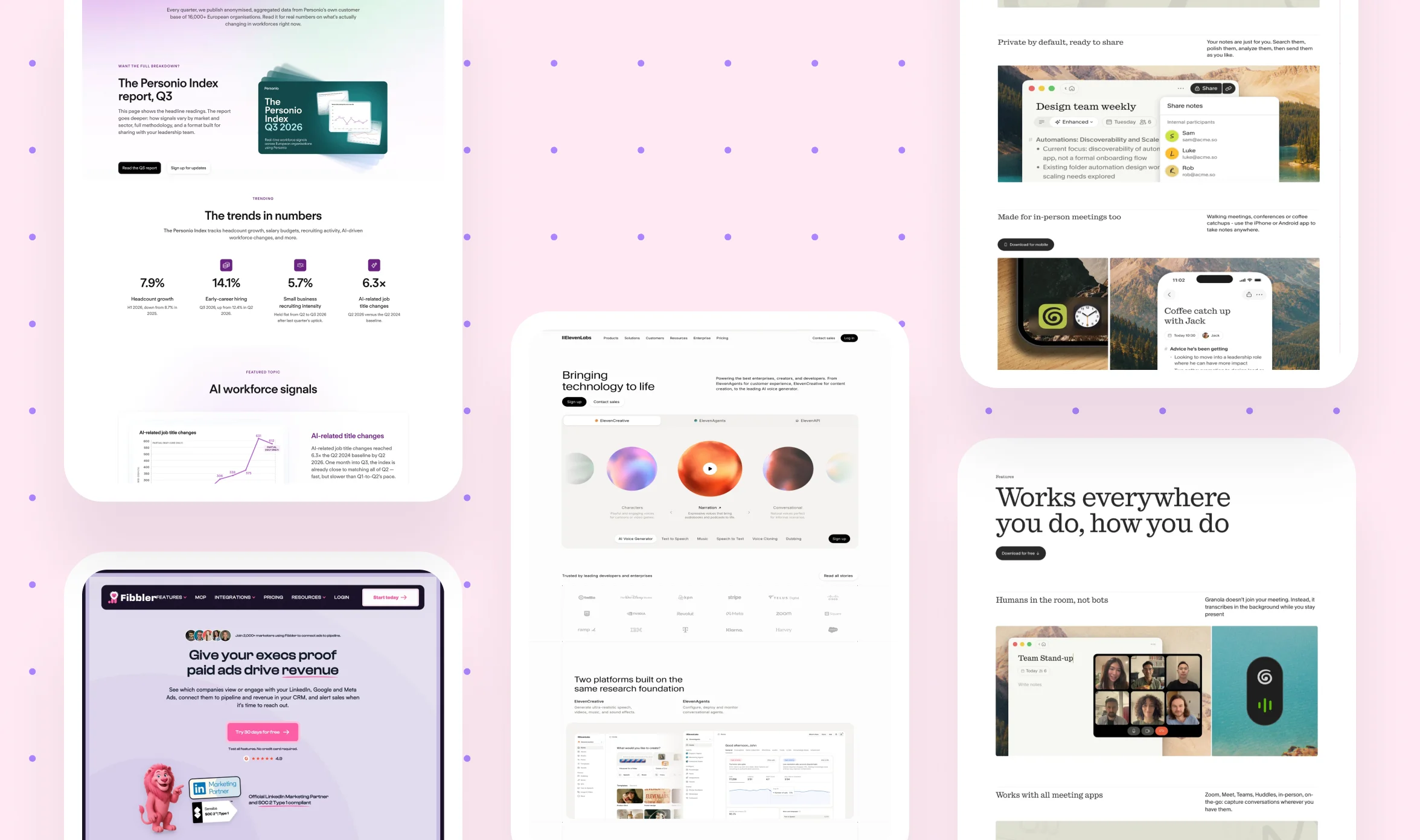
Which examples should you copy, and which should you only study? These four B2B SaaS pages each show one idea clearly, and every entry names what to copy and what to skip. They are marketing pages and not confirmed ad destinations, so borrow the idea and keep your own paid page to one offer and one action. Live pages change often, so open each site to see its current version.
Fibbler
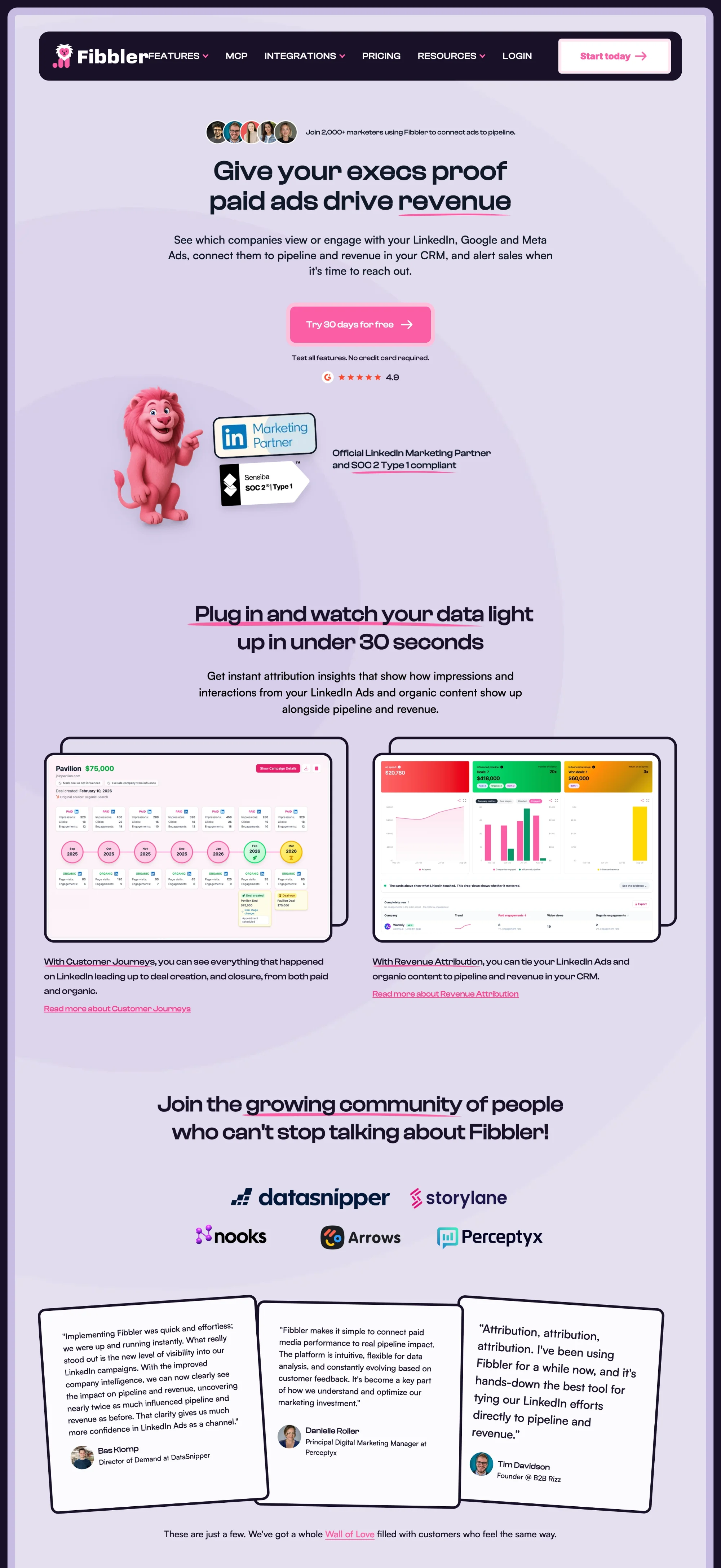
What to copy:
- A headline that states the outcome and the audience, “Give your execs proof paid ads drive revenue”
- A trial CTA with its reassurance right beside it, “Try 30 days for free” and “No credit card required”
- Proof near the hero, such as a count of marketers using it, an official LinkedIn partner badge, and a SOC 2 mark
What to avoid: the full menu in the header, since a paid page should keep a logo and one CTA.
Personio (the Personio Index report page)
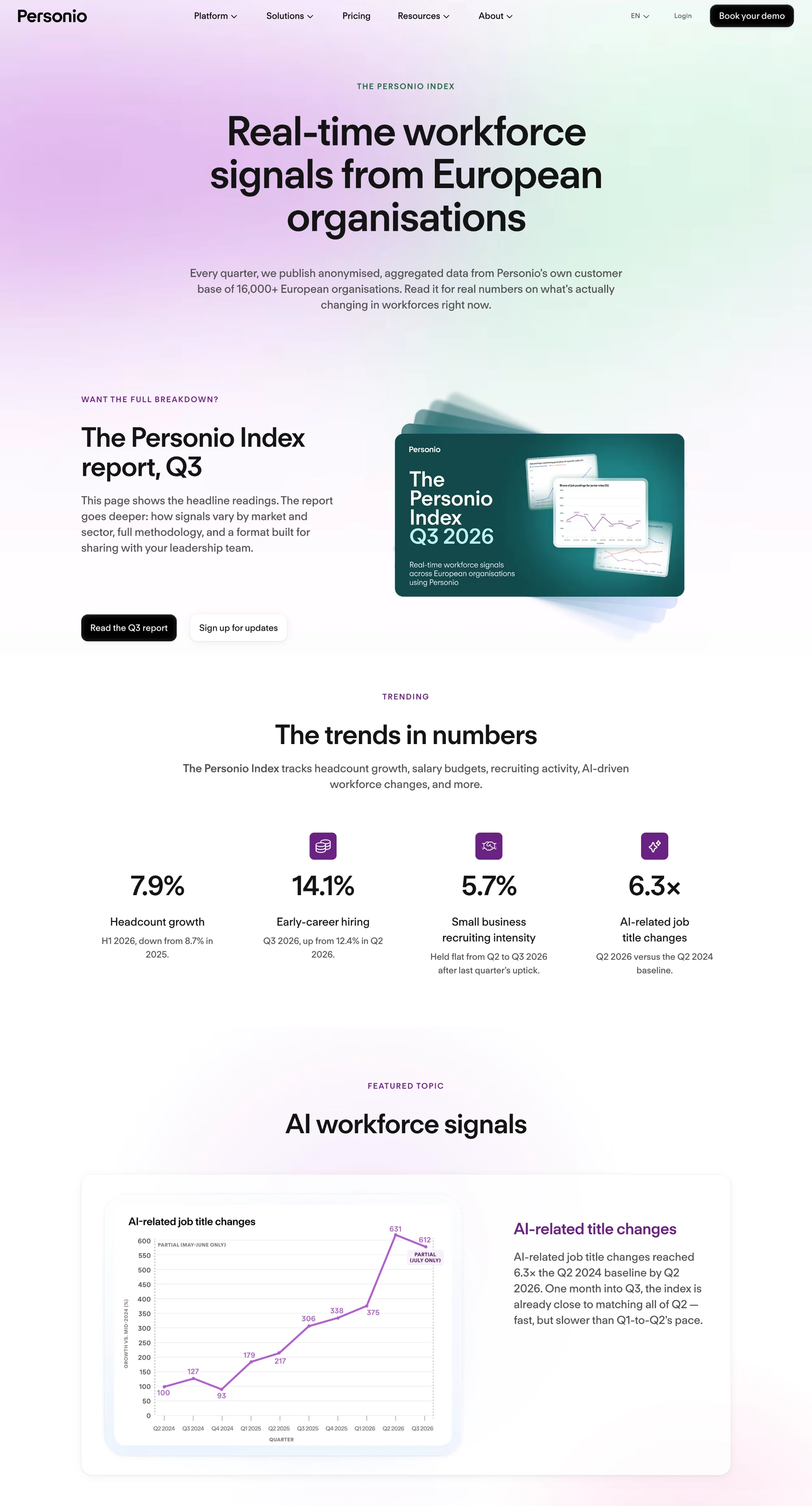
What to copy:
- A hero that promises specific value, “real-time workforce signals,” and backs it with the source in the subline, 16,000+ European organisations
- Big-number tiles that show the proof before the reader scrolls
- A Q&A block and an “About our data” section that answer doubts before they become objections
What to avoid: a chat widget that offers “Request a demo” and “Contact Sales” next to the report CTA, because it splits the visitor’s next step.
Granola
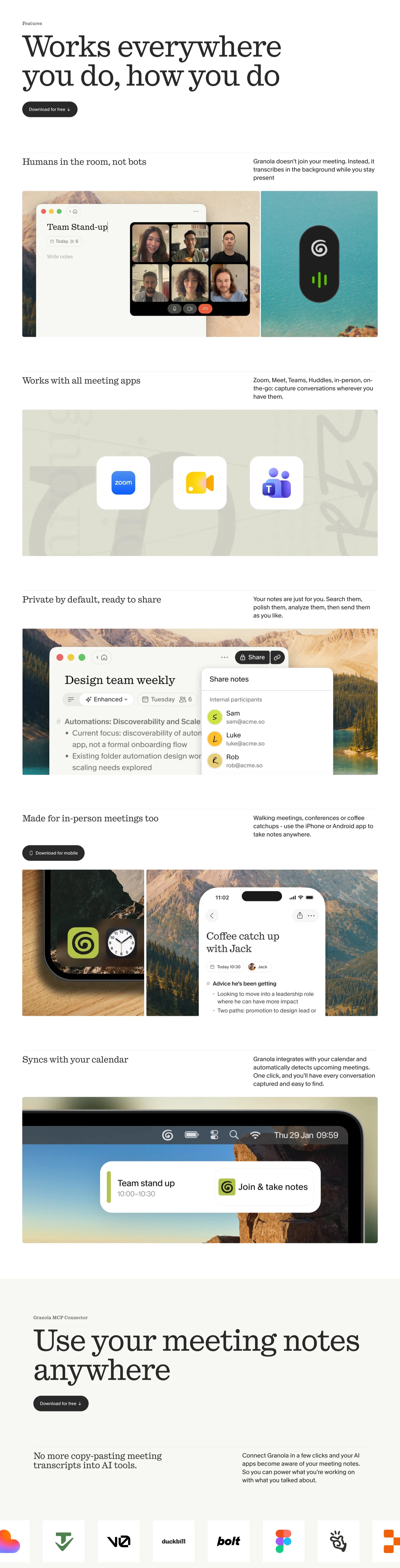
What to copy:
- A plain-language value line with a differentiator in the subhead, “The AI notepad for back-to-back meetings” and “Without a meeting bot”
- One primary CTA, “Download for free,” repeated at the bottom of the page
- Product mockups arranged as before, during, and after a meeting, so the visitor sees the use case
What to avoid: a long scroll of feature sections, which suits browsing, while a paid visitor needs the proof and the CTA sooner.
ElevenLabs
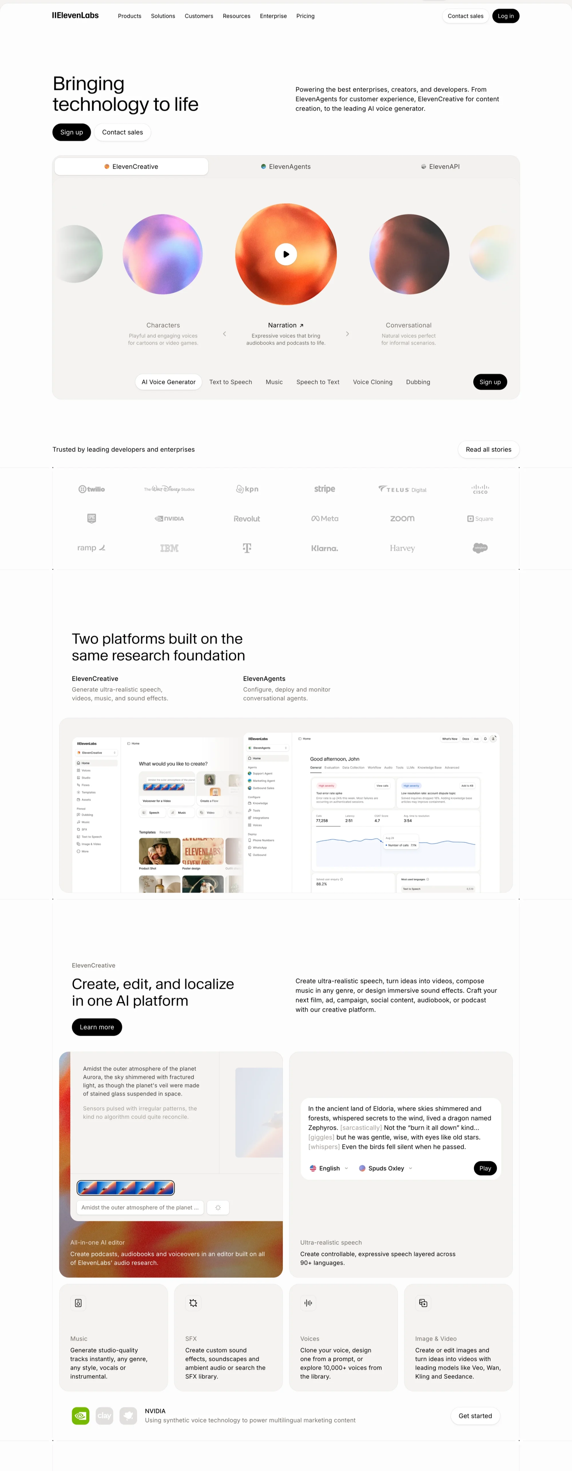
What to copy:
- Tabs that let visitors pick their use case above the fold, ElevenCreative, ElevenAgents, or ElevenAPI
- Two CTAs with different intents, “Sign up” for self-serve buyers and “Contact sales” for larger teams
- A strip of recognizable customer logos right below the hero
What to avoid: a broad headline, “Bringing technology to life,” and three products on one page, since a paid visitor cannot tell which one matches the ad they clicked.
If you want more inspiration after these, these places collect real pages.
- Dribbble and Behance: design showcases that are useful for layout ideas but not for conversion data.
- Landing.so: an AI-powered template library.
- HubSpot and Unbounce: round-ups of live PPC landing page examples with commentary.
What is a good PPC landing page conversion rate?
What conversion rate should you aim for? The honest answer depends on the offer, the traffic source, and the visitor’s intent, and one benchmark publisher notes that a rate only means something once you know the page goal, the traffic source, and the visitor’s intent. The reported figures below come from secondary sources, so treat them as planning ranges.
The median landing page conversion rate across industries is 6.6%, based on Unbounce’s Q4 2024 analysis of about 41,000 pages. The SaaS and technology median in the same data is lower, at 3.8%. SaaS Hero reports that demo-request pages typically convert between 1.5% and 4%, while self-serve free-trial pages reach an 8% median. Platform figures differ again, because Google Ads reports its own conversion rate, which is not identical to a landing page’s rate.
The numbers differ because the median and the average are different measures, industries have different buying cycles, and a free trial is easier to say yes to than a sales call. Compare your page with a benchmark for the same offer and traffic source, and not with one blended number.
Unbounce’s own case examples show how wide the spread can be, and they are vendor-selected, so read them as illustrations. A home improvement service booking appointments reached a 10.54% conversion rate, a software company’s demo-or-blog-click page reached 2.55%, and a real estate page for a large purchase reached 0.31%. A bigger commitment usually means a lower rate, which is why you should compare pages only with others that ask for the same thing.
Don’t count your leads before they close
A high conversion rate can hide a weak page. One practitioner in the r/PPC thread said their conversion rate became a vanity metric once they judged pages by closed sales, and reported that fewer conversions produced much better returns. Those figures are self-reported and come from one niche, so we won’t quote them, but the lesson applies to B2B SaaS. A page that books fewer demos with the right buyers can beat one that fills the calendar with people who never buy, so track lead quality as well as lead volume.
How a PPC landing page impacts paid campaign results
Why does the page carry more weight than the ad once the click is paid for? The money is already spent, and the page decides whether that click becomes a lead, which is the role of landing page quality in PPC success. These are the benefits of a dedicated PPC landing page.
- Relevance: the page covers one topic, so it can match one ad promise instead of four.
- Focus: visitors see one message and one action, which makes the next step easy to choose.
- Easier testing: you can test headlines and forms without redesigning the homepage, which often needs sign-off from several teams.
- Cleaner data: paid visitors land on their own page, so their behavior is not mixed with other channels.
Sending paid clicks to your homepage is like paying for a taxi to your office and dropping the passenger in a lobby with twelve elevators. The visitor came for one thing and now has to search for it, and many will not bother.
Quality Score and landing page experience
Quality Score (Qualitätsfaktor in German) is the number most advertisers connect to their landing pages. Google calculates it from three components, which are expected click-through rate, ad relevance, and landing page experience, and the last one measures how relevant and useful your page is to people who click your ad. If a component is rated Average or Below average, Google says that may point to an opportunity to improve.
Many guides say a better page directly lowers your cost per click, but Google describes it a little differently. Google calls Quality Score a diagnostic tool and says it is not an input in the ad auction, so treat it as a health check on your page and not as a lever. Page quality still counts, because Google lists ad and landing page quality among the factors behind Ad Rank, which decides where and whether your ad shows.
When you don’t need a dedicated ppc landing page
Does every campaign need a new page?
No, and knowing when to skip it saves you design time. Your existing page may already do the job if it matches the ad, offers one clear action, and loads quickly on a phone. A new page is worth building when the current one fails those three checks, and the cost is lower than the clicks it wastes. There is one more reason the page deserves attention in 2026, because Google may now choose which page a click reaches.
Can Google choose your PPC landing page? How AI Max and Final URL expansion work
What happens when the page does not match the search?
Imagine a visitor who searches “Webflow agency for SaaS companies,” clicks your ad, and lands on a page titled “Smart solutions for modern teams.” The visitor cannot tell whether they are in the right place, so they go back to the results and click the next ad.
That gap is what message match means, which is how well your ad copy (Anzeigentext in German) and your page answer the search phrase. Each ad group (Anzeigengruppe) should point to a page that keeps the promise made in its ads.
Here is what changed in 2026. AI Max is now the default when someone creates a new Google Search campaign. Turning it on also turns on text customization and Final URL expansion for the campaign, and you can switch each off in the settings. Final URL expansion sends traffic to the page on your domain that Google predicts will perform best, limited to pages that are relevant to the query and themed to your ad group.
That does not make dedicated pages obsolete. It makes each page’s job clearer, because any URL Google might choose needs one offer and a headline that keeps the ad’s promise. This table shows what you control and what to do about each change.
Google’s AI Max help page documents each of these behaviors, including the {lpurl} tracking issue and the “Selected by” column in the landing pages report. And let’s face it, most teams set an ad up once and never check where Google sends the clicks. Google reports that advertisers using the full AI Max suite see an average of 7% more conversions than search term matching alone, but that figure is Google’s internal data, so test it on your own account. Microsoft Advertising has launched its own AI Max, with Final URL expansion and a search term landing page report. AI Max applies to search campaigns, so your LinkedIn and Meta ads still go to the URL you choose.
What are the common PPC landing page mistakes, and how to fix them
The costliest mistake happens before the page exists, and it is choosing where the click goes. Sending paid traffic to the homepage is the most common version, and the table below covers it and nine others, each with its fix.
PPC landing page templates, generators, and AI
Can you use a template, a generator, or ChatGPT to build the page? Yes, as a starting point, and builders such as Unbounce, Leadpages, Landingi, and Swipe Pages now include templates and AI generators, which explains why “template” and “generator” show up in search suggestions. You might be thinking a template or an AI tool is all you need, since they save so much time. They save drafting time, but they cannot know your buyer’s words, your proof, or your offer, and those are the parts that make a page convert.
AI will happily write a headline that fits every SaaS company, which is exactly the problem. This table shows where each approach helps.
How to build your PPC landing page in Webflow
What changes when the design leaves Figma and goes live? A page that looks right in a design file can still stumble in a browser, because speed, forms, and tracking only show up there. Tools like Webflow and Framer let marketing teams edit a live page without a development ticket, so a headline test does not wait for a sprint. These checks keep the build reliable.
- One page per offer: reuse a layout so you can launch a new ad group’s page quickly.
- Design handoff: keep type sizes, spacing, and hierarchy consistent between Figma and the build.
- Media and speed: compress images and video, and test load time on mobile.
- Form and tracking: connect the form to your CRM, fire your conversion event, and capture the campaign source with each lead.
- Staging review: check the page on a staging version, including phones, before it goes live.
- After launch: re-test the tracking, because a broken event can hide a working page.
This is where a team that designs and builds together helps. magier’s team includes designers and expert Webflow developers under one subscription, with a dedicated project manager and a 48-hour turnaround per task. We also produced 100+ ad creatives a month for SaaS company Valuecase, and when the same team makes the ads and the page, the headlines and visuals stay in sync. Check out magier’s one-time project service if you need a single page built without a subscription.
PPC landing page pre-launch checklist
Does your page pass the basics before you spend a euro on clicks? Run this table once before launch and again after any big change.
Final thoughts
A strong PPC landing page comes from a clear match between the ad and the page, proof that answers real doubts, a short form, and tracking that shows which leads become customers. In 2026, AI Max adds one more step, which is checking that every page Google might choose keeps the ad’s promise. Execution still takes work, because the message, the design, the build, and the measurement all need attention.
You might be thinking that handing a paid page to an outside team is expensive, especially when you are comparing a PPC landing page design agency with building it in-house. magier’s Webflow service starts from €890 per month for a fixed fee, design starts from €2,750 per month, and you can cancel or pause anytime. See how magier covers both design and Webflow.
Run the pre-launch checklist on your current page, and start with the part that fails first. If you would like a second pair of eyes, book a free demo with magier.
FAQ
Aim for one page per distinct offer or ad group theme. With AI Max, Google can send traffic to other pages on your domain that fit the ad group, so keep each page focused and use URL exclusions for pages that should not get paid clicks.
Define one goal and offer, match the page to the ad, write a hero, add proof, keep the form short, design for mobile, and set up tracking. Then test one change at a time. The step-by-step section above covers each one.
Yes, you can send ads to any page, including your homepage. Dedicated pages usually give a better match between the ad and the offer, and they make testing easier. A strong existing page that matches the ad can still work.
There is no single best design, because the right layout depends on the offer and the traffic source. A single column with a clear hierarchy, a hero that repeats the ad, and one CTA is a safe starting point. Test it against your own audience.
A good page matches the ad, makes one offer, and gives the visitor one clear next step. It also shows relevant proof, keeps the form short, loads quickly on mobile, and tracks conversions properly. Each part removes a reason to leave.
A homepage introduces the whole company to visitors with many intents, while a PPC landing page serves one paid click with one offer. The landing page repeats the ad’s promise and offers one action. A homepage usually has a full menu and several CTAs.
Track conversion events in GA4 and your ad platform, tag ads with UTM parameters, and send the campaign source into your CRM. Use a heatmap tool to see where visitors click or stop, and judge pages by qualified leads. Review the Google Ads landing pages report if you use AI Max.
AI can draft copy, suggest structure, and produce test variants quickly. A person still needs to choose the offer, supply real proof, check every claim, and set up tracking. Treat AI output as a first draft.
It depends on how much the visitor already knows. A search visitor who typed your exact solution may need only a hero, proof, and a form, while colder traffic from LinkedIn or Meta usually needs more explanation. Match the length to the visitor’s readiness.
Remove the main site menu and keep the logo and one CTA, so nothing pulls visitors away. Google’s guidance emphasizes relevant content, transparency, and ease of use, and clear contact and privacy links support that. Test the result on your own traffic.
.avif)