.avif)
How to Use the Claude Code Frontend-Design Plugin: A Non-Designer's Guide
Claude Code might be the most useful thing to happen to founders building their own sites in years. But… it's also a big part of why half the internet's new landing pages look identical.
Every week, someone posts about shipping a full site in an afternoon using Claude Code (yes, we’re very active on LinkedIn!). Every week, a few more of those sites quietly join the pile of interchangeable, purple-tinted pages running Inter at 400 weight, each one able to describe a CRM, a dental practice, or a crypto project with equal ease. Developers call this AI slop, and once you can see it, you can't stop seeing it. Anthropic actually built a fix for it: an official plugin called frontend-design.
A 2026 web design industry report found that 93% of designers now use AI tools in their workflow, yet a separate Figma survey found only 40% feel AI actually improves the quality of their work. That gap between adoption and satisfaction is the whole story of this article.
The tool is everywhere, and the results are inconsistent. The plugin exists to close that gap for the specific case of frontend design.
This guide skips the developer jargon and walks through the plugin the way we'd explain it to a founder or marketing lead who has never opened a terminal before. Here's what we cover:
- What the frontend-design plugin actually is
- Why AI-generated websites tend to look the same
- How to install the plugin step by step
- What's actually inside the plugin's instructions
- How to prompt Claude so your site doesn't default to the AI average
- Copy-paste prompt templates for landing pages, portfolios, and marketing sites
- How to set up your project so Claude remembers your brand between sessions
- A skill-stacking workflow and an iteration process for getting output you'd actually ship
- Platform-specific notes for Webflow, WordPress, and Shopify
- An honest framework for deciding when the plugin is enough, and when you need a designer
{{freebie}}

What is the Claude Code frontend-design plugin?
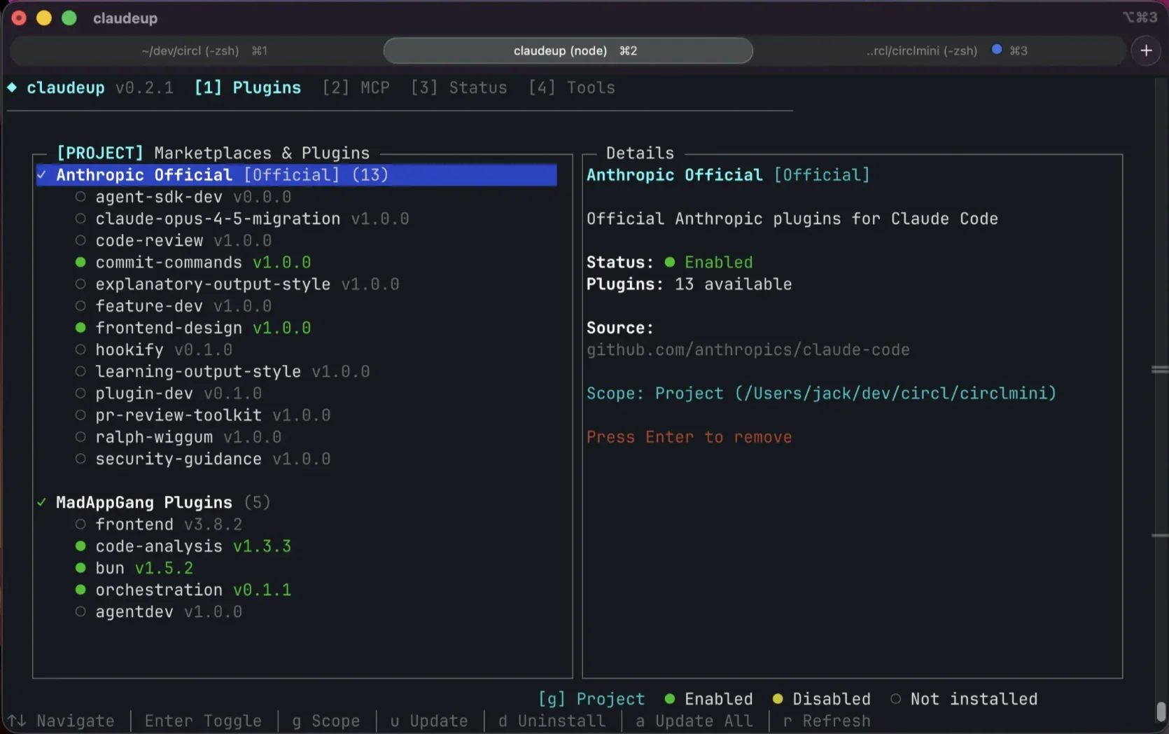
Claude Code is Anthropic's AI coding tool. You run it from your computer's terminal, describe what you want in conversational language, and it writes, edits, and runs code on your behalf. It is not a chatbot that hands you a code snippet to copy. It works directly inside your project, reads your existing files, and makes changes you can review before anything ships.
The frontend-design plugin is a smaller piece that sits on top of that. It is a single file, called SKILL.md, that is roughly 4.5KB and about 400 tokens of instructions. That file changes how Claude approaches any design task. Instead of jumping straight to code, this file helps Claude first commit to a design direction, purpose, tone, and a point of differentiation, and only writes CSS and markup once that direction is set.
Now that we know how this plugin works, it is equally helpful to be clear about what this plugin is not. It is not a separate app, a visual editor, or a fine-tuned model with better taste. It is a set of written instructions that steer an existing model toward more deliberate choices. We should remember this difference, because it explains both what the plugin does well and where it runs into limits later in this guide.
The plugin has become the most-installed plugin in Claude Code's official marketplace, with more than 277,000 installs by mid-2026. This massive adoption tells us two things: the AI slop problem is real enough that hundreds of thousands of people went looking for a fix, and a 400-token instruction file was enough to meaningfully move the needle.
{{cta}}
Why AI-generated websites all look the same
Before you install anything, it helps to understand why this problem exists in the first place.
AI language models generate text and code by predicting the most statistically likely next piece of content, based on everything they were trained on. For frontend code, that training data is dominated by the design conventions that were everywhere between 2020 and 2022, largely from Tailwind UI, Dribbble, and early Stripe and Vercel style sites.
So when you ask Claude to "build a landing page" with no further direction, it reaches for the average of everything it has seen. Developers have a name for this specific failure mode: distributional convergence, meaning the model settles on the statistical middle of its training data instead of making a real choice. That average has a recognizable look, built from Inter or another system font, a purple-to-blue gradient near the hero, and three feature cards with identical rounded corners.
The headline usually reads generic enough to describe a CRM, a dental practice, or a crypto project with the same prominence. This vagueness is the biggest indicator of the AI slop.
Tailwind's creator, Adam Wathan, once posted a self-deprecating tweet apologizing for picking "bg-indigo-500" as Tailwind UI's default accent color five years ago. That one default, repeated across a million tutorials and templates, became the signature color of the entire AI-generated internet. It's a small, almost funny example of how one choice made by one person can quietly become everyone's design by accident.
The reason this matters for your business is simple. According to Hostinger's 2026 web design report, design shapes 94% of a visitor's first impression of your company, and poor design is directly responsible for driving away 38% of visitors before they read a word. If your site carries the visual fingerprint of AI slop, a visitor who has seen a dozen sites that look identical will register yours as one more, not as something worth trusting with their email address or their card details.
Here's the AI slop fingerprint, so you know it when you see it:
- The same font on every AI-generated site, usually Inter, Roboto, or a plain system font
- A purple or indigo gradient on a white or light background
- Headlines vague enough to belong to almost any company ("Build the future of work")
- Three or four identical cards with uniform border radius and matching shadows
- Stock-feeling illustrations or generic gradient blobs used as decoration
- Micro-interactions that feel scattered rather than intentional, or no motion at all

How to install the frontend-design plugin (step by step)
This is the part most guides rush through, so let's slow down. If you have never opened a terminal in your life, start here.
Prerequisites you need first
Before you touch the plugin, you need three things in place.
- A Claude subscription that includes Claude Code: This means Pro, Team, or Enterprise. Claude Code is not available on the free tier.
- Node.js version 18 or higher installed on your computer: Node.js is a program that lets your computer run JavaScript tools outside a browser, and Claude Code needs it to work. If you're not sure whether you have it, open your terminal (on Mac, search for "Terminal" in Spotlight; on Windows, search for "Command Prompt" or "PowerShell") and type “node --version”. If a version number appears, you're set. If you get an error, download Node.js from nodejs.org and install it before continuing.
- Claude Code installed globally: Once Node.js is confirmed, run this command in your terminal: “npm install -g @anthropic-ai/claude-code”
- Then verify it worked with: “claude --version”
If a version number prints back, you're ready to install the plugin itself, so let's move on to that.
Method 1: Install from the plugin marketplace (recommended)
This is the fastest and most reliable path for most people.
- Open your terminal and move to the folder where your project lives, or create a new folder for your site.
- Launch Claude Code by typing “claude” and pressing enter.
- Inside the Claude Code session, run this command: “/plugin install frontend-design@claude-plugins-official”
- Run “/reload-plugins” to make sure the plugin activates in your current session.
- Confirm it installed by typing “/plugin” and checking that frontend-design appears in the list.
That's the whole process. There's no configuration screen, no settings to tune, and no separate login. Once it's installed, the plugin loads automatically whenever Claude recognizes that you're asking for design work.
Method 2: Add the SKILL.md file manually
Some people prefer to keep the skill file directly inside their project folder, so it's version-controlled alongside their code and doesn't depend on the marketplace staying available. If that sounds like you, run this instead:
“mkdir -p .claude/skills/frontend-design
curl -o .claude/skills/frontend-design/SKILL.md \
https://raw.githubusercontent.com/anthropics/claude-code/main/plugins/frontend-design/skills/frontend-design/SKILL.md”
The advantage here is portability. Because the file is plain markdown, you can copy the exact same file into a Cursor project's “.cursor/rules/ folder”, into an “AGENTS.md” file for Codex, or into GitHub Copilot's instructions file, and each of those tools will read and apply the same design guidance.
The Claude Desktop option: if you'd rather skip the terminal entirely
If the terminal still feels intimidating even after the steps above, Claude Desktop gives you a visual, chat-style way into the same underlying tool. You describe what you want in a normal conversation window, see a live preview, and let the app handle the technical execution behind the scenes. The plugin works the same way inside Desktop as it does in the terminal, since it's the same skill file being loaded either way.
The terminal version gives you more direct control over your project's files and structure, and it's worth learning eventually if you plan to build more than one page. But Claude Desktop is a completely reasonable place to start, and it removes the single biggest barrier that keeps non-technical founders from trying this at all.
How the plugin actually works (what's inside the SKILL.md)
It helps to know what that 400-token file is actually telling Claude to do, because understanding the mechanism makes you a better prompter later. The file reads like a design brief written to Claude, not to you. It tells Claude to approach every task "as the design lead at a small studio" whose client has already rejected anything that felt templated.
Before writing a single line of code, the file forces Claude to answer four questions:
- Purpose. What problem does this interface solve, and who uses it?
- Tone. Pick one clear direction from a list of extremes: brutally minimal, maximalist, retro-futuristic, organic, luxury, playful, editorial, brutalist, art deco, soft pastel, or industrial.
- Constraints. What are the technical requirements, like framework, performance, and accessibility?
- Differentiation. What's the one thing about this design someone will actually remember?
Once that direction is set, the file governs five specific dimensions of the output.
The file also carries an explicit forbidden list that includes Inter, Roboto, Arial, and other system fonts, along with purple-to-blue gradients on white backgrounds and cookie-cutter card layouts. It even calls out Space Grotesk by name, because once you tell Claude to avoid Inter, it tends to converge on Space Grotesk instead across nearly every generation. Whoever wrote the skill clearly noticed that specific habit and wrote a fix directly into the file.
This is the mechanism that makes the plugin work. Left alone, Claude predicts the highest-probability next token, which is the design equivalent of the statistical average. By forcing a committed direction first, the plugin narrows that pull and gives you real variance in what comes out the other side.
How to prompt Claude for designs that don't look AI-generated
Installing the plugin raises your floor. Prompting well is what gets you the rest of the way, and this is where most guides stop being useful for people who aren't developers. Let's fix that.
Why detailed specs make your designs worse
Here's a finding that surprises most people the first time they hear it. Specifying exact hex codes, precise pixel measurements, and font sizes down to the decimal point produces worse output than a looser, more directional prompt. It sounds backward, but there's a clear reason behind it.
When you fill a prompt with rigid, pixel-level specifications, you've used up all the room Claude has to make its own creative choices. It follows your instructions exactly, adds nothing of its own, and the result is technically correct and visually flat. Total openness has the opposite problem: ask for "a fitness landing page" with no further guidance, and you get the statistical average, which is AI slop on a plate.
The sweet spot sits between those two extremes. Tell Claude what to think about, not exactly what to produce, and let it make the actual decisions inside that frame.
A prompt that produces slop:
“Build a hero section with a 1200px container, 80px padding, H1 at 64px Inter Bold, subhead at 18px Inter Regular, purple gradient background from #6366f1 to #8b5cf6, white CTA button with 8px border radius.”
This hands Claude every default it would have picked anyway and removes any room for it to surprise you with something better. It's a recipe for a page that's technically correct and forgettable within seconds.
A prompt that creates comparatively better output:
“Landing page for a fitness coaching app aimed at busy professionals who don't want to live at the gym.
Aesthetic direction: editorial magazine, not generic SaaS.
Pair a serif display font like Fraunces or Playfair with a clean geometric sans for body text. Dominant color: a single warm earth tone with one sharp accent.
One coordinated motion moment on page load, not scattered micro-interactions.
Avoid: Inter, purple gradients, generic three-card feature grids.”
This version gives Claude a purpose, a tone, a font category, a color family, and a motion philosophy, then trusts it to make the specific choices inside that frame. The difference in output quality between these two prompts is significant, and it costs you nothing extra to write the second one.
If you want an extra layer of polish on top of what the plugin generates, some developers pair Claude Code with 21st.dev, a library of pre-built, professionally designed React components you can reference directly in a prompt. It's optional, but it's a fast way to raise the ceiling on interactive elements like navigation bars and pricing tables.
The prompt framework that works, with templates you can copy
Anthropic's own prompting research, published in what it calls the Frontend Aesthetics Cookbook, boils down to three habits worth building. Guide specific design dimensions individually, reference design inspirations without being overly prescriptive, and explicitly name the defaults you want Claude to avoid.
Below are four templates built on that framework. Copy one, fill in the brackets, and use it as your starting prompt.
Template 1: SaaS landing page
“Landing page for [your product] aimed at [your specific audience, not "everyone"].
Goal: get visitors to [sign up for a trial / book a demo / join a waitlist].
Aesthetic direction: [pick one: calm and editorial / bold and high-contrast / warm and approachable / precise and technical].
Pair a distinctive display font with a clean body font. Commit to one dominant color with a single sharp accent.
Requirements: responsive, accessible, one coordinated motion moment on page load.
Avoid: Inter, Roboto, purple gradients, generic three-card layouts, vague headlines that could describe any company.”
Template 2: Portfolio or agency site
“Portfolio site for [your name or agency], showcasing [type of work: design, photography, consulting, etc.].
Aesthetic direction: [pick one: brutalist and raw / luxury and refined / playful and expressive / minimal and quiet].
The work itself should be the hero. Typography should feel like part of the brand, not a neutral container for the content.
Requirements: fast image loading, mobile-first, one signature visual moment that makes this site memorable.
Avoid: generic template layouts, stock photography, centered symmetrical grids on every page.”
Template 3: E-commerce homepage
“Homepage for an online store selling [your product category] to [your target customer].
Aesthetic direction: [pick one: editorial and aspirational / clean and minimal / warm and artisanal / bold and energetic].
Product photography should carry visual weight. Color palette should reflect the product's actual world, not a generic brand blue.
Requirements: clear path to product pages, visible trust signals (reviews, shipping info), mobile-first layout.
Avoid: generic "shop now" hero banners, purple gradients, templated feature grids.”
Template 4: Startup marketing site
"Marketing site for [your startup], explaining [what you do] to [your specific buyer, by role or industry].
Aesthetic direction: [pick one: developer-focused and precise / approachable and human / enterprise and trustworthy / bold and disruptive].
One clear differentiation point should be visually obvious within the first scroll.
Requirements: responsive, fast load, a hero that states the value proposition in one sentence a stranger would understand.
Avoid: Inter, Space Grotesk, generic startup gradients, three identical feature cards, headlines that could apply to any company in any industry.”
How to prompt for pages that convert, not just pages that look nice
The plugin is built to fix aesthetics. It has nothing to say about whether your landing page actually gets people to act, and that distinction matters, because a beautiful page with no clear next step still fails at its actual purpose.
Add a few conversion-specific instructions to any of the templates above. Ask for a hero section with exactly one clear call to action above the fold, not two competing buttons. Ask for a social proof section with specific numbers or names rather than a vague "trusted by companies worldwide." Ask for feature sections that build a case and lead somewhere, rather than a flat list of capabilities with no throughline. And ask for an objection-handling section near the bottom of the page, addressing the one thing your specific buyer is likely to hesitate over.
A simple way to think about visual hierarchy for conversion is that the eye should move from headline, to value proposition, to proof, to call to action, in that order, without competing for attention along the way. Good aesthetic design and good conversion design aren't automatically the same thing, and it's worth prompting for both on purpose.
Setting up your project for consistent results
A one-off prompt gets you one good page, if you're lucky. A project set up properly gets you a consistent brand across every page you build afterward, and this is the step most people skip.
What CLAUDE.md is and why you need one
CLAUDE.md is a file that Claude Code reads automatically at the start of every session. Think of it as the onboarding document you'd hand a new team member on their first day, except Claude reads it in full every single time and never forgets a line.
Without this file, every new session starts from zero. Claude has no memory of your brand's fonts, your color rules, or the patterns you've already told it to avoid, so you end up repeating yourself in every prompt. With a CLAUDE.md file in your project folder, that context loads automatically.
One practical warning worth passing on is to keep this file under 300 lines. Developers who packed in 500 or more lines found that Claude started quietly ignoring some of the rules. Short and specific beats long and thorough.
Here's a starting structure for a design-focused CLAUDE.md:
# Project: [Your Brand Name]
## Design rules
- Display font: [your chosen font]
- Body font: [your chosen font]
- Primary color: [hex code]
- Accent color: [hex code]
- Never use: Inter, Roboto, Arial, purple gradients
## Tone
[One or two sentences describing your brand's visual personality, e.g. "warm and editorial, never corporate or cold."]
## Forbidden patterns
- No symmetrical three-card feature grids
- No stock photography
- No generic SaaS-style hero sections
Adding a DESIGN.md for your brand tokens
If CLAUDE.md is the onboarding document, DESIGN.md is your actual design system in file form, covering your color palette, your typography roles, and your spacing scale, all defined once and reused everywhere. This is what turns "generate five versions and pick one" from a nice idea into something you can actually do, because changing your entire site's look becomes a matter of swapping this one file and re-running your prompts, rather than rebuilding from scratch.
A basic DESIGN.md should cover four things: a color palette described as four to six named hex values, typefaces for at least two roles, a spacing scale, and a short list of patterns you never want to see again. For typefaces specifically, aim for a characterful display face used sparingly, paired with a body face for everything else.
The skill-stacking workflow for better output
The frontend-design plugin gets most people 70 to 80% of the way to a design they'd actually ship. Closing the remaining gap usually means stacking a few more skills on top, in a specific order.
- frontend-design first: This sets the aesthetic direction before anything else happens. Everything downstream depends on this foundation being in place.
- baseline-ui second: This is a polish pass that catches spacing inconsistencies, alignment issues, and small visual details the first pass missed.
- fixing-accessibility third: This audits contrast ratios, aria labels, and keyboard navigation, catching issues that matter for real users and for compliance.
- fixing-motion-performance fourth: This cleans up any animation that's janky, too aggressive, or ignoring a visitor's reduced-motion settings.
- Superpowers, optionally, for bigger builds: If you're building more than a single page, this community plugin adds a planning-and-execution loop that breaks larger projects into manageable steps.
The iteration workflow, from first draft to something you'd actually ship
Accepting the first thing Claude generates is the single most common mistake people make with this plugin, and it's an easy one to fix. Plan on three to five passes for any page that matters. The first generation establishes a direction. Everything worth having happens in the passes after that.
- Generate your first version using one of the prompt templates above.
- Review it against the direction you asked for. Did it actually commit to the tone you named, or did it default back toward something generic?
- Name exactly what converged toward the average, and correct it specifically. Tell Claude directly: "you used Space Grotesk again, switch to a serif." Or: "the hero is perfectly symmetrical, break the grid." Vague feedback like "make it better" won't move the output; naming the specific default will.
- Run the polish chain from the skill-stacking section: baseline-ui, then fixing-accessibility, then fixing-motion-performance.
- Take a screenshot and compare it against your brand with a critical eye. Does it look like it was built for you specifically, or could it belong to any company in your category?
Developer testing shared across Claude Code forums suggests that two focused passes of this review-and-fix loop close about 95% of the gap between a first draft and a result worth shipping. If it looks intentional and distinct after two rounds, it's likely ready. If it could still belong to anyone, keep iterating rather than shipping it as-is.
Using the plugin with Webflow, WordPress, and Shopify
A website theme has two separate layers, and the plugin only helps with one of them. The aesthetic layer, meaning typography, color, layout, and motion, is exactly what the frontend-design skill is built for. The platform integration layer, meaning how that design translates into a specific platform's actual markup and systems, is a separate problem the skill doesn't solve on its own. Most of the frustration people report online comes from trying to solve both with a single prompt.
Webflow
Claude Code can generate clean, semantic HTML and Tailwind CSS using the plugin's design guidance, and that output translates well as a reference for rebuilding inside Webflow's visual builder. There's no direct connection between Claude Code and Webflow today, so the practical workflow is to generate the design in Claude Code first, then recreate the structure inside Webflow using that generated code as your blueprint for layout, spacing, and typography decisions.
WordPress
The design pass goes well here too, but the integration side needs more attention. Claude tends to default to wrapping everything in raw HTML blocks instead of using WordPress's native block editor components, which creates extra cleanup work later. Pairing the frontend-design skill with a WordPress-specific MCP connection produces more reliable block markup, though WordPress developer Jonathan Bossenger's April 2026 case study of rebuilding his personal site with this exact workflow still needed active human guidance to keep Claude from treating WordPress like a plain static host.
Shopify
Shopify shipped its own official AI Toolkit in April 2026, and it's free and open source. It connects your coding agent to live Admin and Storefront API documentation and validates any Liquid theme changes against Shopify's actual schema.
Stacking this toolkit with the frontend-design plugin gives you a complete workflow, with aesthetic direction from the plugin and correct, validated Liquid code from the toolkit. This combination handles section edits, color changes, and homepage tweaks well. For fully custom interactive sections, you'll still want a developer writing Liquid by hand.
Is the plugin enough, or do you need a designer?
This is the question that actually matters if you're running a business, so let's be direct about it rather than dancing around it. The honest answer depends entirely on what the page needs to do for you.
What the plugin is great at
The plugin gets you a defensible result fast for MVP landing pages, internal tools, side projects, and any marketing page where the brief is simply "make it look professional and ship it by Friday." It's also excellent for iterating quickly once you already have a design system in place, since generating five directions and picking the best one becomes cheap once your DESIGN.md exists.
What it can't do
It can't invent a brand identity from a blank page. It applies a design system well once one exists, but it doesn't originate one the way a human designer building your visual identity from scratch would. And let's be honest, most founders can't tell if an AI-generated design is actually good or just unfamiliar enough to seem good, which is exactly the kind of judgment call a design system can't make for you. The plugin also can't run real user research or reliably handle every responsive edge case across every device without a person checking the result.
The cost and time comparison
If your team is stretched thin and design keeps landing on whoever has five free minutes, that's usually the gap a subscription model like magier is built to close, with pre-qualified designers, a fixed monthly fee, and a 48-hour turnaround, without the overhead of managing a full-time hire or chasing down freelancers. If you'd rather see how that works in practice, our design and development services page walks through it.
Checklist: is your AI-generated design good enough to ship?
Run through this list with a critical eye before you publish anything.
- Does the site use a distinctive font, not Inter, Roboto, or a plain system font?
- Is there a clear visual hierarchy on every page, moving from headline to value proposition to proof to call to action?
- Does the color palette commit to one dominant color with a sharp accent, rather than spreading five colors evenly?
- Does the site look like it belongs specifically to your brand, or could it belong to any company in your category?
- Is there at least one intentional motion moment, such as a page-load animation or a considered hover effect?
- Are backgrounds textured or layered, rather than flat solid white or black?
- Does the mobile version feel like it was designed on purpose, rather than a desktop layout squeezed into a smaller screen?
- Can you name the single action you want a visitor to take on each page?
- Would a first-time visitor understand what your company does within five seconds of landing?
- Does the design pass a basic accessibility check, covering contrast ratios, alt text, and keyboard navigation?
"The fastest way to tell if a design is templated is to cover the logo and ask whether it could still belong to five other companies. If the answer is yes, it isn't done yet."

Final thoughts
A generic-looking site costs you trust before a visitor reads a single word, and the frontend-design plugin closes most of that gap for a fraction of what a from-scratch build usually costs. Getting results worth shipping still takes real prompting, a properly set up project, and a few honest rounds of iteration rather than one lucky first try.
None of this replaces a designer's judgment when your brand's visual identity is the actual product you're selling, and it's worth knowing that line before you find it the hard way. For everything else, the plugin gets founders and marketers a long way on their own.
If you're starting from zero, pick the prompt template closest to what you're building and run through the installation steps first. If you already have a site up and it just feels a little too familiar, start with the checklist above and work backward from there.
{{cta}}
FAQ
The plugin is the SKILL.md file that Claude loads automatically during design work. The Frontend Aesthetics Cookbook is Anthropic's separate prompting guide explaining the theory behind better design prompts. Use them together by installing the plugin, then applying the cookbook's prompting strategies in your own requests.
The plugin itself is free to install. You'll need a Claude Pro, Team, or Enterprise subscription to access Claude Code at all, starting around $20/month, but there's no additional charge for the plugin.
You don't need to be a developer, but you do need to be comfortable running a few commands in your computer's terminal. Claude Code handles the actual coding, and the plugin guides its design choices. If you can follow numbered steps and copy commands, you can use this.
Claude Code generates responsive code by default when you're working with frameworks like Tailwind CSS, and the plugin improves the design quality of that responsive output. That said, unusual screen sizes and complex mobile interactions often still need manual testing and a human pass to get right.
Use it for MVPs, prototypes, internal tools, and marketing pages on a tight deadline. Bring in a designer, or a design subscription, when the design itself is the product, such as agency sites, portfolios, or brand-led commerce where visual identity has a direct effect on revenue.
Most people need three to five passes for a page that matters. The first generation sets the direction, and each pass after that refines it. Two focused rounds of review and correction typically close most of the gap between a rough first draft and something worth shipping.
They're the same underlying content, packaged two different ways. Installing the plugin through the marketplace gets you automatic updates. Downloading the SKILL.md file manually gives you version control inside your own project, but you'll need to update it yourself when Anthropic revises it.
Yes, and it's one of the more effective techniques available. Give Claude a screenshot and ask it to analyze the typography, color palette, spacing, and component patterns, then build a new page using that same design language. Many people do this using reference sites like Stripe, Linear, or Vercel.
.avif)

.avif)

.avif)