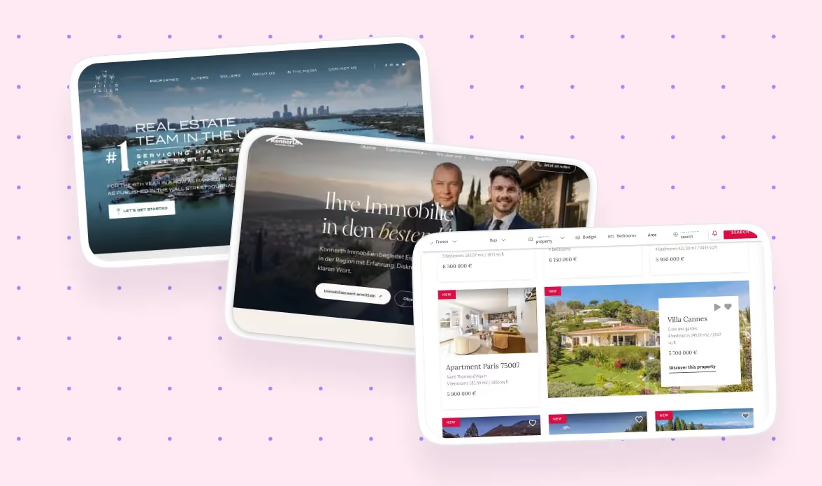
14 Best Real Estate Website Design Examples, Best Practices & Trends (2026)
It always feels nice and productive to scroll through Dribble and Mobin’s landing page galleries, only until you realize none of them are applicable to your case.
That’s the problem with real estate website designs. It is rare to find swipe files or collections that only consist of real estate design examples. Furthermore, the niche has multiple segments within. A luxury brokerage, a single agent building a personal brand, and a property search platform all need very different things from their website.
But does the design of a real estate website even matter? Yes, of course. Over 90% of prospective buyers and renters start their property search online before they ever speak to an agent, so the website is often the actual first impression, not the agent's handshake. A confusing homepage or a generic template loses that visitor's trust before they've seen a single listing.
The internet already has plenty of "best real estate websites" roundups, but most group examples loosely by size or luxury tier rather than by what you're actually building, and at least one widely-cited list turned out to include sites that never survived a basic check on whether the business behind them was real. We wrote this guide to fix both problems: sites grouped by business type, verified as real and currently live, with design lessons you can actually apply.
Here's what you'll find below:
- How we chose and verified these examples
- 14 real estate website design examples, grouped by business type
- What actually makes a real estate website design work in 2026
- Design elements and trends every real estate site should account for
- What makes a real estate website convert, not just look good
- How to choose between an agency, an in-house designer, and a freelancer for this specific job
{{freebie}}
How we came up with this list
We assessed every site against the following set of factors:
- Is the site live, real, and currently operating: We checked that each business actually exists today, not a rebranded or defunct site still floating around old "best of" lists.
- Does the design solve a real business problem for that specific type of real estate business: A luxury brokerage and a search platform are not judged by the same standard.
- Mobile experience and load speed: This is important since the majority of real estate searches now start on a phone.
- Navigation clarity and time to key action: This means how quickly a visitor can search, contact an agent, or request a valuation.
- Visual storytelling versus generic stock photography: We checked whether the pictures that they are using are actual ones of their properties.
- Trust signals appropriate to the business type: Like agent credentials, license numbers, or verified reviews.
- Whether the site would still hold up as a reference a year from now: This is to make sure that the site is not just a trend snapshot that will look dated by next spring.
Here's the quick-reference version before we go deep on each one:
Best luxury brokerage website designs
1. The Agency
.webp)
The Agency's website has become one of the most referenced luxury brokerage sites in the industry, and the current version leans further into that reputation than ever.
Most luxury brokerage sites try to communicate prestige by cramming in every award, every past sale, and every agent headshot above the fold. The Agency does the opposite. The homepage opens on a single, oversized image and a short headline, because the team understands that luxury communicates through restraint, not density.
The real strength of the site is how little chrome sits around each property. Navigation stays minimal throughout, so nothing competes with the cinematic photography carrying the page.
Typography leans oversized and editorial, closer to a fashion magazine spread than a typical brokerage template. The color palette stays tightly restrained, and imagery does almost all of the persuading.
Takeaway for designers: if your brand's value proposition is prestige, prove it through restraint and photography quality, not through the volume of information on the page.
2. Sotheby's International Realty
.webp)
Sotheby's International Realty carries one of the oldest, most recognized names in luxury real estate, and its website design matches that weight.
Most listing pages read like database entries: a photo carousel, a price, a set of specs. Sotheby's treats each listing like an editorial feature instead, with property copy written to tell a story about the home rather than just describe it.
That editorial approach extends to the information architecture. Listings are organized by lifestyle and region as much as by price point, which helps a browsing visitor discover properties they weren't specifically searching for.
Premium serif typography and generous whitespace do a lot of quiet work here. Nothing on the page feels rushed, which reinforces the brand's positioning at the top of the market.
Takeaway for designers: treat your best listings like editorial content, with real writing and pacing, not just a template with photos dropped in.
3. Christie's International Real Estate
.webp)
Christie's International Real Estate borrows more from art-world presentation than from typical real estate conventions, which fits its brand heritage.
Where many luxury sites over-animate their transitions to feel "premium," Christie's uses restrained animation and careful image sequencing instead, letting each property reveal itself at a deliberate pace rather than all at once.
The property detail pages are unusually rich, layering high-resolution imagery with architectural detail and provenance-style copy about each home's history and design.
Visually, the site favors a quiet, gallery-like palette that lets photography stay the focal point on every screen.
Takeaway for designers: if your brand already has cultural weight, let restraint and pacing do the work instead of leaning on flashy interaction design.
4. Carolwood Estates
.webp)
Carolwood Estates, based in Beverly Hills, uses an unusually specific color choice, a deep oxblood tone, to separate itself from the sea of black-and-white luxury brokerage sites.
Many luxury brokerages default to the same monochrome palette, assuming safety equals sophistication. Carolwood's oxblood accent breaks that pattern while still reading as expensive, proving a small, deliberate color choice can do more brand work than an entirely neutral palette.
The site pairs that color decision with tight, confident typography and large-format property photography, so the brand color shows up consistently without overwhelming the listings themselves.
The overall layout stays close to other luxury brokerage conventions, which makes the color choice feel intentional rather than like a departure from the category.
Takeaway for designers: one distinctive brand color, used consistently, can differentiate a luxury site more effectively than an entirely custom layout.
Best independent agent and personal brand website designs
5. SERHANT.
.webp)
SERHANT. is built entirely around Ryan Serhant's public persona, and the design commits to that fact rather than hedging toward a generic brokerage feel.
Most agent-led sites bury the founder behind a standard "meet the team" page. SERHANT. does the opposite, using video and media content as the primary way visitors experience the brand, since Serhant's personality is the actual product being sold alongside the listings.
Social proof appears constantly throughout the site, not just in a testimonials section, reinforcing the sense that this is a media brand as much as a brokerage.
The visual style stays bold and high-contrast, matching the confident, camera-ready tone of the founder's public presence.
Takeaway for designers: if your business is genuinely founder-led, build the site around that person's actual public presence instead of forcing them into a conventional "about us" box.
6. Ginger Martin + Co
.webp)
Ginger Martin + Co markets elite Napa Valley properties, and the site's subtlety is a deliberate contrast to the loud luxury conventions used elsewhere in the category.
Where many luxury agent sites reach for maximalist imagery and bold typography, Ginger Martin + Co uses subtle branding and generous whitespace instead, letting high-resolution photography of the properties and the region carry the emotional weight.
That restraint extends to navigation, which stays simple and gets out of the way quickly, since visitors are usually already familiar with the region and just want to see the properties.
The typography is quiet and refined, and the color palette pulls from the Napa landscape itself rather than a generic luxury color scheme.
Takeaway for designers: subtlety can be its own form of luxury positioning, especially when your properties or region already carry a strong reputation.
Best property search platform designs
7. Zillow
.webp)
Zillow remains the benchmark for property search UX, and the current version keeps refining an already dominant interaction model.
Most search-heavy platforms clutter their filters and results into a confusing wall of options. Zillow avoids this by reducing cognitive load at every step, surfacing the most relevant filters first and keeping the rest tucked behind a simple expand action.
The deeper strength is the map and list sync. Scrolling the list updates the map, and adjusting the map boundary updates the list, so a visitor never loses their sense of place while browsing.
Visually, the interface stays clean and utilitarian, since the content, meaning the listings themselves, is the actual draw, not decorative design.
Takeaway for designers: in a search-heavy product, every visual decision should reduce the number of steps between a visitor's intent and their result.

8. Redfin
.webp)
Redfin takes a more data-driven approach than Zillow, leaning into neighborhood insight as a core part of the experience.
Where many platforms treat a listing page as just photos and specs, Redfin surrounds each listing with decision-making content, like neighborhood scores, market trends, and comparable sales, placed directly beside the listing rather than buried in a separate page.
That placement is important since A visitor comparing two homes can evaluate both the property and its context without leaving the page they're already on.
The visual design stays clean and chart-friendly, since much of the value here comes from data visualization rather than lifestyle photography.
Takeaway for designers: if your product's edge is data, put that data next to the decision point, not in a separate report a visitor has to go looking for.
9. Compass
.webp)
Compass balances property discovery with brand credibility better than most platforms in this category.
Many brokerage-meets-platform sites make visitors choose between "browse listings" and "learn about us" as separate journeys. Compass's homepage answers buy, sell, and rent immediately, without forcing a visitor to figure out which part of the site they need first.
The map-driven search UI stays central to the experience, paired with crisp, modern typography that keeps the platform feeling more like a tech product than a traditional brokerage.
CTAs stay clear and consistent across the site, so the path from browsing to contacting an agent never feels ambiguous.
Takeaway for designers: when your business does more than one thing, resolve the ambiguity on the homepage instead of making the visitor guess which path applies to them.
Best new development and single-property website designs
10. Olympus
.webp)
Olympus markets a single residential development in Ōwairaka, Auckland, and builds its entire site around that one community rather than a generic template.
Single-development sites often reuse a brokerage template that wasn't built for one specific project. Olympus instead builds interactive floor plans and neighborhood guides directly into the experience, treating the development itself as the entire product.
That focus lets the site go deeper than a typical listing page would, walking a prospective buyer through unit layouts and the surrounding community in detail.
The visual tone stays warm and local, reinforcing a sense of place rather than a generic "luxury development" aesthetic.
Takeaway for designers: a single-property site earns more trust by going deep on that one project than by borrowing a general brokerage template.
Best global and European luxury real estate website designs
11. BARNES International Realty
.webp)
BARNES International Realty carries a distinctly Paris-inspired aesthetic that separates it from the more maximalist luxury brands elsewhere on this list.
Many international luxury brokerages lean on heavy animation to signal sophistication. BARNES achieves the same effect through refined branding and understated interactions instead, proving luxury doesn't require motion to feel premium.
The site organizes properties by region in a way that respects an international audience, without forcing every visitor through the same navigation path regardless of where they're searching.
Typography and color stay tightly controlled throughout, giving the whole site a coherent, European editorial feel.
Takeaway for designers: luxury without excessive animation can still feel premium, and it often ages better than a heavily animated site will.
12. Nest Seekers International
.webp)
Nest Seekers International markets to a genuinely global audience, and the site's photography does most of the heavy lifting.
Many international real estate sites default to a single-language, single-market experience and treat everything else as an afterthought. Nest Seekers instead builds a multilingual feel into the site's structure, alongside exceptional property photography that communicates lifestyle across language barriers.
That lifestyle-led approach extends to how properties are grouped, often by destination and experience rather than strictly by price or size.
Visually, the photography is doing work that copy alone couldn't do for an international audience, letting the imagery carry the emotional pitch.
Takeaway for designers: for an international audience, invest in photography and destination framing before you invest in translated copy.
13. Douglas Elliman
.webp)
Douglas Elliman operates across multiple states and reads more like a design magazine than a typical multi-market brokerage site.
Multi-market brokerages often feel dated because they're stretched across too many regional templates bolted together. Douglas Elliman avoids that by keeping a strong, consistent grid system across every market it serves, so the site feels unified rather than assembled from parts.
That consistency makes it easier to scale content across markets without the design falling apart region by region.
The visual language stays sophisticated without feeling stuck in an older era, thanks to premium photography and a restrained color and type system.
Takeaway for designers: a strong grid system is what lets a large, multi-market site scale without losing visual consistency.
14. Jills Zeder Group
.webp)
Jills Zeder Group is a top-ranked luxury team, and the site reflects that positioning through a tightly curated presentation rather than a large, generic team roster.
Large luxury teams often list every agent with equal visual weight, diluting the sense of who's actually leading the group. Jills Zeder Group instead keeps the presentation focused on the team's collective track record and top listings, rather than trying to give every individual agent equal billing.
That focus keeps the site feeling curated and confident, matching a team that has already established its position at the top of the market.
The visual execution stays clean and photography-led, consistent with the other luxury examples on this list.
Takeaway for designers: for a top-performing team, lead with collective track record and top listings rather than an exhaustive agent directory.

What actually makes a real estate website design work in 2026?
The 14 examples above all follow a few shared principles, even though they apply them differently by business type.
Mobile-first design
Over 62% of global web traffic now comes from mobile devices, so a real estate site designed for desktop first and shrunk down for mobile will lose visitors before they see a single listing. Designing mobile-first forces a useful discipline: you have to decide what content and actions actually earn screen space, rather than cramming everything in and hoping it collapses gracefully later. Zillow and Redfin both build search and filtering as single-column, thumb-friendly flows first, then scale up for desktop, not the other way around.
Real-life visual storytelling over stock photography
Every strong example above uses real properties, real agents, or real developments instead of generic stock imagery, because visitors can tell the difference even if they can't say how. Sotheby's International Realty and Christie's International Real Estate both treat photography as the actual product being sold, not decoration around a price tag. A stock photo of a smiling family in a kitchen signals template, while a real, well-lit shot of the actual property signals substance.
Minimal color and typography over maximalism
Luxury and corporate real estate brands increasingly build around a tiny palette, often just two or three colors, paired with disciplined typography instead of a busy, decorative system. Carolwood Estates leans on one distinctive color rather than five, and The Agency uses oversized, editorial type instead of ornamentation to do the same job. Restraint reads as confidence, while visual noise tends to read as effort.
Simplified, 2-3 click navigation
Every page on a real estate site should be reachable in two or three clicks. Deep, nested navigation, common on older brokerage sites still organized around internal departments or office locations, is where visitors quietly give up rather than complain. Compass solves this by answering "buy, sell, rent" directly on the homepage instead of hiding that decision inside a dropdown menu.
Role-based entry points for different visitor types
A real estate website often serves several distinct audiences at once, a buyer, a seller, and sometimes a corporate or investor client, and each one is looking for something different within the first few seconds. Rather than forcing every visitor down the same path, stronger sites offer a clear early fork, like separate buying and selling paths, or a dedicated investor section with different content entirely. Douglas Elliman and Compass both make that choice explicit near the top of the homepage instead of assuming every visitor wants the same journey.
Trust signals paired with lead capture
A testimonial or a license number sitting far from the contact form does less work than one placed right next to it, at the exact moment a visitor is deciding whether to reach out. This is a placement problem as much as a content problem, since the same trust signal, moved closer to the actual decision point, converts more visitors than one buried on a separate About page.
Interactive media used with consideration
Virtual tours, animated transitions, and video backgrounds all add real value when they help a visitor understand a property or a brand faster. They become a liability the moment they slow down page load or distract from the decision a visitor is actually trying to make. Christie's International Real Estate uses restrained animation deliberately, letting each property reveal itself at a controlled pace rather than throwing every interactive element at the visitor at once.
Content organized around what a visitor is searching for, not how the business is structured internally
Many underperforming real estate sites organize content by department, office, or agent roster, mirroring an org chart instead of a visitor's actual question. Stronger sites, particularly search-first platforms like Zillow and Redfin, organize around neighborhoods, price bands, and property types instead, since that's what a visitor is actually trying to answer when they land on the page.
Key real estate website design trends shaping 2026
Editorial typography
Fashion-inspired serif headlines paired with clean sans-serif body text are showing up across luxury brokerage sites, borrowing directly from magazine design rather than typical corporate templates. Sotheby's International Realty and The Agency both lean into this pairing, using oversized serif display type for headlines while keeping supporting copy simple and legible, which signals prestige without needing decorative flourishes elsewhere on the page.
Dark, premium themes
Black, charcoal, and warm neutral palettes now dominate luxury agency branding, replacing the brighter, more generic color schemes common a few years ago. Carolwood Estates' oxblood accent is one example of this shift, chosen specifically because a darker, more considered palette reads as expensive in a way a brighter one doesn't. The tradeoff is that dark themes demand more careful contrast work to stay accessible, which ties directly back to the compliance section later in this guide.
Oversized photography
Properties now occupy most of the viewport before any text appears at all, a shift from the smaller, more contained hero images common in earlier design eras. The Agency and Nest Seekers International both use this approach, since it lets property or lifestyle imagery carry the emotional weight before a visitor reads a single word of copy.
Minimal card layouts
Less shadow, more whitespace, and subtle borders have replaced the heavier, more decorative card styles common a few years ago, especially on listing grids and featured-property sections. This mirrors a broader shift across web design toward flatter, quieter interfaces, and it shows up clearly on platforms like Compass, where listing cards stay clean enough not to compete with the map and search interface around them.
3D and virtual tours
Listings with professional 3D virtual tours see a 130% higher transaction likelihood among 18-to-34-year-old buyers, making this less of a novelty feature and more of an expected one for that audience specifically. Tools like Matterport have become close to standard for higher-end listings, and platforms increasingly build the tour viewer directly into the listing page rather than linking out to a separate site.
AI-assisted personalization
Dynamic content based on a visitor's location, traffic source, or return-visit status is becoming standard on larger platforms, adjusting featured listings, headlines, or CTAs without the visitor noticing the underlying logic. Behind the scenes, this often relies on the same kind of AI data orchestration tools, like AirOps, that pull and organize property data across a site's content in the first place. The goal isn't novelty, it's showing a returning visitor something different than a first-time one, since they're at different points in their decision.
Smooth, purposeful motion over decorative animation
Where animation appears at all on the strongest 2026 sites, it guides attention rather than trying to impress, often built on tools like GSAP, the GreenSock Animation Platform, to keep scroll-based reveals and transitions smooth without hurting load times. Christie's International Real Estate is a good reference here, using motion sparingly enough that it never competes with the photography itself.
Design elements every real estate website needs in 2026
Across every business type, a handful of homepage sections show up again and again, each doing a specific job.
For luxury listing pages specifically, a few patterns separate premium execution from an average one:
- 80 to 90% image-first layouts
- Large property headlines
- Minimal UI chrome around each image
- Interactive galleries rather than static photo grids
- Floor plans available directly on the listing
- Neighborhood storytelling, not just an address
- The agent visible throughout the scroll, not just at the top
And for search-first platforms specifically:
- A sticky search bar that stays visible while scrolling
- Live map and list sync
- Progressive filters that reveal more options as needed
- Saved searches for returning visitors
- A mortgage calculator placed beside the listing, not on a separate page
- School and commute information integrated into the listing view
Understanding IDX and MLS integration
If you're building a real estate website with an actual property search, you'll run into two acronyms quickly. MLS stands for Multiple Listing Service, the database real estate agents use to share listing data with each other. IDX, or Internet Data Exchange, is the technology that pulls that MLS data onto a public-facing website so visitors can search real, current listings instead of a manually updated list.
Getting this integration wrong is one of the fastest ways to lose visitor trust, since outdated or broken listing data undermines everything else on the site. Most dedicated real estate platforms and several general-purpose builders now offer direct IDX integrations, though the depth and reliability of that integration varies significantly between providers.
"IDX integrations are usually where a Webflow build either holds up or falls apart. Get that connection solid before you spend another hour on the visual design."

What actually makes a real estate website convert?
A beautiful real estate website that doesn't convert is still a beautiful failure, so a few specific choices are more significant than overall aesthetics.
- Minimal lead capture forms: Restricting a contact form to name, email, and phone, rather than asking for a full profile upfront, meaningfully reduces abandonment.
- Valuation tools and mortgage calculators near the listing: Tools placed beside a property, rather than buried in a separate section of the site, get used more often because the visitor doesn't have to leave their current context.
- Localized copy: Mentioning specific neighborhoods, schools, and streets in a listing's copy targets long-tail local search intent, and it also signals real, specific knowledge rather than generic templated content.
- Trust signals placed at the point of decision: A testimonial or review score does more work sitting right next to a CTA than it does in a separate, disconnected section of the homepage.
- Accessibility and fair housing compliance: This isn't just a legal checkbox. Federal accessibility lawsuit filings rose 27% in 2025 to over 3,100 cases, and real estate carries additional fair housing obligations beyond general web accessibility standards. A site that fails basic contrast or keyboard navigation requirements is taking on real legal exposure, not just a minor UX gap.
How AI is changing real estate website design
AI is showing up in real estate website design in a few concrete ways rather than as a vague buzzword. Chatbots now handle a growing share of initial visitor questions, freeing up agents for higher-value conversations. Predictive recommendations surface listings based on a visitor's browsing behavior rather than requiring them to re-enter search criteria every visit. Dynamic personalization adjusts headlines, featured listings, or CTAs based on a visitor's location or whether they're a new or returning visitor.
None of this replaces the fundamentals covered earlier in this guide. AI features sit on top of a well-organized site; they don't fix a poorly organized one.
Common real estate website design mistakes to avoid
- Cramming every service onto the homepage: Trying to represent every department, listing type, and announcement at once, instead of organizing around what the visitor is actually searching for, is one of the fastest ways to lose someone in the first five seconds.
- Using generic templates with no differentiation: A template that looks identical to a dozen competitor sites does nothing to build the specific trust a real estate decision requires.
- Missing or broken IDX integration: Outdated or non-functional listing data undermines every other design decision on the site.
- Weak mobile experience: Given how much real estate search happens on a phone, a site that only really works on desktop is turning away the majority of its potential visitors.
- No clear lead capture path: A visitor who's ready to reach out and can't find an obvious way to do so simply leaves.
- Stock photography instead of real listings and agents: Visitors can tell the difference, and it undercuts the trust every other section is trying to build.
Are design awards a reliable quality signal for design services?
Several "best real estate websites" roundups reference Awwwards recognition as proof of quality, so it's worth knowing what that recognition actually costs and measures.
Submitting a site to Awwwards costs $65 per submission, or $165 a year for three submissions with directory access. To earn an Honorable Mention, a site needs a score of 6.5 or higher from the jury and a separate 6.5 or higher from PRO community users, scored across four weighted criteria: Design at 40%, Usability at 30%, Creativity at 20%, and Content at 10%.
None of that makes Awwwards recognition meaningless. It's a legitimate craft signal from an experienced jury. But it's a paid, gameable process, not an independent verdict on whether a business is trustworthy or whether the site actually converts visitors. Use award-winning sites for design inspiration, not as proof that a real estate business behind the site is worth trusting.
How to choose the right design approach for your real estate website
Real estate carries a few specific demands that shape which resourcing model actually makes sense: ongoing listing updates, IDX integration complexity, compliance requirements, and brand consistency across potentially many agents.
For most independent agents and small teams, a freelancer or a small agency project covers a one-time build well. For brokerages managing many agents, ongoing listings, and compliance requirements, a subscription-based design and Webflow partner, or an in-house hire once volume justifies it, tends to hold up better over time.
How magier can help with real estate design works
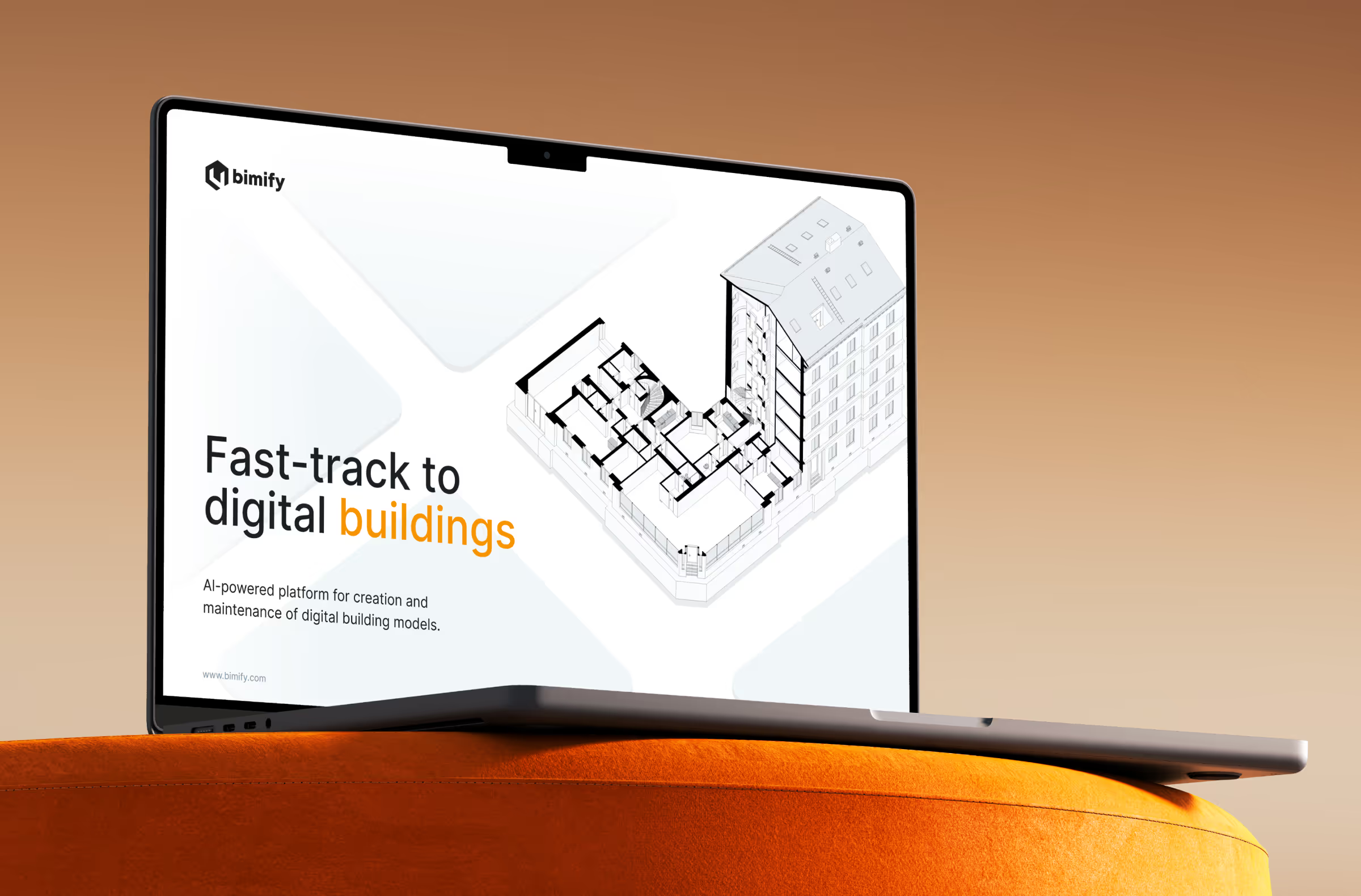
bimify creates and maintains digital building models using machine learning, helping real estate and construction teams digitize building data for renovations, energy planning, and ongoing management. Before working with magier, bimify was pitching investors with unbranded Google Slides decks and had no real design foundation. magier built bimify a bold, tech-forward brand identity suited to standing out in a crowded proptech category, then rebuilt their pitch decks and internal materials with custom illustrations and a clearer narrative.
Worth being precise here: this work covered brand identity and investor materials, not a finished website, which is exactly why bimify isn't one of the 14 ranked examples above. It's included as the honest version of magier's real estate-adjacent experience, specific about what was and wasn't delivered, rather than dressed up as something it isn't.
Final thoughts
The right real estate website example depends entirely on what you're actually building, and a verified, well-organized reference beats a flat, ungrouped list every time.
None of this happens without real design and development effort, especially once IDX integration, compliance, and ongoing listing updates enter the picture. That's exactly what magier's combined design and Webflow subscription is built for. See how magier covers both design and Webflow, or see how magier handles Webflow development specifically if IDX and CMS work is your main concern.
If you want to talk through your specific project, you can book a free demo.
Find your business type in the sections above and get started.
{{cta}}
FAQ
They can be a useful source of craft inspiration, since the jury and scoring process reward genuine design quality. Just remember it's a paid submission process, not proof that the business behind the site is trustworthy or that the site converts visitors well.
Costs vary widely based on scope, from a few thousand dollars for a freelancer-built single-agent site to significantly more for a brokerage-wide platform with IDX integration and ongoing design support. The comparison table above walks through how the resourcing model itself affects cost.
Zillow is an excellent reference for search UX specifically: filters, map and list sync, and reducing cognitive load. It's a platform built for property discovery at scale, not a brand-building brokerage site, so borrow its search patterns without expecting to copy its overall brand approach.
Given that this is itself a "best examples" list, it's worth asking the same question of any list like this one, including this one.
A review of one widely-cited "10 best brokerage websites" list found that 4 of the 10 sites, 40%, failed a basic check on whether the business behind them was real and currently operating. Some "best-of" lists are also published by design agencies ranking their own client work, without disclosing that conflict of interest.
For this guide, we checked that each site listed above is live today, represents a real, currently operating business, and reflects the site's current design rather than an outdated screenshot still circulating from an older version. That's a lower bar than an independent, peer-reviewed study, since no such study currently links real estate website design directly to business outcomes, but it's more than most competing lists disclose doing.
Any site with a real, current property search needs some form of IDX integration to pull live MLS data. Sites without an active search feature, like a single-property or pre-construction site, may not need it.
At minimum, a real estate website needs a clear property search, featured listings, agent or team trust signals, an easy lead capture path, and a mobile experience that works as well as the desktop version.
There isn't one single best design, since the right approach depends on your business type. Luxury brokerages like The Agency and Sotheby's International Realty succeed through restraint and editorial storytelling, while platforms like Zillow succeed through search UX and reduced cognitive load.
.avif)



%20(1).avif)