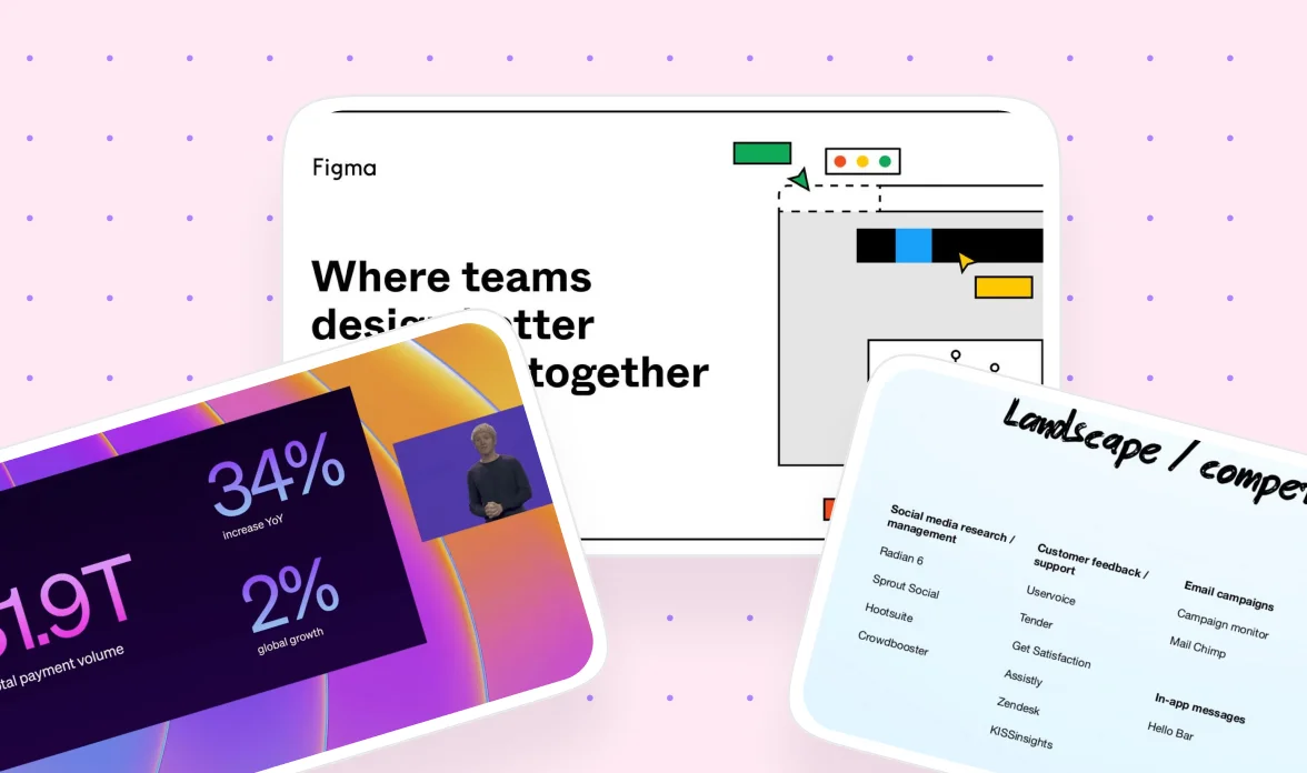
Presentation Design: How to Create Decks That Hold Attention (With Real Examples)
It's the night before a client pitch, and you're staring at a slide with a headline, a subheadline, two charts, a product screenshot, and a full paragraph of text, all fighting for attention on one slide. You know it's too cluttered, but you're not sure what to eliminate or how to make them co-exist.
If that sounds familiar, you're not alone.
Presentation design is the practice of structuring and visually organizing information so an audience actually understands and remembers it, and it is a real, teachable skill rather than a matter of taste. Learning how to design a presentation well means treating the deck as its own medium, not a slide-shaped copy of a document. One of the clearest proof points for this comes from Intercom, whose seed round deck used only about 250 words across 8 slides and became one of the most studied pitch decks in B2B SaaS. But not everyone will know that and it's exactly what this presentation design tutorial breaks down.
We created this blog for designers, marketers, and startup founders who design decks by themselves, so that the next time they tackle a project like this, they know how to make it successful.
Here's what we cover:
- What presentation design actually means
- Importance of good deck design
- Different platforms and tools for presentation design
- Presentation design best practices
- How presentation design changes across five different audiences, from investors to academics
- General rules, common mistakes, and when it makes sense to bring in expert help
- A dedicated section for startups, SaaS companies, and B2B teams
- Example from brands like Intercom, Figma, Stripe, Linear, Shopify, GitLab, and Dropbox
{{freebie}}
What is presentation design?
Presentation design is the discipline of turning an idea, a pitch, or a set of findings into a sequence of slides that an audience can follow without effort. It covers narrative structure, visual hierarchy, typography, color, and layout, and it treats all of these as connected decisions rather than separate tasks. A well-designed deck doesn't just look clean, it also guides the audience's attention to the one thing you want them to take away from each slide.
This is different from writing a document. A presentation is meant to be presented out loud, with a person talking through it, so the slide only needs to carry the visual memory while your voice carries the detail and nuance. Most bad decks try to say everything on every slide, which forces the audience to choose between reading and listening, and they usually end up doing neither well.
Every strong presentation follows the same order, with the story coming first and the slides coming third. A simple structure works for almost any kind of deck, and it looks like this.
Think of it the way you'd think about a landing page. Every slide should lead naturally into the next one, and if you can't explain the flow in plain sentences before you've designed a single slide, the deck isn't ready yet.
{{cta}}
Why having a good presentation design is important
A presentation is often the moment an investor decides whether to keep listening, a moment a client decides whether to trust your agency, or a moment a room full of colleagues decides whether your plan makes sense. The gravity deepens when the format feels casual, and the design of the deck plays a direct role in how much of your message actually lands.
Part of the reason design carries so much weight, and a big part of the importance of presentation design overall, is that audiences retain far less of a spoken talk than presenters assume. A commonly cited estimate from academic presentation discussions is that audiences catch only about 20% of what's said out loud, which means your slides need to do real work on their own rather than acting as a backdrop to your voice. That's also why a talk and a written paper need to be treated as two different mediums, since content built for one doesn't automatically survive the move to the other.
We’d like to bring up the Intercom example stated below, because it shows this isn't just a stylistic preference. A deck that trimmed itself down to 8 slides and roughly 250 words still managed to raise a seed round and became one of the most referenced pitch decks in SaaS, precisely because every slide was built to carry weight rather than fill space.
That's exactly why design deserves the same level of attention as the words themselves, since a strong idea buried in a cluttered slide often lands no better than a weak one.
Platforms and tools for presentation design
Most people default to whatever tool they already know, but the platforms have split into clearly different categories, and picking the wrong one for the job creates friction later. The table below breaks down the six major categories plus the two tools that dominate in data-heavy academic fields.
Figma Slides
Best for design agencies, product teams, and UX reviews, since mockups stay live and connected to your design system instead of being exported as static images.
- Build a 12-column grid once and reuse it across every deck
- Create reusable slide components for title, agenda, KPI, and comparison layouts
- Use design tokens for colors and typography instead of picking values slide by slide
- Present actual Figma frames during the meeting rather than exporting to PNGs
- Keep every slide as an Auto Layout frame so spacing stays consistent as content changes
Pitch
Best for startup decks, sales decks, and collaborative teams, since it adds comments, version history, and shared templates on top of a familiar slide-editing experience.
- Build a company-wide slide library so every new deck starts from the same base
- Stick to 16:9 only, since mixed aspect ratios break the moment a deck gets duplicated
- Limit each slide to 7 to 12 words
- Use section dividers every 5 to 6 slides to reset the audience's attention
- End every deck with a clear, single call-to-action slide
Keynote
Best for polished keynote talks and product reveals, still the standard for Apple-style presentations.
- Use Magic Move sparingly, since it loses its impact if every transition uses it
- Animate individual objects rather than entire slides
- Pick one transition style and use it for the whole deck
- Favor large photography and minimal text over dense slides
PowerPoint
Best for enterprise settings, consultants, and any deck that needs to travel as an editable client file.
- Always build from Slide Master, since it keeps typography, logos, and page numbers consistent without manual fixes on every slide
- Write every slide title as the answer to a business question, not the topic name

Canva
Best for marketers, social teams, and quick branded decks where speed matters more than precision.
- Upload your brand kit first, before building a single slide
- Limit yourself to two font families for the whole deck
- Replace stock photography with real product or team screenshots wherever possible
- Keep icon style consistent rather than mixing several icon sets
Gamma
Best for AI-generated first drafts and fast, async sharing.
- Use it for first drafts, workshop outlines, and internal knowledge sharing
- Avoid it for investor pitches, premium client presentations, or brand storytelling, since experienced designers typically end up rewriting most of the output anyway
Beamer and LaTeX
Best for math, physics, and econometrics, or any field with heavy equations and citations.
- Reach for these when PowerPoint's equation formatting becomes more fiddly than the content is worth
- Expect a real learning curve if you're new to LaTeX, which is why it stays uncommon outside technical fields
Google Slides
Best for internal workshops and informal team updates rather than client or investor work.
- Use it specifically when the deck's job is alignment, not persuasion
- Don't expect the design control that Figma Slides or Pitch offer, that's not what it's for
If you're a B2B design agency or a SaaS team, a reasonable default is to standardize on Figma Slides for anything connected to your design system, and Pitch for collaborative sales and proposal work, rather than picking a new tool for every deck.

Use cases: how presentation design changes by audience
The same six-slide storytelling structure and typography rules apply everywhere, but the design choices built on top of them change a lot depending on who's in the room. An investor, a professor, a board member, and a client all process information differently, so the slide density, visual style, and even the typography size should shift accordingly. So how does this actually play out across different situations? The five use cases below cover most of what a design agency, a startup, or a SaaS team will run into, each with the best practices specific to that audience.
Investment and startup pitches
Investors aren't evaluating your product line by line, they're evaluating the size of the opportunity and whether your team can execute on it.
Best practices:
- Keep the deck to 10 to 15 slides, moving through cover, problem, solution, why now, market, product, traction, business model, competition, and team plus the ask
- Hold word counts to 5 to 15 words per slide
- Use large typography in the 36 to 48 px range
- Let one hero visual carry most of the communication rather than proving every claim in text
- Favor charts over tables, since a single upward line tells the story faster than a grid of numbers
B2B sales and agency proposals
Clients coming into a sales or proposal meeting already know they have a problem, so the deck's job shifts from creating urgency to reducing risk.
Best practices:
- Replace general claims like "we design beautiful websites" with a specific audit finding next to a specific recommendation
- Connect every recommendation back to a business outcome
- Write each slide headline as the outcome, not the topic being discussed
Academic presentations
Academic audiences reward evidence and credibility over polish.
Best practices:
- Structure the deck around the research itself, moving through the research question, literature review, methodology, data, results, discussion, limitations, and conclusion
- Title slides with the finding, not the label, "task completion improved 28%" works better than "results"
- Label and cite every graph rather than leaving it to speak for itself
- Treat text density as an open debate rather than a solved rule, since some presenters keep slides nearly text-free while others argue that a slide with no text loses anyone who tunes out for a moment
- Aim for a middle ground where a slide is self-explanatory enough to understand from a photo alone, without becoming a full script
- Expect tool choice to split by field, PowerPoint dominates broadly, but Beamer and LaTeX show up constantly in math, physics, and other equation-heavy disciplines because they render formulas and citations more cleanly
Corporate board presentations
Executives want the answer before the explanation, which is the whole idea behind the BLUF principle, short for Bottom Line Up Front.
Best practices:
- Write headlines as the conclusion, "Q2 pipeline grew 31% despite lower ad spend" instead of "Q2 marketing performance"
- Include 3 to 5 KPIs, one chart, and one clear recommendation per slide
- Avoid long paragraphs, tiny hard-to-read tables, or a dozen metrics crammed onto one slide
Product launches and keynotes
This use case is built around emotion rather than proof, moving through the current state of the world, the friction in it, the reveal of the new product, its features, a live demo, a customer story, and finally a vision statement.
Best practices:
- Keep to one sentence per slide
- Use full-screen imagery
- Favor a live product demo over a static mockup wherever possible
- Use consistent transitions rather than clever ones, since the audience should stop noticing the deck's mechanics entirely
Quick reference: word density and type size by audience
Even though these five use cases call for different visual styles, they share one underlying logic, word density and title size should be set by the audience's attention span and prior context, not by habit or whatever the last deck happened to look like.
The pattern across every row is the same. The less familiar the audience is with your specific field or the less time they have to absorb it, the fewer words and the larger the type needs to be, and the more the visuals need to carry the weight instead of the text.
Basics of good presentation design
These rules hold regardless of which tool you use, who the audience is, or what the presentation is for. They are the foundation every placement-specific and audience-specific choice later in this guide builds on top of.
- One idea per slide: If someone photographs a single slide and shows it to a colleague later, they should understand the point without needing the rest of the deck. A useful test is to ask what one sentence you want someone to remember from that slide, then make that sentence the headline.
- Headlines that state the conclusion, not the topic: A slide titled "SEO results" forces the audience to hunt for why it matters, while "organic traffic grew 42% in 6 months" tells them immediately.
- Typography and hierarchy over decoration: Weight and size should guide attention before color does. A reliable scale for most decks runs 40 to 56 px for slide titles, 22 to 28 px for section titles, 16 to 20 px for body text, and 12 to 14 px for captions.
- A consistent color ratio: A simple rule that holds up across most decks is 60% neutral, 30% secondary, and 10% accent, with the accent color reserved for the one thing you want the eye to land on.
- A consistent spacing system: An 8-point grid, with related items spaced 8 px apart, text-to-image gaps at 16 px, section breaks at 24 px, and edge margins at 48 to 64 px, makes a deck feel considered rather than random.
- Reuse layouts instead of inventing a new one every slide: Most strong decks repeat a small set of patterns, a hero slide for openers, a 50/50 split for explanation-plus-visual slides, a comparison layout for before-and-after or competitor slides, a metrics layout for large numbers, and a timeline layout for progression.
- Ruthlessly remove anything that isn't doing work: Before presenting, run through a short checklist. Can you delete 30% of the text without losing the point? Does every image support the message, or is it just decoration? Is there one clear focal point on the slide? Is anything competing for attention with the main takeaway? Could someone understand the slide in 5 seconds? If the answer to any of these is no, simplify before moving on. Building a deck like this is a bit like packing for a trip, it's tempting to bring everything you might possibly need, but the version that actually works is the one where you took the time to leave half of it at home.
- Keep animation purposeful, never decorative: Animate to explain a change, such as a chart building up point by point, rather than to make a slide feel more exciting. A decorative zoom or swipe transition adds nothing and can actively pull attention away from the point you're making.
- Design for accessibility from the start: Stick to two or three consistent colors so people with color blindness aren't relying on color alone to tell elements apart. Use a clean sans serif font at a size that holds up even with the glare of a conference room screen. Make sure key text is legible enough to stand on its own, since audience members with a hearing difficulty or an unfamiliar accent from the speaker often rely on the slide itself to follow along.
- Match the slide to the room, not just the topic: A chart or table that reads perfectly on your laptop screen can become unreadable from the back of a conference room, so font size and contrast decisions should account for screen size and lighting, not just how the slide looks while you're building it.
- Follow a repeatable slide-building workflow: So that polish never happens before the message is clear. Write the takeaway first, one sentence, no slide open yet. Sketch the layout, deciding roughly where the image, chart, or text block goes. Add the evidence, the data, screenshot, quote, or diagram that supports the takeaway. Polish spacing and typography last, since this is the final 20% of the work, not the first 80%.
- Rehearse against a hard time limit: A rough guide of 1 to 2 minutes per slide is common, and running through the full deck once with a strict clock will usually reveal which slides need to be cut before the room does it for you.
"I've watched founders spend three days polishing the typography on a slide that was making the wrong argument in the first place. Get the argument right first, the polish is the easy part."

Common mistakes in presentation design
A handful of mistakes show up again and again across decks, and most of them come from optimizing for the slide instead of the audience. If you take one thing away from how to design presentation slides that actually hold up in front of a real audience, it's this list.
Building slides that are meant to be read instead of presented
The detailed explanation belongs in your speaker notes, not on the canvas, since the slide's job is to carry the visual memory while your voice carries the nuance. The presenter and speaker David Phillips built an entire well-known talk called "Death by PowerPoint" around exactly this failure, and it's worth watching if you want the case made in full.
Using decorative animation that doesn't serve a point
One frequently cited piece of advice from a tenured academic reads roughly as "stop with the cute zooms, swipes, and effects, if an effect doesn't serve a purpose to the talk, don't use it." Animation is fine when it reveals information in sequence or highlights a specific point, but it becomes a distraction the moment it's there just because it looks nice.
Ignoring the room
Text that reads fine on your monitor can become illegible under conference lighting on a large screen, so font size and contrast should be tested against the actual presenting environment whenever possible.
Treating a topic label as a headline
A slide titled "Homepage" or "Analytics" forces the audience to guess why the slide matters, while a headline that states the finding removes that guesswork entirely.
Wandering a laser pointer across the whole slide
Circling the pointer or holding it over an item the whole time is more distracting than it is helpful. It's a bit like trying to direct someone's attention with a flashlight in a dark room, they'll follow the dot for a second, but they won't remember what it was pointing at. Highlighting the point directly on the slide, through a box, a color change, or a simple appear animation, gives the audience a clearer signal than a moving red dot ever will.
Packing a dozen metrics onto one executive slide
Boards and executives want 3 to 5 KPIs and one clear recommendation, not a dashboard's worth of numbers competing for attention.
If you want to go deeper on any of this, the peer-reviewed Ten simple rules for effective presentation slides is a solid next read, and presentation design practitioner Garr Reynolds has written extensively on the topic, including in his book Presentation Zen.
When to bring in expert help
Plenty of decks are fine to build yourself. An internal alignment deck, a first rough investor outline, or a small team update usually doesn't need a professional designer, and building it yourself keeps things fast and low-cost while you figure out what you actually want to say.
But client-facing proposals, investor decks for a serious raise, and anything tied directly to your brand carry more risk if the design falls short, and that's a fair amount of pressure to put on someone who's also trying to run the business or close the deal. Running your own presentation design while juggling everything else on a founder's plate is real work, especially when the deck needs to look like it belongs next to Stripe's or Linear's. That's where bringing in a design team pays for itself, since a second set of experienced eyes can catch the cluttered slide, the weak headline, or the inconsistent typography that's hard to spot in your own work.
Check out how magier handles design if you want an experienced team handling the deck work while you focus on the pitch itself. magier works with startups and SaaS companies on everything from investor decks to client proposals, backed by a dedicated art director and project manager per client, unlimited revisions, and a 48-hour turnaround per task.
Presentation design for startups, SaaS, and B2B companies
If you're building decks repeatedly, whether that's client proposals, investor updates, or quarterly reviews, the biggest efficiency gain comes from building a reusable system instead of starting from a blank canvas every time.
A strong reusable structure for a B2B or SaaS design agency typically includes:
- Cover
- Agenda
- Problem statement
- Audit findings, often shown as a 3-card layout
- Competitor comparison
- Design direction
- Homepage or product breakdown
- Timeline
- Investment
- Next steps
Standardizing your tool stack matters just as much as standardizing the structure. Picking one or two tools, such as Figma Slides for anything connected to your design system and Pitch for collaborative sales work, and sticking with them across every deck cuts design time significantly and gives every client the same premium experience instead of a different look each time.
This is also where deck clarity has a direct line to revenue. A cluttered proposal deck slows down a sales cycle because the prospect has to work to find the recommendation, while a clean one gets straight to the business impact and moves the conversation forward faster. magier runs on a single subscription that covers both design and Webflow development work, which means the same team building your proposal deck can also carry that design straight into a live homepage or landing page without a handoff gap.
Real presentation examples worth studying
Reading about principles only gets you so far. Studying real presentation designs from companies known for strong visual work shows what these rules look like when they're actually applied under pressure.
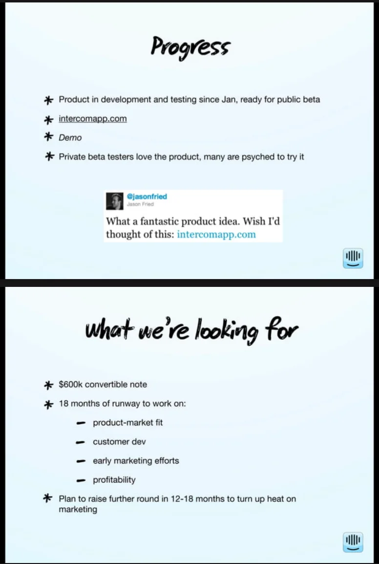
Intercom's 2011 seed deck is often called one of the best SaaS pitch decks ever made, and it raised its round with only about 8 slides and roughly 250 words total. It led with the founding team, explained the problem visually, and used a fragmented category map on its competitor slide instead of a feature-by-feature comparison, which created a new category rather than getting stuck comparing checkboxes.
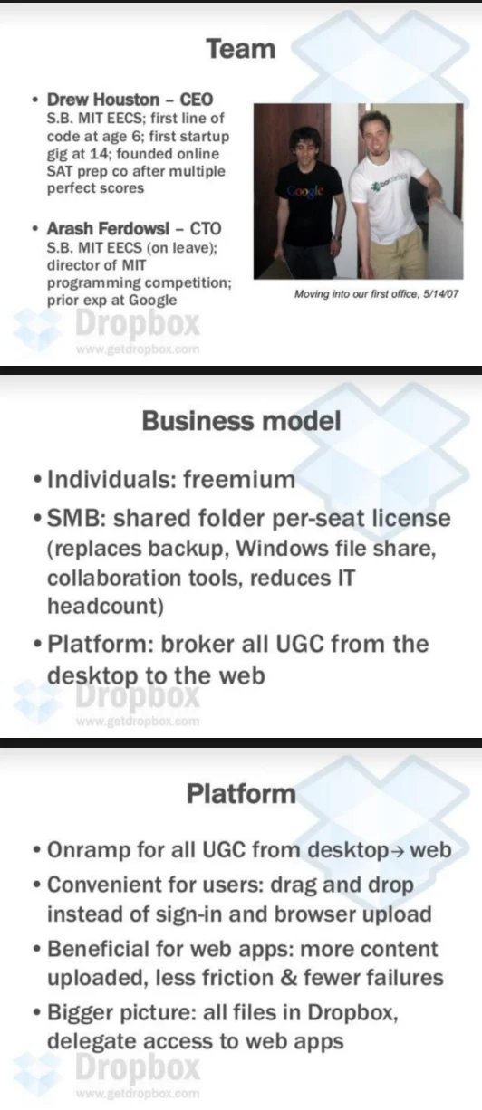
Please note that these are snaps of real slides, collected years ago. Hence the image quality might be a tad bit blurry.
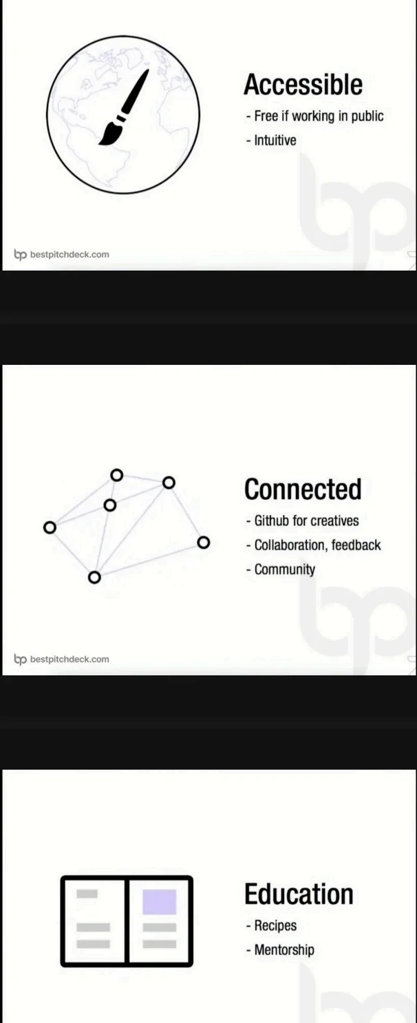
Figma's seed deck focused almost entirely on the future of collaborative design rather than product screenshots, built around huge typography, a minimal color palette, and diagrams instead of paragraphs. Every slide carried one dominant visual object, which is a pattern that shows up across most modern product companies today.
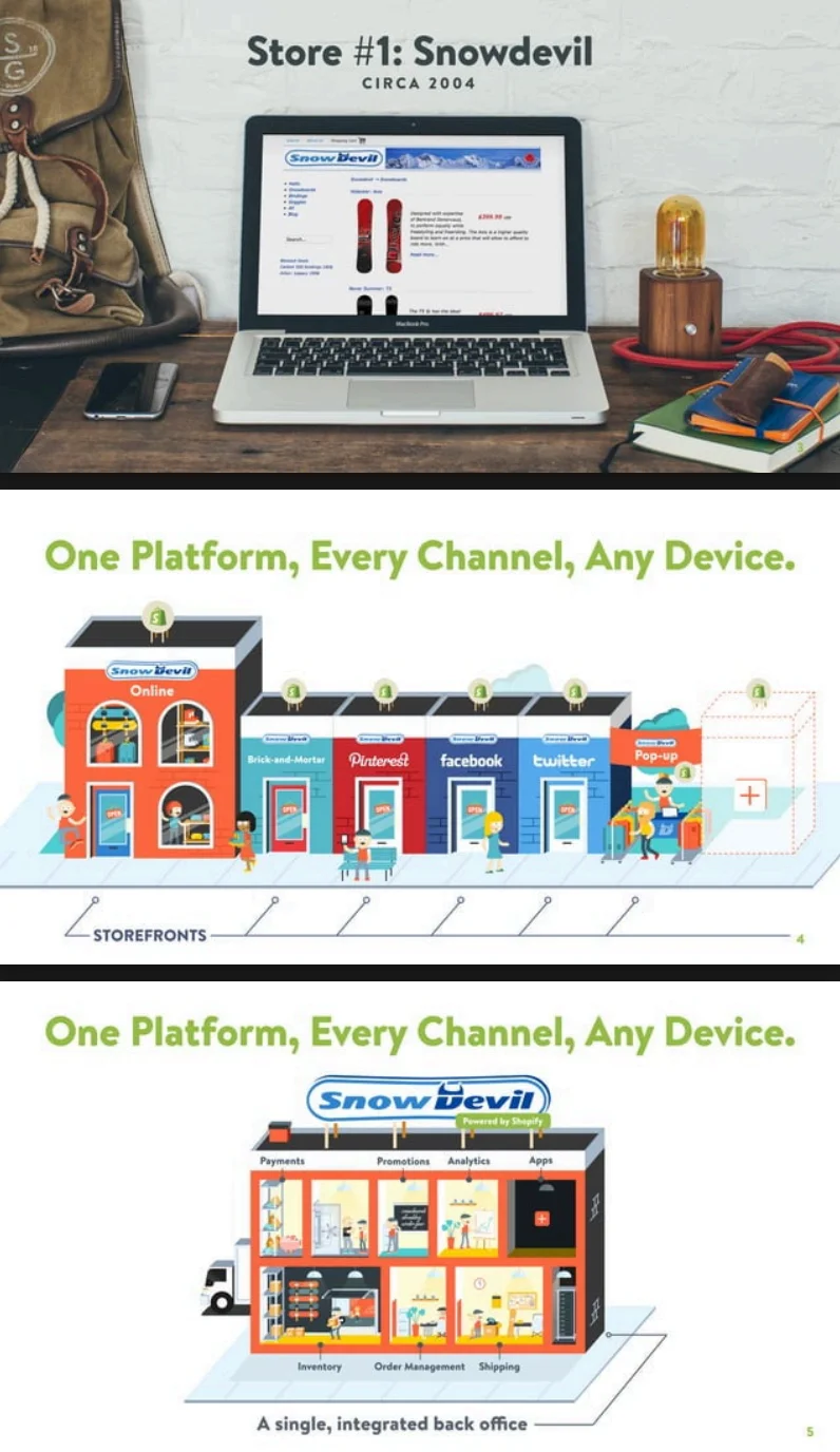
Shopify's growth deck relies on massive whitespace and KPI-first storytelling, where the charts occupy most of the slide and the supporting text stays small. It's a useful reference specifically for quarterly or internal strategy decks rather than fundraising.
GitLab's seed deck is a strong example of communicating a technical product to a non-technical audience, particularly through its roadmap, open-source strategy, and business model slides.

Dropbox's pre-seed deck replaced a technical explanation of file syncing with a single diagram showing a computer connecting to the cloud and then to a phone, which did the work of three paragraphs of text in one image.
If you're building presentations for a B2B SaaS audience specifically, Intercom, Linear, and Stripe are the three worth studying first, since they map most closely to the kind of client proposals, investor updates, and product decks a modern SaaS team or design agency actually produces.
Final thoughts
Good presentation design comes down to a small set of decisions repeated across every deck: a clear narrative before you open any design tool, one idea per slide, a hierarchy that survives a photo taken from the back of the room, and a level of polish matched to who's actually in the room. None of that is complicated in theory, and the hard part is holding onto it once a deadline is close, the slide count keeps growing, and everyone in the room has an opinion on the headline.
That's normal, and it's exactly why a repeatable system beats rebuilding a deck from scratch every time. Lock the structure once, and the next pitch, proposal, or board update takes a fraction of the effort the first one did.
If you'd rather have that system built for you, check out how magier handles design or book a free demo with magier to talk through your next deck.
Pick the section most relevant to your situation, whether that's your platform, your audience, or the examples, and start there rather than trying to fix the whole deck at once.
FAQ
A good presentation combines a clear storyline, one message per slide, and a visual density that matches your specific audience, whether that's investors, a board, or an academic panel. Rehearsing against a hard time limit before you present is what usually reveals which slides still need to be cut.
There isn't one universal answer, since it depends on the use case. Figma Slides tends to work best for design-connected agency work, Pitch for startup and sales decks, Keynote for polished talks, and PowerPoint for broad enterprise compatibility.
Most investor decks run 10 to 15 slides, though Intercom's well-known seed deck famously used only 8 slides and roughly 250 words total.
Treating slides like a script instead of a visual aid is one of the most common mistakes, since it forces the audience to choose between reading the slide and listening to the speaker instead of doing both at once.
The 5/5/5 rule suggests keeping no more than 5 words per line, 5 lines per slide, and 5 slides in a row before changing the visual pattern. It's a simple guardrail against cramming too much text onto a single slide.
This is a looser variant of the 5/5/5 rule, capping each slide at roughly 7 words per line and 7 lines total. Both rules exist to force conciseness, and which one you follow matters less than sticking to some version of it consistently.
Start by writing the narrative structure in plain sentences before opening any design software, then apply one idea per slide, consistent typography, and a limited color palette. Polish spacing and visual details only after the message and layout are already solid.
.avif)



.avif)