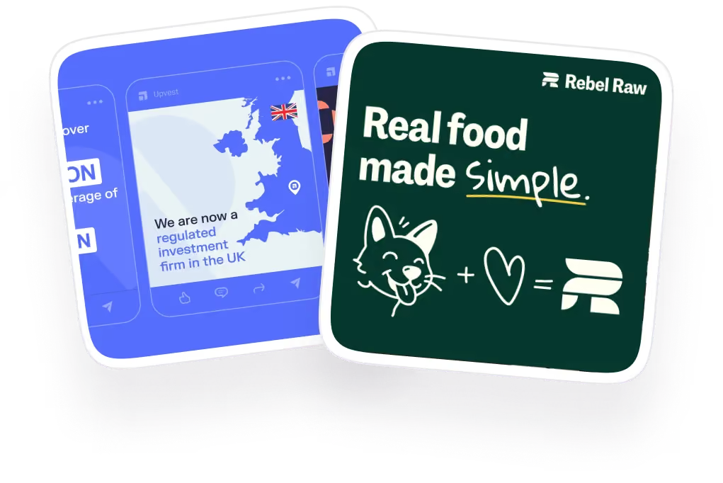
Ad Design Best Practices for Successful Ads: A Guide for Designers and Marketers
The first banner ad ever published, back in 1994, pulled a 44% click-through rate. Today the average click-through rate on the Google Display Network sits at 0.46%. That drop tells you everything about why ad design (also known ad ad creative) matters more now than it ever did, since the same visual tricks that used to work on a curious internet no longer get anyone's attention.
Ad design or ad creative is the visual and messaging work behind any paid ad, whether that's a static banner, a video, or a carousel. Nielsen research found that 47% of a brand's sales lift from advertising comes directly from the creative itself, not the targeting or the budget behind it, and separate research puts the number even higher for social specifically, with 41.6% of consumers' purchasing decisions on social platforms tied directly to an ad's image elements. Those two numbers together are why getting the design right carries so much weight.
We build and test ad creative across Meta, Google Display, and social platforms for 150+ clients at magier, so the practices in this guide come from work we do every week as well as extensive ground work. This piece is organized around what we've found actually helping our clients generate revenue through ads.
Here's what's covered:
- Best practices broken down by ad creative format
- Best practices broken down by platform
- Tools to use for ad design and production
- Agencies that help with ad design
- Three fast tests you can run before an ad ships
- When it's smart to break these rules on purpose
TL;DR: general best practices every ad should follow
If you only take away a handful of rules from this guide, these are the ones that hold up across every format and platform covered above.
- Communicate one message per ad, not three
- Design for the first three to five seconds, since that's usually all the attention you get
- Match the format's structure to how people actually consume it, whether that's a scroll, a swipe, or a scan
- Adjust for the platform, since the same creative rarely performs identically everywhere
- Back decisions with real data and named results, not just instinct
- Run a fast test, like the phone or squint test, before anything ships
{{freebie}}
Ad design best practices by ad creative format
A carousel ad and a 9:16 video ad can carry the exact same message and still succeed for completely different reasons. Format changes how much time you have, how much space you get, and what kind of attention the viewer is giving you. Getting the format-specific mechanics right is just as important as getting the message right.
Static image ads
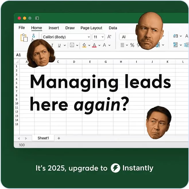
Static images work best for awareness campaigns, retargeting, and platforms like LinkedIn where a single strong visual outperforms motion. The core rule here is the 70/30 rule, meaning roughly 70% of the ad's space should go to visual content and no more than 30% to text, since people process images in milliseconds while reading text takes conscious effort.
Structure is as important as the ratio. A hook at the top, a single visual focal point, and one clear call to action at the bottom follow the way people naturally scan a static ad, whether that's an F-pattern for text-heavy layouts or a Z-pattern for image-driven ones. Feed-based visual layouts built this way outperform static, text-heavy formats by 54% on average across industries, which is a strong argument for trimming copy before adding more of it.
- Do: lead with one dominant visual and keep supporting text to a headline and a short benefit line
- Don't: stack multiple competing focal points into a single frame, since each additional element only takes attention away from the others
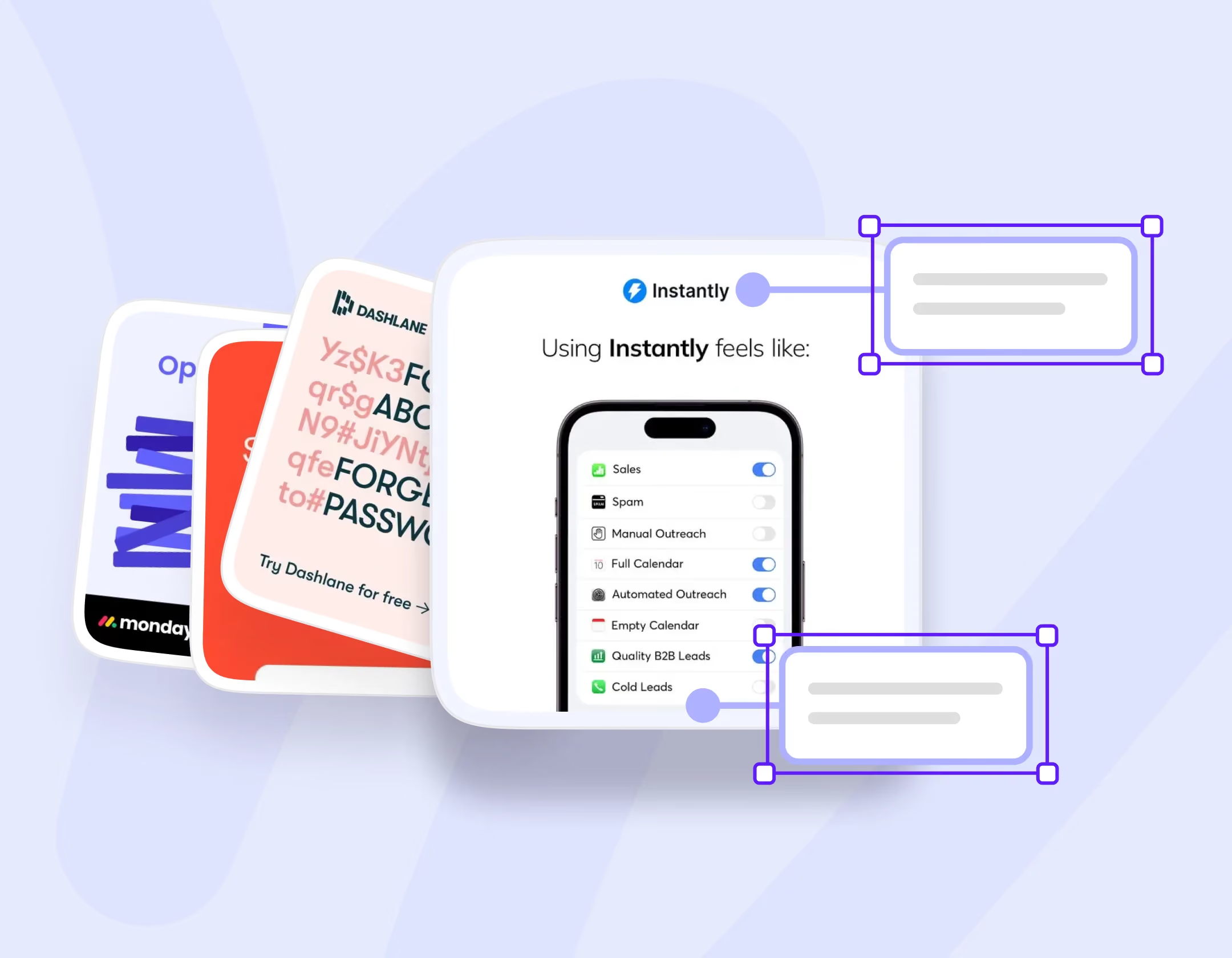
Carousel ads
.avif)
Instagram carousel ad mockup for LawLift showing six slides on document automation templates
Carousels work like a short visual presentation rather than a single frame, which means each card needs its own job. A typical winning structure moves through a hook, a problem, an insight, a solution, proof, and a call to action, one idea per slide rather than one message repeated six times.
The most common carousel mistake is treating every card as a copy of the first one with a different product photo. That approach wastes the format's biggest advantage, which is the ability to walk a viewer through an actual sequence.
- Do: give each card a distinct purpose in the sequence, from hook to proof to CTA
- Don't: repeat the same design and message across every slide, since that gives viewers no reason to keep swiping
Vertical short-form video ads (9:16)
Vertical video, whether on TikTok, Instagram Reels, or YouTube Shorts, runs on a tight framework: a hook in the first two seconds, the problem laid out by second eight, the solution shown by second eighteen, and a clear call to action at the end. Captions need to be large enough to read without sound, since a large share of viewers watch muted.
Safe zones matter more here than in almost any other format, because platform interfaces overlay the top and bottom of the frame with buttons, captions, and navigation. Anything essential needs to sit in the middle two-thirds of the frame or it risks getting covered.
- Do: front-load the hook and keep essential text and product visuals inside the safe zone
- Don't: open with a logo animation or a slow, cinematic build, since the platform's own scroll behavior won't wait for it
Responsive and dynamic ads
Responsive ads, Google's primary display ad format, work differently from the formats above because a machine learning system assembles the final ad from the assets you provide, not a fixed layout you design by hand. That means the upfront work of creating strong, varied headlines, descriptions, and images matters even more, since the system tests combinations you'll never manually preview.
Google's own data backs this up directly. Running an image alongside a responsive display ad drives 50% more conversions on average, and including multiple headlines, descriptions, and images instead of the bare minimum drives another 10% lift. The system can only combine what you give it, so a thin asset set caps its own performance ceiling.
- Do: supply the maximum number of headlines, descriptions, and images the platform allows, and make each one meaningfully different
- Don't: overlay logos, buttons, or heavy text on top of your images, since Google's own guidelines flag this as a policy violation, not just a design mistake
Ad creative best practices by platform
Getting the format right solves half the problem. The other half is platform, since the same static image or video that performs on one channel can flop on another because of different audience expectations and different technical constraints.
Meta ads (Facebook and Instagram)
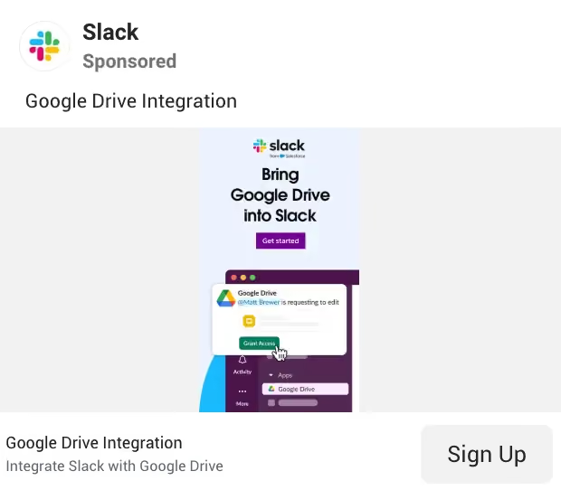
Meta's winning formats include the 4:5 feed placement, 9:16 Stories and Reels, and carousels. The creative hierarchy that tends to work best moves from hook to visual proof to brand to call to action, in that order.
- Do: lead with a bold headline directly on the creative, use real people in the imagery since faces increase stopping power, and show the product immediately
- Don't: cram in tiny text blocks, generic stock photography, or more than one competing call to action
LinkedIn ads
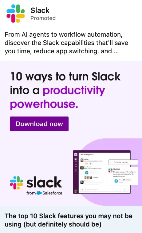
LinkedIn audiences respond to clarity over entertainment, which shifts what "good creative" looks like compared to consumer platforms. The best-performing styles tend to be data visualizations, founder opinions, customer quotes, or a single product screenshot paired with one clear benefit.
A single strong statistic on the creative itself, something like "73% of marketers waste budget on poor attribution," often outperforms a list of five features, since one credible number is easier to process and remember than a feature dump.
TikTok ads
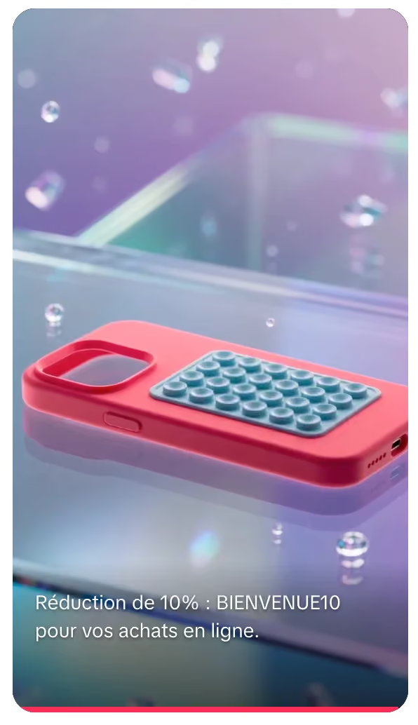
Vertical video ad in French showing a pink phone case with a 10% discount code overlay
TikTok rewards the opposite of polished advertising. The framework that performs best runs a hook in the first two seconds, the problem by second eight, the solution by second eighteen, and a call to action at the end, matching the same structure covered in the vertical video format section above.
- Avoid: cinematic intros, logo animations before any content, and corporate-sounding voiceovers, since all three read as an ad the moment they appear and give viewers a reason to keep scrolling
Google Display ads
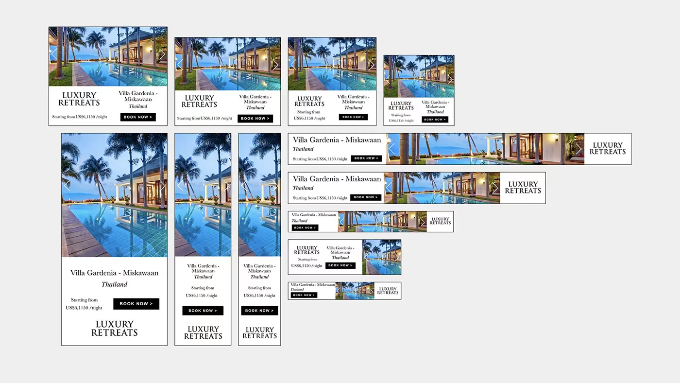
Banner ads on the Google Display Network have milliseconds to communicate, which is why the rule here is simple: image, benefit, button, and nothing more. Never take an Instagram creative and shrink it down for a banner placement, since the composition that works at Instagram's scale usually falls apart at banner size.
Google's own Creative Best Practices Guide is worth citing directly here, since it's the platform's own documentation. It recommends avoiding blurry, skewed, or upside-down images, keeping blank space under 80% of the frame so the product stays the focus, and never overlaying fake buttons or logos on top of a photo, since Google's policy treats that as misleading functionality.
YouTube ads
The first five seconds of a YouTube ad determine whether the rest gets watched. Strong openers include a surprising statement, an admitted mistake, a bold question, or a visual transformation, anything that interrupts the viewer's expectation of what a skippable ad usually looks like.
- Don't: open on your logo, since that's the single most common mistake and it wastes the exact seconds you have the most attention to work with

What is ad design (or ad creative)?
Ad design, also called ad creative, is the visual and messaging work behind any paid advertisement, whether that's a static image, a video, a carousel, or a responsive display ad. It covers everything the viewer actually sees and reads: the layout, the imagery, the headline, the color choices, and the call to action.
The term applies across every paid channel, including Meta, Google Display, TikTok, LinkedIn, and YouTube, even though the specific format and rules change from platform to platform. Good ad design does one job above all else: it communicates a single, clear message fast enough to stop a scroll or hold attention through a skippable ad.
Ad design differs from general graphic design in one key way. A graphic designer might optimize for aesthetics or brand consistency alone, while ad design is built around a measurable outcome, a click, a sign-up, or a sale, so every visual decision gets judged by whether it moves someone toward that action.
"Ad design" and "ad creative" are used interchangeably throughout this guide, since both terms describe the same work: designing the visual and written content that makes up a paid ad.
Tools for ad design and creative production
The right tools speed up production without replacing the thinking behind good creative. Canva and Figma cover most DIY design needs, from quick social posts to fully custom UI mockups, while Adobe Express and the broader Creative Cloud suite handle more advanced photo and video editing.
For teams producing many ad variations at once, automation tools like Abyssale, Bannerbear, and Creatomate generate resized and localized versions of a single design across dozens of formats without manual rework. These tools solve a real production bottleneck, but they still depend on the underlying design being strong before automation multiplies it.
Before building anything new, it helps to see what's already working. Meta Ads Library shows every active ad a competitor is running on Facebook and Instagram, completely free to browse. Foreplay lets you save and organize the strongest ad design examples you find into a swipe file instead of losing them across screenshots, and TikTok Creative Center surfaces trending formats and hooks specific to that platform. If you want a deeper look at where to find inspiration and research tools like these, our guide to graphic design websites for marketers covers the full list.
Agencies for ad design
Some teams handle ad creative in-house, and others bring in outside help when the volume or specialization outpaces internal capacity. Here's how a few real options compare.
6 ad design statistic and research experiments you should know about
Principles are easier to trust when they're backed by real, named results instead of generic advice. Here are five documented tests worth knowing.
- Strayer University: a 6-second video ad that delivered its value statement in the first 2 seconds produced 50% lower cost per engagement and 32% higher click-through rate than a 15-second version of the same ad
- Ownable: converting static promotional creative into animated GIFs drove a 17% increase in spend, 26% more revenue, and a 45% higher conversion rate
- Luca + Danni: pulling real customer reviews directly into ad copy, instead of using evergreen headlines, produced a 26% decrease in cost per click, a 19% increase in click-through rate, and a 110% improvement in return on ad spend
- Maurices: shoppable collection ads that dynamically showcased a product carousel drove 67% higher click-through rate and 51% higher return on ad spend than standard link-post ads
- Google Customer Match: campaigns using first-party data signals saw conversions increase by 10% on average and return on ad spend improve by 15%, compared to campaigns without proprietary data
- HubSpot's CTA color test: a red call to action button generated 21% more clicks than an otherwise identical green button, a reminder that even a single color choice on a single element can move performance
The pattern across all six tests is the same: small, specific creative changes, not bigger budgets, drove the improvement.
Book a free demo with magier if you'd rather have a team apply these same principles to your next campaign.
"The Luca and Danni review test is the one we point to most with new clients, since it proves a small copy change can beat a completely new creative concept. Testing one variable at a time still wins more often than starting over."

{{cta}}
Why accessibility is so important for ad creative performance
Accessibility standards often get treated as a legal checkbox, but they overlap directly with what makes an ad readable on a phone in bright sunlight or a crowded feed. The Web Content Accessibility Guidelines call for a minimum contrast ratio of 4.5:1 for normal text and 3:1 for large text, and hitting those numbers makes an ad easier to read for every viewer, not just those with visual impairments.
Designs that pass a grayscale test, meaning the hierarchy still reads clearly with all color removed, tend to hold up better across devices and lighting conditions than designs that lean entirely on color to separate elements. Building for accessibility from the start avoids having to retrofit it later, and it tends to improve mobile performance as a side effect rather than a separate initiative.

Three quick ad design tests to run before you ship an ad
None of these require a research budget or extra software, just a few minutes before an ad goes live.
- The phone test: Hold your phone at arm's length and check whether the headline and call to action are still legible. If you have to lean in to read them, most viewers will scroll past before bothering.
- The squint test: Blur your eyes slightly while looking at the ad and see whether one element still clearly dominates. If everything blurs into equal weight, the hierarchy isn't strong enough yet.
- The 5-second test: Show the ad to someone unfamiliar with the project for exactly five seconds, then ask what they remember. If they can't repeat the core message, the design needs more clarity, not more content.
When to break these ad design rules
Every rule in this guide exists because it reliably works, but understanding why a rule works is what gives you permission to break it on purpose. Apple's "Think Different" campaign ran black-and-white photography during an era of colorful advertising, breaking color convention specifically to communicate sophistication and timelessness. Volkswagen's "Think Small" campaign broke the usual instinct to make a product look large and impressive, instead using honest minimalism that felt refreshingly different from every other car ad running at the time.
Rule-breaking works when it's deliberate and tied to a real strategic reason, like standing out in a saturated category or expressing a distinct brand personality, not when it happens by accident or because a rule was never learned in the first place. If you're considering breaking a convention, A/B test it against a version that follows the standard approach and let actual results settle the question rather than a hunch.
Quality control checklist for ad design
Run through this before publishing any ad.
- Can someone grasp the core message in five seconds or less
- Is there a single, clear call to action
- Does one element clearly carry the most visual weight
- Does the design pass the grayscale test
- Is contrast at or above 4.5:1 for normal text
- Are all essential elements inside the platform's safe zone
- Does the format match the platform it's running on
The bottom line
The ads that consistently perform share a small set of principles: one clear message, strong visual hierarchy, and creative that's built for the specific format and platform it runs on. Applying all of this consistently across a full campaign calendar, and testing it the way Strayer, Ownable, and Maurices did, takes real ongoing work, not a one-time checklist.
If you'd rather have a team handle the strategy, design, and testing for you, check out magier's design services. We build and iterate on ad creative across Meta, Google Display, and social platforms with a dedicated designer and project manager on every account.
Pick whichever section matches the ad you're working on this week, whether that's a format you haven't tried yet or a platform where performance has been flat, and start there.
{{cta}}
FAQ
Banner ad sizes vary by platform, but Google Display recommends including the top five image sizes, 160x600, 320x50, 300x250, 300x600, and 728x90 pixels, since these are automatically resized to fit roughly 95% of available placements. For responsive display ads specifically, Google recommends uploading 5 to 10 images in both the 1.91:1 and 1:1 aspect ratios.
Google Display ads rely on a strict image-benefit-button structure because banner placements offer very little space and time to communicate. Meta ads have more room to work with hooks, visual proof, and brand storytelling across formats like Stories, Reels, and carousels, which allows for a more layered creative approach.
The general guideline is the 70/30 rule, meaning roughly 70% of an ad's space should go to visual content and 30% or less to text, since images process far faster than reading does. Google Display banners in particular have a strict 150KB file size limit, which naturally forces minimal, efficient text and imagery.
Yes. Google's own Creative Best Practices Guide recommends using high-quality, unedited images, providing multiple headline and description variations, and always including a logo in both 1:1 and 4:1 aspect ratios so the system has full flexibility to assemble the strongest combination.
Use high-resolution, unedited photography with natural lines and full color, and avoid blurry, skewed, or heavily filtered images. Google's own guidelines also recommend keeping blank space under 80% of the frame and never overlaying logos, text, or fake buttons directly on the photo.
The strongest ad creative practices are consistent across research: one focused message, high contrast between elements, and a single clear call to action. Beyond that, the specific best practices shift depending on the format, whether that's a static image, a carousel, or a video.
Effective ad design communicates one clear message fast, usually within the first three to five seconds, and uses strong visual hierarchy so viewers know exactly where to look first. It also matches its format and platform, since the same design rarely performs identically everywhere it runs.
.avif)